UI Updates in 2026: How to Communicate and Guide for Fast Adoption


A major UI update affects a lot of stakeholders on the development and consumer side. While the existing users have to relearn workflows they’re already familiar with, the customer success teams get overwhelmed with an increase in support tickets. Also, the support teams prepare documentation updates, and product teams refresh dashboards, hoping the adoption numbers justify the months of work that went into the redesign.
Then the launch happens. The announcement email goes out, and the release notes are published. A modal appears in the product, and then the litmus test of product adoption begins.
Can users still get their work done? Do they understand why the change matters? Will they adopt the new workflow, or look for ways around it?
This is where many UI update strategies fall apart. Teams put in a lot of effort into the launch announcement and very little time planning what happens after users encounter the change.
But seeing an update and adapting to it are two different things. The navigation flows your users are used to for years have suddenly moved/changed. Even improvements create friction when people are under pressure to finish their work. Users need guidance, support, and a reason to change old habits.
In this article, I’ll share how leading SaaS teams are rethinking UI updates in 2026, and why the success of a redesign depends less on how you announce it and more on how you help users adapt to it.

The old playbook: Emails, release notes, and announcement fatigue
Traditionally, announcing UI changes is carried out by three main channels:
- You send an email to your user base.
- You write release notes that document what changed.
- If the update is significant enough, you write a blog post.
These aren’t bad practices; they’re just not sufficient anymore.
You should still follow all the best practices, but assuming announcing the UI change is just a checkbox or update in the change log, you’re mistaken. Because of changes in the end user’s behavior, best practices fulfill the wrong goals. The other side of the job is to help users adapt to the UI changes. That’s where the loop closes.
Design thinking in 2026 is moving away from feature marketing and focusing on the why behind the feature changes. Your users would notice the difference between an announcement that honestly educates them on what changed and those that treat update announcements as mere formality. This difference is where your brand can win trust and retain users for longer subscription cycles.
The metric you’re probably tracking is the wrong one
When a product team ships a UI update, the default success metrics are announcement metrics, email open rate, modal impression count, click-through on the “learn more” button, and views on the release notes page. These feel like adoption signals because they involve users taking action, but they’re actually attention signals. A user who clicked through on your announcement email and then found the new interface confusing has been measured as a success.
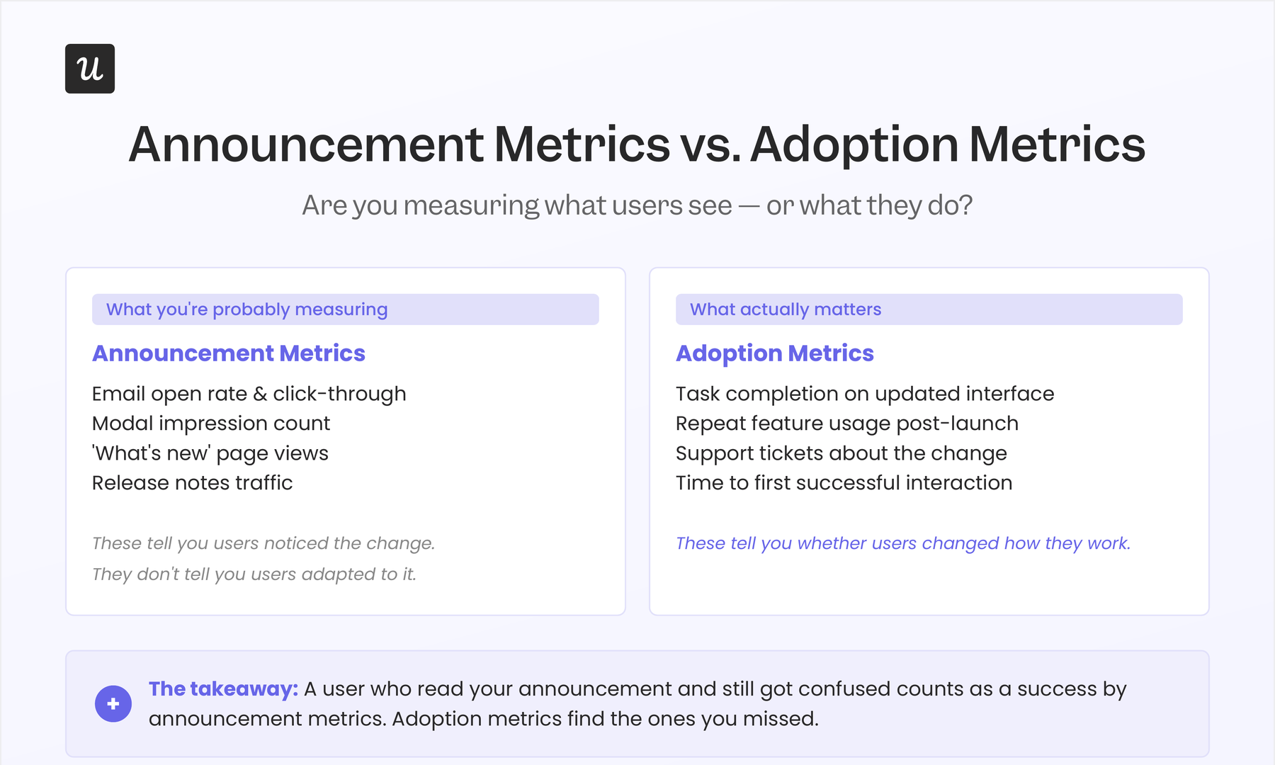
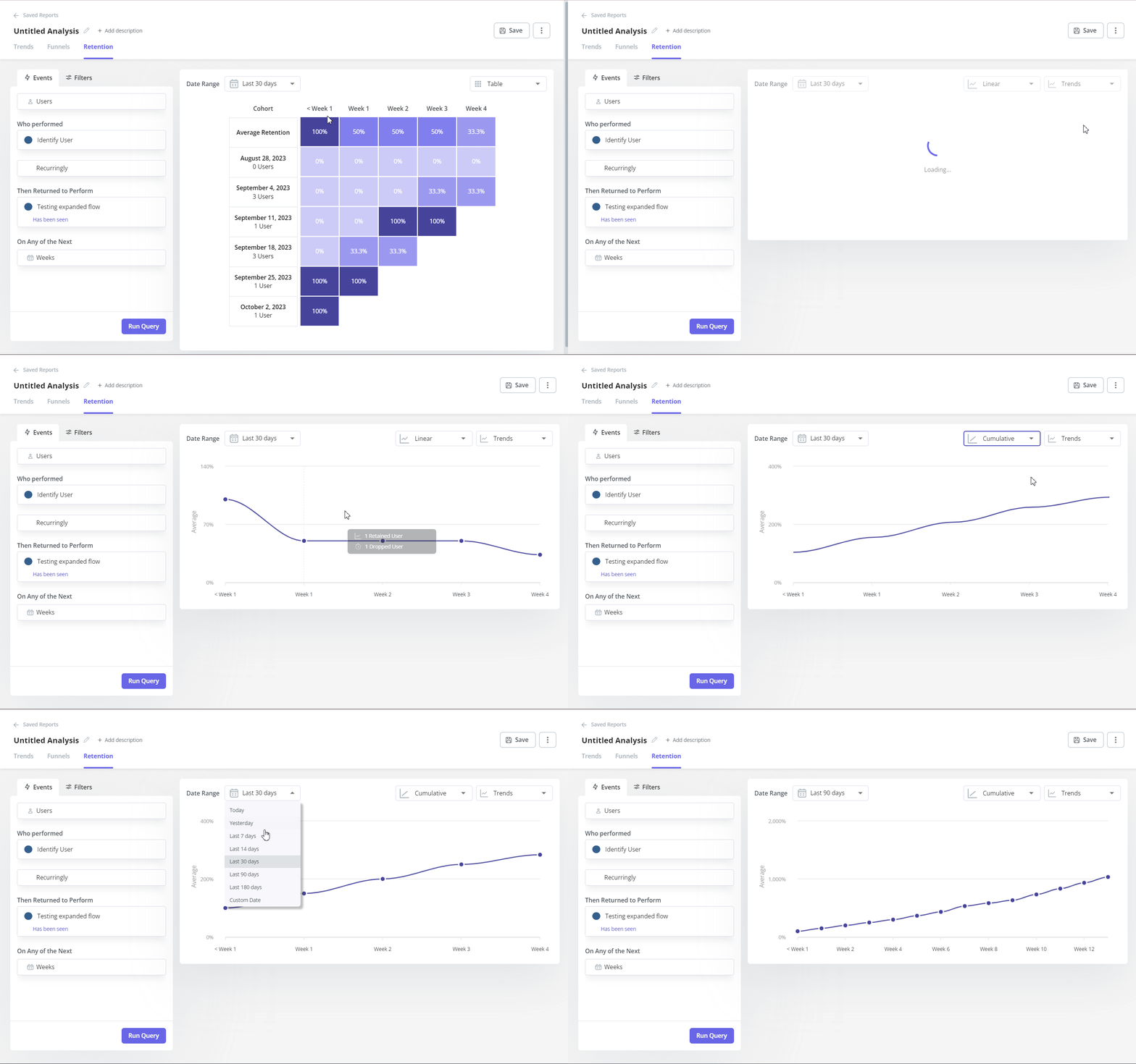
If you focus on feature adoption metrics, you’ll get a different story that covers task completion rates, repeat usage of updated features, support ticket volume specifically about the updated UI, and the time to first successful interaction after encountering the update. Monitoring these signals tells you if users adapted or only paid attention to what changes.
These are harder to collect, slower to show movement, and much more useful than click-through rates on announcements.
The distinction matters because it changes what you focus on when you ship next UI updates. If your success metric is the reach your announcements got, you’ll statistically incline towards doing more announcements as a response to low adoption.
On the other hand, if your success metric is task completion on the updated interface, your natural response would be to look at where users are getting stuck and fix those specific friction points. This is where the trend is heading in 2026 and beyond.
Why do users fail to adopt good interfaces? Three causes of change resistance
Even if your new UI follows the best principles and should satisfy the users on paper, sometimes, it doesn’t stick. Here are three reasons separate from the quality of the upadate that you should consider:
#1 Users have spatial memory
People remember where things live in an interface, not why they’re there. When you update navigation, change icon positions, or restructure menus, you’re not just changing the visual design, but you’re invalidating months or years of learned muscle memory. And navigation changes are clearly the most fragile category of UI update for exactly this reason.
When Slack redesigned the sidebar in 2023, it drew a lot of criticism. The old sidebar layout was useful for users to scan notifications and switch between workspaces quickly. Even though this feature didn’t disappear, the path to find this navigation changed. This was a learning for Slack and the entire SaaS industry that even the beneficial redesigns come with a relearning cost.
Skyler Schain published a post that captured the root problem clearly. Slack’s new layout was more organized by design principles, but it moved things that millions of users had built reflexes around. The backlash had nothing to do with aesthetics and everything to do with the relearning tax Slack charged users without adequate support for paying it.
The reason why changing the cosmetics of a UI (such as fonts, navigation, and colors across all screens) creates friction is that the users were used to the old version. Since the UI and the flow of features were familiar, that reduced cognitive load.
#2 Users often don’t know why the change happened
Most UI update announcements describe what changed. Very few update announcements explain the why behind the change, and even fewer connect the change to a specific outcome the user cares about. That asymmetry matters because “why” is what gives a user a reason to invest in relearning.
“We’ve redesigned the reporting section” is an announcement. “You can now build reports without exporting data to a spreadsheet” is a reason to care. The first version puts all the interpretive work on the user to figure out whether the change is relevant to them. The second does that work for them and lands in a completely different cognitive register.
Unexplained changes make users reverse-engineer the reason behind the change. If you can explain the problem that the change solved with that update, you can avoid users seeing the update as a disruption without benefit. This way, you can avoid negative feedback as well. Your updates weren’t the problem, the lack of communication behind the update was.
#3 The announcement and the experience aren’t synchronized
When your announcement emails land in your users’ inboxes during their work hours, they might scan them and even click the link to the changelog. They might leave the tab open and or add it to read later, assuming that they’ll get back to it later. But three days later, when they open your product and notice the change in interface while trying to complete something time-sensitive, the announcement email you sent and the moment of actual use remain disconnected.
This is exactly where your announcement-only rollout strategy failed. Because you delivered the information outside of the workflow, it couldn’t reach the user when they needed it the most. With in-app guidance, you can explain a navigation change the first time a user tries to navigate without surprising them with a different UI change.
The update experience model: From announcement to adoption
The teams that consistently get UI update rollouts right tend to think about the update experience across the following four connected phases. None of them is optional for any change that significantly affects an existing workflow.
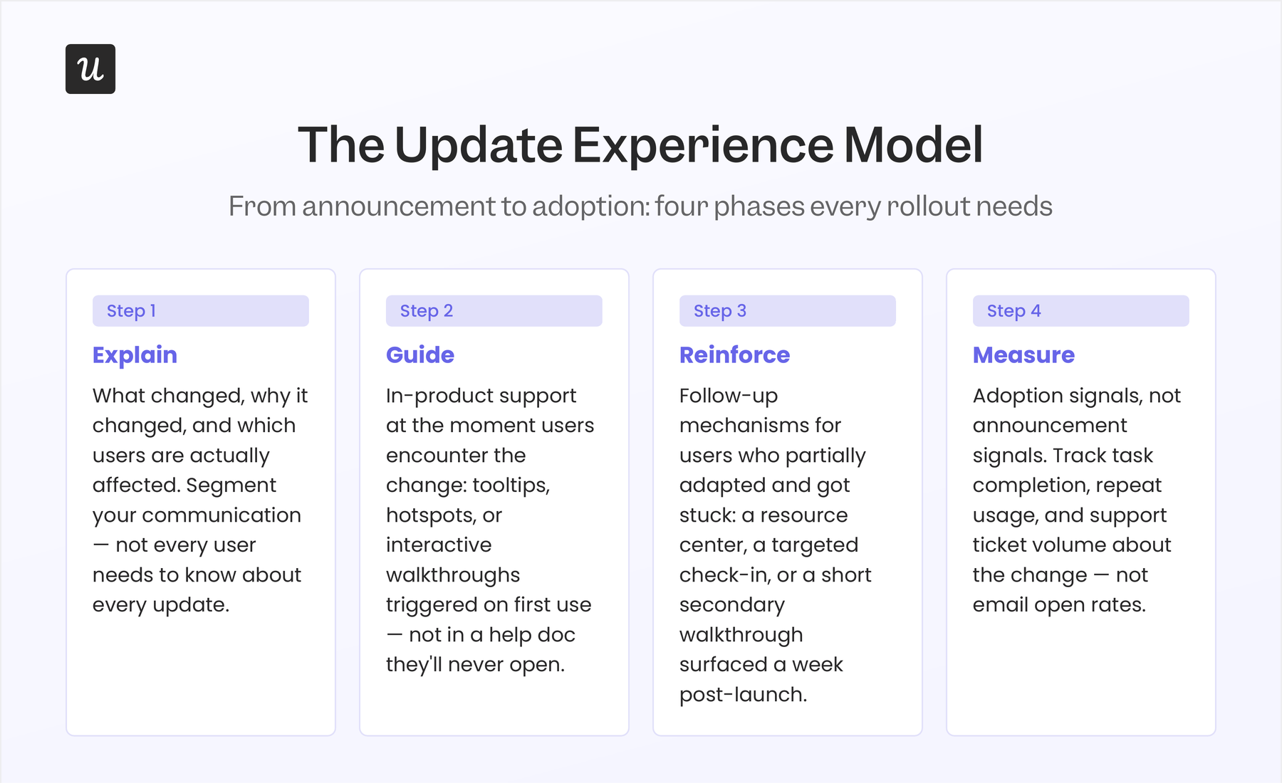
Explain what changed, why it changed, and who it affects
If you stop with just announcing the change and don’t explain the change, you’d fail at everything that follows. An announcement with a good explanation answers three questions:
- What is different?
- What problem does the difference solve? and
- Which users are affected by it?
Segmenting your update announcements by who the change actually affects matters enormously at this stage because a UI change that affects power users doing advanced reporting is not the same communication problem as a change affecting every user on first login. Sending the same announcement to both groups wastes attention and creates noise for users who don’t need to know.
Guide support in the workflow, not around it
Trigger the guidance exactly when the user encounters the change. That’s the most effective way of bridging the awareness-to-adoption gap.
How you guide depends on the magnitude of the change. Simple navigation changes can be dealt with by trigger hotspots pointing to where things have moved. On the other hand, a significant workflow change might need a dedicated interactive walkthrough that triggers on the first encounter.
A full interface overhaul might need both, plus an informed support team that the users can return to if they get confused later. The guiding principle is that support should be available where the confusion occurs, not where it’s convenient for your team to put it. This is how software proactively presents the exact next step a user needs at the moment of confusion, creating the effortless flow that good design promises but announcements alone can never deliver.
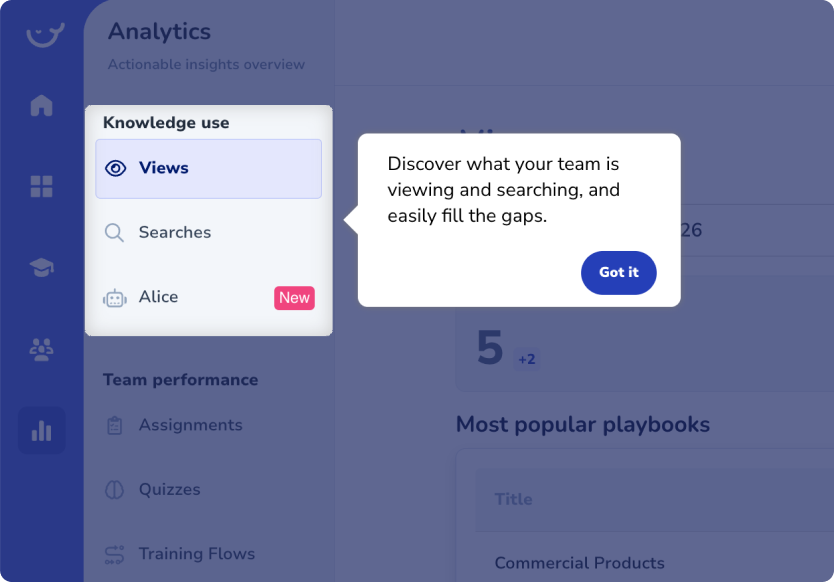
We ran into this problem ourselves when we shipped our email feature within Userpilot. The funnel showed a sharp drop-off at the domain-verification step. Abrar Abutouq, one of our product managers, describes what happened next:
“Within a few hours, I just created a targeting tooltip and showed it to users and highlighted the correct steps for them to make it clear what to do next. That helped a lot on reducing friction and supporting users in real time without involving our dev team.”
The resistance was cleared in a few days without engineering manpower and a second email blast. The guidance placed at the exact moment users needed it was visibly the winner in this workaround.
Reinforce what happens after the first exposure
Educating users about what changed hardly does anything to make people remember the change, let alone get used to it. Ideally, your users would notice the change in UI, read the tooltips, and be done with it. When they come back a few days later, they can’t quite remember the flow of the new UI change, which is normal. You should reinforce the changes through repetition and not with just a single interactive walkthrough.
Reinforcement means building the support system that helps users get unstuck without generating a support ticket. A well-designed in-app resource center that surfaces relevant help content for the updated area of the product handles most of this passively. Customer success outreach for high-value accounts who haven’t engaged with a significant change handles the rest.
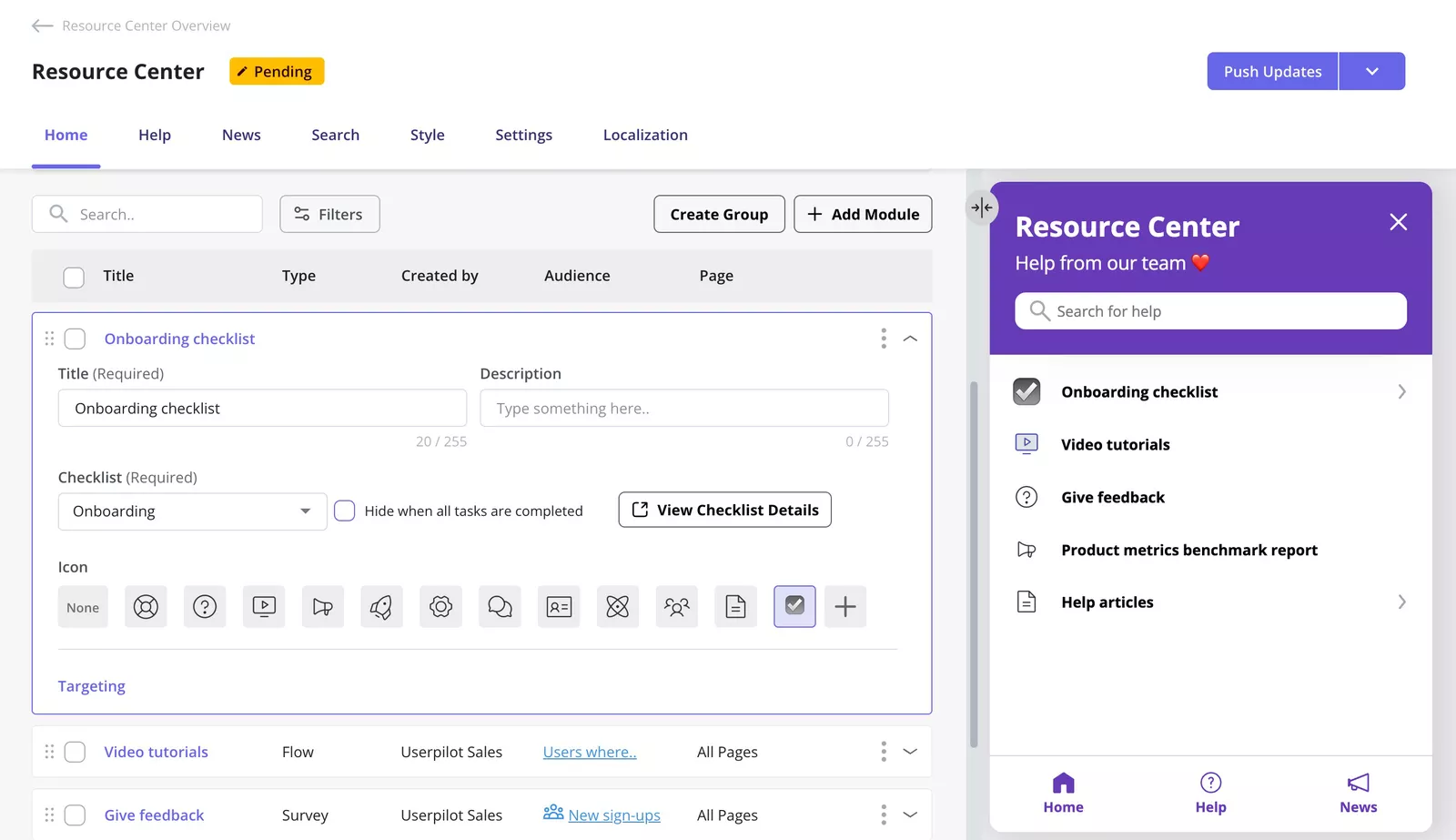
The whole point of reinforcing is to reduce the confusion in users who encountered the update. Especially when they have partially adapted and only need occasional help to finish the transition to the new interface.
Measure adoption signals, not announcement signals
Once the rollout is live, closely track:
- Behavioral repeat usage of the updated feature.
- Task completion on the new interface.
- Time spent in the changed section.
- Support ticket volume specifically about the update.
These signals indicate whether users are actually adapting, which is the only outcome that matters. The feature adoption rate is the most direct measure. If a UI change was supposed to make a workflow easier, you should see task completion improve in the weeks following launch. If it doesn’t, that’s a signal worth investigating, and it’s almost always a signal you’d miss entirely if you were measuring announcement reach instead.
Five patterns that kill UI update adoption
Now that you know how to go about an update, let’s take a look at a few practices you should stay away from.
#1 Announcing every minor change
Teams that announce every small change create announcement fatigue. Users begin ignoring update communications because most of them require no action, then stop paying attention to the ones that do. Announcing fewer changes, more deliberately, with a clear signal about which ones require users to do something differently, is a more effective response than refining your release notes.
#2 Celebrating the redesign instead of the user outcome
Internal teams unknowingly ship a redesign with pride, and that pride leaks into external communications. The announcement leads with how hard the team worked, how many iterations the design went through, or how visually superior the new interface is.
But users don’t care about any of that. They care about whether the thing they needed to do yesterday is still as easy to do today. Redesign announcements that center on the team’s process rather than the user’s outcome trigger resistance. The user’s first interaction with your new interface will be evaluated on one question only: “Does this help me do my job?”
#3 Shipping without in-product support
Launching a significant UI change with only a changelog entry and an email is equivalent to rearranging a physical office and expecting people to figure it out from a memo. The confusion happens within the product, so the support also needs to be in the product. Announcements that live entirely outside the product are weakly positioned to help users who encounter confusion inside it.
#4 Measuring success by visibility
A high email open rate on your UI update announcement tells you that your subject line worked. It doesn’t tell you that users understood the change, found the new interface easy to use, or changed how they work. Visibility metrics are a reasonable early indicator but a terrible final one. Teams that declare a rollout successful because of high engagement on announcement emails are often sitting on undiscovered adoption problems that won’t surface until their users stop renewing their licenses.
#5 Launching globally before catching the friction
Beta testing UI changes with a small focus group first, and collecting feedback using a short in-app survey is always a best practice. Using the data, understand where users are getting confused before the global launch. This will cost almost nothing compared to the cost of rolling back a global release, like OpenAI did last year. Your team should treat the beta phase as a friction-finding drill and not just another checkbox.
Staged rollouts also give you a data layer you can’t get from internal testing. Data from real users encountering the change, without any briefing, in the middle of their actual workflows. That data is worth more than any amount of internal confidence about how intuitive the new design feels.
Build the update experience, not just the announcement
The UI changed announcements are still an absolutely valid practice, but they should lead the existing and new users to a larger experience within the product. If your team is trying to close the gap between adoption and awareness, KPIs around adoption will matter more than ever.
Userpilot provides product teams with no-code tools like tooltips, interactive walkthroughs, hotspots, resource centers, and behavioral analytics. While these tools track adoption signals, you can push updates that explain the change, guides the users through those changes at the right moment. You can also reinforce their understanding over time and analyze whether it worked or not. All this under one roof.
If you want to see how this works in practice, book a demo, and we can walk through a rollout scenario specific to your product.
About the author