UX Redesign for SaaS in 2026: The Human Process, Plus the Agentic Practices No One’s Added Yet



UX redesign in 2026 has a blind spot most teams don’t know about: a growing share of the people using your product every day aren’t people at all. UX redesign means reevaluating and revamping a product’s visual elements, navigation, or overall user journey to remove friction points and add new functionality. The standard definition still holds for the human side of the rework, which is usually triggered by outdated interfaces or user feedback.
What’s changed is the definition of who (or what) a user really is when 85% of enterprises and 78% of SMBs are already using AI agents.
Those AI agents interact with your product too, just not through the frontend interface the way a human does. The seven-step redesign process below still works for human UX but it was never built to cater to agents who silently fail confirmation steps they can’t parse. This guide will walk you through the redesign process for human UX and show you how to design with agentic users in mind so you can cater to both populations.

How to execute a successful UX redesign for SaaS products
The sections below will offer a step-by-step guide on how to handle SaaS UX design overhauls, covering everything from preliminary audits and competitor analysis to launch day itself.
Step 1: Audit your current UX and competitors before you touch anything
The process of auditing your current UX extends beyond your own product. Pull up online reviews of your top competitors and take note of any recurring complaints. Sign up for their trials, go through their onboarding flows, and see how they approach the friction points that your users are currently facing. This first-hand research will tell you what users can already get elsewhere, reframing your audit from “what’s broken” to “what’s inferior relative to alternatives.”
Then run a conversion funnel analysis to identify where users are dropping off in their journey.
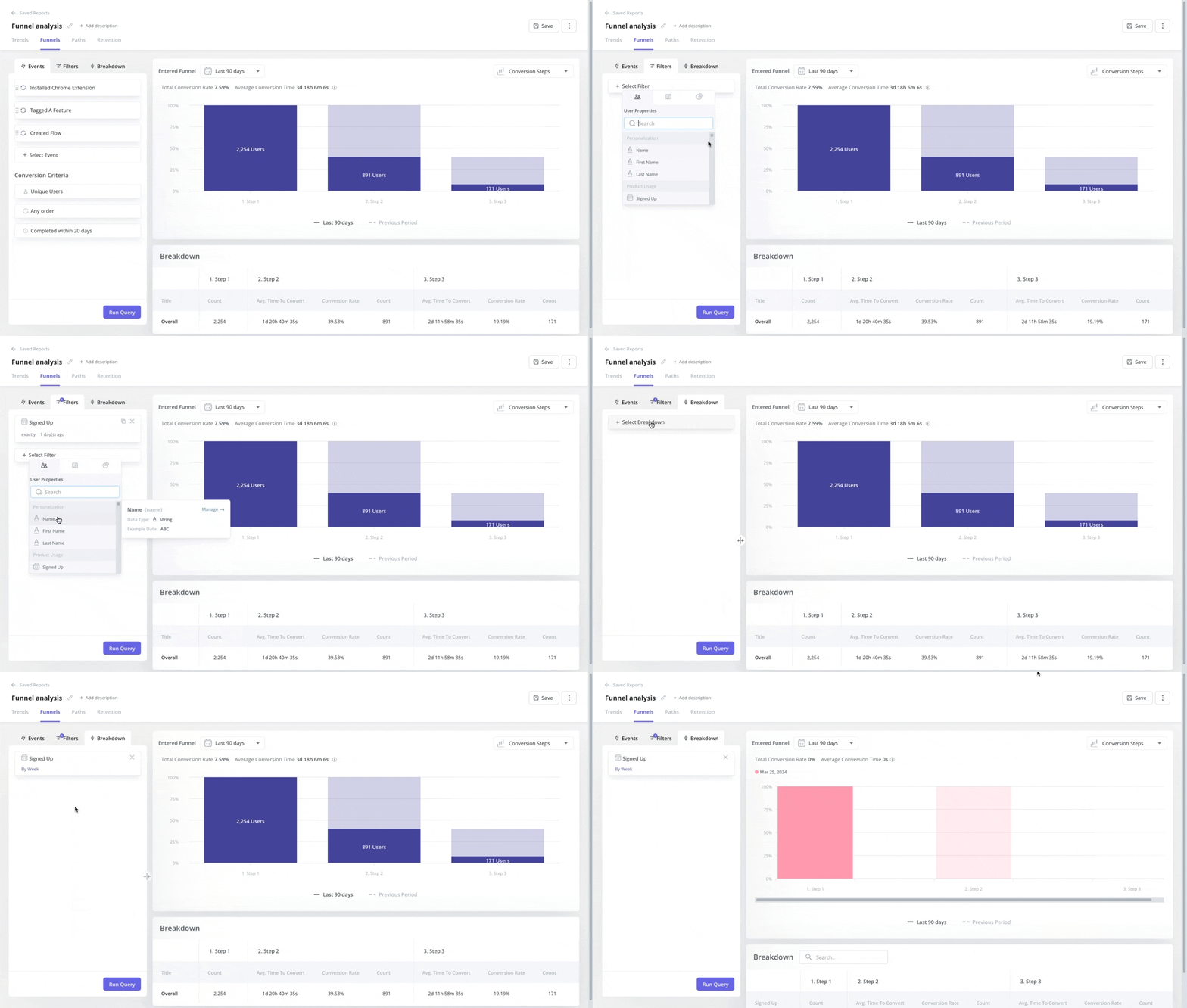
Once you’ve honed in on a specific funnel stage, watch the session replays for the accounts that dropped off on that step.
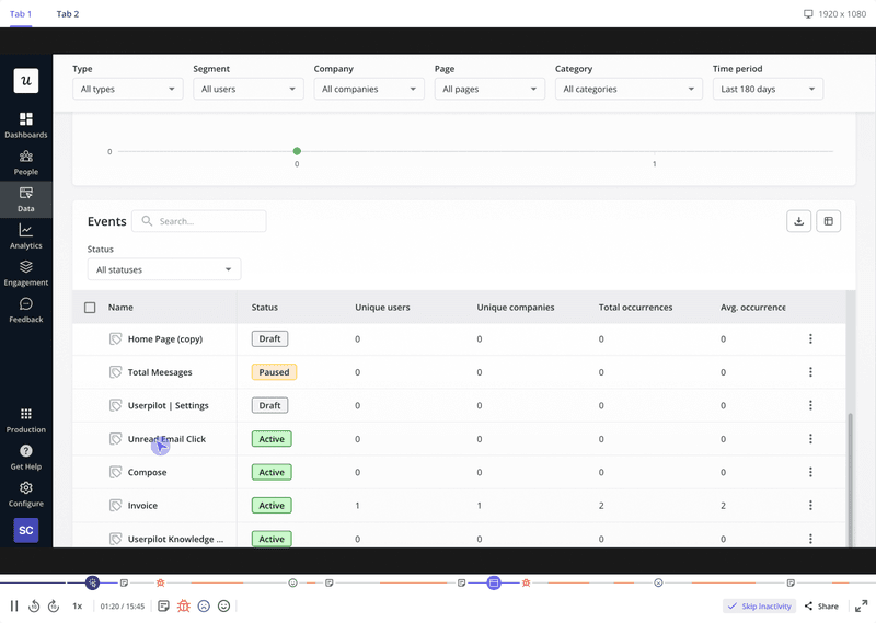
If a session leaves you with more questions than answers, interview that user directly to learn more. It’s better to ask users directly than to make guesses and assumptions based on a session replay alone. It’s far too easy to construct a whole theory around a drop-off only to find out it was just a slow-loading integration rather than a design problem. If AI agent traffic is mixed into your funnel data, your baseline could be skewed further and lead you to the wrong conclusions.
An agent hitting an API rate limit might look identical to a confused human abandoning a form unless you check the error logs to verify. Tag and separate agent sessions before you trust any drop-off metrics. Segregating this data is crucial so that you don’t end up with blended insights that don’t accurately portray either population because of how differently both user groups behave when using a product.
Step 2: Prioritize UX issues with frameworks, not hunches
Fixing every UX problem at once burns your team out while testing user patience. Prioritization frameworks like a feature prioritization matrix exist precisely so that decisions aren’t made based on whoever’s complaining loudest.
Kano model
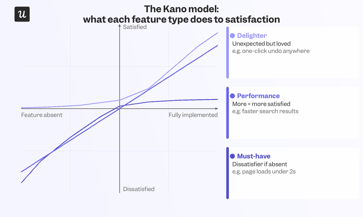
The Kano model sorts fixes into three buckets: must-haves that cause complaints if missing, performance attributes with room for improvement, and delighters nobody asked for but love once they see them. It’s the right heuristic when trying to differentiate “this prevents churn” from “this differentiates us.”
Rice scoring
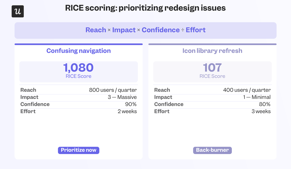
A RICE score calculator scores an issue by Reach × Impact × Confidence / Effort. A fix that touches every user but takes an entire sprint to ship should outscore a flashy fix that only helps 5% of your base.
MoSCoW fixes
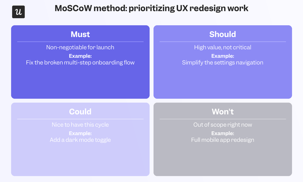
MoSCoW sorts fixes into Must-have, Should-have, Could-have, and Won’t-have which helps multiple teams agree on a scope before the redesign kicks off.
MoAR impact
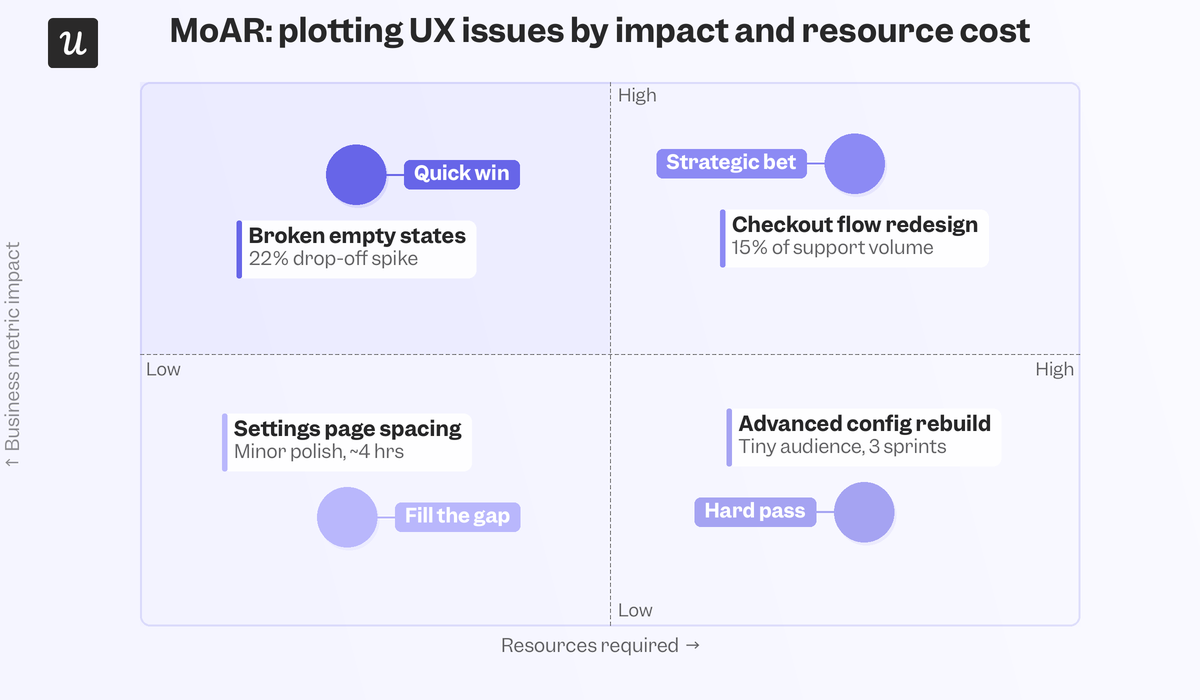
MoAR (Metrics over Available Resources) weighs business impact against the resources a fix would require, making it most useful when you’re building a benefits case for leadership.
Step 3: Define clear goals and success metrics
Once you know which issues you’re tackling first, set a specific and measurable goal for the redesign. “Improve the experience” isn’t a goal a team can hit, but “increase user activation rate by 15% within a quarter of launch” is. Pick one or two key UX KPIs tied directly to the business outcome you actually care about most. A redesign that marginally moves a dozen metrics is harder to defend than one that doubles a couple of KPIs.
Step 4: Test big design decisions with real users before you build
Major design decisions deserve validation before they’re locked into a build ticket. Preference testing shows you which of two directions your users actually prefer before either one is shipped as a feature. Usability testing puts a real user in front of the new design and watches what breaks. A/B testing tells you whether a specific piece of in-app messaging outperforms the control version it’s meant to replace before engineering hours get spent on it.
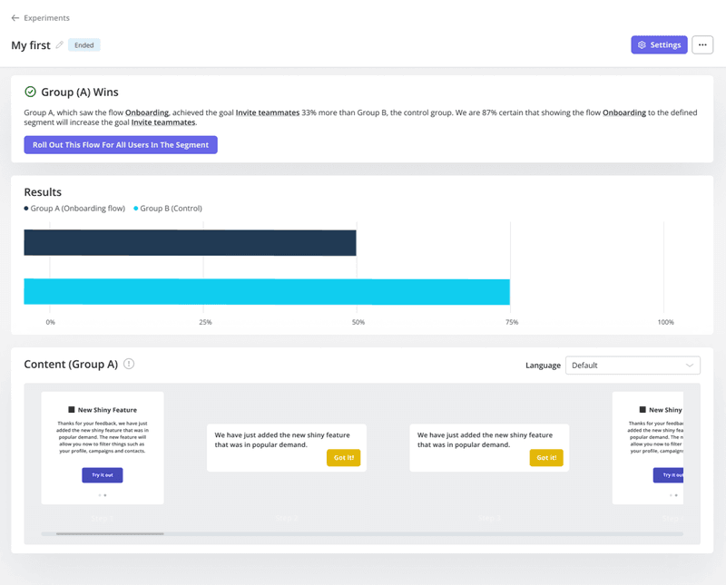
Combine preferences, usability, and A/B testing to catch bad decisions in a five-person focus group of real users instead of finding out with a flood of support tickets weeks after launch.
Step 5: Build and refine through iterative prototyping
Start incorporating what you learned from testing into actual prototypes or mockups. Design these prototypes with your existing brand guidelines in mind so the redesign still feels like your product rather than a bolted-on experiment. Creating wireframes at this stage is cheaper to throw away than a shipped feature. Share each round with a small test group, collect user feedback, and iterate again based on their response. Each pass gets you closer to a design that reflects what real users need, instead of whatever looks good in the design team’s opinion.
Step 6: Roll out the redesign in phases, and build momentum before launch
Launching an entire redesign to every user at once means you don’t find the problems until everyone already has them. Beta tests, feature toggles, and dark launches let you catch issues while the blast radius is small enough to contain. The CYBERBIZ case study is the clearest example of this approach: when the Taiwanese e-commerce platform overhauled its admin dashboard, the team recruited beta testers through an in-app survey.
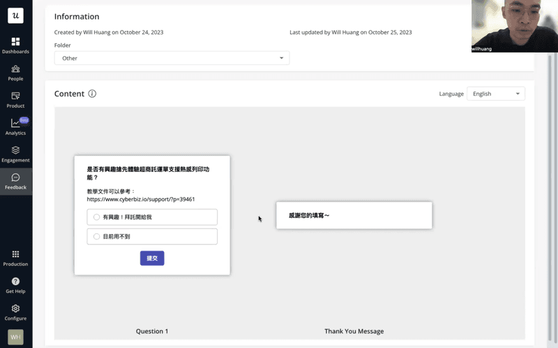
The survey got them more testers in less time, which allowed them to refine the dashboard before the wider rollout. In-app survey recruitment beats an email blast because it catches people while they’re already in the product instead of asking them to recall friction points days after the fact. Once the phased rollout is underway, gather a small group of engaged customers as early access testers and send out teasers so users can see what’s coming before it arrives.
CYBERBIZ paired this with clear in-app feature announcements and interactive walkthroughs that explained the new dashboard as soon as users first encountered it.

Step 7: Launch, monitor performance, and support users through the transition
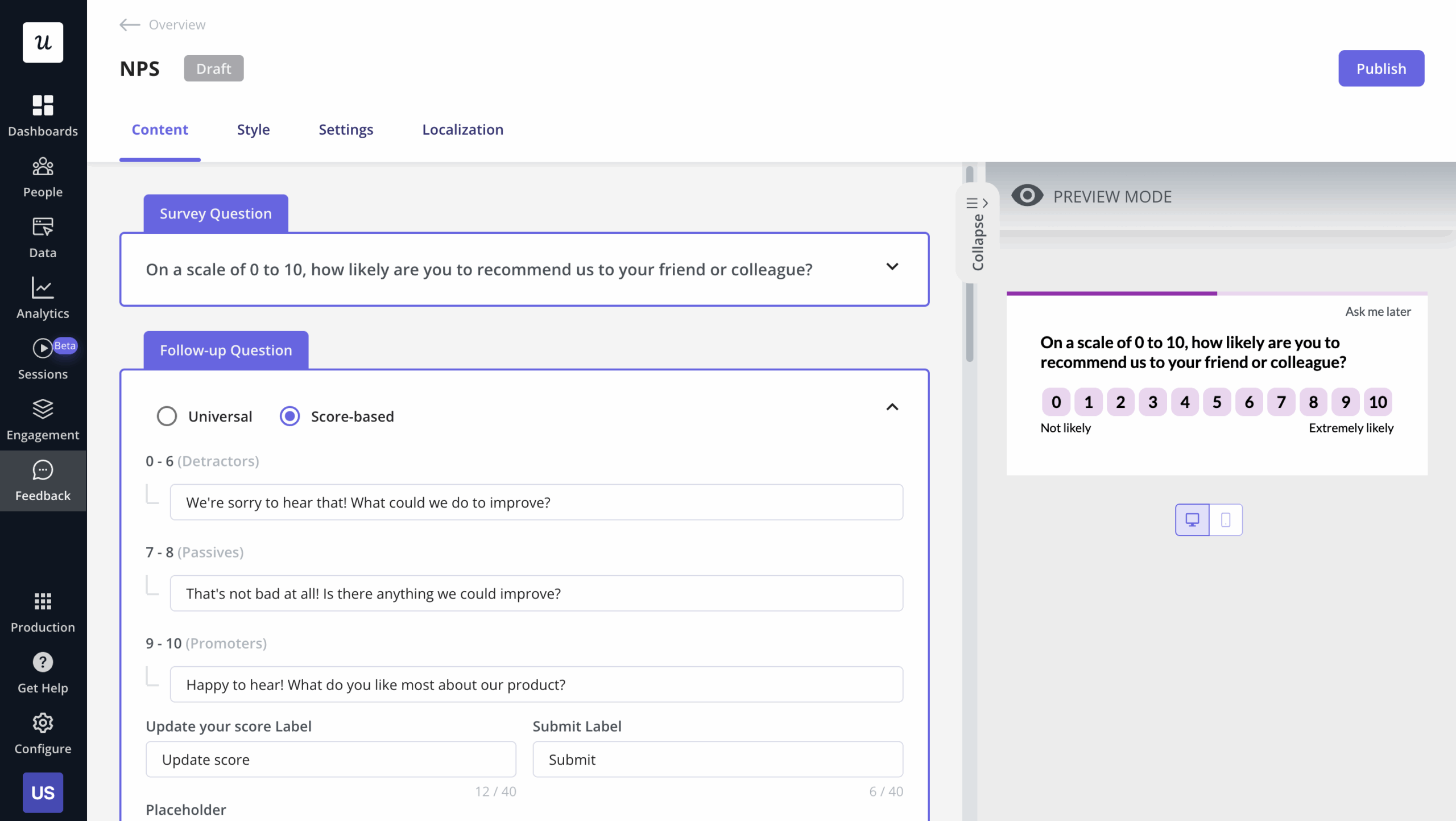
After you finalize the redesigned interface and roll it out, track whether it’s achieving the goals you set for it. Deploy in-app surveys to ask people how they feel about the redesign while the experience is still fresh, giving you an emotional read on how the changes are being received. Session recordings, trend analysis, and heatmaps give you a more objective look at the behavioral side (revealing what people actually did, regardless of what they said).
CYBERBIZ tracked both page views and average session duration on the new dashboard to gauge whether the redesign landed as intended. Any negative feedback was added to the backlog, with direct follow-ups to those customers.
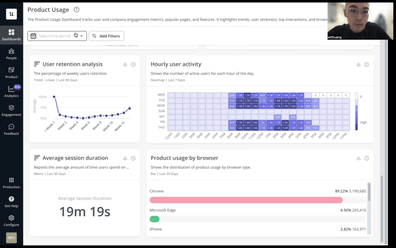
Wei-Di Huang, CYBERBIZ’s Senior Product Manager, had this to say about using product data to analyze feedback:
In Userpilot, we can connect user data and the feedback together to see the feedback from a specific user.
The result for CYBERBIZ was reduced support ticket volume and higher adoption, because most users needed minimal hand-holding to get through the change.
Designing for non-human users: Agentic UX best practices
Existing UX redesign processes were built with human users in mind and thus fail to address the growing share of AI agents using SaaS products.
Sarah Gibbons of Nielsen Norman Group captured the root of the issue in a single sentence:
“A core assumption needs updating: ‘user’ is no longer synonymous with ‘human.'”
Agents navigate websites, parse information, and execute tasks. This functionally classifies them as users even if they don’t read in-app onboarding tooltips and can’t respond to surveys. When they hit a UX problem like a confirmation step they can’t parse or an error state that requires a support ticket to fix, they fail silently and abandon the task altogether. This undermines the usefulness of agentic workflows and could lead their human operators to start scaling back product usage as a whole.
Separate agent traffic from human traffic before starting any UX audit
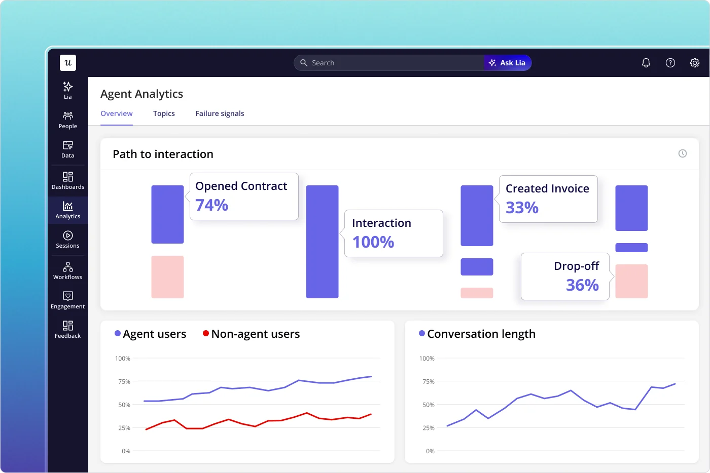
If agent interactions are sitting inside your funnel data, the insights your audit yields could lead you down the wrong path. An agent’s drop-off might reflect an API timeout or authentication failure rather than confusing interfaces that human funnel analysis is built to catch. Before running any analysis in preparation for a UX redesign, filter agent traffic into its own cohort. Userpilot’s Agent Analytics was built for this exact purpose so you can see product usage analytics for AI agents on a dedicated dashboard.
Use task-completion and API-level metrics to audit agent usability
The standard toolkit of heatmaps, session recordings, and satisfaction surveys don’t work on AI agents. Agents don’t hover, scroll, or click in ways that generate meaningful heatmap data and can’t fill out surveys to tell you where they got stuck. The signals that actually matter here are task completion rate, API error frequency, latency on agent-initiated flows, retry rate, and containment rate (which tracks how often an agent workflow needs a human to step in).
Victor Yocco, UX Researcher at ServiceNow, highlights the underlying design challenge:
“Autonomy is an output of a technical system. Trustworthiness is an output of a design process.”
Reconciling the two only becomes harder as 40% of enterprise apps are predicted to feature task-specific AI agents by the end of 2026. If your redesign audit still measures agent sessions with the same yardstick used for human users, you’ll be making blind decisions at best and operating on misguided assumptions at worst. As the new population of agentic users continues to grow, monitoring separate metrics for them is the only way to account for them in UX redesigns and other critical processes.
Regression-test redesigned flows against agent behavior before launch
A UI change that improves human UX can silently break an agentic path through your product, invalidate an agent’s workflow without human users ever noticing. If your product exposes an API, verify before launch that the redesigned UI doesn’t impact the programmatic access points AI agents already depend on, because they won’t be able to tell you if something breaks. UX design principles like clear labeling, predictable interaction patterns, and structural markup that reflects visual grouping can all help agentic users parse your product when trying to use it.
Treat agent UX as a concurrent design workstream, not an afterthought
A redesign that restructures the human interface without considering the agent access layer can create residual work for customers who now have to reconfigure their automations around changes they didn’t see coming and weren’t consulted on.
Teams with a meaningful agentic presence in their product should ask these three questions:
- What programmatic access points does each redesigned flow expose?
- What does an agent’s experience of this interface actually look like?
- What documentation does an agentic operator need to adapt their configuration to the new design?
This will help you identify and address any agent UX concerns during the design process, instead of ending up with a backlog of bug fixes after rolling out changes.
Turn your UX redesign into a process built for the users you actually have
A UX redesign done right can give humans faster value, fewer friction points, and more intuitive interfaces. Identifying friction, prioritizing fixes, testing them, and rolling out in phases are still the right steps but a redesign process built entirely on human feedback is already working from an incomplete dataset. Separating agentic traffic, reading agent-level signals, and protecting the programmatic paths agents depend on ensures your redesigns benefit both audiences so you aren’t helping one of them by harming the other.
Userpilot covers both populations with in-app surveys, session recordings, A/B testing, and interactive onboarding for human users and Agent Analytics for agentic data.
Book a demo to see what a redesign audit can look like with the right data in hand!
FAQ
What is UX redesign?
UX redesign involves reevaluating and revamping a product’s visual elements, navigation, or overall user journey to address pain points or add new functionality.
This process begins by gathering feedback and user data. Then, applying UX design principles to create a smooth user experience. The goal is to boost user satisfaction, stay competitive in your market, and ensure your product’s look and feel align with evolving business objectives.
When should I redesign the user experience?
Redesign your product’s user experience when:
- Your interface looks outdated: Modernizing an outdated design to make it more user-friendly can drastically improve how users perceive your brand.
- You receive frequent negative feedback: Ongoing negative user feedback, like trouble navigating your landing pages, clearly indicates your design needs improvement.
- Your business goals change: Adapting to a new marketing growth strategy and market trends may require a fresh look, features, or workflows.
- Technology becomes outdated: Existing designs can limit technical performance or security, creating frustrations you can solve with an updated stack.
- You expand into new products: Scaling up often requires a more versatile and consistent user experience, prompting a redesign to support those added offerings.
About the author