Customer Experience Analysis 101: Methods, Metrics, and Real Use Cases

As Director of Customer Success at Userpilot, I’ve worked with dozens of SaaS teams that conduct customer experience analysis but never act on it, or worse, aren’t sure what to do with the data in the first place.
This is a common experience. According to the Global State of CX 2024, nearly 3 in 10 CX leaders say creating actionable insights from customer data is one of their biggest challenges, and 1 in 5 say disconnected data is still slowing them down. Without a clear path from insight to impact, many teams freeze or fall back on assumptions.
In this guide, I’ll walk you through my proven CX analysis process. We’ll cover:
- Where to find your most valuable insights.
- How to prioritize changes that drive retention and customer loyalty.
- Ways to track the impact of your improvements over time.
What is customer experience (CX) analysis?
Customer experience analysis is the process of gathering and examining customer data to understand how people interact with your brand across multiple touchpoints.
It’s often mistaken for general customer feedback collection or brand tracking, but those are just pieces of the puzzle. CX analysis is more detailed. It combines quantitative metrics with qualitative insights to form a complete picture that tells you what is happening and why.
Why is customer experience analytics important?
CX analytics turns raw interactions into actionable insights, and for SaaS businesses, the payoff is huge. Here’s why:
- Eliminate the guesswork: Verint’s 2024 state of digital experience report shows 70% customers will switch to a competitor after poor experiences, and 65% will spread negative word of mouth. Many of these customers won’t tell you they had a bad experience, and trying to make guesses rarely works. But regular CX analytics helps you uncover unspoken pain points and address them early on.
- Break silos: A strong CX analytics process gives all teams access to a shared source of truth. Instead of wasting hours chasing customer insights or interpreting conflicting data, your teams will easily align around a single view and make faster customer-centric improvements.
- Account expansion and referrals: Happy customers are your best marketers and a powerful engine for recurring revenue. Qualtrics’ latest CX report says satisfied customers are 2.2x more likely to become repeat customers and 86% of them will gladly recommend your product to others. When your CX analytics shows you what’s working, you can double down and turn great experiences into growth.
What you need before you start analyzing customer experience
A little groundwork goes a long way. Here’s what I always put in place before diving into the data:
Clear user segmentation and personas
I start by defining exactly which users matter most to the goal at hand.
For example, if your goal is to improve activation and initial customer engagement, build a segment of newly signed-up accounts within their first 14 days. If you want to reduce churn, focus on accounts showing signs of disengagement, such as a drop in logins or feature usage.
Next, create personas to get more granular. For example, within that “newly signed-up” segment, you might have a persona for solo founders at small startups and another for product managers at mid-sized SaaS companies. Both are new, but their needs, priorities, and adoption paths can be very different.
Once you do this, you’ll notice that patterns start to emerge. It becomes easier to see where each group succeeds, where they get stuck, and what drives their decisions.
Is your Customer Experience Analysis driving growth?
Collecting feedback is just step one. To truly improve CX, you need to analyze and act. Take this 4-step assessment to see if your customer experience analysis strategy is effective.
A map of key touchpoints
The second step is to identify moments in the entire customer journey that shape CX the most. Every company’s journey and interaction channels may look slightly different, but most share common customer touchpoints like:
- Signup
- Onboarding
- Activation
- Upgrades
- Cancellations
Map out the stages within each touchpoint and the experiences that bridge them. For example, between signup and first value, your customers may complete an onboarding checklist, explore a help center, or interact with a welcome survey. For upgrades, they might first hit usage limits, then compare pricing tiers, before finally converting.
A feedback and behavior data collection layer
This is huge for us at Userpilot. I track how users move through our product, which features they use, and where they get stuck.
Our product usage analytics give me a clear view of user activity, and event tracking lets me see both the number of unique users engaging with a feature and the total usage count. This combination makes it easier to spot friction or confusion and fix it fast with in-app guidance or product tweaks.
But numbers alone don’t tell the full story. We layer in multiple feedback channels to capture context and emotion:
- In-app surveys: We trigger CSAT or CES surveys right after a user completes a task or interacts with a new feature.
- Feedback loops: We ask targeted, open-ended questions to uncover the “why” behind user behavior.
- Support interactions: Our customer service knowledge base and direct conversations often surface pain points and opportunities we can’t see in usage data alone.
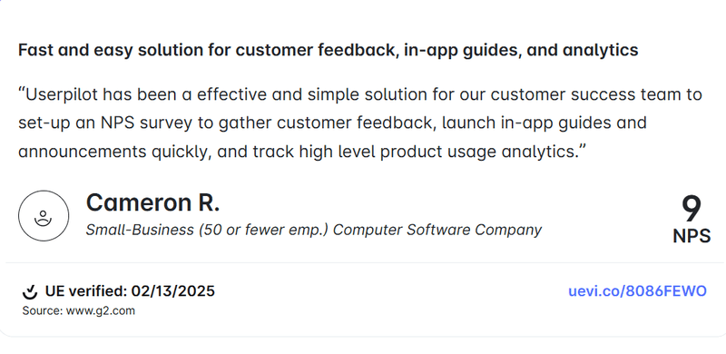
Our customers appreciate this same capability. In fact, 55% of them switched to Userpilot because they struggled to gather actionable user feedback.
Here’s what Cameron R. had to say after using our platform for a while:
![]()
Turn Your Customer Experience Analysis into Actionable Growth with Userpilot

5 Methods I use for customer experience analysis
After completing the groundwork above, you’re ready to collect customer data, understand their behaviors, and optimize every touchpoint.
Let me walk you through five methods I use most often:
1. Customer surveys
I love customer surveys because they help you hear directly from the horse’s mouth.
As mentioned earlier, the best time to trigger surveys is immediately after a user performs the action you’re surveying them about. The experience is still fresh in their minds, so you’re more likely to get a response that reflects their true feelings, rather than a vague memory days later.
There are many types of customer surveys, but I prefer sticking to these three:
- Net Promoter Score (NPS): Measures how loyal customers are and how likely they are to recommend your product.
- Customer Satisfaction Score (CSAT): Captures how satisfied customers are with a specific interaction or your product overall.
- Customer Effort Score (CES): Measures how easy it is for customers to complete a task or get help.
💡Userpilot action tip
Use our library of free templates and no-code survey builder to deploy native surveys in minutes.
Userpilot’s advanced customer segmentation lets you target users based on specific criteria like lifecycle stage, role, subscription plan, and actions taken in-app. And because everything happens in a single, unified workspace, anyone on your team can create, launch, and manage surveys without relying on developers.

Userpilot also provides detailed breakdowns of individual survey questions so you can see where users drop off, skip questions, or take longer to respond. This rich customer data makes it easier to refine your surveys and get the most value from every response.

2. Onboarding checklists
Checklists help me achieve three objectives:
- Provide a clear, step-by-step path so new users know exactly what to do next.
- Keep users engaged by making progress visible and rewarding.
- Spot where users drop off and fix friction before it costs conversions.
For example, I could create a checklist to walk a new customer through setting up their profile, completing a core action like importing their first dataset, and exploring a key feature. Then, I’ll use our analytics feature to see the completion rates.
If more users drop off while exploring that new feature, it suggests the feature guide isn’t clear, or they’re not finding enough value in it. At that point, I’ll dig further to isolate the real issue and design a proactive fix before it impacts activation rates.
💡Userpilot action tip
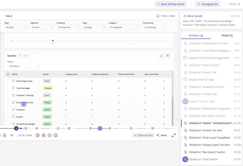
Use our platform to implement no-code gamified checklists that guide users through key in-app processes. Once your checklist is live, check the analytics regularly to spot any customer experience issues.
As in the image below, you can drill down the analytics to specific segments, companies, or time periods for even more nuanced details.
For example, you could filter by new SMB customers over the last 7 days to see if they’re completing your onboarding flow at the same rate as enterprise accounts. If completion rates are significantly lower, you’ll know exactly which group to investigate and where to make targeted improvements.

3. Behavior-based analysis (time to value, flow completion, drop-offs)
While surveys tell you what customers think, behavior-based analysis shows you what they actually do. I look closely at three core behavioral signals:
- Time to value: How long it takes a user to reach their first meaningful outcome in your product. The faster they find value, the less likely they are to churn.
- Flow completion: The percentage of users who finish a guided flow, tutorial, or key process.
- Drop-offs: The points where users abandon a task or leave the product altogether.
💡 Userpilot action tip
Use our advanced conditional logic to group users by the actions they’ve taken, skipped, or abandoned.
For example, segment users who started onboarding, completed a checklist, and viewed a demo. Then, based on that, trigger personalized follow-ups, targeted in-app messages, or test changes to boost completion rates for that specific group.

4. Session replays
Sometimes the fastest way to understand a customer’s experience is to watch it happen.
I use session replays to validate anecdotal feedback and uncover usability issues that might not show up in analytics alone. For example, a customer might say, “I couldn’t find the export option,” but the replay reveals they hovered over it multiple times without clicking, which is a sign to rework the button’s label or placement.
💡 Userpilot action tip
Use Userpilot to capture and organize replays into playlists for easy sharing with your team.
Worried about sensitive user information? Userpilot automatically masks private data such as passwords, credit card numbers, email addresses, and other personally identifiable information (PII) to ensure full privacy compliance.
5. User interviews or customer calls for qualitative depth
Interviews can be demanding, but they reveal nuances like the emotions behind a decision or the subtle frustrations users might not bother to log as a support ticket. Sometimes a single sentence from a user sparks better ideas than a 20-point drop in NPS.
How do you make the most of user interviews? My best recommendation is to keep your conversations focused but open-ended.
For example, instead of asking, “Do you like our onboarding?” try “Walk me through your first week using the product.” The former invites a bland “yes” or “no,” while the latter draws out detailed stories that surface both wins and pain points you can actually act on.
How I turn CX analytics into action
Collecting customer data is only half the battle.
The real value comes from turning those insights into meaningful experience improvements, and here’s how I do it in three steps:
Prioritize by impact: Frequency x severity
Not every customer complaint deserves the same level of attention. The key is to weigh how often an issue occurs against how much damage it causes when it does. This simple approach helps you spend resources where they’ll have the biggest impact.
I use a frequency × severity matrix to guide these decisions:
| Low Severity | High Severity | |
|---|---|---|
| Low Frequency | Nice-to-have fixes: Small quality-of-life tweaks that can wait. | Monitor closely: Rare, but when it happens, it hurts. Investigate causes and prevent escalation. |
| High Frequency | Quick wins: Happens often but has low impact. Easy fixes can improve overall experience. | Top priority: Common and highly disruptive issues. Fix these first. |
One of our customers, Cleeng, used this exact approach to rescue a core feature. After a UI redesign, they saw a staggering 92% drop in usage of their “Customer History” page. Using Userpilot analytics, they quickly discovered the new location made the feature far less discoverable.
Instead of spreading efforts across multiple small fixes, Cleeng prioritized this high-frequency, high-severity issue. First, they added a targeted in-app tooltip to highlight the relocated feature. Then, they replaced the small text hyperlink that led to the feature with a prominent green button.
These actions delivered a 75% boost in feature usage, a turnaround that wouldn’t have happened if they’d focused on less severe issues.
In the product designer’s words:
“Userpilot set me on the path to becoming a very good product designer. The platform helps me learn how to use data and make product decisions.” – Anna Sobiak, Product Designer at Cleeng.
Tie issues to behavior data, not just opinions
A customer telling you “I’m confused” is valuable, but it’s not enough to act on. You need to know what they were doing and where they got stuck to turn that feedback into something actionable.
That’s why I always connect qualitative feedback to behavioral data. For example, if multiple users say they’re “lost during onboarding,” I’ll revisit the analytics report to pinpoint the problem.
It could be that most of them dropped off right before completing the “connect your account” step, a sign that the instructions or prerequisites aren’t clear enough. Or maybe they all stopped at the “choose your first template” stage, which could mean the options feel overwhelming or irrelevant.
Userpilot lets you combine survey answers with funnel analysis, so you can see both the “what” and the “why” and make better changes. For example, if detractors in your NPS survey are also dropping off after a specific step, you can target that exact group with a tailored in-app guide, a tooltip, or even a redesigned flow and then track whether the change improves customer satisfaction and completion rates.

Pair feedback with customer analytics in Userpilot.
Make changes visible
A recent Khoros survey found that 83% of customers feel a stronger sense of loyalty toward brands that acknowledge and address their complaints.
But customers don’t open your app just to check if you’ve made changes based on their feedback. Many only discover improvements by chance as they continue using your product. And when they don’t notice quickly, that boost in customer satisfaction gets delayed.
Why wait for customers to stumble upon an update when you can make it known?
Use our platform to build tooltips, banners, or announcement modals in minutes. Userpilot also provides a powerful AI writing assistant within your workspace that can refine your microcopy or localize content for global audiences.

Got a mobile app? Our platform supports mobile content. You can create carousels, slideouts, and even push notifications to notify mobile users of new changes.
If you don’t want to repeat the same information across platforms, you can create flows where a user who interacts with your in-app announcement doesn’t receive a mobile notification about the same update.

![]()
Ditch the guesswork and build a winning Customer Experience Analysis with Userpilot
The customer experience analysis metrics you need to track
Tracking the right metrics gives you a clear view of how customers experience your product. Here are five core metrics I rely on to measure performance, uncover friction, and show the impact of improvements:
| Metric | User Journey Stage | What it Measures | Why it Matters |
|---|---|---|---|
| Net Promoter Score (NPS) | Post-onboarding / Ongoing use. | Likelihood to recommend. | Indicates loyalty and overall relationship health. |
| Customer Satisfaction Score (CSAT) | After specific interactions (e.g., support chat, feature use). | Satisfaction with that experience. | Identifies wins or pain points at key touchpoints. |
| Customer Effort Score (CES) | During key workflows. | Ease of completing a task or getting help. | Reveals high-friction steps worth streamlining. |
| Time to Value (TTV) | Onboarding to first “Aha!” moment. | Speed at which users realize product value. | Strong predictor of activation and retention. |
| User Retention Rate | Ongoing use. | Percentage of users who stay over time. | Measures if positive experiences translate into long-term loyalty. |
Net Promoter Score (NPS)
I use NPS to track promoter behavior, spot customers likely to spread positive word of mouth, and flag those at risk of churn.
For this survey, I ask one straightforward question: “How likely are you to recommend us to a friend or colleague?”
Respondents choose a score from 0 to 10, with 10 meaning they’re extremely likely to recommend and 0 meaning they’re not at all likely.
Based on their answers, I group them into three categories:
- Promoters (9–10): Loyal enthusiasts who are highly satisfied and likely to recommend our product.
- Passives (7–8): Content but not excited enough to actively promote, and vulnerable to switching if a competitor offers something better.
- Detractors (0–6): Dissatisfied customers who should be my main focus when reducing customer churn.
The NPS score is the percentage of Promoters minus the percentage of Detractors. For example, if 60% of respondents are Promoters and 20% are Detractors, your NPS is +40.

Userpilot provides an NPS analytics feature that lets you go beyond a simple score to get a full picture of your customer relationships.
You can filter responses by segment, platform, or time period to see patterns across all the data you’ve collected. The feature also lets you tag responses for easier analysis:

Customer satisfaction score (CSAT)
While NPS works best for understanding overall sentiment, CSAT surveys help you see how users feel about key customer interactions like onboarding, feature adoption, and other moments critical to customer engagement.
To measure customer satisfaction, trigger a quick survey right after the interaction you want to assess.
A common question is: “How satisfied were you with [specific interaction]?”
Users typically respond on a 1–5 or 1–7 scale, with the top scores representing satisfied customers.
Calculate your customer satisfaction score by dividing the number of satisfied customers by the total number of respondents. Multiply that figure by 100 to get a percentage.
For example, your CSAT is 80% if 80 out of 100 respondents give you a top rating.

Customer effort score (CES)
CES is an underrated survey, but it’s useful for spotting effort-heavy workflows that are frustrating users.
The standard CES question is: “To what extent do you agree with the statement: ‘[Task] was easy to complete’?”
Respondents rate their agreement on a numbered scale, often from 1 (strongly disagree) to 7 (strongly agree).
To calculate your CES score, divide the number of “agree” responses by the total responses and multiply by 100. For example, if 60 out of 100 respondents agreed that a specific customer interaction was easy, your CES would be (60 ÷ 100) × 100 = 60%.

Time to value
Gainsight’s research shows that lack of perceived value is a major driver of customer churn, ranking just behind budget constraints.
Often, the problem isn’t that your product lacks value; it’s that customers aren’t experiencing it quickly enough. That’s why I regularly track time to value (TTV) and look for ways to shorten it. If you’re curious, our 2024 benchmark report found that the average TTV for SaaS companies is 1 day 12 hrs.
To measure your TTV, use a customer experience analytics solution like Userpilot to track the average time it takes new users to reach activation. If activation takes more than a day or two, investigate your processes and see what you can shorten or improve.

Customer retention rate
The retention rate measures how many customers stay with you over a specific period.
It’s one of the clearest indicators of whether your customer experience strategies are truly paying off. You might see improvements in NPS, CSAT, or CES, but if retention isn’t moving upward, it’s a sign that positive interactions aren’t yet translating into long-term customer loyalty.
To calculate your retention rate, subtract the number of customers acquired during a specific period from the number of paying customers at the end of the period. Then, divide that result by the total number of customers you had at the start of the period, and multiply by 100.
For example, if you began the month with 500 customers, ended with 520, and acquired 50 new ones during that time, your retention rate would be: (520-50/500) X 100 = 94%

These five metrics are a solid starting point for tracking your customer experience analysis efforts. If you have the bandwidth, you can also expand your tracking to include metrics like Customer Lifetime Value (CLV), First Response Time (FRT), or product stickiness.
Your CX analysis is only as good as what you do with it
Collecting customer data, running surveys, and tracking metrics are all great, but experience improvements only happen when you act on the data.
Noticed that customers keep abandoning a key workflow halfway through? Add an in-app tooltip or checklist to guide them to completion. Seeing a drop in feature usage after a redesign? Use session replays to pinpoint friction points and test a clearer entry point.
Userpilot makes all these easy. From uncovering hidden blockers to prioritizing fixes and measuring the results, our platform streamlines your customer experience analysis so you can focus on delivering value that your users will love. Book a free demo to discuss your needs with our team.
![]()
Turn Your Customer Experience Analysis into Actionable Growth with Userpilot
FAQ
What are the 4 components of customer experience?
Most CX models agree on four core components that make up the complete customer experience:
- The customer journey: The sequence of steps a customer takes when interacting with your brand throughout the entire customer lifecycle.
- Touchpoints: Individual customer interactions that occur at any point of contact with your brand throughout the customer journey. Common examples include a website visit, a support call, or an email.
- Customer perception: How the customer feels at each touchpoint and across the journey. Do they feel heard, valued, frustrated, or delighted? This is the emotional “how” of the experience.
- Business outcomes: The results these experiences create for your company. Examples include customer loyalty, higher CSAT scores, reduced customer churn, and more repeat customers.
What is a customer experience analyst?
A CX analyst is an expert who gathers customer feedback and uses customer analytics to identify patterns, measure customer satisfaction, and recommend product improvements.
What are the 5 Cs of customer experience?
Based on popular frameworks, here are 5Cs to keep in mind:
- Clarity: Make every step, expectation, and outcome easy for customers to understand.
- Consistency: Use a customer experience analytics solution like Userpilot to deliver seamless, predictable experiences across all customer interactions and channels.
- Convenience: Minimize the time and effort customers need to reach their goals.
- Customer Context: Use customer history and preferences to create personalized, relevant experiences across the entire customer journey.
- Connection: Build emotional bonds through empathy, personalization, and community.
About the author