10 SaaS Interactive Walkthrough Examples to Inspire Your Own
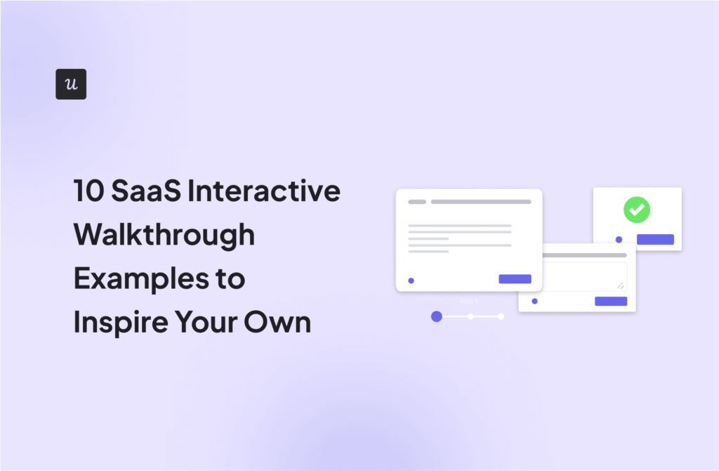
Looking for ways to improve your SaaS onboarding experience? We’ve selected 10 interactive walkthrough examples to get your creative juices rolling!
For each example, we covered:
- The strategy used.
- What made the walkthrough great.
- Key takeaways for you.
We also discussed best practices for delivering the perfect product experience and getting users excited about using your tool.
Overview of interactive walkthrough examples
- Interactive walkthroughs are on-screen tutorials that help new and existing users learn how to use an entire product or new features. You can utilize walkthroughs for in-app guidance on both web apps and mobile apps.
- While interactive walkthroughs guide users step-by-step through using a product, product tours showcase the tool’s features and benefits without direct interaction.
Here are 10 product walkthrough examples to inspire your own:
- Rocketbots uses a personalized welcome page and checklists to guide users.
- Groupize uses an onboarding assistant that provides detailed guides as users progress through the onboarding steps.
- Demio combines a product tour and product walkthrough for a better user experience.
- Kommunicate uses an onboarding checklist and interactive guides.
- Salesflare combines a welcome screen with interactive tooltips.
- Notion uses branched onboarding and a detailed checklist.
- Figma uses tooltips and demo content to educate users.
- ProdPad gamifies its onboarding to help users complete the steps quickly.
- Slack uses friendly in-app communication to drive adoption.
- Canva uses tooltips and engaging microcopy to improve onboarding completion.
Keep these best practices in mind when creating product walkthroughs:
- Build product walkthroughs using different UI elements.
- Personalize your product walkthroughs for different user segments.
- Use AI to improve the microcopy in your product walkthroughs.
- Collect user feedback to improve your product walkthroughs and smoothen the user journey.
- Run A/B and multivariate tests to find the best product walkthrough.
- Measure the effectiveness of your product walkthrough with in-app analytics. Then, act on the insights to maximize engagement and drive user retention.
Userpilot helps SaaS teams create interactive product walkthroughs code-free. Try it now.
What is an interactive walkthrough?
An interactive walkthrough is an on-screen tutorial that uses elements like tooltips, hotspots, or modal windows to help users learn how to use a product, a new feature, or navigate through a platform.
Walkthroughs are often utilized in user onboarding, training programs, and when updates or changes are made to existing products. You can create walkthroughs for both mobile and web apps if you use the right onboarding tools.
Interactive product walkthroughs vs product tours
The primary difference between the two lies in the level of user engagement and the depth of guidance provided.
Interactive walkthroughs are more immersive, requiring users to interact with the product, which can lead to a deeper understanding and better retention of information. They’re best used for user onboarding and driving feature adoption.
In contrast, product tours are more about showing rather than doing, offering a quicker, more general introduction to the product. Product tours are most suited for sales activities—showing prospects the most important parts of a tool to create awareness and generate interest.
What makes a good interactive walkthrough?
Effective walkthroughs not only help users understand and utilize the product but also enhance their overall experience. For the best results, ensure your product walkthroughs are clear, concise, engaging, and skippable.
- Clear: Explain how your features work in a simple language.
- Concise: Get to the point quickly. Each instruction should focus on the most important action without extra details that might confuse or bore the user.
- Engaging: Design your product walkthrough in a way that encourages users to interact with the tool rather than watch. For example, if you’re a design tool, the onboarding flow should encourage users to create basic designs and experience the features for themselves.
- Skippable: Some users might already know the basics, so give them the option to skip ahead. Without this option, you risk creating a bad user experience, which counters your onboarding goals.
10 Great interactive walkthrough examples to inspire your own
Ready for real-life examples? This section shows product walkthrough examples from top SaaS companies and what makes the flows effective.
1. Rocketbots
Rocketbots, now rebranded as Respond.io, is a conversational customer engagement platform designed to help businesses streamline their communication across multiple channels.
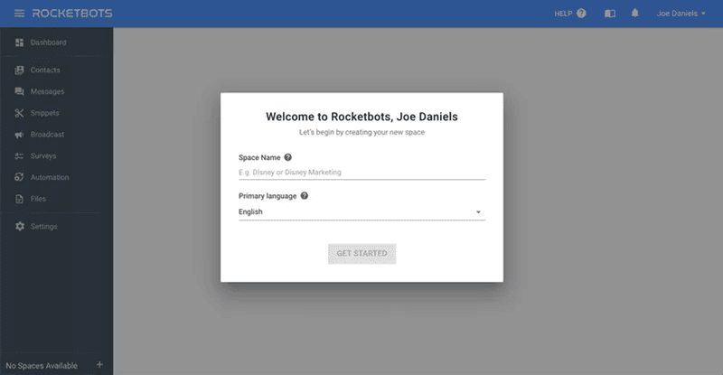
The onboarding flow begins with a personalized welcome page that addresses the user by name and prompts them to create a new space.
This sort of personalization makes users feel like someone is holding their hand through the process, further motivating them to continue the onboarding flow.
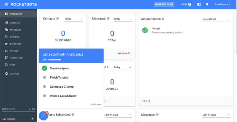
After creating a space, the next screen shows users an onboarding checklist containing four tasks to be completed.
Checklists always work for onboarding because they allow users to track progress and know how many steps are left before the process is complete.
2. Groupize
Groupize is a comprehensive platform for group travel management. It simplifies the entire process, from planning and booking to managing itineraries and facilitating communication between travelers.
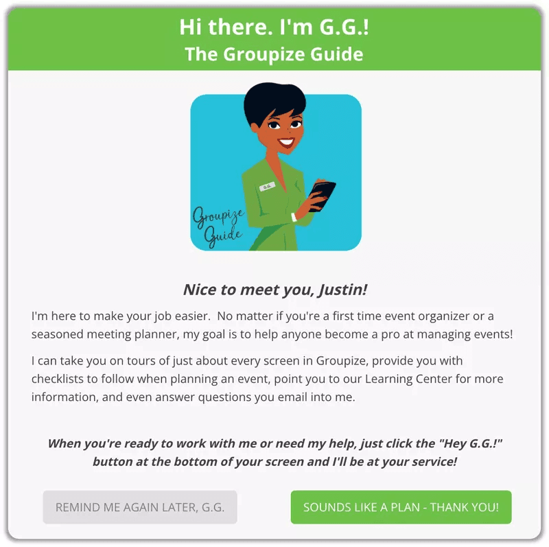
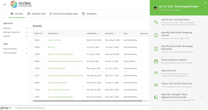
Created with Userpilot, Groupize’s onboarding begins with a personalized welcome page that introduces the user to a personal onboarding assistant and gives them the option to continue the flow or take the guide later.
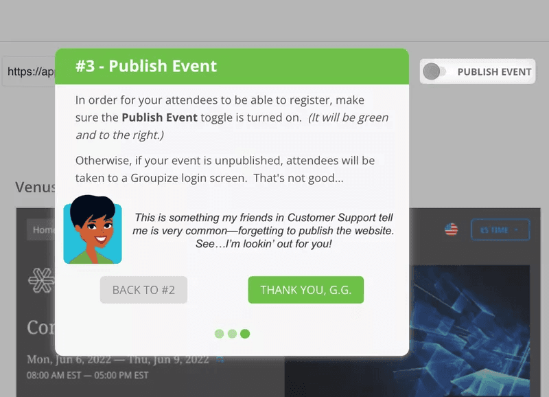
The product walkthrough includes detailed, step-by-step instructions for specific tasks. The instructions are concise and provide actionable steps, making it easy for users to follow along.
As part of the onboarding process, Groupize also created an in-app resource center with Userpilot. This empowers users to access contextual help while using the app:
3. Demio
Demio is a webinar hosting service that helps businesses create engaging and interactive webinars for marketing, training, or sales purposes.
The onboarding flow begins with a product tour from a specialist that shows what a webinar will look like when you host it:
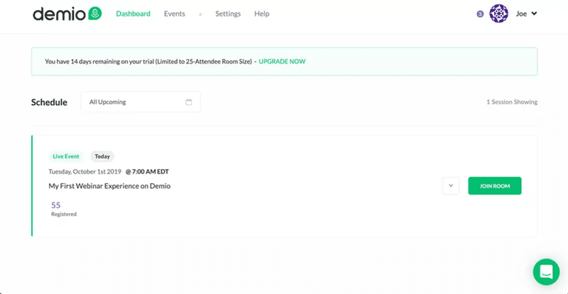
After the tour, users receive an onboarding checklist that guides them to complete key tasks and independently host a webinar. This interactive experience helps the user quickly get acquainted with the product.
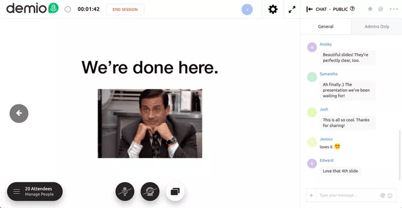
Demio’s example is a classic case of combining a product tour with an interactive product walkthrough to create a satisfying customer experience. You can try this, especially if the initial phases of your sales process require a product specialist to guide trial users through your product.
4. Kommunicate
Kommunicate is a customer support automation platform that integrates live chat, chatbots, and other communication tools into websites and apps.
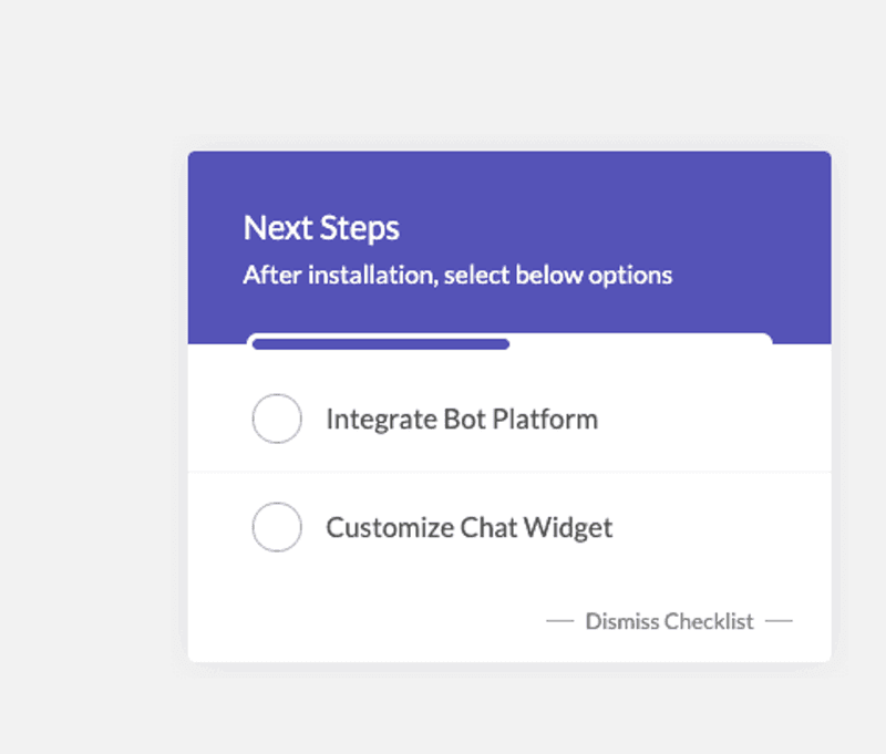
This is another example of an onboarding flow created with Userpilot. The process begins with a checklist that guides new users through the essential setup steps.
This checklist is clear and concise, providing a straightforward path for users to get started with the platform.
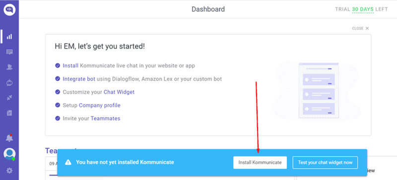
After the initial installation, the platform presents the next steps—integrating the bot and customizing the chat widget.
This segmentation of tasks helps users focus on one aspect at a time, making the process less overwhelming and more manageable.
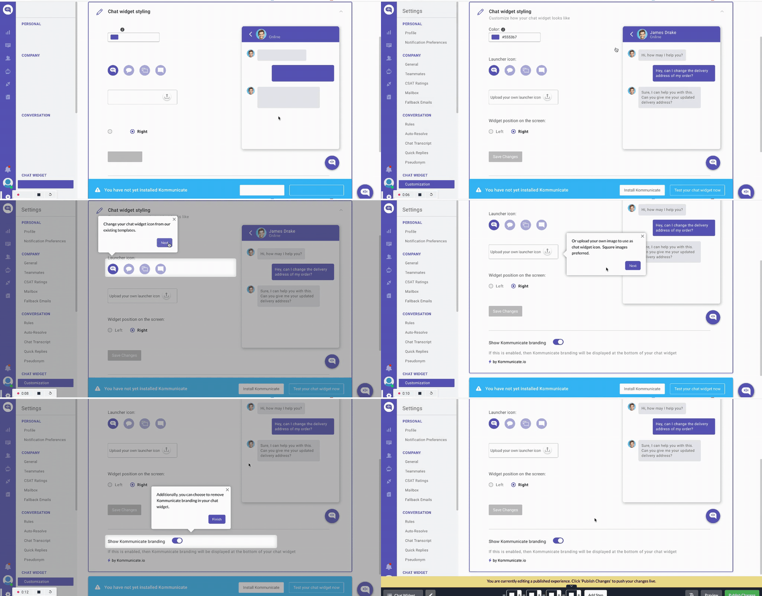
Next is an interactive walkthrough that uses tooltips to guide new users through the chat widget customization process, helping them experience value quickly.
By using checklists and product walkthroughs for their onboarding, Kommunicate increased adoption by 4% and boosted feature usage by 3% in just a few weeks.
5. Salesflare
Salesflare is a CRM tool that helps businesses automate data collection, organize customer information, and spot ways to improve customer relationships.
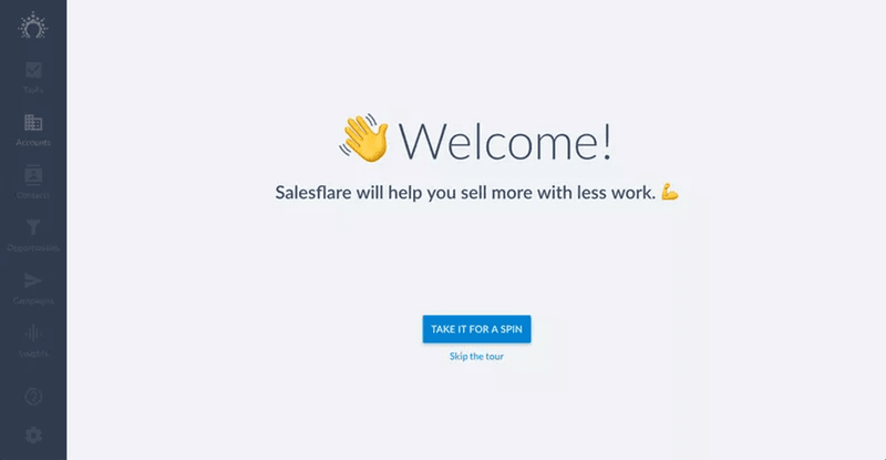
The welcome screen in Salesflare’s onboarding process sets a positive tone with a friendly greeting and a clear message about the platform’s value proposition.
Users are given the option to take a guided tour or skip it, making the experience optional for those who may already be familiar with CRM systems.
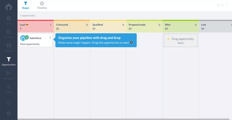
As new users navigate the platform, Salesflare provides interactive guides using tooltips to showcase how the platform works:
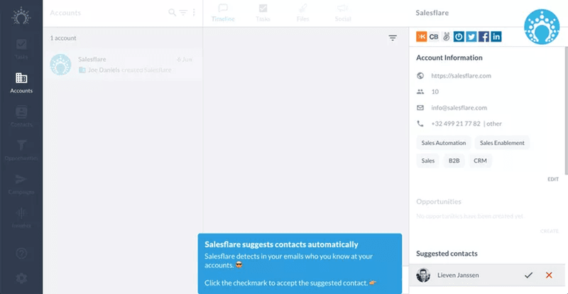
The interactive guide continues with Salesflare walking users through creating and organizing a sales pipeline (one of the platform’s core functionalities).
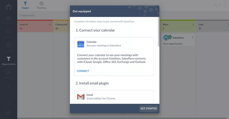
Finally, Salesflare guides users through integrating their calendar and email, which is essential for maximizing the platform’s capabilities.
The step-by-step instructions for connecting these tools are presented in a pop-up window, making it easy for users to follow without navigating away from their current screen.
6. Notion
Notion is a versatile productivity tool that combines note-taking, task management, and collaboration features into one platform.
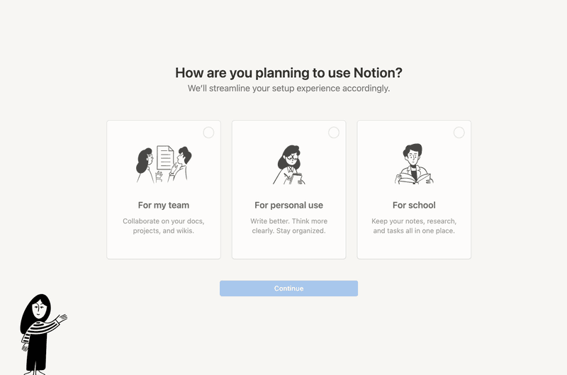
The onboarding begins with a welcome survey to understand user needs and JTBD. This initial step helps tailor the setup experience to meet the user’s specific needs.
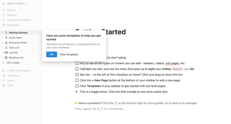
Once inside the platform, Notion provides a “Getting Started” checklist that introduces users to key features and functionalities.
While the checklist guides users through Notion, it also demonstrates how a Notion page works—effectively using one stone to kill two birds.
7. Figma
Figma is a web-based vector graphics editor and prototyping tool primarily used for UI/UX design.
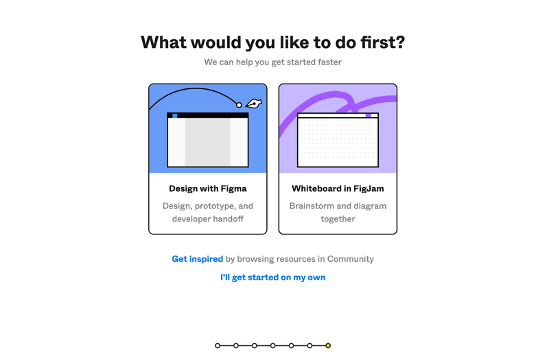
Like Notion, this platform also uses branched onboarding to cater to different use cases.
The flow begins with a welcome survey asking users what they would like to do first, with options to either design with Figma or whiteboard in FigJam:
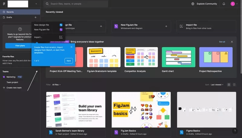
Upon entering the main dashboard, users are greeted with a walkthrough that highlights key features and functionalities.
Also, notice how Figma uses demo content instead of an empty state. This is an onboarding best practice you want to implement to prevent new users from feeling confused and overwhelmed.
8. ProdPad
ProdPad is a project management tool that helps teams prioritize features, gather feedback, and build product roadmaps.
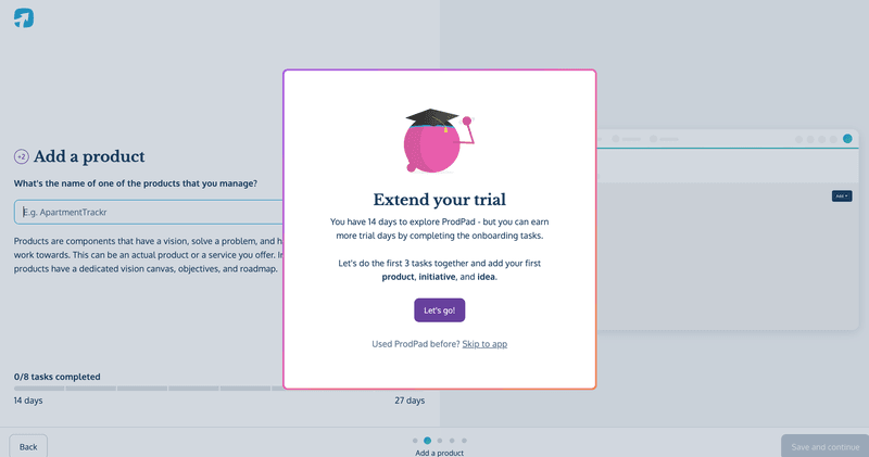
As part of the onboarding process, ProdPad offers users the opportunity to extend their trial period by completing specific onboarding tasks.
These tasks allow ProdPad to collect data about the user’s project and further personalize their journey, but that’s not the main advantage here. Completing the tasks provides a quick Aha! Motivating users to finish the onboarding process and even upgrade their accounts after the trial period.
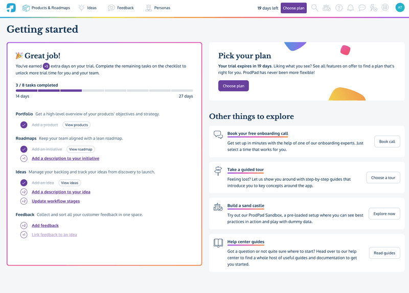
After completing the key tasks and earning their reward, a new page opens that shows users the next steps in the onboarding flow. At this point, there’s some vested interest, so most users wouldn’t have a problem finishing the flow.
9. Slack
Slack is a team communication and collaboration platform that provides a centralized space for messaging, file sharing, and integration with various tools.
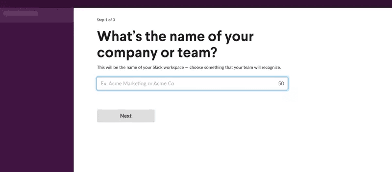
The first step in Slack’s onboarding process involves entering a company or team name. This step is straightforward, guiding users to create a workspace their team will recognize.
The interface is clean and focuses on a single task, ensuring clarity and simplicity.
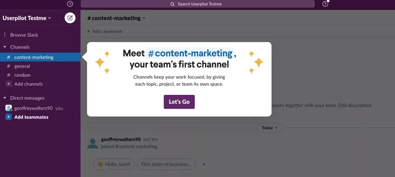
After setting up the workspace, Slack introduces users to different features using friendly in-app messages that make the experience engaging and informative.
10. Canva
Canva is a graphic design tool for creating various visual content, including social media graphics, presentations, posters, and more.
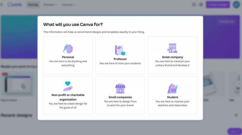
The onboarding process begins by asking users how they plan to use the platform, with options to cater to different use cases.
This step helps tailor the user experience by recommending designs and templates based on the selected use case.
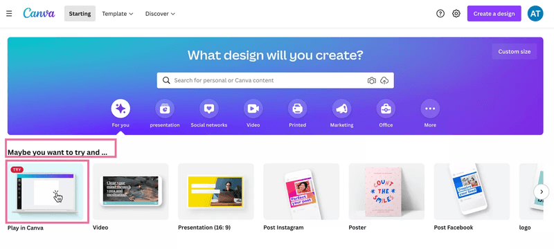
Once new users enter the main dashboard, they’ll see an engaging microcopy that invites them to “play” with a tool.
After clicking that option, users will see a skippable interactive walkthrough explaining each feature and how to create their first design
Best practices for creating interactive walkthroughs
Now that you’ve gotten some ideas to implement for your walkthroughs, it’s time to go over best practices to help you maximize the process:
Create interactive walkthroughs using different UI patterns
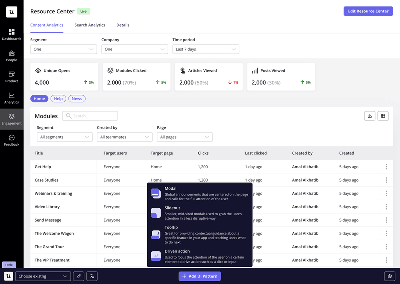
Variety keeps users engaged and caters to different learning styles. By combining different UI patterns, you’ll make your product walkthroughs visually appealing and more engaging.
Examples of patterns include:
- Checklists: Onboarding tasks that will drive users closer to the Aha! moment.
- Tooltips: Concise explanations that appear when hovering over an element. Ideal for quick tips and definitions.
- Modals: Pop-up windows for more detailed instructions or showcasing a new feature.
- Slideouts: Panels that appear from the side of the screen, providing step-by-step guidance without obstructing the main interface.
When using UI patterns, ensure you customize them to match your brand colors for a consistent experience. Onboarding tools like Userpilot let you do this code-free:
Personalize interactive walkthroughs for different user segments
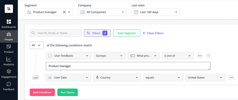
Users have varying needs and jobs to be done, so they’ll be using different parts of your product, and a general onboarding flow won’t help.
To cater to each user group, begin your flow with a welcome survey that collects user data to help you understand their use case.
Then, segment users and trigger personalized interactive walkthroughs based on their responses.
Use AI to improve the microcopy in your product walkthroughs
Why spend time thinking of the perfect words when AI writing assistants can help?
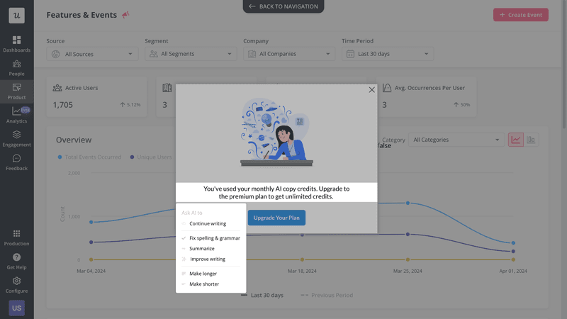
From ChatGPT to Google’s Gemini, there are many AI tools you can consult. However, Userpilot streamlines the process by offering an AI writing assistant directly within its interface.
As you build your walkthrough, you can easily generate, expand, paraphrase, or refine your microcopy without leaving the page:
Collect user feedback and improve your interactive walkthroughs
Trigger feedback surveys after a user completes your onboarding process to understand their experience with these educational materials.

Ask follow-up questions to find improvement opportunities and enhance your product walkthrough. Examples of questions you can ask:
- What was the most helpful part of the onboarding process?
- What was the least helpful part of the onboarding process?
- Is there anything we could have done to make the onboarding process easier or more informative?
Run A/B test and multivariate tests to find the best walkthrough
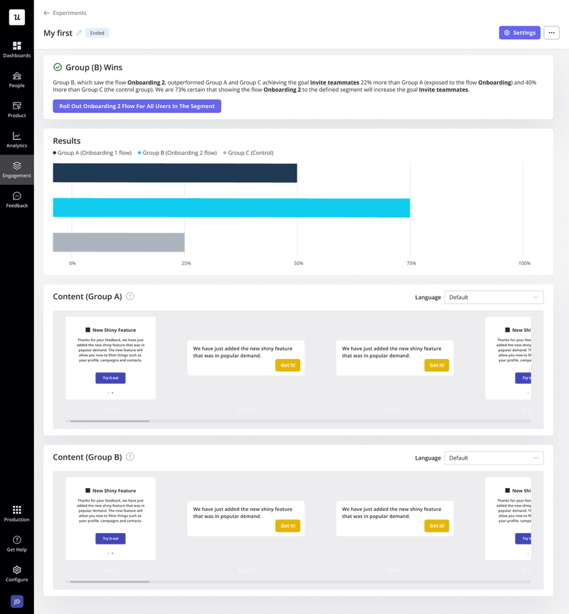
A/B testing compares two versions of a walkthrough element (e.g., different microcopy, UI patterns, media, etc.) to see which performs better in terms of user engagement, task completion, or conversion rate.
Multivariate testing, on the other hand, involves testing multiple variables simultaneously to understand how different combinations affect user behavior.
By systematically testing and analyzing the results, you can identify the most effective design and content elements, leading to a more efficient and user-friendly walkthrough.
Measure the effectiveness of your walkthrough with product analytics
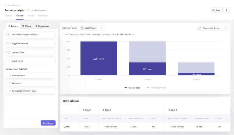
Use the right product analytics tool to analyze your adoption funnel and track key onboarding metrics like user engagement, task completion, time spent on each step, and drop-off points.
Aim to pinpoint specific steps that need improvement and optimize the walkthrough to enhance user experience and achieve better onboarding outcomes.
Conclusion
With the knowledge gathered from this article, you should be ready to build or refine your product walkthrough. Remember to keep it clear, concise, engaging, and skippable.
Also, regularly track key onboarding metrics to measure your performance and note improvement areas.
Userpilot can help. In addition to helping you implement insights from the interactive walkthrough examples above, our platform lets you track user behavior, deploy in-app surveys, and perform product experiments to better understand users. Book a demo now to begin.

