6 Interactive Walkthrough Examples From Successful Userpilot Customers


The six examples below all come from Userpilot customers, so we know the problem each team was trying to solve, what they built, and what happened afterward. Between them, they increased activation and feature adoption, recovered usage after a redesign, reduced the burden on Customer Success, lowered support demand, and supported renewals.I’m James, Head of Customer Success at Userpilot, and that range of outcomes is exactly why I don’t think of interactive walkthroughs as an onboarding format. They are a way to help a particular user take the next meaningful action inside your product. Sometimes that requires a checklist and a multi-step flow. Sometimes one tooltip is enough.

1. Amplemarket increased feature adoption by 5–10x with every guided release
Whenever Amplemarket added a Userpilot nudge to a new feature, adoption increased by five to ten times. That is not the result of making the tooltip brighter or writing a more enthusiastic announcement. It came from fixing a basic product-discovery problem that gets worse as a platform grows.
Amplemarket is an AI-powered sales platform that helps revenue teams find prospects, automate outreach, and manage their sales workflows. It also has a wide product offering and a fast release cycle. For the team, that created an uncomfortable gap between shipping a feature and customers actually using it.
A release email could tell users that something new existed, but it could not guarantee they would remember the update when they next reached the relevant part of the product. Release notes had the same limitation. The information lived away from the action.
So Amplemarket made in-app education part of the launch itself. The team used Userpilot hotspots, tooltips, and walkthroughs to introduce new functionality where eligible users could act on it. The prompt explained the value of the feature, but it also gave users a direct route into trying it rather than leaving them to find it later.
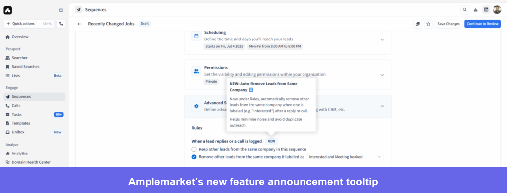
The part I find most useful, though, happened after the message was published. Amplemarket used Userpilot’s no-code event tracking to measure how users interacted with the feature and watched session replays each week to see where people hesitated, what they ignored, and whether the workflow behaved as expected. The product team could label a new event in minutes instead of waiting for engineering to instrument it.
That combination makes the five-to-ten-times result much more meaningful. A feature announcement can produce curiosity clicks and still fail to create adoption. Amplemarket could see the full sequence: who encountered the guidance, who tried the feature, and how they behaved once they were inside it.
The Amplemarket case study on combining launch guidance with behavioral analytics goes into that measurement process in more detail. It is worth reading because the lesson is bigger than “use a tooltip.” Amplemarket changed what a completed release meant. The feature was not finished when it went live; it was finished when the right users could discover it, understand it, and start incorporating it into their work.
I see teams miss this constantly. They spend months building a capability and treat the adoption layer as optional polish. Then, when usage is low, they conclude that the feature was not valuable. Amplemarket’s approach gives the feature a fair chance before anyone makes that decision.
2. Kontentino lifted its two activation events by nearly 10% in one month
Kontentino increased both of its key activation metrics by almost 10% within the first month of launching its Userpilot onboarding. The flow worked because it was built around two actions that matter in a social media management product: connecting a social account and scheduling a first post.
That sounds obvious once you hear it. In practice, onboarding teams are often tempted to include far more. They want to explain collaboration, approvals, reporting, calendars, permissions, and every other feature that might eventually be useful. The new user ends up clicking through a miniature product manual before they have done anything with the product.
Kontentino resisted that temptation. Its welcome screen introduced the onboarding experience and helped collect information about the user. A checklist then kept the two activation tasks visible, while interactive walkthroughs guided users through the work inside the live interface.
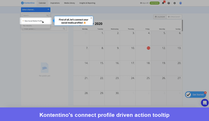
Look closely at the tooltip above and you will notice there is no “Next” button. Users move forward by selecting “New Social Media Profile,” which is the action they came into the product to complete. In Userpilot, this is handled with a driven action: the walkthrough waits for the user to interact with the interface instead of advancing because they acknowledged another piece of text.
This changes the learning experience more than it may seem. Clicking “Next” confirms only that the user saw the instruction. Clicking the product element starts building the behavior you want the user to repeat after onboarding is over.
The checklist adds something different. It gives users a clear route to activation without forcing them to finish the entire flow in one sitting. Each task can launch the relevant walkthrough when the user is ready, and completion can be tied to the actual product event rather than the user simply dismissing the guidance.
In the Kontentino case study on using driven actions to improve activation, you can see how the team combined the welcome experience, checklist, tooltips, and small moments of celebration. None of the individual patterns is unusual. The strength comes from how tightly they are organized around the two activation events.
That is the part I would copy. Not the wording of the tooltip or the exact checklist design, but the restraint. Kontentino decided what a meaningfully activated user had done, then removed everything that did not help them get there. Once users had linked an account and scheduled a post, the team had plenty of opportunities to introduce the rest of the product through secondary onboarding.
3. RecruitNow cut live customer training down to four hours per month
RecruitNow reduced live training from hundreds of hours per month and thousands per year to two two-hour sessions each month. The company did not achieve that by offering customers less support. It moved the repetitive parts of training into the product and kept its Customer Success team available for the parts that genuinely needed a person.
RecruitNow provides an applicant tracking system for recruitment agencies. Users need to learn multi-step processes such as creating job advertisements, managing candidates, and matching applicants with open roles. This is not a simple consumer app where people can explore for five minutes and work everything out for themselves.
When the customer base was smaller, live training was a reasonable answer. Two team members could walk customers through the system and make sure everyone knew what to do. But the same process became a bottleneck as RecruitNow grew beyond 220 companies and expanded into Germany and Austria.
The problem was not only the number of calls. Live training also creates consistency issues. One trainer may explain a workflow differently from another. A customer may send five people to the session even though 30 will eventually use the software. Someone joining the customer’s team three months later may receive an abbreviated handover from a colleague rather than the original training.
RecruitNow used Userpilot to turn its standard curriculum into interactive flows with tooltips and video tutorials. Users could learn the process while working in the actual applicant tracking system, then return to the material from an in-app resource center when they needed a refresher.
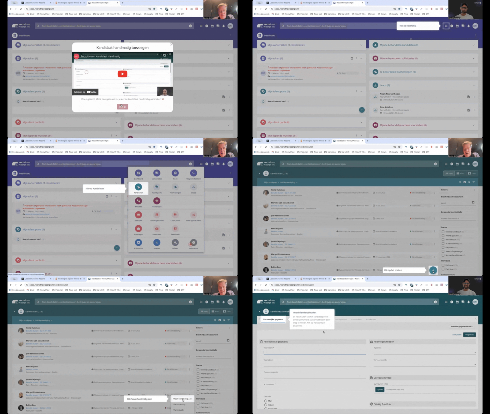
For an international customer base, localization was just as important as the flow itself. RecruitNow could translate its in-app training and support content for different markets instead of rebuilding the experience manually for each language. The team also added onboarding and satisfaction surveys, giving customers a way to flag what remained unclear and helping RecruitNow improve the training over time.
The full RecruitNow case study on scaling customer training without scaling the CS team makes an important point: RecruitNow did not eliminate live training. It still runs two sessions a month so users can raise questions after completing the self-serve experience.
That is exactly how I would want this setup to work. Automation should remove explanations that are predictable and repeatable, not remove access to Customer Success. A walkthrough can show every customer how to complete the standard workflow in the same way. A CSM is far more valuable when discussing how that workflow should fit the customer’s operation, why adoption is uneven across a team, or what should change in the implementation.
RecruitNow’s result is therefore more than a training-efficiency metric. It shows how in-app onboarding can change the capacity of a CS organization. The same team can support more customers and more markets without turning every new account into another calendar full of introductory calls.
4. Cleeng increased visits to a relocated feature by 75% in a few days
After a UI redesign caused usage of Cleeng’s Customer History feature to fall by 92%, one Userpilot tooltip increased page visits by 75% from that post-redesign low within days.
This is my favorite example when someone assumes an interactive walkthrough needs multiple steps to count. Cleeng did not need a checklist, a welcome modal, or a tour of the redesigned interface. Existing users already understood the product. They knew the feature and had used it before. They simply could not find it after its location changed.
Cleeng provides subscriber retention and management software for direct-to-consumer media companies. Its dashboard brings together subscription management, payments, churn prevention, and support capabilities. As more functionality is added, even a small navigation change can disrupt habits that users have built over months or years.
The team first used Userpilot analytics and session replay to work out what had happened. That order matters. A usage drop tells you there is a problem, but not what the problem is. Customers may have stopped needing the feature, found another way to complete the task, encountered a technical issue, or simply missed the new placement.
Replays showed that users who had previously visited Customer History were overlooking the relocated tab. With that evidence, Cleeng placed a contextual tooltip in the area where the old mental model was breaking down.
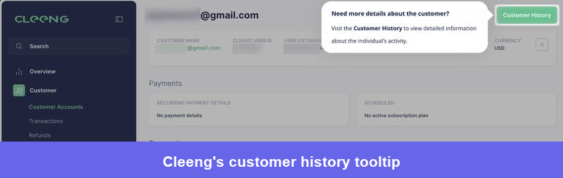
The tooltip worked quickly, but the team did not use that as an excuse to leave the navigation problem in place. The behavioral evidence supported another design change: turning the link into a more prominent button and moving it into a location users were less likely to miss. Customer History later became one of the product’s ten most-visited pages.
You can follow that full diagnostic sequence in the Cleeng case study on recovering adoption after a 92% usage drop. It is a much better model than jumping straight from “the metric went down” to “we should launch an onboarding campaign.”
What worked here was precision. Cleeng used product analytics to identify the drop, session replay to understand the behavior behind it, and in-app guidance to resolve the immediate friction while the team improved the underlying UI. Userpilot supported all three stages, but the team still chose the smallest possible experience for the user.
That last part is important. More guidance is not automatically better guidance. When a user needs one answer, give them one answer.
5. Osano cut support chats by 25% and delinquent churn by 40%
Osano reduced support chat requests by 25% and delinquent churn by 40% using Userpilot. Yet the most interesting part of its story is that neither result came from a conventional first-run walkthrough.
Osano originally adopted Userpilot for onboarding its data privacy platform. The team soon realized that the same no-code building blocks could handle many other moments where a user needed guidance or a clear next step inside the product.
Take overdue billing. Waiting for engineering to build and revise every upgrade or account-status dialog would have slowed experimentation and pulled developers away from core product work. Osano instead used Userpilot to create native-looking dialogs that responded to account data. As an account became more delinquent, the messaging could become progressively more prominent, from a light reminder to a full-screen interruption.
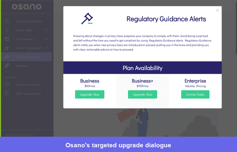
The flow was not just telling users that another plan existed. It was helping them resolve an active account problem at the moment it affected their work. The team could also revise the dialog without placing every copy or design change into an engineering sprint. In this case, you can see that interactive walkthroughs are not only for onboarding. The same Userpilot toolkit supported onboarding, upgrade prompts, overdue billing, announcements, feedback collection, and contextual self-service. The connecting idea was not the UI pattern. It was giving users the right intervention while they still had the problem in front of them.
Osano applied the same logic to support through Userpilot’s resource center. Its product is complex, and many questions arise only when a user reaches a particular page or task. Instead of expecting people to leave the product and search a generic help center, Osano surfaced relevant documentation and proactive tips in context. On one page, a single recommended article addressed around 90% of the questions users typically asked there.
Only after seeing those resources would the user reach the chat option. That did not remove access to support; it prevented customers from having to wait for a person to answer something that good documentation could resolve immediately.
From a CS standpoint, that is the ideal division of labor. Let the product resolve common, well-understood friction quickly. Keep the support team focused on questions where the customer needs investigation, judgment, or reassurance. Osano improved efficiency, but it also gave users a faster path to an answer.
6. Jiminny reached a 79% renewal rate for customers with custom flows
79% of the Jiminny customers that received custom Userpilot flows renewed for another year and were still with the company when the case study was recorded.
I want to be precise about that number. It is not Jiminny’s overall renewal rate, and the walkthroughs were not the only reason those customers renewed. The result applies to the cohort that received custom flows. That is still valuable because it shows what Jiminny built around those accounts: a repeatable connection between product behavior, targeted in-app guidance, and Customer Success follow-up.
Jiminny is a market intelligence platform for sales, CS, and other go-to-market teams. It has grown from conversation intelligence into a wider platform that includes call recording, CRM enrichment, deal insights, and AI-powered analysis. A manager, admin, and frontline user can all log into the same product for different reasons.
That made generic announcements a poor fit. Jiminny used Userpilot segmentation to tailor flows by user role and subscription tier. A user on a higher plan could be guided directly into a newly available feature. Someone on a lower plan might see an explanation of the value and an invitation to speak with their CSM instead.
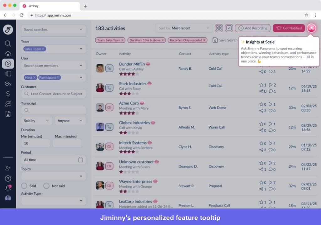
The team also learned that multi-step flows were not always the best way to announce releases. When users tended to close them after the first step, Jiminny shifted toward focused tooltips and modals that asked for one action. That is a good example of not becoming attached to the format. The job was to drive discovery and use, not to make users complete a beautifully designed sequence.
Behind those experiences, Jiminny used Userpilot’s no-code event tracking, trends reports, and dashboards to monitor adoption after each launch. The team looked beyond total usage because a handful of power users can make a feature appear healthier than it is. They checked whether adoption was spreading across the target accounts and roles, then added follow-up nudges where it was not.
Customer Success used the same information for larger accounts. A CSM could see which relevant capabilities the customer had adopted, identify gaps, and work with the product team to launch a custom flow tied to that customer’s goals.
This is where I think interactive walkthroughs become genuinely strategic for CS. A generic quarterly check-in often depends on what the customer remembers to mention. Product behavior gives the CSM a much better starting point. They can ask why a valuable workflow is concentrated among two users, guide the rest of the team toward it, and then measure whether the intervention changed adoption before renewal.
Jiminny did not use walkthroughs to replace the relationship. It used them to make the relationship more informed and the follow-up more scalable.
What I’d copy from these customer walkthroughs
These examples do not point to one perfect walkthrough structure. Amplemarket needed guidance attached to every important release. Kontentino needed a short route to activation. RecruitNow needed a reusable training system. Cleeng needed one precise correction. Osano needed contextual support and account-resolution experiences. Jiminny needed a connection between adoption data and CSM action.
The common thread is much simpler: each team knew what should change after the user saw the experience. That is where I would start. Finish this sentence before you build anything: “After this walkthrough, the user should have…”
“Seen our key features” is not specific enough. “Connected a social account,” “used the new prospecting workflow,” “found Customer History,” or “resolved an overdue account” gives you something you can design around and measure.
Once the outcome is clear, Userpilot gives you several ways to deliver the experience without engineering: tooltips and driven actions for step-by-step guidance, checklists for self-paced onboarding, segmentation for targeting the right role or account, localization for different markets, and an in-app resource center for help users may need again later. Product analytics and session replay then show whether the experience changed the behavior you built it for.
You do not need to use all of those features in one flow. In fact, the Cleeng example is a good reminder that you often should not. The goal is to use the smallest combination that gets the user unstuck and closer to value.
That is what we help teams work through at Userpilot: not just how to build an interactive walkthrough, but where it belongs in the journey, who should see it, and which customer outcome should prove it worked.
Want to build contextual walkthroughs around your own activation, adoption, or retention goals? Book a demo and we’ll show you how to create and measure them with Userpilot.
About the author