Bad UX Examples That Reveal a Trust Problem, Not a Design Problem


A bad checkout kills the sale before the user reaches the cart, and a confusing cancellation flow turns a subscriber into someone who leaves a one-star review. I’ve seen both happen to products that had no shortage of design resources, and the problem wasn’t craft; it was intent.
Baymard Institute found that forced account creation alone accounts for 18% of all e-commerce checkout abandonment. Dovetail’s research found that 43% of shoppers who encountered a dark pattern stopped buying from that retailer entirely. This made me realize that users don’t just file complaints; they leave and inform others about their bad experience.
What makes this hard to fix is that most bad UX isn’t accidental. It’s the result of teams optimizing for metrics that are easier to measure than trust, like notification open rates, session length, and short-term user retention. The interface reflects those priorities, and users feel it even when they can’t name it.
The ten examples below are real products with real consequences. Each one maps to a specific way the product’s goal and the user’s goal stopped lining up, and the cost of that.
The five trust failures behind most bad UX
Every example in this article maps to one of five categories. These are categories of misalignment between what the product appears to offer and what it actually delivers.
- Hidden intent is when the interface appears to help the user but is actually driving business outcomes like upgrade prompts framed as recommendations, notifications timed for engagement rather than utility, and a customer onboarding process that exists to showcase features rather than to help users reach value.
- Forced effort is when the product makes simple tasks harder than necessary, like making users do work the product should handle, long onboarding flows, repeated data entry, an overwhelming interface that buries key actions, and forms that ask for information the system already has.
- Loss of control is when the end user cannot easily make decisions or reverse them. For example, no way to dismiss a blocking modal, complex navigation with no clear way back, account settings buried four clicks deep, and cancellation flows designed to outlast the user’s patience rather than honor their request.
- Manipulative guidance is when the interface steers users toward choices that benefit the company. Pre-selected add-ons, button placement that makes the expensive option easier to click, and surveys timed before users hit any friction, all of these guide behavior without the user realizing they’re being guided.
- Broken expectations occur when the product behaves differently from what the user expected. For example, autoplay that fires without warning, features that appear to complete an action but leave behind evidence that they did not, and surprise charges at checkout.
That being said, let’s look at 10 examples of bad UX around the 5 failure categories.
#1 Onboarding that teaches before users are ready to learn
Trust failure: Hidden intent
GetANewsletter is an email marketing and landing page platform. Its onboarding tour is built to walk new users through the product’s core features, which sounds helpful on paper. But in reality, the tour prompts users to send a newsletter before they have uploaded an email list. The action the tour directs them toward has a prerequisite that the tour has not helped them complete.
The tour exists to show new users what the product can do, which serves GetANewsletter’s activation metrics. Different user types arrive at onboarding with different contexts. Some have email lists ready; others are still building them. The tour ignores both, fires the same steps regardless, and walks every user type into the same dead end.
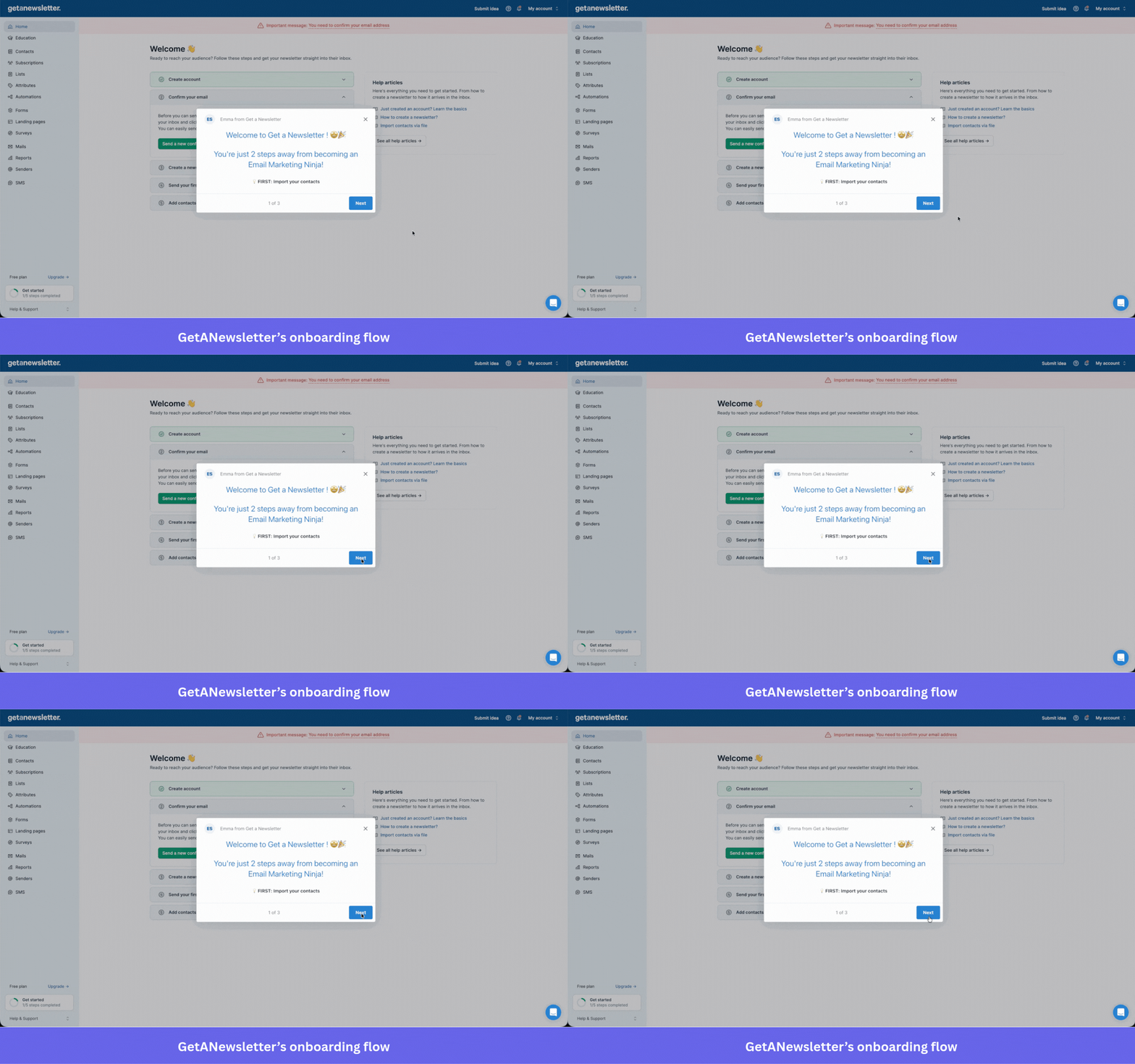
Lesson: Design onboarding around what users need to do, instead of what the product can do
An onboarding tour should not fire a feature step until the user has completed every prerequisite for that step. If sending a newsletter requires an email list, the “send your first newsletter” step should be gated behind a custom event confirming the list exists. Without that gate, the tour is not a guided tour. It is a product demo that inconveniences the user by pretending to be guidance.
Behavioral sequencing can fix this issue by triggering each onboarding step based on what the user has actually done, instead of a fixed schedule set in the signup flow. Userpilot lets teams build flows that adapt to user progress, so new users only see a step when they are ready to complete it, instead of hitting dead ends when they follow the tour in good faith.
#2 Notifications designed for the product’s metrics, not the user
Trust failure: Hidden intent
LinkedIn defaults every new user into fourteen notification categories simultaneously across in-app, email, and push channels, like job application updates, post interactions, profile views, suggested connections, and content recommendations.
All of them compete for the end user’s attention, whether or not the user asked for any of them. Turning them off requires navigating to account settings and working through each category and its sub-options one by one, which takes dozens of interactions across a menu structure that is not designed to make the task easy.
More notifications mean more opens, which means better numbers for LinkedIn. The design serves their dashboard, not the person receiving it. Users who eventually figure this out do not just turn off notifications. They lose trust in the entire platform’s intentions.
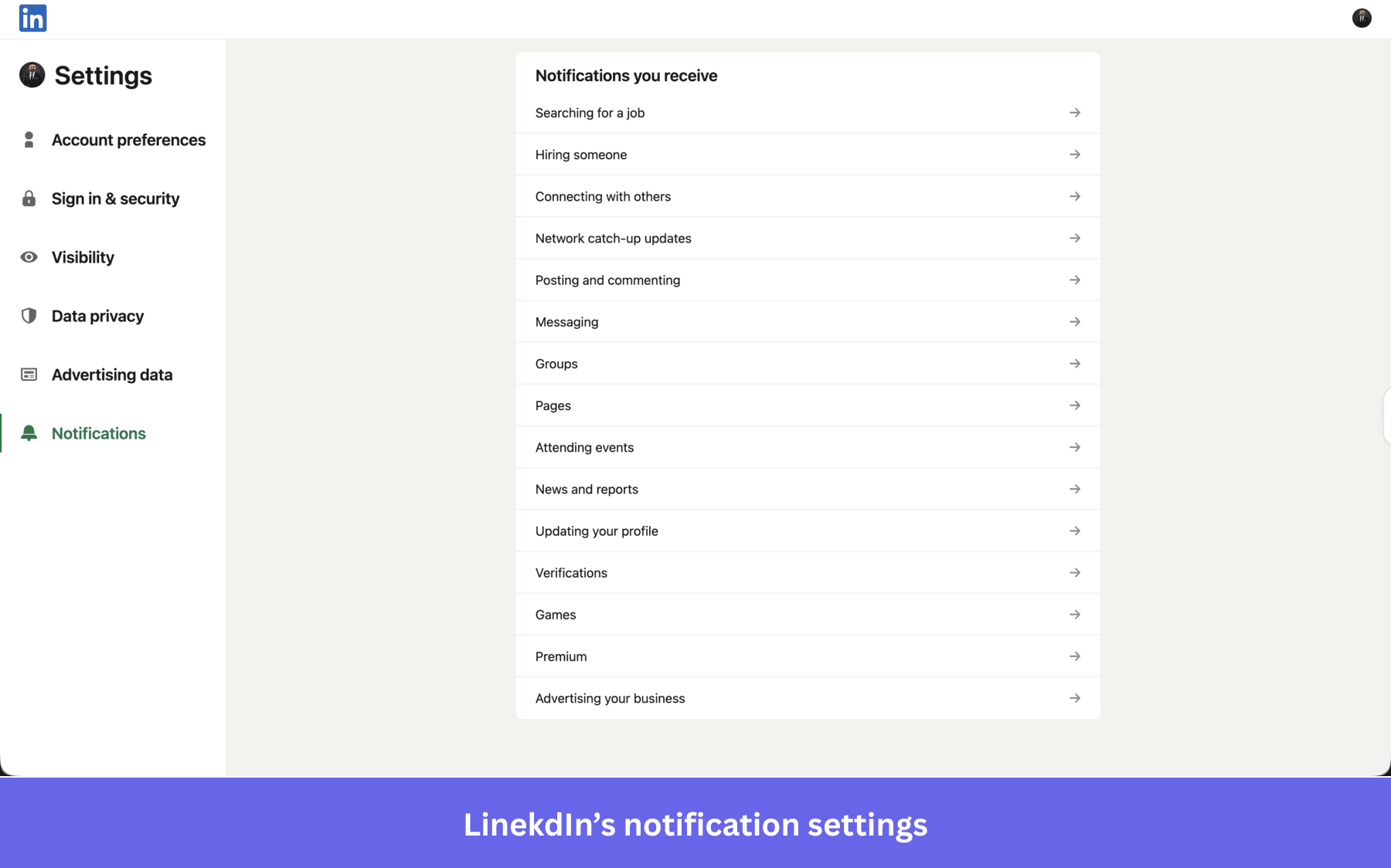
Lesson: Default to fewer notifications and make the off-ramp obvious
A notification’s job is to help the user and improve user activation, not to inflate open rates. The default notification state should reflect what a brand-new user genuinely needs to know first, like messages, critical account alerts, and whatever the user explicitly signed up for. Everything else should be optional notifications users can opt in to, reachable in two to three clicks from wherever the user is when they decide they want fewer interruptions.
Sending the same notification by email, push, and in-app at the same time does not make it more useful. It makes it more annoying. Pick the right channel for each notification type and use the others only if the first one goes unread.
#3 Autofill that creates more work than doing it manually
Trust failure: Forced effort
Workday’s job application flow offers an “Autofill with Resume” button. A candidate uploads their CV expecting the system to parse it and populate their work history, education, and contact information automatically. In practice, the autofill misreads phone numbers, puts experience in the wrong fields, and skips sections entirely, leaving candidates to correct every entry by hand. The upload did not reduce the work, but it added a step to a process that was already long.
Matthew Spence, a Vice President of Software Engineering at CLICS, described the experience publicly on LinkedIn. Workday’s Trustpilot rating of 1.1 reflects the impact on user satisfaction across thousands of job seekers who made the same calculation. The autofill label created an expectation the feature could not meet, and every broken promise of that kind is a UX failure that shows up in reviews, not bug reports.
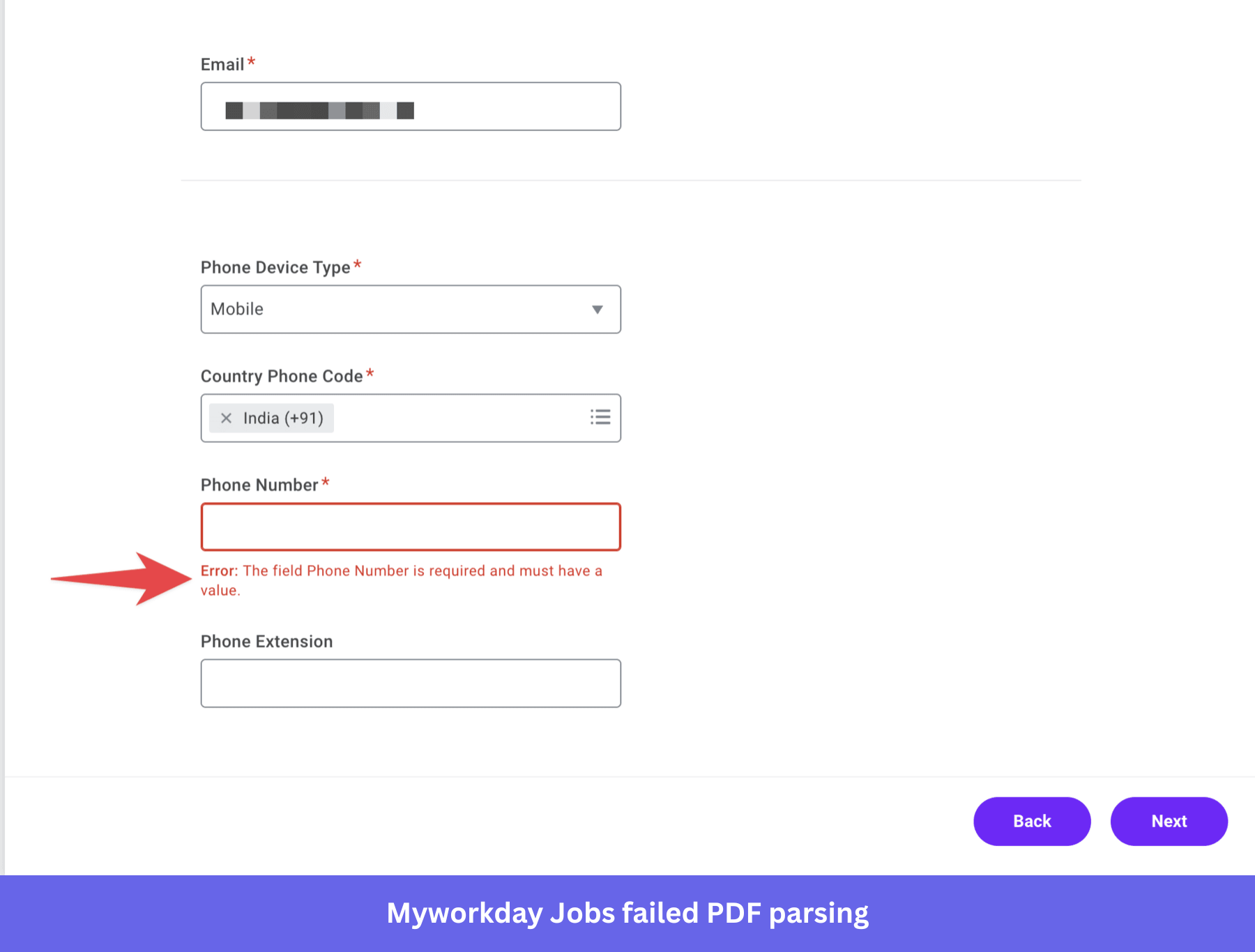
Lesson: Do not label a feature for what it promises if it cannot deliver it reliably
A button labeled “Autofill with Resume” sets a contract with the user. If the feature cannot fulfill that contract reliably, the options are: fix the feature, change the label to reflect what actually happens, or remove the button. Shipping it half-functional and trusting users to figure out the gap converts a capability into a frustration point that damages trust in everything around it.
The simpler application flows on competing platforms demonstrate the alternative. A contact information screen, a resume upload, a few employer-specific questions, and a review page. No re-entry of information that the resume already contains. The less surface area for something to go wrong, the fewer users who walk away feeling like the product wasted their time.
#4 Navigation that overwhelms instead of orienting
Trust failure: Forced effort
Wayfair’s primary navigation uses a mega-dropdown that opens the moment a user’s cursor gets near a category label, not when they click it. The complex navigation fills most of the viewport with subcategories simultaneously, which means the cognitive effort required just to orient within the menu rivals the effort of finding a product. A user who moves their mouse toward “Bedding & Bath” can accidentally trigger the “Mattresses” menu instead, forcing them to start over.
The overwhelming interface presents forty-plus categories at once, which does not help users choose faster. It triggers the kind of cognitive load that makes choosing feel impossible, and many users who confuse the menu for the product simply give up and type their query into the search bar or Google instead. Wayfair’s intent is probably to give every category equal visibility; the execution made a seamless browsing experience impossible because when everything competes for attention at once, nothing stands out.
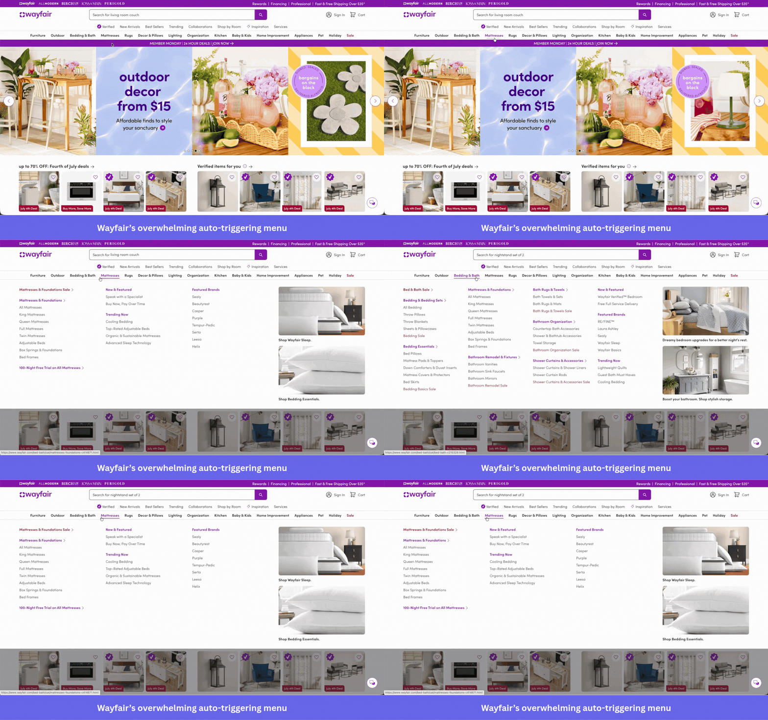
Lesson: Fewer choices, surfaced only on click, convert better than all choices, surfaced at once
The way to simplify such navigation UX, like Wayfair’s overwhelming menu, is to identify the top categories by real traffic and purchase behavior, surface only those at the top level, and put everything else one deliberate click deeper. Hover-triggered menus that fire on cursor proximity should be replaced with click triggers so the menu only opens when the user wants it to. This is more about reducing the cognitive effort required to use them than it is about reducing options.
A minimalist approach to navigation does more for conversion than any additional category could. When users can read the structure of a menu at a glance, they orient themselves quickly and arrive where they intended. When the structure requires scanning forty entries at once, most users do not orient at all. They close the tab and type their query into a search engine.
#5 Error states that trap users instead of helping them
Trust failure: Loss of control
Apple’s iPhone displays a “Storage Almost Full” modal when device storage runs low, typically at the worst possible moment, like when a user is taking a photo at an event. The modal explains the problem, offers a “Not Now” button, and links to Settings. “Not Now” does not dismiss the modal. It defers it until the next time the user opens the camera, guaranteeing they will see it again without having resolved anything. Tapping the Settings link opens the general storage management screen, which shows how much space is used overall but provides no guidance on what to delete or how much space needs to be freed to solve the immediate problem.
The user has been interrupted, given no actionable path forward, and denied even the option to dismiss the interruption until later. This is a loss of control failure that also creates poor accessibility problems where the modal provides no specific in-app guidance that screen readers can surface to help users with visual impairments understand what to delete or how much. An error state that blocks users and offers no resolution adds anxiety to a problem the product is not actually fixing.
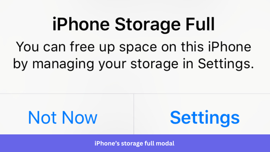
Lesson: Every blocking error message needs a specific next step and a real exit
A modal that takes over the screen should be responsible for solving the problem it reports. That means telling the user specifically what to do and not just “go to Settings,” but “Your largest files are Photos, taking 14GB. Open Photos to review and delete.” An X button that genuinely dismisses the alert for a period of time, not one that quietly re-queues it, gives the user the control they need to prioritize on their own terms.
#6 Cancellation flows designed to outlast your patience
Trust failure: Loss of control
Amazon Prime’s cancellation flow became famous enough that “how to cancel Amazon Prime” became one of the most searched phrases. The process involves multiple screens of benefits reminders, downgrade offers, pause options, and confirmation steps, each one designed to introduce a reason to stay before the user can complete their request to leave.
In 2023, the Federal Trade Commission filed a complaint against Amazon, specifically citing the Prime cancellation flow as a dark pattern that made cancellation deliberately harder than enrollment. The FTC described it as a process that required consumers to click through multiple pages and offers just to reach the cancellation option.
An interface that introduces five additional steps between a user’s decision to cancel and its fulfillment is not a user-friendly experience. In fact, it exists to push customers back from cancellation, betting that enough people will give up before completing it. That bet generates short-term user retention and long-term brand damage, because users who navigate the flow and successfully cancel remember it as adversarial, and users who give up and stay develop customer loyalty.
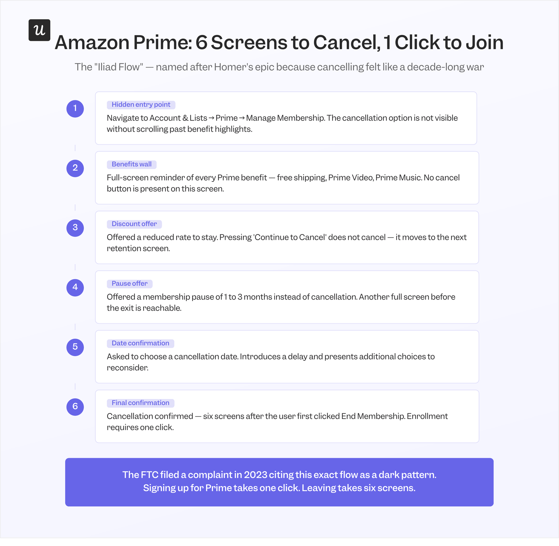
Lesson: A cancellation flow that respects users converts more of them than one that traps them
If someone cancels and it takes thirty seconds, they leave neutral. If it takes six screens, they leave angry and tell people. One confirmation screen asking why they’re leaving, then actually canceling- that’s all it needs to be.
The FTC’s increased scrutiny of dark patterns in cancellation flows is a signal that regulatory risk is now part of the calculation for companies that design these experiences. Beyond compliance, there is a simpler reason to fix them: users talk about bad cancellation experiences more consistently and more publicly than almost any other negative product interaction.
#7 Interface controls that steer users into the most expensive option
Trust failure: Manipulative guidance
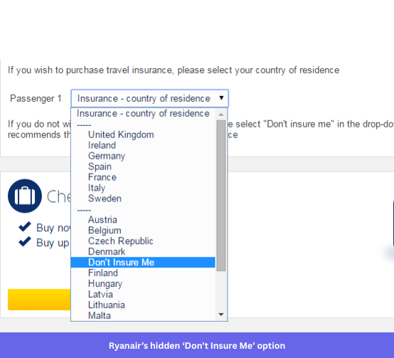
Ryanair’s booking flow includes a travel insurance add-on that arrives pre-selected by default. To decline it, users open a dropdown menu showing countries of residence and look for an option labeled “Don’t insure me,” which sits alphabetically between Denmark and Finland. No visual cues distinguish it from a country name. No separator, no different text weight, no color change. A user scanning for their actual country will scroll past the opt-out without recognizing it as an opt-out, and the only users who find it deliberately are those who already know it is there.
Ryanair eventually modified this specific mechanism under regulatory pressure, but the broader pattern remains. Aggressive upsell modals, fear-based copy, and defaulted upgrades that require deliberate action to remove are all still present in the checkout flow. Trust is a crucial element of any booking experience, and every dark pattern that survives regulatory scrutiny continues to erode it. Users who notice these patterns do not just lose trust in the checkout. They lose trust in the price they were initially quoted.
Lesson: Every hidden default earns the mistrust it eventually produces
A default that benefits the company at the user’s expense is not neutral. It is a bet that the short-term revenue from users who miss the opt-out is worth more than the long-term trust damage from users who notice they were steered. That bet sometimes wins a quarter in a financial year, but it loses the relationship. Products that build revenue through transparency consistently outperform products that build it through confusion, because the former generate referrals and the latter generate complaints.
If a user who fully understood the default would not choose it, the default should not be on. That applies to pre-checked insurance add-ons, pre-selected seat upgrades, and any interface element where the company’s preferred outcome and the user’s preferred outcome are not the same thing.
#8 In-app messages timed for company research, not user readiness
Trust failure: Manipulative guidance
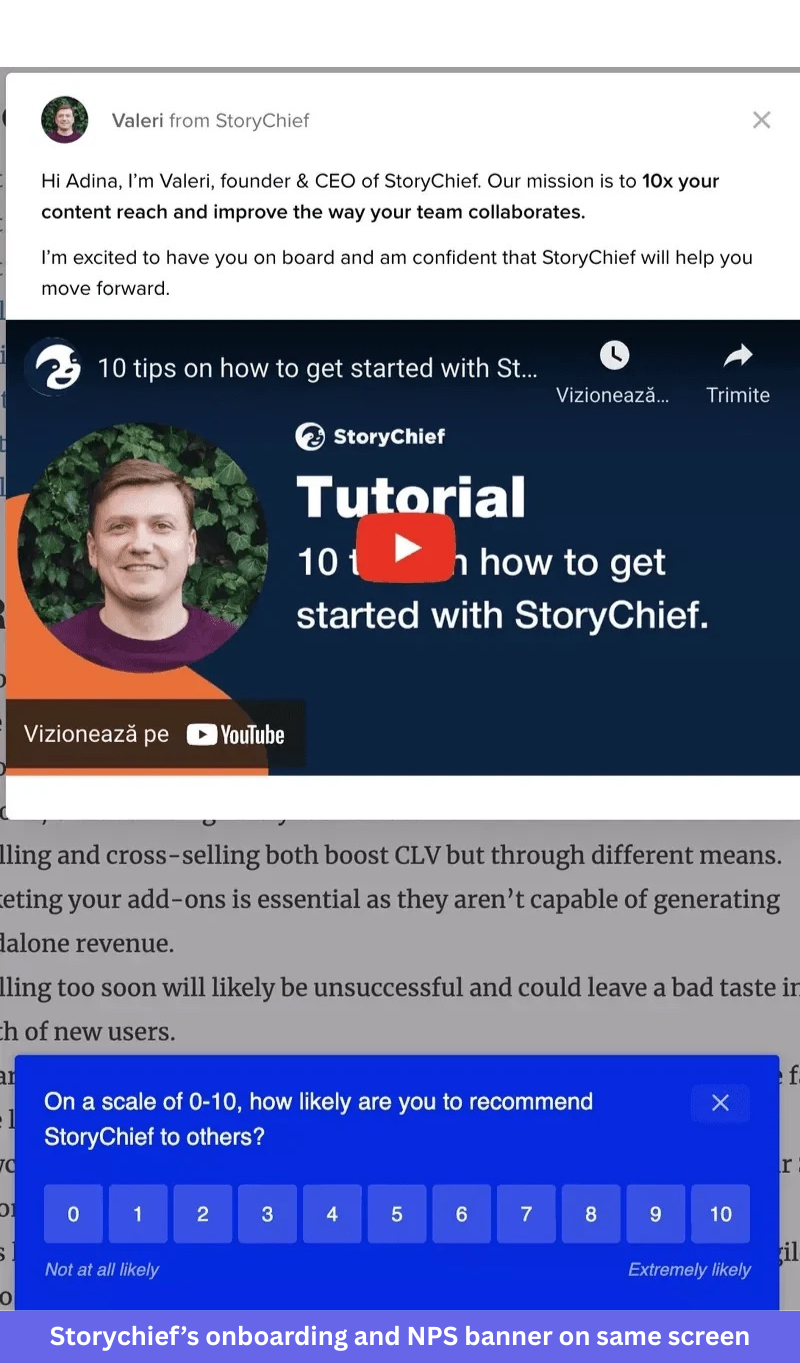
StoryChief, a content collaboration platform, displays two contradictory in-app messaging in the same session. A beginner tutorial modal appears on screen at the same time as an NPS survey asking how likely the user is to recommend the platform to a colleague. These two messages cannot logically target the same person.
A user who needs ten beginner tips has not yet formed a meaningful opinion about the product, and a user experienced enough to answer an NPS survey accurately does not need the beginner tips. Running both simultaneously means one of them is wrong, and both of them interrupt the user at the same moment.
The NPS timing is the more telling of the two. NPS surveys fired in the first session, before a user has discovered the key features that make the product useful or encountered the essential tools they will rely on daily, capture artificially positive responses. Firing an in-app NPS survey before users have genuinely tested the product is a form of manipulative guidance: it shapes the response by controlling when the question is asked, not by asking when the answer would be honest. That data benefits the company’s NPS score without helping the product team understand what experienced users actually think.
Lesson: Trigger in-app messages based on what the user has done, not when you want data
Every in-app message should trigger only if a specific user actually needs it right now. An NPS survey has a meaningful answer only after a user has spent real time in the product, completed at least one core workflow, and encountered at least one moment of friction.
Behavioral segmentation separates new users from experienced ones and sets triggers on actual events rather than on time since signup. A new user who has not completed the key activation events should see onboarding content. A user who has completed several core workflows over multiple sessions is the right NPS target. The tools to make this distinction exist in most modern product analytics tools, including Userpilot, which lets teams set in-app triggers based on custom events rather than registration timestamps.
#9 Autoplay behavior that assumes users are always ready
Trust failure: Broken expectations
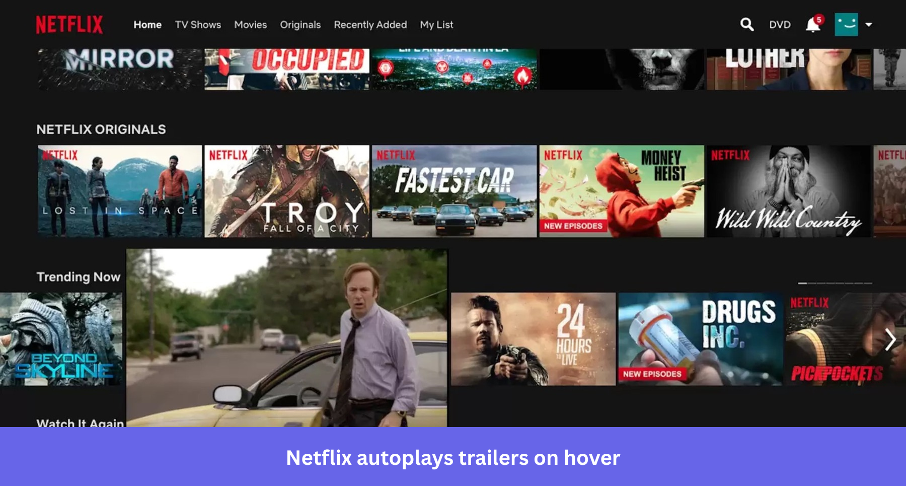
Netflix plays trailers automatically, at full volume, when a user hovers their cursor over a thumbnail. The product hijacks the user’s attention without a deliberate user interaction. Despite the fact that the user did not click or choose to play anything, simply moved their cursor near a title.
Netflix’s autoplay feature leads to user frustration due to unexpected audio and distraction, particularly in quiet environments, and inflates engagement metrics by counting hover events similarly to intentional plays.
Lesson: Features that override user control should be off by default
Any feature that takes an action on behalf of the user without a deliberate trigger should default to off and be explicitly opt-in. Most users browsing a video catalog want to be in control of when sound and video start. The minority who want autoplay can enable it once they know it exists, while the majority who do not want it currently have no recourse except to mute their browser tab for the entire session.
Product redesigns that remove familiar workflows create the same broken-expectations problem on a larger scale. When Netflix introduced its browse redesign, the complaints were not primarily about aesthetics. They were about losing the ability to predict how the product would behave. Users tolerate visual changes more readily than they tolerate a product that stops responding to their input in the way they expect. Control is what users remember most when it is taken away.
#10 Features that don’t match expectations
Trust failure: Broken expectations
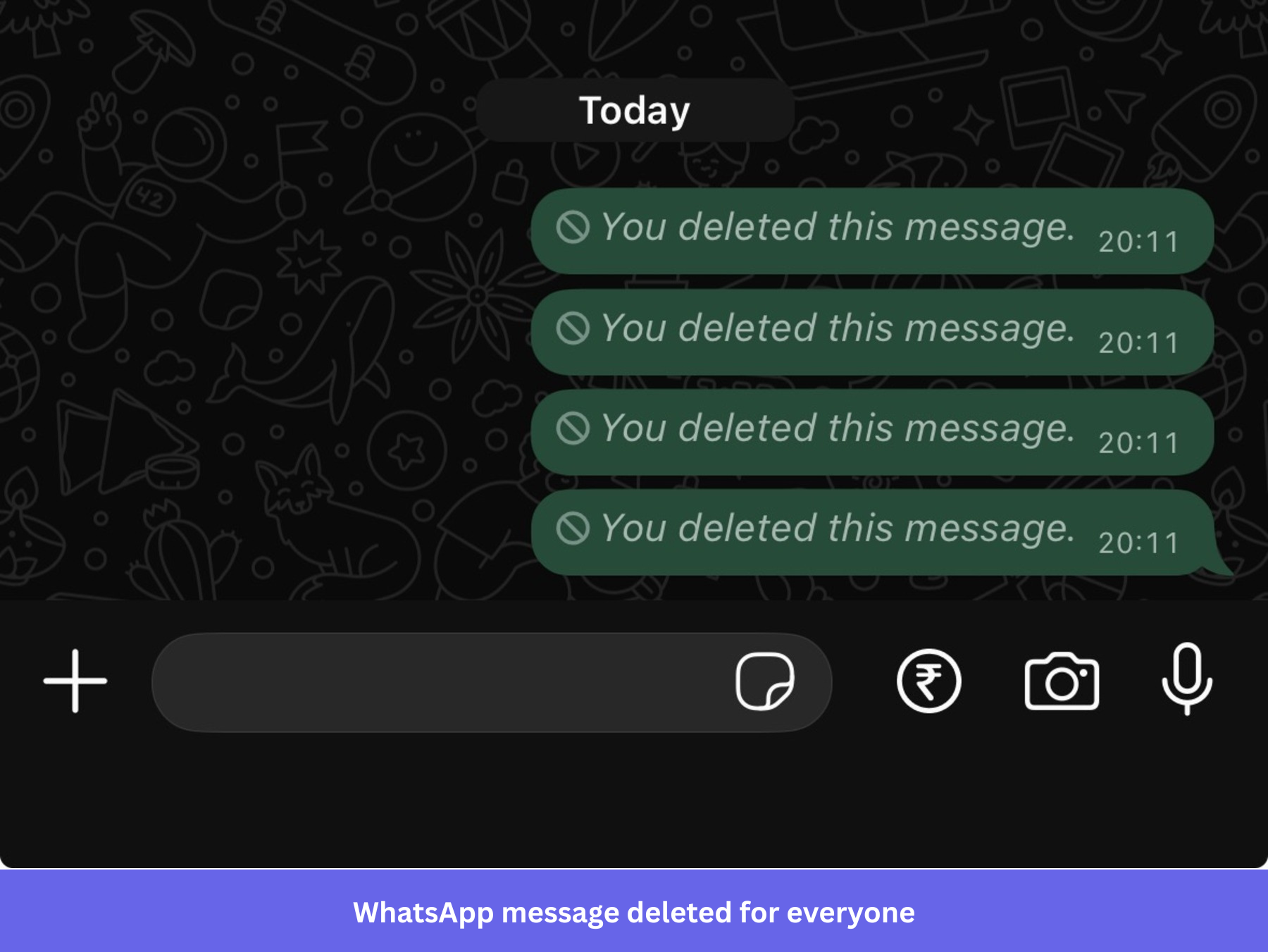
WhatsApp’s “delete for everyone” feature allows users to remove a message from a conversation. When the feature works, it removes the message from both the sender’s and the recipient’s view. In practice, it leaves behind a visible placeholder that reads “This message was deleted.” Every person in the conversation can see that a message existed and was removed.
WhatsApp’s “delete for everyone” feature creates user frustration by leaving this placeholder message, which raises suspicion rather than removing the message as users expect. Instead of quietly undoing a mistake, the feature announces that a mistake was made and then removed.
Trust is a crucial element of any messaging feature where WhatsApp users who press “delete for everyone” expect the message to disappear without a trace, which is exactly what the feature’s label implies. What they get instead is a public record of the deletion, often more conspicuous than the original message, and the placeholder WhatsApp leaves behind can lead to precisely the awkward conversations users were trying to prevent.
Lesson: When a feature makes a promise through its label, the behavior must fulfill it completely
A feature called “delete for everyone” creates an explicit expectation of complete removal. If the implementation cannot deliver complete removal, the label needs to reflect what actually happens. “retract for everyone” or “replace with deletion notice” are honest descriptions of the behavior users actually experience. It is a trust failure built into the product design, one that surfaces at exactly the moment a user most needs the feature to work as described.
Expectation management at the label level is the cheapest form of UX improvement available. Before a feature ships, ask yourself, “Does this button’s label describe what will happen exactly, or does it describe what we wish would happen?” The gap between those two answers is where user frustration lives.
What to do with this
Most discussions about bad UX focus on screens when they should focus on incentives. A confusing button can be fixed in a sprint, but a company that consistently places business goals ahead of user goals creates a problem that no sprint can solve, because the issue is structural, not visual.
The five trust failure categories are a useful lens for auditing your own product. Look at your onboarding flows and ask whether each step exists to help the user or to show them what the product can do. Look at your notification defaults and ask whether they reflect what users need or what the engagement dashboard rewards. Look at your cancellation flow and ask honestly whether it was designed to honor the user’s decision or to delay it. Look at your modal microcopy and ask whether users who read it will know exactly what to do next, or whether they will feel more confused after reading it than before.
Session replay and product analytics make these patterns visible before they accumulate into customer churn. If you want to see where users in your own product are hitting dead ends, hesitating on actions they should be able to complete quickly, or abandoning flows they started, Userpilot’s analytics and in-app engagement tools will surface those moments without requiring you to instrument them from scratch. The behavior patterns are there. The only question is whether you see them before your users start describing them in reviews.
FAQ
What are bad UX examples?
Bad UX examples are real product experiences where the interface creates friction, confusion, or mistrust for the user. The most significant bad UX examples share a common pattern, like the product’s design serves the company’s goal before the user’s goal. GetANewsletter’s out-of-sequence onboarding tour, Workday’s autofill that forces manual data re-entry, and Ryanair’s insurance opt-out hidden inside a country name dropdown are all examples where the design choice makes sense from a business perspective and creates a frustrating or misleading experience for the user.
What makes UX bad?
Bad UX is almost always one of five things. It hides its real intent, it forces unnecessary effort, it removes the user’s control over their own experience, it uses the interface to guide users toward outcomes that primarily benefit the company, or it behaves differently from what the user expected. The most damaging bad UX examples do more than one of these at once. Ryanair’s checkout hides the opt-out, forces users to discover it through a misleading interface element, and guides them toward the more expensive option through defaults. That combination makes the experience feel adversarial, not merely confusing.
How do you identify bad UX in your own product?
Watch where users stop, not where they complain. Rage clicks, repeated attempts to interact with elements that are not responding, and long pauses before completing straightforward actions are all signals that the interface is not doing what the user expects. Session replay makes these moments visible without requiring users to report them. Usability testing with a small group of real users before a feature ships will catch the most common failure modes before they reach your full user base and appear in reviews.
Can bad UX hurt revenue directly?
Yes, and the research is consistent. Baymard Institute has found that forced account creation before checkout accounts for roughly a quarter of all e-commerce checkout abandonment. Dovetail’s research found that 43% of shoppers who encountered a dark pattern stopped buying from that retailer entirely. The damage typically shows up as reduced repeat purchases and increased churn rather than an immediate drop in conversion, which is why it tends to get attributed to the wrong cause.
What is the difference between bad UX and bad UI?
Bad UI is a UI design problem: contrast too low to read, interactive elements that do not look interactive, or a responsive design that breaks on mobile. Poor UI design is visible and fixable. Bad UX is a flow and intent problem: unnecessary steps, features that do not match their label, and defaults that benefit the company at the user’s expense. Most users can tolerate imperfect UI design for years if they trust the product, but they rarely tolerate bad UX that makes them feel trapped or misled.
About the author