8 User Onboarding Case Studies to Learn From to Improve Your Onboarding Process
Sustaining user engagement throughout the entire onboarding process can feel like a task only large teams can achieve.
Introducing core features, driving user activation, and maximizing retention rates after the user onboarding experience will all impact the user journey moving forward.
In this guide, we’ll look at eight user onboarding case studies that can provide inspiration for your own onboarding flows!
Onboarding case study #1: How The Room increased new user activation by 75% in 10 days
The Room is a Talent-as-a-Service (TaaS) platform that helps connect world-class workers throughout Africa with companies across the globe. However, the company was facing a major issue: new members weren’t uploading their CVs to the platform.
The user onboarding challenge
Without CVs, it would be impossible for recruiters to vet and hire candidates for their openings. Senior Project Manager Arjoon Talukdar came across Userpilot and decided to build in-app onboarding flows that would encourage new members to upload their CV.
The user onboarding solution
Despite trying out other solutions, including Appcues Arjoon found that Userpilot was the easiest to use and made it possible to build the onboarding process himself — without the need for coding knowledge or help from other team members!
Specifically, Arjoon used Userpilot to add a “driven action” UI pattern that would draw the user’s attention toward the upload CV button:
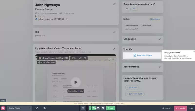
After using Userpilot for just 10 days, the number of weekly CV uploads went from around 200 to 300-350.
This marked a 75% increase in CV upload volume within the first two weeks of leveraging Userpilot.

Onboarding case study #2: How Osano reduced delinquent churn
Osano is a data privacy platform that initially signed up for Userpilot to build out its user onboarding process.
However, they quickly realized that the UI capabilities of Userpilot could also help them curb delinquent churn and generate expansion MRR earlier in the user journey.
The user onboarding challenge
CEO Arlo Gilbert noted that creating and fine-tuning pop-ups on Osano was a slow, expensive process prior to adopting Userpilot as the engineering team would need to wait for his feedback and then manually go back in to make each change.
The user onboarding solution
Because Userpilot is a no-code platform, Arlo was able to create, edit, and split-test multiple variations of upsell popups or overdue billing notices without needing to wait for engineering to make changes on their end.
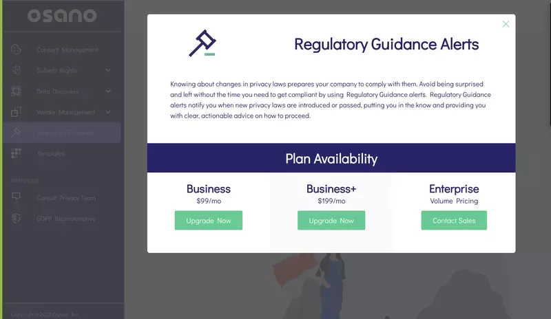
Arlo even came up with a progressive approach to in-app messaging in an effort to reduce delinquent churn and late payments.
By synchronizing data with their CRM solution, Arlo created progressively larger reminders depending on how late an account was on payments.
It would start as an unobtrusive dialogue box and then work its way toward a full-screen modal if the subscription remained unpaid. At that point, most users on the team would ring up their accounting department and ensure the bill gets paid so they can get back to work.
Osano also used Userpilot to build out a full in-app resource center:
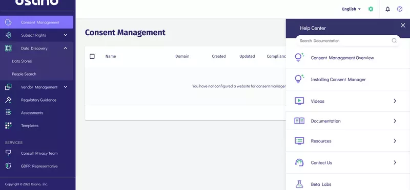
This allowed them to further their product-led growth and improve user retention by highlighting notable features with a demo document or step-by-step guide on the entire process of using it.
As a result of providing these customer education resources to users through Userpilot, Osano was able to reduce the volume of live chat support requests by 25% — significantly lowering their support costs.
Onboarding case study #3: How ClearCalcs improved user activation
ClearCalcs is a structural design software that describes itself as a streaming service for engineers — except its content includes steel column calculators rather than reality shows or movies.
The user onboarding challenge
Despite having multiple calculators for different engineering use cases, ClearCalcs users don’t always find the calculator they need and end up churning prematurely in search of different apps.
The user onboarding solution
CEO Chris Borzillo had two primary onboarding goals:
- Help new signups find the right calculator for their job-to-be-done (JTBD).
- Improve user-friendliness so new users aren’t overwhelmed by a large number of options.
To achieve these goals, ClearCalcs used Userpilot to run product experiments and track how user behavior would change in response to these changes. Chris said that Userpilot’s quick and easy UX made it possible to take an Edison approach to eliminating onboarding roadblocks.
By identifying all the ways how not to onboard real users, ClearCalcs was able to get a better understanding of the shortcomings in their existing flows and use these key takeaways to make the onboarding process work efficiently moving forward.
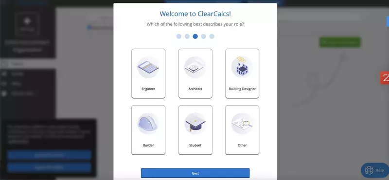
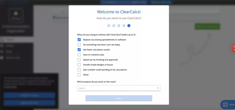
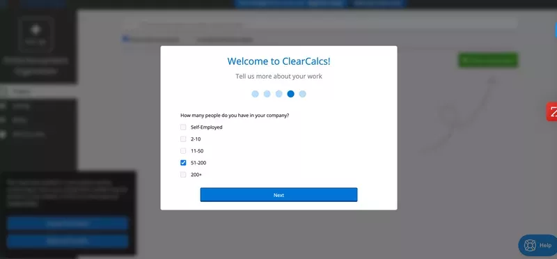
ClearCalcs also leveraged Userpilot’s user segmentation capabilities to segment each user by role or goal and thus create more contextual onboarding experiences.
Here’s a look at some of the welcome screens that ClearCalcs used to segment their customers early on:
Role-based segmentation
Goal-based segmentation
Size-based segmentation
Onboarding case study #4: How Sked Social tripled conversions with a checklist
Sked Social is a social media management platform that was struggling with conversion rates during the onboarding stage of the customer journey.
As such, the Sked team wanted to add a useful checklist to make the onboarding experience feel less intimidating.
The user onboarding challenge
Sked was struggling with low conversion rates during the onboarding experience. This made it hard to turn their new users into paying customers.
To resolve this, Sked wanted to create a world-class onboarding experience that would meet user expectations and get them to convert.
The user onboarding solution
Sked Social starts the sequence of onboarding tasks off with a welcome modal that offers new users two options: either schedule a one-on-one walkthrough or proceed with an amazing onboarding flow on your own.
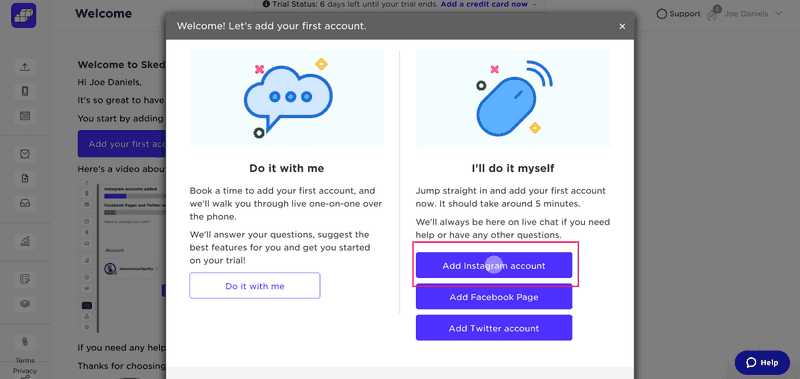
This ensures that the user’s expectations are met whether they’re a high-touch or low-touch customer. New users are then redirected to the main dashboard where they’re greeted by an onboarding checklist.
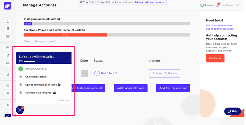
To make the onboarding flow feel less daunting to new users, Sked Social only has four tasks present on the checklist.
It also uses progress bars and checkboxes. This helps users feel a sense of progress so they don’t lose interest halfway through the initial onboarding flow.
As a result of using Userpilot to add checklists to onboarding experiences, Sked was able to achieve 3x higher conversion rates from users who completed the checklist. This meant more new users were converting into paying customers after their great onboarding experience.
Onboarding case study #5: How Stripo provides a frictionless onboarding process
Stripo is an email design platform and template builder.
Making a good first impression is often the biggest challenge for SaaS businesses but Stripo has managed to prompt an ‘Aha moment‘ early in the user experience which sets things up for a better onboarding experience.
The user onboarding challenge
Relying on onboarding UX and knowledge bases that educates users about the core benefits of your product is great but why wait for them to signup before nudging them towards their first ‘Aha’ moment?
Pre-signup ‘Aha’ moments can serve as a powerful marketing tool! How Stripo implemented this is a good user onboarding example.
The user onboarding solution
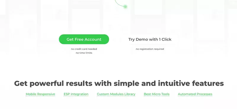
Looking at Stripo’s signup page, it’s clear that there are two primary CTAs for users to choose from. Users can either create a free account through the signup form or demo the product’s features without needing to register at all:
New users who choose the demo are greeted with a welcome screen that offers video tutorials for various tools and interactive walkthroughs for those who prefer a step-by-step product tour experience.
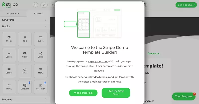
This makes the user’s experience more targeted since they’re able to choose how they’d like to proceed.
You’ll notice that the checklist only contains three tasks and has a skip option for new users who want to forego the product walkthrough in favor of experimenting for themselves:
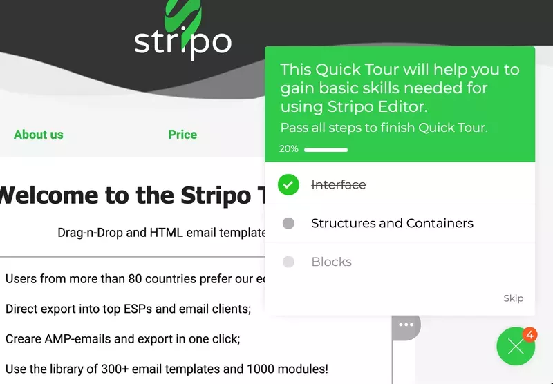
The rest of the demo focuses on helping new users learn by doing and walks them through the steps of building emails within the platform.
Active learning is part of what makes user onboarding important for SaaS companies after all.
As a result of these efforts, 32% of site visitors were engaged by the one-click demo with 5% of visitors completing the full tutorial. Out of 31,000 users, 1,500 new users completed the entire tutorial before even signing up meaning they were activated from the get-go.
Onboarding case study #6: How Kontentino increased new user activation by 10%
Kontentino is a social media management tool that came to Userpilot hoping to increase feature/product adoption, create in-app announcements for new features, and build their first onboarding flow.
The user onboarding challenge
While adoption, announcements, and onboarding were Kommunicate’s initial goals with Userpilot they were surprised to find that the solution would also impact their product stickiness.
The user onboarding solution
The two main activation points for Kontentino users are:
- Linking their social media accounts.
- Scheduling their first post(s).
Within the first month of creating an interactive walkthrough and onboarding checklist with Userpilot, both of these activation metrics increased by almost 10%. The rapid increase in activation rates came down to using interactive walkthroughs rather than product tours.
Long, linear tours dump too much information on new users which makes it harder for them to retain everything they’re told. In contrast, learning by doing during an interactive walkthrough teaches them how to use core features at their own pace.
Kontentino built its entire onboarding process with Userpilot and started things off with a welcome screen and short survey:
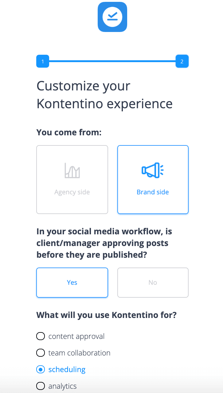
This lets users adjust the onboarding experience depending on their role, JTBD, and whether or not clients need to review social media posts before they go live.
After that, Kontentino’s Head of Customer Success greets users through an in-app modal:
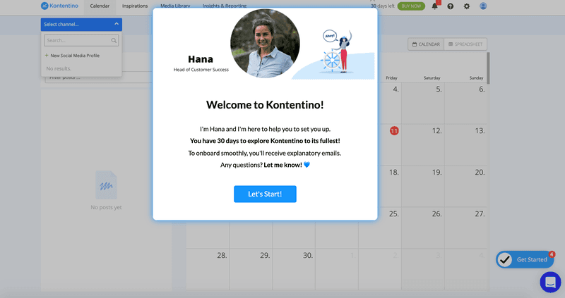
Throughout the entire onboarding flow, Kontentino uses UI patterns like tooltips and driven actions to highlight specific elements, buttons, or features:
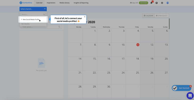
Onboarding case study #7: How Kommunicate.io drives product adoption without a sales team
Kommunicate is a chat-based customer support tool that helps companies combine human agents with AI-powered chatbots to offer better service 24/7. The primary goal of Kommunicate’s product team was to drive feature discovery and customer education.
The user onboarding challenge
Product managers at Kommunicate noticed that users were asking for product features that already exist. In fact, two-thirds of all their users were only using three or four aspects of the platform based on feedback from user interviews.
The user onboarding solution
Kommunicate Senior Product Marketing Manager Parth Shrivastava realized that their sales-less approach to customer acquisition meant no dedicated team member introduced users to specific features.
They decided to resolve this problem using Userpilot instead of hiring a full customer success team to manually tell users about new features that they might not have noticed. The goal was to reduce the volume of support tickets centered around undiscovered features.
Upon analyzing session recordings from Hotjar and user behavior data from Heap, Parth realized that there were two steps that needed to be taken:
- Get users to their initial ‘Aha’ moment with a chatbot integration that could draw them toward an activation point
- Get users to adopt key features that drive the most conversions by inserting subtle cues within the product itself
Starting out, Kommunicate used a notification bar with two buttons to increase chatbot integration amongst their target users. At the time of their first onboarding experiments with Userpilot, user research showed that signup-to-chatbot-integration rates were around 40%.
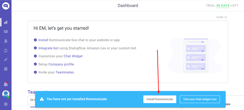
After seven months of tweaking things with Userpilot, that figure is closer to 60% now. Because chatbot integration is such a significant conversion cue within Kommunicate’s user base, this one change has significantly increased MRR growth over the past two quarters.
By adding a checklist, adoption rates increased by an additional 4%:
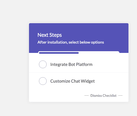
User testing showed that most paying customers adopt the same set of five to seven key features — so Parth plugged these features into Userpilot’s product adoption feature to better track their adoption rates.
Within five months of launching product adoption cues for these key features, the percentage of users discovering them has gone from 28% to 41%. Another ‘Aha’ moment that Kommunicate led users to with Userpilot was chat widget customization:
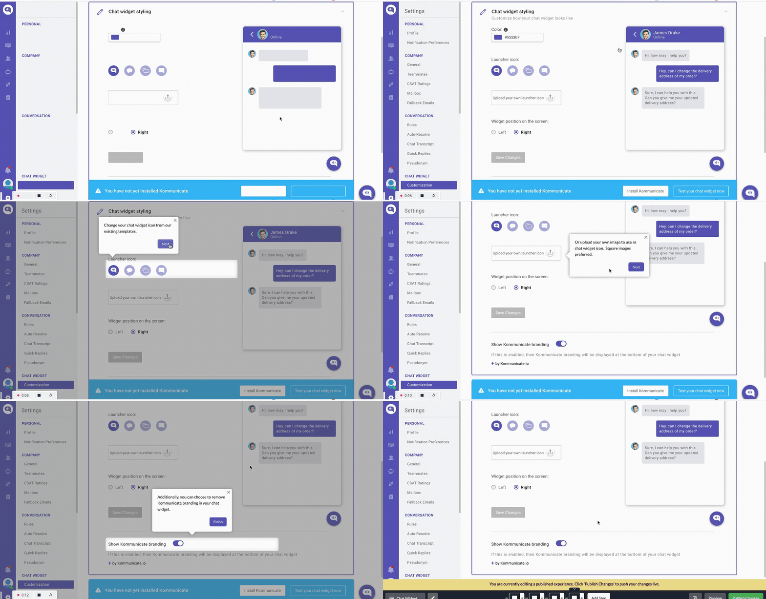
Since introducing the cue for chat widget customization, 86% of people have completed this product goal, which led to a 3% increase in feature usage overall, driving a proportional 3% increase in revenue.
Onboarding case study #8: How Platformly onboards new users to its complex product
Platformly is a marketing automation platform that helps companies nurture leads, track the user journey, and develop stronger relationships with their customers.
It’s a full-suite platform with tons of features for new users to explore.
The user onboarding challenge
Because of Platformly’s large feature catalog, some new users struggle with the complexity and get overwhelmed by the abundance of options. Thus, the team at Platformly needed to simplify the onboarding and value realization journey for their users.
The user onboarding solution
When users log into Platformly for the first time, they’re greeted with an empty dashboard. These empty states are a crucial point in the onboarding process and a prime opportunity for a friendly message informing users on where to go next.
Platformly uses this space to deploy three onboarding features on the screen:
- An onboarding checklist with a progress bar.
- CTA so users set up their first dashboard.
- Dashboard walkthrough (for users who need additional guidance).
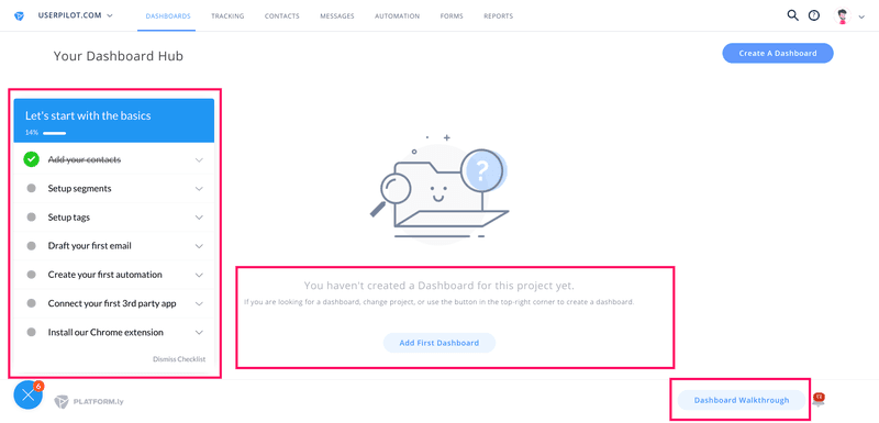
Those who select the dashboard walkthrough option will watch a micro-video (after some short loading screens) to learn more about the feature and how to use it in around three minutes.
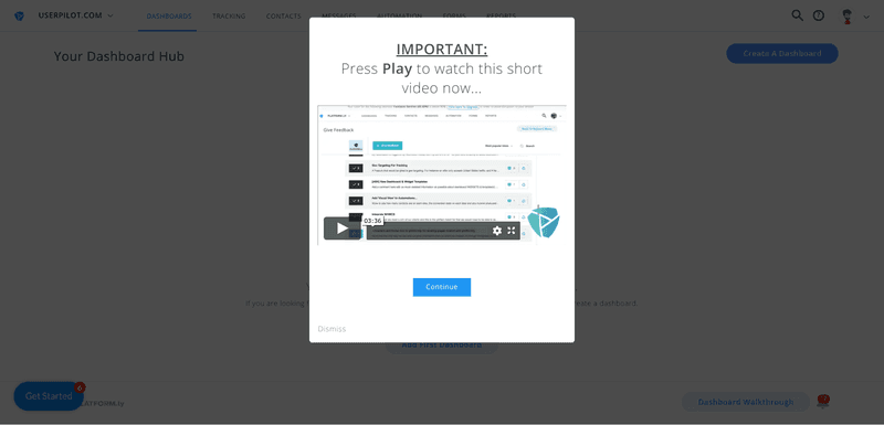
This combination of checklists, walkthroughs, and tutorial videos makes the complex platform feel a lot simpler for new users. As a result, Platformly’s onboarding flow had completion rates of 40%+ — which is fantastic considering 30% is generally considered a good completion rate.
What makes a great user onboarding experience?
While flows can vary from one company to another, there are a few elements that the best user onboarding experiences all have in common. These are:
- User-centric approach. Personalized user onboarding flows based on the needs of each user rather than a boilerplate, one-size-fits-all approach. Also known as progressive onboarding.
- Contextual. User segmentation and feedback are used to create a contextual onboarding experience.
- Checklists. User onboarding checklists help new users discover the stickiest features early on.
- Constant improvement. Collect feedback from your customer base and regularly improve upon your onboarding flows using the data from these insights.
Conclusion
As you can see, the art and science behind onboarding users are more than just theoretical best practices. The strategies in this guide have been used by actual companies to achieve real results with new and existing users alike.
If you’re ready to improve the onboarding experience for your users then it’s time to get your free Userpilot demo today!

