Userpilot Custom Analytics Dashboards: Setup, Features, and Best Practices


Userpilot product analytics tend to live in a dozen separate reports, and no two teams ever want the same slice of them. A custom analytics dashboard is where you pull the reports that matter for one goal into a single filterable view.
Picture a growth lead opening a tab to check trial conversion, then jumping to another report for time-to-convert, then a third for the onboarding funnel feeding both. That context-switching is where insight quietly leaks out, because nobody stitches the three views back together.
What used to be true is that Userpilot shipped a fixed set of prebuilt dashboards and you worked around them. Now you can assemble your own view around the exact business question a team is trying to answer.
The honest catch is that a dashboard is only as good as the reports and segments feeding it, so most of the real work is deciding what belongs on it and what to leave off.
I wanted this to be more useful than another feature tour. So here is what I will walk through: what a custom analytics dashboard consolidates, what you can put on one, five workflows worth building, how to create one from a template or from scratch, and how Lia surfaces meaningful changes so you stop babysitting dashboards manually.

What a Userpilot custom analytics dashboard actually is
A custom analytics dashboard is a personalized view that consolidates the reports and survey data most relevant to one team or one goal, in a single place you can filter. It is not a wall of every chart you own, and treating it like one is the fastest way to make it useless.
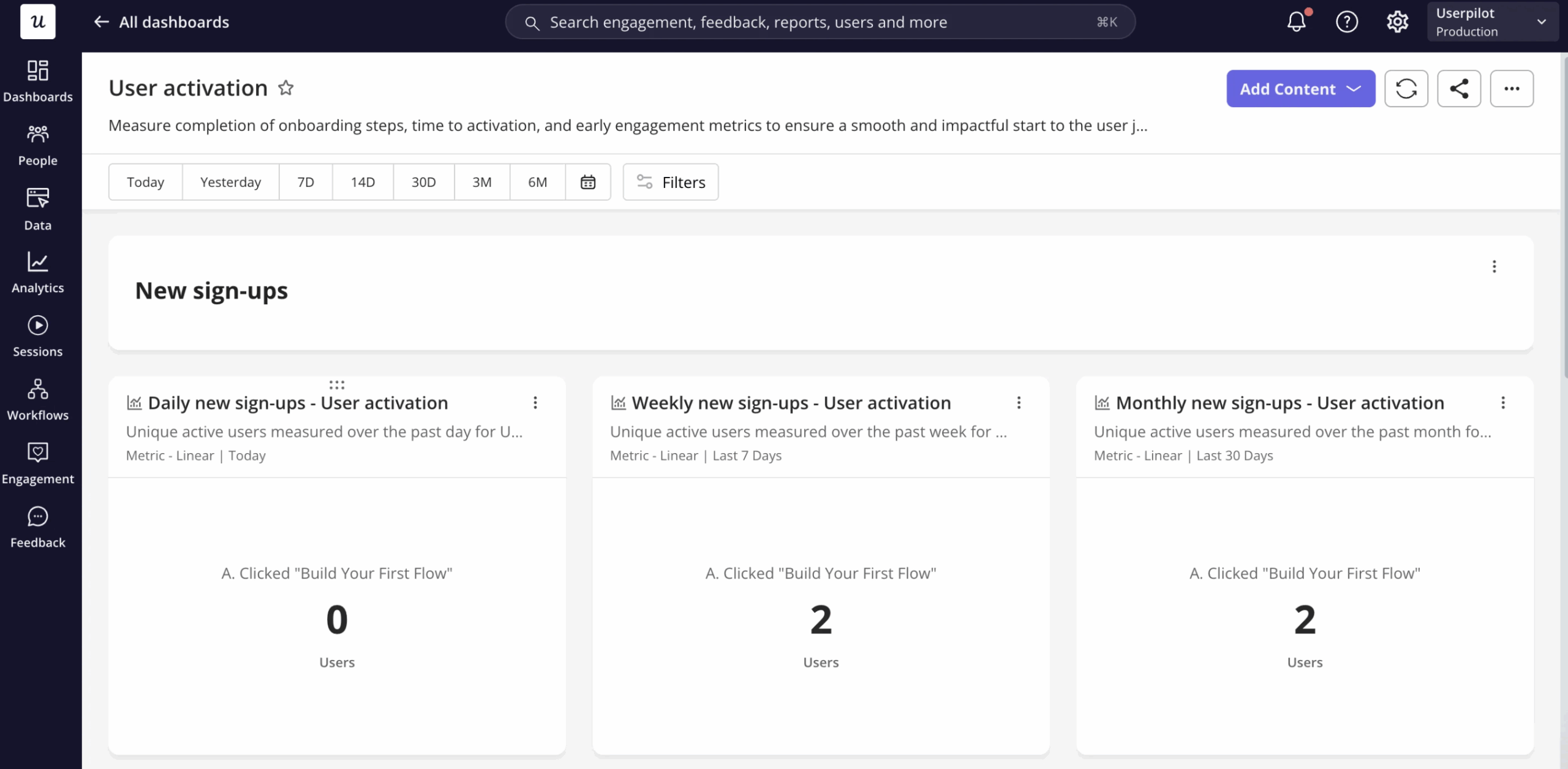
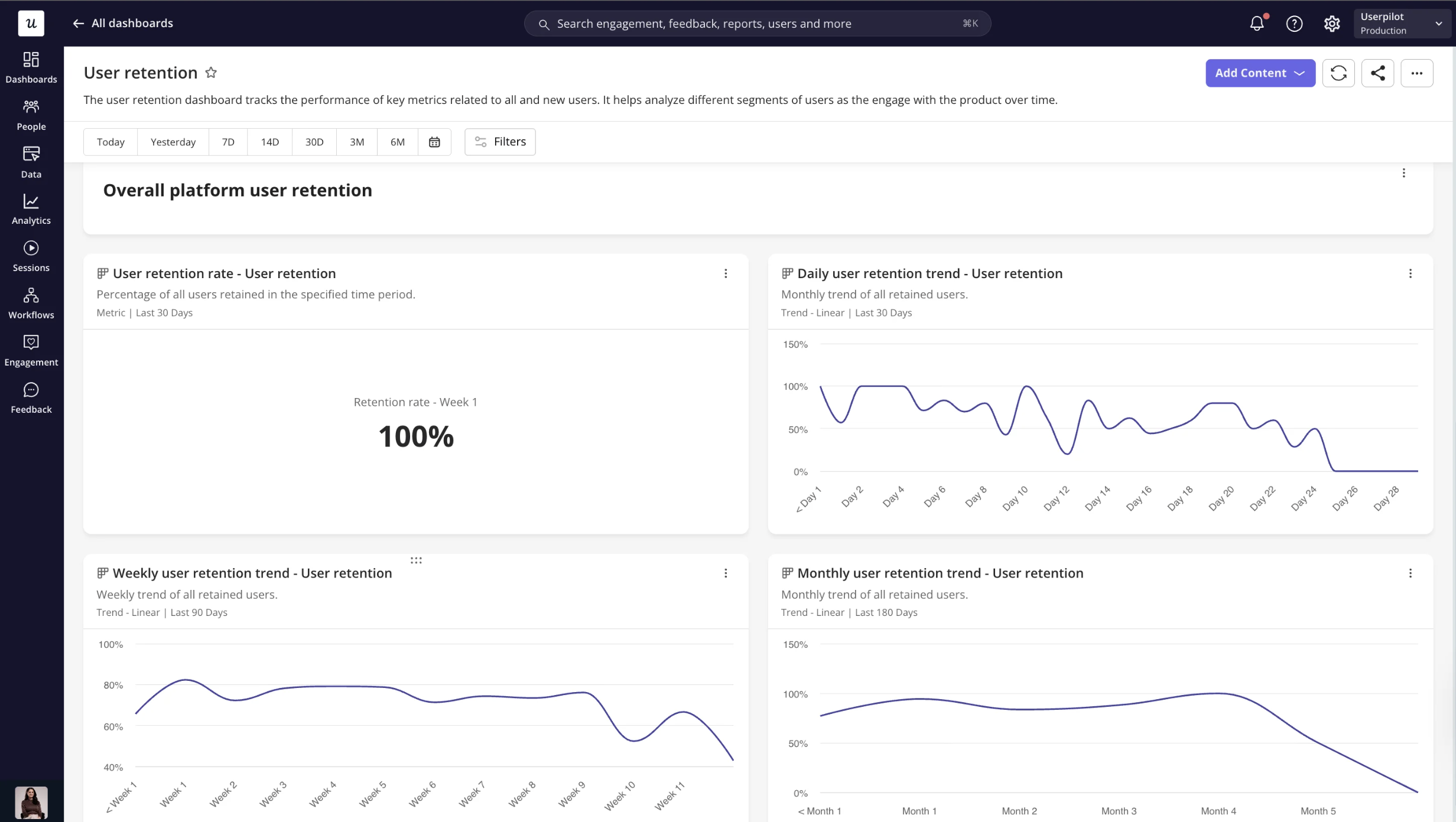
Userpilot ships four prebuilt analytics dashboards by default: product usage, new user activation, core feature engagement, and user retention. Those cover the common product analytics questions most teams start with, and they are a fine baseline before you build anything of your own.
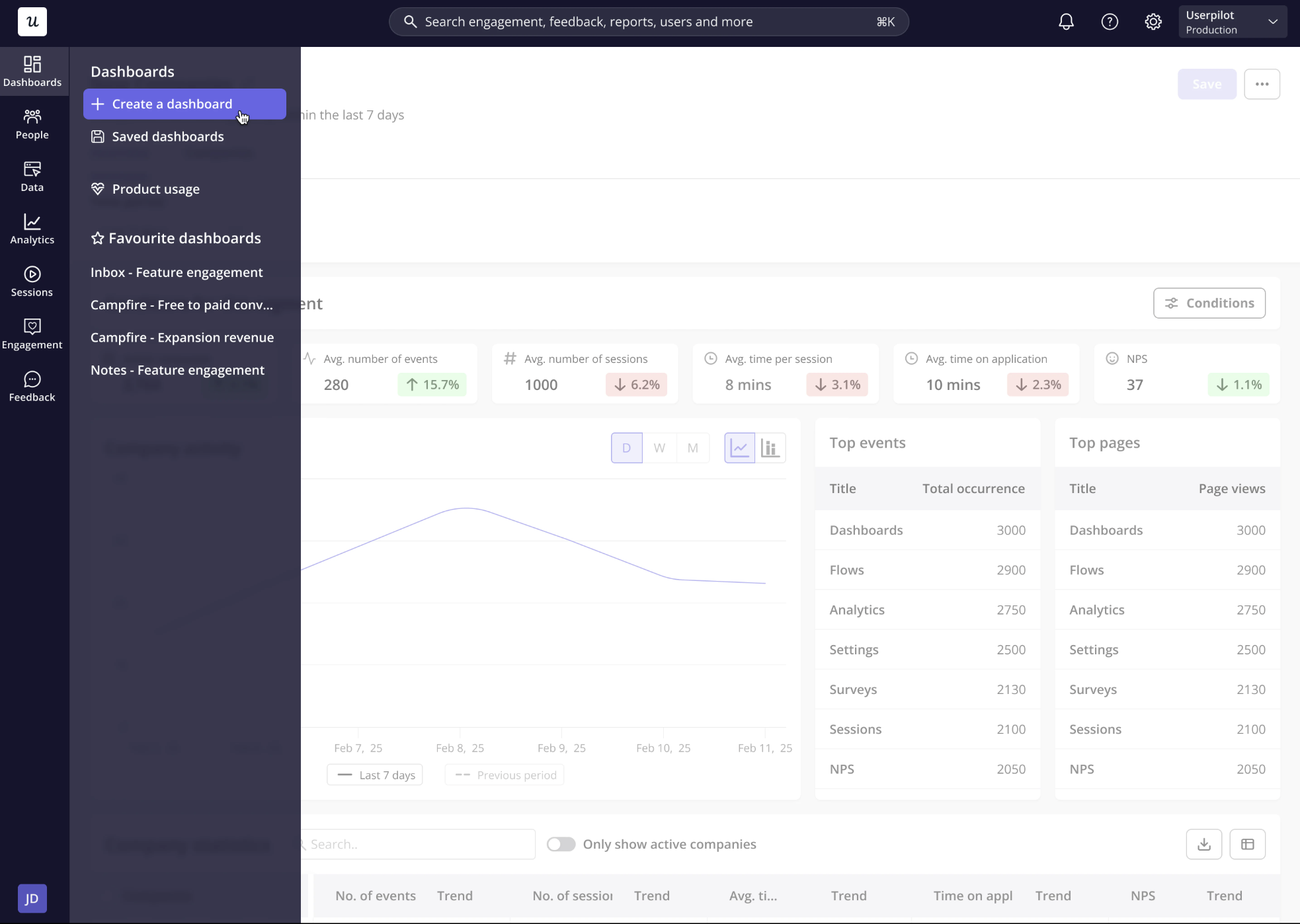
Custom dashboards are where you go beyond that baseline, combining reports and survey data into a view built around your own business question. One quick note on access before you plan anything: custom dashboards are available on the Growth and Enterprise plans only, so if you are on Starter this is your cue to upgrade or stick with the prebuilt four.
The discipline that makes any of this work is selection. Product, customer success, and leadership each need a different view of the same product, so you choose the handful of reports that answer their question rather than dumping every report you have onto one screen.
What you can put on a custom dashboard
A Userpilot dashboard is assembled from reusable analytics reports rather than locked into a predefined layout. You can reuse reports you have already saved, or build brand new ones directly inside the dashboard without leaving the view.
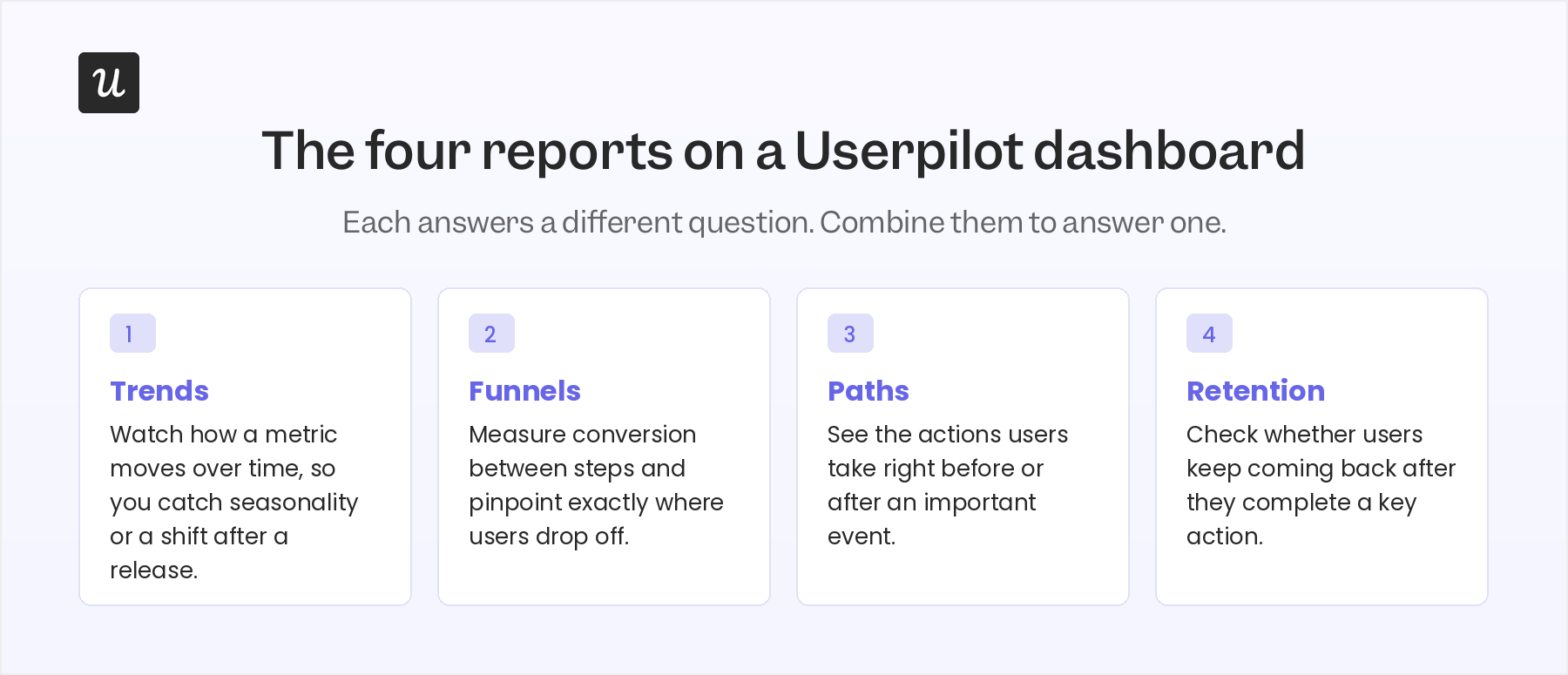
Four report types do the heavy lifting, and each answers a different kind of question:
- Trends for watching how a metric moves over time, so you can catch seasonality or a shift after a release.
- Funnels for conversion funnel analysis: measuring conversion between steps and pinpointing where users drop off.
- Paths for seeing the actions users take before or after an important event.
- Retention for checking whether users keep coming back after they complete a key action.
Dashboards also take text blocks, which sound trivial until you use them well. I drop a text block above a group of reports to document the hypothesis we are testing, or to tell a teammate exactly what to look at first when they open the view cold.
Everything on the dashboard is movable. You can rearrange reports with drag-and-drop, resize them to give the most important metric more room, and filter the whole view by user properties, company properties, segments, time period, and platform where your workspace has Userpilot mobile enabled.
The rule I hold every dashboard to is simple: it should answer one business question, not accumulate into a junk drawer of unrelated reports. If a new report does not help answer that question, it belongs on a different dashboard.
Five dashboards worth building and the questions they answer
The point of a custom dashboard is not to catalog every report you could make; it is to answer a specific question a team keeps asking. Here are five workflows I see teams build around real decisions.
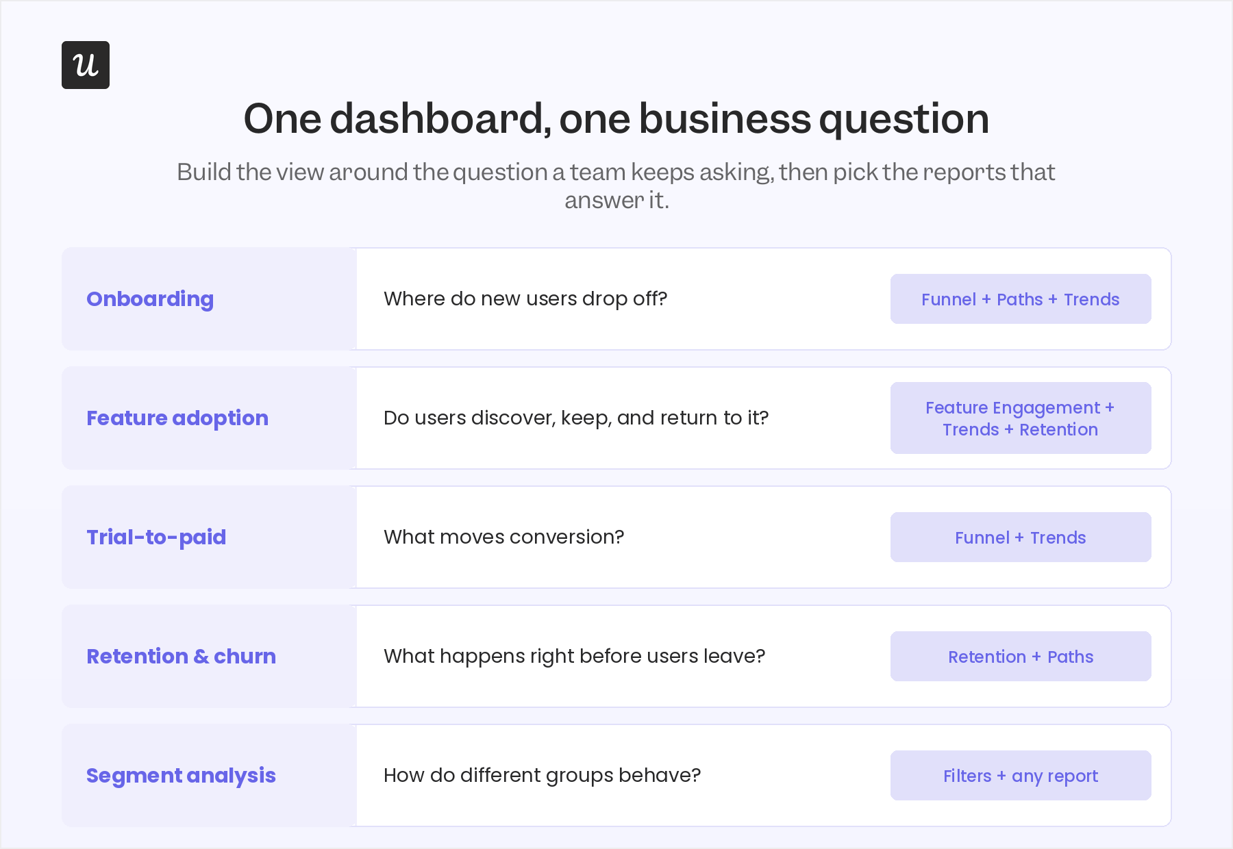
For onboarding performance, combine a funnel, a paths report, and a trends report. The funnel shows where new users abandon onboarding, paths shows what they did right before they gave up, and trends tells you whether last month’s fix moved completion.
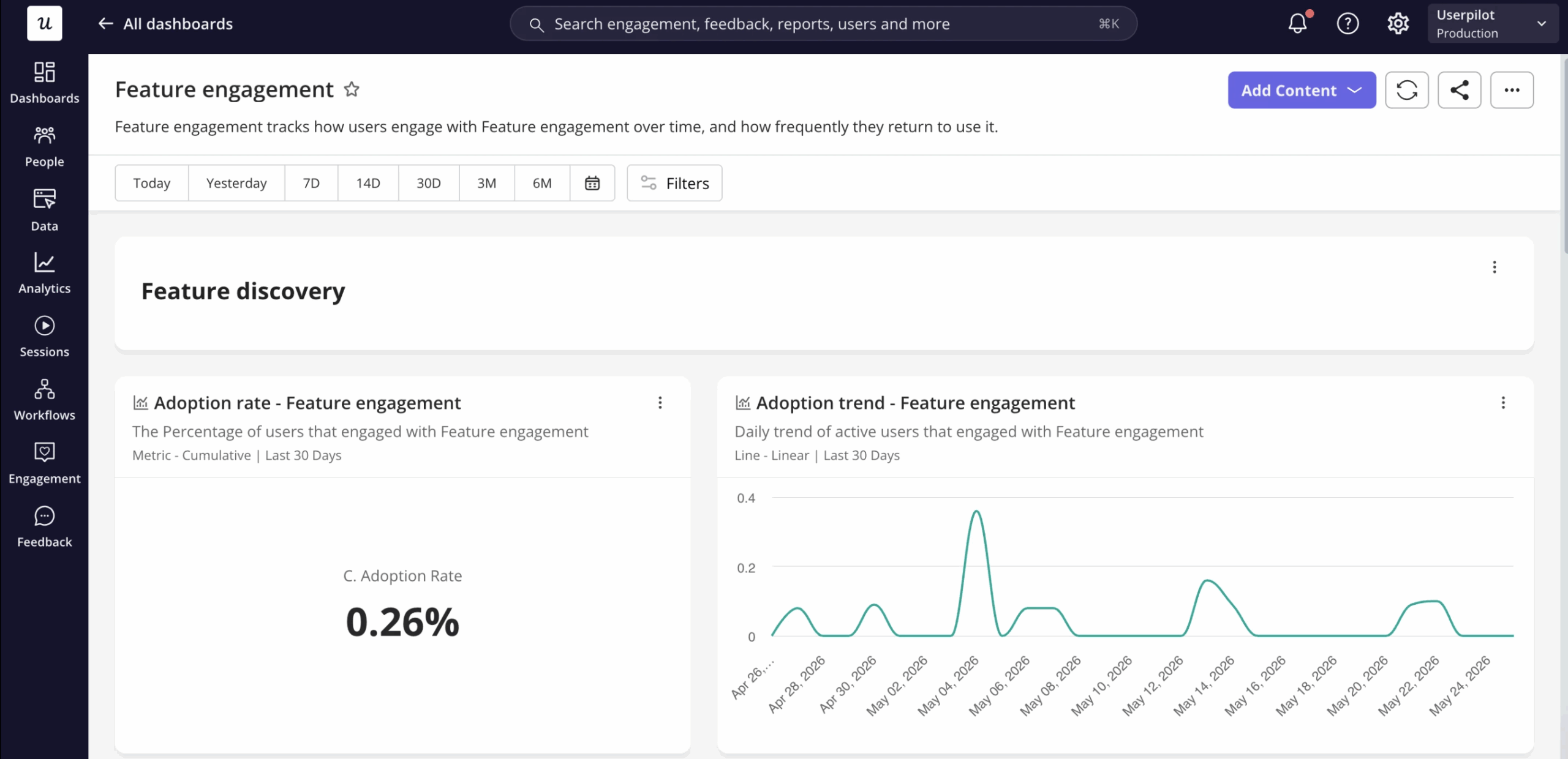
For feature adoption, pair feature engagement with trends and retention. Together they tell you whether users find a feature at all, whether usage holds up week over week, and whether people come back to it after the first try instead of bouncing off.
For trial-to-paid conversion, a funnel and a trends report are usually enough. You can watch the conversion rate, track time-to-convert, and see whether an onboarding or pricing change shifted paid conversions rather than guessing.
For retention and churn, put a retention report next to a paths report. Retention shows when users tend to disengage, and paths surfaces the churn prediction signals, the behaviors that typically happen right before someone churns.
For segment analysis, filter one dashboard by user properties, company properties, or a saved segment instead of cloning it five times. Comparing how different customer groups behave is where you spot the opportunity for a more personalized customer experience in onboarding or engagement.
The through-line across all five is the same: build the dashboard around a business question or a workflow, never around a report type you happen to like.
How to create a custom dashboard in Userpilot
There are two ways to build a dashboard, and the right one depends on how standard your question is. A template is fastest when you are solving a common analytics problem, while building from scratch fits custom workflows or cross-functional reporting that no template anticipates.
Option 1: Start with a template
Reach for a template whenever your dashboard matches a common product analytics workflow. The reports and layout are already designed around a specific goal, so you skip most of the setup and start from something that already makes sense.
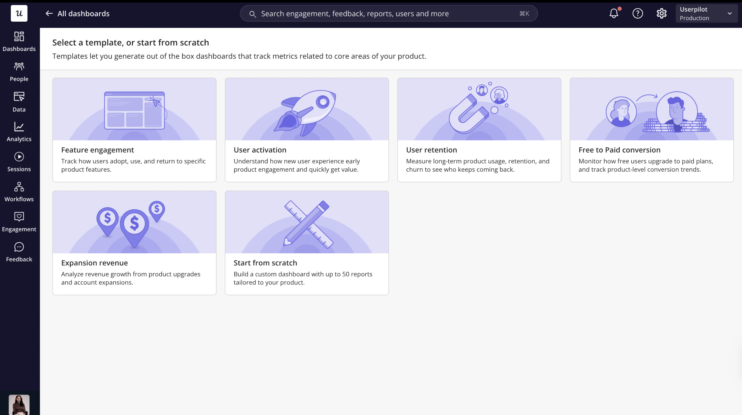
Userpilot currently provides three dashboard templates:
- Free Trial to Paid Conversion: Tracks new signups, conversions to paid customers, and the duration and trends of those conversions once you specify a signup event and a trial conversion event.
- Feature Engagement: Measures usage trends, adoption rate, and retention metrics for a given feature.
- Expansion Revenue & Upgrades: Tracks user upgrade patterns, monthly trends, and behavior before and after upgrades once you specify an upgrade event.
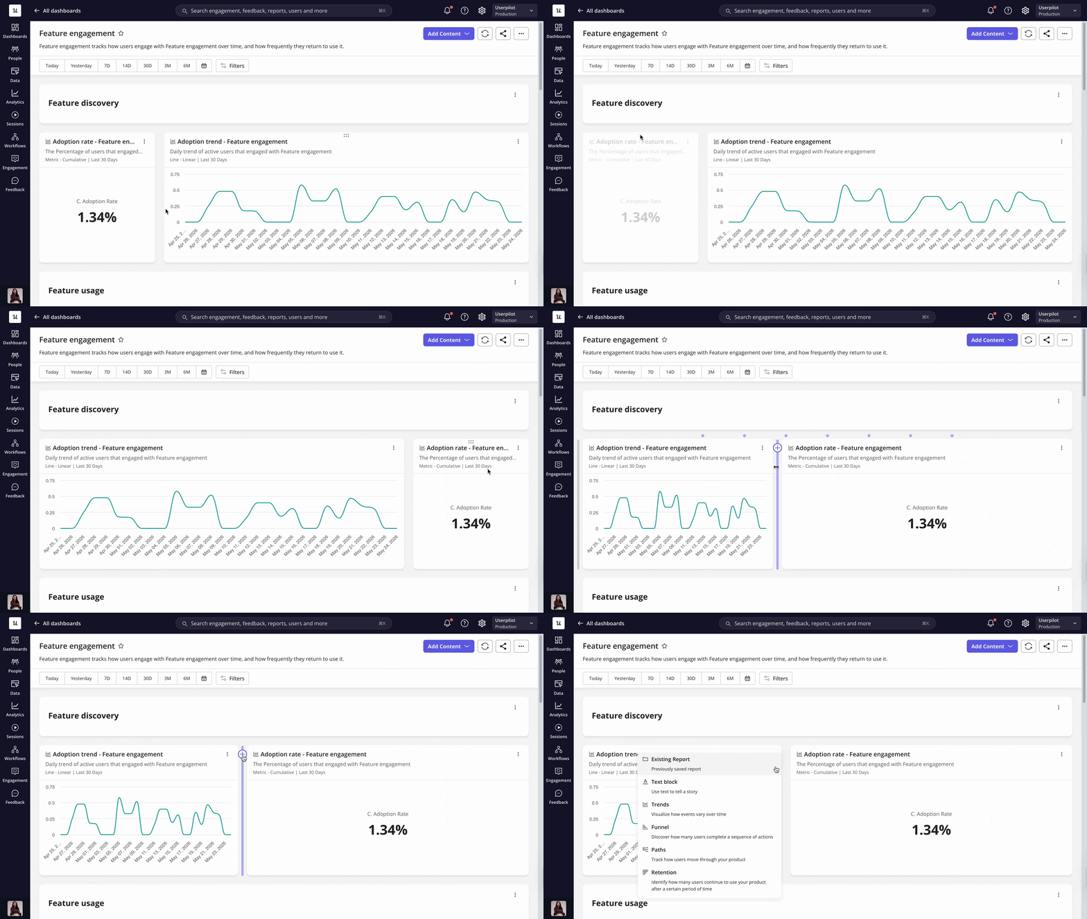
These templates are fully customizable, so you’re free to add or remove reports, adjust filters, resize widgets, and reorganize the layout after the dashboard is created.
Creating a dashboard takes only a few steps.
- Head to Dashboards, click Create dashboard, and select the template that best matches the business question you want to answer.
- If the selected template requires additional setup, choose the event or events it should analyze so Userpilot can populate the dashboard with the appropriate reports.
- Once the dashboard is created, customize it by adding or removing reports, adjusting filters, resizing widgets, and rearranging the layout to match your team’s goals.
Option 2: Build from scratch
Building from scratch is the better choice when your business question spans multiple workflows or doesn’t fit one of the available templates. It gives you complete control over the reports, layout, and supporting context that appear on the dashboard.
- From the dashboard creation screen, choose Start from scratch.
- From there, add existing reports or create new Trends, Funnels, Paths, or Retention reports directly inside the dashboard. You can also insert text blocks to explain metrics, document assumptions, or provide context for teammates.
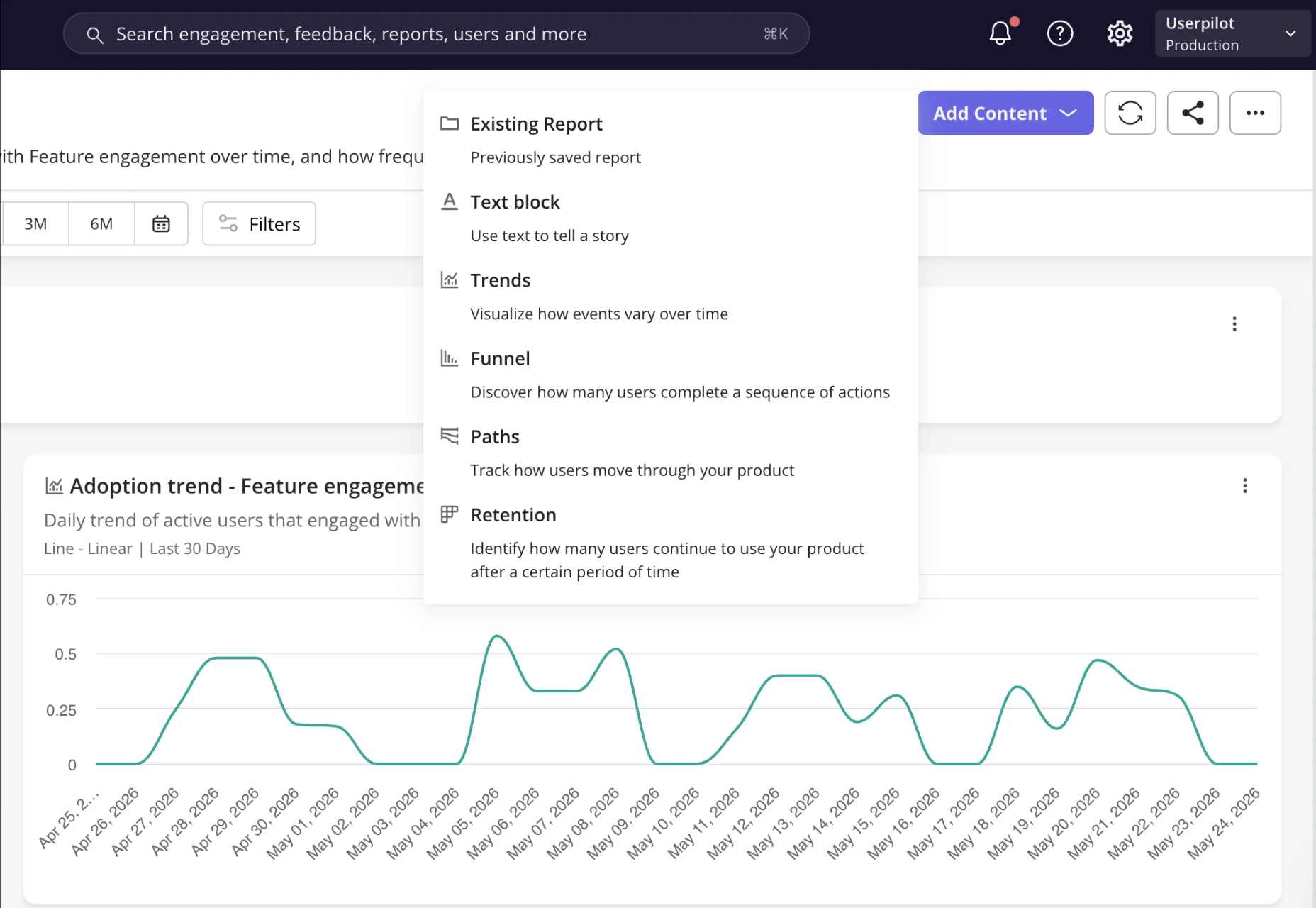
- Continue adding reports until the dashboard answers your business question. A single custom dashboard can include up to 30 reports, giving you enough flexibility to organize multiple related analyses in one place.
My one recommendation is to organize reports by workflow rather than report type. For example, keep all onboarding-related reports together so teammates can understand the entire journey without jumping between different sections of the dashboard.

Customize, share, and maintain your dashboards
Building the dashboard is only step one. As product goals shift, the dashboard has to shift with them, or last quarter’s reports start quietly competing with this quarter’s priorities for attention.
Customizing is mostly about emphasis. Rearrange and resize reports so the metric that drives the decision is the biggest thing on the screen, and group related reports so a teammate can read a whole workflow without hopping between dashboards.
Filters are how one dashboard serves many audiences. Rather than cloning a view for every scenario, filter the same dashboard by user properties, company properties, segments, timeframe, or platform where your workspace supports it.
Sharing keeps everyone arguing over the same numbers instead of building duplicate reports in private. You can share a dashboard with teammates, and when someone needs a single chart for a deck, individual report tiles download as PNG files. Frequently used dashboards can also be added to Favorites, and you can keep up to five there for quick access.
Maintenance is the part everyone skips. I review my dashboards on a schedule to cut reports that no longer earn their place, update filters that have drifted, and confirm every remaining report still backs a real decision.
This is also where Userpilot user analytics stops being a thing you check and starts checking itself. Lia, our AI agent, monitors your analytics, surfaces meaningful changes, and helps you investigate an unusual trend faster than you would by opening dashboards one at a time, with the exact capabilities depending on what your workspace has enabled.
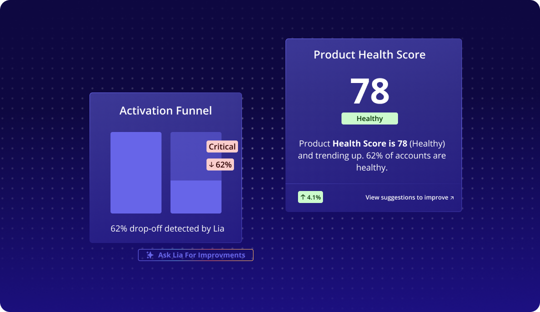
That shift, from operating dashboards to supervising what an agent flags, is where our CEO Yazan Sehwail thinks product work is heading.
“You’re no longer operating. The AI is operating. You’re just basically evaluating and monitoring the agent workflow.” — Yazan Sehwail, CEO of Userpilot
Best practices for dashboards that stay useful
Features are easy to explain and easy to misuse, so these are the habits that keep a dashboard valuable as your product grows. Most of them come down to restraint.
- Build the dashboard around one business question. Every report should contribute to answering it.
- Build separate dashboards for separate audiences rather than one dashboard for everyone. Product managers, leadership, customer success, and growth teams ask different questions, so each view should stay pointed at a single audience or workflow.
- Combine complementary reports instead of leaning on one number. A Funnel report points you toward conversion funnel optimization, a Paths report tells you what led to the drop-off, and a Trends report tells you whether your fix worked over time.
- Keep it uncrowded. When a report stops influencing a decision, delete it, because every extra chart raises the odds a teammate anchors on the wrong one.
- Review dashboards as goals evolve so stale reports do not distract from current priorities. This is the same maintenance discipline as above, and it is worth repeating because it is the first thing to slip.
- Lean on Lia to surface changes faster where it is available, but validate anything important by opening the underlying report before you act. I treat every signal, whether it comes from Lia, a teammate, or my own read of a chart, as an experiment to test.
One last thing that charts alone will never give you is the reason behind the behavior. Pair your quantitative dashboards with qualitative user feedback like survey responses, because the numbers tell you what changed while the words tell you why, and you need both to act with any confidence.
Turn dashboards into faster decisions
A custom dashboard is only useful when it helps your team answer a question faster. Instead of trying to track everything, build each dashboard around one goal, choose the reports that support it, and update it as your priorities change.
If you want to see how Userpilot custom dashboards and Lia can help your team monitor product performance, book a demo.
About the author