Conversion Funnel Optimization Explained (+ Strategies)


How much paid traffic is compensating for a poor conversion funnel optimization?
I did the math. The median conversion rate of SaaS landing pages is 3.6%. Plus, our own benchmark report showed an average activation rate of 37.5% and a median adoption rate of 16.5%.
So, according to these stats, sending 10,000 visitors to a landing page will only result in 59 adopted users. Assuming an optimistic CPC of $5, that’s $841.75 per user who churns instead of adopting the product organically.
Despite this, I’ve found that a “leaky” funnel is not about traffic or CPC, but about clarity. Here’s how I analyze, diagnose, and repair broken funnels using a product-led approach:
What is conversion funnel optimization?
Conversion funnel optimization is an iterative process of increasing the percentage of users who move from one stage to the next (e.g., visit > signup > activation > retention > expansion). It involves measuring users’ progress (e.g., via funnel or path analyses) and optimizing each step in their journey to reduce drop-offs.
Marketing funnel vs. PLG funnel vs. revenue funnel
A conversion funnel might involve very different steps depending on whether you’re in marketing, sales, customer success, and so on.
Here are different types of funnels to consider:
- Marketing funnel: The main goal is to generate marketing-qualified leads (MQLs) for sales. The funnel stages start with generating brand awareness with marketing strategies, followed by interest, consideration, and finally lead capture.
- Revenue/sales funnel: This is usually a part of the funnel that’s owned by sales, RevOps, or product marketers. It involves converting leads into paying customers, followed by retention, expansion (via upsells/upgrades), and customer loyalty.
- PLG funnel: This is a growth-focused funnel that usually follows the customer lifecycle stages. A typical model for this is the AARRR framework (acquisition, activation, retention, revenue, and referrals), which attaches a metric to each stage of the funnel.
Note: The number of funnel stages and their names might vary by company and industry. So for the sake of consistency, we’re going to focus on the AARRR-based funnel for PLG companies.
What are the conversion funnel stages?
When I talk about SaaS conversion funnels, I refer to the specific set of steps a user must take to achieve a goal. For PLG companies, this goal isn’t about achieving a milestone, but about nurturing a cycle of acquisition > retention > referral > more acquisition.
For example, here’s what this funnel looks like in Userpilot:
- Acquisition: Our marketing team creates valuable content to drive awareness and encourage prospects to book a demo or get a free trial.
- Activation: Once a user gets access to our product, the goal is to help them experience its value as soon as possible (e.g., creating the first onboarding process without coding)
- Retention: After the activation stage, we make sure that our users fully adopt Userpilot’s core features. The goal is to turn them into paid users so they can use the product on a daily basis.
- Revenue: Once users are used to Userpilot’s core features, we introduce them to secondary features that are relevant to their needs (e.g., advanced analytics, session replays, emails, etc.) Here, besides generating revenue expansion via upgrades, our goal is to convert them into power users.
- Referral: This final stage is where we reach out to our power users and give them incentives to share our product (e.g., implementing loyalty programs, gifts, etc). The goal is to do a full circle and bring new users via referrals to start the cycle again.
9 High-impact strategies to optimize your conversion funnel
Now that we’re clear about the conversion process, let’s go over the main 9 strategies I follow to minimize friction in our PLG conversion funnel:
1. Map the happy path (macro view)
Before applying any other strategy, my first action is to diagnose the largest conversion gap in our funnel. This diagnosis dictates whether we focus on fixing acquisition, activation, or free-to-paid conversions.
To do this, I love creating funnel reports. This gives me a macro view of the necessary steps a user must take to advance in the customer journey. These macro steps might look like this:
- Land on the home page.
- Click Sign up.
- Verify email.
- Create the first project.
- Invite a teammate.
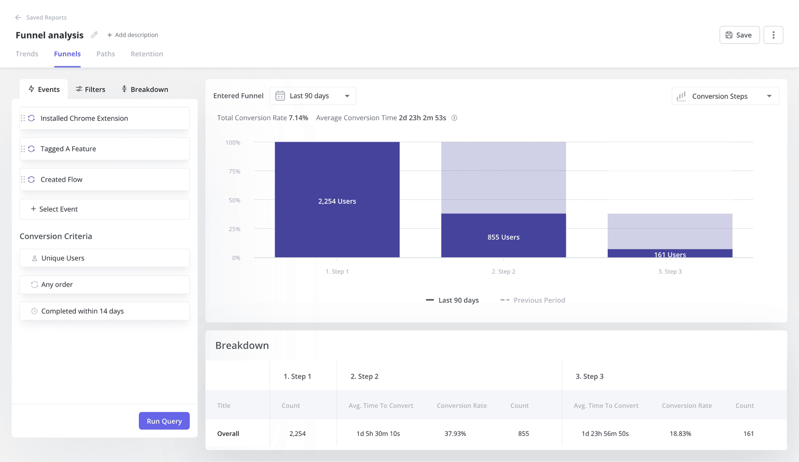
This conversion funnel analysis lets me isolate specific drop-off points. For example, if 60% verify their email, but only 10% create a project, the design failure may lie in the product’s empty state, not the landing page.
The funnel chart also leaves room to track why users drop off. Are they going to the pricing page? Are they looping back to the dashboard? Or are they just hitting the documentation? If I see users constantly navigating to the help center during onboarding, it’d be a sign of design failure.
Metrics to track
For funnel charts, the best is to focus on metrics that reflect stage-to-stage conversion health. This will vary based on your product, but some metrics for this would include:
- Sign-up page conversion rates for acquisition.
- Percentage of users who perform the activation task (a.k.a. activation rate).
- Drop-off rate between stages.
- Conversion rates of each customer acquisition channel (e.g., Google Ads, SEO, Meta Ads, etc).
- Free-to-paid conversion rates.
2. Track the actual path (micro view)
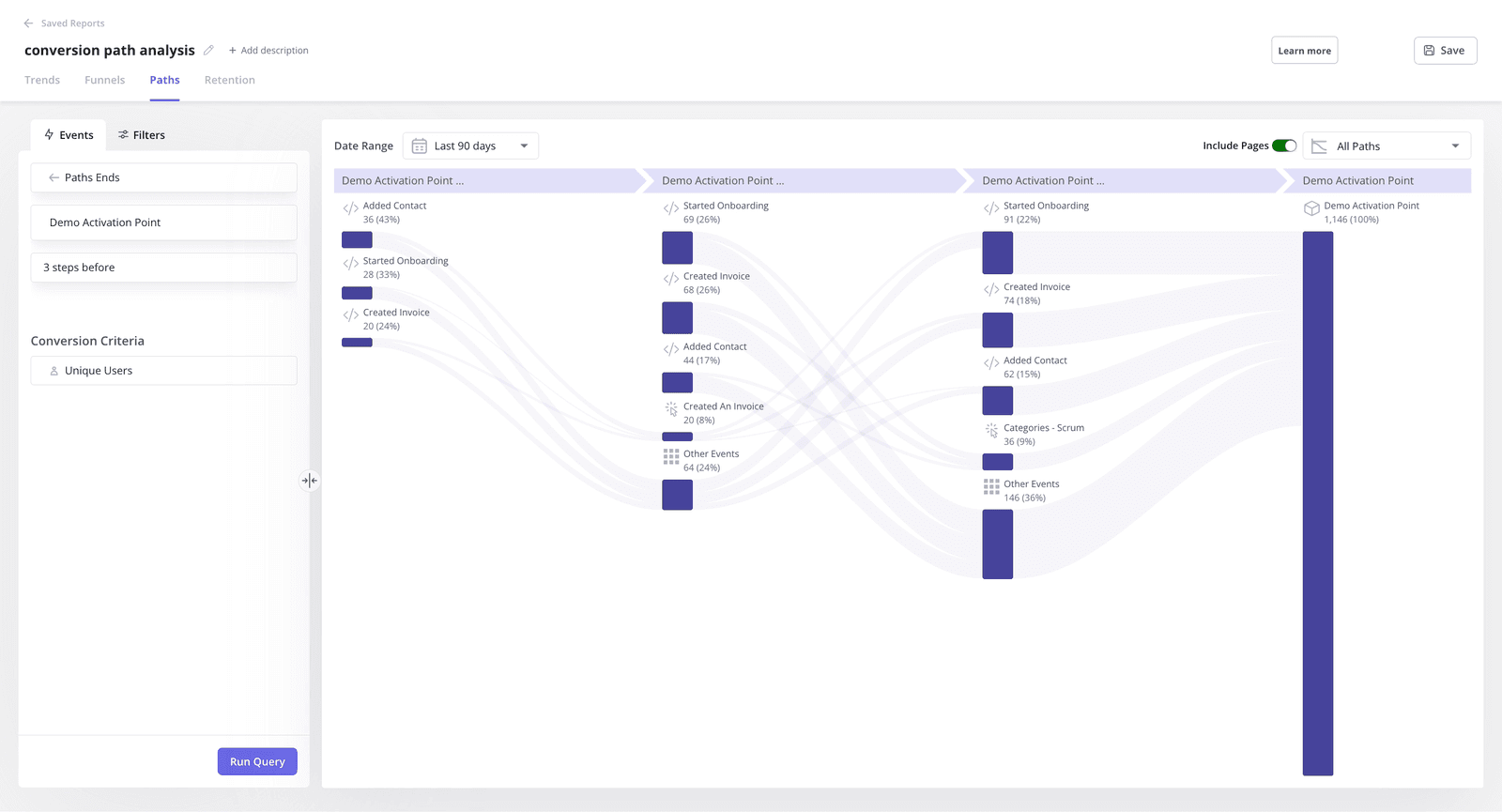
Besides following the macro steps, I also analyze the micro actions that users perform within a funnel stage.
This is because users will rarely follow the happy path. And if I can spot deviation patterns, then I’ll be able to find a solution for it.
To analyze these micro steps, I prefer using path analysis. It lets me visualize the sequence of actions that users follow in our product. And within it, I can spot how users are deviating from the happy path and understand their intent. For example:
- When users keep coming back to the pricing page, they might be confused about how much they’ll spend.
- If a user visits the dashboard page multiple times in a session, maybe they’re getting lost in the product.
- If a user stops using a feature to read documentation, then the UI failed to be intuitive.
Metrics to track
For the micro steps, I prefer to focus on very specific data points that reflect friction. For example:
- Path deviation frequency (percentage of users who deviate from the happy path).
- Number of pricing page revisits before signup.
- Loop completion rate (the percentage of started loops that are completed).
- Customer effort score (CES) via in-app surveys.
3. Watch the struggle (identify the “why”)
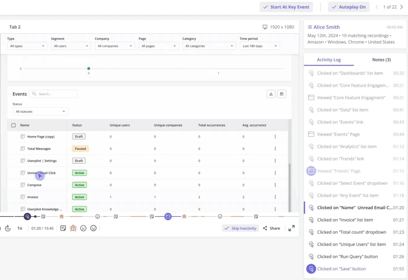
While quantitative data tell what happened, session replays show why.
I know seeing a user struggle with a form field I designed is painful, but it’s the fastest way to fix user friction. That’s why once I’ve identified multiple friction points, I then watch the recordings to look at:
- Rage clicks: Furious clicking on unresponsive elements.
- Thrashed cursors: Wild mouse movements or hovering without clicking; it signals cognitive load and confusion.
- Error clicks: Specific taps/clicks that lead to an error inside the product.
- Dead clicks: Taps/clicks that don’t do anything inside the product.
Cleeng, for instance, made a change in their user interface powered by Userpilot’s reporting that led to a 92% drop in feature usage. And the team’s only way to fix the issue was to use session replays to understand that it happened due to a button placement.
“Session replays were super useful when we changed the navigation. We could see what exactly the users were clicking and if they were visiting the pages we want them to visit.” – Anna Sobiak, Product Designer.
Metrics to track
Although session replays are qualitative, there are a couple of metrics that help me analyze user behaviors, including:
- Task abandonment rate (percentage of users who start but don’t complete a task).
- Rage click frequency (signal slow loading speeds or confusion).
- Dead clicks frequency (shows if the UI is too hard to understand).
- Session duration. Unlike marketing pages, the less time it takes for users to complete a task, the better.
4. Segment users to personalize their experience
A website visitor is only valuable if their intent matches the offer. Bringing cheap website traffic will only bloat the numbers without increasing sales in a significant way.
So, to optimize the top of the funnel (TOFU), I actually add more steps to bring users down the funnel.
Usually, adding more steps will reduce conversions because of friction. But by segmenting users and using personalized content, I’ve found that adding the right step increases the quality of conversion.
An example of this is when we trigger a welcome screen after a user logs in, asking, “What is your main goal today?”
Then, depending on their answer, they’ll follow a personalized onboarding flow. If they say that they want to send email marketing campaigns, then the flow will lead them directly to the email feature. Ultimately, the result is improved customer satisfaction compared to a non-personalized product tour with “less friction”.
Metrics to track
Personalization will usually improve conversion rates, but there are other metrics to determine if it’s working, including:
- Activation rate of core features.
- Completion rate of each personalized onboarding flow.
- Time-to-value of each user persona.
- Page quality score (from Google Ads) to measure if a landing page matches the audience’s intent.
- Bounce rates for each landing page or target audience.
5. Engineer the Aha! moment
In the PLG funnel, activation is the inflection point that sets the user on the path to becoming a life-long customer.
This is why we’re obsessed with providing value as soon as the user logs into our product. For which I always ask myself these three questions:
- What action indicates readiness for upgrading?
- What signals suggest confusion?
- Is the experience relevant to the user or disrupting it?
To optimize activation, many people think adding in-app guidance will only annoy users and create friction.
But what I’ve found is that, instead of bombarding users with pop-ups upon login, triggering flows based on specific in-app actions leads to shorter time-to-value. For instance, if a user clicks the “Reports” tab, then showing a native tooltip on how to export data adds more value rather than being an obstacle.
The key difference is that most product tours are passive. They sit there waiting for the user to pay attention. Whereas contextual guidance requires the user to take action, building familiarity and reducing friction.
Metrics to track
Besides activation rates, there are more sensitive metrics that might tell different stories, including:
- Time-to-value (TTV), specifically from signup until completing the activation task.
- Retention rate across different time frames (day-1, day-7, and day-30) and cohorts.
- Onboarding checklist completion rates.
- Percentage of users completing a key task in the first session.
6. Gamify the onboarding sequence
You might think that gamification belongs to the domain of B2C apps like Duolingo.
But some of its practices are also very useful for B2B SaaS: adding scores based on completed tasks, streaks, achievements, or simply adding funny animations are perfectly mappable to B2B software.
Plus, the best stage to add gamification is during onboarding. My go-to tactic is to embed an onboarding checklist that leverages the Zeigarnik effect: our psychological need to finish incomplete tasks.
This means adding pre-completed steps (mark “Create Account” as done) to create immediate momentum, including progress bars so users feel motivated to finish the task, and giving rewards to users who achieve the activation task (i.e., the final item).
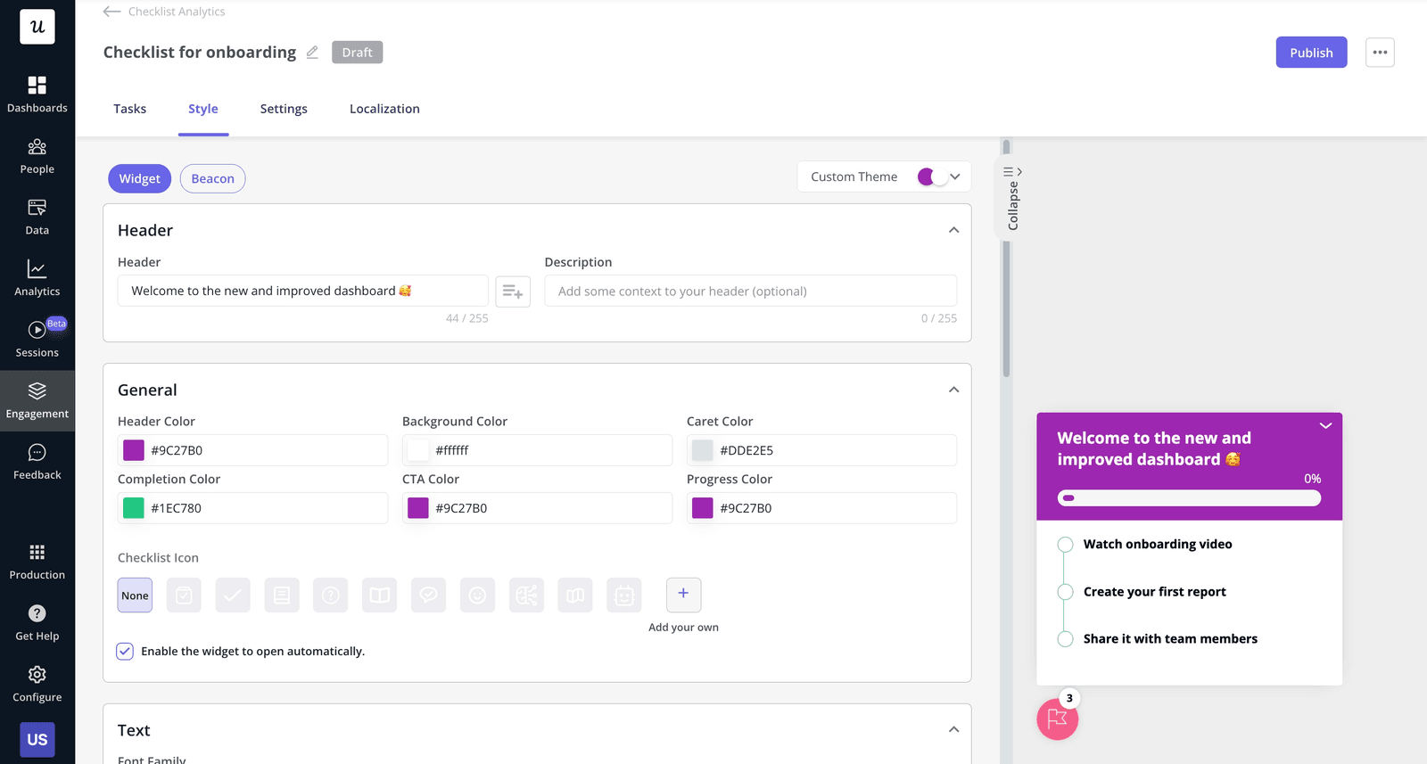
Sked Social, for example, tripled its free-to-paid conversion rates when adding a gamified checklist that included the three elements I just mentioned.
Metrics to track
To measure customer engagement, track metrics that reflect how users interact with gamified elements, such as:
- Checklist completion rate.
- Drop-off rates between checklist steps.
- Checklist completion time.
- Usage of gamification features (e.g., leaderboards, accomplishment page, receiving rewards, etc.)
7. Embed an always-on support layer
Users will get stuck in the funnel, and depending on how you manage it, you might send them to a competitor. In fact, 73% of consumers will switch to a competitor after multiple bad support experiences.
To avoid this, support must be both instant and self-serve, with a human safety net for high-value accounts.
My best recommendation is to implement an in-app resource center widget for self-service support. This will connect the knowledge base to the product, and as a result, users will stay inside the app rather than opening a new tab to Google the documentation.
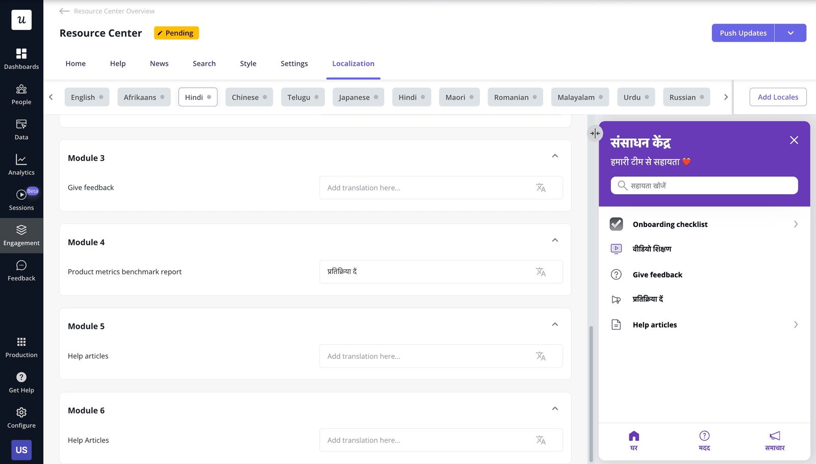
Plus, you can even allow the most impactful customers to book a call with their customer success manager right inside the product.
Metrics to track
Use any metrics related to resource center performance, including:
- Individual articles/modules views to see what issues are most common.
- Session abandonment rate after opening a help center.
- Correlation between article views and reduction in ticket volumes.
8. Deploy secondary onboarding
When a user activates a core feature, it doesn’t mean that they’ve adopted the product.
Once a user starts to use the product consistently, our focus shifts toward expansion revenue and support.
For this, my first step is to use behavioral segmentation to identify users who are ready for advanced features. For example, if a user has logged in 10 times but hasn’t used our “Team Collaboration” feature, I trigger a slideout showcasing the benefits of inviting their team.
This is secondary onboarding, and it’s how you drive expansion revenue. Companies like Chargezoom manage to triple expansion growth (from 1,38% to 4% in one quarter) this way. They added tooltips and step-by-step flows to nudge users toward features they would have otherwise missed.
“Most customers only used our product for one thing. They didn’t even realize all the other features that could make their lives easier until we started guiding them with tooltips.” – Erin Gordy, Director of Customer Success at Chargezoom.
Metrics to track
Key performance indicators for secondary onboarding include:
- Advanced feature adoption rate (segmented by cohort/plan/role).
- Time from activation to secondary feature activation.
- Feature usage frequency (segmented by cohort/plan/role).
- Customer lifetime value over time.
9. Close the feedback loop
In general, closing the feedback loop means collecting customer voice and responding to it by addressing user pain points. It’s a form of customer retention strategy that “reacts” to the user’s sentiment.
The common practice is to measure NPS to gauge user sentiment. But that misses the “reaction” part of the cycle, and what I do to close the loop is to automatically trigger tasks based on NPS responses. For instance, if a user is a “promoter,” I automate a follow-up message asking for a G2 review. If they are a “detractor,” I send it to the success team so they can reach out personally.
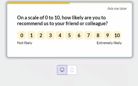
An example of this strategy is Unolo. They started regularly running NPS surveys and alerting the success team about detractors. The result? Response rates increased to 43.65%, and churn decreased by almost 1% after addressing negative feedback.
“I started using NPS, which was a really great feature because it gave us feedback almost instantly. This helped us get in touch with customers more quickly and understand their concerns with the product, which, in turn, helped us reduce our churn rate.” –Subhash Yadav, Product Marketer at Unolo
Metrics to track
Besides NPS, key metrics that help close the feedback loop include:
- NPS survey response rate (compare between relational vs transactional surveys).
- Click-through rate of follow-up messages to promoters/brand advocates (e.g., for referrals, reviews, customer testimonials, etc).
- Detractor resolution rate.
- Correlation between detractor outreach and churn reduction.
Sustaining funnel performance over time
Effective conversion funnel optimization is a continuous loop of hypothesis, design, and analysis. You’ll never have a perfect funnel simply because products and users are constantly evolving.
Instead, treat the funnel as the product experience. Use data to locate the leaks, segment your users by intent, and track customer behavior to guide your design. So, to implement the strategies I explained, start gathering data and improving your funnel’s performance.
FAQ
Why is it called a conversion funnel?
It’s called a funnel because the number of potential customers typically narrows as they progress through stages (many aware visitors → some signups → few convert).
What is an example of conversion optimization?
An example of conversion rate optimization (CRO) is A/B testing different versions of a landing page to figure out which one has higher signups. The traffic volume must be high enough so the results are statistically significant, and it’s even possible to perform multivariate testing to optimize individual elements (e.g., button placement, headers, forms, colors, etc.).
What is CTR and CVR?
Click-through rate (CTR) is the percentage of potential customers who clicked your link and visited your website (either from search engine results, email, or an ad).
Conversion rate (CVR) is the percentage of visitors/users who performed a desired action inside your website/app (e.g., a purchase, signup, filling a form, etc.).
About the author