Userpilot Cohort Analysis: Features, Pricing, Pros & Cons


If you are evaluating Userpilot cohort analysis, you probably have three questions: what it does, what it costs, and whether it is the right fit for your team. I am a product manager at Userpilot, so this is the honest version of that answer. Cohort analysis lives inside our Product Analytics suite, and the way it works today looks nothing like the feature checklist most review articles still publish.
Cohort analysis answers one question better than any other report: do users who joined or acted during a given period keep coming back, and how does that differ between groups? You group users by sign-up week, plan, or first action, then track how each group retains over time. A single average user retention number hides that pattern, which is exactly what a cohort view exposes.
Userpilot has changed a lot and is now a product experience platform that combines Product Analytics, in-app engagement, Session Replay, AI, and product feedback tools in one place. Cohort analysis is one report inside that system rather than a bolt-on feature.
The single most important buyer fact belongs at the top, because it changes who should keep reading. Retention Reports, which is where cohort analysis actually happens in Userpilot, are available on the Growth and Enterprise plans only. On the Starter plan, you get trends, and that is a narrower tool for this job.
I wanted to write something more useful than another feature list, so this guide does four things:
- Shows exactly how cohort analysis works in Userpilot, step by step.
- Covers the analytics and event data that feed a cohort report.
- Rebuilds the pricing from the current pricing model, since the old version had an error.
- Gives a balanced read on where Userpilot fits and where it does not.

How Userpilot cohort analysis works: Retention Reports
Userpilot runs cohort analysis through Retention Reports, one of the core reports in the Product Analytics suite. You open one from the Retention page in the navigation bar, or through the Create Report button on the Saved Reports page. The official Retention documentation walks through every setting if you want to follow along in your own account.
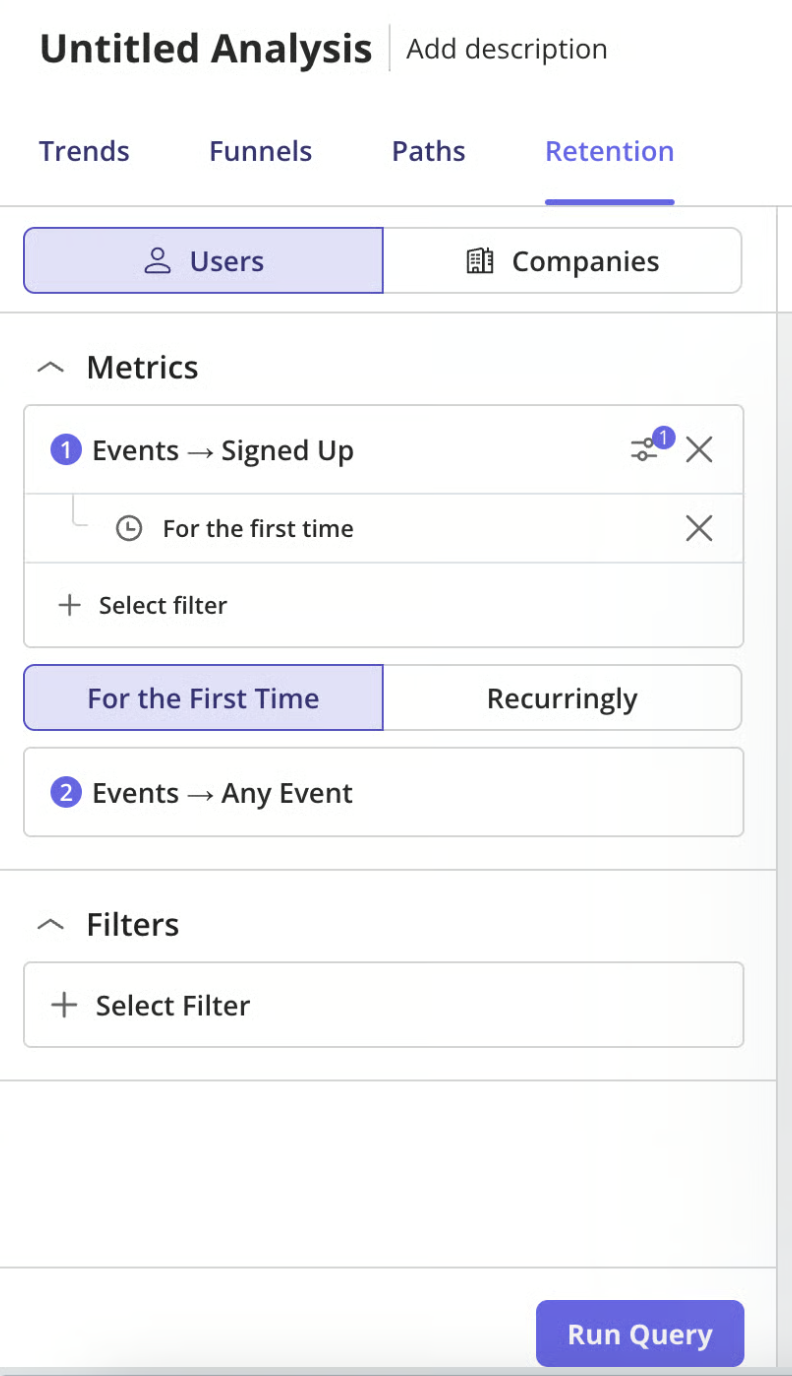
The first choice is whether to analyze data at the user level or the company level. User level suits self-serve and product-led motions where the individual is the unit that retains. Company level suits B2B accounts where you care whether the whole customer keeps coming back.
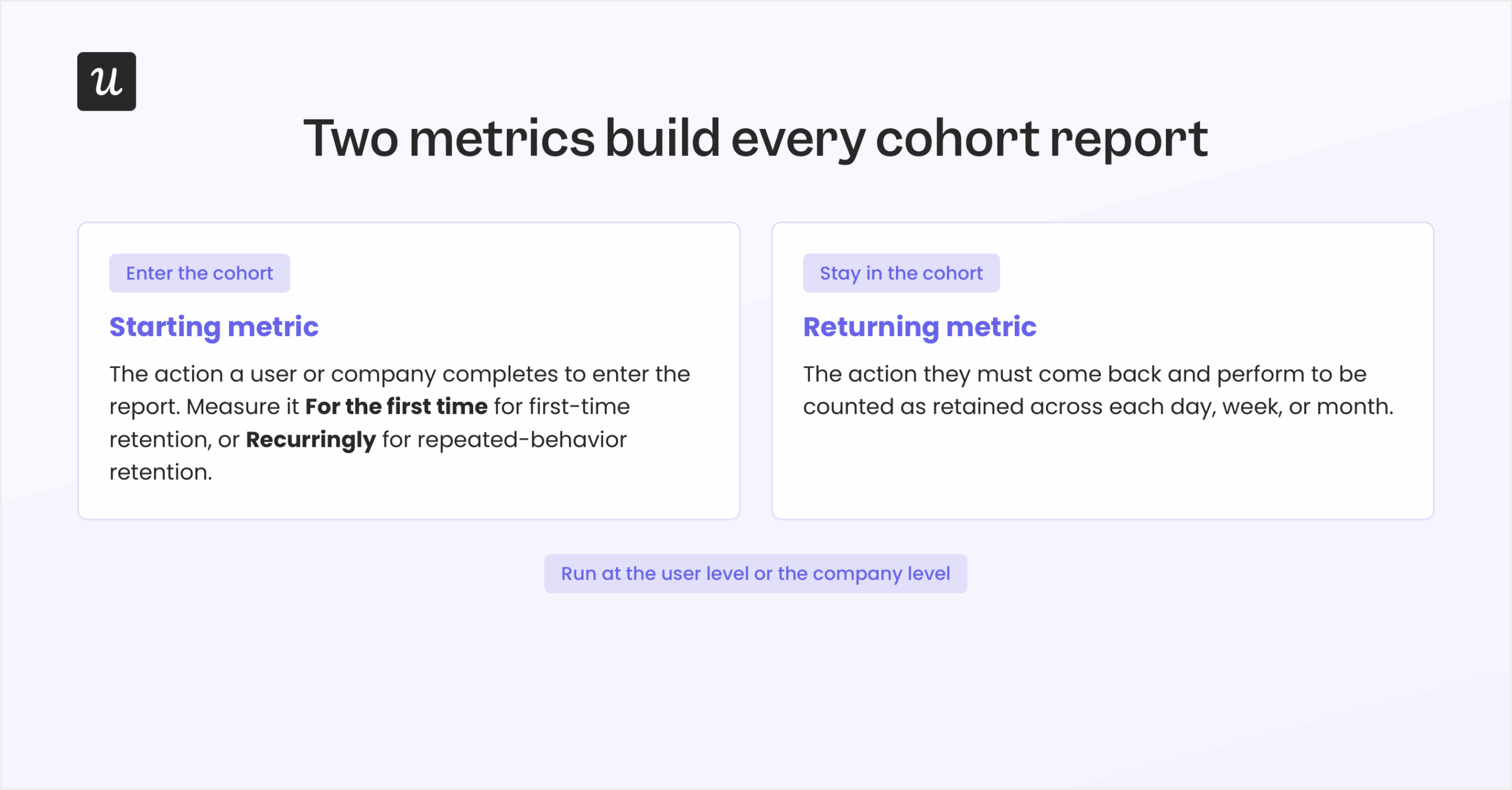
Every Retention Report is built from two metrics. The starting metric is the action a user or company must complete to enter the report. The returning metric is the action they must come back and perform to be counted as retained.
The starting metric can be measured in two ways, and the choice decides what kind of cohort analysis you are running. “For the First Time” counts users or companies only the first time they perform the starting action within the selected period, which is the classic cohort setup for questions like whether users return after signing up. “Recurringly” lets users re-enter the report every time they perform the starting action during the period, which is the right mode for repeated behaviors such as creating reports or completing a recurring workflow.
You then narrow the analysis with filters. The report supports event properties (inline filters only), user properties (on user-level reports), company properties, and saved user segments. Filtering by segment is what turns a generic retention chart into a comparison between acquisition cohorts or behavioral cohorts you actually care about.
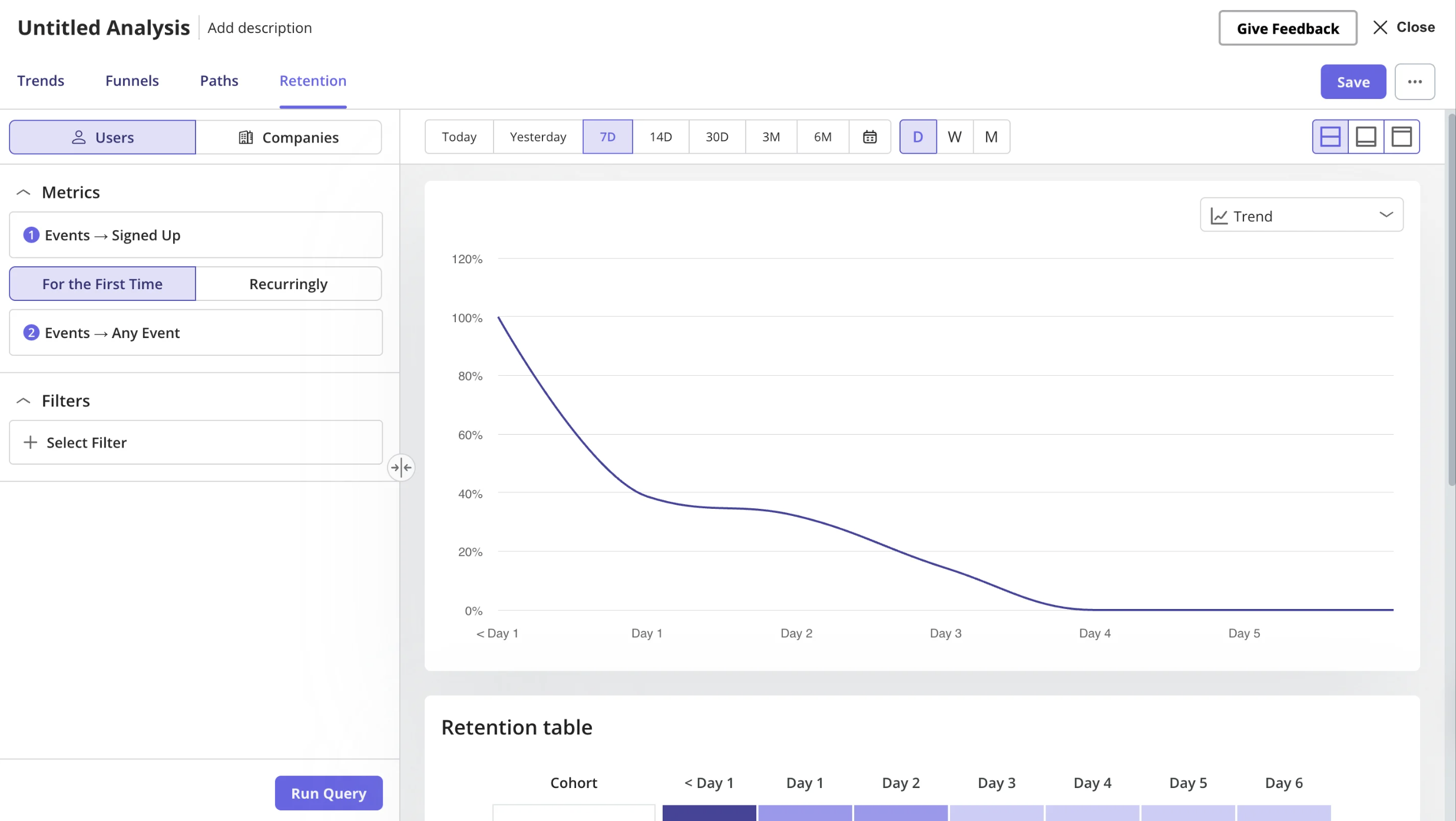
After you set the query, you customize the report before reading it. You pick the date range, the platform (web, mobile, or all platforms), the data point period (day, week, or month), and the report view. These are display choices, so you can change them without rebuilding the underlying cohort.
How to read a Userpilot cohort report (three views, one table)
Once the report is configured, you click Run Query to generate the results. Userpilot then lets you control how the retention data is displayed. The display options cover the chart period, the platform, the data point period, and the view layout.
Chart period is a preset range such as the past 7 or 30 days, or a custom window you define. Platform filters the report to web activity, mobile activity, or all platforms together. Data point period groups the data by day, week, or month depending on the reporting cadence you want, and the View control switches between a split view, a chart-only view, and a table-only view.
Retention Reports can be visualized three ways, and each one answers a different question. Here is when to reach for which:
- Retention Trend shows average retention and drop-off rate over time after the starting event. Use it to see how retention changes across days, weeks, or months and to spot long-term engagement patterns.
- Retention Metric shows the retention percentage for a specific period, such as Day 1, Week 1, or Month 1. Use it when you are tracking a single retention KPI over time.
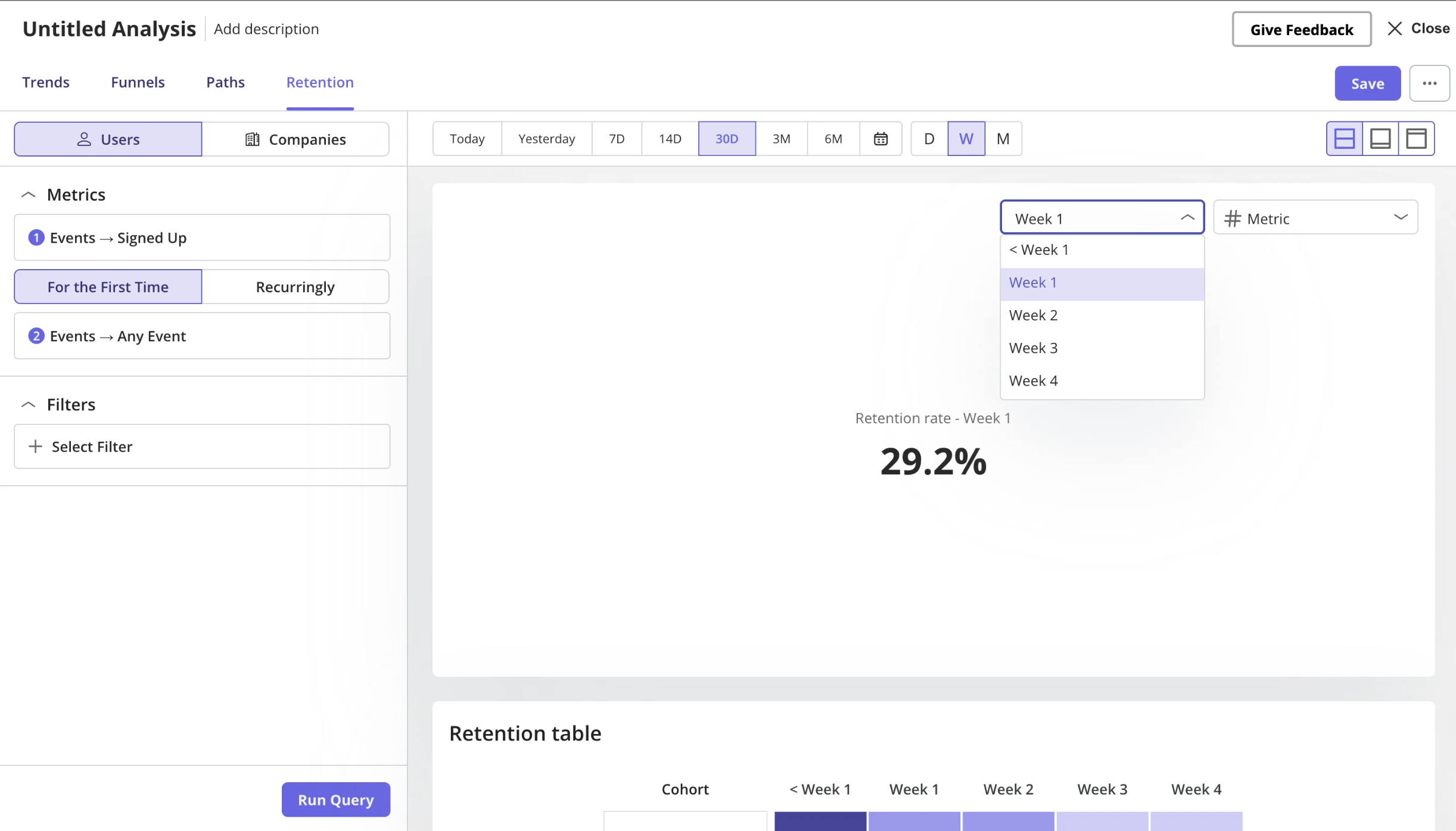
- Retention Table shows the full cohort table of retained and dropped-off users or companies for each day, week, or month, which makes it easy to compare cohort performance across different starting dates.
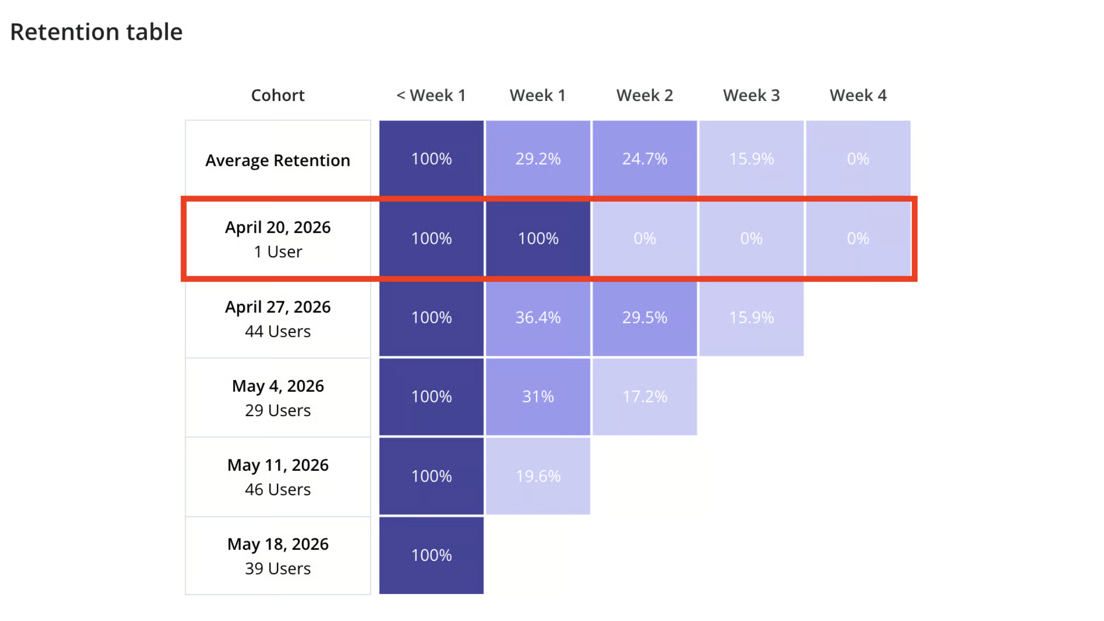
An example from Userpilot’s own documentation makes the retention table easier to interpret. Running a query with “Created Report” as the starting event and “Viewed Report” as the returning event, the highlighted row shows that 15 users created a report on October 6th. Of those 15 users, 66.7% returned to view a report that same day, and 33.3% of the original group returned the next day, with the pattern continuing across subsequent days. Each row tracks the same cohort over time and shows when users stop returning.
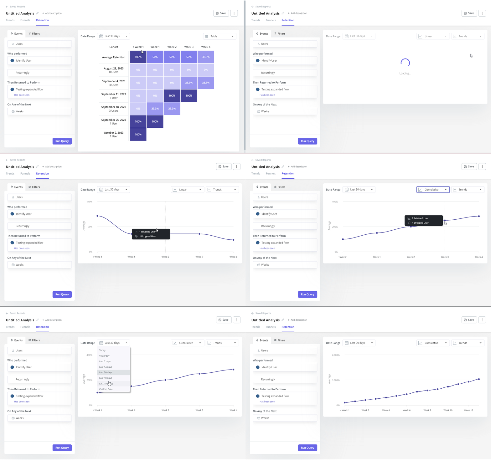
You can also read average retention as a line graph, in both linear and cumulative form, which is the fastest way to see the shape of the retention analysis before you dig into individual cohorts.
What feeds a cohort report (and why Starter falls short)
A Retention Report is only as good as the events behind it. Userpilot builds cohorts from the behavioral data it collects across your product, so the quality of your cohort analysis depends on how accurately those interactions are tracked and organized. That is where the data capture layer matters more than most buyers expect.
Userpilot supports several ways to collect the data a cohort report needs. Labeled Events are no-code events you create with the Visual Labeler, CSS selectors, or auto-captured raw events, and when Autocapture is enabled, they can even use historical data collected before the event was labeled. You can set these up without engineering support, which is the difference between shipping a cohort report this afternoon and waiting on a sprint.
Tracked Events are developer-defined and capture product interactions, backend actions, and extra event properties, so they are the right choice for complex workflows that cannot be captured visually. Custom Events combine multiple tracked or labeled events into a single event, which makes it easier to measure a whole workflow or trigger an experience from a broader action. Feature Tags and tagged pages let you measure engagement with specific features and pages so they can be analyzed in Retention Reports.
Content engagement rounds this out. Retention and other analytics reports can analyze interactions with Userpilot content itself, including flows, checklists, surveys, NPS surveys, emails, embeds, and workflows where supported. That means a user onboarding checklist can be both the thing you ship and the returning metric you measure.
Behavioral data gets far more useful once you combine it with Segments. Teams compare retention across free versus paid customers, enterprise versus self-serve accounts, geographic regions, or any saved user or company segment. Comparing segments is how a flat retention curve turns into an insight about which acquisition cohorts or power users stick.
I want to be transparent about the plan limits here, because they are the real catch. Starter includes basic segmentation with up to 10 saved segments, but Labeled Events, Custom Events, and retroactive event autocapture are reserved for Growth and Enterprise. If your cohort work depends on no-code event labeling or historical backfill, Starter will not carry it.
Cohort analysis is only half the job: Pairing it with the rest of the platform
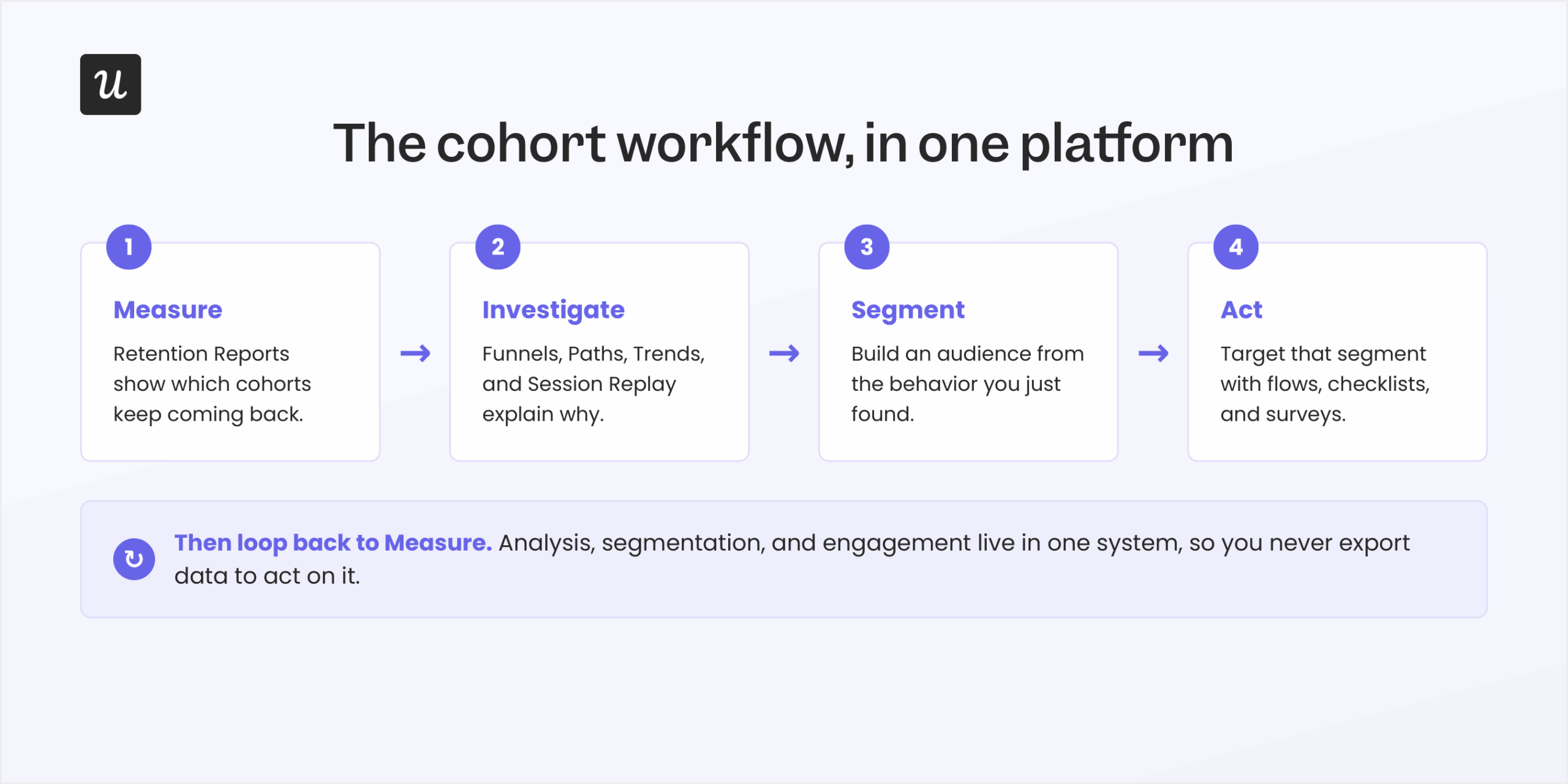
Retention Reports tell you which users stay engaged and which do not, but they never tell you why. The reason I rate Userpilot for this work is that the tools to investigate the why sit in the same platform, so you are not exporting cohorts into a separate product to chase them down. It helps to walk through the questions a product team asks after spotting a retention problem.
Why are users dropping off? Reach for Funnel analysis to find where users abandon onboarding, activation, or another key journey. Funnel reports show conversion between steps and highlight exactly where users fail to progress.
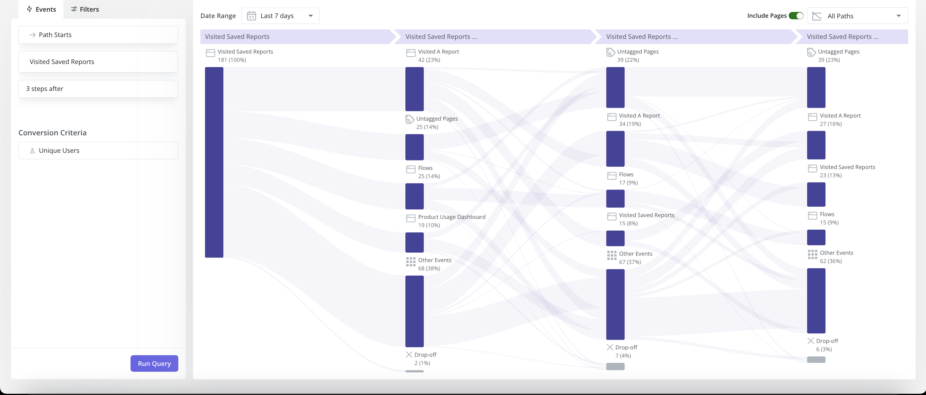
What did retained users do differently? Reach for Paths to map the sequence of actions users take before or after a key event. Comparing the navigation patterns of retained cohorts against churned ones surfaces the behavioral KPIs that go with successful product adoption.
Did our changes actually improve retention? Reach for Trends to watch a metric over time, whether that is feature adoption, engagement, DAUs, WAUs, MAUs, or a custom metric. This is how you confirm that an onboarding change moved the number after release instead of assuming it did.
What friction caused users to leave? Reach for Session Replay to watch recordings from the very users in your cohort. Instead of inferring the reason for a drop-off from charts alone, you observe the confusing UI or unexpected behavior directly.
How do we act on those insights? Build a segment from the audience you want to improve, then target it with in-app experiences such as flows, checklists, or surveys. Because analytics, segmentation, and engagement live in one platform, you can investigate a retention issue and launch a targeted fix without moving data into a separate user onboarding tool.
This is the part I would underline for anyone comparing tools. Userpilot’s advantage is not the Retention Report on its own, it’s the ability to move from analysis to segmentation to engagement inside a single system.
Separating human users from AI agents in a cohort
This section matters most if you are building an AI-powered product. When both humans and AI agents interact with your product, folding them into one cohort distorts retention, adoption, and engagement numbers. The signups look healthy while the humans behind the metric may be churning.
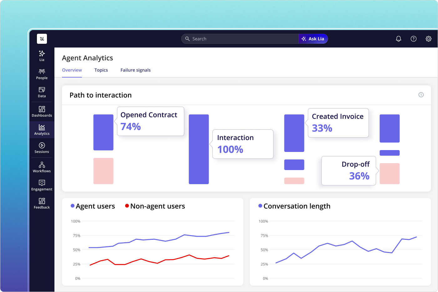
Userpilot’s AI Agent Analytics measures agent activity separately from human usage. Agent-generated events are analyzed on their own, so you can understand how agents perform without letting them contaminate your customer retention reports. Human retention analysis stays in Retention Reports, while Agent Analytics focuses on agent adoption, task completion, conversation quality, and business impact.
The problem this solves is not hypothetical. Frictionless, AI-assisted signups have created a wave of curious accounts that explore once and never return, and lumping them in with real users is the fastest way to misread a cohort retention curve. Our CEO Yazan Sehwail frames the shift behind this bluntly:
“As producing and building features become a lot cheaper, instead of every quarter you’re releasing one or two features, now you’re releasing 7, 8, 9. It becomes even harder for product teams to manually have to track each one and understand usage for each one.”
Lia, Userpilot’s AI analyst, complements these reports by monitoring product analytics, surfacing unusual changes, and helping teams investigate trends without checking dashboards by hand. For products with no AI agents, this whole capability is optional, and traditional Retention Reports, Funnels, Paths, and Trends stay the primary tools for cohort analysis.
Userpilot pricing and which plans include cohort analysis
Userpilot prices on monthly active users (MAUs) rather than event volume, which keeps costs predictable as your tracking grows. There are three plans, and the takeaway is simple: cohort analysis needs Growth or Enterprise. You can see the full breakdown on the pricing page.
| Plan | Price | What you get for cohort work |
|---|---|---|
| Starter | $299/month | Up to 2,000 MAUs, 3 seats, 1-year data retention, up to 10 segments. Includes in-app engagement, user segmentation, tracking, Trends, and NPS. No Retention Reports, Funnels, or Paths. |
| Growth | From $849/month | 15 seats, 3-year data retention, unlimited segments. Adds advanced Product Analytics, Retention Reports, Funnels, Paths, custom dashboards, Resource Center, advanced surveys, email engagement, and event autocapture. |
| Enterprise | Custom | Unlimited seats, custom data retention, premium integrations, Data Warehouse Sync, bulk import and export, custom roles and permissions, SAML SSO, and activity logs. |
The implication is worth stating plainly. Retention Reports, Funnels, and Paths are not on Starter, so a $299 plan gives you Trends and not a true cohort table. If cohort analysis is why you are buying, your real entry point is Growth at $849/month.
A couple of add-ons and limits shape the decision further. Session Replay, Unlimited Session Capture, and Mobile Engagement are paid add-ons on Growth and Enterprise, with 30-day replay retention on Growth and custom retention on Enterprise. Data retention itself is a real buying consideration, since Starter keeps data for 1 year, Growth for 3 years, and Enterprise offers custom retention, which decides how far back you can analyze historical cohorts.
Where Userpilot fits for cohort analysis, and where it does not
I would rather give you the balanced version than a sales sheet, so here is the current read based on where the product stands. The strengths are real, and so are the limits.
On the strengths side, Userpilot combines product analytics, session replay, segmentation, and in-app engagement in one platform, which is what makes it easy to act on a cohort insight without switching tools. Setup is no-code for event capture, segmentation, and report building, so a PM can run a cohort report without filing a ticket. Support is the point reviewers raise most consistently, and Userpilot holds a 4.6 out of 5 rating across roughly 950+ reviews on G2 (the exact count moves over time).
The limits deserve equal weight. Cohort analysis requires Growth or Enterprise, so Starter buyers only get Trends. Pricing is the most common criticism, especially the $299 Starter plan capped at 2,000 MAUs, and some reviewers mention a learning curve on the deeper analytics.
Two more honest notes. Teams that need highly specialized or custom analytics as their core use case may still pair Userpilot with a dedicated analytics platform. There is also no freemium plan, though a 14-day free trial is available without a credit card.
Who should use Userpilot for cohort analysis
This comes down to fit rather than features, so here is who gets the most out of it. The teams that win with Userpilot cohort retention analysis tend to share a pattern.
- Product teams on Growth or Enterprise that want cohort analysis alongside funnels, paths, and in-app engagement in one platform.
- Product, growth, and customer success teams that segment users by behavior and then target those segments with personalized in-app experiences.
- Teams building AI-powered products that need to analyze AI agent activity separately from human behavior.
It is a weaker fit for two groups. Teams on a tight budget hunting for a sub-$300 tool will feel the Starter ceiling, and organizations that need highly specialized, custom product analytics as their primary use case will likely want a dedicated platform for that job.
The bottom line on Userpilot cohort analysis
Retention numbers only tell you what happened. Cohort analysis helps you understand who stayed, when they dropped off, and how those patterns change over time. Userpilot brings those insights together with session replay, funnels, surveys, and in-app engagement, so you can investigate the reasons behind your retention trends and respond without relying on a separate analytics stack.
If you want to see how Userpilot’s cohort analysis works on your own product data, book a demo with the team.
About the author