How to Launch a Product Update Email in 2026 (+ Templates and Examples)


Launching a product update email sounds simple until you’re deciding what to announce, who should receive it, and how much information to include. Even the subject line carries more weight than most teams realize: Invesp research found that 47% of recipients decide whether to open an email based on the subject line alone.
This guide hands you a seven-step process for launching product update emails, plus 10 real-world templates you can model from companies like Stripe, Figma, Monday.com, and Webflow.

What goes into a product update email?
The best product update emails share seven core elements that work together to grow your product engagement score and feature adoption. Six of them have been table stakes for years, while the seventh is the one most teams still treat as optional in 2026.
- A personalized greeting that includes the recipient’s name and, when possible, references their specific product usage patterns or company.
- An engaging, personalized subject line that pairs curiosity with clear value. Personalized subject lines get 26% higher open rates than generic ones, where personalization means the recipient’s name, company, or a detail specific to them.
- Value-driven copy that focuses on user outcomes rather than technical specs. “Save 3 hours per week on reporting” lands harder than “Updated export functionality.”
- Visual elements like screenshots to show what changed in the interface, and GIFs to demonstrate the new workflow, so users aren’t guessing how to access or use the feature.
- A clear call to action that points users to try the feature immediately. Use a specific CTA, such as “Try the new dashboard in 1 click,” instead of a vague “Learn more.”
- A feedback request that asks users for their thoughts. It signals you value their input and helps you gather engagement insights for the next iteration.
- Mobile-first design, which is the element teams underrate most. Over 60% of email opens now happen on mobile, where clients like the Gmail app show only about 37 characters and iPhone Mail around 40, so the value has to land in the first few words, and the preview text has to carry its weight.
Types of product update email templates
I’ve found that companies that get this right match the email to both the update type and specific customer journey touchpoints. Here are ten templates that consistently drive adoption, each with a real example and the timing that tends to work best.
1. Beta testing invitation: Apollo’s AI Assistant
Beta invites need to balance exclusivity with honest expectations about bugs or incomplete features. Pick users with high engagement or those who’ve requested similar functionality, and send 2 to 4 weeks before the public launch. Defining your ideal beta tester first makes that segment far easier to build.
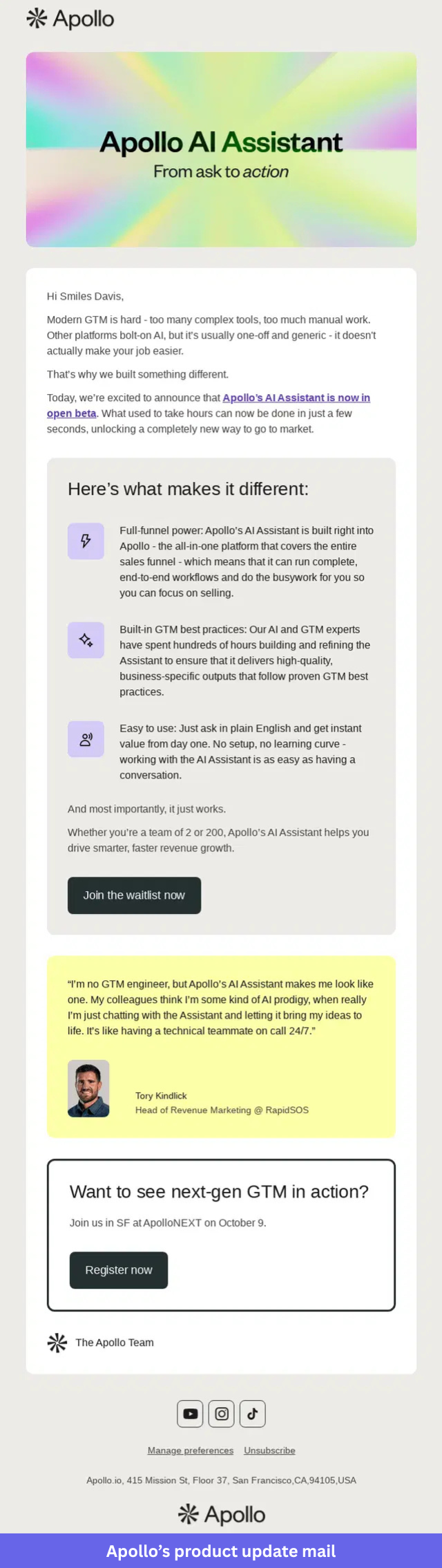
What I like about Apollo’s beta invite email:
- It starts with a problem the target audience already recognizes, creating context before introducing the product.
- The “Now in open beta” message sets clear expectations while still encouraging early signups.
- Focusing on a few specific benefits helps readers quickly understand the value of joining.
- A customer quote adds credibility, and the waitlist CTA gives readers one clear next step.
2. Product release email: Rebrandly
Product release emails announce that a new product, feature, or capability is now available. The goal is to explain why the release matters, what users can do with it, and how to get started.
Send these on launch day, when your audience is most likely to engage with the announcement, and keep the structure close to solid release notes.
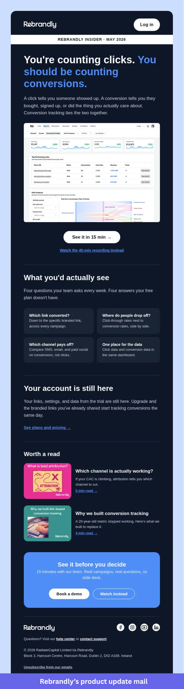
What I like about Rebrandly’s product release email:
- The headline focuses on the outcome rather than the feature itself. By comparing clicks and conversions, Rebrandly immediately shows why the update matters.
- Plain language carries the explanation. Readers can quickly understand the difference between tracking clicks and tracking conversions without learning new terminology.
- “What you’d actually see” connects the feature to questions users already ask. The examples make it clear how the update fits into everyday decision-making.
- Multiple learning options accommodate different preferences. Some readers can book a demo, while others can watch the recorded walkthrough before taking the next step.
3. New feature announcement: Flourish
New feature announcement emails help existing users discover and adopt recently released functionality. They work best for feature additions, enhancements, or new templates that expand what users can do inside the product.
Send these within the first 24 to 48 hours of release to drive early adoption and collect customer feedback early.
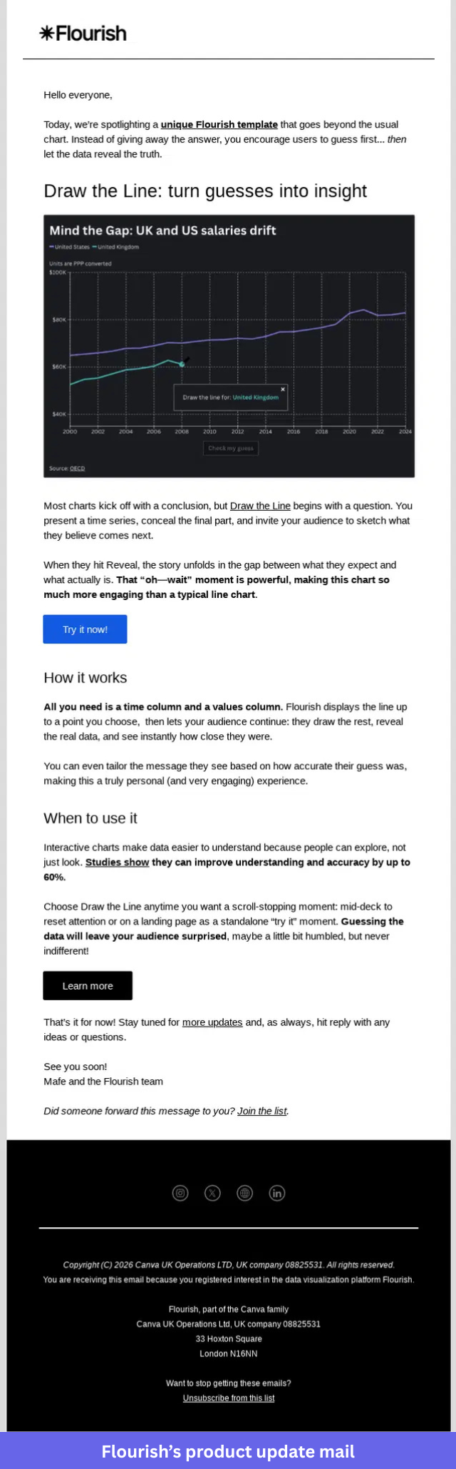
What I like about Flourish’s new feature announcement email:
- The headline explains both the feature and the outcome. Readers immediately understand that the template turns audience predictions into a more engaging data story.
- Flourish uses a real chart example instead of simply describing the template. Readers can see how the experience works before they click through.
- One section focuses on the idea behind the template. It explains why asking people to make a prediction first creates a more memorable experience when the data is revealed.
- Setup instructions are refreshingly simple. Users only need a time column and a values column to get started.
- Practical use cases give readers a clear picture of where the template fits. The examples cover presentations, reports, and landing pages, which connect the feature to real work.
4. Product revamp email: Miro
A major product redesign generally means asking people to relearn how they use your product. Product revamp emails announce these changes, and the messaging justifies why users need to adjust.
Send this email at least 1 to 3 days before changes go live so users have time to prepare, and where possible, let them switch back to the old UI so you don’t hamper their productivity.
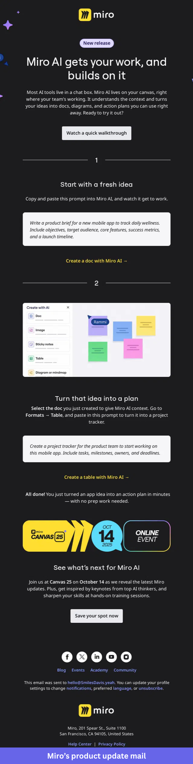
What I like about Miro’s product revamp email:
- Miro starts by explaining what makes its AI experience different. The opening message focuses on AI that works directly on the canvas, which gives readers a clear reason to pay attention to the update.
- Throughout the email, the headline reinforces a single idea. Readers quickly understand that the new experience is designed to build on existing work rather than start from a blank page.
- Real prompts show users how the updated AI works in practice. The examples feel relevant to everyday work and give readers something they can try immediately.
- Screenshots support each step of the interactive walkthrough. Users can see the interface, follow the process, and understand what to expect before opening the product.
- Several CTAs support different levels of interest. Some readers can watch the walkthrough first, while others can jump directly into the product and start experimenting.
5. Pricing change announcement: Stripe
Pricing change emails prepare customers for upcoming pricing updates. The goal is to explain what is changing, when it takes effect, and how it impacts each customer segment.
Send a price increase announcement 30 to 90 days before the change, depending on the size of the increase and the complexity of your pricing model.
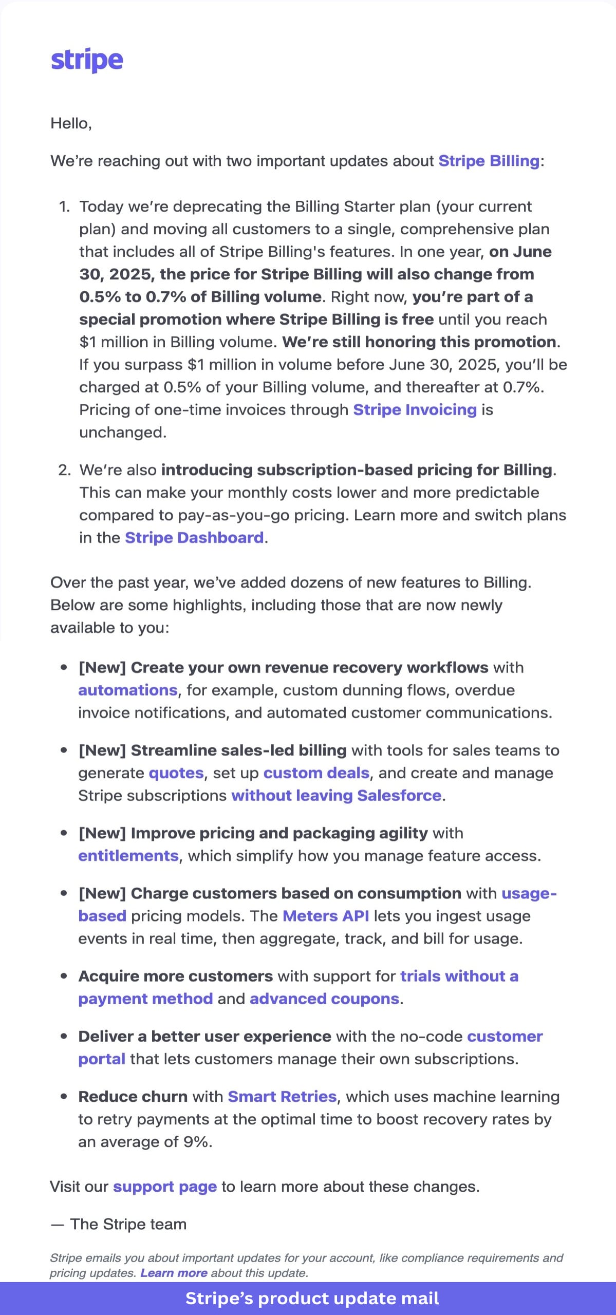
What I like about Stripe’s pricing change email:
- Stripe gets straight to the point. The email explains the pricing change and the effective date in the opening paragraph, so customers don’t have to look for the information.
- Specific numbers remove ambiguity. Users can immediately see the current price, the new price, and when the change takes effect.
- Existing promotions receive their own explanation. Stripe confirms that current discounts will still be honored, which addresses a common customer concern.
- Additional product improvements provide useful context. Readers can see what has been added to Stripe Billing over the past year and understand how the product has evolved.
- The closing message stays focused on support and next steps. Users who need more information know exactly where to go.
6. Post-launch follow-up email: Monday.com
Post-launch follow-up emails re-engage inactive users after a new feature or product release. They are typically sent 1 to 2 weeks after launch, once users have had enough time to explore the update.
Use them to answer questions, collect feedback, and encourage users to return to the feature.
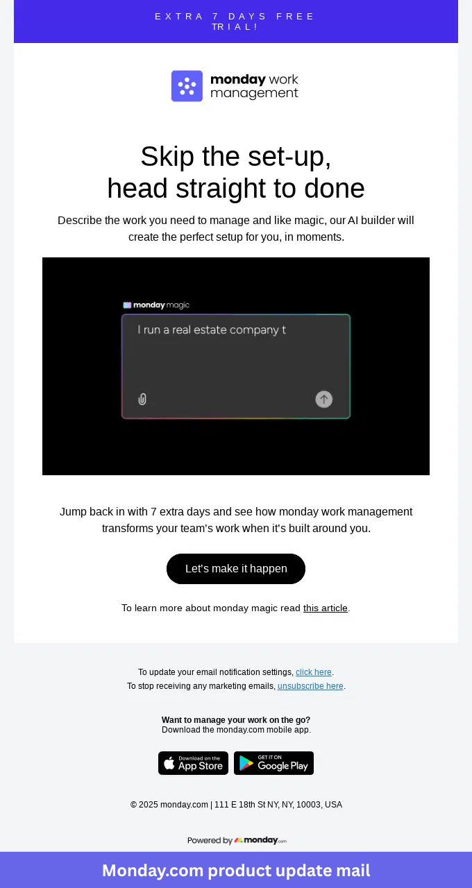
What I like about Monday.com’s post-launch follow-up email:
- Monday.com focuses on a specific challenge instead of promoting the feature broadly. The message speaks to users who started the trial but never got through setup.
- “Skip the set-up, head straight to done” addresses a common source of friction. Readers immediately understand how the AI builder helps them get value faster.
- An animated demo shows the feature in action. Users can see how the AI builder works without leaving the email.
- The extra seven-day trial extension gives people another reason to come back. Additional time reduces pressure and gives users more room to explore the product.
- A clear CTA keeps the next step simple. Readers can jump back into the product, while supporting resources offer more information for those who want it.
7. Terms and conditions update email: Figma
Terms and conditions update emails inform users about policy, privacy, or legal changes that affect their account. The goal is to explain what is changing, when the changes take effect, and what actions users may need to take.
Send these at least 30 days before the update whenever regulations or company policies require advance notice.
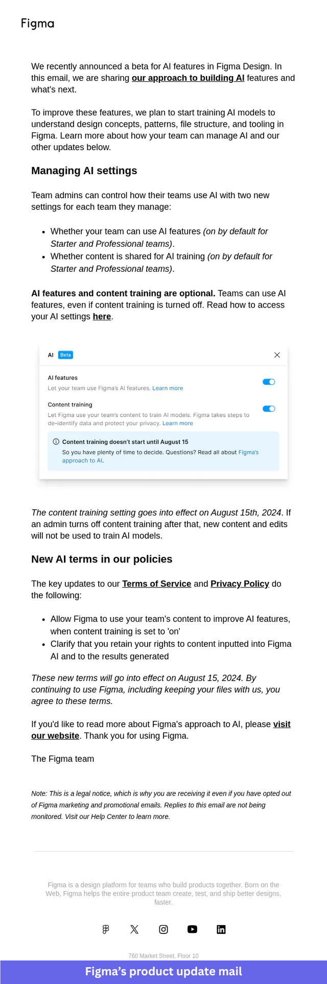
What I like about Figma’s terms and conditions update email:
- Figma starts with the product context behind the update. Readers immediately understand that the policy changes are connected to the company’s new AI features.
- Transparency shows up early. Users can see that AI features and content training are enabled by default, along with the timeline for when those settings take effect.
- A screenshot of the settings panel removes guesswork. People know exactly where to review and manage their preferences if they want to make changes.
- Plain-language explanations make the legal updates easier to understand. Figma clearly outlines what it can do with customer content and what rights users keep.
- The closing note explains why recipients are getting the email even if they opted out of marketing communications. That small detail answers a common question before users have to ask it.
8. Teaser and sneak-peek email: Webflow
Teaser emails build anticipation before a major launch, feature release, or event announcement. They give users just enough information to spark interest without revealing every detail upfront.
Send these 1 to 2 weeks before launch to engaged users, beta participants, or customers who have shown interest in similar updates.
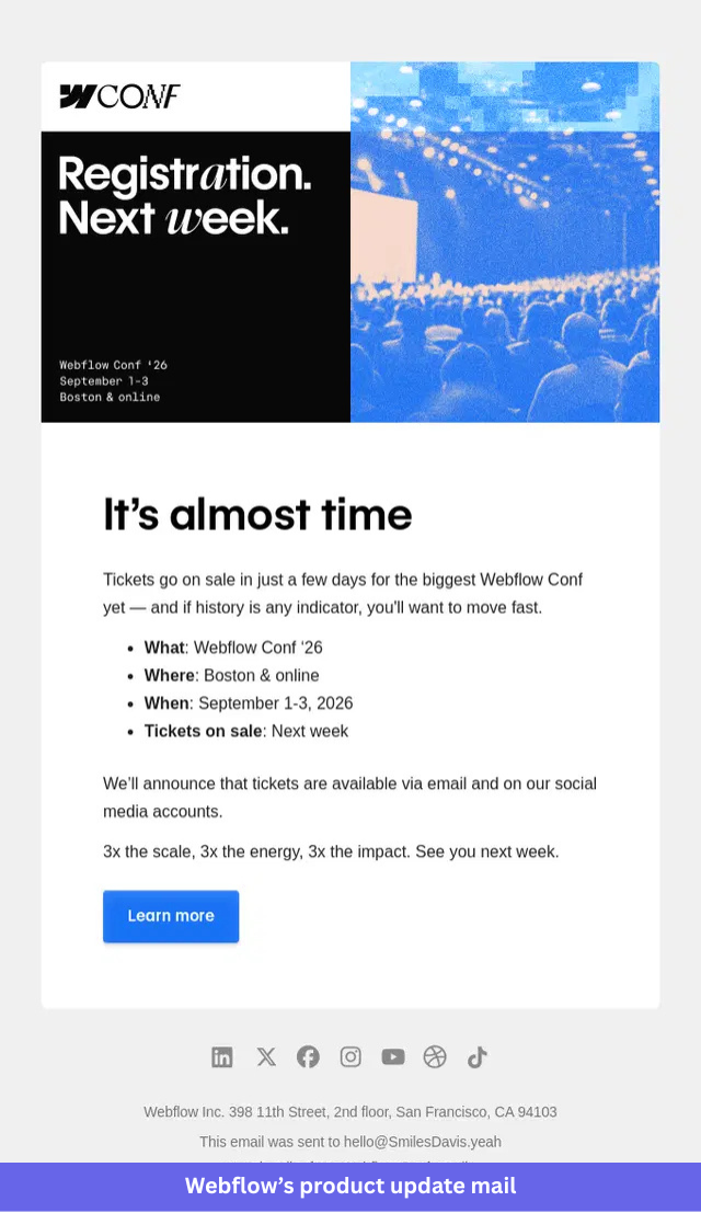
What I like about Webflow’s teaser email:
- “Registration. Next week.” communicates the core message in just two words. Readers immediately know something important is coming and when to expect it.
- Photography creates most of the excitement. The conference image gives the email energy and reinforces that this is a major event rather than a routine update.
- A simple What, Where, When, and Tickets on Sale section makes the information easy to scan. Readers can absorb the key details in seconds.
- Previous conference demand adds a sense of urgency. The reminder that tickets sell quickly encourages people to pay attention without resorting to exaggerated claims.
- “Learn more” fits the purpose of the email. Interested readers can explore further, while everyone else can wait until registration opens.
9. Bug and technical fix email: Willow
Bug and technical fix emails keep users informed when an issue affects the app experience. The goal is to explain what happened, confirm whether a fix is available, and spell out any actions users need to take.
Send these as soon as the issue is resolved or a workaround is available, especially when the problem impacts core functionality.
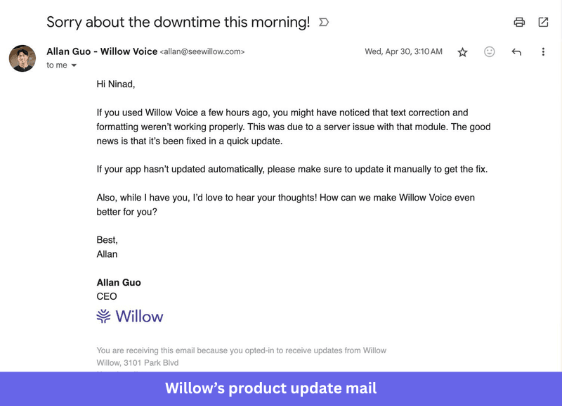
What I like about Willow’s bug and technical fix email:
- The subject line acknowledges the problem immediately. Users know what the email is about before they even open it.
- Allan Guo writes the update in a direct, personal tone. The message feels like a quick note from a founder rather than a formal company announcement.
- Specific details help users understand the issue. Willow explains that text correction and formatting were affected and confirms that the problem came from a server issue.
- Clear instructions tell users what to do next. Anyone whose app hasn’t updated automatically knows they may need to install the update manually.
- The email closes with a request for feedback. That small touch turns a support update into a conversation and gives users a chance to share what would improve their experience.
10. Yearly and monthly product update roundups: Descript
Yearly and monthly product update roundups help users stay informed about multiple releases in a single email. They work best when you have several improvements, fixes, or experiments to share and want to give users a clear snapshot of recent progress.
Send these on a consistent schedule so customers build a habit of expecting your product updates.
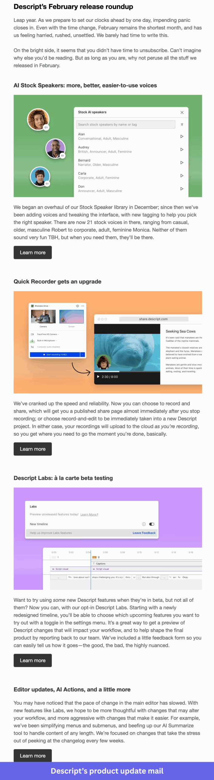
What I like about Descript’s product update roundup email:
- Descript organizes the email into distinct product updates instead of combining everything into one long announcement. Readers can quickly scan the sections and focus on the updates that matter most to them.
- Each update includes a short explanation and a supporting visual. Users get enough context to understand what’s new without feeling overwhelmed by details.
- Feature categories span improvements, experiments, and workflow enhancements. That gives readers a broader view of how the product is evolving across different areas.
- “Learn more” appears throughout the email at natural points. People can dig into specific updates without interrupting the reading experience for everyone else.
- The opening and closing copy keep the tone conversational, so the email feels like a progress update from the team rather than a list of release notes pasted into an inbox.
How to launch product update emails in 7 steps
I’ve refined this process through dozens of product launches. Here’s the seven-step framework that consistently drives feature adoption.
1. Decide whether the update warrants an email
If product teams had the choice, they’d announce every change they shipped, because we all like recognition for our work. But your users aren’t interested in every update or minor software bug fix. Each unnecessary email trains users to ignore the next one, so when you finally have something important to share, fewer people pay attention.
Reserve email announcements for updates that genuinely change how users reach their goals or solve problems they’ve complained about. For everything else, use this framework to pick the right channel.
| Tier | Type of update | Communication channel |
|---|---|---|
| Tier 1 | Major feature release or redesign | Dedicated email |
| Tier 2 | Medium update with some user impact | In-app message |
| Tier 3 | Minor fixes or behind-the-scenes work | Changelog or help docs |
| Tier 4 | Security patches or technical improvements | Support documentation |
2. Authenticate your domain to ensure email deliverability
The strongest product announcement fails if it lands in spam. To stop that from happening, you need three things configured properly: SPF records, DKIM, and DMARC.
- SPF records tell receiving servers which IP addresses can send email from your domain.
- DKIM adds a digital signature so providers can verify your messages are legitimate.
- DMARC gives email providers instructions for handling messages that fail authentication.
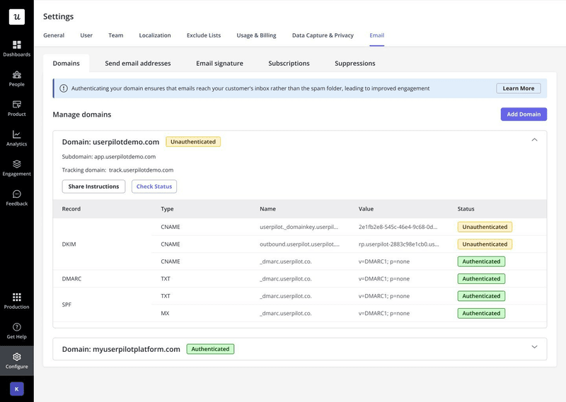
In my experience, most teams are better off using a reliable SaaS email marketing platform instead of handling sends in-house. The good ones offer product analytics and deliverability optimization that’s almost impossible to maintain on your own.
3. Define user segments to personalize messaging
You could send the same email to everyone, but it won’t perform as well as tailoring the message to specific segments. A power user who’s been with you for two years has different context and interests than someone who signed up last week.
I generally segment users on three factors: behavioral patterns, subscription tier, and engagement patterns. When you announce a new analytics feature, you can talk up advanced reporting to experienced users while pointing new users to basic setup. Even simple segments like “new users,” “active users,” and “enterprise customers” beat blasting one message to the whole list.
The catch is what segmentation actually costs when your tools are fragmented. When analytics, in-app messaging, and email each live on separate platforms, every new segment becomes a small migration project: you export the data, map user IDs between systems, rebuild the same audience in two or three places, and then babysit the sync drift when the numbers stop matching.
A unified product stack changes that math. When analytics, in-app messaging, and email run on one platform, a segment you define once stays self-updating across every channel, and product usage data doesn’t have to be reconciled by hand. It’s a quiet advantage, but for teams shipping updates every week, it removes a recurring tax most people have simply gotten used to paying.
AI has lowered the barrier further. Building dynamic segments like lapsed users, power users, or role-based audiences no longer requires developer support or hand-written SQL, which means the segment behind your next announcement can be more precise without being more work.
4. Develop benefits-focused copy that resonates with your users
Most product teams get excited about the technical details of what they built. Your users care about outcomes, so write to those instead. “Save 2 hours per week on reporting” resonates more than “We’ve updated the export functionality” because it connects to something people actually value.
Your copy needs to answer the reader’s first question, “What does this update mean for me?” before it gets anywhere near features or implementation details.
5. Incorporate engaging product visuals
A picture is worth a thousand words, and that holds up well in update emails. Visual content increases email click-through rates by 42%, and it helps users grasp complex features faster than text alone. Use screenshots for interface changes, GIFs for workflow demonstrations, and short clips for anything that needs a fuller walkthrough.
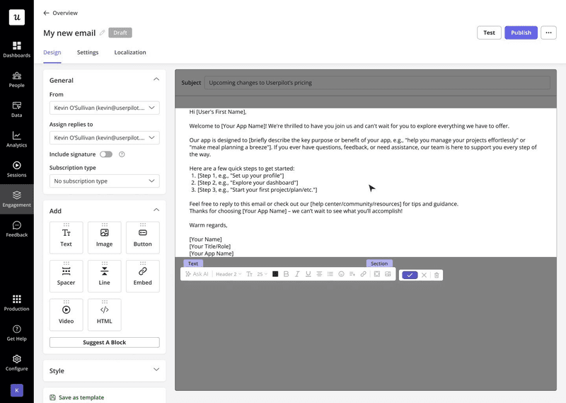
The right tooling makes this easy. Userpilot’s no-code email editor lets you add visuals by dragging and dropping image blocks into the email body, then build, test, and send targeted product updates from a single interface.
6. Configure email targeting and scheduling
You first need to know who your audience is, because if that’s wrong, when you send, it won’t matter. Start with your audience segments and give each group its own messaging: new users need a basic introduction, while experienced ones care about advanced capabilities or integrations.
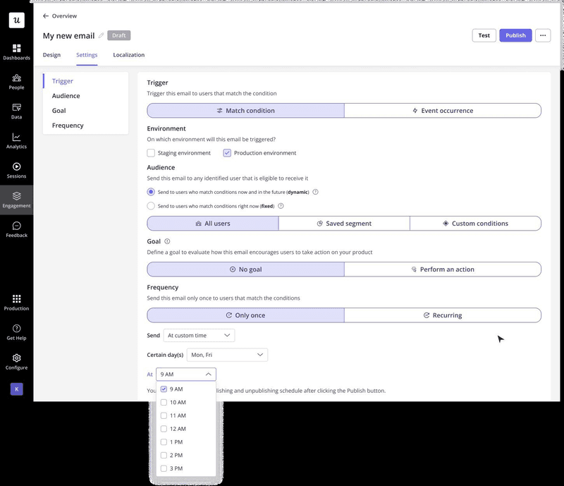
Timing is where AI now earns its keep. Predictive send-time optimization, which picks the ideal send time for each individual recipient, increases open rates by 23% and click-through rates by 17%. A staggered rollout also helps, since releasing the announcement to one group at a time lets you gather feedback and adjust before the full send.
B2B tools usually see higher engagement during work hours, adjusted for the recipient’s time zone, while consumer apps do better in the evenings. Test a few times with small segments before a large send, because your own data will tell you more than any general best practice.
7. Track performance and iterate
Open rates have become noisy since Apple’s Mail Privacy Protection started auto-loading images, so treat them as a directional signal rather than the truth. Lean instead on click-through rate (CTR) and click-to-open rate (CTOR), which reflect whether people actually did something after the email landed. A high open rate paired with a low CTR usually means the content or the CTA isn’t pulling its weight.
For a benchmark, MailerLite’s recent data puts the average CTOR around 6.8%, so treat a double-digit CTOR as a strong result and use it to compare campaigns over time. Keep an eye on unsubscribe rate too, since a spike after a particular send is a clear signal that the content was too frequent, too long, or not relevant enough.
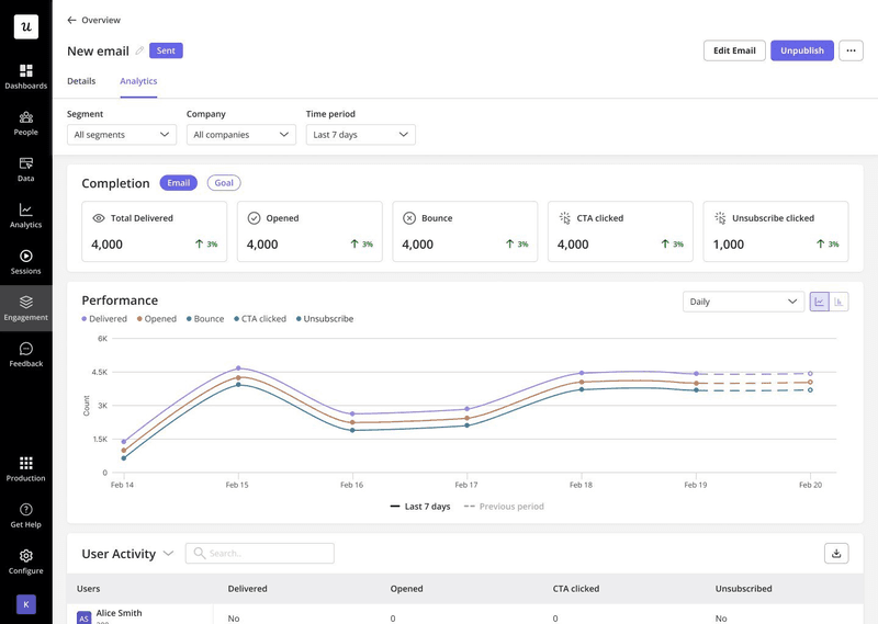
The most useful insight comes from connecting email performance to product usage. I usually build a simple funnel analysis: email sent, opened, clicked, feature accessed, feature used.
If a send hit a 25% click rate but only 3% of recipients used the feature, the messaging set the wrong expectation. Direct replies and in-app feedback after the click matter as much as the numbers, because they tell you whether the email actually changed behavior and improved feature adoption metrics.
The goal isn’t to get it perfect on the first send. Build a system that improves with each update you announce: track what works, learn from what doesn’t, and refine based on real behavior.
The teams that win this treat it as a system
The strongest examples in this guide work because the teams behind them knew exactly who they were writing to and how to measure whether the email moved someone to act. That kind of consistency comes from operational discipline more than clever copywriting.
Once segmentation, in-app messaging, email, and analytics run off the same source of truth, a feature launch becomes one coordinated motion across channels. Every signal from one send informs the next.
If that’s the setup you’re trying to build, book a Userpilot demo to see how it works end-to-end.
FAQ
What's a product update email?
A product update email is a targeted message you send to users when you’ve built something new, fixed something that was broken, or made changes to how your product works. These emails work best when they focus on what the update means for the user rather than just announcing what you’ve shipped. The goal is to drive adoption and keep users engaged with your product.
How do I announce product updates?
You can announce product updates through a multi-channel approach that includes email, in-app notifications, and documentation updates. Start by segmenting your audience based on relevance. Then, craft benefit-focused emails and messages, add visual demos of the new features, and provide clear next steps for users to try.
About the author