18+ Announcement Banner Examples + Tools to Build One


We have all been on websites that bombard us with full-screen pop-ups the second we land. It feels like walking into a shop and having a salesperson jump on your back. It is annoying, and it makes people leave. That is exactly why, in my day-to-day product management work, I tend to avoid intrusive UI patterns and lean on a simpler solution: the humble announcement banner.
It is the polite neighbor of UI patterns. It often sits at the top (or bottom) of the screen and doesn’t block the user from doing what they came to do. Yet, despite its simplicity, most people still design announcement banners the wrong way.
In this guide, I will show you announcement banner examples across platforms for inspiration. You’ll also find useful tips on how to design and launch an announcement banner that improves click-throughs without annoying your users.
What is an announcement banner?
An announcement banner (often called a notification bar, sticky bar, or floating bar) is a thin strip of content that usually sits at the very top of a webpage or application interface.

Unlike a modal that blocks the screen, the banner pushes content down or floats over it, allowing the user to continue using the app while the message stays visible.
You have likely seen them used for:
- Feature releases: “New: Dark mode is finally here.”
- Maintenance alerts: “Scheduled downtime on Saturday at 2 AM UTC.”
- Promotions: “Get 20% off if you upgrade in the next 24 hours.”
- Legal updates: “We have updated our Terms of Service.”
Announcement banners can be sticky or non-sticky, depending on how urgent or important the message is. A critical system alert usually stays visible until the user dismisses it, while a promotional or informational banner might disappear once the user scrolls or reloads the page.
What is an announcement bar?
An announcement bar is a specific type of announcement banner that is usually sticky and persistent.
Unlike promotional banners, announcement bars focus on clarity over persuasion. The copy is short, factual, and often paired with a status indicator or a link to a status page.
You will most often see it used for system-level communication, such as outages, maintenance windows, security updates, or compliance notices. Because announcement bars remain visible as users navigate the product or website, they work well for messages that users should not miss.
Announcement banner examples for SaaS
To start with, let me take you through a few great SaaS examples I often keep coming back to. Each announcement banner here has a clear purpose, tight copy, and a reason for existing:
#1 SurferSEO displays a system maintenance status alert
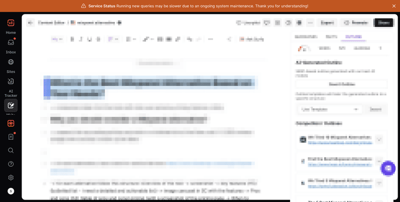
To me, this is a textbook announcement banner for critical communication. SurferSEO uses a high-contrast bar at the top to flag ongoing maintenance and set expectations early.
The message is short, specific, and honest about impact (“queries may be slower”), which helps reduce support tickets and frustration.
The banner stays visible while users work, so the context is never lost, but it doesn’t block the interface. I like that it prioritizes clarity. For system updates, this calm, always-visible approach works far better than an interruptive modal.
#2 Mixpanel encourages engagement with an actionable, quick-start banner

Mixpanel’s banner is a great example of using banners to drive early activation.
Instead of a vague announcement, it focuses on just one next step: “Start sending data.” I like that the copy is reassuring, the CTA is explicit, and the placement keeps it visible without hijacking the page.
What works well here is timing: the banner appears when users are most likely setting things up, not randomly later. This kind of actionable banner is especially effective in complex products where users benefit from being nudged toward a clear first win.
#3 HubSpot prompts trial conversion with a sales CTA
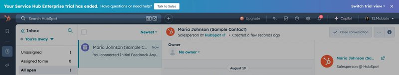
HubSpot uses this banner to handle the sensitive moment of trial expiration. The message is direct, contextual, and framed around help rather than urgency.
Instead of pushing an upgrade button, it offers a “Talk to Sales” CTA, which matches the intent of enterprise users who might need reassurance or answers before converting.
#4 Jobber shows a persistent trial expiration countdown banner
Jobber takes a more urgency-driven approach, and it works because it’s clear and consistent. The countdown-style banner reminds users exactly how much time they have left, so that there’s less ambiguity around trial limits.
It also features an upgraded CTA, which helps users act the moment they’re ready. I think it’s a strong example of using repetition intentionally, because when timing matters, visibility is better than subtlety.
#5 Monday requests notification permission through an action banner
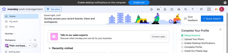
Here, Monday uses an action-oriented banner to request notification permissions at just the right moment: When you are accessing their application via the website.
This reduces friction and increases opt-in rates because users understand why the request matters. I also like that it’s dismissible, so that users are always in control. I think it’s a smart use of banners for setup-related actions that are important for long-term engagement, but don’t justify interrupting the entire experience.
#6 Zapier incentivizes annual subscriptions with a discount
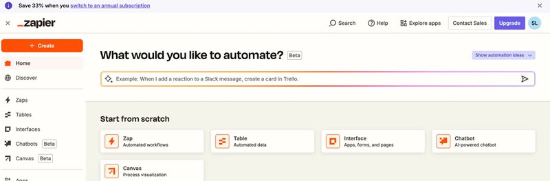
Zapier uses this banner to gently nudge users toward an annual plan by framing it as savings, not pressure. The copy is short and benefit-led (“Save 33%”), and the banner sits right at the top without covering core actions.
I think what works here is placement and restraint. It shows up while users are already thinking about automation, so the offer feels relevant. There’s no countdown or aggressive language, but rather a clear incentive and an easy way to learn more. It’s a classic example of letting your value instead of urgency do the heavy lifting.
Announcement banner examples for websites
Website banners usually have one job: Catching user attention without stopping the scroll. The best ones feel timely, relevant, and are easy to ignore if they’re not for you. Here’s how I think different teams get that balance right:
#7 Monarch drives signups with a limited promo code
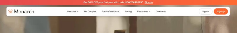
Monarch’s banner is simple, bold, and time-bound. It highlights a limited promo code in plain language and pairs it with a strong signup CTA.
What I like here is clarity. Users immediately understand what they get and what to do next. There’s no extra explanation or visual clutter. This kind of banner works best when your offer is easy to grasp, and your goal is quick conversion instead of education.
#8 Snowflake promotes annual conference with a registration CTA

Snowflake uses its banner to promote a major event without distracting from the main site experience. The message is concise, the CTA is action-oriented, and the banner feels like a “heads-up” more than an ad. It’s clearly designed for awareness and registration rather than product conversion.
Also, by keeping the copy short and linking directly to registration, Snowflake respects users’ intent while still promoting something important to its community.
#9 Programa highlights a newly launched product feature
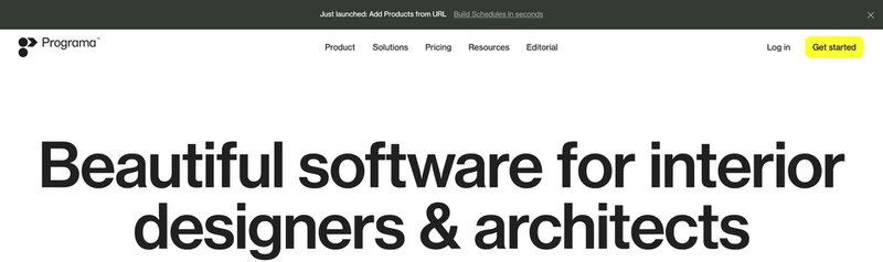
Programa’s banner focuses on discovery. It announces a newly launched feature with minimal copy and lets curiosity do the rest.
The banner also blends into the site’s visual style, which makes it feel like part of the product story rather than a marketing interruption.
I like how it targets both new and returning visitors without assuming prior context. This approach works well for feature awareness on websites, especially when you want users to explore on their own terms instead of pushing them into a guided flow.
#10 Clockwise shares a downloadable workplace research report
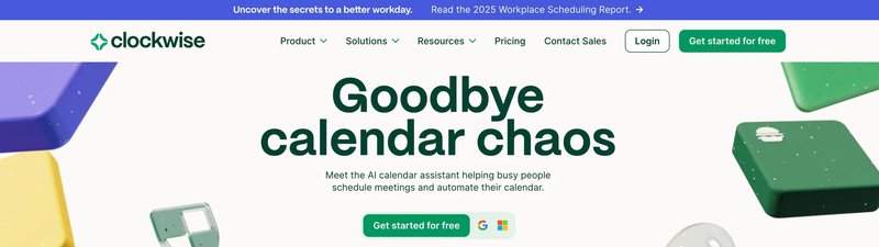
Clockwise uses its banner to promote not a sale, but its thought leadership instead. The message highlights a research report and positions it as valuable insight rather than gated content spam. The CTA is clear, and the banner sits quietly at the top, letting users engage if the topic resonates with them.
This is a smart use of banners for content marketing because it builds credibility, supports long-term brand trust, and gives visitors something useful without asking them for immediate commitment. It’s especially effective for B2B audiences.
#11 Jobber announces a time-sensitive discount with urgency

Jobber’s example leans into urgency here, but in a controlled way. The banner clearly communicates that the discount is time-sensitive, while the CTA makes the next step obvious. It stays visible as users browse and reinforces the message without shouting.
I think what makes this work is relevance, because Jobber places the banner where users are already evaluating the product. This is a good example of using repetition and timing together to drive action on a website.
#12 Synthesia shares a Series D funding milestone
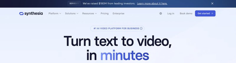
Synthesia uses its banner to share a credibility signal rather than push a conversion. Announcing a Series D milestone builds trust, especially for new visitors who are still evaluating the product. The copy is short and celebratory, and the banner doesn’t ask for much action beyond learning more.
I like this use case because it shows banners aren’t just for promotions. They can also help build legitimacy and momentum.
#13 PlanetScale invites early access to Postgres
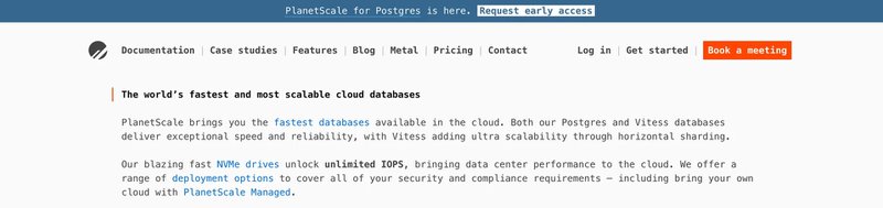
PlanetScale’s banner targets a specific audience: users interested in Postgres. The message is clear, niche, and invitation-based, which makes it feel exclusive rather than promotional. Also, the CTA focuses on early access, tapping into both curiosity and developer interest.
It’s placed prominently but doesn’t interfere with reading or navigation. This works well because it aligns the banner’s message with the site’s core audience. When your offer is highly relevant, even a simple banner can drive meaningful engagement.
Announcement banner examples for mobile apps
When it comes to mobile banners, I find that it’s usually all about timing. The announcements should show up when users need to act now, stay informed, or notice something important without ever being pulled out of the app.
Here are a few examples of brands that do it right:
#14 Clue promotes features via a dismissible banner
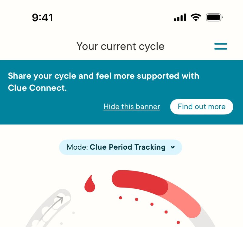
Clue uses a soft, dismissible banner to introduce a feature that feels deeply personal. You can see that the message sits calmly against the app’s background, uses clear text, and explains value before asking for action. This works because the banner respects where the user is in their life (tracking a cycle isn’t exactly a moment for loud prompts).
Also, the copy reads more like guidance than promotion, and the “hide” option offers users control. It’s a good example of how feature discovery on mobile doesn’t need heavy flows or tutorials to be effective.
#15 GoPay shows a mandatory regulatory warning banner
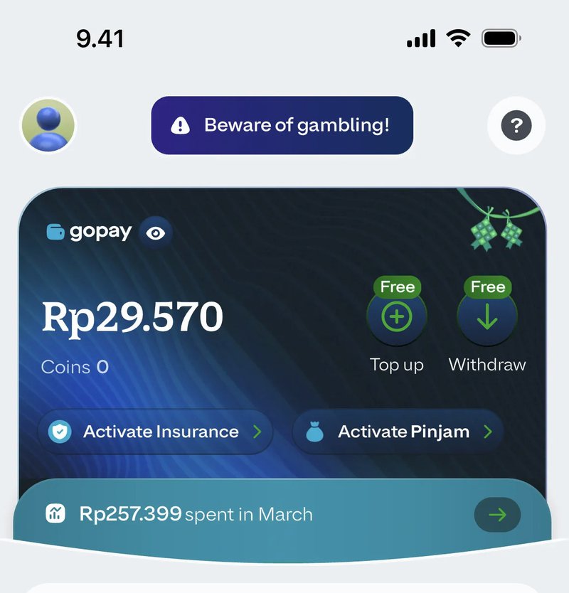
This banner exists for just one reason: compliance. GoPay places a highly visible warning at the top of the screen with a clear icon system and restrained copy.
The icons communicate seriousness quickly, and the size of the banner makes it hard to miss without blocking key actions like top-ups or withdrawals. I believe this is the best approach for regulated business apps, where clarity and consistency matter much more than persuasion.
#16 Skype alerts critical migration with an actionable banner
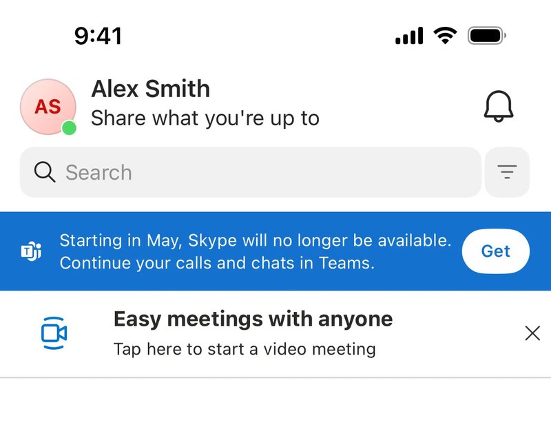
Skype’s banner handles a high-stakes moment: product migration. It clearly explains what’s happening, why it matters, and what users should choose next. The CTA is simple and actionable, so that users can move forward without digging through the menu or using search to figure things out.
This kind of banner is essential when a project affects existing behavior. By keeping it persistent and contextual, Skype makes sure users don’t miss critical changes that could disrupt their workflows.
#17 Rakuten celebrates achievements through a persistent banner

Rakuten uses banners not only for alerts, but also for motivation. This persistent banner celebrates an achievement and encourages users to engage further. The subtle animation, friendly visuals, and reward framing make it feel creative rather than transactional. It’s also tied to a specific occasion, which is great for reinforcing positive behavior instead of interrupting it. Overall, I think it’s a strong example of how to use banners to support retention and emotional engagement.
#18 Monzo displays a dismissible update notification card

I like that Monzo’s update banner feels more like a card than a warning. It explains what changed, why it matters, and lets users explore more if they want to download more details. The design is clean and familiar, almost like one of Monzo’s UI templates, which helps reduce friction. This works well at scale: when thousands of users are getting updates, clarity is always more important than novelty. Plus, the dismiss option ensures users can move on quickly once they understand what’s new.
#19 Hopper drives referrals with a clickable banner
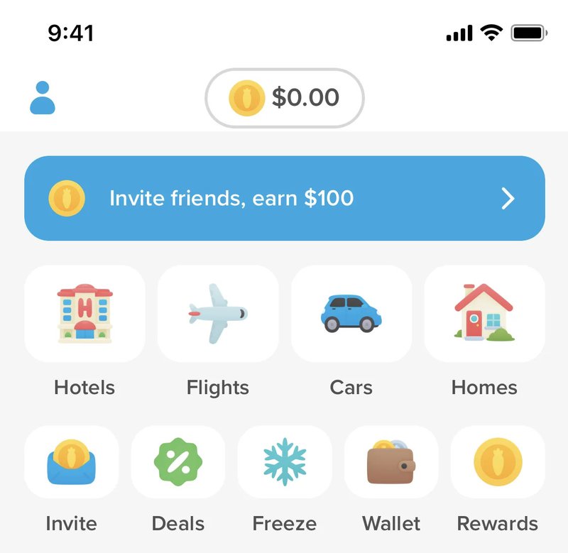
Hopper’s referral banner is bright, simple, and impossible to miss. It uses friendly visuals and clear copy to encourage sharing, but doesn’t ask users to upload anything or dig through settings. The banner also feels native to the app and blends seamlessly with the surrounding images and photos. What I think works especially well is how it encourages users to add friends using their own images and contacts so that referrals feel natural. The format is easy to fit into regular browsing instead of a forced detour.
Why you should stop hard-coding banners
In the early days of my career, if I wanted a banner on the dashboard, I had to beg a developer. I would write a ticket: “Please add a blue bar to the top of the pricing page that says ‘20% off annual plans’ with a button linking to the billing settings.” Two weeks later, the developer would push it to production. By then, the promotion was half over. Even worse, if I wanted to fix a typo or change the color, I had to file another ticket. This approach fails for three reasons:
- Speed: Marketing moves faster than development cycles.
- Targeting: Hard-coded banners usually show to everyone. You don’t want to show a “Sign Up” banner to a user who already pays you.
- Analytics: Developers rarely build tracking into these custom banners, so you never know if they work.
The solution is to use a no-code tool. This gives you full control over the design, targeting, and publishing of your banners.
How to build and implement an announcement banner
I think that, above all, a good banner needs clarity. That’s why, before you jump into design, you need a clear title, a single goal, and a rough sense of which banner ideas deserve space in your product.
Once that’s clear, building and launching the banner becomes a straightforward, repeatable process. Here’s how I approach it, step by step:
Step 1: Define your goal and audience
Before you open any builder, you need to know what you are doing. A banner without a goal is just noise. I categorize my banners into three buckets:
- The “Heads Up”: System maintenance, downtime, or critical policy changes.
- The “Look at This”: New feature announcements, webinars, or new content.
- The “Do This”: Upsell prompts, free-to-paid conversion nudges, or feedback requests.
Once you have a goal, you need to define who sees it. This is where a customer segmentation strategy becomes vital. If I am announcing a new feature available only on the Enterprise plan, I must not show that banner to my Basic plan users unless the goal is to upsell them. If I show them a feature they can’t use, I create frustration, not feature adoption.
Step 2: Create the banner
I use Userpilot for this because it lets me build directly on top of my live product. To start, I open the Chrome extension and select “Create Content.” From the options, I choose Banner. This opens the builder directly on my screen. I don’t have to imagine what it looks like; I can see it.
Most people slap a banner at the top of the page and call it a day. That is often the right move, but not always.
I have found that bottom banners work exceptionally well for less urgent messaging, such as a webinar invite. They feel less like a system warning and more like a helpful nudge.
I can toggle the placement between Top and Bottom instantly. I also have to decide on the Embedding style. This is a technical detail that matters for user experience (UX):

- Overlay: The banner floats on top of your app’s content. This is good for grabbing attention, but it might cover up your navigation bar.
- Inline: The banner pushes your app content down (or up). This is safer because it doesn’t hide anything, but it shifts the layout.
I almost always use Inline for top banners to avoid blocking my navigation menu. You can adjust these settings in the Layout tab.
Step 3: Design for action
Your design needs to do two things: catch the eye and allow for dismissal.
I stick to a simple color code or sometimes use one of my brand color palettes.
Red or orange is for critical alerts (downtime, payment failure). Blue or green is for promotions and features. If you use red for a “Check out our blog” banner, you will train your users to panic when they see your marketing messages.
You can customize the colors, font, and background directly in the Design tab. I always try to match the banner to my product’s native theme so it doesn’t look like a cheap ad.

In addition, if you want users to do something, give them a button. You can configure button actions to do almost anything. You can set the button to:
- Go to URL: Send them to a blog post or settings page.
- Trigger Flow: Start a product tour that shows them how to use the new feature.
- Trigger JavaScript: Execute a specific function in your app.
Nevertheless, you must allow users to dismiss the banner. If you force a banner onto the screen with no way to close it, you aren’t marketing; you are annoying people. Therefore, in the design settings, always ensure the Close Button is enabled.
Step 4: Target the right users
This is where the no-code approach destroys the hard-coded approach. In the Targeting settings, I can get incredibly granular.
First, where does this live? If I am announcing a new feature that only exists on the dashboard, I should only show the banner on the dashboard. Showing it on the login page or the help center is a waste of pixels. I set the Page Targeting to “Only on Specific Paths” and enter the URL, like/dashboard.
Next, who sees it? If I want to increase trial to paid conversion, I will create a segment of users who:
- Are currently on a “Free Trial.”
- Have more than 3 days of activity (so I know they are engaged).
- Have NOT upgraded yet.
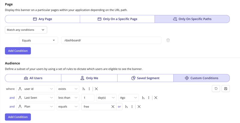
Now, my banner saying “3 days left on your trial!” only appears to people who actually have 3 days left. This context is what drives conversion.
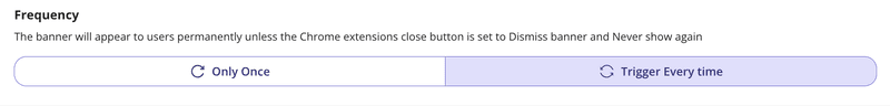
Step 5: Set frequency and triggers
How often should the banner appear? If it is a critical system alert, I might set the frequency to “Every time” the page loads until the issue is resolved. For a marketing announcement, I usually set it to “Once” or use the “Dismiss and never show again” logic.
You can also schedule banners. If I am running a Black Friday promo, I don’t want to wake up at midnight to turn it on. I can set a start and end date in the publishing settings.
Step 6: Measure and iterate
You aren’t done when you hit publish. You need to know if it worked. Hard-coded banners are a black box. But with a dedicated tool, I get performance analytics out of the box. I look at three metrics:
- Views: How many people saw it?
- Clicks: How many people took action?
- Dismissals: How many people hated it?
If the dismissal rate is high and the click rate is low, my copy is bad, or I am targeting the wrong people. I often run A/B tests on my banners. I might test a blue announcement banner against a yellow one, or test “Learn More” against “Try it Now.” I can run A/B experiments to see which variation drives more goal completions.
Build and launch your announcement banner
Announcement banners work best when they’re fast to launch, easy to change, and grounded in real user context. With Userpilot, you don’t need to hard-code messages or wait on development cycles. You can design, target, test, and iterate directly inside your product without any guessing.
About the author