Appcues vs Spekit: Which is Better for Interactive User Guides?

Appcues vs Spekit: Which is Better for Interactive User Guides?

Appcues vs Spekit – quick summary

  • Let’s explore how Appcues and Spekit compare when it comes to creating interactive user guides.
    • Appcues is a robust product adoption and user onboarding platform for web and mobile apps. It enables product teams to create, implement, and test personalized in-app onboarding experiences. The platform also helps you announce new product features and collect customer feedback.
    • Spekit is an employee onboarding solution. This means that, while it does let you create interactive user guides, they will only be visible to your internal team members. You cannot use Spekit to create customer-facing guides that are accessible to external users.
  • If you’re looking for a better option for creating interactive user guides, Userpilot exceeds both functionality and value for money compared to other tools on the list.
  • Userpilot is a product growth platform that drives user activation, feature adoption, and expansion revenue. It also helps product teams collect user feedback, streamline onboarding, and gather actionable insights from analytics. Get a Userpilot demo and drive your product growth code-free.

What is an interactive user guide?

An interactive user guide is a set of UI patterns designed to work together and help customers understand how to use your product.

There are two main types of user guides: full product tours (which tend to be more detailed and time-consuming), and interactive manuals (using tooltips and real-time guidance to provide more contextual help to your customers).

Interactive user manuals are an excellent way of engaging and educating your users, helping them to get the most out of your product, and improving user onboarding and feature adoption.

Must have features for interactive user guide tools

Not all tools are built the same. Some offer different advantages over others while some will simply get you basic functionality but at a low price. It depends on your budget and needs which will be the best tool to build interactive user guides.

Here’s what to look for as the main functionalities when picking a tool to build in-app guides:

  • Good range of UI patterns to use for building your guides.
  • Ability to customize each interactive guide to fit your brand and style.
  • Segmentation so you could trigger the guides to the right audience at the right time. A one-size-fits-all approach won’t bring you the desired results.
  • The ability to trigger the user guides when specific in-app events happen is nice to have and will help you build more contextual in-app experiences.
  • Minimum product usage analytics, to be able to track how users engage with the product, and where they get stuck so you can build relevant user guides to help them.

The above list is not exhaustive but it’s a starting point. Depending on your product, you might also need automated localization, A/B testing capabilities, advanced analytics or security, and more.

Appcues for creating interactive user guides

User guides are an integral part of creating frictionless in-app experiences and maximizing product adoption. As a user onboarding platform, Appcues offers various tools to help users understand how to navigate your product.

  • Modals, tooltips, slideouts, and hotspots to help users take the right actions.
  • Launchpad for giving users access to all the flows they’ve engaged with (available on the Growth plan – $879/mo, paid annually).
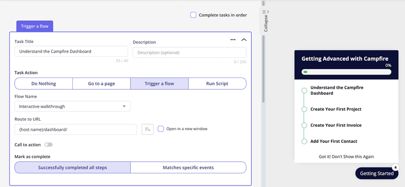
  • Checklists for guiding users through a series of tasks to complete a goal (also available on the Growth plan).
  • Target these to specific user audiences you can build based on specific criteria such as in-app engagement or events.
  • To trigger your guides when an event occurs, you’ll need to ask for a custom quote for the Enterprise plan, as this option is not available on the Essentials or Growth plans.
  • Appcues supports localization of your walkthroughs only on their Growth plan and up.

Overall, Appcues is a good option for building in-app guidance, but it can get quite expensive fast if you need more than just some simple tooltip guides.

No-code product tours in Appcues

The drag-and-drop Appcues Builder is a useful tool for creating personalized product tours without engineering support.

Other features that facilitate product guides and tours include:

  • Appcues Flows to create customized user onboarding journeys and welcome new users.
  • UI patterns, such as modals, tooltips, and slideouts, to convey crucial information about different product features at the right time.
  • Checklists to help new users monitor their progress as they get the hang of your app.
  • Segmentation and event tracking to take each user on a personalized journey based on how they interact with your product.

It’s worth noting that the no-code Appcues Builder lets you customize icons, text, and other elements to match your brand identity. However, you’ll have to use CSS to unlock advanced customization capabilities. If you’re looking for a more customizable and flexible alternative, Userpilot might be a better option.

In-app messaging in Appcues

Appcues is primarily designed to facilitate user onboarding, meaning it features that let you provide seamless in-app support.

These include:

  • Launchpads: These let users access all Appcues flows from a dropdown menu within your app. It acts as a handy resource center that users can reference whenever they get stuck. The downside is it offers no categorization or search functionality, so it might get a bit tricky to find resources. You also can’t integrate your chat or KB docs inside.

  • Tooltips: These are useful for walking users through various product features and changes.
  • Modals and screens: They come in handy to notify users about new features that might be useful for them. You can also use them to share inspiration, suggestions, and tips.

Spekit for creating interactive user guides

Spekit is an employee onboarding solution. This means that, while it does let you create interactive user guides, they will only be visible to your internal team members. You cannot use Spekit to create customer-facing guides that are accessible to external users.

Spekit-UI-patterns

Spekit for interactive user guides.

Here’s an overview of how Spekit lets you create interactive guides for employees:

  • Codeless guides: Spekit’s Chrome extension makes it possible to build interactive employee guides without writing any code. These flows are installed on the browser level rather than on the software itself so employees will need to have the extension installed to access them.
  • Cross-product flows: Because Spekit isn’t installed on any one tool, you can use it to create employee onboarding flows that span multiple software platforms. Just ensure that employees can access the Chrome extension throughout each step.
  • Guide limitations: Spekit’s flows are quite limited as you only have two UI patterns to choose from: tooltips and modals. Furthermore, adding a modal as the first step of a flow could cause a bug where the flow doesn’t appear to employees (because Spekit modals lack unique URLs).

No-code product tours in Spekit

Spekit-flow-editor

Spekit for no-code product tours.

Spekit is an employee onboarding solution which means it can be used to build no-code product tours, but these walkthroughs will only be accessible by internal team members. You cannot use Spekit to create customer-facing product tours for scenarios like onboarding new users.

Here’s an overview of Spekit’s product tour capabilities:

  • Employee walkthroughs: Spekit lets you build code-less walkthroughs for new employees that teach them how to use third-party software in the company tool stack. Sadly, the only two UI patterns available for these tours are modals and tooltips which limits their usefulness.
  • Cross-tool tour: Because Spekit isn’t installed on a software level, it’s possible to create a product tour that spans multiple tools. Just ensure that employees will be able to access the Spekit Chrome extension at all stages of the product tour (avoid redirecting to other browsers).
  • Tour versions: Spekit’s versioning capabilities let you record product tours, edit them, and save drafts to be completed later on. You can also use Spekit to preview your tour, add/delete steps, and edit text or UI patterns.

In-app messaging in Spekit

Spekit cannot be used for conventional in-app messaging (i.e., between a company and users of its product). However, Spekit can be used to create notifications for your employees who have the Chrome extension installed.

Spekit-in-app-messaging

Spekit for in-app messaging.

Spekit’s alert features are limited to members of your team but they can be helpful for announcing updates. These could include new software being added to the company tool stack, recently added walkthroughs, newly-created resources (Speks), and other relevant information you’d like to share.

Pros and cons of Appcues

Are you wondering if Appcues is the right fit for your user onboarding needs or if you should check out other options?

Here are a few reasons why using an Appcues alternative makes sense:

  • You want more customizability. Customization options on Appcues are limited to color, size, and style. Advanced customization will require you to work with CSS code. It can be a roadblock when your team members lack technical expertise, leaving you dependent on developers.
  • You’re on a budget. With Appcues, you’ll have to pay more to access advanced features like custom CSS, localization or even simple checklists. If you’re a startup or small business with a limited budget, you might benefit from using a tool like Userpilot that offers more value for money.
  • You want to collect detailed customer feedback. Appcues offers limited functionality in terms of surveys. If you want to explore other survey and feedback collection formats apart from NPS, Appcues may not be an ideal choice.

Pros of Appcues

As a first-comer in the no-code product adoption landscape, Appcues offers several valuable features. It’s suitable for mid-market SaaS businesses looking for a simple, easy-to-use tool that enhances user onboarding, retention, and the overall customer experience.

Let’s take a closer look at the benefits of Appcues:

  • Intuitive UI and UX: Appcues offers a straightforward interface that’s easy to navigate and use. Users with non-technical backgrounds can design captivating in-app flows and onboarding journeys with its simple drag-and-drop builder. You can tailor user journeys with various UI patterns, from modals and hotspots to tooltips, slideouts, and banners.
  • Simple setup: You can get started with Appcues in minutes by adding the SDK to your app’s source code or integrating Appcues with Segment or Google Tag Manager. Then, add a Chrome extension to launch the Appcues Builder in a few quick clicks and start creating in-app flows.
  • Feedback options: Create Net Promoter Score (NPS) surveys to collect actionable user feedback. You can even check and analyze NPS analytics on your Appcues dashboard.
  • Mobile onboarding: Besides web apps, you can use Appcues to create end-to-end experiences for mobile apps. It supports various mobile environments, including Native Android, Native iOS, React Native, Flutter, and Iconic.
  • Extensive integrations: Appcues integrates with 20+ email automation, CRM, and analytics tools, including Heap, Zapier, HubSpot, Google Analytics, and Google Tag Manager. Many of these include two-way integrations.

Cons of Appcues

Appcues comes with a ton of useful features you’d expect from a leading product adoption platform, but it does have a few shortcomings.

Let’s look at a few drawbacks of Appcues:

  • Poor element detection: The Appcues algorithm occasionally struggles to detect in-app elements, unlike some of its competitors like Userpilot. It’s particularly limiting when you want to add tooltips to individual options in a dropdown menu.
  • Limited customization capabilities: While Appcues lets you customize pre-designed templates, you’re limited to basic options like font style, size, color, and padding. Advanced customization requires working with CSS code, which can be challenging for non-technical teams.
  • Basic analytics: Appcues provides insights into product usage and customer behavior. However, you can’t access in-depth analytics without connecting to a third-party tool like Amplitude or Google Analytics.
  • Limited survey options: Appcues lacks variety in feedback collection and survey options and doesn’t offer integrations with other platforms like Google Forms and Typeform. You can only build NPS surveys. This is in contrast to some of its competitors, like Userpilot, which offers an extensive library of customizable survey templates.
  • Higher pricing: Starting at $249 per month, the Appcues Essential tier has several constraints, such as limited UI patterns and no custom CSS support. Moreover, localization support is only available in the Enterprise tier. If your app is multilingual, you’ll have to shell out a ton of money to make the most of Appcues.
  • No live chat: While Appcues offers educational resources and a help center (Help Docs), customer support is limited to email and phone.

Userpilot – A Better Alternative for Building Interactive User Guides

Pros and cons of Spekit

Spekit is perfectly viable as an employee onboarding tool but its usability is limited by the narrowly focused feature set.

Here are a few scenarios where you should consider using alternative solutions instead of Spekit:

  • Onboarding Analytics: Despite Spekit focusing on (employee) onboarding it lacks the detailed analytics that you’d need to optimize your flows. You’ll likely need to use additional tools to collect and analyze data if you use Spekit as your primary onboarding platform.
  • UI Navigation: While installing the Chrome extension is fairly straightforward, actually navigating through its interface can be more difficult due to the subpar layout and performance issues.
  • Contextual Onboarding: If you want to create contextual onboarding flows for multiple segments then Spekit might not be the best tool. Its segmentation capabilities aren’t the best and there are plenty of other tools in the same space with better segment targeting features.

Pros of Spekit

Spekit is a handy solution for employee onboarding use cases.

Here are some of its main benefits:

  • Chrome Extension: Spekit can be installed in any web-based application and then accessed through the Chrome extension.
  • Knowledge Bases: You can build multiple knowledge bases with different formats for each respective team in your organization.
  • Internal Access: Your new employees will be able to find all the resources they need in a single place instead of having to ask coworkers multiple questions per day.

Cons of Spekit

Spekit has notable limitations that could be a deal-breaker for certain companies or use cases:

  • Onboarding Limitations: Tooltips and modals are the only UI patterns that you can use when building in-app flows with Spekit.
  • Product Experience: Spekit’s software has numerous bugs and performance issues that you’ll need to reckon with when using the tool (along with subpar UI navigation).
  • Analytics Shortcomings: Spekit lacks feedback collection and analytics reporting capabilities which makes it hard to identify areas that need improvement.

Appcues vs Spekit: Which one fits your budget?

Understanding the cost implications is paramount when selecting the right solution for creating interactive user guides, so here’s a detailed pricing comparison of Appcues and Spekit.

Pricing of Appcues

Pricing for Appcues starts at $249 per month, with the platform offering three distinct tiers – Essentials, Growth, and Enterprise.

The total cost can vary depending on the number of monthly active users (MAU). For instance, the Essential plan starts at $249 per month for 2500 MAU but jumps to $299 for 5000 MAU.

Here’s a detailed glimpse of the different pricing tiers:

  • Essentials: It’s the basic tier that starts at $249 per month. It includes 3 user licenses and lets you add up to 5 audience segments. Some UI patterns, such as checklists, launchpads, and custom CSS support, aren’t available. Customer support is only available through email.
  • Growth: This tier starts at $879 per month (for 2500 monthly active users) and includes 10 user licenses. You can target unlimited audience segments and use the full spectrum of UI patterns. Additionally, you can access the Premium Integrations package, which includes integrations with Slack, Salesforce, Marketo, and Zendesk.
  • Enterprise: This is the most feature-packed tier and includes robust security controls like role-based access and activity logs. It’s also the only tier that comes with multi-account and localization support. Besides email and phone support, you also get a dedicated Customer Success Manager and Technical Implementation Manager. Pricing is available on request.

All three plans come with a 14-day free trial, where you can test unlimited flows and track up to 5 events. You can extend the trial by another 14 days by installing the Appcues SDK in your app. Additionally, you don’t need a credit card to sign up for the free trial.

Keep in mind that the above pricing plans are applicable to web apps. Pricing for Appcues Mobile is available on request.

It’s also worth noting that Appcues is pricier than some of the other product adoption tools available in the market, including Userpilot. For instance, Userpilot’s basic tier (Starter) lets you add up to 10 audience segments and includes the complete set of UI patterns.

Pricing of Spekit

While Spekit previously charged $20/month for each user, they have since updated their pricing model. The price will now vary based on the size of your organization and which use cases you’ll be deploying the product for.

Spekit doesn’t have a freemium plan, nor does it offer a free trial.

This means that you’ll need to contact the Spekit sales team and pay for a proof-of-concept to get an idea of how the solution works. Features like seismic integration, knowledge checks, and knowledge check analytics are sold as add-ons that cost extra on top of your base subscription.

Userpilot – A better alternative for building interactive user guides

Userpilot is a product growth platform that drives user activation, feature adoption, and expansion revenue. It also helps product teams collect user feedback, streamline onboarding, and gather actionable insights from analytics.

main-dashboard-userpilot.

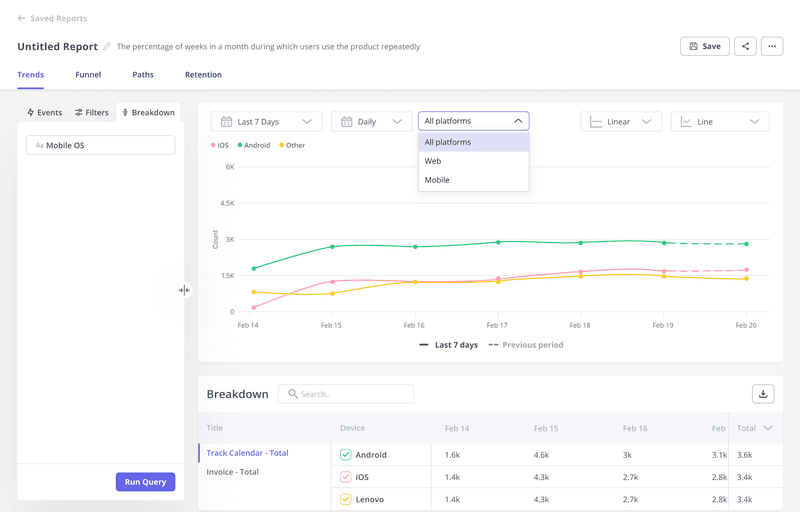
With Userpilot, you’ll be able to track both product usage and user behavior to get a holistic view of how customers use your product — which will guide future development, improve the user experience, and inform your growth efforts.

No-code product tours in Userpilot

Product tours are an effective way to show new users what a product can do and reduce the time-to-value (TTV) for them. Userpilot lets you build advanced product tours, set contextual triggers, and target specific audiences, all without writing a single line of code.

Here are the Userpilot features that you can use to build a product tour for your users:

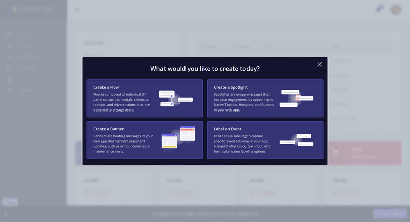
  • Flow builder: Userpilot’s no-code flow builder has a variety of UI patterns to choose from, such as modals, slideouts, tooltips, and driven actions. All UI patterns are available for use regardless of which Userpilot plan you’re on. All you need to do is install the Chrome extension.

no-code UI builder userpilot

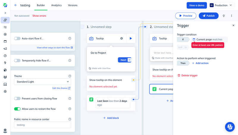
  • Contextual triggers: Userpilot lets you set triggers for your flows to ensure that they appear at the most contextual moments. Flows could be triggered when users land on a specific page or when a tracked event occurs. There are also manual triggering options that you can tinker with.

flow trigger for contextual support

  • Audience targeting: Userpilot’s audience targeting setting lets you set the conditions needed for a flow to show up for a specific user. You can use these settings to create flows that target a specific segment or exclude certain users from seeing a flow if certain conditions are met.

audience flow settings

In-app messaging in Userpilot

In-app messaging enables communication within your product to onboard new users or drive feature adoption among existing customers.

Here are a few ways you can send in-app messages using Userpilot:

  • Modals: Userpilot lets you use modals to send unmissable in-app messages to your users. Simply choose from one of the six templates or create a new modal from scratch. You’ll be able to use text, emojis, images, and videos to help your modals get the message across to users.

in app modal

  • Banners: Userpilot banners can be used to send in-app messages that are urgent but don’t need to take up the entire screen. You can also add blocks with text, emojis, images, videos, forms, custom JavaScript functions, and more to style banners to your liking.

banner settings in userpilot

  • Tooltips: They are the least intrusive form of in-app messaging as they only show up when users hover over an element or click on an info icon. You’ll be able to adjust the height, shape, color, and placement of tooltips to make them native-like.

Pricing of Userpilot

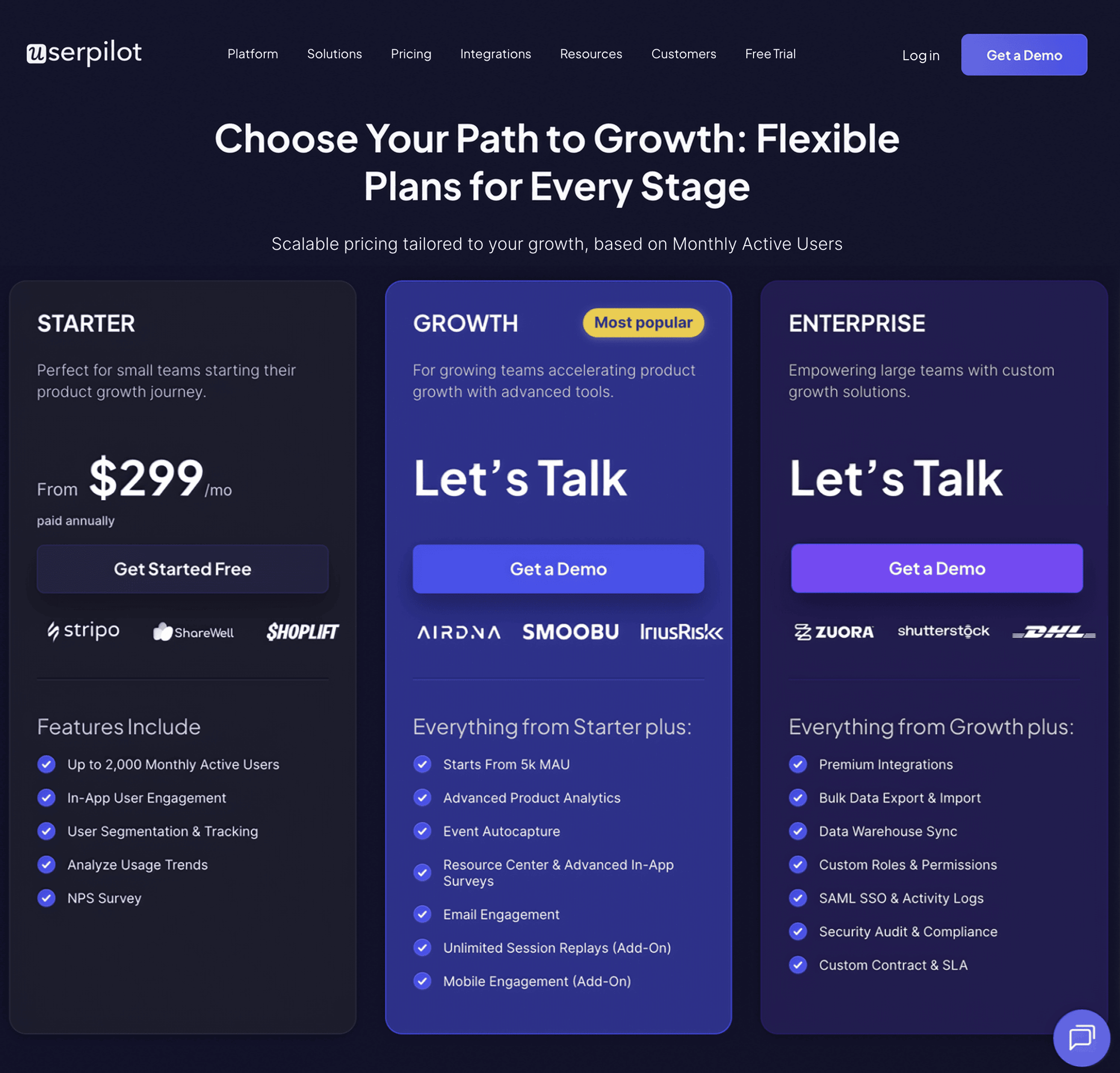
Userpilot’s transparent pricing ranges from $249/month on the entry-level end to an Enterprise tier for larger companies.

Furthermore, Userpilot’s entry-level plan includes access to all UI patterns and should include everything that most mid-market SaaS businesses need to get started.

userpilot pricing new april 2024
Userpilot has three paid plans to choose from:

  • Starter: The entry-level Starter plan starts at $249/month and includes features like segmentation, product analytics, reporting, user engagement, NPS feedback, and customization.
  • Growth: The Growth plan starts at $749/month and includes features like resource centers, advanced event-based triggers, unlimited feature tagging, AI-powered content localization, EU hosting options, and a dedicated customer success manager.
  • Enterprise: The Enterprise plan uses custom pricing and includes all the features from Starter + Growth plus custom roles/permissions, access to premium integrations, priority support, custom contract, SLA, SAML SSO, activity logs, security audit, and compliance (SOC 2/GDPR).

What do users say about Userpilot?

Most users laud Userpilot for its versatile feature set, ease of use, and responsive support team:

I recently had the pleasure of using Userpilot, and I must say it exceeded all my expectations. As a product manager, I’m always on the lookout for tools that can enhance user onboarding and improve overall user experience. Userpilot not only delivered on these fronts but also went above and beyond with its impressive new features, unparalleled ease of use, and truly exceptional customer support.

What truly sets Userpilot apart is its outstanding customer support. Throughout my journey with Userpilot, the support team has been responsive, knowledgeable, and genuinely dedicated to helping me succeed. Whenever I had a question or encountered an issue, their support team was always there to assist promptly, going above and beyond to ensure my concerns were addressed effectively.

Source: G2.

Of course, other users are also kind enough to share constructive criticism regarding specific features like event tracking filters:

“The filtration while analyzing specific events is a little confusing. Understanding of custom properties and data management configuration could have been more organised.”

Source: G2.

Conclusion

This is the end of our thorough comparison between Appcues and Spekit. You should be able to make a confident decision by now. If you’re looking for a solid tool for building interactive user guides that promises great value for money, give Userpilot a go. Book a demo today.

Userpilot – A Better Alternative for Building Interactive User Guides

previous post next post