10 Bad UX Examples That You Can Learn From


From the annoying Netflix autoplay feature to overly complicated vending machines, we all encounter bad UX examples every day.
Today’s article aims to help you avoid becoming another example for your customers. We’ll dissect ten design fails that negatively affect the customer experience, discuss what could have been done differently, and offer actionable insights to improve your UX design efforts.
Bad UX example #1: Zapier’s long onboarding checklist
Zapier is a powerful automation tool that aims to simplify complex workflows, but ironically, its onboarding process is anything but simple.
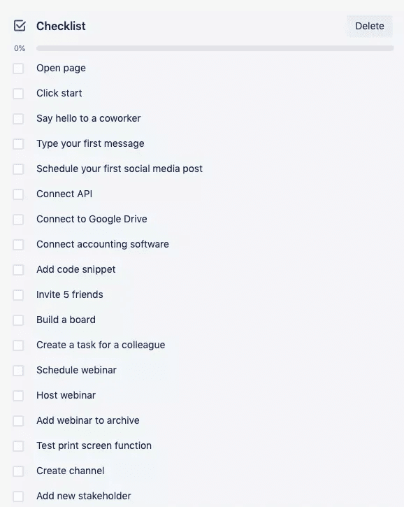
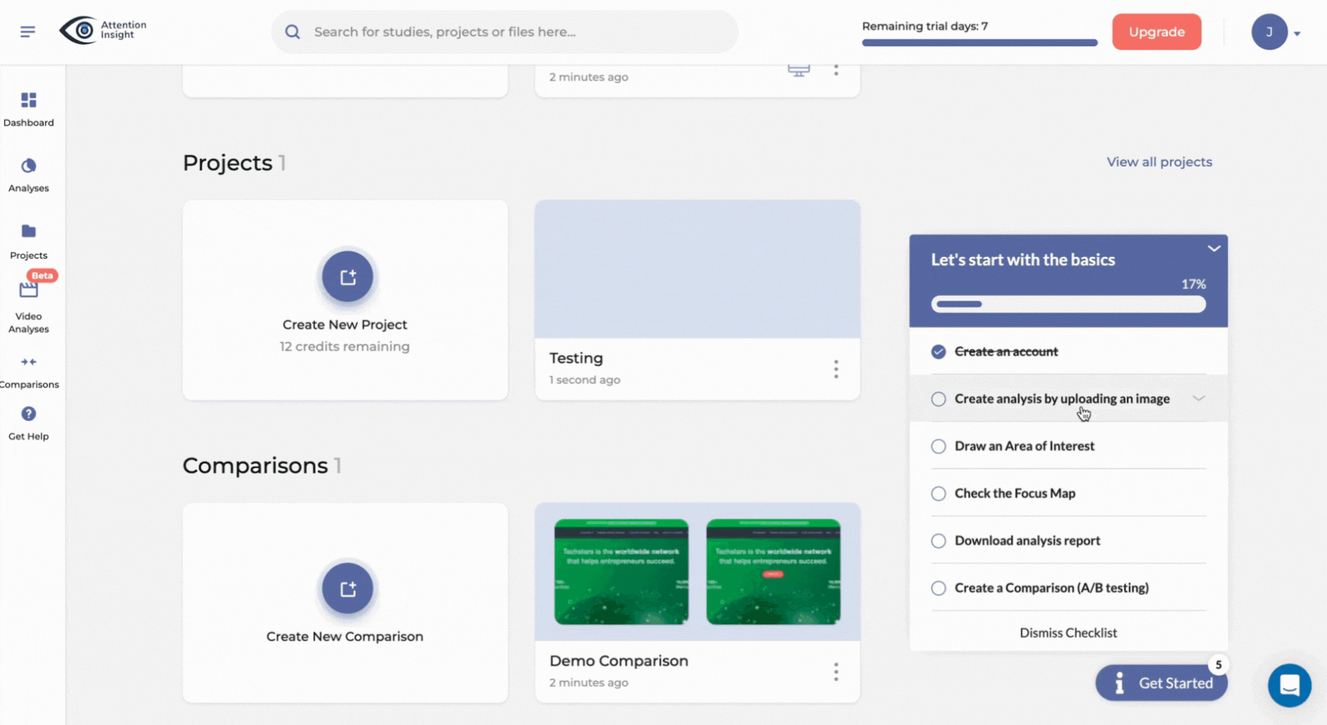
New users are greeted with a daunting checklist of over 15 items (see screenshot below). This overwhelming list, presented without any clear prioritization or visual hierarchy, can lead to choice paralysis and a sense of frustration before users even begin to explore the platform’s capabilities.
In addition, a long checklist like this extends the time to value because users will get bogged down in less important tasks.
Lesson: Focus on key actions for quick value realization
Keep your onboarding checklist short, highlighting just a few key activation events that will lead to initial Aha! Moments for your users.
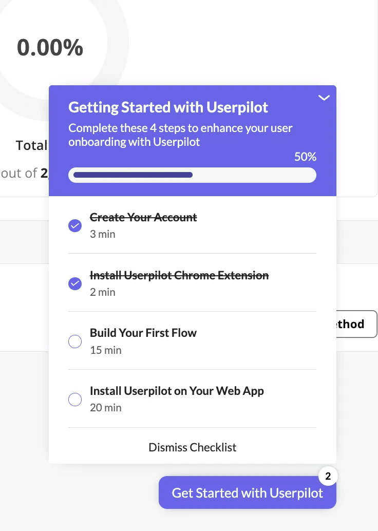
Ideally, your checklist should have 3-5 items. Anything more than that will begin to feel too long and annoy users.
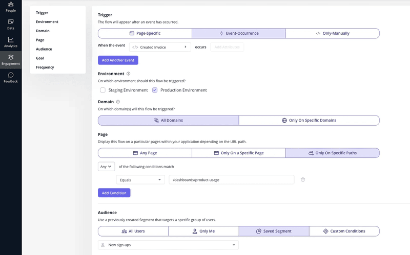
Consider the example below. Notice a few important elements:
- Focused actions: The checklist includes four main events, each action building on the previous one.
- Progress visualization: The checklist uses a progress bar to give users a sense of achievement and trigger the Zeigarnik effect—our natural tendency to remember and prioritize unfinished tasks.
- Time estimates: Adding an estimated time to completion for each event helps set the right expectations and encourages users to commit to manageable steps.
Bad UX example #2: GetANewsletter’s linear product tour
GetANewsletter is an email marketing tool that also lets you build landing pages, create customer surveys, and perform SMS marketing.
Upon signing up, new users are immediately launched into a product tour. The intention is to explain the core features so customers don’t get stuck when using the platform.
Unfortunately, GetANewsletter’s product tour is linear, and this is where the problems start.
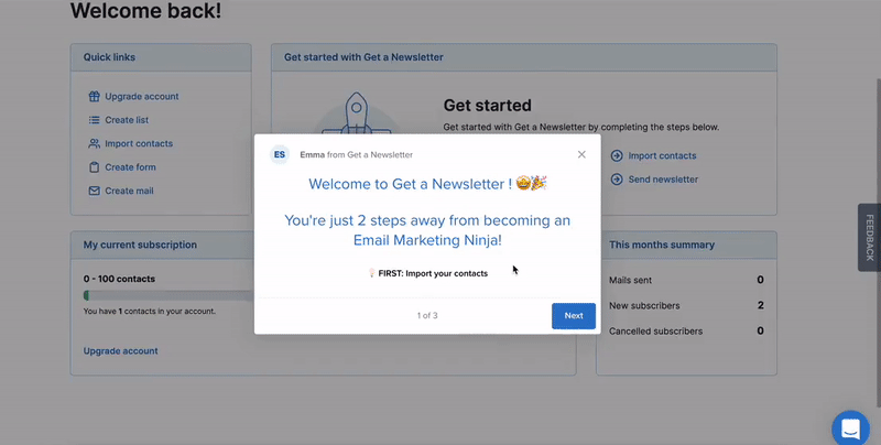
As you can see in the gif above, the platform is in such a hurry to showcase all its features that it prompts the user to send a newsletter before they’ve successfully added their email list. This is problematic because it forces users to interact with a feature that is contextually irrelevant at that stage in their journey. Such a confusing flow can lead to frustration, a sense of being overwhelmed, and potentially cause users to abandon the platform.
Lesson: make your tours interactive
Interactive tours actively engage users, allowing them to learn by doing and explore features at their own pace. This leads to better comprehension and higher retention of information.
To improve its user experience, GetANewsletter could set “Uploaded Email List” as a custom event and only show subsequent parts of the tour to users who have completed that event.
That’s similar to what Attention Insights did. Rather than burden users with too much information, the company utilized Userpilot to create an interactive walkthrough that guides users step-by-step, ensuring they actively perform a key action before moving to the next step.
Bad UX example #3: LinkedIn’s empty states
One of the many features that LinkedIn offers is the ability to join groups of like-minded professionals.
If you’re already in groups that are benefiting your career, you’ll probably be interested in joining more of them. So LinkedIn released the Discover feature, which allows you to do just that.
In practice, this is what the Discover feature looks like:
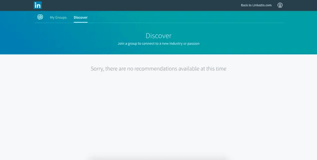
It can be rather daunting for a customer to be confronted with so much empty space waiting to be filled.
Unless they have an incredibly compelling reason to persevere with the Discover feature, a user might be more tempted to play games on their phone, check Facebook, and generally procrastinate on getting started with using Discover.
A professional UX designer would call this example of bad UX an “empty state.”
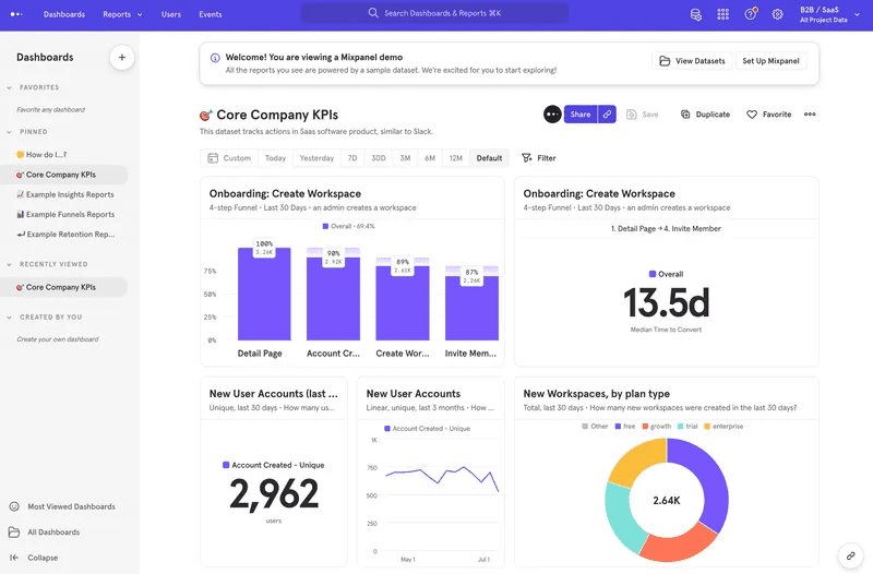
Lesson: fill empty states with valuable demo content
Fortunately, there’s an easy solution to this one.
In cases where a new user hasn’t created content yet, it’s customary to give the user demo content like Mixpanel does below so they can see what your product might look like once they’ve started inputting their data.
From the user’s perspective, this means that your platform feels less lifeless than it would have done with an empty state.
The fact that it now requires less activation energy for them to get started with using your product is also a nice bonus!
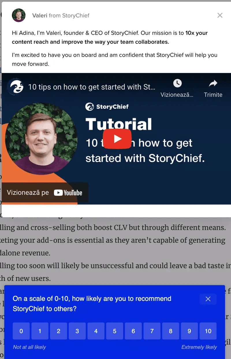
Bad UX example #4: StoryChief’s excessive use of pop-ups
StoryChief’s educational modal pops up at the same time as an NPS survey while the user is in the middle of the product.
Aside from the frustration that comes with disrupting the user’s flow, those two UI elements are completely different and almost conflicting.
Take a look at the image below.
Ten tips on getting started with a product are best suited for a total beginner, not someone who has had some experience with your tool. If anything, you should share advanced tips to maximize a few features that your analytics report shows users aren’t engaging with.
And if you assume the user is new to your tool, they have no business seeing an NPS survey asking about their likelihood of recommending you to others. New users haven’t engaged enough to provide experience-driven feedback.
Lesson: trigger your in-app messages contextually
To avoid situations like this, use analytics tools to track user behavior and create contextual experiences based on specific in-app events.
For example, you can trigger guidance for advanced features only after core feature adoption. Also, you could set your in-app survey to trigger only after the user has spent a specific number of days on your platform and completed specific engagement milestones.
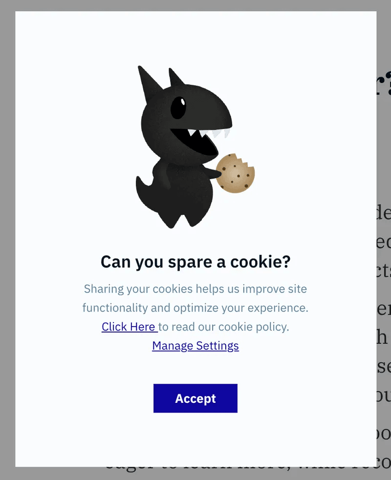
Bad UX example #5: Amplitude forgetting to add an X to a modal
Amplitude is a sophisticated product analytics suite used by companies as large as Ford and Walmart, so they must be doing something right. However, with this cookie consent modal, they definitely miss the mark.
Imagine you were doing something really important before this modal popped up, such as looking at analytics for your power users. Perhaps you really don’t want to be disturbed at that moment, so you look for a way to exit the modal. But there is no “X” button.
Your only choices are to click “Accept” or flip through the account settings, hoping to find a way to opt-out. This dark pattern manipulatively leads users toward clicking “Accept,” even if they don’t want to, and the subtle guilt trip in the header (“Can you spare a cookie?”) makes this even more egregious.
Lesson: Respect your users’ autonomy
While it’s understandable that Amplitude wants users to accept cookies, this shouldn’t come at the expense of user choice. Consent is a fundamental value, especially for something as disruptive as a modal.
Modals, by their very nature, demand attention. Therefore, it’s essential to balance this with respect for user choice.
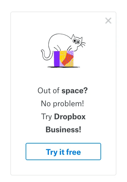
As you can see in the Dropbox example below, a simple “X” button provides a clear exit route. This empowers users to control their experience and creates a sense of trust.
You might lose out on some CTA clicks in the short term, but in the long term, respecting user autonomy will garner trust and loyalty.
Bad UX example #6: ClickDimensions’ neurotic use of captchas
ClickDimensions is a leading marketing automation platform built specifically for Microsoft Dynamics.
One feature it offers is the ability to add multiple image captchas to a form. The thinking is that adding captchas will help keep the form more secure.
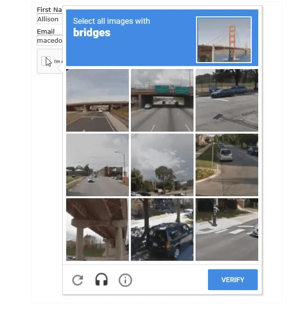
While this feature is almost certainly well-intentioned, it’s frustrating from a user’s perspective.
This amount of friction is bad UX, period—especially if it’s popping up in the middle of something important.
Image captchas like these are often part of unnecessarily complicated password requirements, but there’s always a way to do it without frustrating customers.
Lesson: balance security with usability
Strive for a user flow that is both secure and user-friendly. By minimizing friction and prioritizing a positive user experience, you can encourage user engagement without compromising on essential security practices.
As an example, here’s a signup flow with just the right amount of friction:
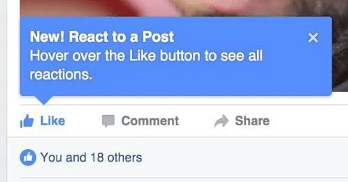
Bad UX example #7: Citibank’s excessive verbosity
Most of Citibank’s users will understand the concept of a search bar, so this copy is wholly unnecessary and even patronizing.

Lesson: make every word count
Have a good, hard look at your UX writing before releasing it to the public.
Ask yourself:
- Is there a section that is just fluff?
- Is there any corporate jargon?
- Are you stating the obvious, like Citibank in this bad UX example?
Cut all of it out and say the bare minimum that you need to get your point across.
Look how concise Facebook is in their copy here, by comparison:
Bad UX example #8: WhatsApp’s delete message feature
Even massive messaging platforms like WhatsApp aren’t immune to UX design fails. Users often need to delete messages without drawing attention to the action. Perhaps they sent a message with a typo, or they simply changed their mind about what they wanted to say.
Unfortunately, the delete message feature WhatsApp uses doesn’t quite live up to its name.
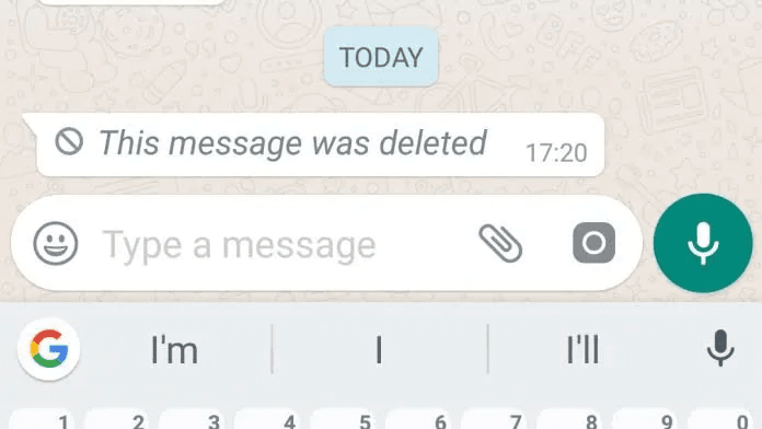
As you can see, when a user deletes a message, it’s replaced with a conspicuous notification that screams, “Something was here, but now it’s gone!”
This creates an awkward situation, often leading to more questions and suspicion than if the message had simply disappeared. It undermines the user’s intention to discreetly retract a message, taking away their agency in the communication process.
Lesson: Honor the promises you make to your customers
From a UX design perspective, this is a horribly confusing result for Whatsapp users.
If you see “delete message for everyone,” it’s natural to expect that your message will vanish entirely for all parties.
What you don’t expect is that a residual part of your message will remain, showing the other person that you wrote to them but want to hide your original message.
If your company says that your product will do something, then try to ensure you deliver on your promises. Or at least use a microcopy that clearly explains what will happen when the user takes action. In this case, WhatsApp could have said something along the lines of:
“Delete message for everyone (a notification will be shown in the chat)’.”
Or, to be even more explicit:
“…Delete message for everyone (this will replace your message with a notification that a message was deleted).”
Bad UX example #9: Apple’s storage management system
Yes, even the brainchild of design icon Steve Jobs has been known to create poor customer experiences.
Imagine that you’ve just got engaged to your partner. You’re elated and want to share your special moment with the world, so you grab your iPhone to take a picture. And here’s what you see:
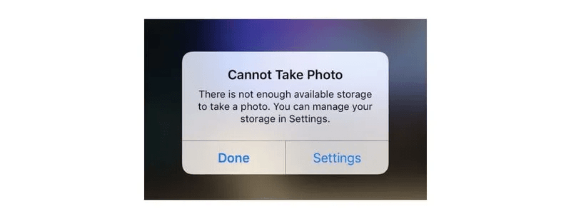
It’s a bit of a mood killer, to put it mildly. You’ll have to spend the next few minutes working out what other photos to delete before you can get back to enjoying one of the most meaningful moments of your life.
Lesson: give the user a clear next step
What’s especially annoying about this particular example is how there’s no obvious way out of this modal.
There’s no X to tap on if you were thinking of deferring this problem until another time.
If you tap Done, the notification will continue to stick around in the background, pestering you until you free up space.
And if you do what I think Apple wants you to do and hit Settings to free up some space, there’s no clear way of seeing what to delete and what not to.
All in all, it’s a very frustrating user experience.
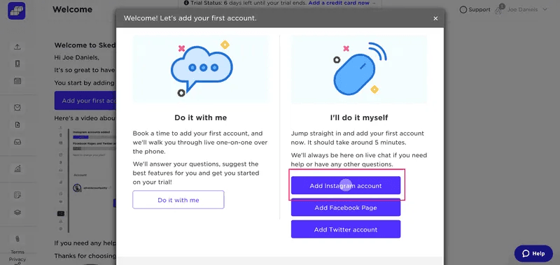
On the flip side, here’s an example from Sked Social. Notice how the modal gives users multiple action steps and even provides an X button to dismiss the modal if they so desire.
Bad UX example #10: Wayfair’s overwhelming dropdown menu
Wayfair aimed to simplify the customer experience by making every item category accessible from the homepage. However, this resulted in a cluttered screen that easily overwhelms users.
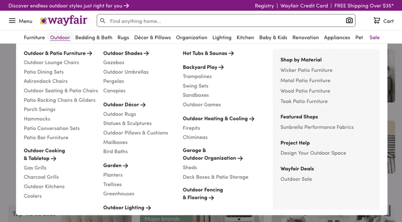
As you can see, the sheer volume of categories and subcategories presented in a single dropdown can cause cognitive overload. This design burdens users with choices, making it difficult to find specific items and potentially leading to decision paralysis.
In addition, the hover-based triggers can lead to unintended interactions. Imagine a user trying to quickly move their mouse to the “Outdoor Lighting” category. They might unintentionally trigger the “Garden” dropdown, interrupting their flow and forcing them to backtrack.
Lesson: Embrace simplicity
As we saw with Wayfair’s overwhelming menu, even with the best intentions, complex designs can hinder usability. Embracing simplicity is key to creating intuitive and enjoyable experiences.
What does simplicity mean in UX design? It means:
- Prioritizing essential features and content.
- Using clear and concise language.
- Employing visual hierarchy
- Providing ample whitespace.
To ensure your design truly embraces simplicity, conduct rigorous user research before and after release. This might involve user testing to observe how people interact with the design, A/B testing to compare different variations, and gathering user feedback through surveys and interviews.
Conclusion
Hopefully, the bad UX examples in this article have helped you spot some mistakes that could be hindering your user engagement. By avoiding these common design pitfalls, you can create user experiences that are both effective and enjoyable.
Ready to take it to the next step? As mentioned earlier, Userpilot can help you understand user needs and deploy contextual experiences. Grab a demo to get started!
FAQ
What is an example of bad UX design?
A few examples of bad UX design include confusing navigations, cluttered interfaces, slow loading times, unclear instructions, and hidden or difficult-to-find features.
How to spot bad UX?
To spot bad UX, look for common signs such as:
- Reduced user engagement.
- High page bounce rates.
- New user churn.
- Rage clicks.
- Low conversions
What does poor UX mean?
Poor UX means that a user has a negative experience when interacting with a product.
In other words, the user struggles to complete tasks and achieve their goals within the app.
What makes a bad UX design?
Bad UX design is any design that fails to meet user needs. It can be confusing, inefficient, or even deceptive. This leads to the kind of frustration that forces users to abandon websites and delete apps.
About the author