Quantitative Data in 2026: From Collecting Metrics to Autonomous Execution


Quantitative data used to have a simple job: tell us what was happening, how fast, and with how many users. The analytics infrastructure we built around it assumed a human would open a dashboard, spot something worth discussing, and bring it to the next team review. In 2026, an AI agent monitors those same numbers continuously, detects anomalies, and initiates a response before anyone has opened a tab.
Two things happened simultaneously: NLP converted qualitative text into structured numerical datasets at scale, and closed-loop systems started executing on metrics without waiting for a human decision in the middle. Quantitative data is no longer just what you collect and report on; it is what your systems interpret and execute against. This post covers what changed, what to measure, and how to act on it:
- Explains what quantitative data is and what actually changed in 2026.
- Maps the types of quantitative data and why the distinctions matter for analysis.
- Organizes the SaaS metrics that matter now into a usable framework.
- Walks through how to collect quantitative data and, more importantly, how to act on it.

What quantitative data actually is (and what it has become)
At its core, quantitative data is information that can be counted or measured and expressed as a number. It answers “what,” “how many,” and “how often,” the kind of questions where a numerical value is both possible and meaningful. NPS score: 42, feature adoption rate: 34%, monthly active users: 8,200. Each of those is a number attached to a specific, repeatable measurement.
That definition has not changed. What changed is who (or what) does the measuring, how fast the measurement cycles run, and what happens to the numbers once they exist. Data-driven decisions used to mean a human analyzing numbers on a screen at a scheduled time. They now increasingly mean an AI system interpreting a live metric stream and triggering an action without anyone reviewing it first.
For product teams, the practical implication is this: quantitative data needs to be clean, structured, and connected to systems capable of acting on it. Storing it in a dashboard for someone to look at next week is the old model.
Examples of quantitative data in a SaaS context
The most useful examples of quantitative data for SaaS product work fall into a few natural categories. Daily Active Users (DAU), Weekly Active Users (WAU), and Monthly Active Users (MAU) measure engagement volume. Monthly Recurring Revenue (MRR) and Annual Recurring Revenue (ARR) measure revenue health. Feature adoption rates, activation percentages, and time-to-value measure how well the product is delivering on its core promise.
Other common examples include conversion rates (the percentage of users who take a desired action), customer churn (the percentage of customers who stop using the product over a given period), satisfaction scores collected through surveys, and Average Revenue Per User (ARPU). Each of these is a discrete, reproducible measurement that lends itself to statistical analysis, trend tracking, and comparison across cohorts or time periods.
What makes these examples interesting in 2026 is not the metrics themselves but what happens to them downstream. Systems now watch these numbers, detect anomalies, and execute responses automatically, something that previously required a human analyst, a Slack message, and a sprint ticket.
How 2026 changed the rules for quantitative data
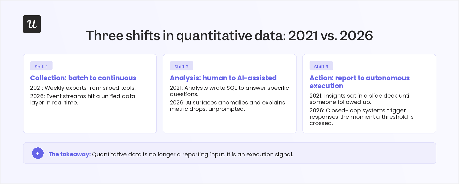
The fundamental definition of quantitative data has not moved. What shifted is everything around it: how it gets generated, how fast it gets processed, and what gets done with it once it exists. Three changes hit simultaneously in 2025 and 2026, and they reinforce each other.
The shift from pull analytics to agentic execution
Traditional quantitative research workflows required someone to initiate the analysis. An analyst built a dashboard, a PM scheduled a weekly review, and a report landed in someone’s inbox on Friday morning. The data sat idle until a human decided what to do with it.
According to Polestar Analytics, 2026 marked the rise of agentic analytics: AI agents that actively monitor quantitative data streams, recognize numerical anomalies, and formulate business responses autonomously, without waiting for a human to open a dashboard. The same agent that spots a drop in feature adoption metrics can trigger an in-app tooltip, flag the issue in a Slack channel, and update a tracking metric before an analyst would have noticed the problem existed.
At Userpilot, our CEO Yazan Sehwail has been direct about what this shift means for how teams operate. “You’re no longer operating. The AI is operating. You’re just basically evaluating and monitoring the agent workflow.” The human role changes from pulling data to setting parameters and reviewing outputs.
The quantization of qualitative data
Quantitative and qualitative data have historically been treated as opposites: numbers on one side, words on the other. That distinction shaped how teams built their research stacks, how they hired analysts, and how they structured the handoff between user research and product analytics.
NLP changed the economics of that boundary. Systems can now ingest millions of pages of unstructured text (global patent filings, support tickets, survey responses, unstructured audio transcripts) and transform them into structured numerical data for statistical modeling in days rather than months. Research that previously required manual coding by a team of analysts can now run on large datasets automatically, producing sentiment scores, topic frequency counts, and classification probabilities that feed into the same statistical models you would use for any other numerical dataset.
The risk worth naming: a sentiment score is still a model’s interpretation of language, not a ground truth. Any quantitative output is only as trustworthy as the NLP system producing it, and treating it as equivalent to a directly measured metric leads to overconfident conclusions.
Closed-loop execution vs. basic reporting
The third shift is about what happens to quantitative data once it exists. Historically, the expectation was descriptive: data flows into a tool, the tool produces a report, and the report informs a meeting. In 2026, that expectation shifted to closed-loop decision intelligence: data layers connect directly to execution layers, so a metric threshold can trigger a downstream action without a human decision point between them.
In SaaS, this shows up as pricing adjustments that respond to usage signals, churn-prevention workflows that fire when a health score drops below a threshold, and onboarding sequences that adapt based on which features a user has and has not touched. Edge computing and optimized streaming metrics layers now process high-volume operational data in real time rather than routing everything through a centralized cloud database on a batch schedule.
The lag that used to define reporting (hours, sometimes days) is gone for the systems that matter most. The teams still running weekly manual reporting cycles are not slower than their competitors by a day; they are slower by an architectural generation.
The four types of quantitative data
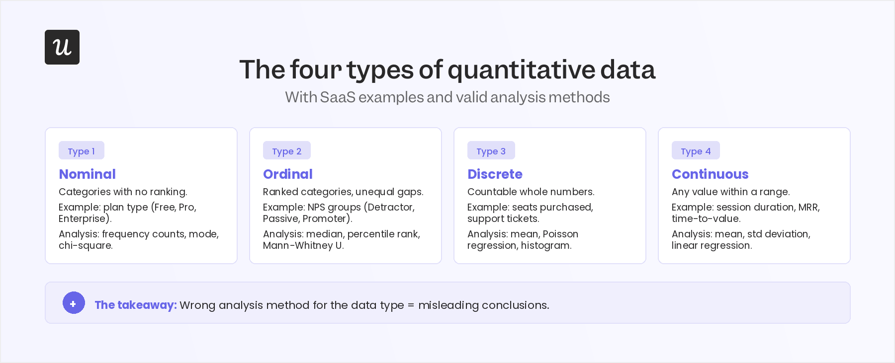
Understanding quantitative data types matters because each type has different measurement properties, which determine which statistical methods are valid and how the data should be visualized. Using the wrong analysis method for a given data type produces conclusions that look precise but are not grounded in the math.
Nominal data
Nominal data categorizes information into groups without any inherent order or ranking between them. The categories are mutually exclusive labels that indicate group membership but carry no hierarchy. In a SaaS context, user roles (admin, editor, viewer), subscription tiers (free, basic, premium, enterprise), and acquisition channels (organic search, paid, referral) are all nominal data.
Nominal data is typically represented using data analytics charts like bar charts or pie charts, showing frequency or proportion by category. You can count and compare frequencies between groups, but calculating a mean is not meaningful. “The average user role is 2.3” tells you nothing useful about the distribution.
Ordinal data
Ordinal data has a meaningful order between categories, but the intervals between those categories are not necessarily equal. A five-point Likert scale running from “strongly disagree” to “strongly agree” is ordinal: you know that 4 ranks higher than 3, but you cannot assume the psychological gap between 3 and 4 is identical to the gap between 1 and 2. Support ticket priority levels and feature request ratings fall into this category.
Stacked bar charts and frequency distributions work well for ordinal data. Median and mode are appropriate summary statistics; mean is technically misapplied to ordinal data, though it is common practice for Likert scales when researchers are explicit about the limitation.
Discrete data
Discrete data takes on countable integer values, whole numbers with no fractional values between them. The number of new sign-ups today, the count of support tickets received this week, the number of users who completed a user onboarding checklist: these are all discrete. Each value is a distinct, countable whole number; there is no such thing as 2.7 sign-ups.
Bar charts and column charts work well for discrete data because each bar represents a specific, countable value. Statistical analysis of discrete data typically involves counts, proportions, and tests designed for count data (such as chi-square tests for comparing distributions across groups).
Continuous data
Continuous data can take any numerical value within a range, including fractional values. Time spent in a product session, bandwidth consumed, revenue generated over a period: these are all continuous because the measurements exist on an unbroken scale. A session can last 4.37 minutes, and revenue for a quarter can be $847,293.14.
Histograms and line charts suit continuous data because they represent the distribution across an unbroken range rather than discrete counts. Continuous data is where descriptive statistics (mean, standard deviation, percentiles) and inferential statistics (regression, t-tests, ANOVA) are most naturally applied.
Two additional types worth knowing for quantitative data analysis: interval data has equal spacing between values but no meaningful zero point (temperature in Celsius is the standard example: 0°C does not mean “no temperature”). Ratio data has equal spacing and a meaningful zero (MRR of $0 means zero recurring revenue). Most SaaS products and financial metrics are ratio data, which means ratios between values are mathematically valid, so saying “ARR this year is twice last year’s” is a legitimate claim.
The SaaS quantitative metrics that actually matter
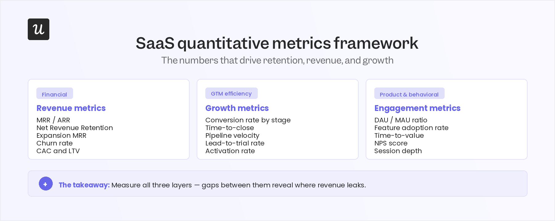
Every SaaS team tracks some version of quantitative metrics, but the frameworks for organizing them vary wildly. After a few years of building and reviewing these systems at Userpilot, I have landed on three buckets that cover what matters at each stage of the business.
Core financial and revenue multiples
Monthly Recurring Revenue (MRR) and Annual Recurring Revenue (ARR): These are the normalized measures of predictable subscription revenue. The more useful practice is not just tracking the total but decomposing it into an ARR waterfall that separately isolates new logos, expansion from existing customers, contraction, and churn. A blended ARR number hides which lever is driving growth or causing problems, and hiding that signal is how teams end up surprised by churn.
Net Revenue Retention (NRR): Measures the percentage of recurring revenue retained from existing customers over a period, factoring in expansions, cross-sells, and downgrades. Strong NRR (typically above 110% for healthy SaaS companies) means your existing customer base is growing revenue even without new customer acquisition. It is one of the clearest indicators of sustainable compounding growth in the business.
The Rule of 40: Combines revenue growth rate and profit margin into a single health index: if the two numbers sum to 40 or more, the business is in a position the market typically rewards with a premium valuation. SaaS benchmarking data from 2026 consistently identifies the Rule of 40 as the strongest quantitative predictor of premium valuations in both private and public markets.
GTM efficiency metrics
- CAC Payback Period: Measures how many months of subscription revenue it takes to recover the average customer acquisition cost. Payback periods above 24 months create cash flow pressure that compounds as you scale; shorter periods free up capital for reinvestment and reduce business risk. This metric deserves more attention than it typically gets during early-stage financial planning.
- LTV to CAC ratio: Compares a customer’s projected lifetime revenue contribution against what it costs to acquire them. A 3:1 ratio is the traditional baseline for long-term sustainability. According to SaaS benchmarking analysis from Coffee.ai, macroeconomic conditions in 2025 and 2026 slowed median public SaaS growth to roughly 15%, pushing companies to prioritize efficiency metrics, specifically the cost incurred to secure each net new dollar of ARR, over top-line growth alone.
Product and behavioral signals
- In-product quantitative data (DAU, WAU, and MAU): Measures engagement volume, but the more diagnostic metric is the ratio between them. A DAU/MAU ratio above 0.4 typically indicates habitual daily use; a ratio below 0.1 suggests the product is visited occasionally at best. Feature adoption rates and activation metrics tell you whether users are reaching the moments in your product that actually drive retention.
- Product-led signals: The behavioral triggers that leading software companies use to drive freemium to premium conversion. The Mixpanel State of Digital Analytics Report highlights how firms anchor their monetization engine around in-product usage data: automated tracking that fires expansion prompts and upsell signals based on specific behavioral thresholds rather than time-based schedules.
- Systems architecture teams add a third layer of product quantitative data: Multi-tenant infrastructure metrics including page load latency, tenant-specific error rates, and per-tenant server load. These are not product KPIs in the traditional sense, but they are quantitative data points that upstream directly from the conversion metrics, as slow load times and error spikes show up in churn numbers before they show up in support tickets.
Quantitative vs. qualitative data in 2026
The traditional distinction is clean and still useful: quantitative data is numerical and measurable, qualitative data is descriptive and expressed in words or visuals. Quantitative answers “what” and “how many,” while qualitative answers “why” and “how people experience it.” The two types serve different research questions and require different collection methods: surveys and usage tracking for quantitative, interviews and user tests for qualitative.
What changed is the pipeline between them. NLP systems can now take qualitative inputs (customer reviews, open-text survey responses, support ticket bodies) and produce quantitative outputs at a speed and scale that were not feasible without machine learning: sentiment scores, topic frequency distributions, and classification probabilities that feed directly into statistical models. The research generates the text; the quantitative analysis runs on the structured output.
One advantage of quantitative data that has not changed: it is far less susceptible to selection bias than qualitative research, where who you talk to shapes what you hear. A properly instrumented product analytics dataset captures behavior across your entire user base, not just the subset willing to sit for an interview. That objectivity and scale are what make quantitative data the foundation for product decisions, with qualitative research used to explain the mechanisms behind what the numbers reveal.
How to collect quantitative data in SaaS and act on it
I will be direct about something most guides skip: collecting quantitative data is not the hard part. Every SaaS team has some version of a product analytics tool and a survey platform. The part that actually separates teams is what happens after the data exists: whether you have built the workflows to act on it, or whether the numbers accumulate in dashboards that inform quarterly retrospectives.
Here are the five main quantitative data collection methods I use at Userpilot, and what acting on each one looks like in practice.
In-app surveys
Customer feedback surveys are one of the most reliable sources of structured quantitative data. Using in-app survey tools, I trigger in-app surveys with closed-ended questions (Likert scales, rating scales, multiple-choice questions) at specific moments in the user’s workflow rather than on a fixed schedule. A net promoter score survey triggered immediately after a user completes a key workflow collects more signal than one sent three weeks after signup.
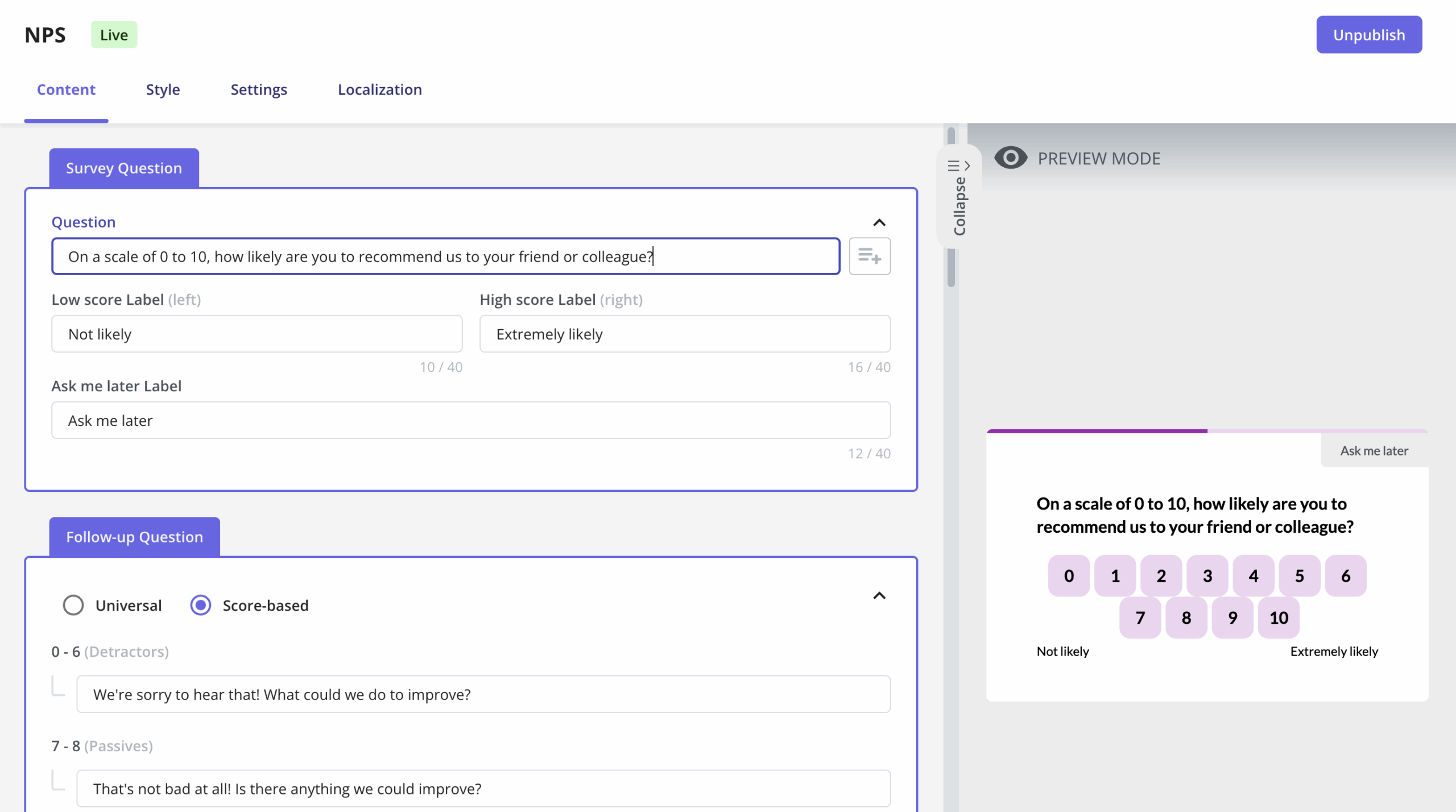
Survey analytics let you track the quantitative output (NPS scores, satisfaction ratings, feature preference rankings) over time to identify trends, segmented by cohort to compare user groups, and fed into the same analytics stack as your product usage data. Sampling matters here: if your survey only reaches power users, the quantitative data you collect will not represent your full user population, and the conclusions you draw from it will reflect that bias.
Product usage tracking
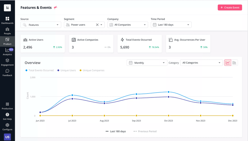
Product analytics tools are the primary source of behavioral quantitative data: what users click, which features they adopt, how long sessions run, and where drop-offs happen. The key is tracking meaningful events rather than tracking everything. I define events around moments that indicate progress toward value (not generic pageviews, but specific actions that correlate with retention and expansion).
Once those events are tracked, the data flows into feature adoption reports, conversion funnel analysis, and cohort comparisons. The “act on it” side is where it gets interesting: when we launched Userpilot’s email feature, the funnel data showed a sharp drop-off at domain verification, and instead of queuing an engineering ticket, I built a targeting tooltip and checklist directly inside Userpilot in a few hours. Within days, the drop-off closed, and the analytics-to-action loop did what a sprint ticket would have taken weeks to accomplish.
Customer support data
Support tickets are a rich source of quantitative data when structured properly. Tracking ticket volume by issue type, average resolution time, and customer feedback scores on each resolution gives you a numerical picture of where your product is creating friction. Categorizing tickets by type (feature requests, bugs, how-to questions, billing issues) lets you run frequency analysis and spot patterns that individual tickets would hide.
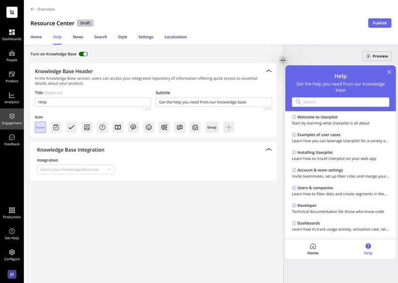
When support data shows a spike in how-to questions about a specific feature, that is quantitative evidence for a product improvement intervention: better in-app guidance, a resource center article, or a proactive tooltip triggered before users reach the confusion point. That is a more direct feedback loop than waiting for the support volume to show up as a concern in a quarterly review.
Experiments and A/B testing
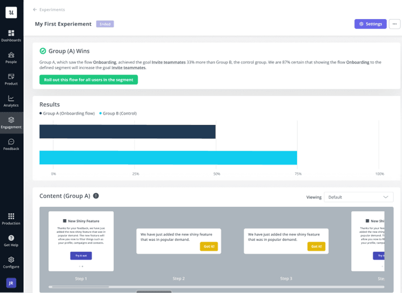
A/B testing is the method for collecting causal quantitative data, specifically the kind where you can say “this change caused this outcome” rather than “these two things happened at the same time.” Product experiments use controlled conditions to isolate variables, randomly assign users to variants, and measure the difference in outcomes using inferential statistics. The quantitative output (conversion rates, retention differences, engagement deltas) gives you evidence you can act on with confidence rather than just optimism.
The practical constraint is statistical power: you need enough users in each variant to detect a real difference rather than noise. Small sample sizes produce unreliable results that look precise because they come with a p-value. Understanding the math behind significance testing (or using tools that handle it automatically) is the difference between experiments that inform decisions and experiments that manufacture false confidence.
Open-source and third-party datasets
External datasets from platforms like Kaggle or Statista provide quantitative context you cannot collect internally: industry benchmarks, market sizing data, demographic distributions, and sector-level trend data. They are useful for product analysis that needs an external reference point, such as comparing your churn rate against industry averages or your activation rate against benchmarks from the Userpilot SaaS Product Metrics Benchmark Report.
The quality filter matters: verify the source, recency, and methodology of any external dataset before incorporating it into your analysis. Data discrepancies from poorly sourced external datasets create more confusion than the baseline uncertainty they were meant to reduce. Treat external quantitative data as context that sharpens your internal analysis, not as ground truth that replaces it.
Quantitative data analysis methods
Having quantitative data and analyzing it correctly are different problems. The analysis method you choose depends on what question you are trying to answer, and using the wrong method for the question produces conclusions that look numerically precise but point in the wrong direction. These are the six methods I use most at Userpilot.
Statistical analysis
Statistical analysis uses mathematical techniques to summarize, describe, and draw inferences from numerical data. Data-driven decisions typically start here: descriptive statistics (mean, median, standard deviation, percentiles) summarize what the data shows, while inferential statistics (hypothesis tests, regression, ANOVA) let you determine whether a difference between groups is real or attributable to random variation. Testing hypotheses uses inferential statistics to assess whether a result is statistically significant, meaning whether you can rule out chance as the explanation.
For SaaS product teams, statistical analysis appears most often in significance testing for experiments, regression analysis for understanding which behavioral variables predict retention, and distribution analysis for understanding variance in engagement metrics. The limitation is interpretability: a statistically significant result tells you the difference probably is not chance, but it does not tell you whether the difference is large enough to matter for your product decisions.
Trend analysis
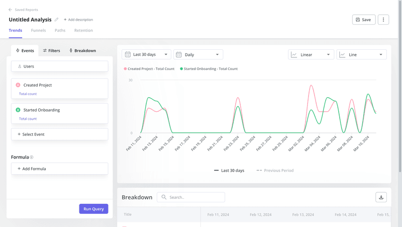
Trend analysis tracks quantitative data points over time to identify consistent patterns: upward movement, seasonal cycles, inflection points that correspond to product changes or market shifts. Using trend analysis reports, you can see how metrics like feature adoption rate, DAU, or NPS score evolve across weeks and months. Analysts use historical numerical data to forecast future outcomes, the same way you would use months of retention data to project churn for next quarter.
Funnel analysis
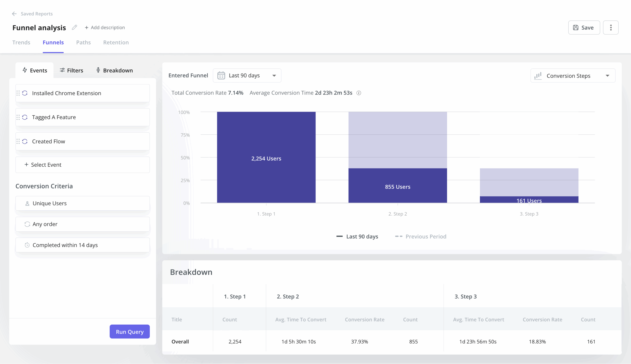
Funnel analysis defines key conversion stages and tracks the count and percentage of users progressing through each one. The quantitative output (step-level conversion rates and drop-off points) shows exactly where users are exiting the funnel. The value is not in the aggregate funnel conversion rate; it is in the step-level breakdown that tells you which specific transition is costing you the most, so you know where to focus.
Cohort analysis
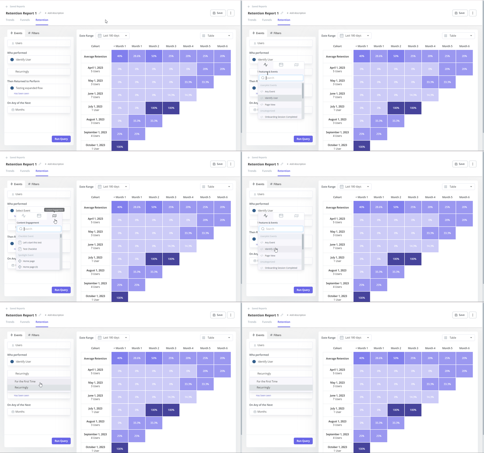
Cohort retention analysis groups users by a shared attribute (month of sign-up, acquisition channel, pricing tier) and tracks how each group’s behavior evolves over time. The quantitative output is a retention matrix: what percentage of each cohort is still active at 30, 60, and 90 days. Retention analysis by cohort is how you determine whether a product change actually improved retention or whether the improvement in your aggregate metric was driven by a specific cohort that happened to be onboarded during a favorable period.
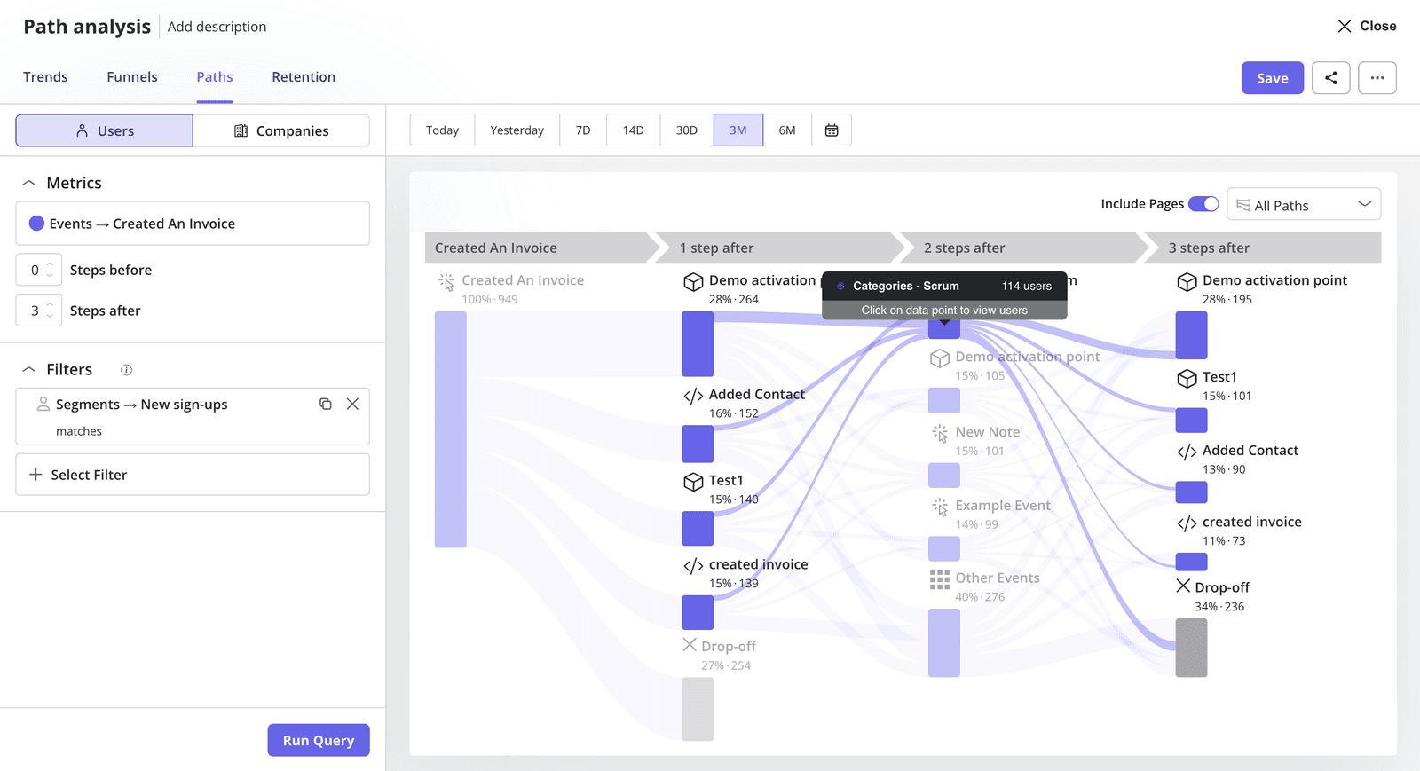
Path analysis
Path analysis maps the sequences of actions users take through your product, treating each sequence as a quantitative dataset. By tracking user paths, you can identify the “happy path” (the sequence of actions that correlates with retention and expansion) and compare it against the paths that precede churn. The quantitative value is in frequency: which path do 80% of your retained users follow, and which path do 70% of churned users take before they leave?
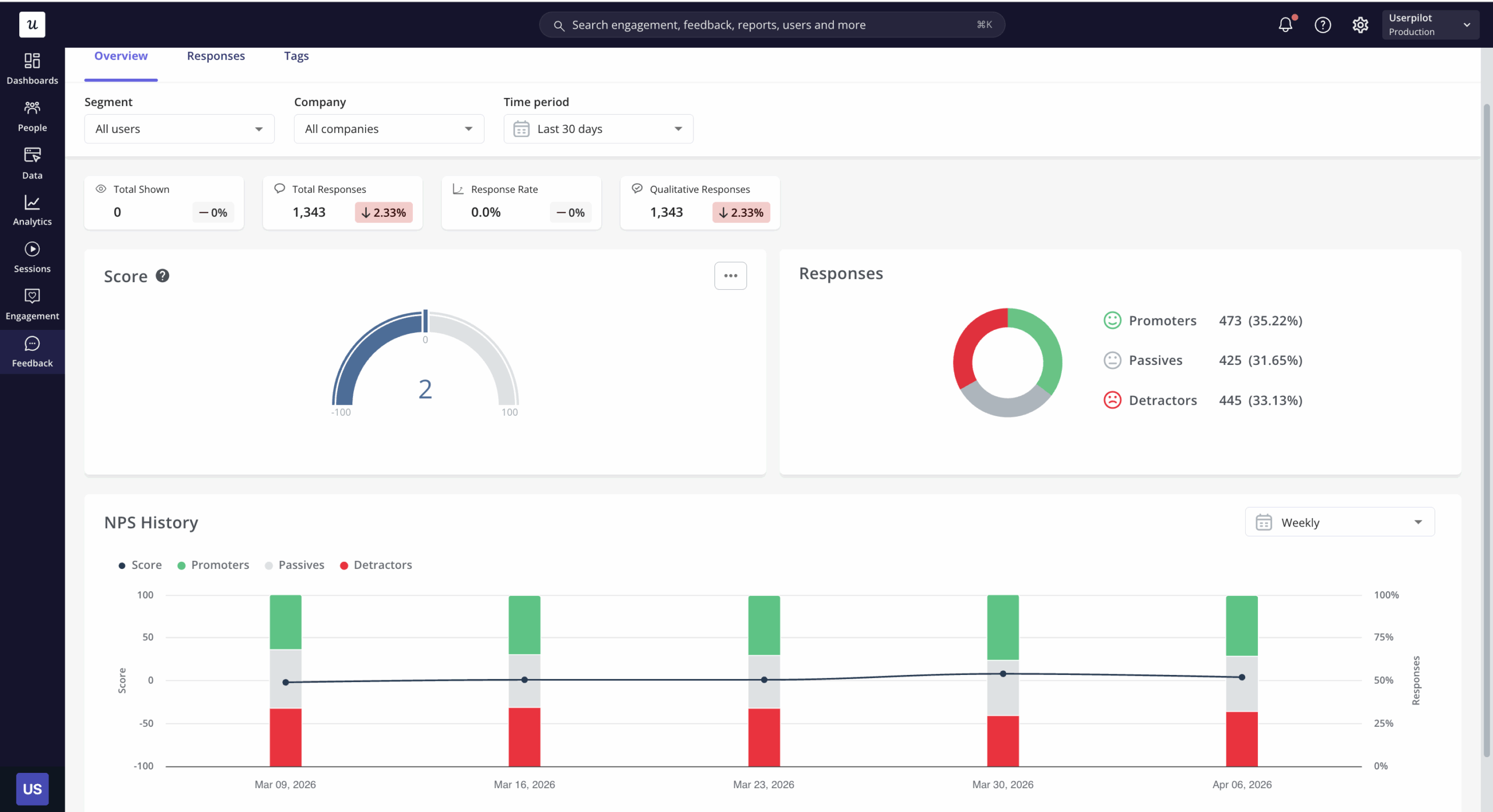
Feedback analysis
Feedback analysis examines responses to closed-ended questions to identify numerical patterns in customer feedback. NPS distributions, feature satisfaction ratings, and CSAT scores are all quantitative outputs from survey instruments that allow you to track changes over time, compare segments, and identify which user groups are most and least satisfied. The quantitative version of feedback analysis is distinct from thematic analysis of open-text responses, though both should inform the same decisions.
From collecting quantitative data to acting on it
The shift described at the start of this post (from pull analytics to agentic execution) changes what you should look for in an AI product analytics platform. Collecting and visualizing quantitative data is no longer the differentiator. The question is whether the tool connects those numbers to action and whether it can monitor them continuously without a human initiating every review cycle.
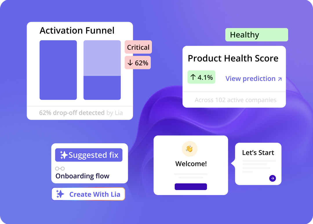
Lia, Userpilot’s AI agent, sits at that intersection, monitoring quantitative signals (feature adoption rates, funnel drop-offs, NPS score trends) and surfacing recommendations without waiting for you to run a report. When an adoption metric drops below a defined threshold, she flags it; when a funnel step shows unusual drop-off, she surfaces where to investigate. As Yazan puts it: “If you as a marketer wanted to see, using NPS data, survey data, and product usage data, you’re able to get your answer without having to go to Userpilot, without having to pull data and upload it to someone.”
If quantitative data is the foundation, the question is always what it enables you to do next, not what it tells you in a report, but what it causes to happen downstream. That is the 2026 version of the question, and it is a more useful frame for building a data practice than asking which metrics to track.
See how Userpilot connects quantitative data collection to in-product action: from funnel analysis through automated in-app responses, without waiting for a developer sprint.
About the author