The SaaS User Onboarding Funnel in 2026: Build it around Time-to-First-Value


A great onboarding experience shortens time to value and gives users a reason to come back. Yet that’s where many SaaS products fall short. Across 62 B2B SaaS companies, the average activation rate is just 37.5%, meaning nearly two-thirds of new signups never experience the product’s core value.
The consequences are hard to ignore: Amplitude found that more than 98% of users who never reach a meaningful value milestone are lost to customer churn within two weeks.
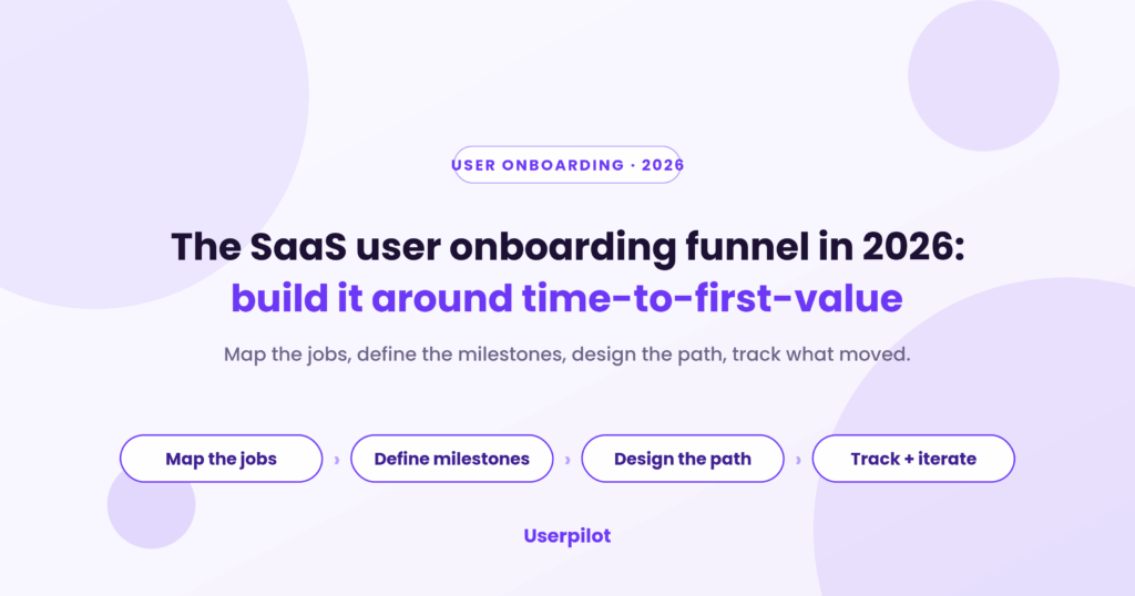
This guide focuses on self-serve onboarding in product-led companies, where the product itself guides users toward that first win. I’ll walk through a four-step framework for mapping, analyzing, and improving your SaaS user onboarding funnel using the ProductLed EUREKA framework.

Where the onboarding funnel sits in the user lifecycle
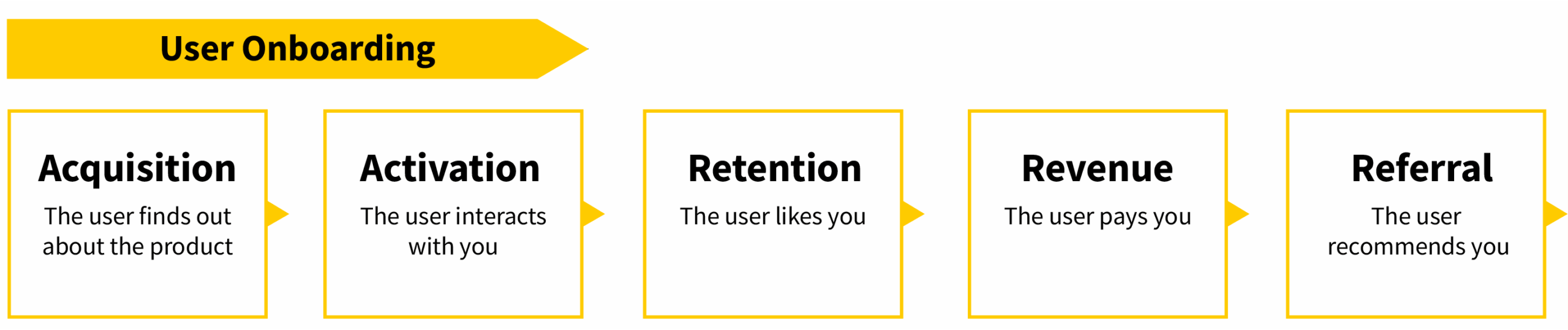
The first thing to fix about a user onboarding funnel is where you think it lives. In Dave McClure’s AARRR, or “pirate metrics,” framework, the stages are acquisition, activation, revenue, retention, and referral, and most teams file onboarding under activation alone. It does not sit there.
Onboarding bridges acquisition and activation, then carries straight into user retention. The first impression, and the positioning that shaped it, start forming before anyone signs up, on the landing page or in the ad that drove the click. By the time someone reaches your product, the onboarding funnel is already running.
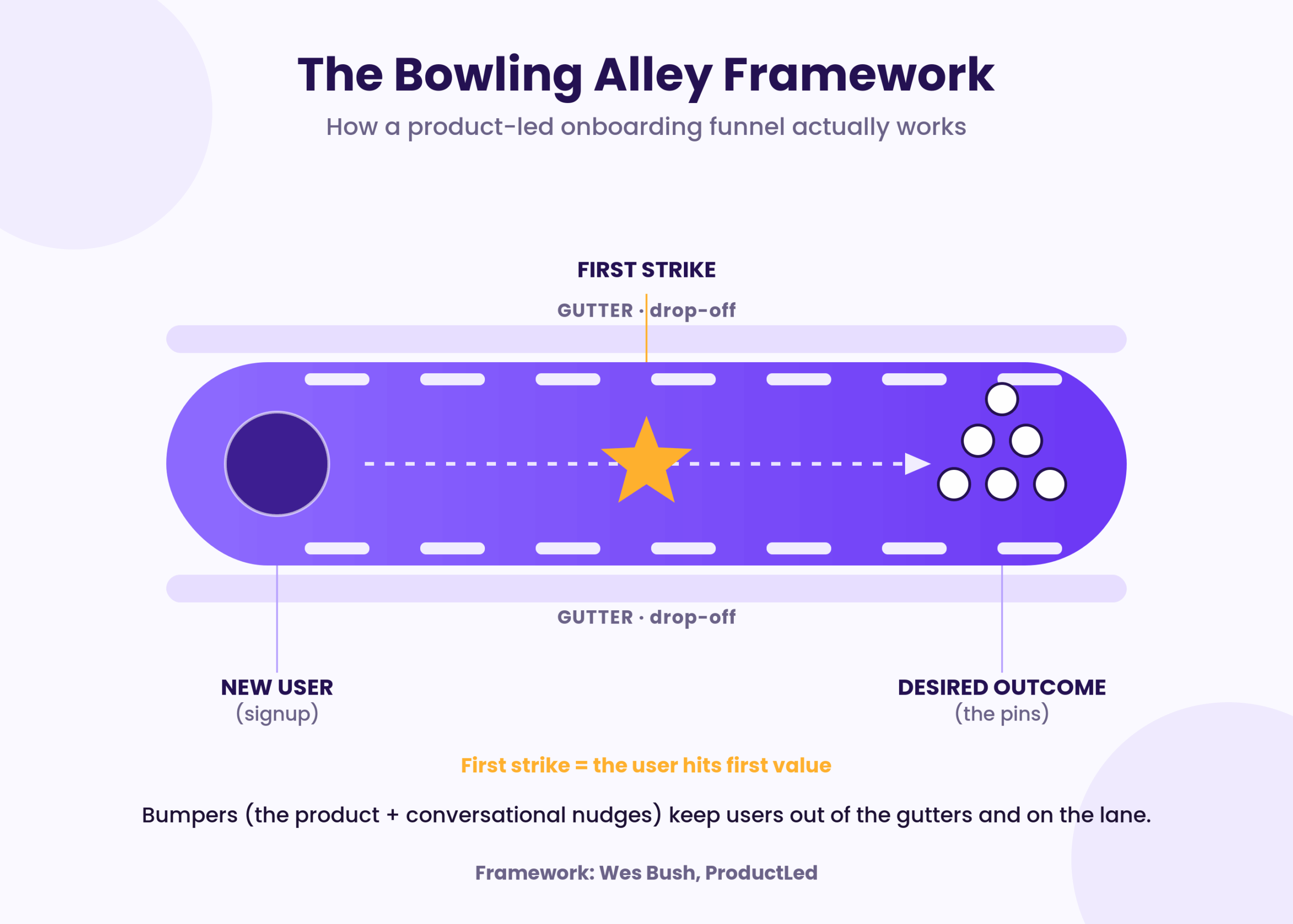
The most useful way to picture all of this is Wes Bush’s bowling alley framework. The user is the bowling ball; the pins at the end are the outcome they came for; and the “first strike” is the moment they achieve a real, observable win with your product. Between the ball and the pins runs the lane, the shortest path to that win.
The gutters are everywhere a user can drop off, and the bumpers are what you build to keep them on the lane. A user onboarding funnel has exactly one job in this picture, which is to design that lane and place those bumpers. Everything that follows is how to do it in four steps.
Step 1: Map the jobs your users hired the product to do
Before you design a single onboarding step, map the job your users hired the product to do. This replaces the old habit of carving onboarding into primary, secondary, and tertiary stages. A framing that has fallen out of favor because it organizes the funnel around your product instead of the user’s goal. Jobs-to-be-done flips that.
Every job has three components working at once. There is the functional job (what the user needs to get done), the emotional job (how they want to feel, or avoid feeling), and the social job (how they want to be perceived). Canva is the cleanest example: a paid ads marketer hires it to ship on-brand creative fast, a teacher hires it to make abstract concepts visual, and a coffee shop owner hires it to print foot-traffic flyers.
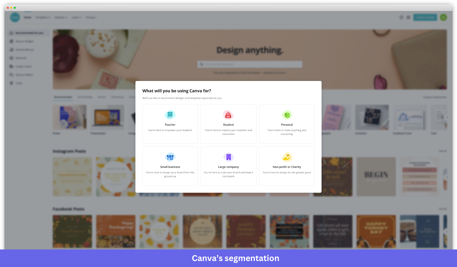
Same product, three different jobs, and three different definitions of a good first session. Underneath the job sit four progress-making forces that decide whether a user switches at all. Push is the pain in their current setup, pull is what could be better, anxiety is what might go wrong in the move, and inertia is the comfort of staying put.
Good onboarding amplifies push and pull while it calms anxiety and chips away at inertia. Once you have mapped the jobs, you can group users by the job they came to do, and that grouping is the input for every personalization decision later. Capture stated intent at signup with one onboarding survey question, “What are you here to do?”, and you have already split your funnel into the tracks that need different paths.
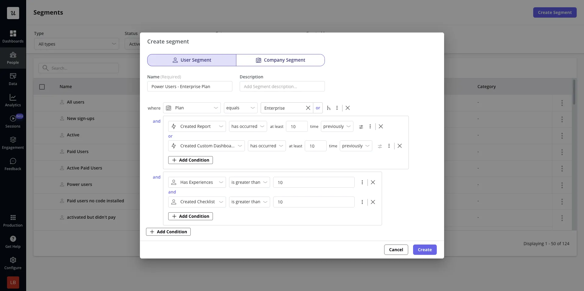
This is exactly what Userpilot’s own activation flow runs on: a welcome survey captures stated intent on first login, segments build automatically from role and use case, and each segment routes into its own downstream flow. The welcome survey feeds a branched walkthrough or checklist tailored to the job the user just told you about. You are relying on what they said.
Step 2: Define the success milestones and the metrics that prove them
A user onboarding funnel needs more than one finish line, because value lands in stages rather than a single click. The ProductLed onboarding model frames this as three moments, and they map cleanly onto the aha moment journey most teams already talk about. Each moment is a milestone you can design toward.
The moment of value perception is when a user grasps how the product could improve their situation, and it usually happens before signup, on a landing page or in an ad. Value Realization comes next, the first time they actually experience that value, the way sending a first message proves it in Slack onboarding. The deepest layer is value adoption, where the product is woven into the workflow, and the team simply keeps using it.
Each moment needs a metric, and these four user onboarding metrics are the ones worth instrumenting. Treat them as a chain, because improving one moves the next.
- Activation rate: The share of new signups who hit the defined value milestone inside the activation window, which is 7 days for self-serve PLG and 14 days for B2B SaaS. Average B2B SaaS activation runs around a 38% median, with the top quartile near 61%.
- Time-to-first-value (TTFV): The minutes from signup to the first activation event, where top-quartile teams get there in under five minutes and low-ARR self-serve medians land around 11 minutes. The nuance from Wes Bush matters here: the goal is not the shortest possible time, it is the shortest time to genuine value, and some friction earns its place.
- Day 7 retention: The strongest leading indicator that product adoption will stick, since 7% of a cohort returning on day 7 puts a product in the top quartile for activation.
- Free-to-paid conversion rate: The outcome metric that the rest feed into, where mid-single-digit percentages are typical for self-serve and the best programs push into double digits.
The reason to track all four rather than one is that any single number lies on its own. A fast TTFV on a tiny activated cohort means the product is great for a narrow slice and nobody else. Activation without retention is a vanity number, which is why Day 7 sits in the middle of the chain as the early read on whether adoption is coming.
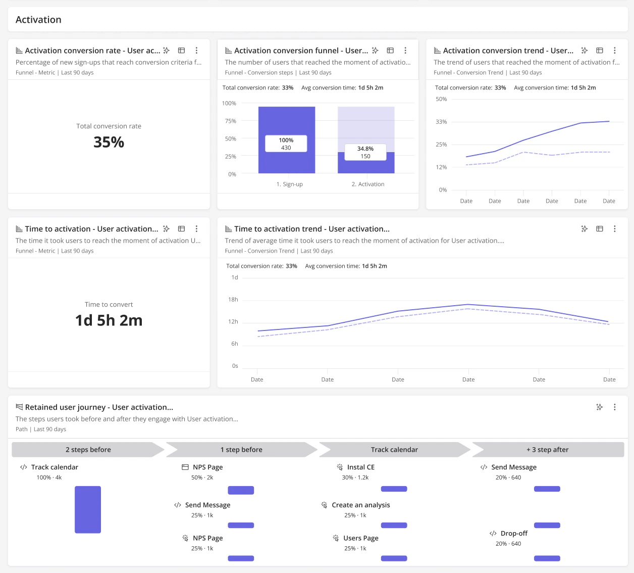
This is also where most teams either win or quietly lose, because the metrics only help if they live in one view. Userpilot tracks activation, TTFV, and retention from the same funnel analytics, so the team can see whether an experiment moved the metric it was supposed to move, or whether users would have activated anyway.
Step 3: Design the path and the guardrails around it
With the jobs mapped and the milestones defined, the design work in a user onboarding funnel is building the straight line and placing the bumpers. The straight line is the shortest path from Point A, the signup, to Point B, the first strike. Map every step on it, then label each one.
Mark each step green if it is required to reach the value, yellow if it is advanced and can wait, and red if it should be cut entirely. Wes Bush’s blunt claim is that about half of the steps in a typical onboarding flow are unnecessary or movable to later, so the labeling exercise usually shortens the lane toward minimum viable onboarding. The steps you keep are the ones that earn a place between signup and the first win.
A personalized user experience is part of straight-line design. If different segments came to do different jobs, they need different lanes, and a single signup question that routes users into different straight lines is one of the highest-impact moves in PLG onboarding.
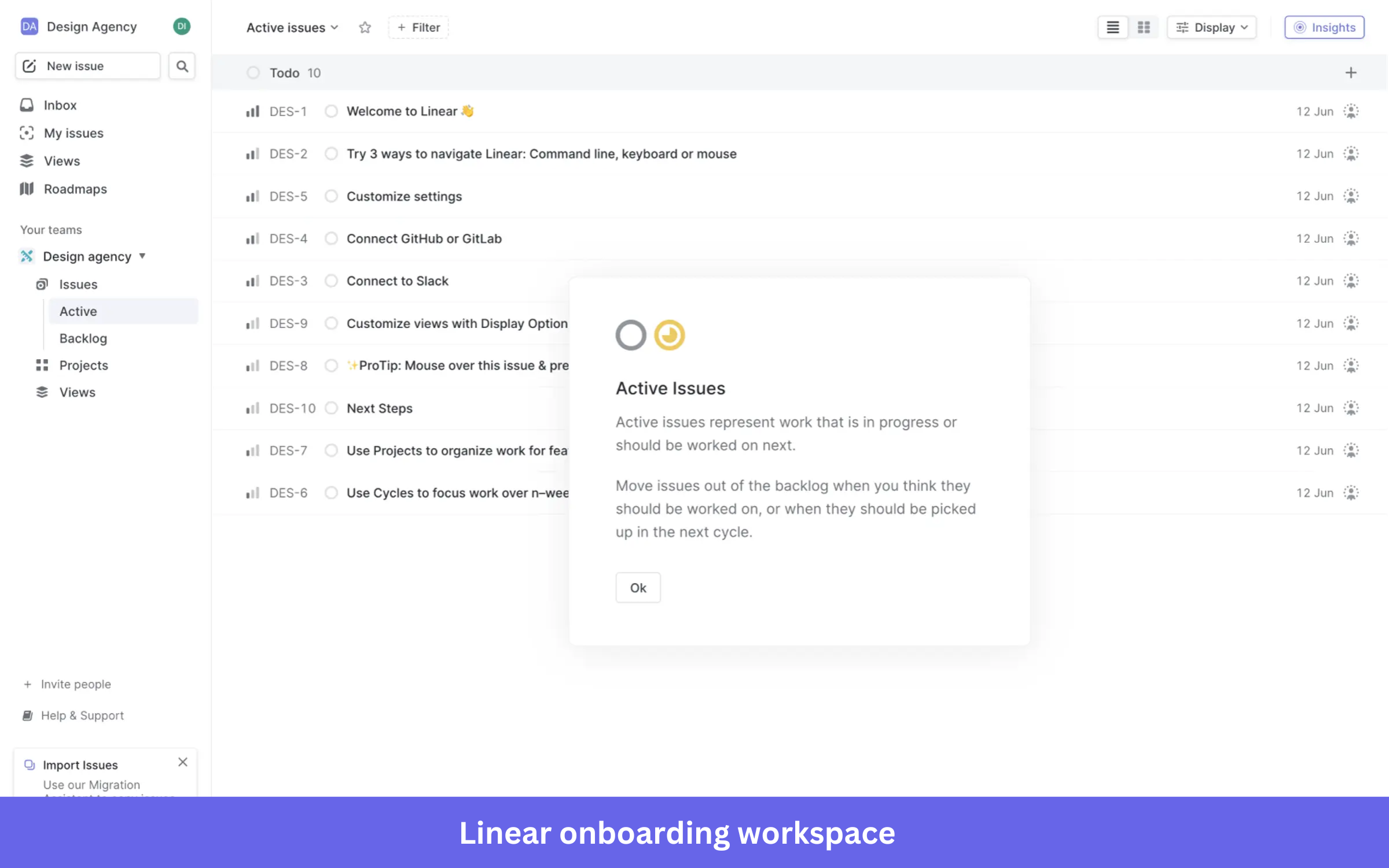
Two onboarding teardowns make the branching concrete. The first is Linear, which ships its onboarding as a working workspace rather than a tour. Signup drops the user into a pre-populated “Design Agency” team with sample issues already loaded into the Active view, so there is no empty board to stare at.
Each sample issue is itself a lesson, with titles like “Welcome to Linear,” “Try 3 ways to navigate Linear,” and “Connect GitHub or GitLab.” Click into any of them, and the user starts learning by doing, with inline tooltips explaining structural concepts as they surface. The first strike lands inside 60 seconds, because the user is already working on a real board that Linear populated for them.
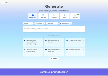
Gamma takes the other route, opening with a segmentation quiz captured from AI-native flows. It asks what you plan to use Gamma for, who you are, what your use case is, and how you heard about them, and those answers feed the personalization downstream. Then it drops you straight into generating your first deck, with a prompt box of pre-filled examples and a shuffle button, so the first preview renders in about 90 seconds, and the first strike lands with it.
Once the lane is built, the bumpers keep users out of the gutter. Product bumpers are the in-app patterns that do this work: welcome messages, product tours, progress bars, checklists, tooltips, and empty-state guidance. Two of them have rules worth following exactly.
- Product tours work best in focus mode: Dim or hide the background UI so the user is not drowning in choices, which leans on Hick’s Law and the paradox of choice, and keep tours to three to five steps.
- User onboarding checklists cap at five items: Eight-item checklists are measurably worse than three-to-five-item ones, so split a long setup into two shorter checklists at different stages of the journey.
Conversational bumpers are everything outside the product that pulls a drifting user back in: onboarding emails, in-app messages, push and browser notifications, and knowledge base articles. They matter because no matter how good the in-app flow is, industry teardowns put the share of users who sign up once and never return at 40 to 60% without an external trigger. The goal is omnichannel consistency, where the email matches what the user sees in-app and where they last left off, because disjointed communication is its own gutter.
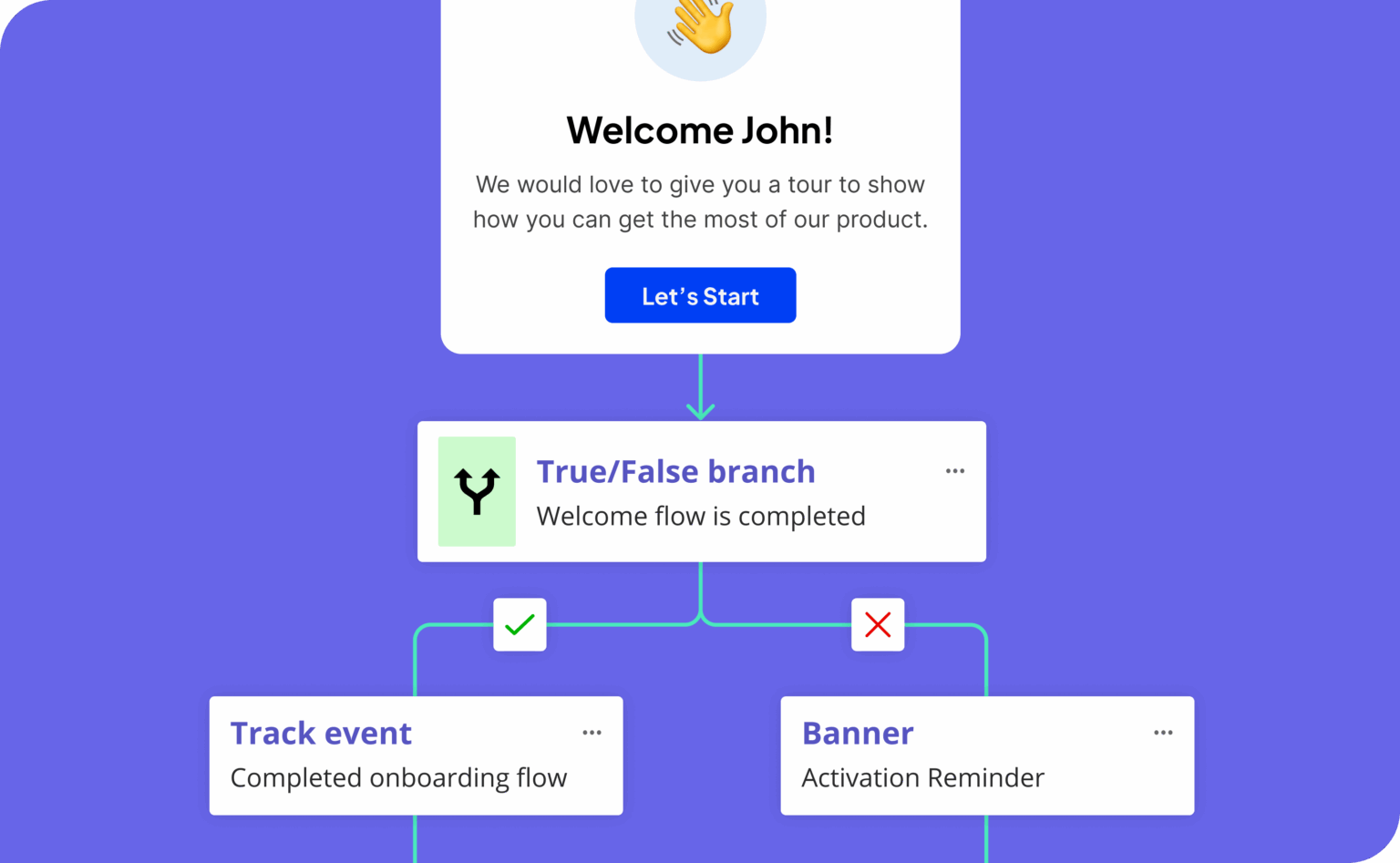
Bumpers fired indiscriminately become noise, so the ones fire on the segment from Step 1, the metric thresholds from Step 2, and the behavior the user is showing in-app. Userpilot ships the straight line and both kinds of bumpers from one place, with checklists, tooltips, modals, slideouts, and in-app surveys for the product bumpers and email and push integrations for the conversational ones. Workflows then trigger different bumpers per segment, so two users on two different tracks get two different nudges.
Step 4: Track outcomes and iterate
A user onboarding funnel is only as good as the loop you run on it after launch. A useful product analytics setup tracks two layers at once: the performance of your onboarding communication, things like open rates, tooltip views, and checklist completion, and the user behavior inside the product, things like activation events, time-to-first-value, and Day 7 retention. The point of holding both is correlation.
You want to see whether a specific email or in-app prompt moved the activation metric, or whether those users would have activated anyway. This is the part I have lived.
When we launched Userpilot’s email feature, the funnel showed a sharp drop right at domain verification, and instead of opening an engineering ticket and waiting, I built a targeting tooltip and a short checklist inside Userpilot in a few hours that highlighted the correct steps. The drop-off closed within days, with no dev time spent.
Once the quantitative layer shows you where users fall off, qualitative user feedback fills in why. The standard in-app survey types each answer a different question: CSAT for moment-by-moment satisfaction, CES for friction at a specific action, and NPS for overall sentiment. You do not need to go deep on survey design here, only to fire the right one at the right milestone.
The newer change is what happens to those open-ended answers. Open-ended NPS and CES responses used to sit in a spreadsheet until someone tagged them by hand, and the large majority of researchers now lean on AI for part of that workflow. AI feedback analysis reads the responses, groups them into themes, and surfaces the patterns automatically.
This is the shift our CEO, Yazan Sehwail, keeps pointing to, that AI has crossed from a novelty into something that can run a whole process end to end. In his words:
“It was just basically individual employees chatting with it, and you couldn’t systemize it. You couldn’t measure the impact of AI on ROI and your processes. Now it’s changing with the capabilities that are happening. It is good enough now to automate a whole process from A to Z.”
Cadence is the last piece. Top-quartile activation teams review their signup-to-activation funnel as often as a sales team reviews its pipeline. Which tends to mean two or three onboarding experiments a week tied to one shared dashboard. Most companies still treat onboarding as a project that finished sometime in 2023, and the activation gap shows up in their numbers.
Common reasons a PLG onboarding funnel keeps underperforming
If the four steps above are in place and your user onboarding funnel still is not moving, the problem is usually one of three leaks. None of them is exotic, and all three are common enough PLG funnels to check first.
The first is the signup-to-verification drop off rate, the single biggest leak in most B2B funnels. In one 2026 analysis of 25,000 SaaS signups, 8,325 users abandoned between account creation and email verification.
The fix is SSO and social login, plus async verification so users can start working while their email confirms in the background. Activation starts before the product even loads, which is why the SaaS signup flow itself deserves the same scrutiny as the in-app experience.
The second is a first-time user experience without value. Most trial cohorts decide whether to come back inside the 72-hour window after signup, and if a user closes the tab without hitting their realisation moment, they usually do not return. The fix is the Linear pattern: pre-populated sandboxes, sample data, and demo workspaces, so the first session has something real in it.
Checklist abandonment is the third leak, and it loops back to the cap from Step 3. Checklists of eight or more items feel like homework and convert worse than the three-to-five-item version, so the fix is simply to keep them short and split anything longer across stages.
Why the best teams treat onboarding as ongoing work
The teams hitting top-quartile activation treat the signup-to-activation funnel as ongoing work, not a one-time project. They map the jobs, define what success means, design the lane, place the bumpers, monitor what changed, kill what did not, and ship the next experiment. That loop is the work.
A user onboarding funnel built this way stops being a thing you launched and becomes a thing you run. The benchmarks reward it: the gap between top-quartile programs and the median has widened to the point where an average onboarding is no longer a small disadvantage. Teams that keep iterating compound, while the ones still measuring checklist completion keep wondering where their cohorts went.
Turn signups into activated users
If you want to build the straight line and the bumpers around it without writing code, that is the work Userpilot was built for. Map the jobs, define the milestones, branch the path by segment, and track what moved, all from one place. Book a demo with our team and see what your activation rate could look like when the funnel is built around first value.
About the author