Tracking User Activity in Web Applications: Effective Tactics & Tools
One of the first things I do when I join a new product team is to check exactly how we’re tracking user activity in our web applications. Not just for the sake of it, but because it tells me pretty much everything I need to know about what’s working, what’s broken, and what users care about.
Product analytics is the best way for you to spot friction, improve onboarding, and double down on features that deliver value. So in this post, I’m going to break down how I track user behavior inside web apps, and the tools I use to turn that data into real product wins.
How to track user activity in web applications
If there’s one thing I’ve learned, it’s this: you can’t improve what you’re not tracking.
When users drop off, skip key features, or never reach activation, it’s rarely random. There’s a pattern; you just need the right data to uncover it.
Here’s how I track user activity using three simple methods:
💡 In-app product interactions: I use autocapture to retroactively collect user actions without manual tagging upfront. When you want any event to show up in reports, just fire up the Visual Labeler. Example? Feature clicks, modal views, or how often users engage with specific tools.
💡 User activity across the customer journey: From signup to activation to power use, we map the full funnel. I track journey milestones like onboarding completions, retention, and drop-offs using our in-app flows (think tooltips and modals). We measure if users see, interact with, or abandon these touchpoints to flag friction or refine conversion paths. This helps us push users past key inflection points with timely nudges.
💡 In-app user behavior flow data: This is where it gets real. We dive into user paths, page traffic, and individual sessions to see how people use the product.
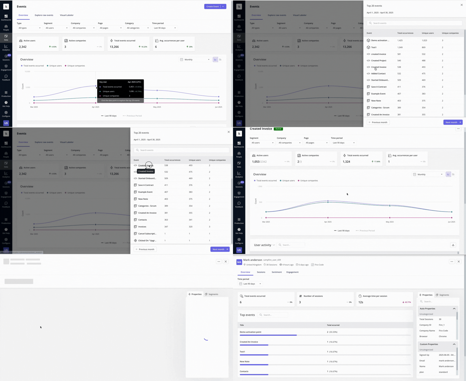
✅ Want to know the top actions after a key feature click? Just click a point on the trend line, and drill down:
- Top 20 events.
- Who triggered them.
- Full session context.
How to gather in-app user interaction data
Once I’ve got a clear idea of what I want to track, I zoom in on how users interact with the product daily. That means looking at every tap, click, and form submission to understand engagement patterns and find friction early.
It might sound like a lot, but this level of detail is essential when tracking user activity in web applications. And if you have a solid setup of user activity monitoring tools and tips to do it, it will pay off big time.
Use autocapture to track in-app engagement
One of the fastest ways I’ve improved user activity tracking is by using autocapture. It’s like having an always-on assistant that logs every user interaction, so you don’t need to tag everything manually.
With autocapture, I can go back to Day 1 and instantly access historical user behavior data. Even before I define specific events, I can just label the most important interactions, and everything shows up in my analytics dashboards.
It helps me combine tracking data across flows and identify how, for example, new users behave differently from experienced ones.
Here’s what gets tracked automatically:
- Clicks: Including rage clicks, which usually signal confusion or frustration.
- Text input changes: Like edits made in forms or search bars.
- Form submissions: Such as sign-up forms, support requests, and instant user feedback.
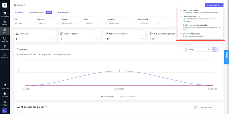
This level of in-app user activity tracking gives me fast, actionable insights, without having to rely on devs or setting up new tags every time we launch something.
Use session replays to understand friction
When it comes to analyzing visitor browsing behavior, session replays are one of my go-to methods. Honestly, it’s the closest you can get to sitting next to the user and watching them use the product.
Session replays help me:
- See where users engage and where they hesitate.
- Spot UI problems like rage clicks or dead zones.
- Understand how new users move through onboarding.
For example, if I notice a sudden drop in user activity, I’ll create a segment of users whose engagement fell during that period. Then, I’ll filter session replays by that segment to dig into what changed.
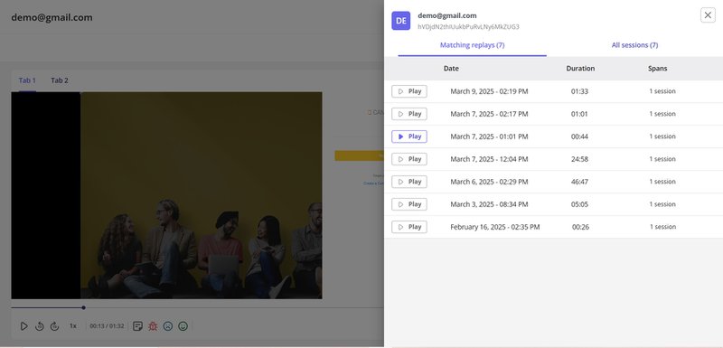
And yes, watching full replays can be time-consuming. But a tool can solve that by letting me skip inactivity and jump straight to moments of real interaction. That alone has saved me hours as I try to troubleshoot sticky user behavior issues.
Use heatmaps to track clicks and activity on a page
When I want a quick, visual overview of how users are engaging with a specific page, I turn to heatmaps. They give me a color-coded map of user interaction so I can see where people are clicking, scrolling, and spending their time. As part of my setup for tracking user activity in web applications, they’re one of the fastest ways to spot issues.
I typically use two types of heatmaps to track user activity:
Scrolling heatmaps
Scrolling heatmaps show how far users scroll and which parts of a page hold their attention. If most people drop off halfway down, I know I’ve either buried something important or lost their interest.
In the heatmap, red zones mean high attention, while green zones show low engagement. It’s a quick way for me to assess whether content placement is working or if it needs a tweak or rethink.
Click heatmaps
Click heatmaps help me figure out which buttons, links, or UI elements users are actually interacting with, and which ones they might be ignoring. They also reveal dead clicks, where users click on something that isn’t interactive, which often signals confusion or bad UX.
How to analyze user behavior across the customer journey
Once I’ve nailed down in-app interactions, I shift focus to the full user journey, from first touch to becoming a power user.
I want to know what actions users take (or don’t take) along the way, and where we’re losing them. This kind of behavioral data is at the heart of what you need to improve activation, onboarding, and long-term retention.
Track user behavior with custom events
While auto-event tracking gives me a solid foundation, I rely on custom events when I want to track something more specific across the journey.
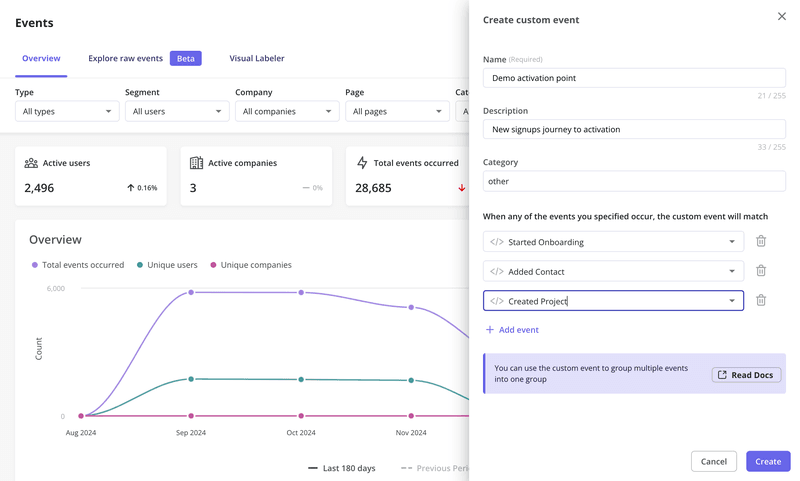
I can set this up by using the visual event labeler. I label the individual autocaptured events first, then combine them into a custom event based on how we’ve mapped the user journey.
For example, I often track account setup completion as a single event, even though it includes several steps (like signup, script installation, and completing the onboarding checklist).
Use funnel analysis to monitor user activity across the journey
Once custom events are in place, funnel analysis helps me take a data-driven approach to understanding user drop-offs.
I map out key steps tied to conversion goals (like onboarding completion or upgrade to paid) and track how many users complete each one.
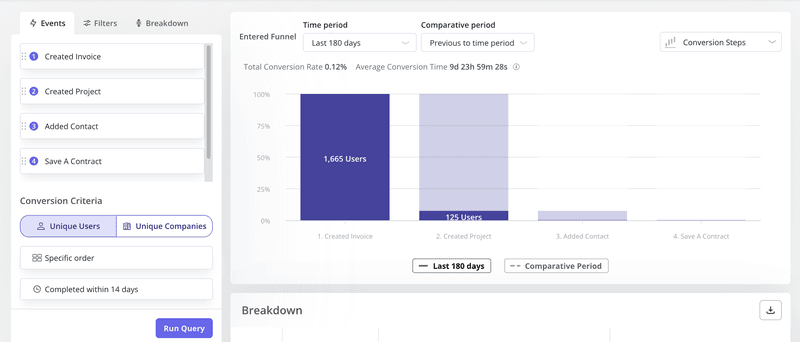
Let’s say I want to track free trial conversion. My funnel might look like this:
- Sign-up: User starts the free trial.
- Setup: They activate their account and start exploring.
- Feature adoption: They engage with the product’s core features.
- Trial expiration: Their free access ends.
- Upgrade: They become a paying customer.
Funnel data shows me where most users drop off and which stages need fixing. From there, I might dig deeper by segmenting users or looking into session recordings to figure out what went wrong.
Set up path reports to see how users navigate your web applications
While funnel analysis shows me how many users move through key steps, path reports help me understand how they get there. With path analysis, I can visualize user navigation and see every step users take before or after a specific event inside the product.
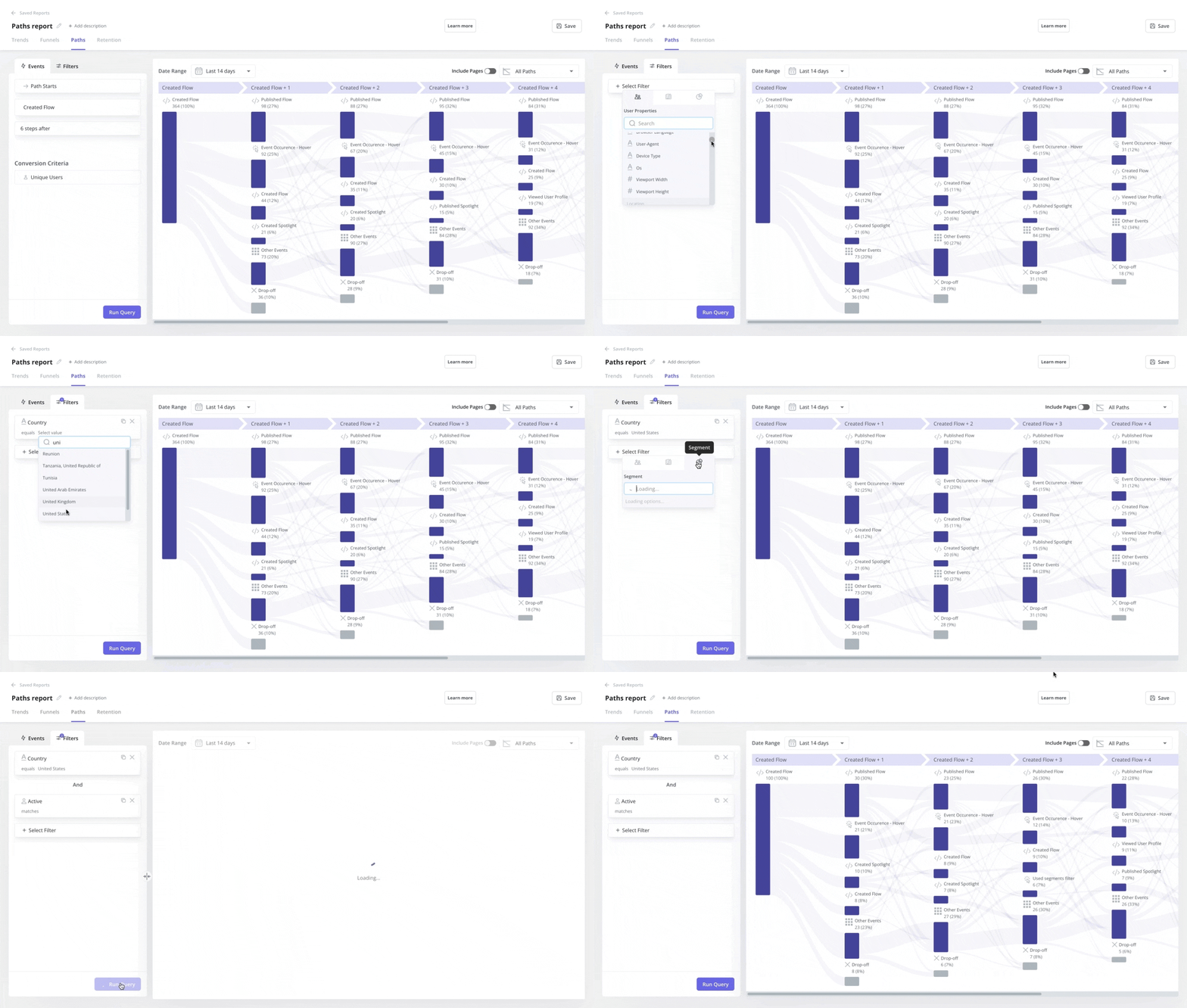
Unlike funnels, which are predefined, path reports show real behavior patterns and all the different ways users explore the app. It helps me spot alternative routes users take, where they diverge from the expected flow, and what that means for product conversion.
In Userpilot, I use path analysis to:
- Understand how users move from login to feature adoption.
- Spot detours or loops in the user journey.
- Identify and optimize our “happy path”, or the ideal route to user success.
And when I pair this with funnel analysis, I get a more complete picture. For example, if users drop out of a funnel but still convert through another route, I can use in-app messages to guide others along that more effective path.
Here’s how I usually set up a path report:
- Select a starting or ending event (like “completed onboarding”).
- Choose how many steps before or after I want to analyze.
- Set conversion goals at the user or company level.
- Add filters to narrow it down to the right segment.
- Hit “Run Query” and get instant insight into how users actually move through the app.
Honestly, it’s one of the clearest ways I’ve found to track user behavior and keep finding new growth opportunities!
FAQ
How to track user activity on web app?
Tracking user activity on a web app typically starts with using user activity tracking tools that capture key behavioral data. These tools record in-app actions such as clicks, form submissions, navigation paths, and more. Advanced platforms also support features like session replays, autocapture, and custom events to provide deeper insights into user behavior. Teams can also generate reports that visualize trends, identify drop-offs, and highlight user engagement patterns across the product.
Is it legal to track user activity on website?
Yes, tracking user activity on websites is legal, provided it’s done in compliance with data privacy regulations like GDPR, CCPA, or PECR. These laws require clear communication about what data is being collected and why, especially when tracking sensitive data. Many modern user tracking tools offer consent management, data anonymization, and clear opt-in flows to ensure ethical data practices while collecting user behavior data and qualitative user feedback.
What is the process of keeping track of a user's activity?
User activity tracking involves defining key interactions to monitor, setting up event tracking, and using analytics tools to interpret the data. The process includes capturing events like button clicks, form completions, and page visits, then organizing that data into funnels, paths, or dashboards for analysis. Tools like Userpilot, Google Tag Manager, or Hotjar help collect both quantitative and qualitative user data, making it easier to track progress through the user journey and uncover friction points.
Can you track web activity?
Yes, web activity can be tracked using tools that monitor both website traffic data and in-app behavior. Platforms like Google Analytics offer insights into where users come from and what pages they visit, while tools like Userpilot and Hotjar help track user session activity, click patterns, and in-app engagement. Together, these tools provide a complete picture of user behavior across both marketing sites and product experiences.


