Heap vs Amplitude vs Mixpanel for Product Analytics


When researching product analytics tools, Amplitude vs Mixpanel vs Heap often end up on a shortlist.
The reason goes beyond their popularity. These are among the most mature features in the market, mentioned favorably in user reviews and professional discussions.
Which is why, spoiler alert, this article doesn’t pick a winner. Each solution is excellent for a different use case. Below, I compared the tools, focusing on features useful for SaaS companies’ product teams, and highlighted actual users’ voices to help you consider their pros and cons.
To start, let’s go over a general summary:
Summary of Heap vs Amplitude vs Mixpanel for product analytics
Let’s start by briefly comparing these tools’ core use cases, standout features, entry-level pricing structures, and current G2 satisfaction ratings:
| Tool | Core use case | Standout features | Starting price (billed annually) | G2 Rating |
| Heap | Fast analytics with minimal engineering via autocapture | Autocapture, Heap Illuminate, Influence analysis | Custom quotes | 4.4/5 |
| Amplitude | Rigorous analytics driving enterprise roadmaps | Compass (Correlation), Pathfinder, Predictive Cohorts | Starts at $49/month for 1,000 MTUs | 4.5/5 |
| Mixpanel | Advanced yet intuitive analytics for less technical users. | Spark AI Query Builder, Metric Trees, Signal Reports | Growth plans start at $140/month for 1,5M events | 4.6/5 |
In short:
- Choose Heap if your team lacks spare engineering time, requires immediate answers about past user behavior (via autocapture), and can spend time organizing a database of raw events.
- Choose Amplitude when you have the engineering capacity to manage complex multi-platform products and need data to drive enterprise-level strategies.
- Pick Mixpanel when the priority is fast, visual reports that non-technical users can analyze (i.e., UX researchers, designers, product marketers, etc.). However, ensure you can dedicate engineers to maintain a clean tracking taxonomy.
Heap
Best for: PLG teams who need automatic data capture to retroactively analyze user behavior without engineers’ help.
Heap (now integrated with Contentsquare’s suite) specializes in collecting autocaptured events. It automatically tracks user interactions (e.g., product usage, activation, and adoption) across the entire product without manual instrumentation.
Heap product analytics features
Rather than requiring engineers to manually tag specific events, Heap focuses on capturing all interactions passively. Let’s explore its features more closely:
Autocapture
Once you install Heap SDK’s snippet into your product’s code, the platform automatically starts tracking user actions (including clicks on elements, text inputs, page views, rage clicks, and many more) and user properties (including ID, location data, first seen, and email.
You can access this raw data on the Heap dashboard and label it for retroactive analysis. This fully eliminates the need for preemptive tracking plans and lets you query historical behavior instantly.
For instance, if you need to measure interactions with a specific button that existed for six months, autocapture ensures the data is already available.
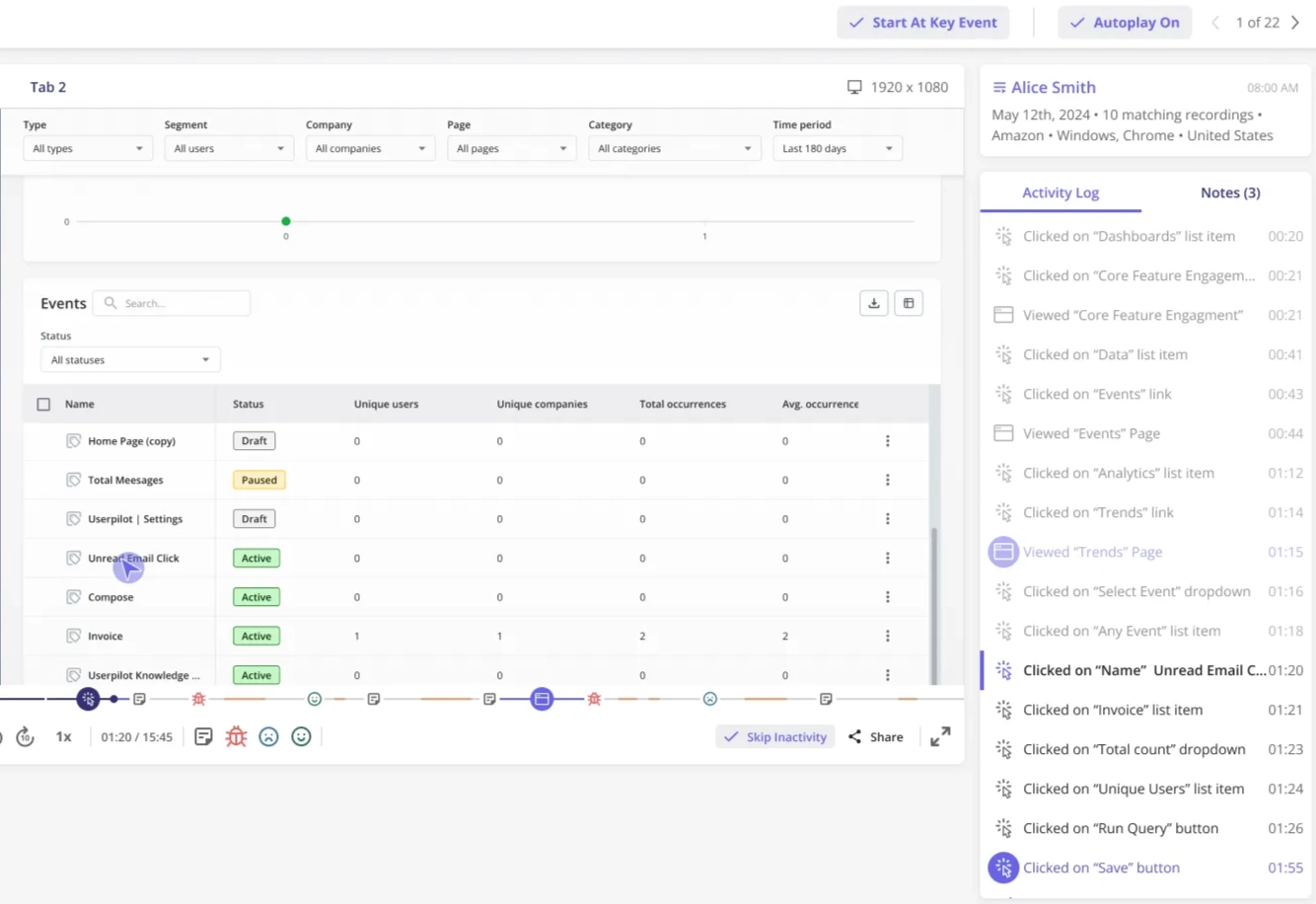
Pro tip: There’s also a live data feed where you can see a chronological, real-time view of all tracked events, enabling your product team to verify data capture and observe user movement instantaneously. This makes it significantly easier to identify and eliminate roadblocks as they happen.
Charts and Playbooks
Beyond autocapturing data, Heap offers multiple chart types for visualizing how users interact with your product, including:
- Acquisition analysis to measure the performance of marketing campaigns.
- Engagement analysis, which shows how users interact with features in a scatter plot.
- Usage over time chart for tracking feature usage over days/months/years.
- Funnel analysis, which tracks how users progress through a funnel and shows potential drop-off points.
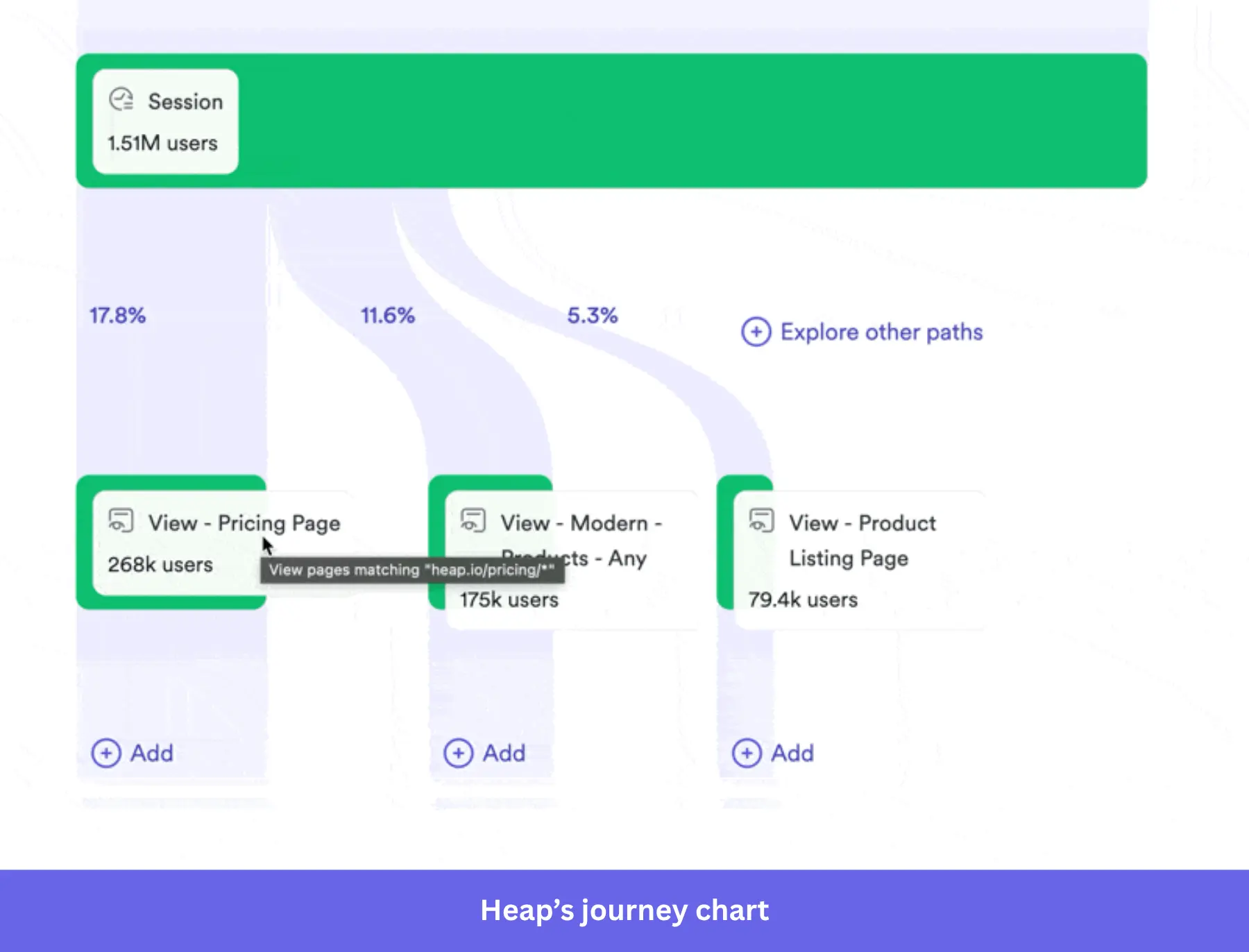
- Journey charts for visualizing the different paths users take inside your product.
- Retention charts that compare retention rates across user cohorts and highlight potential churn risks.
- Influence analysis, which correlates specific marketing campaigns or in-app behaviors with desired actions (e.g., signup, upgrades, activation, etc).
Additionally, Heap’s AI chatbot (Sense AI) is always available to answer questions about your customers (e.g., segment users based on user feedback, spotting friction points, etc.). Even if you’re a non-technical user, Heap’s Playbooks also provide personalized dashboard templates based on your specific use case (e.g., tracking adoption, activation, retention, etc.).
Heap Illuminate
Heap Illuminate scans the autocaptured data to highlight hidden friction points and unexpected drop-offs. So instead of hypothesizing the cause of users’ drop-offs, Illuminate evaluates the most common events between two steps in a funnel.
It also compares different journey paths to see how different behaviors affect conversions. Plus, it can create effort analysis reports, identify key segments via Group Suggestions, and track rage clicks on pages to gain deeper insights.
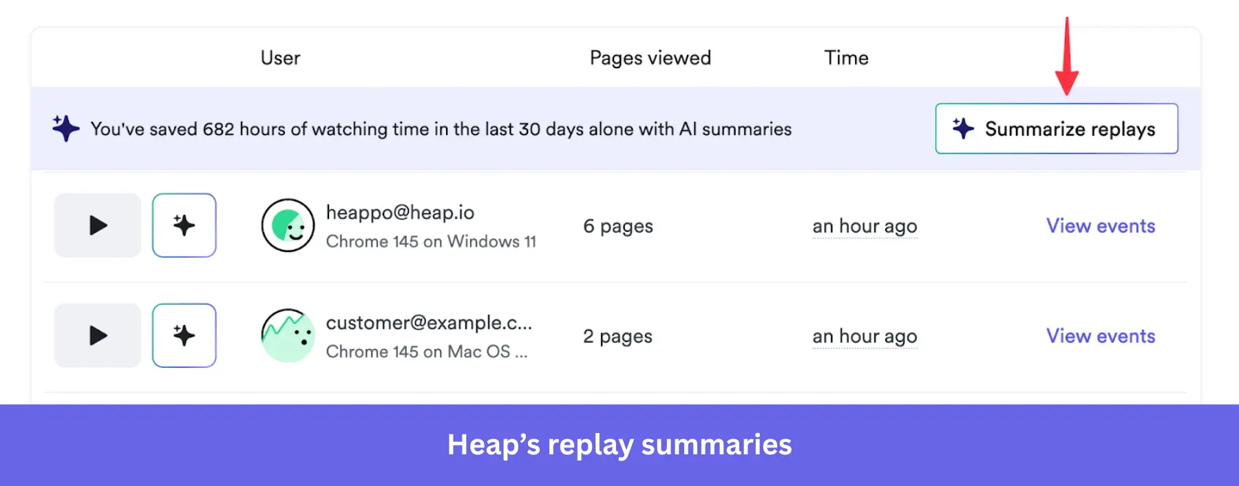
Session replays
Session replays record the exact journey a user takes within the product. It’ll help you identify points where they struggle to complete an action, leave without taking the desired action, or express frustration through behaviors like rage-clicking.
The biggest advantage here is the synergy between quantitative drop-off data and the qualitative replays. As it lets you understand both the statistical reality of a bottleneck and the emotional context behind it, leading to insights you’d otherwise never find.
Heap pros
✅ Web and mobile support: Heap works on all kinds of products, be it websites, web applications, or mobile apps.
✅ Automated data capture: It eliminates the friction of manual event tagging and allows for deep retroactive data analysis.
✅ Easy setup: Getting started with Heap only requires pasting a single code snippet into your app.
✅ Advanced analytics synergy: The integration of Heap’s Auto capture with Contentsquare’s session replays provides a 360-degree view of product navigation.
✅ Real-time data: With the Live data feed, you get a chronological and real-time view of all Heap events (raw and labeled). You can track and analyze user interactions as they happen.
Heap cons
❌ Data overload: The overwhelming volume of raw data can make insights harder to find (plus it can cause pricing to escalate quickly).
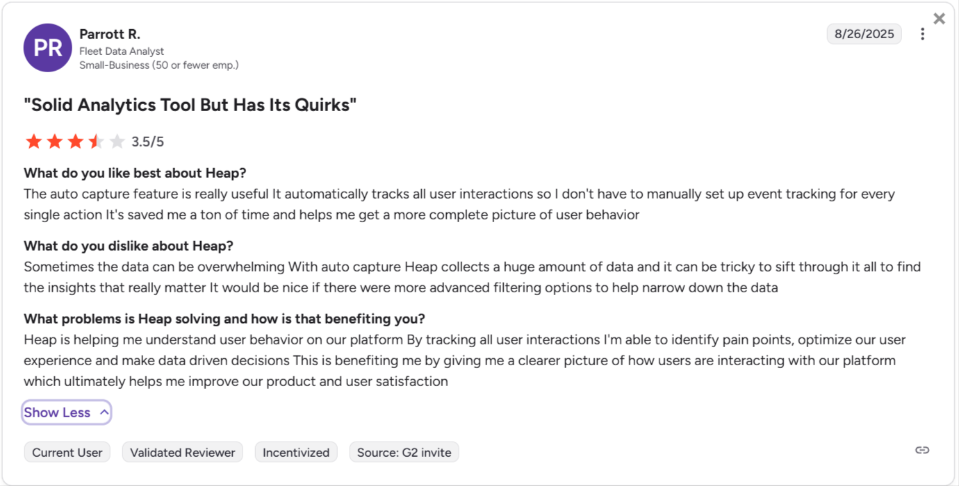
❌ Steep learning curve for advanced features: While the technical setup is simple, Heap involves a fairly steep learning curve due to its vast array of features. As a new user, it’ll take you a while to get a grip on all its features.
❌ No SDK for Flutter-based mobile apps: You won’t be able to label mobile side events if you manage a Flutter app.
❌ Expensive price scaling: The session-based pricing means it can scale very aggressively depending on your product’s traffic.
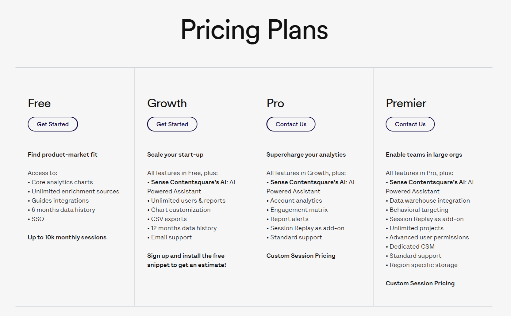
Heap pricing
Pricing for Heap is available on request. The final price will depend on the number of sessions and integrations you need.
The platform offers the following plans:
- Free: This plan allows tracking for up to 10,000 user sessions per month. It includes core analytics charts, access to one project workspace, and stores historical data for 6 months.
- Growth: Provides 12 months of data access, unlimited standard dashboards, automated insights, and integration with Sense AI (Contentsquare’s AI assistant).
- Pro: Introduces advanced account analytics for B2B tracking, an engagement matrix to measure feature success, and report alerts for metric deviations.
- Premier (i.e., enterprise pricing): Includes “Data Connect” for automatic warehouse exporting, behavioral targeting, unlimited projects, advanced user permissions, and a dedicated Customer Success Manager (CSM).
Note: As a reference, Vendr pricing report shows customers paying from $15,000/year (for Pro) to $79,000/year (for Premier).
Amplitude
Best for: Data-mature orgs with dedicated engineering teams that require deep predictive analytics and sustain enterprise-level product strategies.
Amplitude provides in-depth, real-time insights into product usage. It stands out for its predictive analytics insights and deep behavioral segmentation, which makes it a great fit for enterprises with multiple products that need to attribute and optimize the ROI to each initiative.
Amplitude product analytics features
Amplitude offers a highly sophisticated suite of analytical tools designed to go beyond basic metrics. It focuses heavily on causal inference, behavioral patterns, and predictive cohort modeling. Let’s look at them in detail:
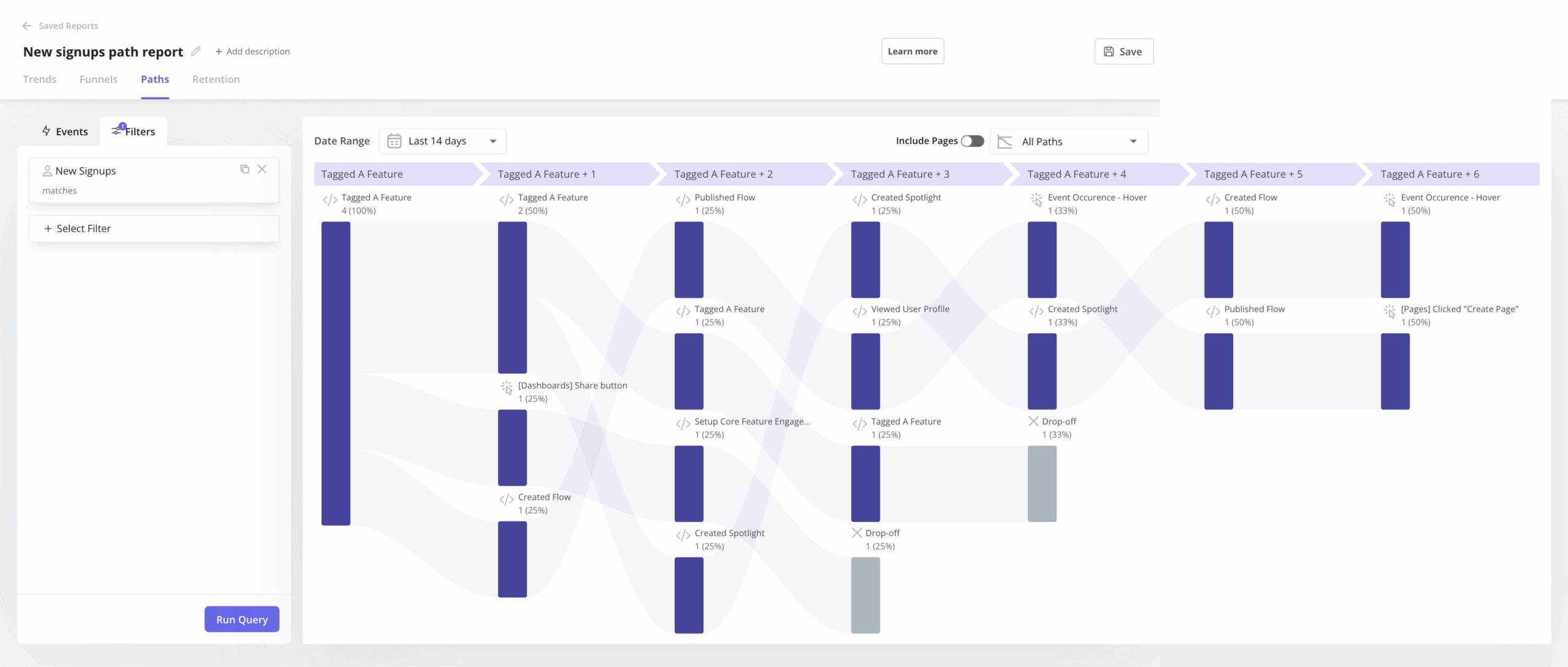
Pathfinder and user journeys
Amplitude’s advanced journey mapping draws the exact step sequences that users follow within a product.
The Pathfinder chart, with a Sunburst visualization, displays customer journey events as a hierarchical radial chart, with each concentric ring representing a sequential step.
This allows product managers to drill down into specific customer journeys, visualize where users deviate from expected onboarding funnels, and identify the optimal pathways that lead to successful conversions (i.e., the happy path).
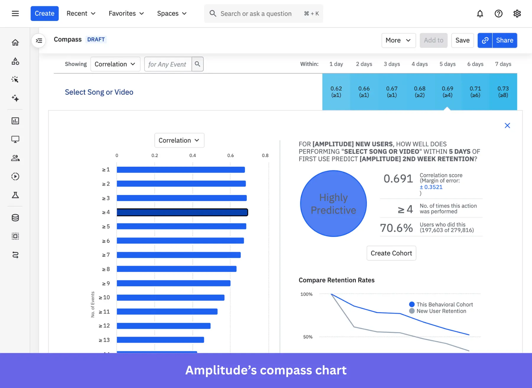
Compass (Correlation Analysis)
The Compass feature is designed to identify inflection metrics (such as the “Aha!” moments) that reliably predict user retention. Compass scans the historical dataset to calculate Pearson correlation coefficients (ranging from -1 to 1) between specific user behaviors (e.g., executing a feature 3 times within the first week) and the likelihood of 30-day retention.
Predictive cohorts
Beyond historical reporting, Amplitude uses machine learning to predict future user behavior based on past interaction patterns.
Predictive cohorts allow you to group users based on their likelihood of churning or converting. This way, your team can design proactive interventions (such as targeted email campaigns or specialized discounts) before a high-risk user churns, as well as reach out to engaged users to encourage an upgrade/expansion.
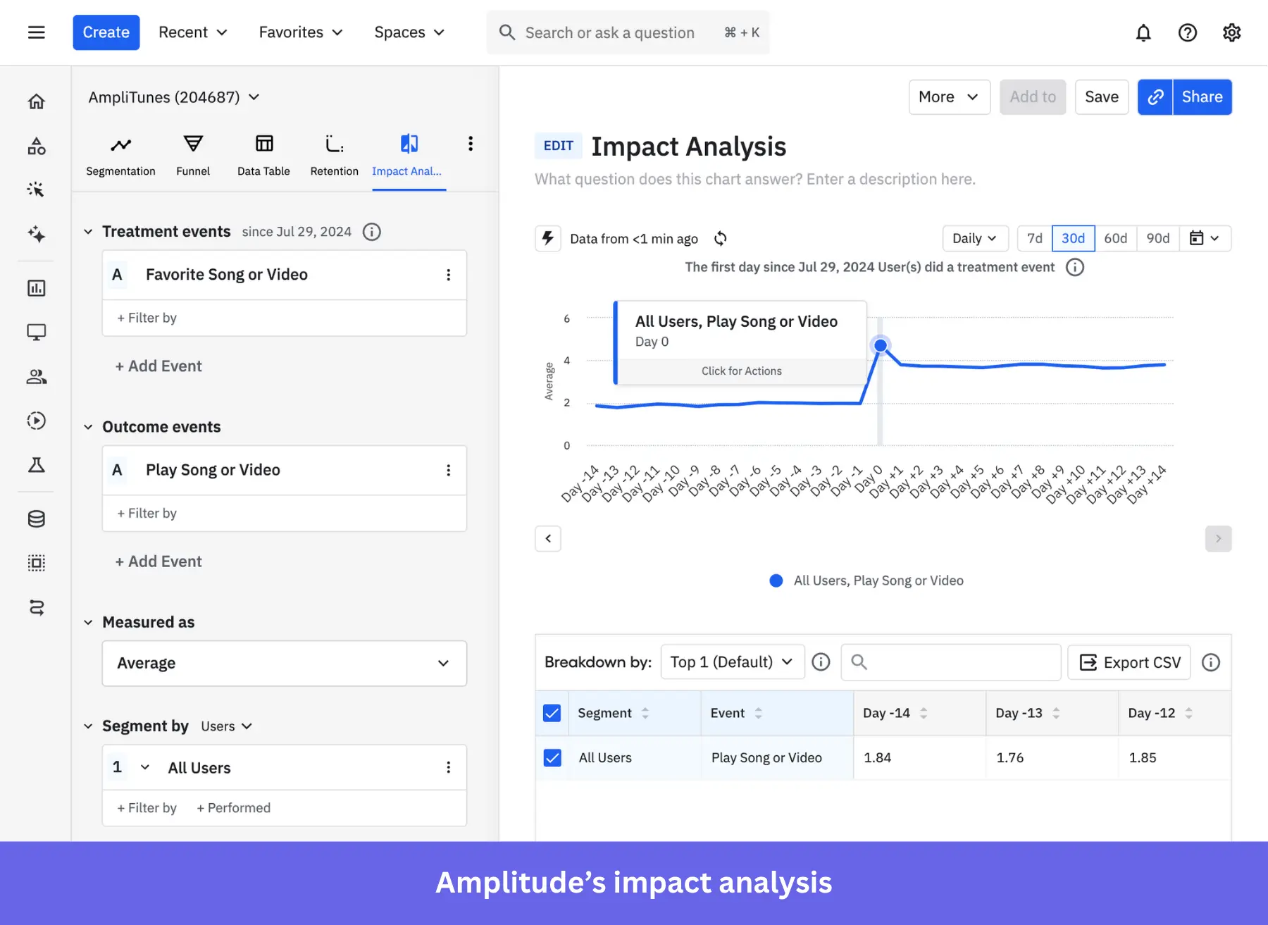
Impact analysis
This analysis applies causal inference to determine how the first engagement with a feature affects the probability of a desired in-app behavior (e.g., activation, feature adoption, upgrade, etc).
So, rather than simply showing two graphs that might correlate, Impact Analysis validates specific product strategies with statistical significance. And as a result, you can dedicate resources only to features/updates with a higher chance of adoption.
Behavioral analysis tools
In addition to predictive analytics and sophisticated statistical tools, Amplitude offers all the usual features for analyzing user behavior, including:
- Funnel analysis for spotting drop-offs in a series of events.
- Retention analysis for tracking retention rates of different user cohorts.
- An engagement matrix to visualize which features are more adopted.
- A stickiness chart that shows how many times users come back to a feature.
- Revenue LTV for translating users’ behaviors (i.e., purchases, upgrades, expansions, etc) into business revenue.
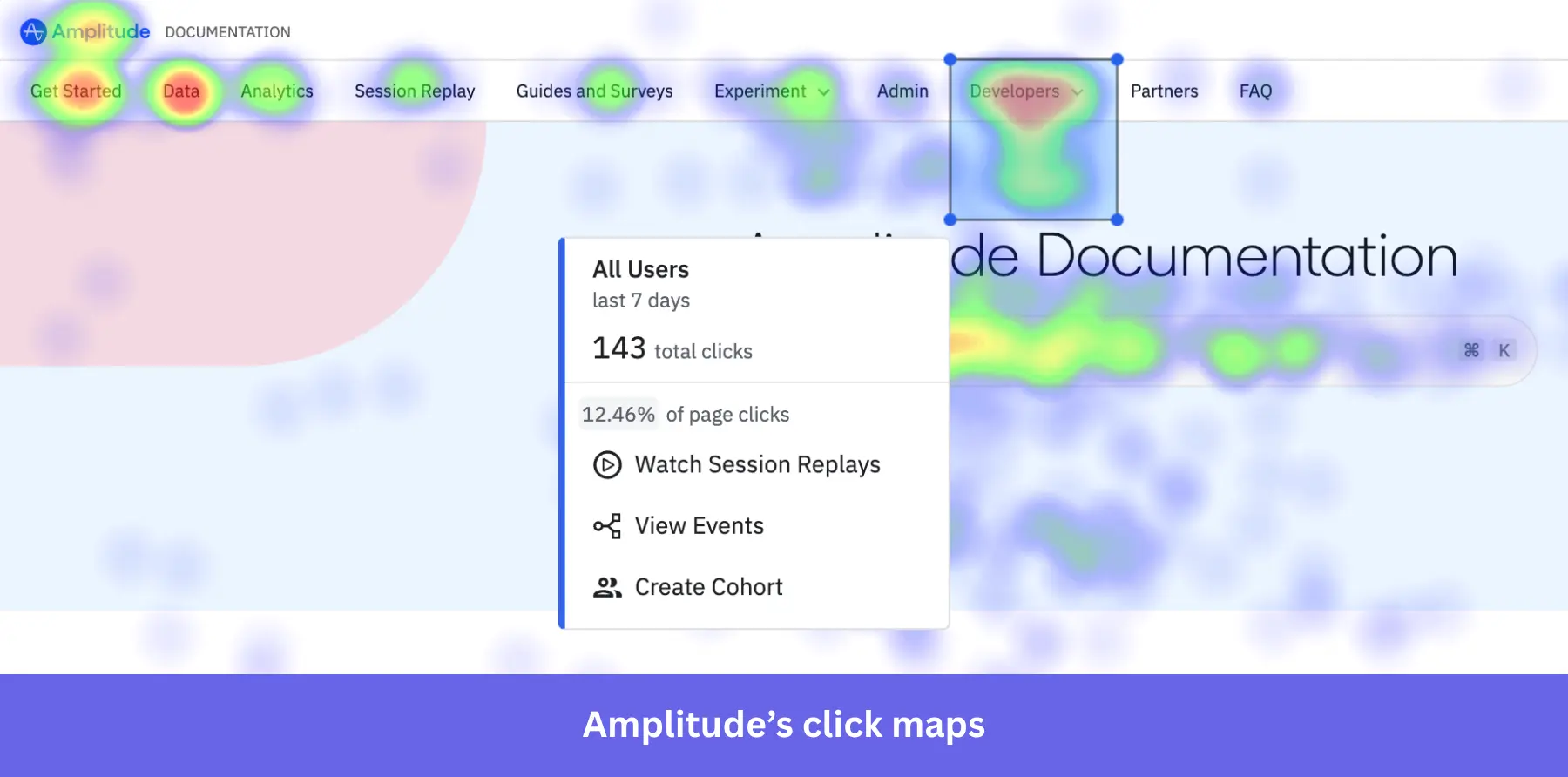
- Session replays and heatmaps, which provide a qualitative context to quantitative analyses.
Amplitude pros
✅ The most mature data analytics: With Amplitude, you can dig deep into user behavior, including how they interact with your product and where they convert or drop off.
✅ Cross-platform analytics: Amplitude lets you track product usage across native mobile apps, web apps, and web pages. It can help you understand how users move between these platforms.
✅ Designed for collaboration: Amplitude enables you to easily share dashboards and reports with other team members. It also facilitates collaboration among different teams, including product, marketing, and customer success.
✅ Powerful integrations: Amplitude connects with more than a hundred platforms, including data warehouses, marketing automation tools, ad networks, and customer data platforms.
Amplitude cons
❌ Steep learning curve: Amplitude’s complex interface and advanced statistical features can be highly intimidating for new users. It’s not particularly suitable for teams lacking dedicated in-house data analysts.
❌ Unpredictable pricing at scale: Amplitude’s pricing structure is based on the volume of Monthly Tracked Users (MTUs). It forces some teams to use feature flags to prevent the tool from tracking more events than they can afford.
❌ You might end up paying for unused features: Amplitude’s extensive features are overkill for product teams with more specific needs, especially if they lack the data analysis expertise.
Amplitude pricing
Amplitude’s pricing structure is based on Monthly Tracked Users (MTUs), which can make cost projections more difficult than on other platforms. Its plans include:
- Starter: A free plan that provides access to core analytical charts, basic retention analysis, and collaboration tools.
- Plus: Starts at $49/month for only 1,000 MTUs and can scale up to $10,188/year for 100k MTUs. It adds unlimited product analytics, behavioral cohorts, feature tagging, and custom events.
- Growth: Pricing is customized upon request and scales dynamically based on MTUs. This tier unlocks advanced behavioral analytics, predictive analytics, unlimited alerts, and conversion drivers.
- Enterprise: It includes advanced data governance capabilities, strict security features (like SAML SSO), root cause analysis, and prioritized customer support. Pricing is also custom.
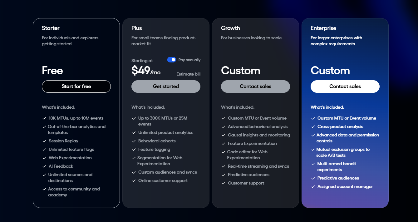
Additionally, Amplitude also offers a free annual subscription to the Growth plan under the following programs:
- Scholarship Program: For startups with under $5 million in funding and fewer than 20 employees.
- Black Founders Program: For US startups with a Black co-founder, fewer than 150 employees, and under $30 million in funding.
Mixpanel
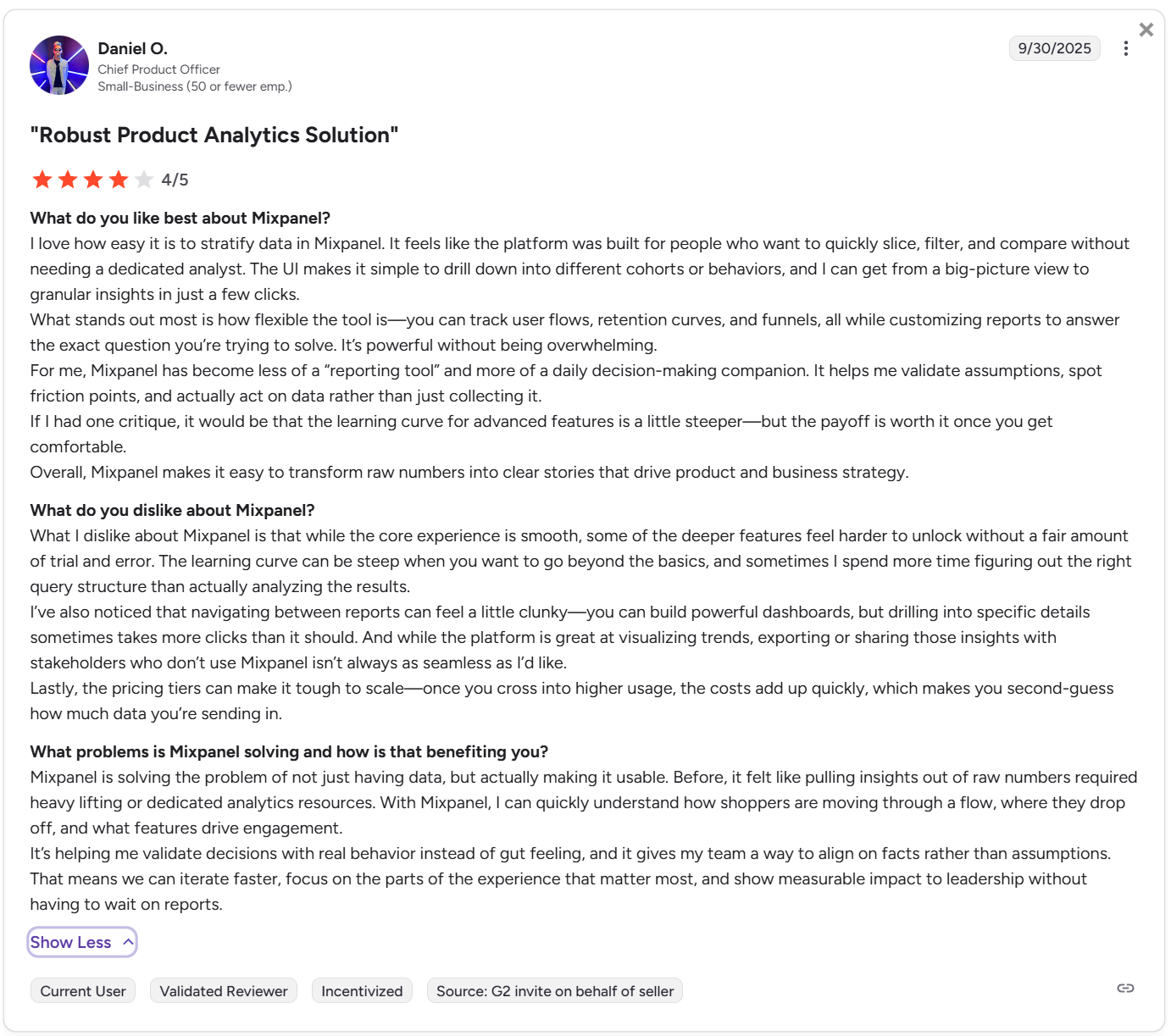
Best for: SaaS companies that need deep yet intuitive analytics for less technical teammates (product marketers, designers, UX researchers, etc).
Mixpanel allows product teams of all sizes to track and analyze in-app engagement across both mobile and web applications. It lets you perform versatile analyses (e.g., impact analyses, metric trees, etc) without having to deal with SQL or ask engineers to retrieve reports for you.
Mixpanel key features for product analytics
Mixpanel offers advanced analytics features, but also has a responsive user interface and AI query capabilities that democratize data access across non-technical teams. Its standout features include:
Spark AI query builder
The Spark AI allows product managers to describe their analytical questions in natural language. And then, it automatically translates the prompts into complete data queries, generating appropriate charts, reports, and analytics dashboards.
This way, anyone in your team can extract insights without needing to write SQL or understand complex Boolean logic.
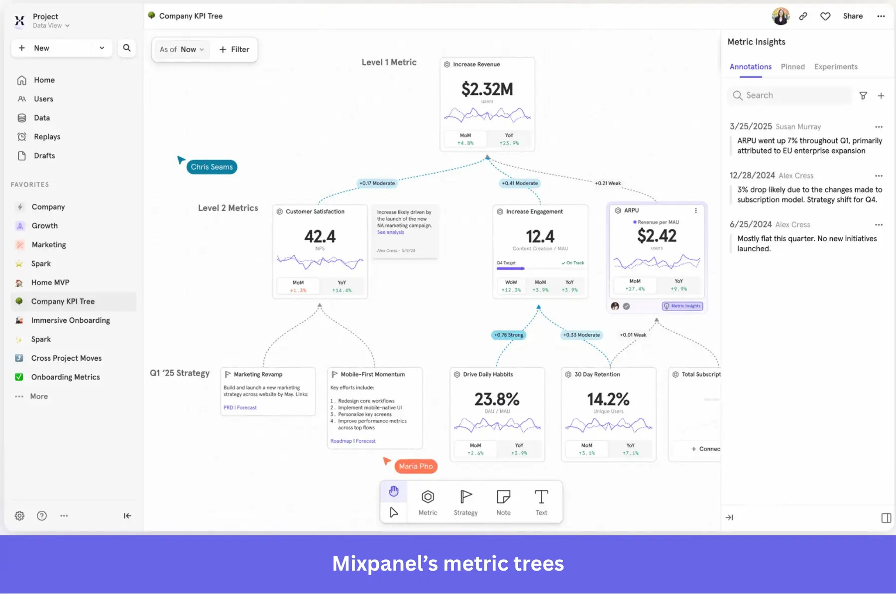
Metric Trees
Metric Trees map the mathematical relationships between input metrics (e.g., daily active users, feature clicks) and output metrics (e.g., total recurring revenue, customer churn). You can build it manually or use AI to generate a first draft based on industry best practices.
With this tree, you can monitor trends and identify strong correlations, ensuring all teams understand how their specific projects influence company objectives.
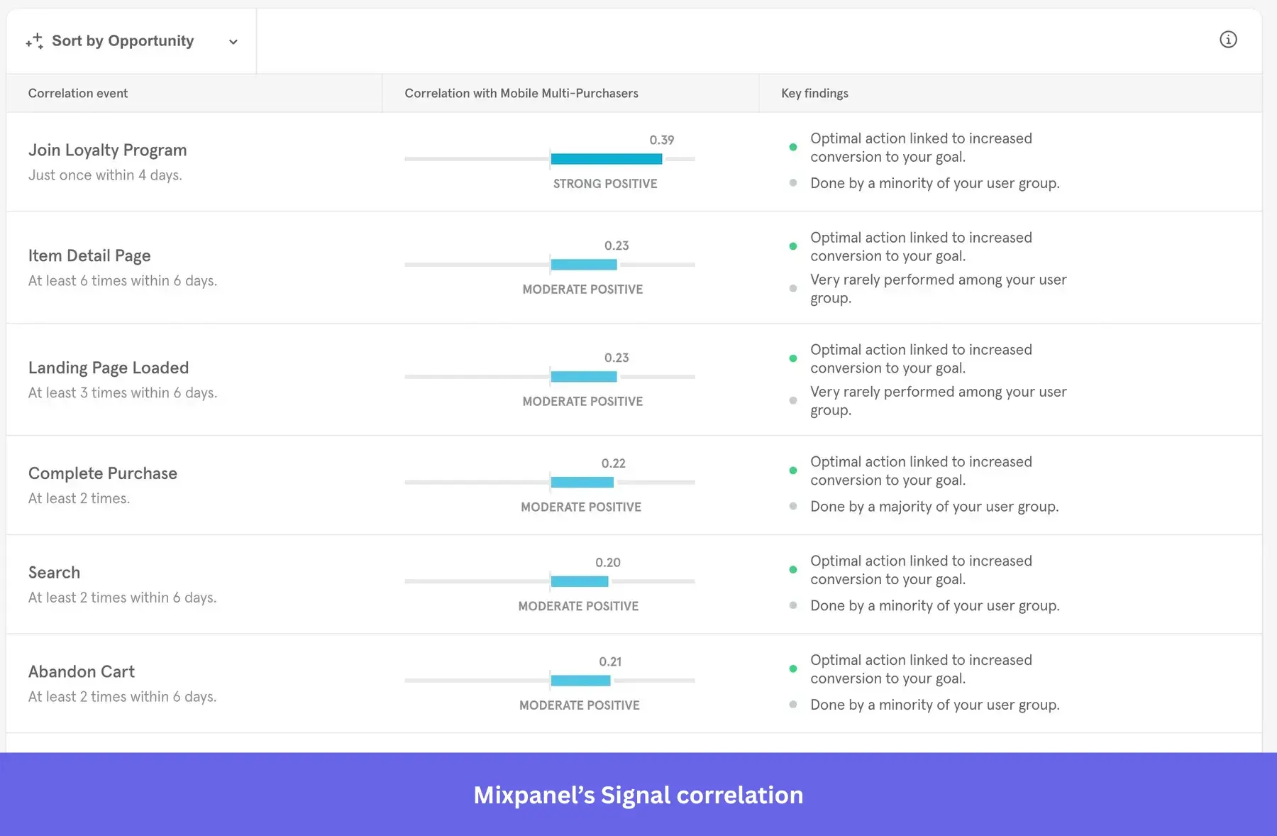
Impact and Signal reports
Mixpanel provides advanced causal inference tools through its Impact and Signal reports.
The Impact report measures the precise effects of product strategies on key performance indicators, calculating the statistical differences between users who adopt a new feature and those who don’t.
The Signal report identifies hidden correlations between specific user actions and desired outcomes. It helps you understand exactly which behaviors ultimately drive long-term conversions or user retention.
Advanced behavioral reports
Although Mixpanel isn’t as feature-rich as Amplitude, it still offers advanced tools for analyzing user journeys. These include:
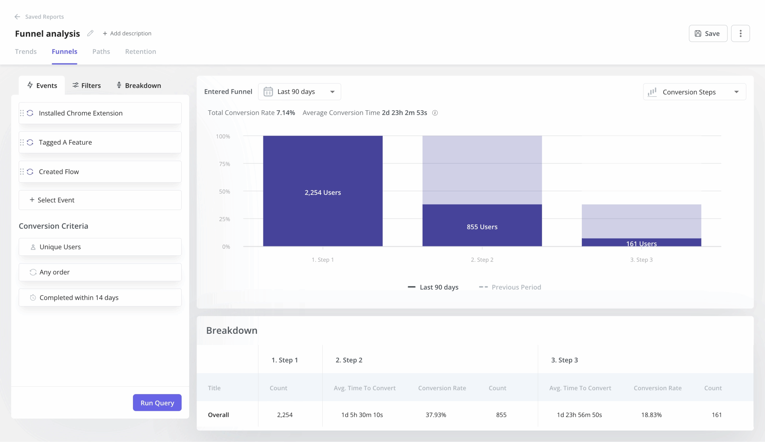
- Funnel analysis to track how users complete specific event sequences and spot drop-off points.
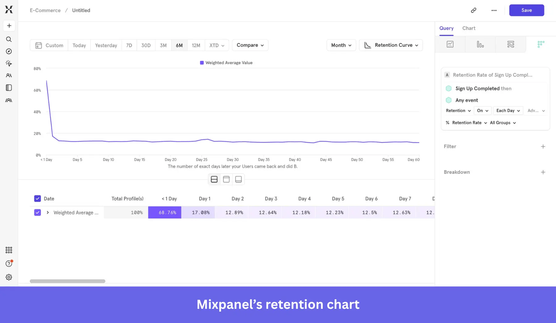
- Retention analysis, where you can observe the retention rate of users after a specific action (e.g., a drop off, an activation task, etc.).
- Flows for visualizing how users navigate your app after a specific event.
- Insights that illustrate trends across different events and user segments.
- Session replays to watch what users do when they face friction.
Mixpanel pros
✅ Advanced reporting: Mixpanel’s granular data analysis tools are a significant advantage, including the ability to map user sign-ups to product purchases or other interactions.
✅ Easier to navigate for non-technical teams: The user interface is simple, featuring a wide variety of functions without requiring technical knowledge.
✅ Fast, real-time data: Mixpanel processes events in real time and generates powerful interactive visuals almost instantaneously.
✅ Generous free plan: Compared to Amplitude and Heap, Mixpanel’s freemium limit is high enough for new startups that need to track users more granularly.
Mixpanel cons
❌ Still requires technical skills: Despite being user-friendly, building a clean taxonomy for custom event tracking requires a steeper learning curve, particularly for individuals without technical skills.
❌ Scaling gets expensive: Because pricing is tied to event volume, high-traffic apps must carefully monitor their usage to avoid unexpected cost escalations.
❌ Risk of inaccurate data: If cross-platform tracking is not well configured, it can easily hurt data accuracy (e.g., duplicate user profiles across different devices, lack of unique user IDs, etc.)
Mixpanel pricing
Mixpanel’s event-based pricing is highly transparent, divided into three primary tiers:
- Freemium: Supports up to 1 million monthly events. You gain access to all core reports for user journey analysis, unlimited integrations, unlimited collaborators, and access to foundational templates to get started quickly.
- Growth: This plan introduces a variable cost structure, starting at $140/month for 1,5M events, $258/month for 2M events, up to $2,289/month for 20M events. This tier unlocks unlimited saved reports, the Mixpanel modeling layer, group analytics, and Impact reports.
- Enterprise plan: Provides unlimited events for a custom price. It features advanced access controls, shared data views, automated provisioning, SAML SSO, and prioritized SLA support.
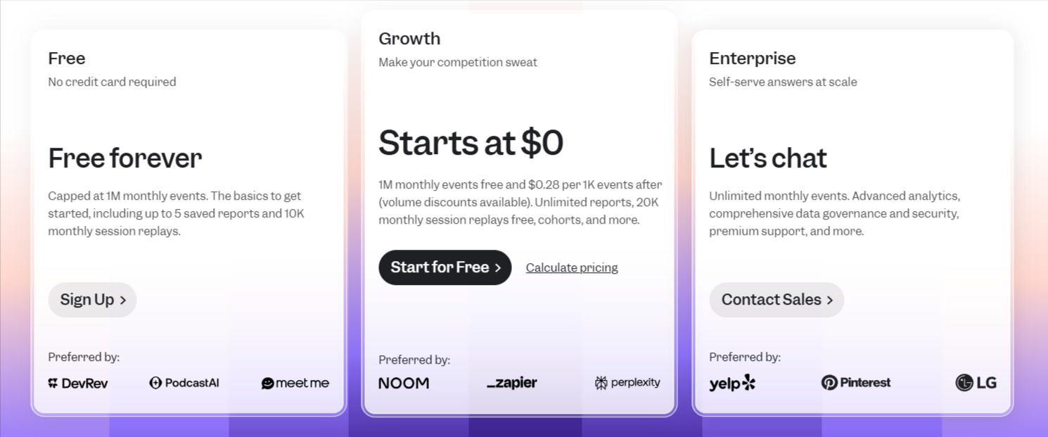
Additionally, Mixpanel has a startup program that offers early-stage companies (founded less than 5 years ago with up to $8M in total funding) a free year of the Growth plan, which supports up to 1 billion events.
Userpilot: An alternative for SaaS product analytics
Best for: B2B SaaS companies aiming to track user behavior and immediately build relevant in-app experiences without engineering dependency.
Userpilot is an all-in-one product growth platform for B2B SaaS companies. It unifies product analytics (e.g., funnel reports, paths, session replays, etc.) with user engagement features (interactive walkthroughs, onboarding checklists, and more), allowing teams to gather actionable insights and immediately deploy changes to the product experience.
Userpilot features for product analytics
Since Userpilot is purpose-built for PLG teams, its analytics tools cover all the use cases that a B2B SaaS might need. These include:
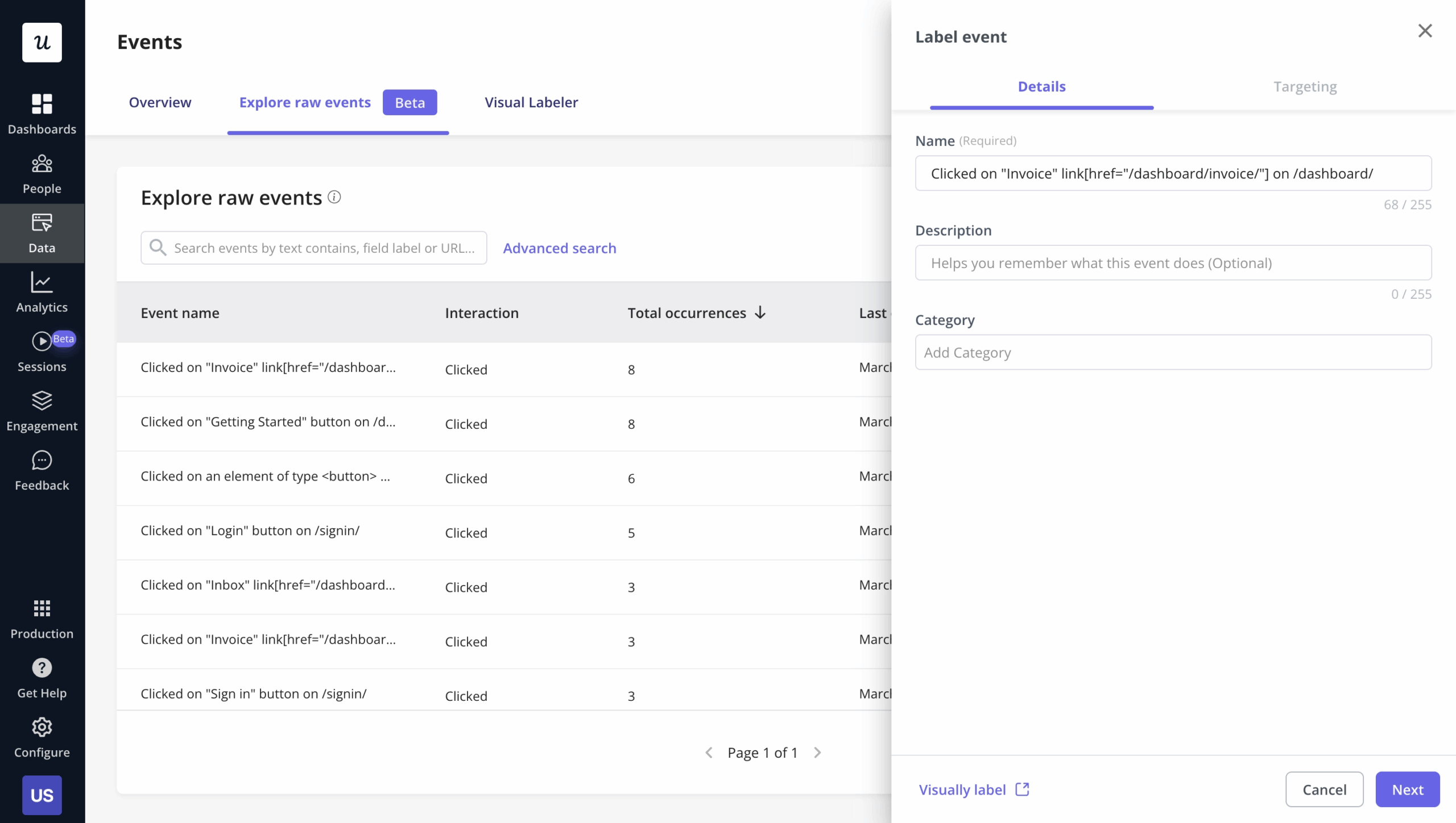
Autocapture
Userpilot automatically records feature clicks, page views, text inputs, and dynamic hovers without requiring manual instrumentation.
This way, product managers get immediate access to historical behavioral data as soon as the installation is complete, reducing the friction behind adopting analytics tools.
Product growth AI agent (Beta)
Userpilot’s AI agent analyzes product data, survey responses, and session replays to detect anomalies and funnel drop-offs.
Beyond mere detection, the AI agent explains the “why” behind user friction and automatically drafts relevant in-app messaging (such as an interactive tooltip or a personalized modal). Product managers can review these AI-generated flows and launch them to the targeted audience with a single click.
Session replays
To perfectly complement its quantitative data, Userpilot supports a privacy-first session replay tool. So when a funnel report indicates a sudden drop in conversion, you can watch the replay to catch the exact UI elements that caused confusion, allowing you to spot usability issues and technical bugs that raw numbers cannot find.
Advanced behavioral reports
Userpilot’s behavioral reporting provides most of the insights you’ll ever need in SaaS, including:
- Trend reports for tracking how specific behaviors evolve. Segmented by device type, location, or signup cohort.
- Funnel reports to map out the activation or conversion processes. Showing the step with the highest drop-off.
- Path analysis for visualizing where users go after a specific action.
- Retention cohorts, where you can compare the retention rates of users who signed up in different periods.
Customizable dashboards
Userpilot lets you customize dashboards to serve as a command center for product managers. These dashboards allow you to pin your most relevant reports and metrics in one view.
Userpilot pros
✅ All-in-one platform: Userpilot combines product analytics, user engagement (flows, modals, checklists), and customer feedback (NPS, surveys) into a single product. This avoids the integration headaches and data silos associated with managing multiple separate tools.
✅ Fully no-code: Userpilot’s intuitive Chrome extension allows non-technical PMs to build complex in-app flows, add UI elements, and perform A/B tests without waiting on engineering sprints.
✅ UI patterns: Userpilot offers a vast library of UI patterns (such as hotspots, tooltips, banners, slideouts, and modals) that allow teams to build personalized interactive walkthroughs.
✅ Third-party analytics integrations: Userpilot has built-in integrations with tools like Amplitude, Mixpanel, Kissmetrics, Segment, Heap, HubSpot, Intercom, Google Analytics, and Google Tag Manager so you can share data between all the solutions in your tech stack.
Userpilot cons
❌ Lacks employee onboarding: Userpilot only supports in-app customer onboarding. There are no tools for internal software adoption.
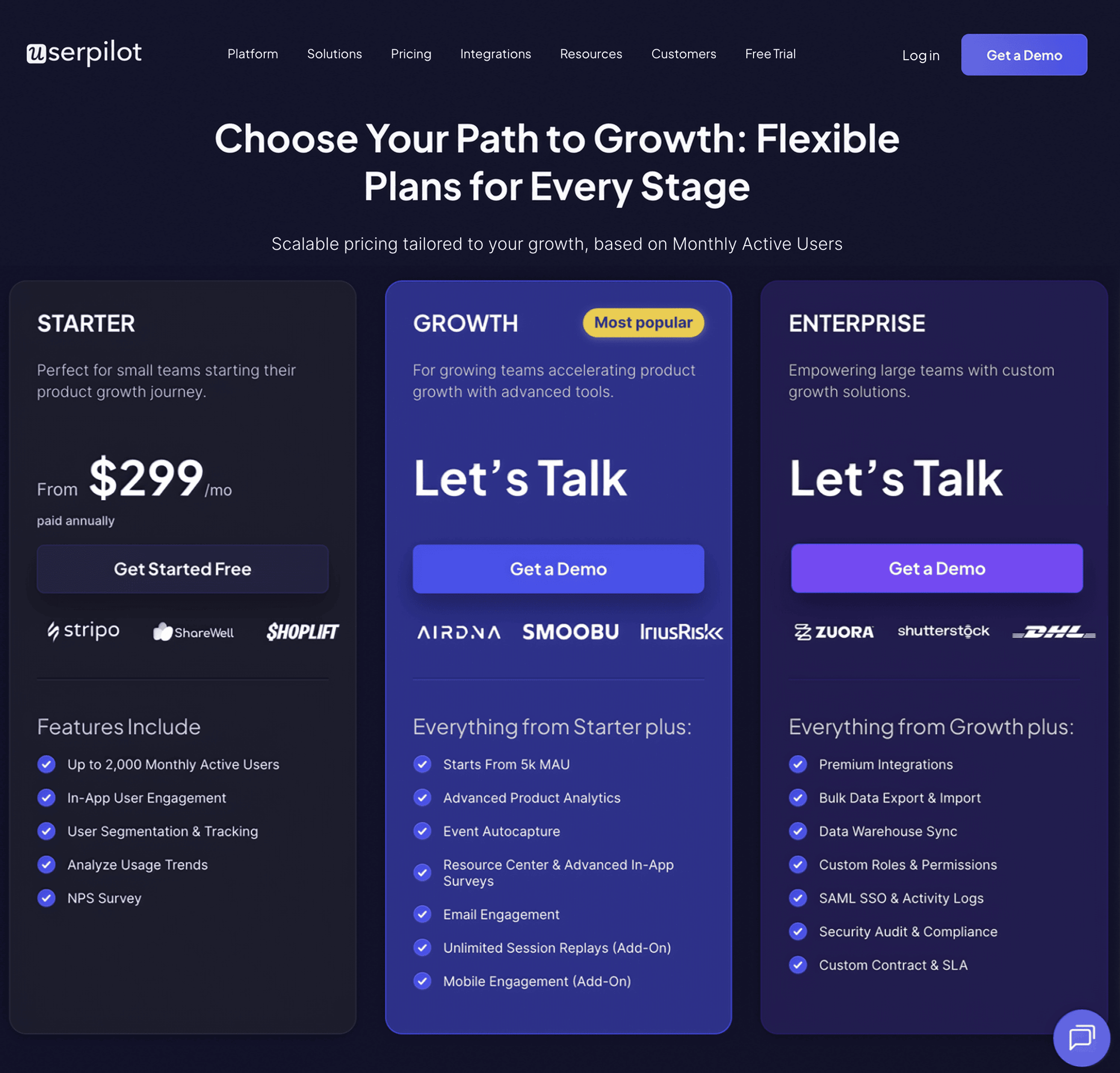
❌ No freemium plan: Unlike the other alternatives, there’s no free tier in Userpilot for product analytics. The entry-level plan starts at $299/month.
❌ Steep learning curve: Like any comprehensive product, advanced features (such as managing the intersection of granular analytics, complex behavioral segmentation, and interactive UI flows) require a lot of time to learn.
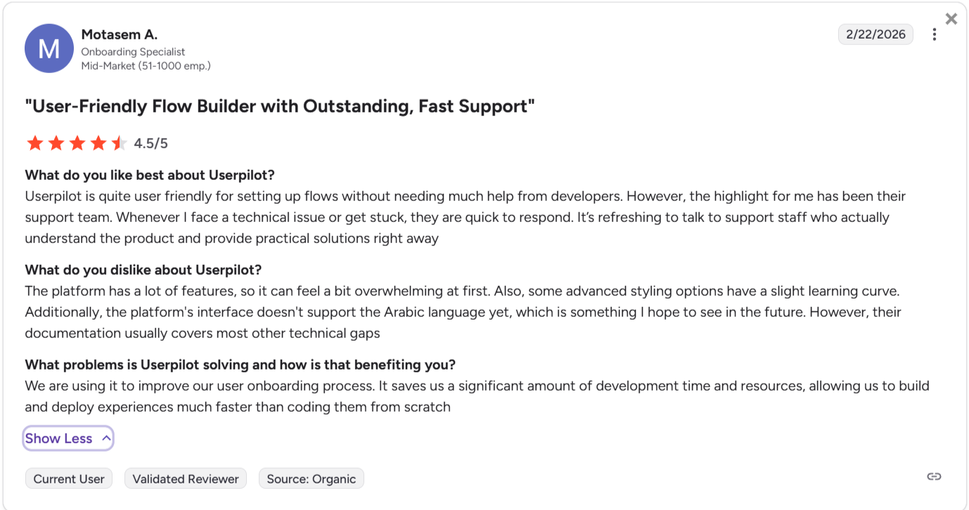
Userpilot pricing
Userpilot offers flexible pricing built around access to product analytics, in-app experiences, and user engagement tools without locking key features behind higher tiers. It includes three plans:
- Starter: Priced at $299 per month (billed annually) for up to 2,000 MAUs. It provides full access to core product analytics, NPS surveys, user segmentation, and in-app engagement flows.
- Growth: The price scales with MAUs. It adds resource center analytics, advanced event-based triggers, unlimited feature tagging, event autocapture, and email engagement.
- Enterprise: Custom pricing. Includes robust security controls like SAML SSO, premium integrations (including data warehouse syncs), comprehensive activity audit logs, and custom Service Level Agreements (SLAs).
Which tool should you choose?
So, which platform should you choose? It depends entirely on your team’s composition and your product’s lifecycle.
- Choose Amplitude if: You have a dedicated data team, complex multi-platform products, and a push for deeper data-driven decision-making. You are also willing to wait for developers to instrument events perfectly.
- Choose Mixpanel if: You want fast, visual answers for your product managers. You have the technical resources to maintain a clean tracking plan, but you want your PMs to self-serve their own funnel reports daily.
- Choose Heap if: You have zero engineering resources to spare. You need to answer questions about past user behavior immediately, and you are willing to spend time actively curating a massive database of autocaptured clicks.
- Choose Userpilot if: You want to connect insights directly to action. You want to track customer behavior and immediately build in-app onboarding flows to improve activation, without ever asking a developer to write code.
So if, besides looking for product analytics platforms, you also need a tool to engage users inside your app. Then check our no-bs guide to choose a user engagement platform based on your specific use cases.
Userpilot strives to provide accurate information to help businesses determine the best solution
for their particular needs. Due to the dynamic nature of the industry, the features offered by
Userpilot and others often change over time. The statements made in this article are accurate
to the best of Userpilot’s knowledge as of its publication/most recent update on April 1, 2026.
FAQ
What is product analytics?
Product analytics studies user interactions with a product or service, allowing product teams to monitor, evaluate, and assess data related to customer engagement and behavior. This information is used by teams to optimize their product or service to improve user experience.
About the author