Customer Journey Visualization in 2026: Stage-by-Stage Playbook for Mapping, Tracking, and Acting on the Signals


Most customer journey visualization projects end with a map getting built, being presented at a QBR, saved to a shared drive, and never touched again. It was accurate the week it was created, but a few months later, it’s nothing more than a historical artifact that the team still treats as a strategy.
The first thing making this harder to ignore in 2026 is that the consideration stage has changed. Buyers increasingly begin their evaluation by asking an AI chatbot which tools to consider, and that shortlist is usually set before your sales team knows the evaluation started. 6sense’s 2025 Buyer Experience Report found that buyers purchase from the vendor they contact first in nearly 80% of cases, which means not making it to the top of the AI-generated shortlist often means missing the deal entirely.
The second disruption is that the in-product stages of the customer journey (activation, adoption, renewal, expansion) are now trackable in real time. AI condenses customer behavior data into signals that a human analyst would have taken a week to surface. The gap between a map built from last quarter’s cohort data and one informed by what users did this morning is no longer a rounding error.
What’s changed about customer journey visualization in 2026
Maps are getting more accurate. AI aggregates more behavioral signal types than manual analysis ever could with event data, session replays, NPS trends, feature usage patterns, and cohort retention rates. The result is a customer journey map grounded in what users actually do instead of what your team assumes they do.
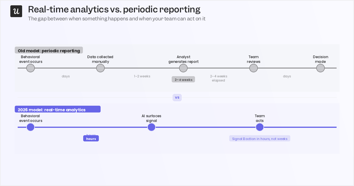
Reporting cycles are collapsing. The old model had an analyst generating a report every few weeks from data already stale by the time it landed in an inbox. AI now continuously condenses behavioral data into actionable signals, which means a customer who stalled at activation three days ago is still reachable, while one who stalled three weeks ago has probably already started their next evaluation. This doesn’t mean that the human layer is gone. Interpreting the signals AI surfaces, checking them against account context and customer personas, and deciding what action to take still requires a human.
The teams building customer journey visualizations that actually improve outcomes treat AI as a faster input to human decision-making rather than a replacement for it.
The consideration stage has a new gatekeeper
The consideration stage is where customer journey visualization has changed most structurally in 2026, and it’s where most existing customer journey maps are still working from outdated assumptions. Buyers increasingly begin their evaluation by asking an AI chatbot which tools to consider. By the time they hit your website or submit a demo request, their shortlist is already set in stone.
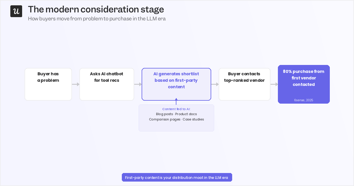
The mechanism is straightforward: large language models train on and retrieve first-party content, including blog posts, documentation, comparison pages, and case studies. If that content doesn’t exist, isn’t authoritative, or doesn’t answer the questions buyers are actually asking, you don’t appear in the AI-generated shortlist. The 6sense stat from earlier is worth revisiting: buyers purchase from the vendor they contact first in nearly 80% of cases. Being at the top of an AI-generated shortlist is the highest-impact position in the entire customer journey funnel, more so than any individual paid media campaign or outbound sequence.
This means that building out first-party content isn’t just an SEO play anymore; it’s planting feedstock for LLM recommendations. As such, it now affects consideration-stage conversion rates in a way it didn’t three years ago. Track which content sources are driving consideration-stage signups and treat that data as a leading indicator of your LLM discoverability, not a vanity metric.
The 8 stages: What to track, what AI surfaces, and when to step in
The 8-stage model below is the standard for B2B SaaS customer journey mapping.
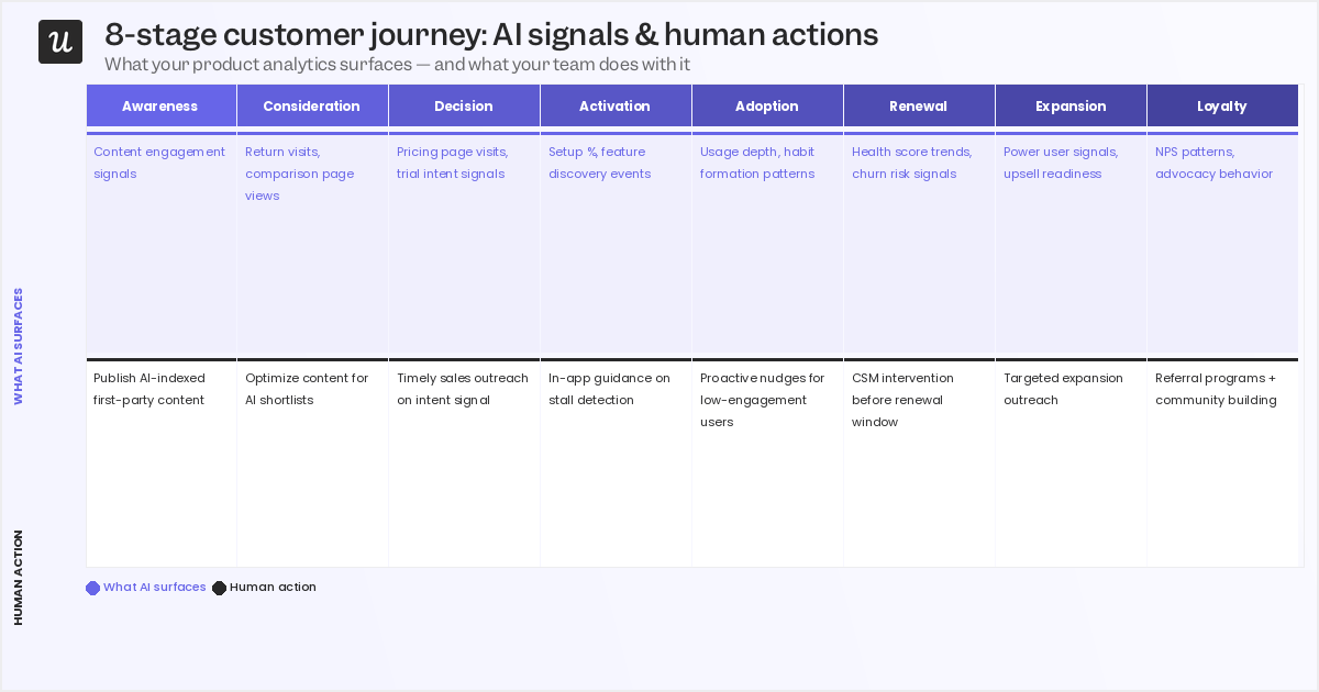
The stages themselves haven’t changed but now you have the opportunity to collect real-time behavioral data and quickly act on them.
- Awareness: The potential customer recognizes a problem and begins searching for information, not necessarily about your product yet.
- Consideration: They actively research solutions, compare features or pricing, and increasingly ask AI chatbots for a shortlist (LLM discoverability now shapes this stage).
- Decision: They book a demo, sign up for a free trial, or go straight to a paid plan.
- Activation: The new user experiences your product’s core value for the first time.
- Adoption: They incorporate the product into their regular workflow and use it consistently.
- Renewal: They decide whether the product is worth another year of investment.
- Expansion: They purchase add-ons, upgrade their plan, or spread the product across their team.
- Loyalty: They become advocates, renewing repeatedly and recommending you through word of mouth or public reviews.
Here’s how I think about each one from a CS perspective:
Decision stage
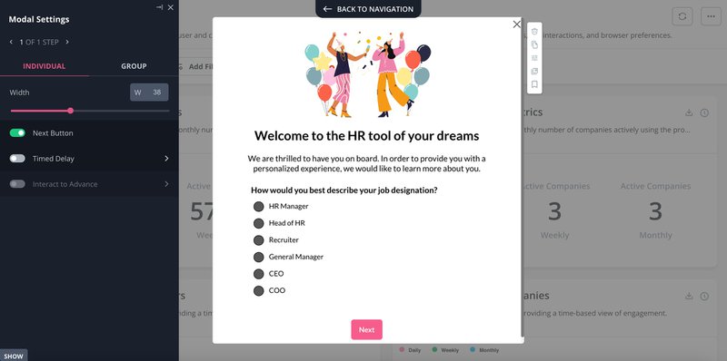
By the time a buyer reaches the decision stage, they’ve already formed a view of your product from content, reviews, and AI-generated comparisons. Segmenting them immediately with a welcome survey gives you the data to route them into the right experience before they touch a single feature. Ask about company size, role, and primary use case. These three questions are enough to meaningfully differentiate onboarding paths for different customer segments.
What behavioral data surfaces here: which new signups show the highest fit signals based on firmographic data and early in-app behavior. Use that segmentation to route high-fit prospects to a CSM for a personalized demo rather than a self-serve onboarding flow. A generic tour for an enterprise account that needs custom data workflows is a fast path to early churn.
Activation stage
Activation is where most customer journey maps underinvest. It’s also where I see the most recoverable churn: accounts that stalled not because the product was wrong for them, but because the onboarding experience didn’t get them to the right feature fast enough. Path analysis gives you the full picture: which routes users take through your product, where they drop off, and what the shortest successful path to activation looks like for your highest-converting cohort.
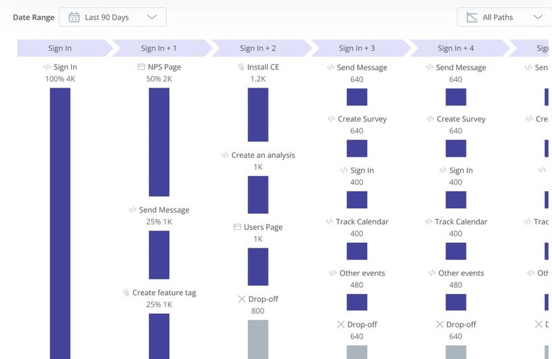
Filter to find the happy path and use that as the basis for your onboarding checklist and in-app guidance triggers. The human-AI boundary here is drawn based on use-case complexity. Self-serve SMB onboarding can be fully guided with checklists, tooltips, and walkthroughs triggered by behavioral events. Enterprise implementations with custom data workflows, compliance requirements, or multi-team rollout need a human CS lead actively involved.
Automate what you can, stop where you shouldn’t.
Adoption stage
Activation gets users to their first value moment. Adoption is about making that moment repeatable: turning a first experience into a workflow the team depends on. The failure mode I see most at this stage isn’t drop-off but plateaus, where an account activates cleanly, uses one feature reliably, and never discovers the parts of the product that would make it hard to replace. Trend analysis identifies which features get the most engagement in a given period, which tells you both what’s working and what isn’t being discovered.
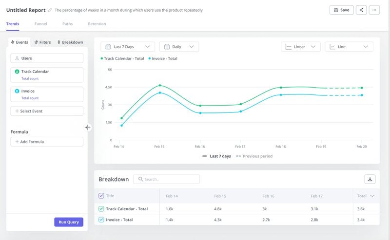
Pair it with cohort retention analysis to find which feature sequences drive deep adoption over time.
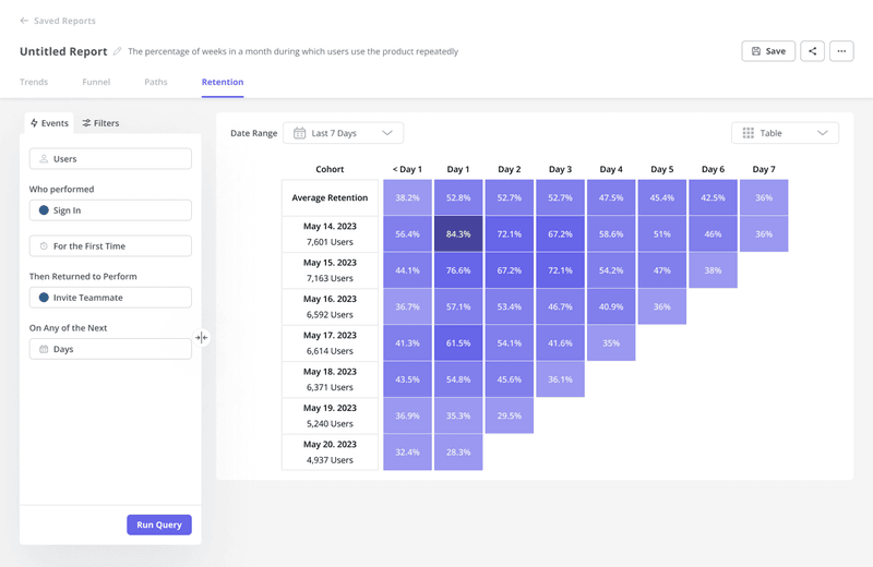
If one customer segment reaches deep adoption in 14 days and another takes 60, that difference is worth understanding. Cohort analysis surfaces those patterns across the user base.
Renewal stage
The renewal stage is where customer journey visualization earns its keep, and where it fails most publicly. Most teams I’ve worked with don’t have a renewal problem in the abstract. They have a signal problem: the data showing that an account was at risk was there three months before the renewal conversation, but nobody saw it in time to act. The warning pattern isn’t sudden disengagement. It’s accounts where logins are daily and activity metrics look healthy, but nobody’s completing anything meaningful with the product.
High activity, zero outcomes is a combination shows up in behavioral data weeks before the customer raises it on a call, and by the time they do, you’ve lost the early window to address it.
What behavioral analytics surface here are engagement trends over the 90 days before renewal, usage drops relative to each account’s baseline, and accounts where the ratio of sessions to completed workflows has deteriorated. The CS team enters the renewal conversation with that brief already prepared instead of having to discover it live on the call.
Expansion stage
Most expansion conversations are triggered by the calendar. A CS manager reviews accounts coming up for renewal, identifies the healthy-looking ones, and reaches out. The timing is arbitrary: it has nothing to do with whether the customer is actually ready to expand. Usage signals are a better trigger: an account approaching a feature limit, a team spreading the product beyond its original user group, or a power user pattern emerging in what started as a self-serve account.
These are behavioral signals that indicate expansion readiness, and AI can surface them automatically. In-app upsell modals triggered by those signals work well for self-serve and SMB accounts where the decision is made by the user themselves. For enterprise accounts, the timing signal still comes from behavioral data, but a human has the conversation. Enterprise clients rarely increase their annual contract without speaking to someone they trust. The data tells you when, but the humans tell you how.
Loyalty stage
Loyal customers are the easiest advocates to miss in a customer journey map. They don’t complain, they renew on time, and unless you’re actively looking for them, they’re invisible in your behavioral data. Advocacy signals are trackable: high NPS scores, deep feature usage, multi-team adoption spreading within an account, and long tenure with consistent engagement. Ask for advocacy when those signals are at their strongest, not on a fixed quarterly schedule sent to your entire user base.
Loyalty-building interventions work best when they’re triggered by behavioral readiness, not by the date on your outreach calendar.
How to build the customer journey visualization itself
Data collection and visualization are separate steps, and conflating the two is one of the most common reasons customer journey maps end up as one-time deliverables. Collection uses analytics tools, session replay, and feedback surveys, while visualization uses a dedicated customer journey mapping tool.
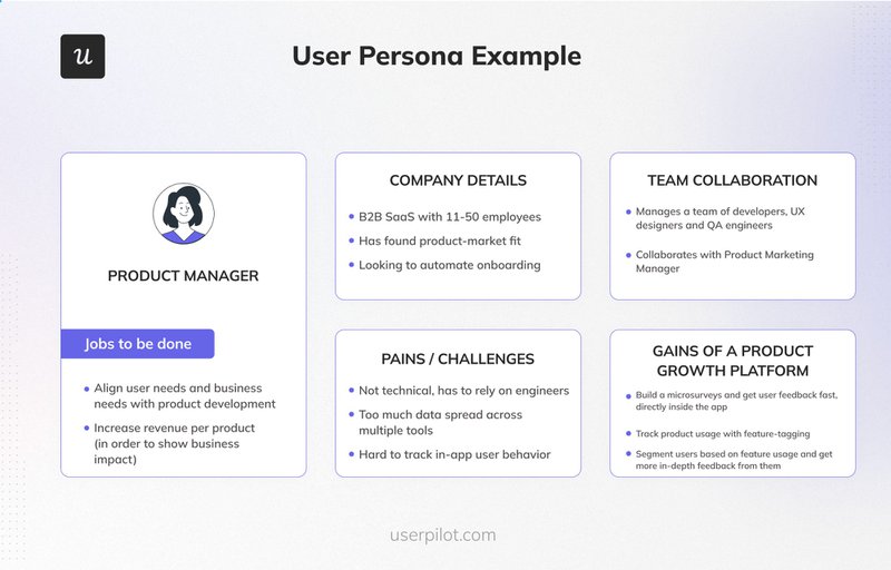
1. Identify your customer persona
Customer journey visualization starts with a specific customer persona, not a generic user type. A startup founder using your product for the first time has a fundamentally different path to loyalty than an enterprise CS team rolling it out across 200 accounts. Pick one persona per map, document their pain points, goals, jobs to be done, and build from there.
2. Segment with a welcome survey
Before new users engage with a single feature, a welcome survey gives you the segmentation data to route them into the right journey. Company size, role, and primary use case (three questions) is enough to meaningfully differentiate onboarding experiences for different customer segments. That data feeds directly into your customer journey map as the starting conditions for each persona.
3. Identify key journey stages with path analysis
Define the goal for each journey stage: the activation milestone, the first completed workflow, the feature that signals genuine adoption. Then use path analysis to find the routes users actually take to get there, and filter for the shortest successful path. That becomes the basis for the onboarding guidance and the happy-path annotation in your customer journey map.
4. Find features that drive engagement and retention
Trend analysis identifies which features get the most engagement in a given period, surfacing both what’s working and what isn’t being discovered. Pair it with cohort analysis to find which features drive retention over time. These are the moments of genuine value in your product that deserve the most prominent placement in your customer journey visualization.
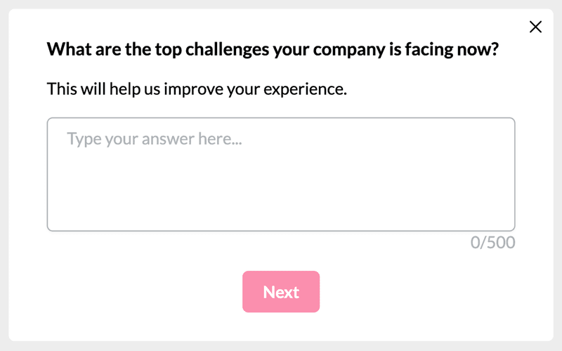
5. Collect qualitative feedback to understand the why
Behavioral data tells you what happened. Open-ended feedback surveys tell you why. Target them to users at specific journey stages: a survey deployed when a user completes activation, or when a cohort hits its 30-day mark, produces more specific and actionable customer feedback than a blanket quarterly NPS blast.
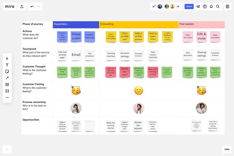
6. Visualize with a customer journey map template
With the behavioral data and qualitative feedback collected, bring them into a visual format. A customer journey map template provides the structure with stages, customer emotions, actions, touchpoints, and proposed solutions mapped at each stage.
Best practices for customer journey visualization in 2026
Generic advice like “keep it simple” or “use consistent colors” is worth ignoring since the practices below are what actually change outcomes.
Treat the map as a living document
A customer journey map that hasn’t been updated in six months has become a record of what you assumed last quarter, not a strategy for what to do next. AI-powered analytics make continuous updating feasible in a way it wasn’t when every data point required a human to pull and process it. Set a quarterly update cadence at minimum, and update the map whenever behavioral data signals a meaningful shift at any stage.
Separate the data layer from the interpretation layer
AI surfaces signals fast, and that speed creates pressure to compress the time your team spends interpreting what those signals mean. Resist it. Account context, customer expectations, and business objectives don’t live in your analytics dashboard; they live with the humans on your CS and product teams. The interpretation step is where customer journey visualization actually creates value.
Build stage-specific action protocols
A customer journey map without a corresponding playbook for each stage is still just data visualization. For each key touchpoint, define what behavioral data triggers action, what that action is, who owns it, and what success looks like. The map tells you where customers are; the protocol tells you what happens next.
Close the feedback loop
Map an intervention at activation, then measure its impact on adoption rates over the following 30 days. If the intervention moved the metric, update the map to reflect the new expected path; if it didn’t, update the intervention. Actionable analytics only create value when they feed back into themselves.
Without that loop, you’re building a record of what you tried, not a map of what works.
A customer journey map is only valuable if it tells you what to do next. AI gives you the data to make that map more accurate and more current than was ever possible before. The teams who benefit most aren’t the ones with the most sophisticated analytics pipeline; they’re the ones who use better data to make informed human decisions at every stage.
Book a Userpilot demo to see how path analysis, trend reports, cohort analysis, and in-app feedback work together to make visualization faster so the decisions that follow it are more confident.
About the author