The Product Adoption Dictionary: Every UX Term You Wanted To Know, But Were Afraid To Ask

The Product Adoption Dictionary: Every UX Term You Wanted To Know, But Were Afraid To Ask

Product adoption has picked up a fair amount of jargon over the years.

And since new fancy terms seem to pop up every week, it can be a bit hard to navigate for both the newcomers and even for the well-established product pros.

Hence: team Userpilot has put together the ultimate guide to product adoption and onboarding terminology!

So, if you occasionally get the User Journey mixed up with the User Experience

Or if you confuse Flywheels and Flows from time to time…

Or even if you can’t tell your JTBDs from your TTFV and your AARRR

Then welcome to the Userpilot Product Adoption Dictionary!

We’ve defined, contextualized and given our best advice on 70 of the terms and concepts that crop up again and again in Product Adoption.
Speaking of which:


You’ll surely be familiar with some of them, but maybe there are a few new ones in there for you…

They are all presented alphabetically below, but we’ve grouped them into five handy categories to get you started:

Adoption Terminology

Adjacent UsersContextual HelpCustom EventsDriven ActionsEvent TriggeringExperimentationFreemiumJobs To Be Done Live ChatProduct AdoptionProduct ManagerProduct MarketerProduct-Led GrowthResource Center Upsell User JourneyUser Segmentation

Measurement Terminology

DAUs/MAUsFlow AnalyticsPirate MetricsTime To First ValueUsage Analytics

New User Onboarding Terminology

ActivationAdvocateAhaBasic UserDay One RetentionEmpty StatesEvergreen Onboarding Flow Interactive WalkthroughsPaid UserPro User/Power UserProduct ToursProactive OnboardingReactive Onboarding RetentionSecondary Onboarding Selected UsersTertiary OnboardingUser Adoption Flywheels

User Interface Terminology

AlertsApplication HeaderAvatarBackdropBreadcrumbsButtonsCoach Marks DropdownExperience LayerFeature Release WidgetFormsGIFsHelp WidgetHotspots In-App Videos Modal Native TooltipNotificationsSlideoutUser Experience User Interface

Terms You Need But Don’t Fit Anywhere Else!

Account AttributesMicrosurveyNo CodeNPSOAuthSelf Serve


Account Attributes

Account attributes userpilot

Account Attributes are descriptive data (or metadata) associated with a record or user profile.

By recording the user’s name as an Account Attribute, for example, it is possible to deliver a more personalized experience.

By recording the user’s job title or priorities for using your app (which can be done during the Sign Up Flow or via the Welcome Screen), you can Segment users to provide more relevant onboarding for their needs.

Activation

user adoption flywheel

An Activated user is one who has realized First Value from your service.

What the user saw was possible when they had their Aha moment starts coming to fruition when they Activate.

Aha moment

As one of the most important steps on the User Journey and one of the five Pirate Metrics, you need to define what counts as Activation for your product.

Your SaaS’s Activation Rate is the percentage of users who get to that key event – and a lot of studies have found it to be that optimizing your Activation Rate has the greatest downstream impact on revenue of any KPI you should be tracking.

Adjacent Users

Adjacent users are a segment of your total audience who are aware of your service and may be trying it out, but who aren’t successfully converting to become engaged users.

We wrote a whole blog about how to capture adjacent users a little while ago.

With just a bit of help – in terms of product positioning and support for their use cases – Adjacent Users can quickly be turned into successful users.

Product Adoption Dictionary: Adjacent Users

Source: reforge.com

Advocates

advocacy

Advocates represent the culmination of the User Journey.

They’re not just your most successful and engaged Power Users.

They are proactively helping you to sell more by referring your service to their own contacts; giving you five-star reviews; and sharing your content with the public.

Aha

Not the 80s Norwegian pop superstars, but a critical step on the User Journey.

When we talk about “Aha!” we mean the moment that a user realizes that your service can meet a need they have and provide value to them.

It’s not when that promise is fulfilled (that’s Activation). Aha happens when the value of your service becomes clear to the user.

Aha moment userpilot

Source: userpilot.com

Alerts

In-app Alerts are an interruptive way of notifying users about new information, actions required or other urgent details.

Product Adoption Dictionary: Alerts

Source: adobe.com

Alerts can appear in any UI form – Modal, Slideout, full-screen (as shown above) or Tooltip. They differ from Notifications in that Alerts force users to dismiss them before continuing.

By interrupting users, Alerts can be frustrating and should therefore only be used for essential and time-sensitive communications.

Application Header

This is your app’s top-level navigation and tool bar.

It will be one of the first places new users look at when they log in for the first time, so it should be self-explanatory.

The Application Header should include:

  • The user’s Avatar, to show when they are logged-in
  • Links to the primary features of your app
  • Options to manage the user’s profile
  • A bank of unread Notifications, if applicable

Avatar

A user’s Avatar is the graphical icon that represents them in-app when they are logged in – such as the one below.

avatar example userpilot

Many SaaS products allow users to upload their own Avatar image and customize their profile.

Backdrop

In CSS, Backdrop filters are used to overlay the main contents of a screen so that they can still be seen behind another window (often, a Modal).

Backdrop

Source: dev.to

There are loads of clever things people are doing with these filters, using color, translucence and other effects to highlight the foreground without completely obscuring the background.

Basic Users

Your Basic Users are regularly using and benefiting from your service. They’re happy, but they’re not blown away and singing your praises to anybody who will listen.

user adoption flywheel userpilot

Source: userpilot.com

Basic Users tend to be unaware of the full range of features your service has. A classic scenario is when somebody is using laborious workarounds because they don’t know how to do things more simply.

Using secondary onboarding is a good way to push your basic users to adopt the more advanced features and correct inefficient user habits – and thus move up the user journey to become ‘Pro users’.

Breadcrumbs

Breadcrumbs are a simple piece of graphical UI which can act as secondary means of navigation. Breadcrumbs show where a current page sits in the hierarchy of a site or app.

Breadcrumbs

Source: shopify.com

Buttons

Everyone knows what Buttons are, don’t they?

But how much are you thinking about and Experimenting with their design?

It has been shown time and time again that the following factors on Call To Action buttons can make a huge difference to conversion:

  • On-screen placement
  • Background color and text color
  • The copy on the Button
  • Contrast with other Buttons (always highlight the preferred option relative to others!)
Buttons

Source: duolingo.com

Coach Marks

Coach Marks are a User Interface element for providing Contextual Help that is used in Product Adoption.

Coach Marks

Source: uxframework.pearson.com

They are aimed at driving feature adoption by pointing out the benefits of a feature or how to use it.

They can load automatically or be event-triggered (for example, when the user hovers over an icon) but what distinguishes Coach Marks from Native Tooltips is that the former only appear the first time a user encounters that element.

For this reason, they can be larger than typical tooltips and contain more information.

Contextual Help

Great onboarding and customer success work depends on knowing:

  • What a user is trying to do
  • What they’ve succeeded at and failed at before
  • What they might want to do next

So if you can offer advice, guidance and notifications that are relevant at the right time, in the right place, you’ll be able to drive users towards value.

So contextual experiences are critical in successful UX.

Everybody hated Microsoft’s Clippy character because he would offer irrelevant advice at random times.

Clippy

Source: windowscentral.com

Microsoft was trying to do the right thing, but got it wrong.

Today, it’s much easier to model user workflows, track in-app activity, and trigger prompts on the basis of behavior than it once was.

That’s Contextual Help is all about.

  • Making sure your UI elements appear when they’re useful
  • Making sure they appear in locations that are intuitive and make sense
  • Making sure that help offered doesn’t get in the way if it’s not wanted

Don’t be like Clippy.

Custom Events

custom events

Source: Userpilot

Custom Events are events that happen in your app (e.g. button click, page view, account upgrade etc.) you have defined for the purposes of Event Triggering, in-app event tracking and analytics. They allow you to e.g. trigger experiences to specific segments of users based on their in-app behaviour (e.g. pageview X has occurred).

They contrast with the pre-defined, default events that are tracked or tagged automatically by your software.

If a tool doesn’t allow you to define and deploy Custom Events, it will be very difficult to tailor to the specifics of your particular product.

DAUs/MAUs

Monthly Active Users Userpilot DAU/MAU

Source: Userpilot

DAUs are Daily Active Users: the number of people who open and engage with your app on a given day.

MAUs is Monthly Active Users.

These metrics can provide important information about your product growth over time and about user behavior.

Oftentimes, SaaS pricing is also based on your MAUs – you pay for the number of Monthly Active Users you have (this is the case in Userpilot as well!)

Day One Retention

Day One Retention is a very specific view of the Retention metric.

It looks at the percentage of new users that do not churn by the end of their first day after sign-up.

We dedicated a whole blog to why Day One Retention is so important to monitor and how to optimize it.

Driven Actions

In an Interactive Walkthrough or other interactive flow, a user may have to take a certain action before the next step appears.

In Userpilotm we call these Driven Actions, and they fall into five different types:

Product Adoption Dictionary: Driven Actions

Source: userpilot.com

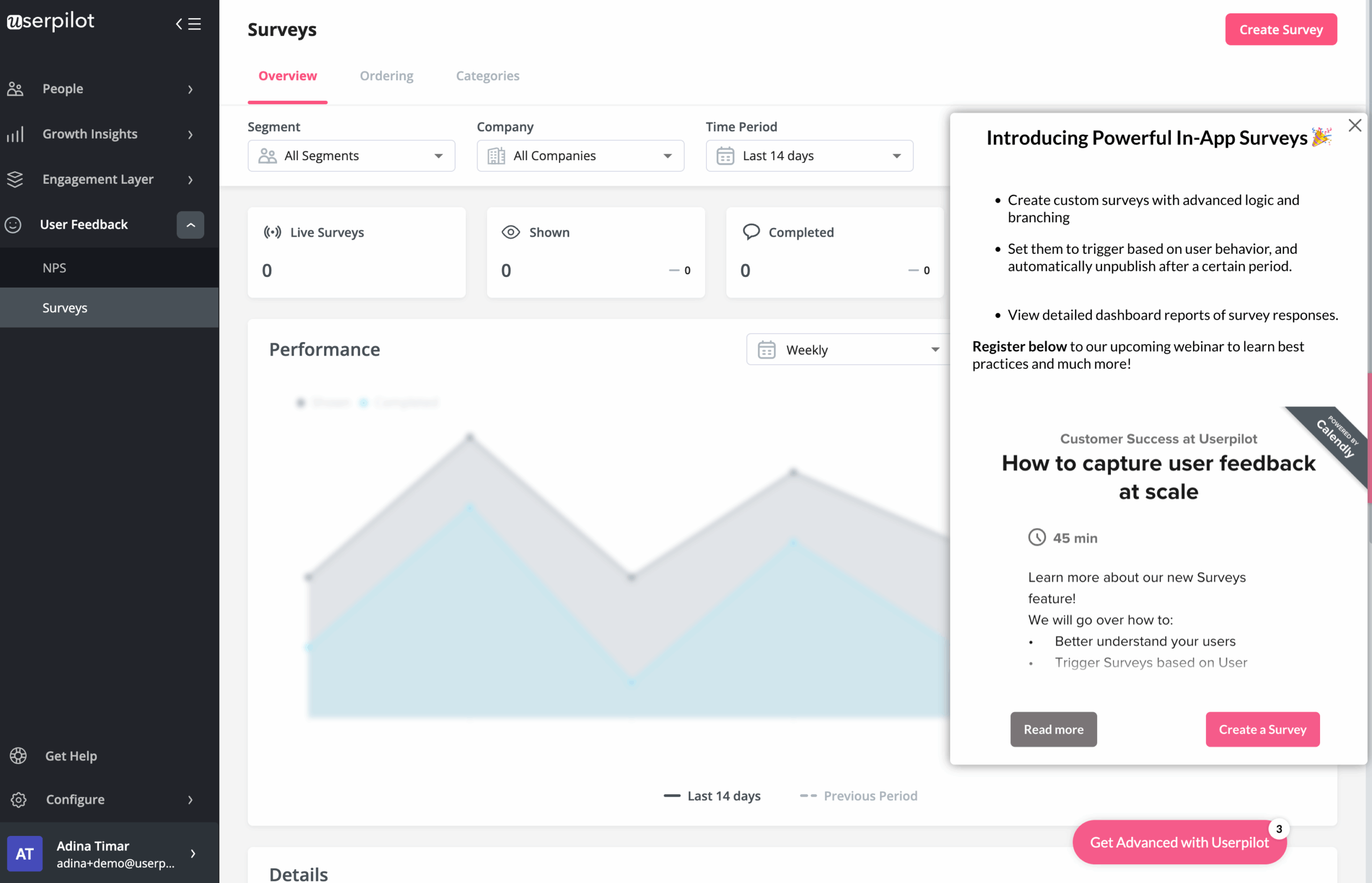
As part of our easy-to-use drag and drop experience builder, Driven Actions make it possible for you to prompt specific actions as part of onboarding flows.

Empty States

Also known as the “white canvas” problem, Empty States are what a new user can be confronted with when they open up your app for the first time in the absence of clear Primary Onboarding.

Compare the examples below from Smashing Magazine:

Product Adoption Dictionary: Empty States

Source: smashingmagazine.com

The version on the left gives no guidance to the user as to what they should do next. The version on the right, however, banishes the Empty State problem with some suggestions on how to get started.

Your Primary Onboarding needs to ensure that new users are not presented with “dead ends” like this where they can’t see how to proceed.

Dropdown

A Dropdown is a UI element that allows a user to choose one from a preset range of options.

Dropdown

Source: useprilot.com

Event Triggering

If you want to provide Reactive Onboarding to your users – that is, to serve up help to them where and when they show that they need it – then you need Event Triggering.

Many SaaS products allow you to track and monitor in-app events. Compiling this data to see behavioral trends is one of the main purposes of Usage Analytics.

But it can also be used to tailor responsive in-app experiences.

The best tools don’t limit your tailoring to Events by themselves.

  • Cross-reference particular actions against User Segments for greater accuracy.
  • Avoid repetition by restricting the number of times a new experience step is triggered by an Event.

Combined with these tactics, Event Triggering can allow you to give really targeted experiences to a range of different users.

Evergreen Onboarding Flow

Your product’s Evergreen Onboarding Flow is the principal, permanent journey through your Adoption process.

When you launch new features or make other changes to your UX, you’ll need to introduce those changes to new users and existing users alike. This can be done via Modals, new Welcome Screens on log-in, of even a Feature Release Widget.

But when a change ceases to be new, it’s important to stop presenting it as such and incorporate it into your Evergreen Onboarding Flow.

The best way to do this is to study Usage Analytics for the changes to see how people have been interacting with them, and build onboarding experiences that correspond to those revealed use cases.

Experience Layer

experience layer userpilot

Your product’s Experience Layer is what sits “on top of” the native UI to enable it to provide personalized, contextual experiences for different users.

Unlike a Product Tour or even many Interactive Walkthroughs, Experience Layers provide a completely Reactive form of onboarding – that responds to whatever the user is doing.

Your product Experience Layer needs to be carefully designed to provide the most appropriate Contextual Help. By understanding the users’ progress along the User Journey and what they are trying to achieve, it helps to guide users to complete the most valuable actions.

Building an Experience Layer depends on tracking Account Attributes and responding to Event Triggering.

Experimentation

In order to optimize your User Experience, it is vital to test different UI elements, navigation options and other factors against one another to see which lead to users realizing more value.

Product Adoption Dictionary: Experimentation

Source: userpilot.com

This blog spells out the principles of running good product experiments, including A/B or split tests and multivariate tests.

Experimentation can be used to target improvements in user activation, feature adoption, retention, and many other KPIs, but they need to be carefully designed:

  • In terms of User Segments selected to take part in the experiment
  • In terms of duration
  • In terms of what you choose to test against what
  • And in terms of what you aim to learn from the experiments

Feature Release Widget

When you introduce a new feature to your SaaS, you want everybody – new users and existing users alike – to know about it as a priority.

New features are by definition not a part of your Evergreen Onboarding Flow, and so need bespoke measures to bring attention to them.

We’ve written a blog all about maximizing new feature adoption here.

A bespoke widget is a powerful alternative to a simple Alert or Notification to really drive users to the new functionality and concentrate all the resources relating to getting the best out of it in one place.

Flow Analytics

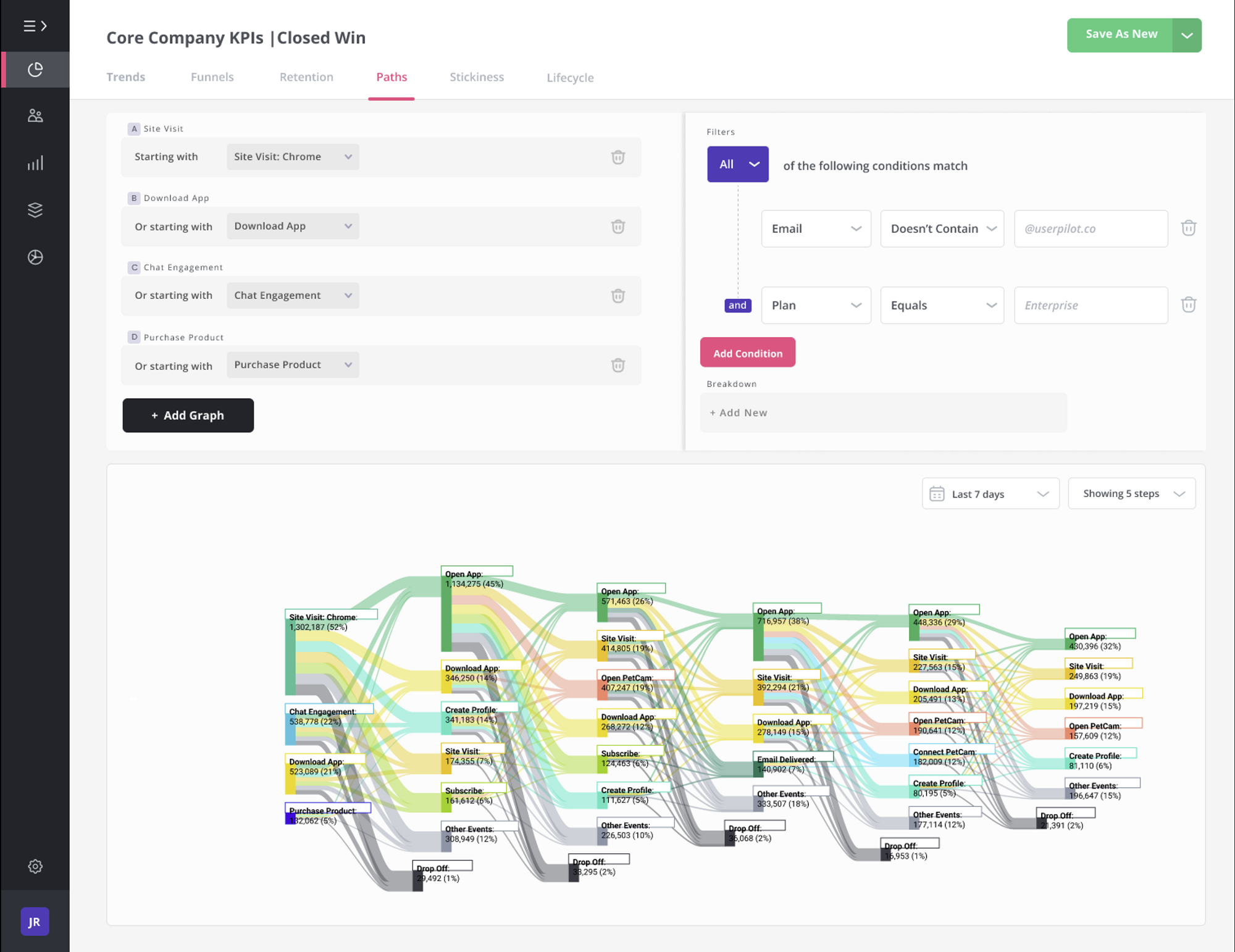
Flow Analytics is a subset of Usage Analytics, which focuses on how users move around your app.

Here’s an example of a flow analytics (User Flow) report from Google Analytics:

Flow analytics

Source: yoast.com

Flow Analytics lets you see how your understanding of user workflows bears out in reality: where users are dropping out of your planned journeys and where they are going to. Once you can see what is actually happening in this way, you can work on fixing the problems!

Forms

forms userpilot

Source: Welcome Screen from Postfity made in Userpilot

Forms are used to collect information from users. They will almost always feature in your Sign Up Flow and possibly in other parts of the UX.

To user that users’ experiences are as frictionless as possible, your Forms should only request information that is essential for you to add as Account Attributes at the current stage of the User Journey.

Data that is not needed to complete registration should be collected at a later stage (whether through another Form or through Microsurveys), when the context for it being needed is clear.

Freemium

In Product-Led Growth contexts, Freemium is a business model where basic services are provided free of charge, while more advanced, premium features have to be paid for.

GIFs

GIF stands for Graphical Interchange Format. It is an image format that supports both static and animated images.

GIFs

Source: figma.com

From a Product Adoption point of view, GIFs can support onboarding by providing a quick and easy way to include short In-App Videos – like the one shown above.

Help Widget

A Help Widget is an ever-present or easy-to-hand tool for accessing help resources.

Product Adoption Dictionary: Help Widget

Source: userpilot.com

By bundling your Resource Center documents and Live Chat support together in one place, Help Widgets make it very clear to users how to find the answers to problems that they have. As such, a Help Widget is a vital part of providing a smooth User Experience.

Hotspots

Hotspots are a more subtle and less intrusive version of Native Tooltips or Coach Marks.

Hotspots

Source: userpilot.com

AS shown above, a gently animated indicator is used to draw a user’s attention to a certain point of the UI. When this is clicked on, Contextual Help information is displayed.

Hotspots are good for promoting new feature adoption without interrupting a user’s workflow – because they are relatively easy to ignore and do not need to be dismissed.

In-App Videos

72% of people say that they prefer to learn using video rather than other formats.

So if your onboarding materials – whether you use Product Tours, Interactive Walkthroughs, a Resource Center, a Help Widget or any combination thereof – are not using videos, you’re missing a trick.

They don’t have to be complex, expensive or high-spec. Often simple GIFs can demonstrate how to complete tasks quite effectively.

Nor do they always have to be educational. Because they are so eye-catching, videos give you the opportunity to entertain your users as well.

In-App Videos

Source: kontentino.com

Interactive Walkthroughs

Most people learn best by doing things.

Really effective onboarding doesn’t just show users product features. It gets them using them so that they realize value as they learn.

Interactive walkthrough

Source: salesflare.com

For example, CRM SaaS SalesFlare doesn’t just show users how to connect their calendar – it actually drives them to do it. And then once it’s done, users begin to experience the benefits of having done it!

Userpilot enables you to build Interactive Walkthroughs quickly and effectively with our unique systems of Driven Actions.

Jobs To Be Done

Jobs To Be Done (JTBD) is a theory of consumer or user action. It says that users choose and use products because they get certain “jobs” that are important to the user done.

A JTBD approach therefore stresses user needs and their fulfilment over product features. Like this:

Jobs To Be Done

Source: intercom.com

In User Experience design, it’s vital to think about users’ Jobs To Be Done.

By thinking in terms of JTBD, some of the most successful SaaS companies in the world – like Slack and Intercom – have managed to sell to widely different industries, demographics and use cases. They focus on the situations people find themselves in and the needs they have in wanting to change them.

Live Chat

At the end of the day, there are only so many problems and use cases you can prepare for in building a Self-Serve onboarding User Experience.

For all those unique hard cases – and for users who prefer interacting to solve their problems than referring to documents or videos – it’s good idea to include a Live Chat function as part of your UX.

That doesn’t mean you have to have operators constantly standing by to deal with incoming queries. Chatbots are great for sorting out simple issues and for triaging more complex needs on for personal attention.

Here at Userpilot, Drift’s AI Chatbot is a key part of our customer success stack, along with our Help Widget and Resource Center.

Microsurvey

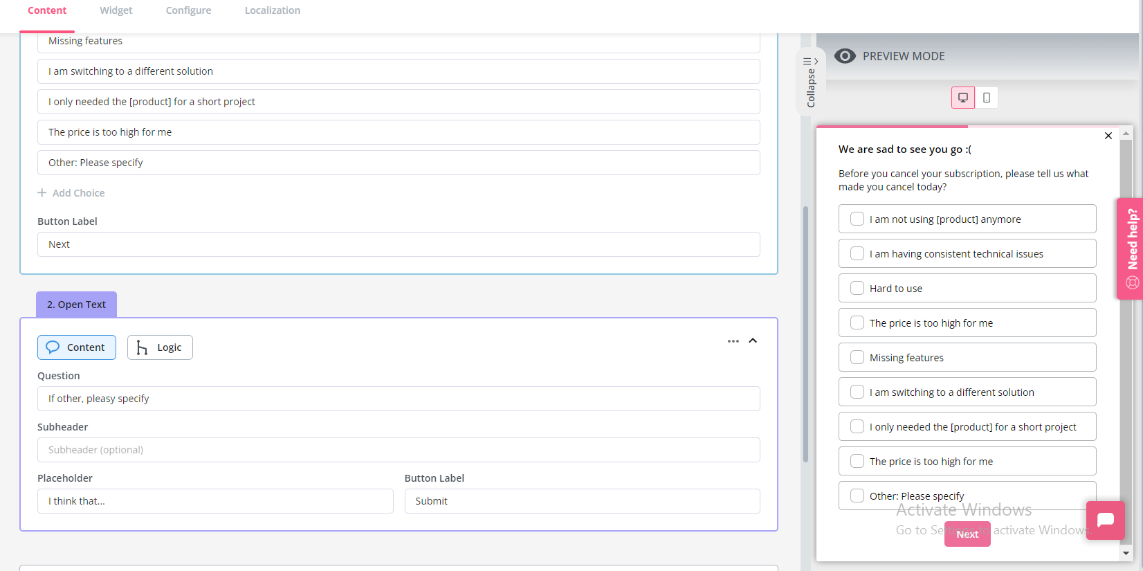
Microsurveys are very short, highly contextual requests for feedback.

Microsurveys

Source: userpilot.com

Usually, they will be shown in-app. Often, they will be Event Triggered to elicit users’ immediate reactions to one aspect of their experience with your service.

These qualities – along with being limited to just one or two questions – make Microsurveys less intrusive and annoying to users than other types of request for feedback.

Read more about how to make the most of Microsurveys here.

Modal

A Modal is a graphical UI element which opens a new window on top of the main window, disabling the latter until the former is dismissed.

Modals

Source: mailchimp.com

Their main uses in Product Adoption is to draw attention to vital (as opposed to optional) pieces of information, to block the interaction flow until a certain action has been taken (in conjunction with Driven Actions) and to report errors.

A Modal that darkens the window behind it but can be dismissed with a click outside the Modal window is called a Lightbox (see Backdrop).

Native Tooltips

Native Tooltips are a common graphical User Interface element. They provide Contextual Help aimed at driving adoption and onboarding.

Native Tooltips

Source: airtable.com

Although the term “tooltip” is widely used to talk about Coach Marks as well, a lot of UX experts differentiate them, saying that Tooltips are perpetual while Coach Marks – once dismissed – are gone forever.

No Code

No Code platforms allow people to build web and mobile apps without writing code.

Instead, functionality is built using a Graphical User Interface. For example, Userpilot is a No Code platform for building Product Adoption experiences.

Some tools that claim to be No Code are in fact “Low Code” – that is, their full capabilities can only be realised if you have coding knowledge.

For example, while Appcues also allows users to build onboarding experiences, advanced styling of UI elements relies on users being able to use CSS.

Notifications

In-app Notifications are typically short informational or instructional messages. They can be used to announce new features, draw a user’s attention to a desired action or let a user know about the completion of a process.

As a rule, Notifications will disappear without needing to be dismissed. They differ from Alerts in this way.

Notifications are less interruptive than Alerts and so are better suited for conveying non-essential information which can be ignored without incident.

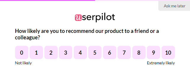
NPS

NPS stands for Net Promoter Score, and it’s a very simple and widely-used measure of customer satisfaction. The question asked in an NPS Microsurvey is as shown below in this example from Userpilot:

Product Adoption Dictionary: NPS

Source: userpilot.com

Net Promoter Score is calculated by subtracting the % of Detractors (respondents scoring from 0 to 6) from the % of the Promoters (who score 9 to 10).

An NPS figure greater than zero is generally deemed to be positive, but as we explained in this blog, the benchmark for SaaS companies is a +26 NPS score.

OAuth

OAuth is an open standard for enabling users to grant web applications access to their data from other sources without a password.

It is the mechanism by which Twitter, Facebook, Google and many other sites allow users to log in to third party applications using their account details.

OAuth can be helpful for making a Sign Up Flow as friction-free as possible.

Paid Users

Once a user has Selected your app over the competition, the next step on the User Journey is to monetize them – to get them to pay for it.

Pirate Metrics

Dave McClure famously called the five most important groups of KPIs for Product Managers “Pirate Metrics” because of their initials: AARRR!

  • Acquisition – concerning new sign-ups
  • Activation – concerning the conversion of sign-ups to successful users (or Primary Onboarding)
  • Revenue – concerning paying users and how much they pay
  • Retention – concerning how long paying users stick around for
  • Referral – concerning users who recommend your service to new users

Pirate Metrics are particularly important for Product Managers because they encourage you to think in terms of the entire customer lifecycle and not just one part of it.

Primary Onboarding

Primary Onboarding is the business of getting new users up to a basic state of competence in using your service and realising value from it.

This concept is strongly connected to:

  • Activation – the goal of Primary Onboarding is to get new users to Activate
  • Time To First Value – your Primary Onboarding needs to be clear and simple enough as to minimize this variable

A good Primary Onboarding process will look to optimize:

Pro/Power Users

Pro Users or Power Users are the guys you can learn from yourself!

They are using most or all of your features, they are integrating your app alongside other services in their own workflows, they’re actively engaged with you and providing valuable feedback.

They’re bought-in, loyal and getting great value from your service!

Proactive Onboarding

When you onboard a user “proactively” you are not waiting for a user to take action, but instead you are driving the action in anticipation of their needs.

Proactive Onboarding is best suited to cases where there are things a user just HAS TO do or learn in order to achieve value from your service.

You take them step-by-step through a workflow that has already been set out in advance, because you know it to be the quickest path to value.

Product Tours are a form of Proactive Onboarding – and as the entry for Product Tours shows, there are serious drawbacks to using this approach exclusively rather than Reactive Onboarding.

Product Adoption

Product Adoption is what it’s ALL about…

How do we define product adoption?
It’s the overall process by which people:

  • Become aware of a product
  • Recognise and understand the value it can offer them
  • Begins to use it and keeps on using it over time

So it encompasses marketing, acquisition, Primary Onboarding, Activation, Secondary Onboarding, Retention, Tertiary Onboarding… pretty much EVERYTHING covered in this dictionary.

Sometimes Product Adoption is presented as parallel to a simple sales funnel, consisting of awareness, interest, evaluation and conversion.

But if you’re a Product Manager or a Product Marketer, you’ll know there’s much more to it than that. Value realized by users is ultimately what drives adoption, and that’s what Product-Led Growth is all about.

Product Manager

The Product Manager is a key figure in most SaaS companies. Their role is (usually) to stand at the center and ensure that:

  • Users’ needs are understood and fulfilled
  • Developers can in turn meet those needs with deliverable features
  • Marketers and sales know how to present the service to potential customers

Or, if you prefer:

Source: productplan.com

In a growing number of companies, the Product Manager is NOT responsible for improving Product Adoption. This falls to the Product Marketer.

Product Marketer

In the Product-Led Growth business model, the product itself is one of the key marketing tools that drives adoption, acquisition and retention.

The Product Marketer is responsible for making sure that happens by:

  • Optimizing the product and its features to deliver maximum value
  • Ensuring that the product’s strengths are made clear to users
  • Making sure that users are ready and able to Upsell
  • Onboarding new users quickly and effectively

See this discussion we had with several Product Marketers to get a more detailed picture of what the role entails.

Product Marketer

Source: userpilot.com

Product-Led Growth

According to Wes Bush – who literally wrote one of the first books on this topic – Product-Led Growth is :

A go-to-market strategy that relies on using your product as the main vehicle to acquire, activate, and retain customers.

Rather than using separate sales and marketing materials to convince people to try out your service, the Product-Led Growth model calls for you to let users try your product out and see if it works for them. If it does, that is much more powerful than any sales pitch!

This is the philosophy that leads so many SaaS companies to embrace a free trial or Freemium approach.

Product Tours

In the bad old days of SaaS, new users would often be forced to sit through a live demo, a long video or stopped in their tracks with a load of explanation every time they tried to do anything in-app.

intercom product tour

Product Tours aim to show new users EVERYTHING about a service up front – regardless of User Segmentation, context or the users’ specific Jobs To Be Done.

As we argued in this blog, Product Tours are ineffective for onboarding. They’re rarely relevant or personalized – and usually patronizing to some and overwhelming to others.

No wonder a lot of SaaS users ‘hate’ them:

product tour hate userpilot

A vastly superior approach is to be found in Interactive Walkthroughs.

Reactive Onboarding

Unlike Proactive Onboarding, Reactive Onboarding waits to see what a user is trying to do and then offers them Contextual Help.

Once a user has achieved basic Activation, there are likely to be many different use cases that they may wish to prioritize. If you try to push them down one route – for example, by making them sit through a Product Tour – it could annoy, bore or frustrate them.

One of the principles of Self-Serve onboarding is allowing users to find their way around your product. Your Reactive Onboarding – whether it’s from a Help Widget, Contextual Help, Live Chat or Interactive Walkthroughs – is there to make sure users can do whatever they want to do successfully.

Resource Center

Your Resource Center provides on-demand help for your users, often in the form of a document or video library.

Here’s ours:

userpilot resource center

Source: userpilot.com

It provides detailed step-by-step information on the majority of principal use cases that we know our users have. The hierarchically-arranged documents explain how to do most of the things that Userpilot enables you to do.

Resource Centers (also known as Knowledge Bases) offer a type of Reactive Onboarding – materials that sit there waiting until a user needs them.

To offer the best experience, you should include alongside your Resource Center:

  • A Help Widget, giving quick and easy access to the resources.
  • A Live Chat tool, so that users can get in touch for one-on-one advice.

Retention

In SaaS, Retention is a key metric (one of the Pirate Metrics) that looks at users’ use of your product – and payment for it – over time.

Broadly, it is calculated as a percentage of your user base that has remained using your product over a fixed period of time (eg 95% per year Retention).

Usually, it is the inverse of churn. That is, a 95% annual retention rate implies a 5% annual churn rate.

Retention is widely used as a proxy for customer satisfaction overall.

Secondary Onboarding

The User Journey does not stop at Activation and First Value.

There are lots of later states related to deeper engagement and greater value (see Selected User, Paid User, Basic User, Power/Pro User, Advocate).

Product Adoption Dictionary: Secondary Onboarding

Source: userpilot.com

Secondary and Tertiary Onboarding are the processes of advancing users to these further stages – we wrote in detail about them here.

Secondary Onboarding is about increasing feature adoption, helping users to complete tasks and beginning to develop habits of using your app.

All these things drive more value to users than they initially realized. That promotes Retention and Revenue (see Pirate Metrics).

Selected Users

The next stage on our model of the User Journey after Activation is Selected User.

There are more than 8,000 martech SaaS companies out there. Chances are, many of your users are testing your service against rivals.

The point of Selection is when a user has decided to run with you instead of the competition.

You would expect to see Selected Users engaging across a wider range of features, making a lot of use of your Resource Center or Help Widget and showing an interest in premium features.

Self Serve

SaaStock Remote 2020 attendees rated providing frictionless Sign Up Flow and Self Serve Onboarding as their most successful Product-Led Growth strategies.

Product Adoption Dictionary: Self Serve

Source: userpilot.com

The vast majority of SaaS product don’t support a sufficiently high Customer Lifetime Value to one-on-one onboarding of new users. If you’re growing fast, you wouldn’t want to offer if even if it made financial sense.

So Self Serve is the standard for onboarding in SaaS, and most of the entries in this dictionary are concerned with the terminology and details of offering that to users.

Sign Up Flow

Sign Up Flow is the process by which new users register with you to use your software. It’s a key part of the User Journey that usually sits between Aha and Activation, as a kind of prelude to Primary Onboarding.

It involves collecting enough information (usually via Forms, and stored as Account Attributes) to set up their profile, authenticate their identity and assign user roles.

Best practice in UX calls for the Sign Up Flow to be made as frictionless as possible.

  • Ask for too much information – especially payment information – and fewer people will complete the process
  • For this reason, many SaaS providers collect data over multiple touchpoints rather than all at once, using Microsurveys or other downstream and/or contextual messages.

Slideout

A Slideout is a type of pop-up window used for providing Contextual Help. Unlike a Modal it does not disable the main window and permits a user to keeping working without dismissing it.

Product Adoption Dictionary: Slideout

Source: slack.com

Here is an example of a Slideout Slack used to promote a new feature launch.

Tertiary Onboarding

Tertiary Onboarding is all about turning your regular users (Paid Users, Basic Users) into Pro/Power Users and, ultimately, Advocates.

That is, getting them so invested in your service that:

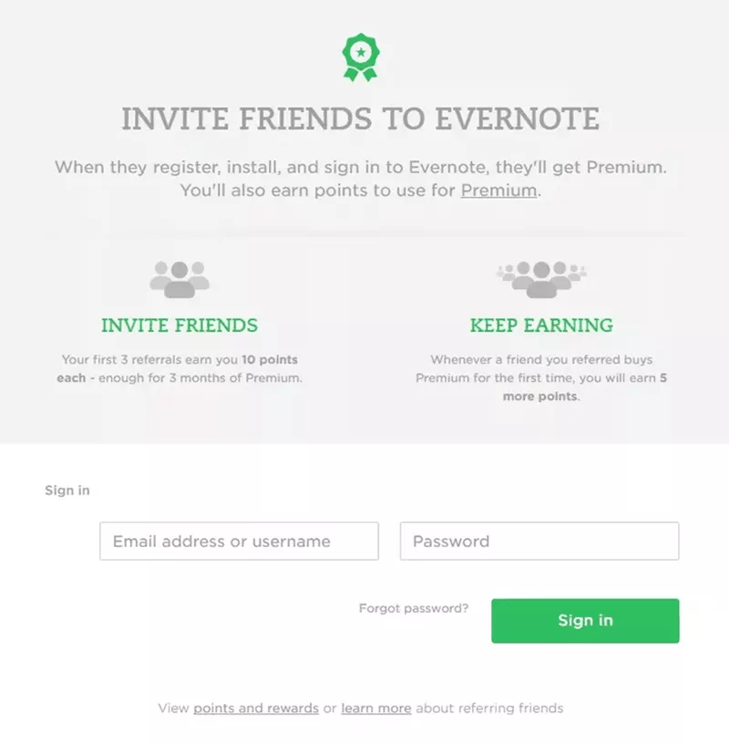
  • They help spread the word through Referrals
  • They are actively involved in product development through feedback – whether through NPS surveys, Microsurveys or more detailed channels and product communities

Tertiary Onboarding tends to be much more focused on the individual user’s needs and one-to-one communication than other forms of onboarding, which can largely be Self-Serve.

Time To First Value

TTFV is a metric that looks at how long it takes to Activate new users. That is, TTFV measures the efficiency of your Primary Onboarding.

When you improve (reduce) TTFV, your users see ROI on your service faster. The faster users experience ROI, the more likely they are to keep engaging with your service instead of drifting away.

So, TTFV can provide important insights into your sales cycle, reducing churn, improving Primary Onboarding and many other important goals.

Upsell

The movement of a user up from a lower pricing tier (or free tier) to a higher one – or otherwise increasing their financial commitment, for example by adding seat licences.

Upselling obviously impacts Revenue directly, but it’s an important KPI for measuring User Journey progress and for understanding user behavior.

In SaaS, the key to upselling is delivering more value and communicating the promise of EVEN more at the higher price point.

Usage Analytics

Usage Analytics is concerned with measuring how much and how people use your software.

In quantitative terms, DAUs and MAUs are key usage metrics which can show rates of product growth over time.

But analytics becomes way more powerful when you start looking at the specifics of what users are actually doing in-app.

Usage Analytics

Source: userpilot.com

Once you can dig in to this level, you can begin to identify and remove pain points, to see what users value and to improve user experience.

We’ve written a whole blog about how Usage Analytics can help you boost engagement here.

User Adoption Flywheels

flywheel

A User Adoption Flywheel is a set of processes for Adoption that generate their own momentum – so that as users progress through Primary Onboarding, Secondary Onboarding and Tertiary Onboarding, the effort required to move along the User Journey reduces.

It’s not a simple process to design and build a User Adoption Flywheel, but luckily we covered in detail in this earlier blog.

User Experience

User Experience (UX) is a digital-only discipline concerned with modelling, designing and optimizing every interaction a user has with a product.

The goal of UX design is to create products that are easy to use, deliver value, and provide a pleasant experience. It incorporates the whole process of acquiring, onboarding, integrating and using those products.

That’s different from UI design, which is much more narrowly about the look and feel of products.

User Interface

The User Interface (or UI) is the means by which a user interacts with a machine. In SaaS terms, that is usually a Graphical User Interface (GUI) between users and your app.

User Interface design encompasses all aspects of the look and feel of an app, including language, color, imagery and layout as well as specific points of interaction – such as Modals, Slideouts, Hotspots, Tooltips, Coach Marks etc.

UI is different from but connected to User Experience or UX. Dain Miller defines the difference in this way:

UI is the saddle, the stirrups, and the reins. UX is the feeling you get being able to ride the horse.

User Journey

The User Journey for your SaaS is an idealized model of how you would like people to engage with and use your tool over time.

User Journey

Source: userpilot.com

This is our version, but it can differ from business to business depending on what your product is.

As users get value from your service over time, their needs change. You need to identify and cater to those needs at the right time.

The points on the diagram above represent what we believe the key milestones a user can encounter are, and we have developed strategies and tactics to help get users up to and beyond each of them.

See Aha, Activated, Selected, Paid, Basic, Pro/Power and Advocates for more details.

User Segmentation

User Segmentation is key to providing relevant and personalized in-app experiences.

By identifying the needs, desires, priorities and challenges of particular users, you can group them into segments using Account Attributes.

User Segmentation

Source: userpilot.com

You can start segmenting users at the Welcome Screen, during the Sign Up Flow or even before they ever register as a user.

Ideally, you would be using at least these segments to customize the experiences users receive:

  1. Progress along User Journey
  2. Paid versus Free Users
  3. Known product use cases

Welcome Screen

Your Welcome Screen is the first thing a new user sees when they first log in to your app.

It’s very important for setting the tone, kicking off Primary Onboarding and helping to avoid Empty States confusion.

Welcome Screens are also ideal for collecting information for User Segmentation.

Source: sproutsocial.com

By collecting information about the user and their priorities at the very beginning of the User Journey, it is possible to deliver a more contextual, personalized and relevant overall User Experience.

And that’s it for now! Feel free to bookmark and share for reference!
Stay in the loop:

 
previous post next post

Leave a comment