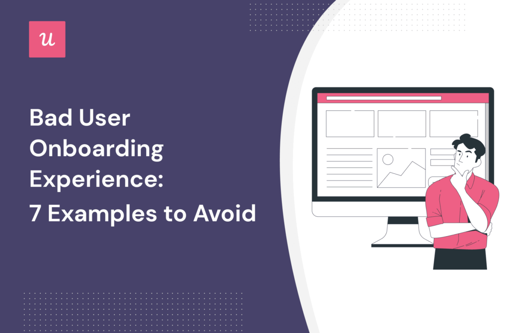
Bad User Onboarding Experience: 7 Examples to Avoid
How long was it before you stopped using a product because of a bad user onboarding experience?
My guess is probably not long enough to get value from the product, meaning you didn’t adopt it as a tool. The customer onboarding process can make or break your product, so it needs a positive experience.
This article will walk you through 7 examples that you should totally avoid for your user onboarding process.
Summary of a bad user onboarding experience
- A bad user onboarding experience is one that doesn’t let the customer achieve value from your product.
- A good customer experience matters as it can create loyal customers, increase conversion rates, and ensure customers get long-term success from your product.
- A completed sign-up flow introduces a barrier before users even begin. Reduce any friction by allowing single sign-on, create a user-friendly design, and collect data from surveys on the welcome screen to personalize the onboarding experience.
- Make sure it’s clear what a user should do next. Use empty screens to showcase your product, and offer training materials.
- The customer onboarding process shouldn’t be a one size fits all. You should gather information from the beginning of the user journey about their jobs to be done. With that information, you can segment users and personalize their onboarding process.
- Long product tours are a big turn-off to customers. It’s passive learning and doesn’t prompt action. Instead, trigger interactive walkthroughs in the right context, use checklists with a progress bar to motivate users to complete their onboarding steps, and provide a help center and resource center if your product is complex.
- Use in-app messaging to help users discover features and help increase engagement. Create automated onboarding flows triggered by certain user interactions.
- Audit unused features and use prompts to help users uncover core features that will improve their customer experience.
- Use in-app surveys to collect feedback at the right times in the customer journey. You can then address customer pain points by acting on the feedback you gather by triggering training materials.
- Userpilot can help you with improving the user onboarding process. You can collect feedback, segment customers, and trigger different onboarding experiences.
- Userpilot also lets you onboard and engage mobile app users by creating personalized messaging, push notifications, and surveys.
- Userpilot also offers analytics so you can visually see how users are behaving in-app. Book a demo to learn more!
What is a bad user onboarding experience?
A bad user onboarding experience is one where a user doesn’t learn how to get the most from your product and never truly reaches an “Aha! moment” where they learn the true value your product can offer. It could be because the onboarding experience isn’t optimized properly or takes too long.
Why good customer experience matters?
Why good customer experience matters?
From the very first moment, a customer uses your product, you want to offer a positive experience. Doing so improves customer experience.
And a good customer experience helps create loyal customers. If they enjoy your product and can get value from it earlier, they will be loyal to using your product.
It also helps to increase conversion rates. The faster you can demonstrate how to use your product, the more likely they will keep using it and become paying customers.
Knowing that you’ve set your users up for success earlier on means they will keep succeeding with your product in the long term.
7 bad user onboarding experiences and how to avoid them
The following seven steps are common user onboarding mistakes that will create a bad user onboarding experience. Thankfully we’ll show you how to avoid them, so you create a good customer experience.
1. Complicated sign-up flow UX
When a customer signs up for your product, you want it to be as frictionless as possible. The harder you make the onboarding process, the more you’re increasing the chance of them falling off and never coming back. Here are some of the causes of complicated sign-up flows.
- A complicated sign-up process. Most products these days offer single sign-up (SSO). If you’re not offering this, you’re increasing the steps needed to sign up which leads to user frustration right from the beginning.
- Your product sign-up flow is one of the best places to capture customer data. But if you ask for too much information, you again increase the chance of customers abandoning.
- A verification email is a great way to ensure the information captured from a user is correct, but it interrupts the customer experience with your product.
Here are a few ways you can address a complicated sign-up flow.
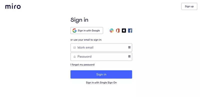
Simplify the sign-up process with multiple single sign-on (SSO) options
Most modern products these days have multiple ways of letting you sign up. One of the most useful is with multiple SSO options. Not only does it make your systems more secure and reduces things like password resets, but it also makes signing in a lot easier.
Letting customers sign in with their Google accounts reduces the steps needed to create an account and doesn’t create any friction.
Continue collecting customer data in-app
Making the customer have to answer a multitude of questions during their sign-up is going to frustrate a percentage of them and stop them from completing the form.
It’s better to ask a few main questions in-app and get the information you need without scaring them away.
Using in-app surveys means you aren’t interrupting the flow, reducing any friction that may result in customers leaving.
To help aid the collecting of customer information, you may benefit from adding gamification to your product. During the process of conducting a survey during your welcome screen, adding a progress bar can help to motivate users to complete it, as it gives them something to work towards.
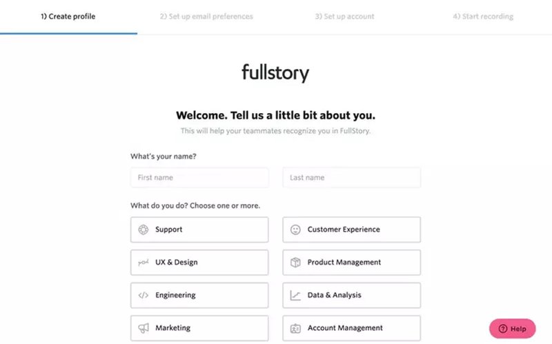
Send onboarding emails
A user receiving a verification email can interrupt the onboarding process. By leaving your product, there’s a chance they could get distracted and not complete the process.
It’s much better to trigger an in-app reminder after the process to verify their account to prevent this. And instead of sending verification emails, send onboarding emails.
These emails can include helpful resources that you might be unable to include in the in-app onboarding process.
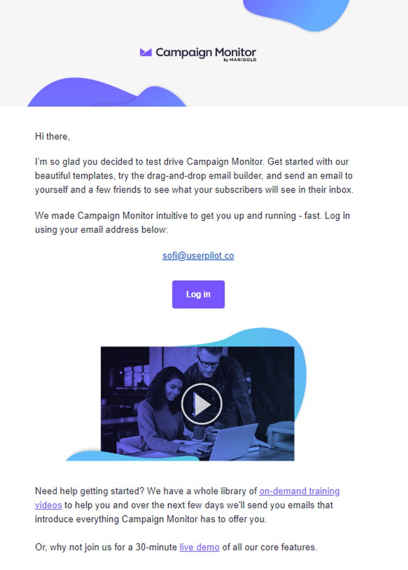
2. An empty onboarding screen that doesn’t prompt action
If, at any point during user onboarding, a customer meets with an empty onboarding screen or not-so-friendly dashboard, you’re increasing the work a user needs to do to use your product.
You want to offer a customer as much guidance on your welcome screen as possible so they can understand how to get value from your product.
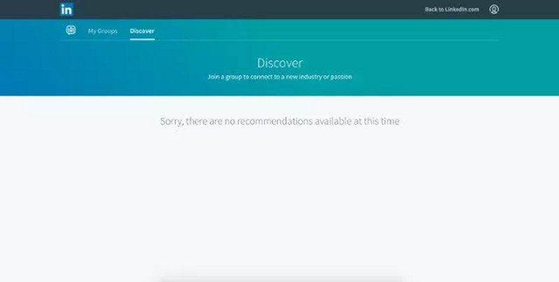
Here is how you can fix this issue.
Use empty states to provide contextual guidance
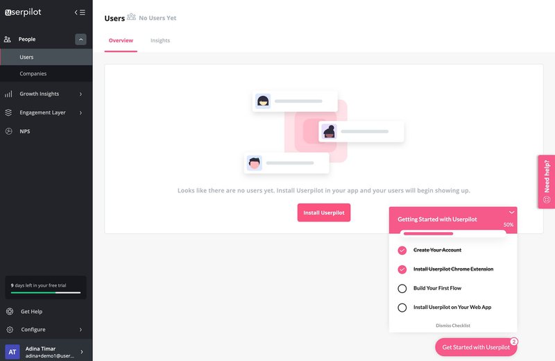
Staring at an empty screen after you sign in will leave the customer feeling lost. To fix the empty onboarding screen, utilize it as a canvas to showcase what your product can do.
You can use quick tutorials like microvideos, tooltips, or modals to educate your users on using core features. Doing so will help reduce users’ frustration with what to do next and decrease the time to value, resulting in a higher retention rate.
3. Using a one-size-fits-all approach for your onboarding strategy
A one-size-fits-all approach to your product’s onboarding strategy can present bad customer onboarding. Remember that every user is different and has different needs based on their jobs to be done.
Not paying attention to individual user needs will lead to users not gaining value from your product and leaving before they can even reach the activation point.
Collect customer data to deliver a personalized onboarding process
The first step in personalizing your customer onboarding is to collect customer data with a welcome survey.
It doesn’t have to be a 20-question survey. You want to ask the right number of questions so you can put your customer into a group ready for segmentation.
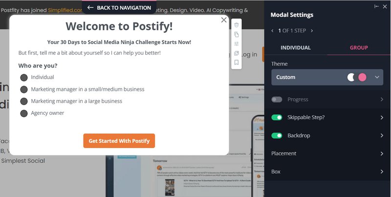
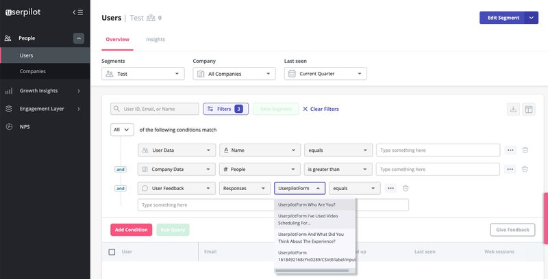
Once you have that data, you can segment your users according to their shared characteristics and similar jobs to be done.
Each segment should be shown a customer onboarding flow that speaks to their goals and highlights how to achieve them within your product.
4. Long product tours as the main source of customer education
A product tour is made up of a series of modals or tooltips that show you the different aspects of your product.
Due to them being heavy on text, they can be quite passive, not prompting the customer into action and showing them how they can successfully get value from your product.
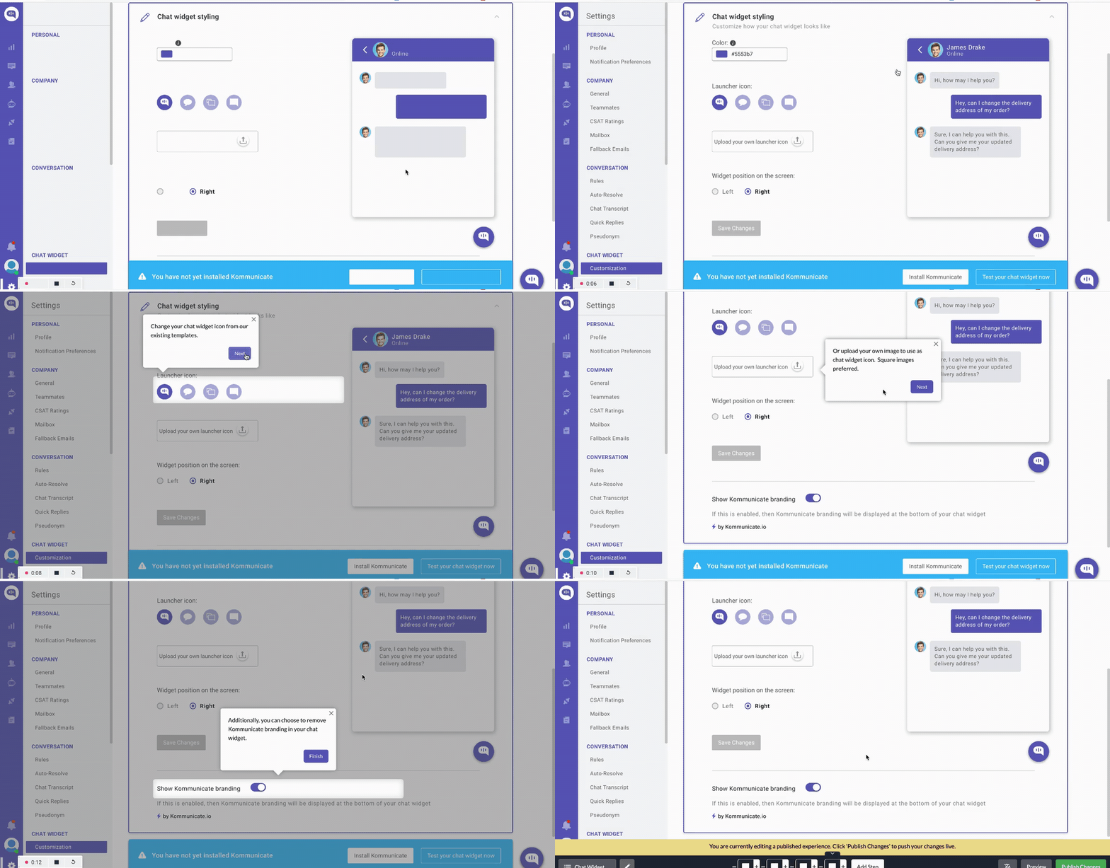
Trigger interactive walkthroughs to improve the onboarding experience
Ditch your product tours and replace them with interactive walkthroughs.
You can strategically trigger them at points in your product that make sense (like when customers are exploring a new feature or when they seem to be struggling). So you can give your customer a helping hand in learning a new aspect of your product.
Implement user onboarding checklists for proper onboarding
Another way to replace passive product tours is to implement user onboarding checklists.
These checklists help to prompt action as the user gets to see items on the checklist getting crossed off. Using any customer data you’ve gathered, you can show different checklists, leading them down the right path to get value for the jobs they need to be done.
You can also add a progress bar to motivate the user to complete all the checklist actions.
Check out our helpful article on improving conversion via user onboarding checklists.
Use educational resources to drive customer success
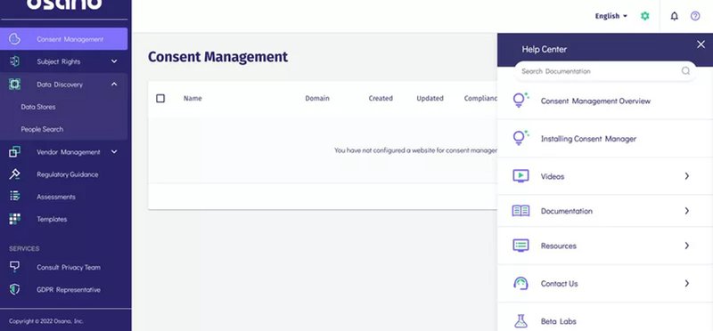
If you have a complex product where your user onboarding can’t touch on all the helpful features, it might make sense to create a resource center.
A resource center can be built from input from the customer success team. In it, you can help users with FAQs and show them how to use certain features. You can even create different modules and formats to make it easy for customers to navigate to exactly what they need help with.
A company called Osano did just that, reducing customer churn rate and producing 25% fewer support chat requests.
5. No contextual help during the onboarding process
No contextual help during the onboarding process is another thing that can produce bad user onboarding.
Having no tooltips or interactive walkthrough limits the value to customers and doesn’t help drive them to activation or product adoption. Lacking in this area will make a customer less likely to continue using your product after the free trial.
Use in-app messaging to prompt feature discovery
Delivering the right message at the right time will help users the most. Providing in-app messaging through tooltips can help with feature discovery.
Overloading your users at the beginning can lead to confusion. It’s better to strategically reveal features when needed by customers, as this will help them get more value out of your product.
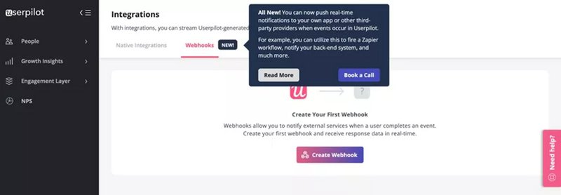
Create automated onboarding flows
As well as prompt feature discovery, you can use automated onboarding flows to help users with a specific feature.
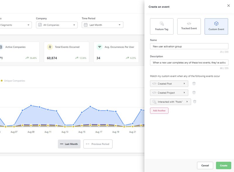
You can set custom events so that when a combination of user interactions happens (interactions that look like someone is struggling or about to use a feature they haven’t used before), you can trigger an interactive walkthrough.
6. Core features stay unnoticed
If your product has many core features and you’re not guiding your users correctly, they could stay unnoticed and never deliver the value your product should provide.
Analyze customer interactions to find unused features
Without any data on how your customers use your product, you might not even realize they aren’t using your product’s core features.
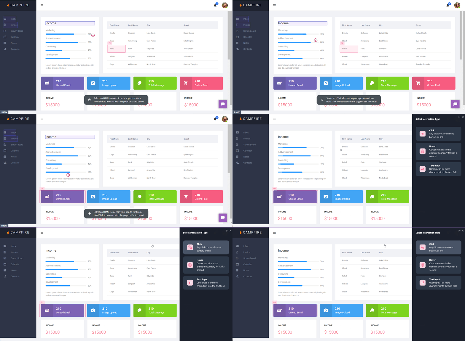
Using feature tagging can be useful to find any features that aren’t being used. You can then analyze this data and use ways to prompt discovery (through tooltips or an interactive walkthrough) to improve the customer experience.
7. Not having enough information to optimize the customer onboarding process
Another way that can produce bad user onboarding is not collecting any customer feedback or customer data. Without this, you have nothing to analyze to find if any customers are experiencing friction points in your product.
No data means you are completely in the dark about how to fix any problems. You’ll have no way of knowing how to optimize the user onboarding, let alone if any changes you make are positive.
Collect feedback with in-app surveys
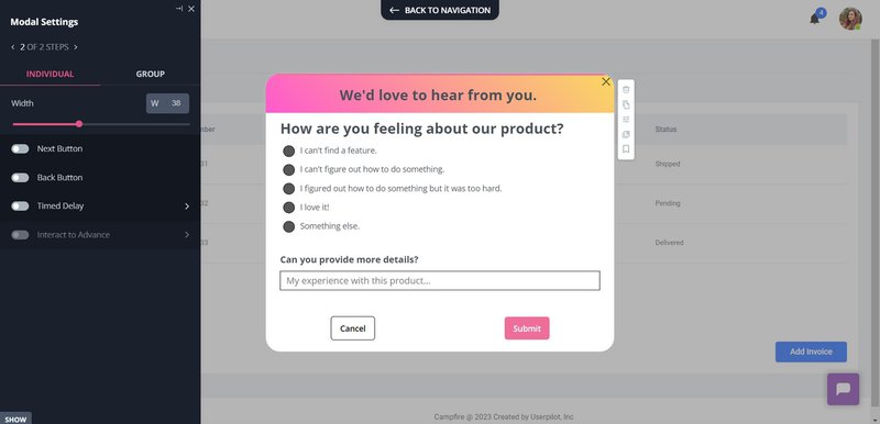
Using in-app surveys is a great way to collect feedback from different customer segments.
You should prompt customer feedback at key stages in your customer journey, so you get the data needed to improve your customer’s experience.
Address customer pain points with onboarding flows
A great way to avoid bad onboarding is to react as soon as you receive bad feedback.
For example, if a customer responds to a feature saying that they don’t understand how to use it, you can trigger a video tutorial that educates them on the feature and how they can benefit from it.
How Userpilot can help you create a positive onboarding experience for new and existing users
If you’re concerned that your onboarding process creates a bad customer experience, consider using Userpilot.
Userpilot can give you the tools needed to build personalized, flexible, and contextually relevant in-app experiences for your customers.
Userpilot can help trigger contextual in-app flows based on information gathered from product usage and in-app behavior, so you can create an onboarding experience that exceeds customer expectations.
Create in-app surveys to collect customer feedback
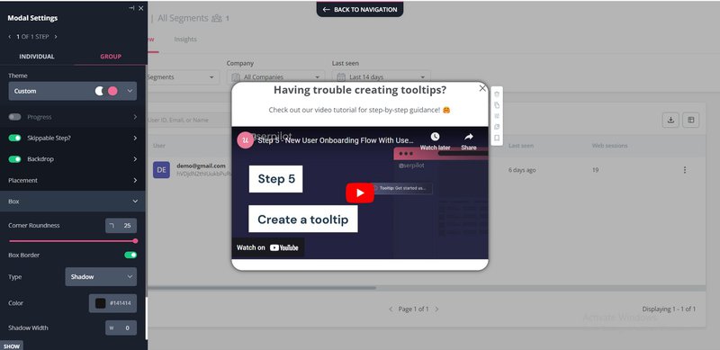
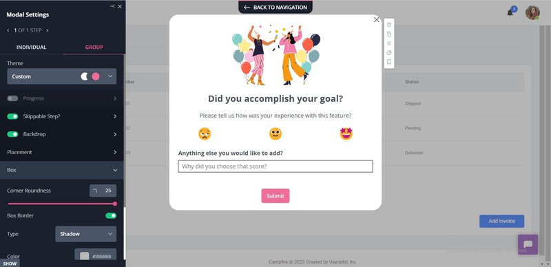
Userpilot can help you collect information from your customers with different in-app surveys.
A Userpilot in-app survey example.omize the surveys that you create. You can add different elements and design the surveys in your brand colors, style, and theme so they feel natural within your app. You can also take advantage of Userpilot’s ready-made templates..
Personalize the user onboarding process with segmentation
As was mentioned above, the best performance from your user onboarding comes from personalizing the experience based on the customer’s jobs to be done.
Userpilot provides you with the option to segment your customer based on different options such as:
- User data
- Feedback responses
- Activity
- Personal information
- Company data
- Engagement profiles
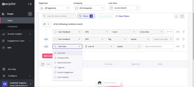
Armed with these detailed segmentation options, you can create different onboarding flows tailored to your segments.
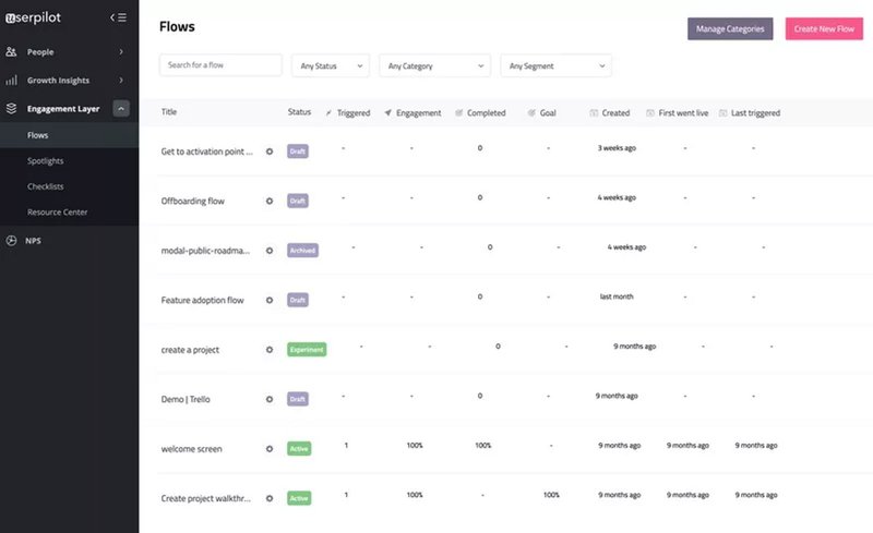
Analyze user behavior to optimize user onboarding experience
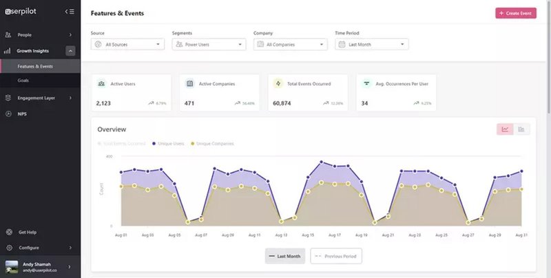
Once you’ve set up your onboarding flows, it’s valuable to be able to review how they are doing. Userpilot analytics lets product teams track and analyze how customers behave in-app. It also lets you see how they progress across different touch points in the customer journey.
You can identify any positive or negative patterns and trends by seeing how customers within different segments behave across the funnel.
Conclusion
User onboarding is one of the most important parts of your product. If you can get it right, you can educate your customer on the value of your product and get them quickly to the particular value they need for their jobs to be done.
Want to avoid any bad user onboarding experiences? Get a Userpilot Demo and see how you can personalize your onboarding experience by collecting customer data and presenting the right onboarding flow.

