User Experience Basics: Beginner’s Guide to UX Design Fundamentals


Think about the last app you deleted within minutes of downloading. The reason could’ve been anything: confusing navigation, slow loading, or just a general feeling that nothing made sense. Now think of an app or website that felt so intuitive, you barely noticed the interface at all. You just accomplished what you needed and felt good about it.
That’s user experience design in action.
This guide covers core user experience concepts, including essential principles, step-by-step UX process stages, and actionable techniques you can start using in your work right away.
What are you hoping to learn about user experience basics?
Understanding the fundamentals is the first step to creating products people love. Select an area to explore:
Great choice! Core principles are the foundation.
Principles like “visibility of system status” and “user control” ensure your design is intuitive. Are you more interested in the theory or practical application?
The process is key to consistent results.
The UX design process typically involves stages like Empathize, Define, Ideate, Prototype, and Test. Which stage are you most curious about?
You’re on the right track to mastering user experience basics.
The best way to learn is by seeing these principles in action. Userpilot helps teams improve their UX with in-app guidance, feedback tools, and analytics.
See how you can apply these concepts today.
What is user experience (UX)?
At its core, user experience is how someone feels when they interact with a product or service. The layout of a mobile app, the clarity of an error message, or even a page’s loading times are all parts of the user’s experience. We want to remove friction so users can reach their goals easily and happily.
Don Norman, co-founder and board member of Nielsen Norman Group and the person who coined the term “user experience,” defines UX more broadly:
“[User experience] is everything that touches upon your interaction with the product. And it may not even be near the product. It may be when you’re telling somebody else about it.”
This means UX extends far beyond just the interface, and it includes the marketing message that brought someone to your product, the onboarding process, customer support interactions, and even word-of-mouth conversations.
Jesse James Garrett’s framework from the book he book “The Elements of User Experience: User-Centered Design for the Web” breaks UX into five interconnected elements that work like layers: strategy (user needs and business goals), scope (what features to include), structure (information architecture and how information is organized), skeleton (interface layout), and surface (visual design).
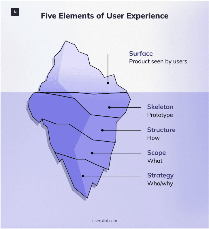
Each layer builds on the previous one, showing how UX goes much deeper than what meets the eye.
Here’s the thing about great UX: when it’s working well, you don’t notice it at all. But you simply get things done.
User-centric mindset in UX design thinking
In my work, I’ve found that customer empathy is the foundation of good UX. You can’t design a truly helpful digital product if you don’t understand the people who will use it. We need to step into their shoes, learn about their daily lives, the problems they face, and what a good experience looks like to them. It’s why a significant part of my role involves user research. My team conducts user surveys and interviews to gather direct insights, listen to feedback, and understand their motivations.
UX vs UI (User Interface): What’s the difference?
Many people confuse UX with User Interface (UI), but they’re not the same. User interface design is what people see and touch: the buttons, the colors, the typography. On the other hand, UX encompasses the entire process of designing user journeys, from user research to designing information architecture. A good UI is a result of thoughtful UX planning.
Let’s look at an example of designing a food delivery app.
The UX designer would spend time understanding how people actually order food. Do they browse first or search for something specific? What happens when their favorite restaurant is closed? How do they handle dietary restrictions? The UX designer maps out the entire ordering journey, identifying pain points and designing solutions.
The UI designer then takes the user journey and creates the actual screens. They choose colors that make the “order now” button stand out, select typography that’s easy to read while walking, and design icons that instantly communicate meaning.
Don Norman captures this relationship perfectly:
“No product is an island. A product is more than the product. It is a cohesive, integrated set of experiences. Think through all of the stages of a product or service – from initial intentions through final reflections, from the first usage to help, service, and maintenance. Make them all work together seamlessly.”
Core UX design principles
At Userpilot, we focus on usability, clarity, and simplicity. As Amal AlKhatib, Senior Product Designer at Userpilot, explains:
“At Userpilot, we focus on usability, clarity, and simplicity. Our goal is to make sure users can easily navigate the product and get value as quickly as possible.”
The foundation of the core UX principles comes from Jakob Nielsen’s 10 usability heuristics, developed through decades of research at Nielsen Norman Group. These are practical guidelines that help you evaluate and improve any interface.
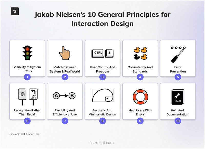
1. Visibility of system status
Users need to understand what’s happening in the product at all times. Show clear status indicators for every product experience: display loading states, inform what’s happening behind the loading screen, and provide clear information whether an action worked or not.
2. Match between the system and the real world
Use familiar language and concepts that match your users’ mental models. If your users call something a “project,” don’t label it “initiative” in your interface. Organize information the way your users expect, not how your database is structured.
3. User control and freedom
People make mistakes and change their minds. Provide clear undo options, breadcrumb navigation, and easy ways to exit unwanted actions. Never trap your customer in a user flow they can’t escape.
4. Consistency and standards
Use the same patterns throughout your product. Users expect the design, interaction patterns, language, and navigation to follow the same patterns. Inconsistency forces users to constantly relearn how your product works and prevents them from building habits.
5. Error prevention
Design interfaces that prevent errors from happening in the first place. Use constraints like date pickers instead of free-form text fields, provide clear labels, and validate information as users type rather than after they submit.
6. Recognition rather than recall
Keep important information visible. Don’t force your users to remember steps and workflows. For example, display recently used files, show progress in multi-step processes, and keep relevant context visible throughout tasks.
7. Flexibility and efficiency of use
Design for both novice and expert users, according to the progressive disclosure design pattern. Start with simple, intuitive options for beginners, and show advanced features such as keyboard shortcuts or bulk actions as users become more familiar or seek greater efficiency.
As Fred Beecher, a UX expert, notes:
“Our mission as user experience designers is to make people love the systems they use every day. To complete that mission, we must think consciously about playfulness and balance it with usability in a manner appropriate to the context in which the system will be used.”
8. Aesthetic and minimalist design
Remove unnecessary elements that compete for attention. Every piece of information should serve a purpose. Clean, focused interfaces with proper visual hierarchy help users concentrate on their primary goals.
9. Help users recognize, diagnose, and recover from errors
When errors occur, explain what went wrong in plain language and suggest specific solutions. Instead of “Error 404,” say “We couldn’t find that page. Try searching for what you need or return to the homepage.”
10. Help and documentation
While the best interfaces need no explanation, sometimes help is necessary. Make documentation easy to find, accessible to users with visual impairments, task-focused, and concise. Users shouldn’t need to read a manual to complete basic tasks.
👉 For a deeper dive into applying these principles, read our comprehensive guide on UX design principles.
Five steps of the UX design process
Building a great user experience requires following a structured UX process. While there are many ways to frame it, the core steps often follow a cycle of understanding, building, and refining.
This iterative nature of the product UX design process is what allows us to improve continuously. We rely heavily on a data-driven design approach, constantly analyzing feedback and usage to inform our next steps.
I’ll outline each stage below, and drop a few helpful resources to learn more about them.
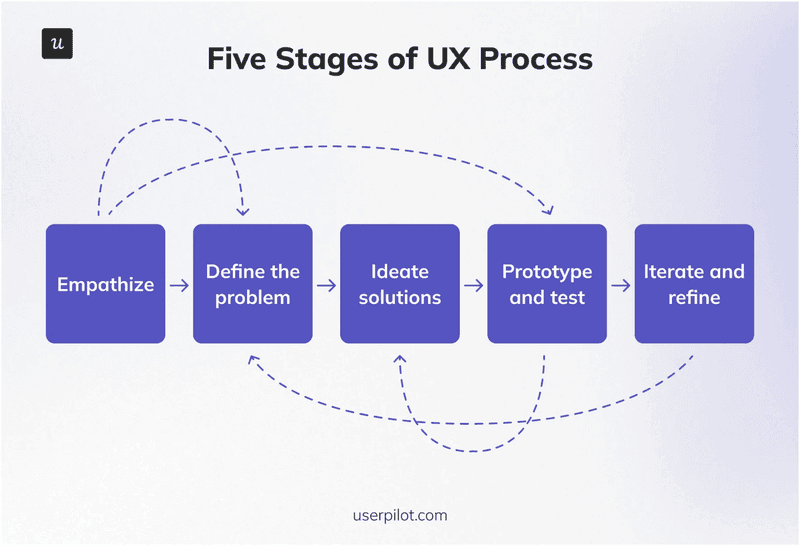
1. Empathize
This is our starting point. We use various research methods to really get inside our users’ heads. This includes surveys, user interviews, and observing how people use our product.
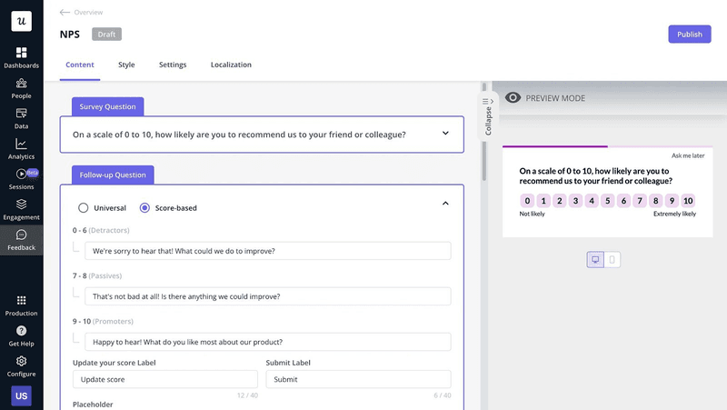
Capture customer feedback through contextual in-app surveys to learn how they feel about their in-app experience.
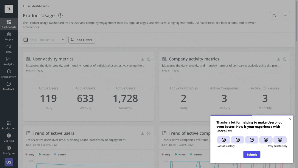
Additionally, Userpilot’s analytics help us identify customer pain points and understand user behavior. They fix the gap between what users say they want and what they actually do in your app. For example, after a user leaves negative feedback in a survey, you can watch their session replay to see what friction they encountered.
👉 Want to understand UX research better? Here’s an article we wrote outlining the complete UX research process.
2. Define the problem
Once we’ve gathered all that insight, we distill it into clear problems to solve so we can map the tasks ahead.
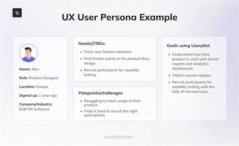
User personas and user journey mapping become essential tools at this stage. User personas are research-based representations of your target users that help teams maintain focus on real people rather than abstract “users.”
User journey mapping visualizes the complete experience users have while trying to accomplish goals, revealing pain points and opportunities for improvement.
👉 We’ve covered these concepts in depth here:
3. Ideate solutions
This is where we brainstorm. We explore as many possible solutions and data as we can think of, including user stories, sketching, and collaborative workshops to guide our ideation.
Design thinking exercises help teams generate diverse ideas and avoid settling for the first solution that comes to mind.
4. Prototype and test
We create rough versions of our solutions, prototypes, and wireframes, and conduct user testing by putting them in front of actual users.
Usability testing helps us find problems early, before we invest heavily in coding. You can evaluate the intuitiveness of a product, such as a website, app, or digital interface, by observing real users interact with it.
The primary goal here is to identify any pain points, confusion, or obstacles users face when completing a specific task.
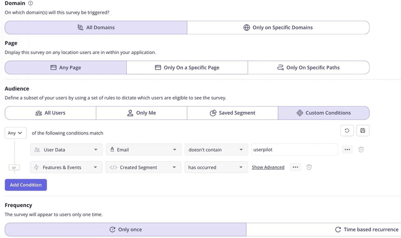
In-product surveys are excellent for recruiting usability test participants. For instance, Userpilot’s in-product surveys allow you to segment users based on attributes and in-product behavior and show your surveys to just a specific subset.
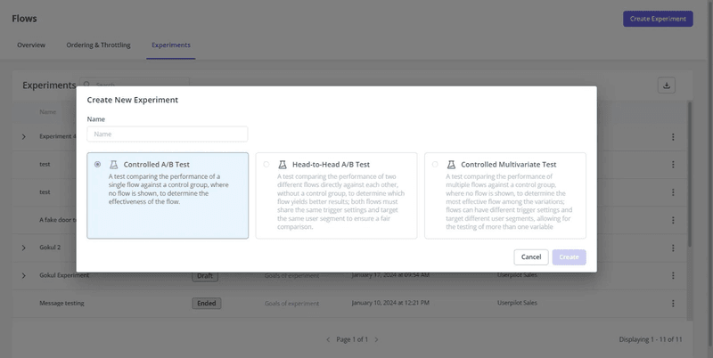
A/B testing can help you compare different design approaches and allow you to make decisions based on real usage data.
👉 Want to learn more about usability testing? Here are two articles that you’ll definitely want to read.
5. Iterate and refine
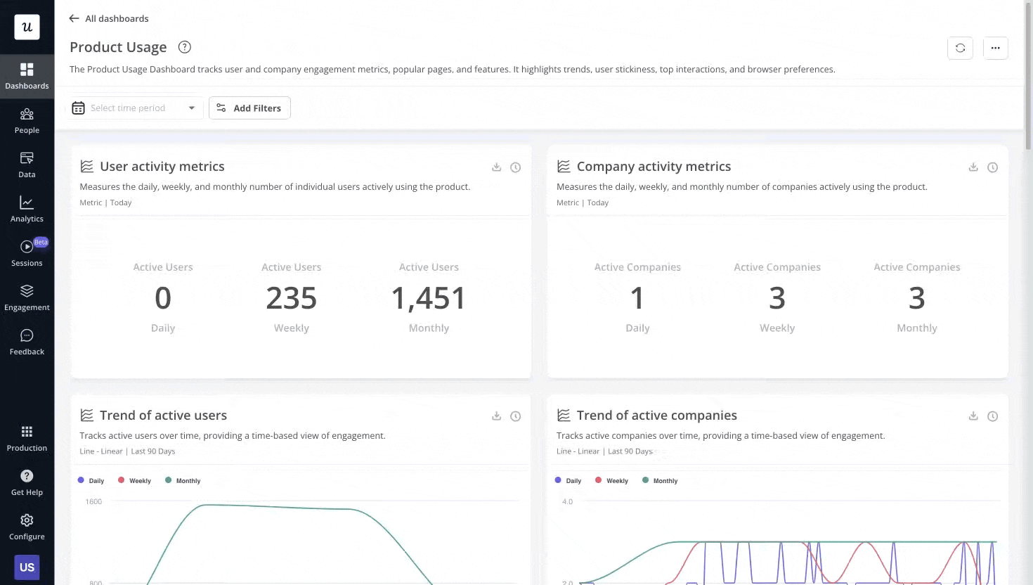
UX is rarely “one and done.” We take the feedback from testing and use it to refine our designs. Our analytics dashboards help us measure the impact of these changes on key UX KPIs like feature adoption and product engagement.
We look at funnel analysis and user path analysis to track friction points in the user journey and strive to remove them.
Funnel analysis shows how users navigate pre-defined flows. They show exactly where users drop off in processes like onboarding or checkout, so you can identify steps that need improvement.
Path analysis shows the actual routes users take through your product, often uncovering unexpected behavior patterns that can later inform better design decisions.
We also set up custom dashboards that combine different data points about how users interact with specific features, giving you detailed insights into what’s working and what needs attention.
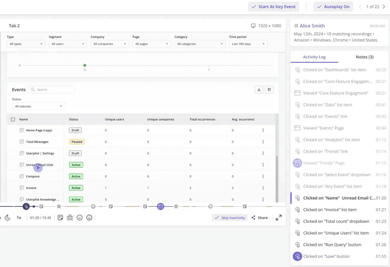
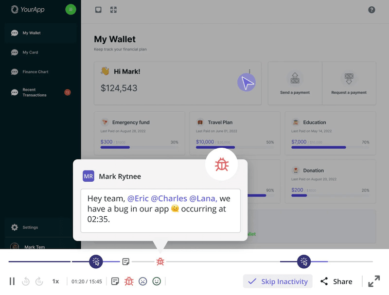
On top of tracking the user behavior reports, we use session replays to watch users interact with our products, giving us powerful “Aha!” moments about what’s working and what’s not. Session replays let you spot friction points like confusing buttons, unclear navigation, or areas where users get stuck, allowing you to fix these issues with precision.
One of our customers, Cleeng, is a perfect real-world example of effective iterative testing in action. Through data analysis, they noticed that usage for one of their features dropped after a redesign.
After noticing the feature drop-off, Cleeng hypothesized that the new navigation made the feature less visible to users. To test this hypothesis, they used session replays to identify where users got stuck, then implemented tooltips to redirect them.
Their hypothesis proved correct: tooltips boosted page visits by 75%. After redesigning the navigation, usage rebounded to even higher than before the drop.

👉 If you’d like to learn more about the methods Cleeng used, read our article on iterative testing approaches.
Common UX traps and how we dodge them
Even seasoned teams can stumble. Here are some common UX pitfalls I’ve observed, and how we tackle them.
1. Ignoring user friction
We should focus on every friction point, not just those that make the user drop off. Even a moment of frustration or hesitation can negatively impact the product experience.
We actively identify and work to reduce user friction through dedicated UX efforts. One way we do this is by analyzing session replays, where you can see exactly what a user does while they’re in the app. Seeing rage clicks or a thrashed cursor tells us instantly where the frustration lies.
2. Poor mobile experience
With so many people using phones and tablets, a desktop-only approach is a recipe for failure. If your product feels clunky or incomplete on smaller screens, users will abandon it.
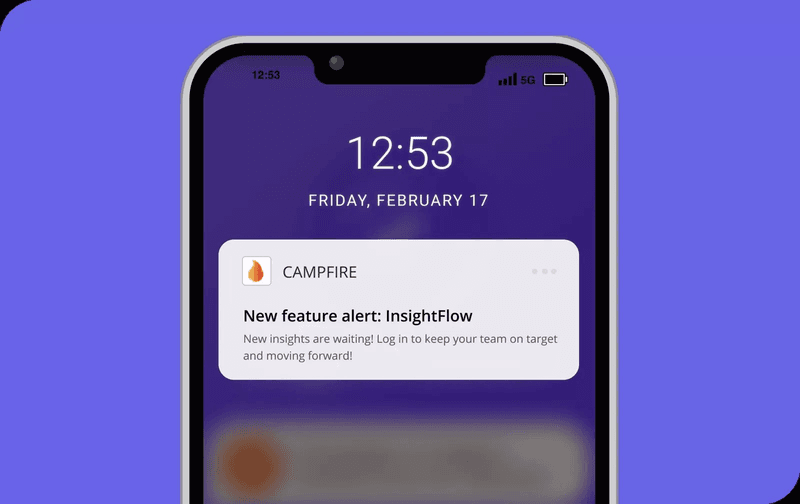
We focus on mobile UX design from the start, making sure our experiences are responsive and intuitive across all devices. For mobile engagement, we also offer push notifications to re-engage users and carousels that work smoothly on touch interfaces, ensuring mobile users get the full experience.
3. Ignoring user feedback
Don’t assume you know what users want without asking them. We prioritize collecting user feedback constantly, through surveys and direct conversations, and actively analyze that feedback data. These surveys include NPS (Net Promoter Score) and CSAT (Customer Satisfaction) measurements that give us quantitative insights into user sentiment and satisfaction levels.
4. Bad onboarding
A confusing first experience can drive users away instantly. Instead, we focus on how to onboard new users to value quickly and monitor the onboarding performance. We design interactive flows with tooltips, modals, banners, and checklists, and test them with A/B tests.
We also personalize the onboarding experience by creating user segments based on their properties (like role or plan) or behavior (like feature usage). This allows us to personalize messages and experiences. Our segmentation feature in Userpilot lets us define dynamic groups for targeted campaigns.
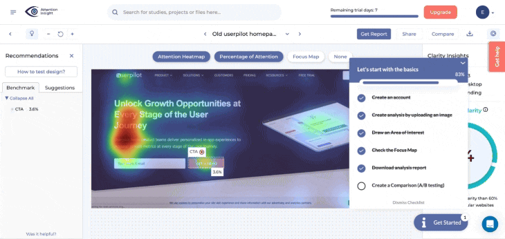
Here’s an example: one of our clients, Attention Insight, had an easy-to-use product, but only half of the trial users reached activation. Landing on the dashboard, they didn’t know where to start.
After implementing interactive walkthroughs and onboarding checklists (as shown in the screenshot above), they increased user activation by 47%.
5. Feature overload
Adding too many features can lead to feature fatigue. We avoid a feature factory mindset by making sure each new addition truly solves a user problem. User personas come in handy here. They help prioritize roadmaps based on JTBDs of the most valuable user segments.
6. Poor performance
Slow load times or buggy interactions are immediate red flags. Users expect speed, and the time they spend waiting for pages to load directly impacts their experience. While performance is often an engineering task, designers must advocate for smooth, responsive experiences.
These little things add up. Addressing them, even with small UX improvements, can significantly impact conversion, trust, and retention.
Build a UX engine with Userpilot
User experience basics come down to one thing: understanding people. When you follow user-centered design principles, removing their pain points to make their journey smooth, you build a product that stands out.
Userpilot provides the tools you need to implement professional UX practices, even without programming knowledge or extensive research experience. Our no-code platform lets you create in-app guidance, collect user feedback, and analyze behavior data throughout every stage of the design process.
Want to implement UX enhancement tools for your product? Book a free demo with Userpilot and discover how easy it is to create user-centered experiences that drive engagement and growth.
FAQ
What do UX designers do?
UX designers research user needs, define problems, create solutions through wireframes and prototypes, conduct usability testing, and iterate based on feedback. They focus on the complete user journey to ensure all of the user pain points are addressed while building the product.
What are the benefits of UX design?
Good UX helps improve user satisfaction, reduces support costs, increases conversion rates, and also creates competitive advantages because people keep coming back to your product. Users are more likely to recommend products that provide excellent experiences, boosting web traffic due to more people searching for them.
About the author