25 UX Design Examples That Work and Why

A good UX design makes your product easier to use, reduces friction, and helps users accomplish their goals with clarity and confidence. While UI focuses on the look of an interface, UX design is about the decisions, principles, and flows that shape the entire user journey.
In this article, you’ll discover 25 UX design examples from popular SaaS tools, each illustrating key UX principles in action, from navigation and onboarding to usability, accessibility, and interaction design.
We’ll break down the UX (user experience) reasoning behind each example so you can understand which UX elements to use, why they work, and how they improve the overall experience. This guide is ideal for designers who want to learn the thinking and strategy behind great UX design, not just interface inspiration.
25 Examples of innovative UX design to take inspiration from
The best way to learn about UX design best practices?
Dissecting bad UX design examples is one. Studying excellent design examples is another way, and that’s what we’re doing in this article.
Here are 25 hand-picked examples of good UX design examples to inspire you.
What’s your biggest challenge with user experience (UX) design right now?
How are you currently trying to improve your UX?
Ready to see powerful UX design examples in action?
Discover how leading SaaS companies build amazing product experiences that drive activation, adoption, and retention. Get a personalized demo of Userpilot and see how you can improve your UX today.
1. Attention Insight’s onboarding flow to guide new users
Attention Insight is an AI-powered tool that allows you to create attention heatmaps of your website or app screen without user participation.
Sounds complex?
No, it isn’t. The process is very straightforward and the onboarding flows built in Userpilot make it even easier for users to adopt the product.
The onboarding process is organized around a checklist with the key tasks necessary to activate new users.
Two tasks are particularly important for AI users to realize the product value: creating the heatmap analysis and drawing the areas of interest.
To guide users through each of them, the team has built interactive walkthroughs made up of driven actions, which take them through the process step by step.
When the user creates their first analysis and draws an Area of Interest, a congratulatory modal appears to motivate users to continue.
Finally, AI users have access to a resource center with self-serve support resources, like the knowledge base, how-to guides, and video tutorials. So that they don’t have to contact support every time they come across an issue.
How effective is the onboarding process?
Attention Insight has increased user activation by 47% within six months of Userpilot implementation.

2. Sked Social’s progress bar to increase engagement
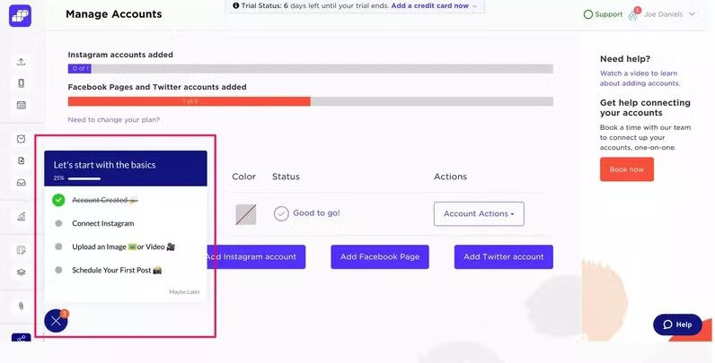
Sked Social, a social media management platform, also uses Userpilot checklists to onboard their users.
And let’s admit, it’s a very successful application of the feature: users who complete the checklist are more likely to convert to paying customers.
What makes the checklist so effective?
The progress bar.
It shows users how far they’ve gone and how many more tasks are left. This may seem like a simple solution, but it leans into a complex psychological process called the Zegeirnik effect.
Basically, people with a checklist in front of them feel the drive to complete the tasks before they do anything else, and the progress bar reinforces it.
3. Talana’s non-intrusive interactive tooltips
Talana is a human resource platform with eight top-notch products, including solutions for payroll and benefits management, recruitment, and company community management.
Talana’s products are often complex, so users often need help to adopt them.
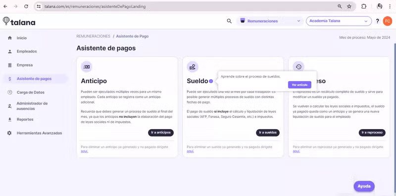
The company supports them with in-app onboarding experiences. These include interactive tooltips, which drive the desired user actions, like engaging with a new feature.
The best part about them?
They’re super unobtrusive and yet difficult to ignore. This means they don’t add unnecessary friction to the user experience but still achieve their objective.
4. Groupize’s award-winning gamified onboarding experience
Groupize is a meeting management platform that allows you to manage travel, spending, and compliance from one place.
The company realizes that user attention during onboarding shouldn’t be taken for granted. To ensure high engagement and completion rates, they gamified the process.
At the core of the process, they have G.G., or Groupize Guide, a personal assistant, for which they got nominated for the Skift Idea Awards 2022.
If you know Siri or Alexa, you get an idea of how it works: it offers users answers to their questions and helps them activate and adopt features. In this case, via product tours, checklists, and live chat, to name a few.
Remember Mr. Clippy? The annoying MS Office widget?
Well, G.G. isn’t like that. It doesn’t spring on you unexpectedly and prevent you from switching it off. Users have to launch it themselves from the resource center.

5. Trello’s enhanced UX with placeholder text
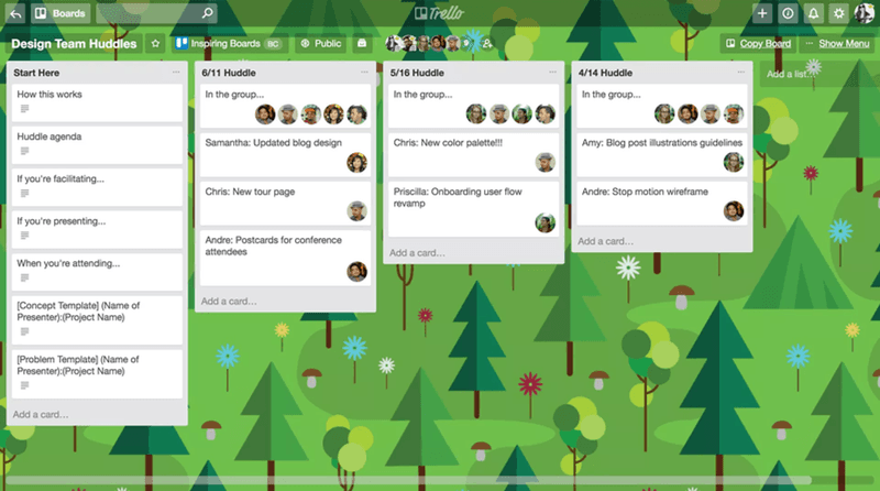
A placeholder is a visual or textual cue that sits in the interface, showing the context of the action a user should take.
Using a placeholder is a good UX practice because it removes the thinking from the process. The user knows exactly what to do, which reduces the risk of error and the time needed to complete a task.
For example, Trello’s placeholders “add a card” and “add a list” help the users manage their Kanban boards and tasks.
6. Miro’s user onboarding process
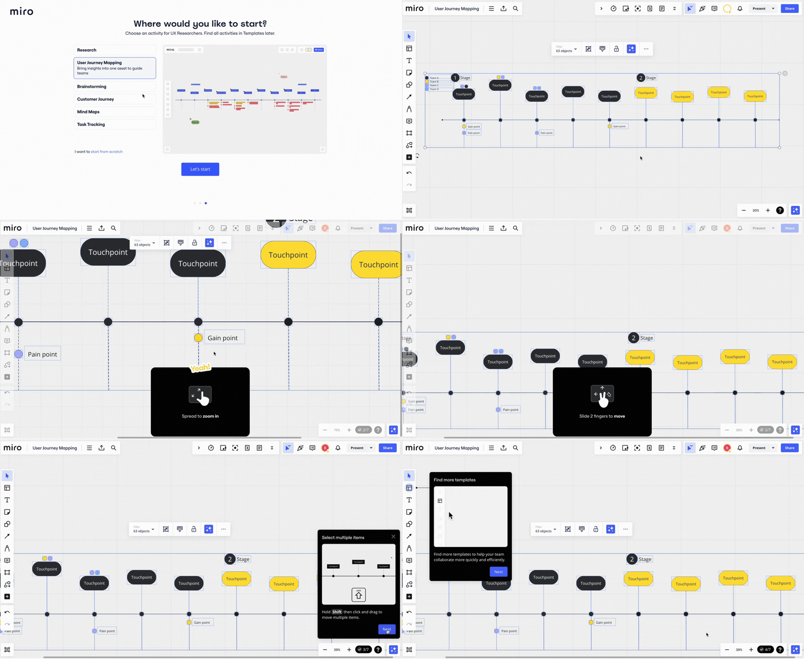
Miro is an intuitive collaboration tool that allows users to create charts, grids, and diagrams without specialist skills.
However, to fully realize the tool’s potential and complete tasks efficiently, users need to be familiar with shortcuts and mouse operations or gestures.
The best way to master them?
Through practice!
That’s why Miro has built an interactive onboarding flow.
At each step of the process, it doesn’t just show users what they should do but prompts them to complete the actions. The users don’t only see what they should do but are prompted to complete the actions.
7. Userpilot uses progressive disclosure to avoid overwhelming users
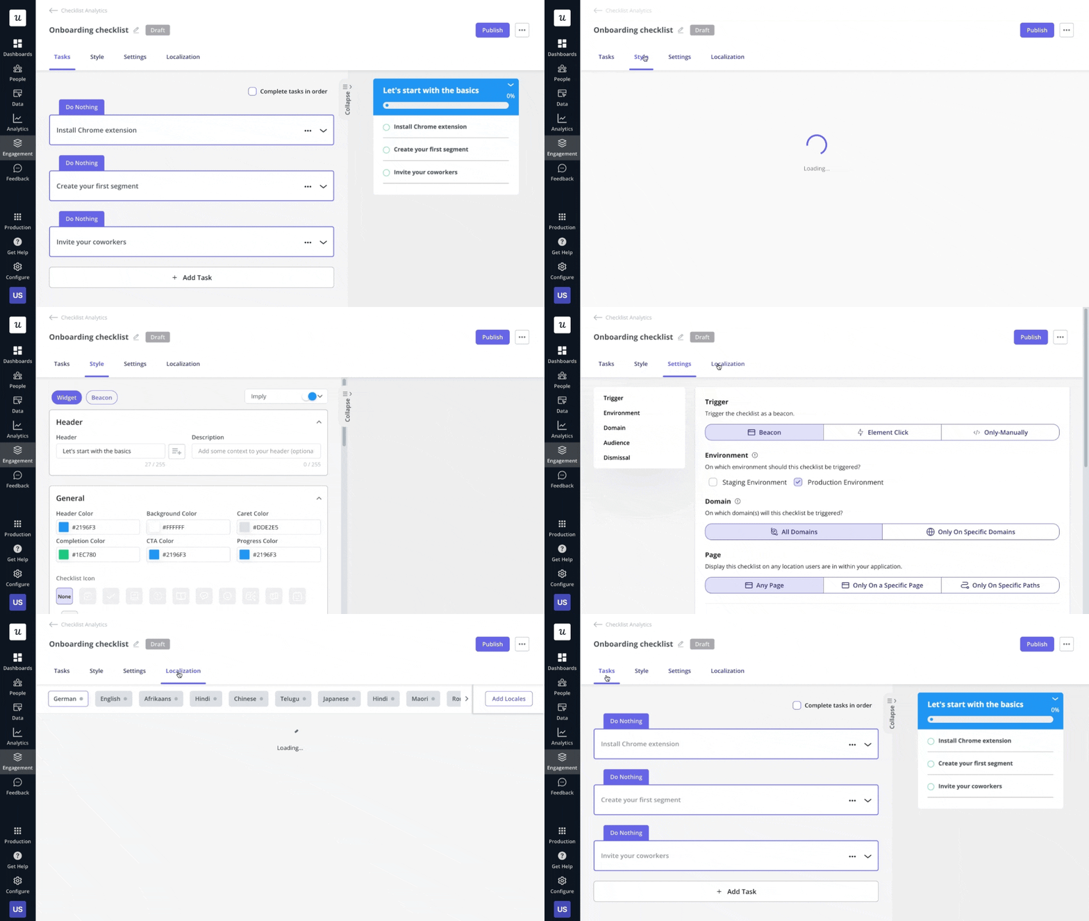
Progressive disclosure is a design pattern that gradually shows users information over multiple screens.
Using progressive disclosure decreases the time it takes for a user to take action by minimizing the cognitive load, making engagement with the UI much easier.
For example, you can break up a multi-step process into multiple screens, just like Userpilot uses when building a checklist.
8. Asana’s unicorn that celebrates user achievements
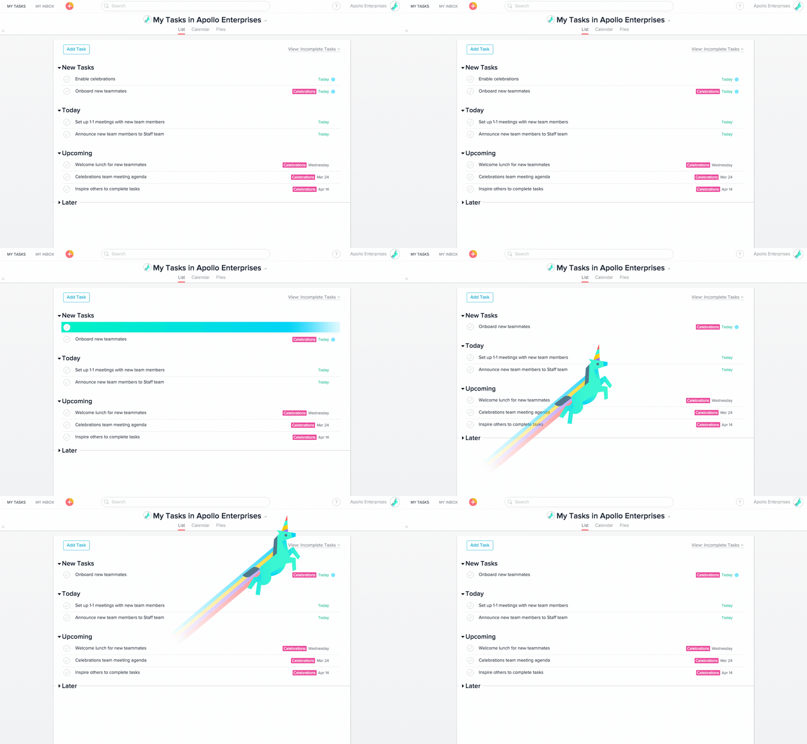
The team behind Asana, the project management platform used across various industries, uses gamification to keep their users engaged and motivated and to inject some fun into the user experience.
This is in the form of celebratory animations of mythical creatures.
When a user completes a task, a unicorn, Yeti, Pheonix, narwhal, or otter flies across the screen. This is a brilliant touch, recognizing their users’ hard work in completing their tasks.
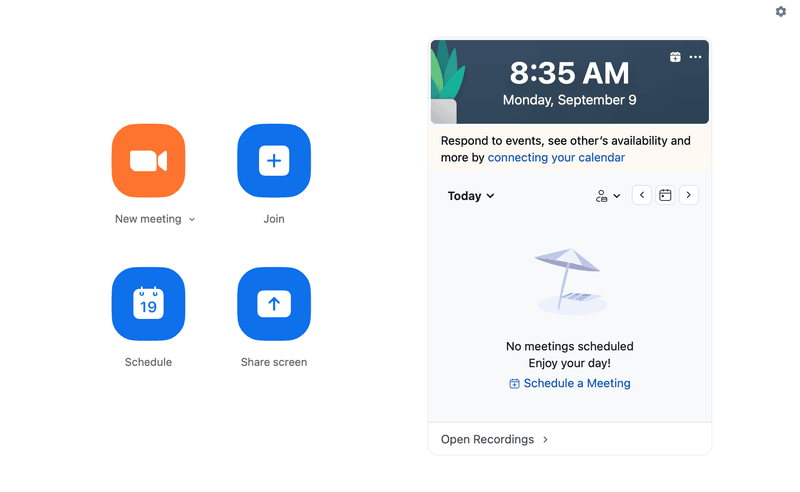
9. Zoom’s simplified user-friendly interface
KISS. Keep it simple, stupid.
One of the timeless UX design best practices.
Your aspiration is to have a simplified user interface with as few UI features and interactions as possible. A simple UI makes it easy for a user to navigate and use your product, especially for those who might not be familiar with it. The easier users find your product, the better the user experience.
So, give users limited options to reduce mental fatigue and make the buttons and icons large enough for users to easily find them on the screen.
Just like Zoom, whose simple design is one of the reasons for its success. There are no cluttered menus or interfaces. None of its options make you think about what to do next.
10. Notion’s empty states that prompt action
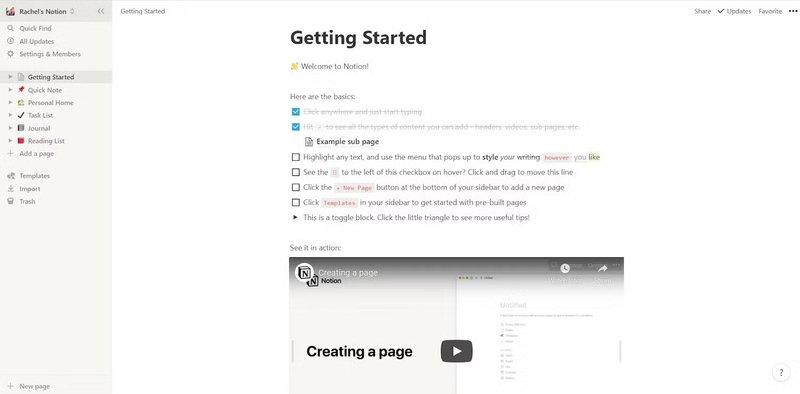
Empty states are what way too many users still see when they log into the product for the very first time.
A blank page. Nothing. Zero. Zilch. Nada. Intimidating and confusing.
But that’s not the experience of Notion users.
The note-taking and knowledge management app uses the empty screen to kick off its onboarding process. It offers them a checklist with basic commands useful for navigating the tool and video tutorials guiding them through key actions.
Be Notion, my friend, be Notion!
11. Airtable’s balanced usability
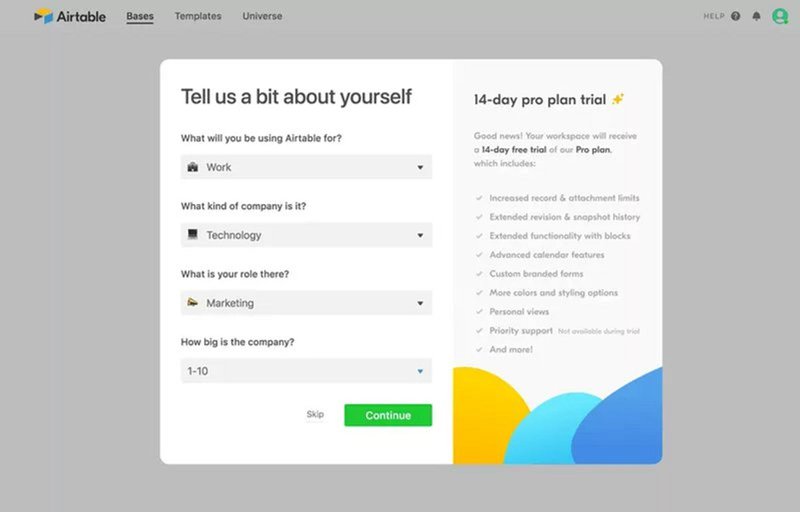
Airtable has created a simple sign-up form that removes friction from the process and yet allows the company to collect all the details about their users necessary to personalize their experience.
That’s when you reconcile the need for great usability for the user and your business goals. The user can get their job done without being overwhelmed, and you get yours done without compromising quality.
12. Grammarly’s demo document
A product tour is an interactive guide showing new users how to use your product. It gives them hands-on experience in how to derive product value.
This is crucial for user retention. If they don’t activate, they aren’t likely to continue using the product, because they don’t see any value in doing so.
However, as already shown in the Miro example above, good onboarding doesn’t just show what to do but teaches users how to do it.
Grammarly knows this.
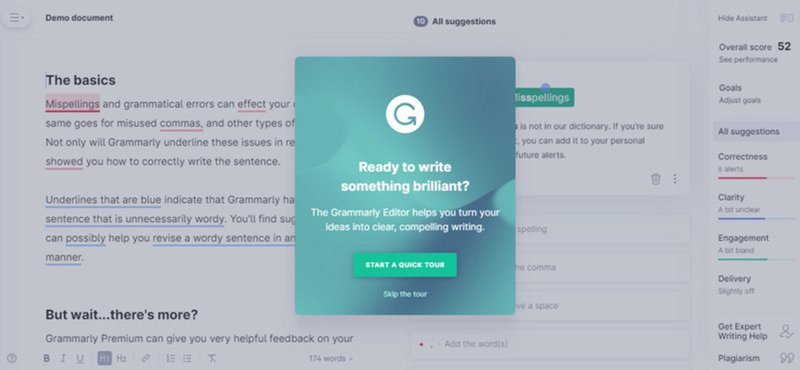
It uses a demo document where users see what each correction code symbol means and have a chance to correct the mistakes themselves. So that it’s easier to do once they start working on their own documents.
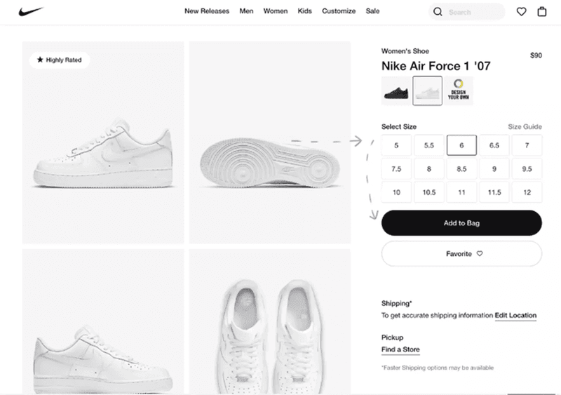
13. Nike’s selling experience
If you want to boost sales, make it easy for your customers to spend their money with you.
Nike’s online shop is a great example of how to achieve it.
The user can see everything they need to make a purchase on one screen. The pictures, the size, the color. They’re literally a few clicks away from owning a pair of Nike sneakers.
This increases the odds they make the purchase.
14. Airbnb booking experience
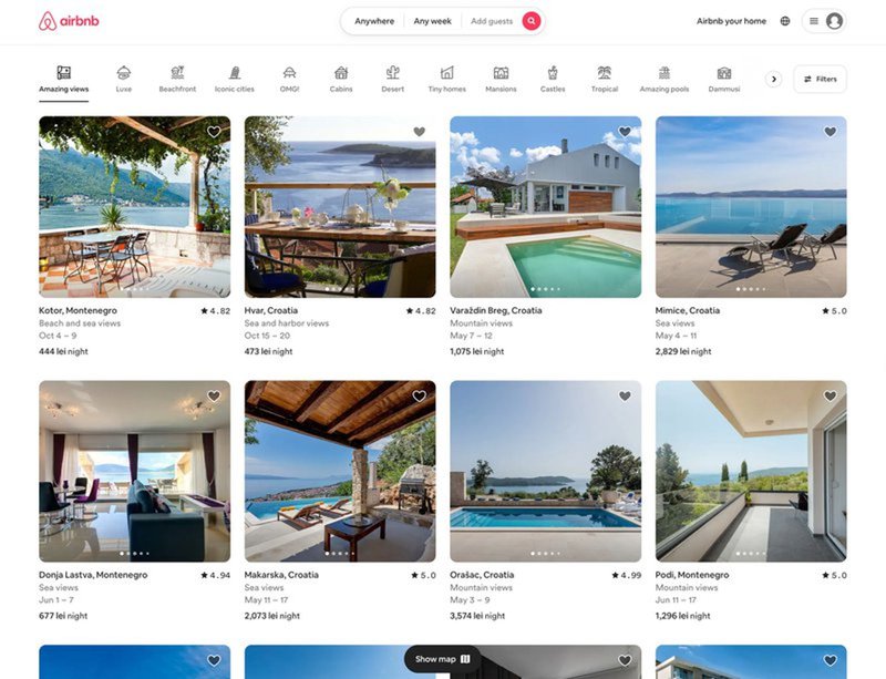
The Aha moment is when the user realizes the value your product could offer, which is necessary for activation and adoption.
Airbnb doesn’t beat around the bush when it comes to taking users to the Aha moment.
When people visit the page, they instantly see the available places to rent across multiple locations, even before they start searching.
15. Netflix’s autoplay feature
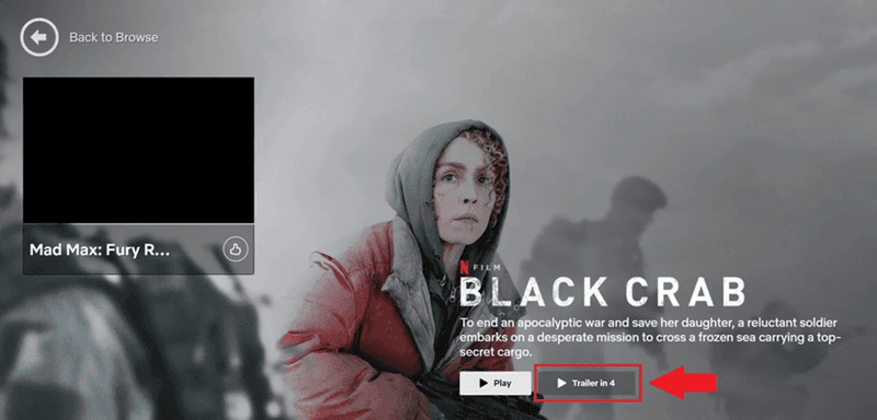
Every Netflix binge-watcher is familiar with the autoplay feature: when one episode finishes, the service automatically plays the next one without having to take action.
This creates a frictionless user experience.
And keeps users engaged for longer. Because every time they reach for the remote, there’s a risk that they may actually switch the TV off instead of pressing Next.
Netflix also uses the feature to hook browsing users with automatically played trailers.
16. Canva’s contextual guidance
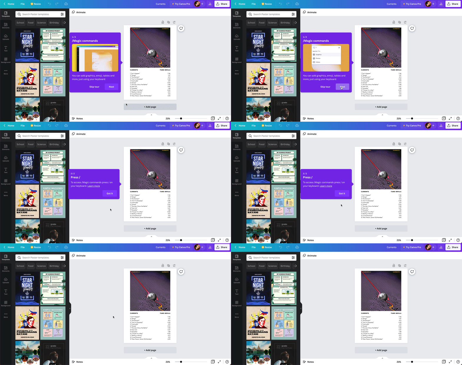
Contextual guidance is when you present information to users at a relevant and timely point while using your product.
The purpose?
To improve the user experience by reducing confusion, frustration, errors, and increasing efficiency.
Canva delivers contextual guidance through tooltips that showcase its different features and show users exactly what to do at a specific moment.
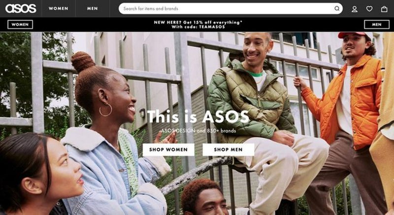
17. Asos’s visually appealing above-the-fold content
Unlike in brick-and-mortar shops, online shoppers can’t touch, smell, taste, or try on the goods they’re buying. All they have is their sense of vision.
Your e-commerce UX design must be visually appealing enough to replace all other sensations.
Asos, the UK clothing retailer, knows this well, and that’s why their website is all about the images of people wearing their garments. And just two CTA buttons, ‘Shop Women’ and ‘Shop Men’.
18. Fenty Beauty’s accessible design
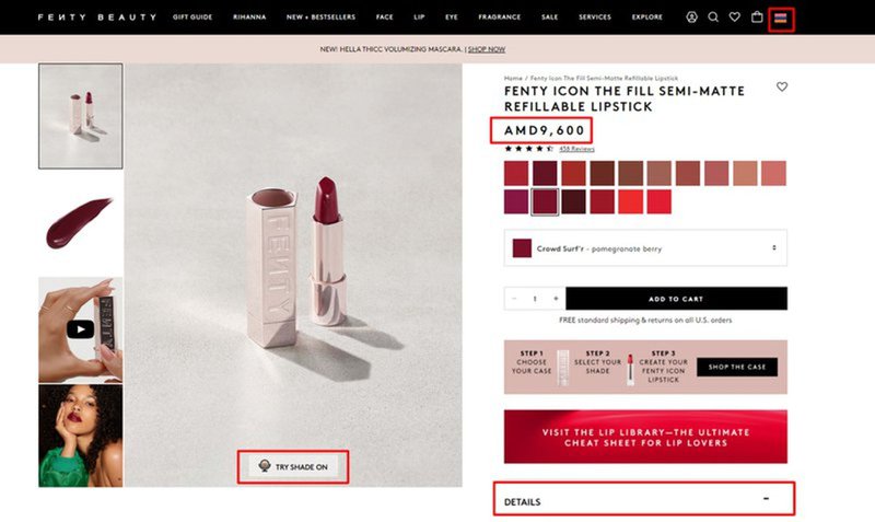
Accessible design is where you create user interfaces that are easy to use and understand. It could include simplified navigation, different media formats (video or images), and interactive content.
Accessible design helps to improve the overall user experience, making it easier for all customers to use your product and increase engagement and satisfaction.
Fenty Beauty has a good, accessible UX design because they:
- Show prices in the user’s currency.
- Enable users to quickly see what colors they can choose for a particular item.
- Have a feature that lets users experience what a product looks like on them.
19. Duolingo’s simplified user flows
When designing the UX for a mobile device, simplicity matters even more.
Mostly because the screen is smaller. This makes it difficult to consume detailed content or perform complex actions.
Moreover, mobile users tend to spend less time on a page or screen, so you don’t want to create any unnecessary friction that could discourage them.
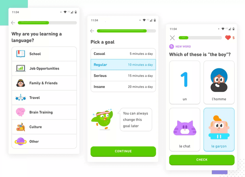
Duolingo seems to be well aware of this, judging by its onboarding process and UI design.
The onboarding flow is short and sweet: it consists of 5 steps during which users can customize their learning experience.
Once inside the app, the UI is clear and intuitive. It features high-contrast color patterns and large buttons, which makes navigation a breeze.
20. Calm’s sign-up flow minimizes users’ cognitive load
Cognitive load is the mental effort needed to understand and interact with your product.
The higher the load, the more difficult it is to complete tasks, which consequently has a negative impact on user experience and satisfaction with the product. In extreme cases, the effort could be so high that they give up.
That’s why reducing the cognitive load should be your priority.
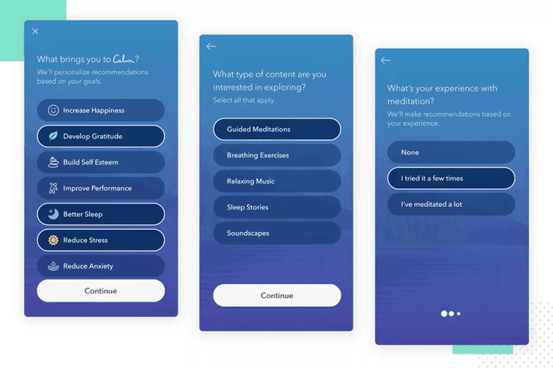
Calm achieves this by breaking down its sign-up flow into sections rather than presenting new users with one long form. Users can concentrate on one question at a time, which makes the experience less stressful.
You wouldn’t expect anything less from a relaxation and meditation app, would you?
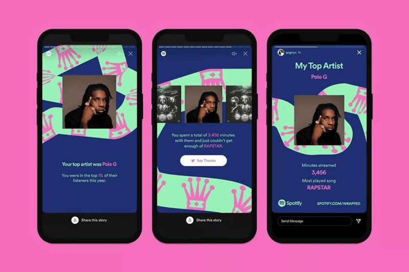
21. Spotify’s end-of-year wrapped stories
What’s the best use of user data for UX design? Creating personalized user experiences.
This is to increase user engagement and better satisfy user needs or to add delight to the user experience.
Spotify leverages user’s own data to create content tailored to them. This includes personalized tune recommendations based on their listening history.
And end-of-year wrapped stories, which have become a proper hit.
60 million people shared them in 2021 across their socials!
22. Google’s minimalistic visual design
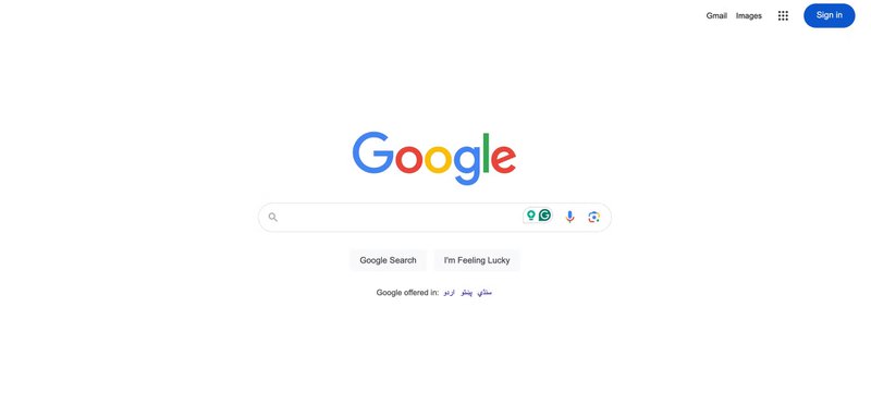
When it comes to simplicity, not many products beat Google’s Search page.
It has everything that it needs: the logo, a menu with key shortcuts, a search bar, and a couple of buttons.
Many users find such a minimalist design extremely appealing, but its main advantage is that it reduces cognitive load and allows users to complete their tasks in less time.
23. Revolut offers customization options
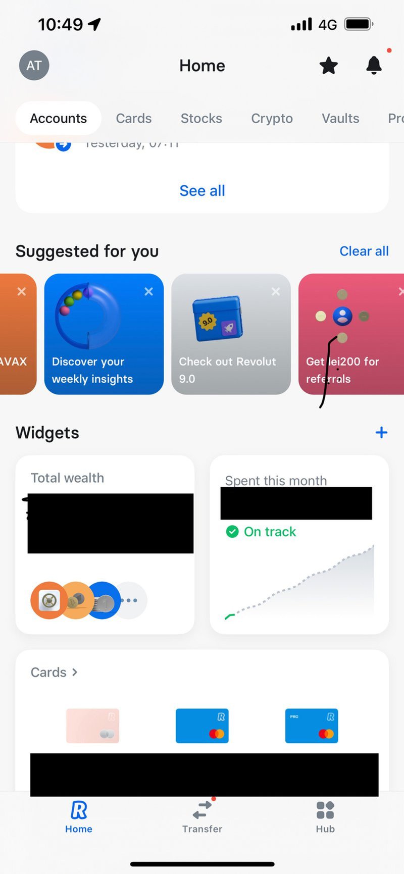
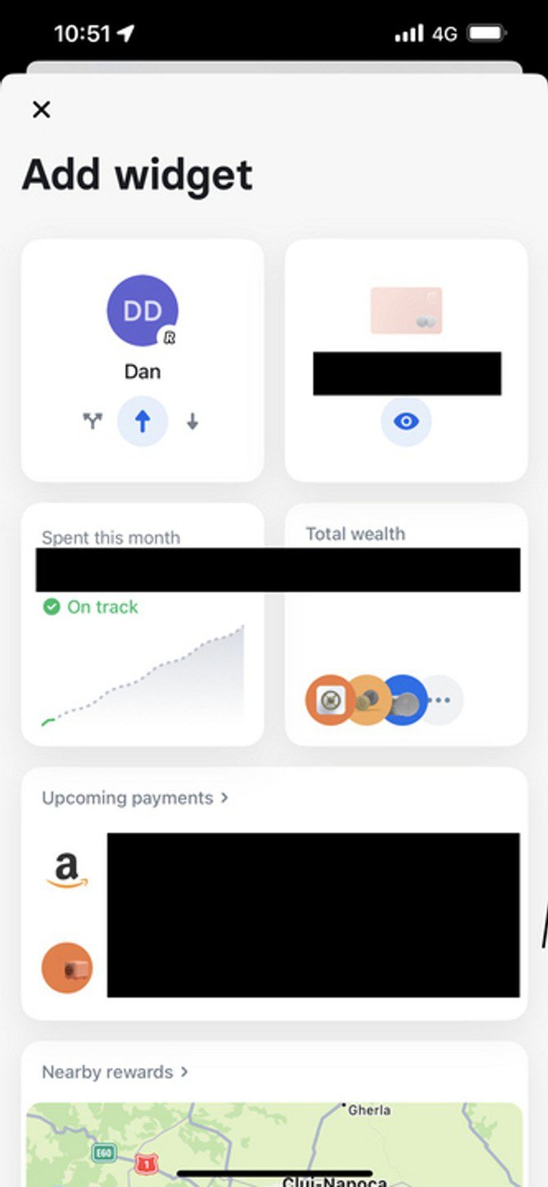
Letting users customize a product’s interface or functionality is a good UX design practice.
Because they can adjust it to their unique needs and preferences. Thanks to that, they can achieve their goals more easily, and this translates into better user experience and greater satisfaction.
Revolut, the online-only bank, does it by allowing users to add different widgets to the home screen. That’s how they can see the information that is most important to them.
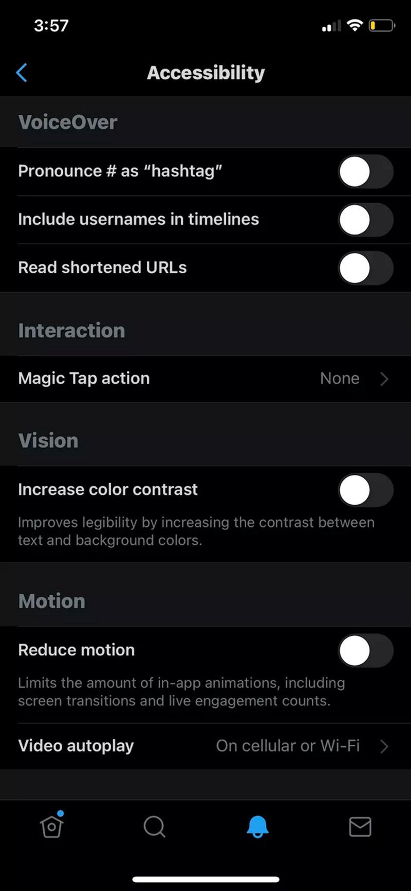
24. X’s accessibility in product UX
When I talked about accessibility before, I didn’t mention its main purpose: creating a user interface for people with various abilities (or disabilities). For example, those with impaired vision.
Accessibility benefits the product in two ways: inclusive interfaces help more people get value from your product, and it sends them a signal that you recognize their unique needs and care about them, which does wonders for customer loyalty.
Twitter X does it by giving the user control over important accessibility settings, like the VoiceOver functionality and color contrast options.
25. Glovo’s great navigation
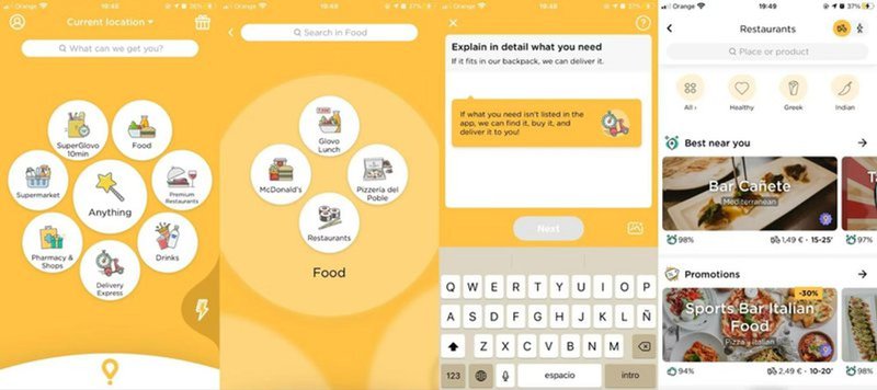
Great navigation lets the user move through your product easily and intuitively to find the information or perform an action to derive the product value without confusion or frustration.
Glovo, a popular food delivery app, makes its navigation simple and clear to use. It combines images and text to help make the options clearer, speeding up the entire app experience.
If you’re looking for more visual inspiration, you can also explore our collection of UI/UX product examples, where we break down real SaaS interfaces and the design patterns that make them effective.
Conclusion
A good UX design improves your customer experience, increases satisfaction, and encourages users to stay around longer. Hopefully, you found the design examples from the article inspiring, and they help you design better experiences for your users.
If you’d like to learn more about Userpilot and how it can help you improve your product’s UX design, book a demo call with our team and get started.
FAQ
What is UX design?
UX design, or user experience design, is a process that focuses on how users interact with and feel about a product.
The goal is to ensure a smooth, effective, and meaningful experience for users by improving product usability, accessibility, and visual appeal, thereby increasing user satisfaction.
What is the difference between UX and UI design?
UX design focuses on the overall feel and functionality of a product, ensuring that it meets user needs.
UI (User Interface) design, on the other hand, is concerned with the product’s appearance and layout, including visual elements like buttons, icons, and typography.
While UX is about the journey, UI is about the look and feel.
What is a good UX design?
A good UX design prioritizes user satisfaction by making interactions intuitive, efficient, and enjoyable. It minimizes friction, ensures easy navigation, and anticipates user needs.
This allows them to accomplish their goals with minimal effort and creates a positive user experience.
What do UX designers do?
A UX designer focuses on understanding user behaviors and translating them into design solutions.
They conduct user research, develop wireframes and prototypes, and test designs to improve usability. Their role also involves collaborating with cross-functional teams to ensure the end product is functional and user-friendly.

