Customer Experience Metrics: (With Benchmarks, Formulas & Dashboards)


One bad experience. That’s all it takes for 52% of customers to switch to a competitor. Customer experience metrics help you identify problems that cause customer churn by showing exactly how users feel about your product.
In this guide, we’ll break down the CX metrics that matter, demonstrate how to calculate them, share industry benchmarks, and give you actionable playbooks for improvement.
What are customer experience metrics?
Customer experience metrics are measurable indicators that track how customers perceive and interact with your product throughout their journey.
These metrics don’t exist in a vacuum. They form a cause-and-effect cycle that, once understood, gives you predictive power.
However, there can be confusion around CX, CS, and UX. To clarify:
- Customer Experience (CX) is every interaction a user has with your brand (from the first marketing touchpoint to ongoing support conversations).
- User Experience (UX) is the product usability and design (how easy and intuitive your interface feels during actual use).
- Customer Success (CS) is the proactive management of customer relationships to drive adoption, retention, and business outcomes.
SaaS companies need all three working together. Great UX gets users in the door. Strong CS keeps them engaged. And CX metrics tell you if the system is working.
Improving customer experience metrics drives your business’s growth. For example, when:
- Users find your product easy to use (low effort), they stick around longer (higher retention).
- They see consistent value (high engagement), they’re more likely to upgrade or expand usage (expansion revenue).
- They’re genuinely satisfied (high NPS), they recommend you to others (lower CAC).
All of this flows into Customer lifetime value (CLV). Better CX means higher CLV, which means you can afford to invest more in acquisition while maintaining healthy unit economics. That’s how product-led growth companies can scale profitably.
Key customer experience metrics you actually need (and when to use each)
Track these metrics to understand the complete story of your customer experience:
Time to first value (TTFV)
TTFV measures how long it takes a new user to experience their first “Aha!” moment. It’s about reaching a milestone that validates why they signed up in the first place.
The goal here is to get users to recognize your product’s value as fast as possible. A short TTFV directly improves activation rates, trial conversion, and early retention.
The average time to value for SaaS companies is 1 day, 12 hours, and 23 minutes. It has a median of 1 day, 1 hour, 54 minutes.
How to calculate TTFV:
TTFV = Activation Event Timestamp – Sign-up Timestamp
For instance, a user signs up on January 1 at 9:00 AM. They complete their first project (your defined activation event) on January 3 at 2:00 PM. Their TTFV is 2 days, 5 hours.
Here are some possible TTFV challenges and how you can fix them:
| When | Signal | Playbook |
|---|---|---|
| TTFV > 3 days for simple products | Onboarding is too complex or unclear | Remove unnecessary setup steps → create progressive onboarding → deploy interactive checklist → focus on single activation milestone |
| TTFV variance > 50% across personas | Onboarding doesn’t adapt to user needs | Build persona-specific activation paths → trigger different walkthroughs by role → customize onboarding checklist by use case → track TTFV per segment |
| High signup-to-activation drop-off | Users don’t understand the activation goal | Add value preview in onboarding → show examples of “done state” → celebrate early wins with confetti/badges → send nudge emails at 24h if inactive |
| TTFV is increasing over time | Product complexity is growing without onboarding updates | Audit new features blocking activation → simplify default settings → offer “quick start” vs “full setup” paths → defer advanced configuration |
Userpilot helps you define custom activation events for each persona and automatically track TTFV. This way, you’ll account for all the nuance that drives real activation.
A small business user’s “Aha!” moment looks completely different from an enterprise admin’s. For a CRM, a sales rep might achieve first value by logging their first call. So, it’s crucial to avoid measuring TTFV with a single definition across all types of personas.
You can also use funnel analysis to identify areas where users drop off before activation. Then deploy elements such as tooltips to guide them and improve TTFV.
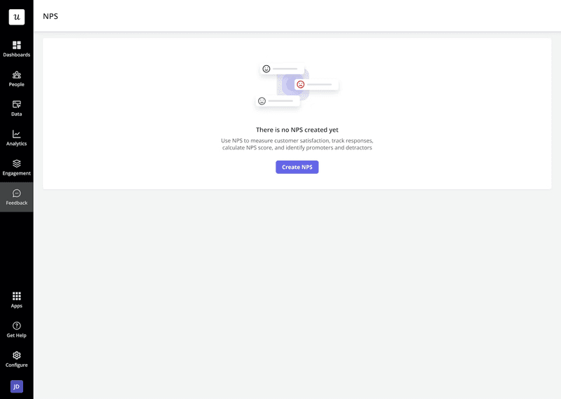
Net Promoter Score (NPS)
NPS measures customer loyalty based on a simple question: “How likely are you to recommend our product to a friend or colleague?”
Respondents score from 0-10, and are segmented into three groups:
- Promoters (9-10): Loyal advocates who fuel growth through word-of-mouth.
- Passives (7-8): Satisfied customers who are unenthusiastic and vulnerable to competitive offers.
- Detractors (0-6): Unhappy customers who risk damaging your reputation.
There’s also an optional follow-up question: “What’s the main reason for your score?” Usually, the answer provides valuable qualitative feedback.
How to calculate NPS:
NPS = (% of Promoters [scores 9-10]) – (% of Detractors [scores 0-6])
For example, you survey 200 users. 120 score 9-10 (60% promoters), 50 score 7-8 (25% passives), and 30 score 0-6 (15% detractors). Your NPS is 60% – 15% = 45.
Here’s how you can work with the NPS metric:
| When | Signal | Playbook |
|---|---|---|
| NPS drops > 10 pts | Surge in detractors (< 7 scores) | Segment detractors → run qualitative “why” survey → tag feedback themes → open follow-up tickets for CSM outreach within 24h |
| Detractors mention onboarding / UX issues | High NPS detractors in the first 30 days | Trigger in-app JTBD survey → launch guided checklist → follow up with CSM to ensure activation milestone hit |
| Promoters ≥ 9 in mid-lifecycle | High satisfaction cohort | Invite to referral program / case-study; send follow-up to post review (G2, Capterra) |
| “Performance” tag trending in detractor feedback | Pattern across multiple responses | Create engineering ticket → prioritize bug fixes → notify affected users when resolved |
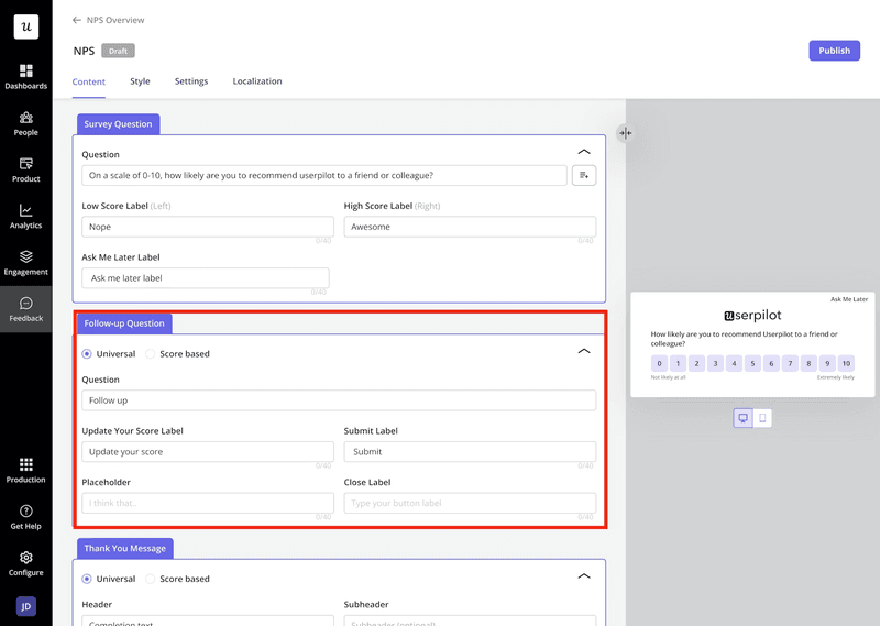
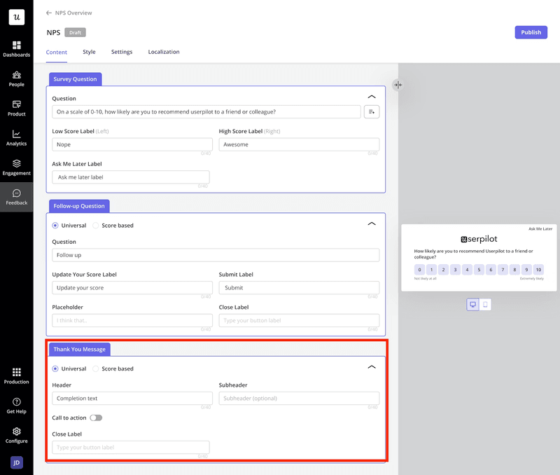
Userpilot helps you build in-app NPS surveys with advanced logic in seconds. You can automatically segment respondents into promoters, passives, and detractors. Then, tag qualitative feedback by theme (UI/UX, pricing, performance), and trigger contextual follow-up experiences based on scores.


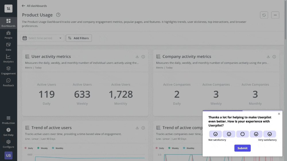
Customer satisfaction score (CSAT)
While NPS measures long-term loyalty, I use CSAT to capture immediate, targeted feedback on customer satisfaction after an interaction.
There are two types of customer satisfaction (CSAT) surveys:
- Transactional CSAT: Measures satisfaction with specific touchpoints. Such as completing a purchase, finishing onboarding, using a new feature, or resolving a support ticket.
- Relationship CSAT: Gauges overall satisfaction with your product or company.
The formula to calculate CSAT is:
CSAT % = (Number of “Satisfied” Responses / Total Number of Responses) × 100
Typically, responses of 4-5 on a 5-point scale (or 8-10 on a 10-point scale) count as “satisfied.” Let’s say you survey 150 users after they complete onboarding. If 120 rate their experience 4 or 5 on a 5-point scale. Your CSAT is (120/150) × 100 = 80%.
You can work on this metric like this:
| When | Signal | Playbook |
|---|---|---|
| CSAT < 75% post-feature launch | New feature causing friction | Segment low-CSAT users → watch session replays → identify UX issues → deploy in-app tooltips and guides within 24h |
| CSAT < 80% post-ticket | Support backlog or slow replies | Audit ticket queue → tag low-CSAT reasons (speed vs quality) → deploy macros → add chat deflection for FAQs |
| CSAT variance > ±15 pts between agents | Inconsistent service quality | Launch peer-QA program → train on empathy scripts → set CSAT target per agent with bonus tied to stability |
| CSAT is steady, but ticket volume is rising | Hidden friction points | Cross-analyze with CES & ticket topics → create “micro-improvement” UX sprints → update help docs |
A CSAT survey best practice is to trigger them immediately after the interaction you want to measure. When you release a product update, Userpilot helps you trigger a CSAT survey after a user completes a key workflow in that updated feature.
A wave of low scores tells us immediately that we broke something or made the experience worse, allowing us to react in hours, not weeks. Also, Userpilot’s segmentation groups responses by user persona, subscription tier, or feature usage so that you can pinpoint exactly which experiences need improvement.
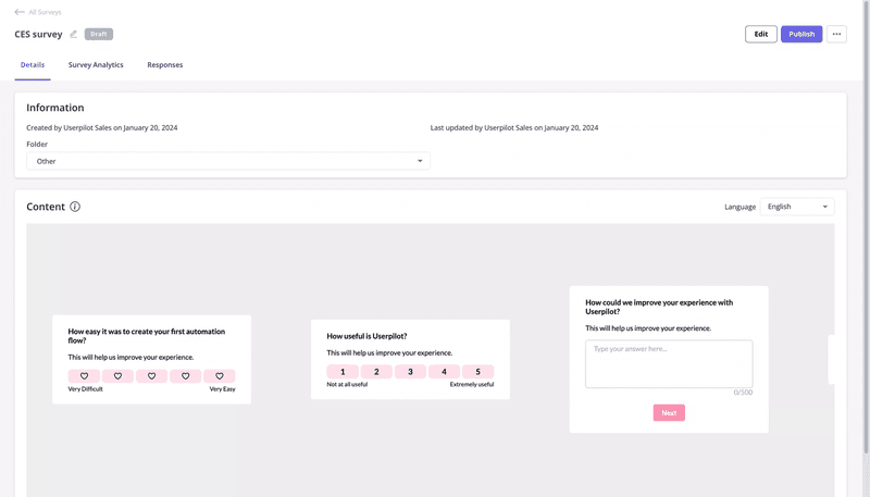
Customer effort score (CES)
Some find that CES is 40% more accurate at predicting customer loyalty than CSAT. It measures how much effort a customer put into performing a task by asking, “How easy was it to get your job done?” on a 1-7 scale (where 1 = very difficult, 7 = very easy).
In SaaS, “easy” wins and high effort are a direct path to churn. 96% of customers with high-effort interactions become more disloyal.
Selecting the right task matters. You’re more likely to get better feedback from CES surveys after workflows like setting up integration or using advanced features for the first time.
For the benchmark, scores below 70% indicate areas for improvement. Above 90% shows strong performance.
How to calculate CES:
CES = (Sum of All Scores) / (Total Number of Responses)
Alternatively, you can calculate it as a percentage:
(Number of scores 5-7 / Total responses) × 100
On a 7-point scale, higher is better. A score of 5.5+ indicates genuinely low effort. Scores below five signal user friction that needs immediate attention.
For instance, 100 users rate their experience with the integration setup. Scores total 520. Your average CES is 520/100 = 5.2 on a 7-point scale. Or: 75 users scored 5-7, so your CES percentage is 75%.
Here’s how you can fix the CES metric:
| When | Signal | Playbook |
|---|---|---|
| CES < 5 on 7-point scale | High friction in the workflow | Map the entire customer journey → identify bottleneck steps → A/B test simplified flow → reduce clicks by 30-40% |
| CES drops after feature launch | New feature adds complexity | Add contextual tooltips → create video walkthrough → trigger in-app guide for first-time users → monitor score for 2 weeks |
| Support tickets cite “too complicated” | Product usability issue | Run usability testing sessions → analyze session replays → redesign UI → deploy progressive disclosure to hide advanced options |
| CES variance across user segments | Different personas struggle differently | Segment by persona → create persona-specific onboarding → deploy role-based checklists |
You can use Userpilot to trigger CES surveys by specific user actions or feature usage. When scores indicate friction points, Userpilot’s no-code builder helps you deploy in-app guidance (such as tooltips, interactive walkthroughs, and checklists) that reduce effort in real-time.
Customer lifetime value (CLV)
CLV quantifies the long-term financial value of a great customer experience.
CLV measures the total revenue you’ll earn from a customer over their entire relationship with your product. It’s an indicator that validates whether your customer experience investments are working. When paired with customer acquisition cost (CAC), it indicates whether your business model is sustainable.
The goal is simple: maximize CLV while keeping acquisition costs reasonable. A healthy CLV:CAC ratio means you can afford to spend more on marketing and sales to grow faster. It also improves your CAC payback period.
How to calculate CLV:
CLV = Average Revenue Per Account (ARPA) / Customer Churn Rate
For example, your ARPA is $500/month, and your monthly churn rate is 2% (0.02). Your CLV is $500 / 0.02 = $25,000.
In the SaaS industry, CLV:CAC ratios between 3:1 and 5:1 are ideal. Below 3:1 suggests you’re spending too much on acquisition. A ratio above 5:1 suggests you’re likely under-investing in growth.
Here’s how to deal with CLV:
| When | Signal | Playbook |
|---|---|---|
| CLV:CAC ratio < 3:1 | Acquisition costs are too high, or churn is too high | Segment by acquisition channel → identify inefficient channels → redirect budget to high-performing channels → implement retention programs |
| CLV declining quarter-over-quarter | Churn increasing or ARPA decreasing | Analyze churned customers → identify common patterns → launch proactive outreach to at-risk accounts → offer upgrade incentives to boost ARPA |
| CLV:CAC ratio > 5:1 | Under-investing in growth | Increase sales and marketing budget → test new acquisition channels → expand into adjacent segments → hire additional SDRs |
| High CLV in specific segments | Product-market fit in a niche | Double down on high-CLV segments → create persona-specific campaigns → build features for these users → raise prices for premium tiers |
Use Userpilot’s product analytics to track user behaviors that correlate with high CLV customers. Identify which features, onboarding paths, or engagement patterns lead to longer retention and higher revenue.
Then, create in-app experiences to replicate those behaviors across your entire customer base. Measure customer experience and iterate on processes that increase CLV and keep churn low.
Daily/Monthly Active Users (DAU/MAU) ratio
Many dismiss the DAU/MAU ratio as a vanity metric. I disagree. This ratio is a direct measure of habit and stickiness. It measures the percentage of your monthly active users who engage with your product daily.
For most B2B workflows that require daily use, a healthy DAU/MAU ratio is critical. It links user habits to product utility, which clarifies its importance and dismisses concerns that it’s a mere vanity metric.
For B2B SaaS, an acceptable ratio is 40% during non-holiday weekdays. A ratio over 20% is good, while over 50% is exceptional.
How to calculate DAU/MAU ratio:
DAU/MAU Ratio % = (Daily Active Users / Monthly Active Users) × 100
Let’s say your product has 1,000 daily active users and 5,000 monthly active users. Your DAU/MAU ratio is (1,000 / 5,000) × 100 = 20%.
Use this playbook for working with the DAU/MAU metric:
| When | Signal | Playbook |
|---|---|---|
| DAU/MAU < 15% overall | Low product stickiness | Identify core value features → trigger in-app guides to drive adoption → send weekly digest emails with personalized insights |
| DAU/MAU drops in the power user segment | Product change alienated key users | Analyze session replays from power users → run targeted survey → deploy compensating features or rollback → schedule 1:1 calls with top accounts |
| DAU/MAU is high, but MAU is declining | Shrinking user base despite engagement | Audit activation funnel → fix onboarding friction → launch reactivation campaign for dormant users → increase acquisition spend |
| DAU/MAU variance across personas | Different personas have different habits | Build persona-specific engagement loops → trigger contextual notifications → create role-based dashboards → deploy use-case-specific tutorials |
For example, a sudden drop in MAU for our “power user” persona is an alarm that may signal a recent change that fell short of expectations. You can always use proactive strategies to increase your monthly active users by delivering more value.
Userpilot’s event tracking helps you understand which features drive daily usage. Then, you can double down on promoting those behaviors by deploying targeted customer engagement campaigns. This approach includes using personalized onboarding flows, feature discovery tooltips, or habit-forming email sequences.
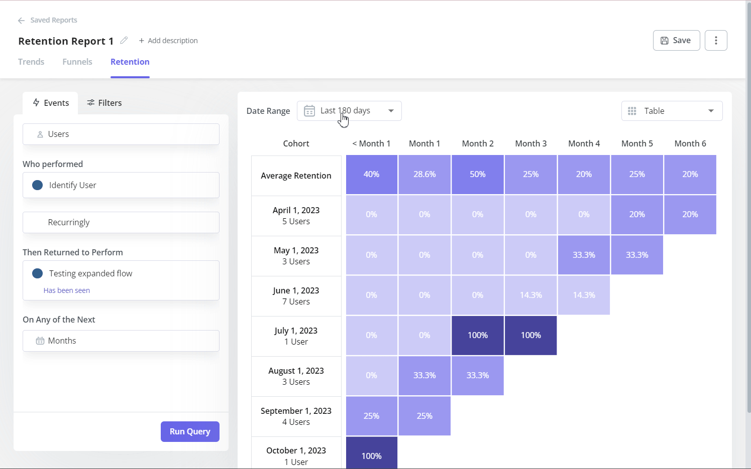
Retention rate
The retention rate measures the percentage of customers who continue using your product over a specific period.
According to our benchmark report, the average across B2B SaaS is 46.9%. The median gross revenue retention for SaaS companies is 92%. Additionally, a customer retention rate of over 35% is considered top-notch for SaaS organizations.
How to calculate retention rate:
Retention Rate % = [(Customers at End of Period – New Customers Acquired) / Customers at Start of Period] × 100
For example, you start the year with 500 customers. Then, you acquire 15 new customers during the year. If you end with 600 customers, your retention rate is [(600 – 150) / 500] × 100 = 90%.
Here’s how you can fix your retention rate:
| When | Signal | Playbook |
|---|---|---|
| Month-1 retention < 40% | Poor onboarding or weak activation | Redesign onboarding flow → add interactive checklists → trigger contextual guides → reduce time-to-value → track activation milestones |
| Retention drops in a specific cohort | The recent product change caused friction | Segment affected cohort → run exit surveys → analyze session replays → deploy hotfix or compensating feature → follow up with personalized outreach |
| High early retention, drops after 90 days | Users hit the value ceiling | Identify power user behaviors → build advanced features → create certification programs → trigger upsell campaigns at engagement peak |
| Retention variance across tiers | Different tiers get different value | Audit feature usage by tier → identify underutilized features → deploy targeted education campaigns → adjust packaging to match value delivery |
Use Userpilot to track retention rate automatically with cohort analysis, segmented by signup date, user attributes, or behaviours.
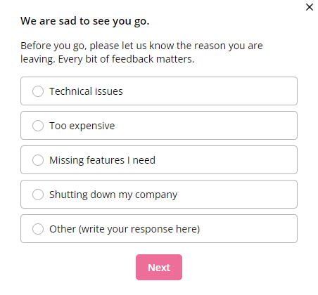
Customer churn rate
Churn is the final, painful verdict on a poor experience. Every metric we’ve discussed so far is a leading indicator for this number. Customer churn rate measures the percentage of customers who cancel their subscriptions during a specific period.
Then there’s logo vs. revenue churn. Logo churn counts customer accounts lost. Revenue churn measures the financial impact. A few high-value customers churning can devastate revenue even if logo churn looks acceptable. Track both, but prioritize revenue churn for business impact.
For SaaS companies, the average churn rate is 5%. Ideally, aim for a ‘good’ churn rate of 5-7% or less.
How to calculate customer churn rate:
Customer Churn Rate % = (Customers lost in period / Customers at start of period) × 100
Let’s say you start the quarter with 400 customers. If you lose 12 customers during the quarter. Your quarterly churn rate is (12 / 400) × 100 = 3%.
You can deal with churn rate with this:
| When | Signal | Playbook |
|---|---|---|
| Monthly churn > 5% | Systemic product or value delivery issue | Conduct exit interviews → analyze common themes → prioritize top 3 pain points → deploy product fixes → improve onboarding for affected use cases |
| Involuntary churn > 1% | Payment failures and billing issues | Implement automated card updaters → deploy smart retry logic → add dunning workflows → extend grace periods → send proactive billing reminders |
| Churn concentrated in a specific cohort | Acquisition or onboarding problem | Analyze cohort characteristics → identify weak activation signals → redesign onboarding for that segment → add early engagement triggers |
| High-value accounts churning | The product doesn’t scale with enterprise needs | Build customer health scores → flag at-risk accounts 60 days before renewal → trigger executive outreach → offer custom success plans → fast-track feature requests |
Use churn surveys to understand why users leave, then act on that feedback to prevent future churn before it happens.
Userpilot helps you track renewal risk flags, such as declining engagement and low NPS scores, on time. This way, you can trigger proactive interventions that build customer health scores, encourage repeat purchases, and reduce churn.
First contact resolution
First Contact Resolution (FCR) measures whether you resolve a customer’s issue on the first interaction. A related metric is Average Resolution Time (ART), which tracks how long it takes to resolve support tickets. Both are proxies for support quality and respect for your customer’s time.
A long ART, even for a minor issue, creates lingering frustration that poisons the customer relationship. When customers feel like they wasted their time bouncing between agents or waiting days for answers, it erodes trust faster than almost any product bug.
Industry benchmarks for ART vary based on the support medium. For email and social media support, it’s 24 hours. Phone support is 10-60 minutes, and live chat is 5-10 minutes. For FCR, target 70-75% or higher.
How to calculate First Contact Resolution:
FCR% = (Number of Issues Resolved on First Contact / Total Number of Issues) × 100
If your team handled 500 support tickets last month and resolved 375 on the first interaction, your FCR is 75%.
How to calculate ART:
ART = (Total Resolution Time for All Tickets in a Period) / (Total Number of Tickets Solved in that Period)
If your team resolved 200 support tickets last month with a combined resolution time of 4,800 hours, your ART is 24 hours.
Use these tips to resolve issues with your resolution time:
| When | Signal | Playbook |
|---|---|---|
| ART > 24 hours consistently | Support backlog or knowledge gaps | Audit ticket categories → identify top 5 friction points → create help docs with screenshots → deploy chatbot for FAQs. |
| FCR < 70% | Customers need multiple touches | Train agents on diagnosis skills → build internal troubleshooting guides → add ticket routing rules to match expertise. |
| ART spikes for a specific category | Documentation gap or product friction | Rewrite confusing help articles → add visual walkthroughs → consider product fix if friction is systemic. |
Integrate your support tool with user engagement platforms like Userpilot to visualize resolution trends alongside customer sentiment. When you spot resolution times climbing for specific user segments, trigger proactive in-app messages with help resources before they submit tickets. You can also direct them to answers in your knowledge base.
Expansion indicators
The customer experience metrics that predict expansion include product qualified leads (PQLs), seat growth, usage depth, and feature adoption rate.
The feature adoption rate tells me if we’re building things people actually want. A low adoption rate for a “killer feature” is a clear signal that we either failed to communicate its value or that the UX is broken, especially since customers who use over 70% of core features are twice as likely to be retained. The median feature adoption rate is 60%.
How to calculate feature adoption rate:
Feature Adoption Rate% = (Number of Users Who Used a Feature / Total Number of Users) × 100
Let’s say that you launch a new analytics dashboard. If you have 1,000 active users, and 220 have used the dashboard in the first 30 days. Then, your feature adoption rate is 22%.
Here’s how you can fix the feature adoption rate:
| When | Signal | Playbook |
|---|---|---|
| Adoption < 15% after 30 days | Feature invisibility or value confusion | Launch in-app tooltip campaign for target personas → A/B test value prop messaging → add feature to onboarding checklist. |
| High adoption in one segment, low in others | Persona mismatch or hidden use case | Interview high-adoption users → document their workflow → create persona-specific guides → adjust positioning. |
| Initial spike, then plateau | Friction after first use | Run CES survey on second-time users → identify drop-off points → simplify workflow → add contextual help. |
Userpilopt helps you track feature adoption rate to actionable data and automatically provide contextual help. This product usage analytics is especially valuable when users match your PQL criteria but haven’t engaged with high-value features.
How Userpilot can help you in measuring and improving customer experience metrics
Tracking customer experience metrics across multiple tools creates blind spots. Userpilot helps you measure customer experience and implement improvement flows in one platform:
- Collect feedback at the right moment: You can launch NPS, CSAT, and CES surveys based on user behavior. Userpilot also enables you to tag responses to quickly understand how users feel.
- Analyze customer experience metrics without code: Monitor feature adoption rates, retention cohorts, and user paths through custom dashboards. Segment by plan tier, persona, or any other attribute to identify which groups are at risk of churn before it happens.
- Act on insights immediately: Let’s say you spot that CES scores spike for a specific feature, you can use Userpilot to launch targeted in-app guides, tooltips, or checklists to fix the issue. So, you don’t have to juggle between a tool that helps you analyze metrics and another that enables you to improve them, since everything is in a single platform.
Your customer experience metrics tell a story
Every metric we’ve covered gives you actionable insights into where your product experience needs improvement and where it’s creating loyal customers.
The question is: Are you equipped to act on those insights fast enough to matter?
Book a demo with Userpilot and see how our no-code platform helps you turn your customer experience metrics into revenue growth.
About the author