Retention Curve: How to Measure and Improve It? A Guide for PMs

Your retention curve is the single most accurate predictor of whether your SaaS company will achieve long-term success. A curve trending toward zero suggests a lack of product strategy, while a flat line indicates you have built a sustainable engine to drive growth. In fact, companies with Net Revenue Retention at or above 100% grow significantly faster than their peers.
To repair a broken curve, you must move beyond vanity metrics and identify specific user engagement actions that correlate with long-term usage. I’ll show you how to construct the right measurement methodology, identify exactly where users drop off through cohort analysis, and implement targeted interventions using churn prevention strategies that respond to retention patterns at each stage of their journey.
What is a retention curve?
A retention curve is a chart that answers one question: “Of how many people who started using my product on Day 0, how many are still here?”
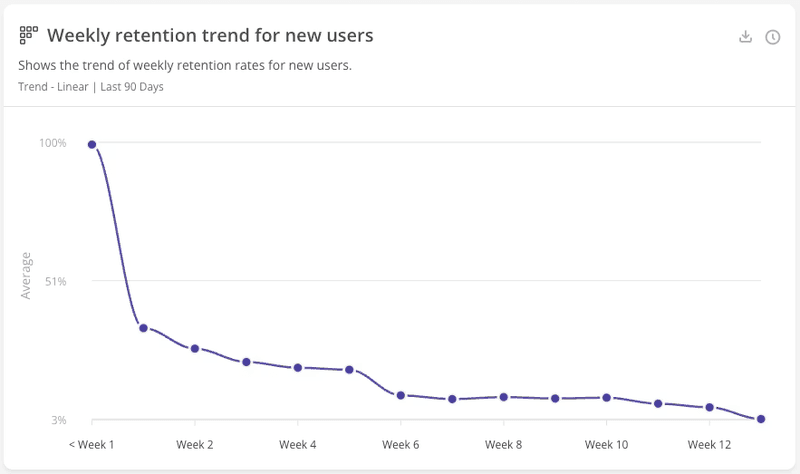
User retention. The X-axis shows time since the user’s first interaction (days, weeks, or months, depending on your product). The Y-axis shows the percentage of active users.
This visualization showcases user retention, cutting through all the noise from acquisition channels and new signups. You can see if you achieved real Product-Market Fit (PMF) and effectively retained users across their lifecycle.
Most common types of retention curve
Almost every retention curve falls into one of three patterns. Recognizing which one you have is the first step to developing appropriate retention strategies.
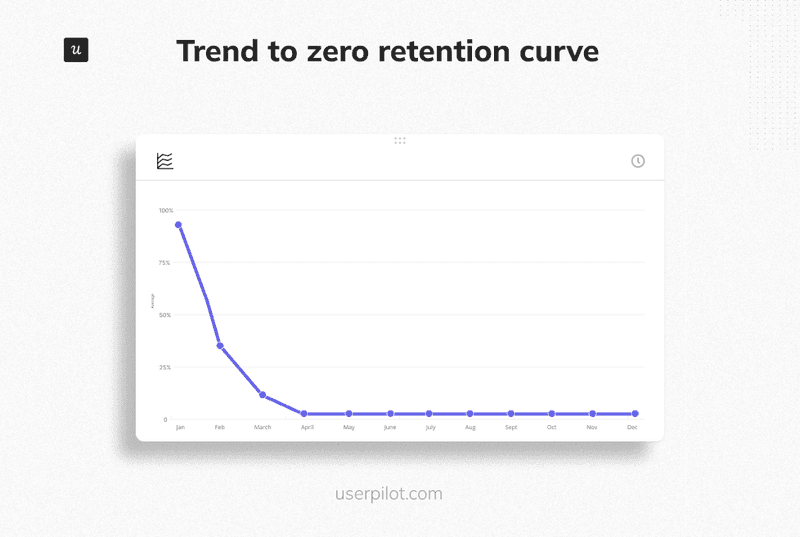
1. The trend to zero curve (The leaky bucket)
The curve starts at 100% on Day 0, drops steeply, and continues a steady slide until it hits the bottom (0%). Declining curves show that when a product has not achieved PMF, it will continuously decline, eventually reaching very few or zero customers. High com§petition and price sensitivity can cause sharper declines as customers switch to better alternatives.
- The diagnosis: Your product fails to form a habit or solve a recurring problem. You may have acquired users based on a promise you couldn’t keep, or the problem you solve is temporary. You do not have Product-Market Fit.
- The fix: Stop spending money on customer acquisition. You need to return to product discovery. Interview the few users who stayed the longest and find out why, then pivot to match that value proposition.
2. The flattening curve (The product-market fit)
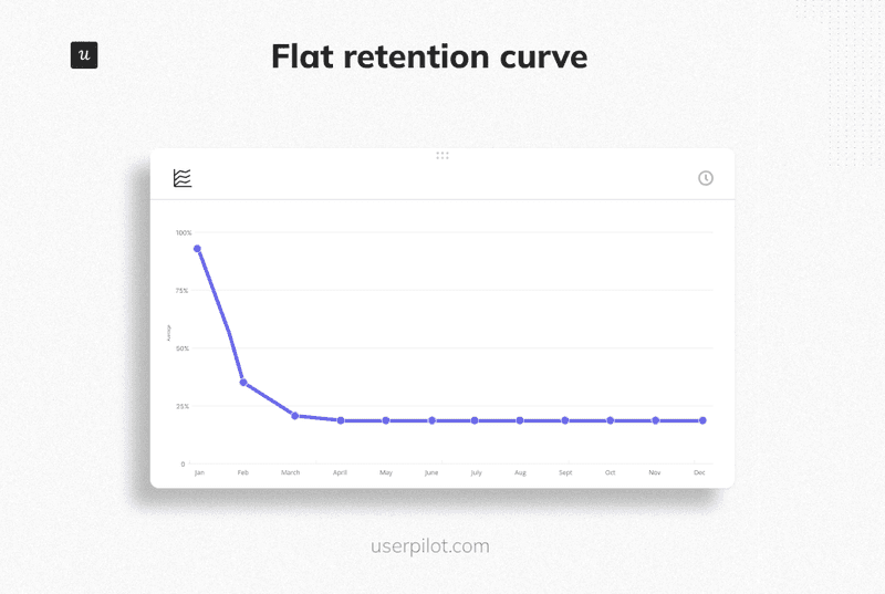
This curve drops during an initial period as bad-fit users leave, then stabilizes at a consistent level above zero. This stable section is your “terminal retention rate.”
- The diagnosis: You’ve achieved product-market fit, and the flat section shows your product stickiness. The retained customers have made your product part of their regular workflow. Predicting long-term value is facilitated by identifying the point at which this happens.
- The fix: Raise the floor where your curve flattens. The higher this level, the healthier the business. The median B2B SaaS retention rate is 85%, but top-quartile companies maintain performance above 92%. Focus on continuous product optimization so that each new cohort stabilizes at a higher level.
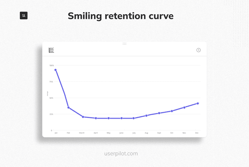
3. The smiling curve (The hyper growth phase)
This curve drops initially, stabilizes, then goes back up.
Here, you may see retention rate exceed 100% or more users come back at scale. Smiling curves show that a product is truly exceptional.
- The diagnosis: Dormant users are reactivating, or existing accounts are expanding faster than others are churning. This happens because of strong network effects (like Slack, Evernote, and Notion). Users return because their colleagues join, or the data they stored becomes valuable again.
- The fix: Double down on features that encourage existing teams to expand and collaborate. Companies with total revenue retention ≥100% grow at 48% year-over-year, twice as fast as companies below that threshold.
How to construct the retention curve?
You can measure retention based on two factors: time frames and events. Building a curve that actually generates actionable intelligence requires a methodical approach and clean data management. Let’s see below how to achieve it.
Step 1: Define the critical event
Defining “monthly active users” merely as “logged in” skews your data. A user might log in only to cancel their subscription or export their information. You must track a Critical Event, the action that signifies value extraction from the platform. What active means will differ depending on your product and how it was meant to be used.
To find your Critical Event, start with early indicators based on your value proposition.
Which actions should best activate customers?
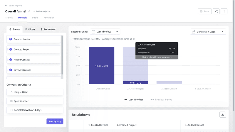
Then track these behaviors and analyze them through funnels to confirm whether they actually correlate with activation and retention. The action that shows up most consistently before sustained usage becomes your measurement standard.
Here are a couple of examples:
- Slack: sending a message.
- Spotify: playing a song.
- Zoom: hosting a meeting (not just scheduling one).
Step 2: Choose your method for calculating retention
There are two primary ways to calculate retention. For B2B SaaS, I recommend the second approach to avoid false negatives.
- Short-term retention: “Did the user come back exactly on Day 7?”. This is too strict for business software, where usage might not be daily.
- Monthly retention: “Did the user come back anytime on or after Day 7?” (Best for B2B).
Using unbounded retention accounts for natural usage gaps, such as weekends or holidays, gives you a more accurate picture of customer health. It tells you if you have lost them forever, rather than just for a day.
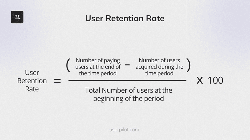
To calculate the retention rate, subtract the number of new customers acquired during the period from the total at the end, then divide by those at the start and multiply by 100.
Step 3: Segment by cohort
Looking at total users together hides important patterns, such as older customers churning while new sign-ups mask the decline. Cohort retention analysis tracks the customer lifecycle over a defined period to detect rate fluctuations.
You must use cohort analysis to identify trends by when they signed up (“January sign-ups” vs. “February sign-ups”). This can reveal which product update or marketing campaign is actually lifting the baseline. Understanding how retention varies by geography, gender, or behavioral characteristics can also provide a clearer picture of your audience.
How to perform retention analysis?
I’ll show you how to perform retention analysis. Visualizing this data can help identify trends and anomalies in behavior.
You can generate reports automatically using the Retention Report feature.
- Step 1: Specify your key metrics. Define how you’d like these measured and filter your data. You can segment by user properties (role, company size), behavior patterns (completed onboarding vs. didn’t), or any custom attributes relevant to your product. A customer engagement score shows you how healthy they are.
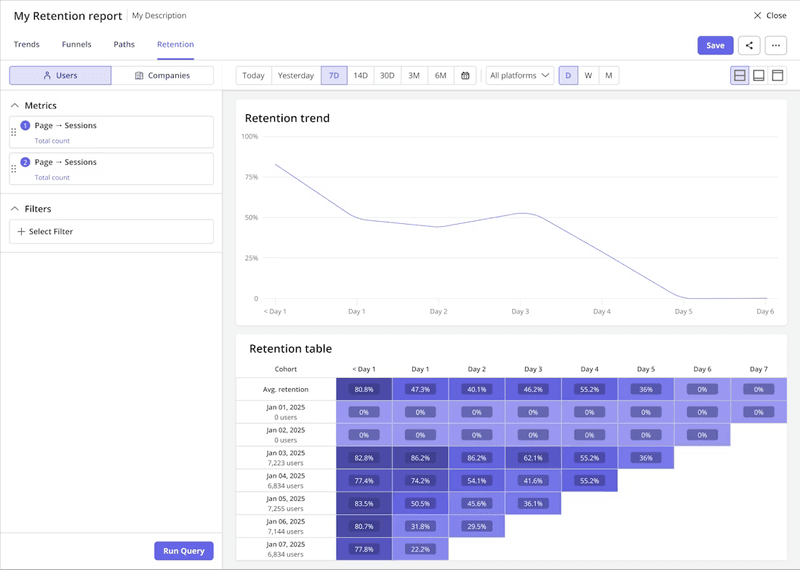
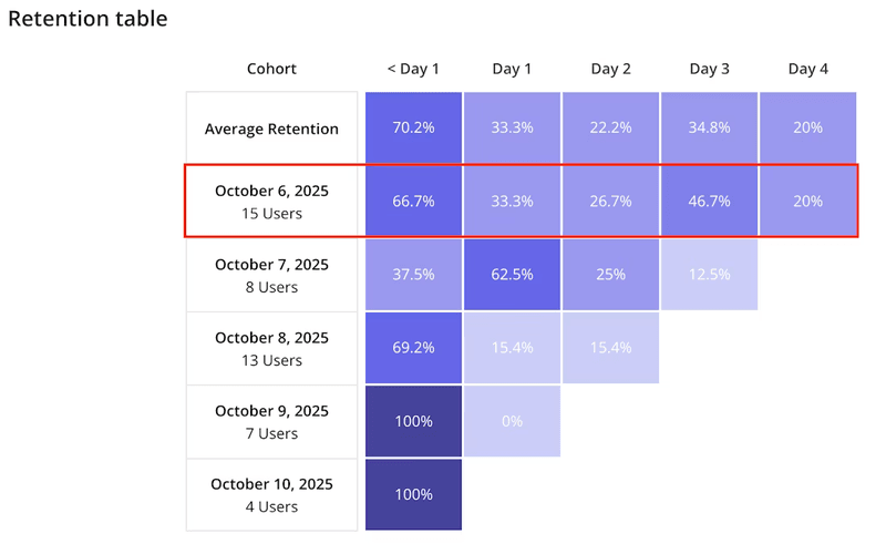
- Step 2: Run the query and specify data presentation. Choose between visualization options: retention trends (the actual curve) or retention tables (the first column performance breakdowns showing exact percentages at each time interval).
- Step 3: Analyze the report using the retention trend or table. The trend shows whether your overall pattern trends, flattens, or smiles. The table breaks down specific cohort performance across time periods, letting you spot patterns in how different groups behave. These curves help you identify user behavior and measure the effectiveness of your strategies.
- Step 4: Apply cohort comparisons. When I run this analysis on users who completed our onboarding checklist versus those who didn’t, I typically see that completers show 65% Week 4 retention compared to 35% for those who skipped it. That 30 percentage point difference proves onboarding value.
How to improve user retention based on drop-off moments?
Once you have your curve, you can see exactly when users leave. Optimize your interventions based on where the drop-off occurs on the X-axis. Identifying these points helps teams decide whether to fix onboarding or improve mid-term engagement.
Phase 1 (Day 0-7): Optimize for Aha! moments
The problem: The retention curve drops in the first week. Users sign up but never reach the “Aha! Moment.” Data indicates that retention typically halves within this period, falling from 26.5% on Day 1 to 12% by Day 7. This is usually a failure of guidance rather than a product. A steep initial drop suggests issues with onboarding or the first experience.
The fix: Frictionless activation
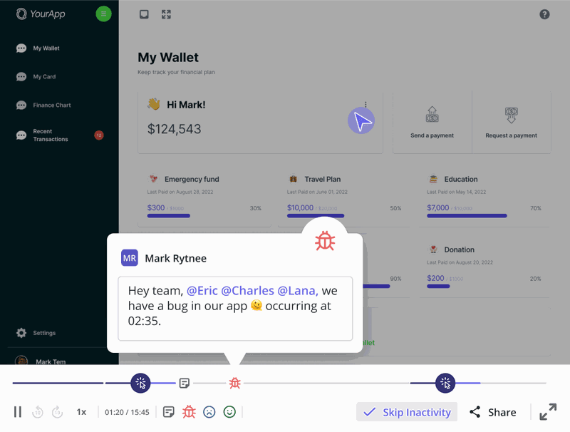
1. Analyze the drop-off. Use funnel analysis to find the exact screen where users quit (email verification, team invites, complex configuration). Then, watch session replays from those who quit at these steps to see cursor movements, clicks, and hesitations that reveal confusion or frustration triggering abandonment. Tracking customer behavior gives you insights into engagement and drop-off patterns.
2. Remove the friction. Shorten the time to value by removing obstacles for new users. Cut unnecessary steps between signup and getting value, and replace passive product tours with in-app guidance that pushes toward meaningful actions.
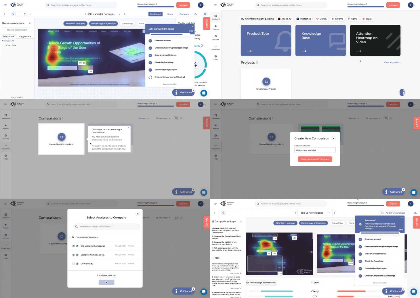
3. Gamify the onboarding. Add onboarding checklists to increase engagement rather than showing everything at once. Smooth onboarding can bend the curve upward. You can also use interactive walkthroughs to teach by doing, which work better than passive tutorials.
Phase 2 (Day 7-30): Fix the habit loop
The problem: Users make it through the first week but don’t stick around long-term. They got value once, but failed to build a habit loop.
The fix: Contextual feature discovery
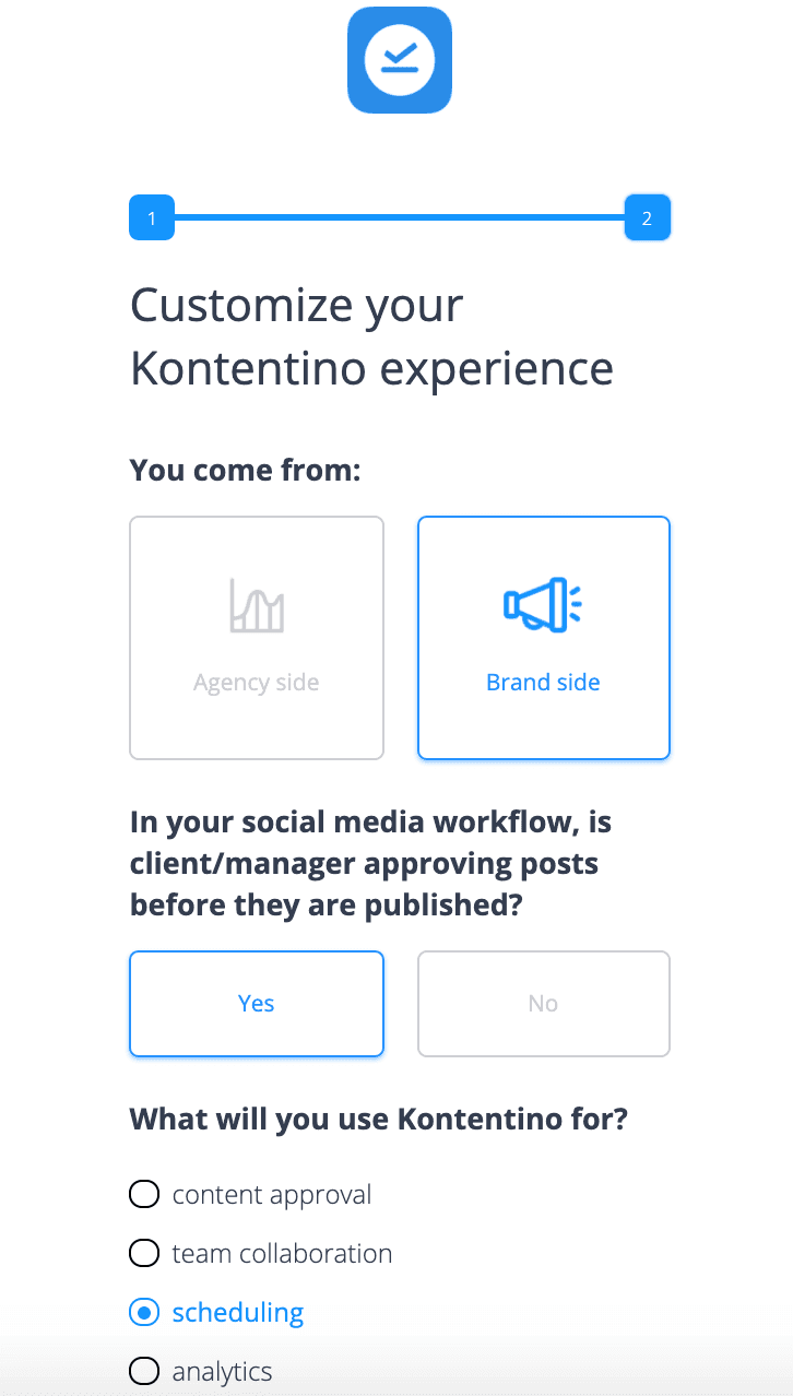
1. Segment by role. Forcing a marketer through a developer onboarding guarantees churn. Instead, use segments to deliver experiences that match the user’s role. You can do that by setting up a “Choose your own adventure” flow that confirms the intent and helps trigger an appropriate educational flow.
2. Target based on behavior. Identifying power users and understanding their behaviors can help improve retention by creating strategies that motivate less-engaged customers to behave similarly. Use feature engagement data to see exactly which crucial features the customers aren’t using. Trigger contextual guidance only when they encounter those specific underutilized features.
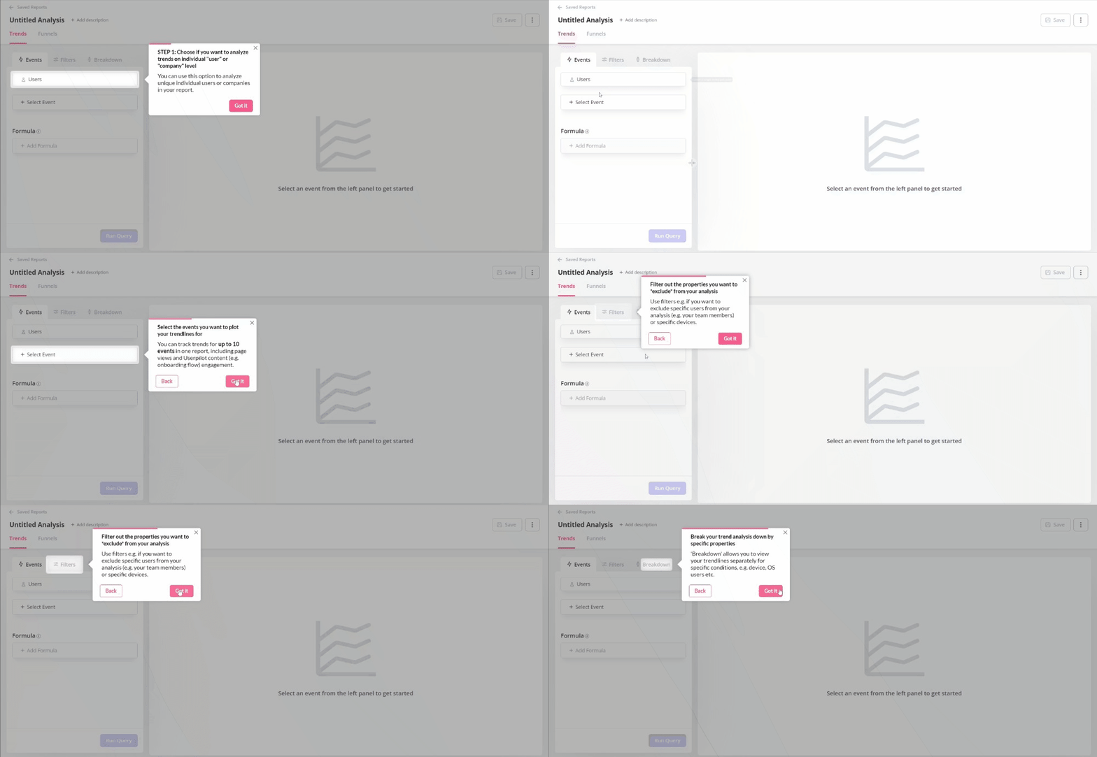
3. Implement secondary onboarding. Introduce advanced features contextually, after the user is settled. Use contextual tooltips triggered by behavior. For example: “IF the user has > 10 data entries AND has not visited Reports, THEN show a tooltip pointing to the Reports tab.” This helps drive retention exactly when it is relevant to their workflow.
Phase 3 (Day 90+): Re-engage users and demonstrate value
The problem: Long-term users leave after finishing their project or if they switch to a competitor. They gradually drift away as your product stops being top-of-mind. This is called “Value Exhaustion.” Retention analysis allows you to understand customer behavior when it comes to using and abandoning your offering.
The fix: The re-engagement loop
1. Gather qualitative data: Behavioral data is less useful here because the user is inactive. Use churn surveys or analyze NPS feedback to determine whether the issue is pricing, features, or support. Direct feedback reveals the “why” behind churn that behavioral data cannot. Additionally, proactive voice of customer initiatives, such as establishing Customer Advisory Boards, ensure new capabilities meet needs.

2. Send value-based re-engagement emails: Send behavior-based emails to your user base. Refer to how long they haven’t logged in, remind them of what tasks they left unfinished, or highlight what changed in the product since they left. Email tools connected with your product data will let you do that easily based on behavior triggers. Engaging customers who might leave by analyzing their behavior before they churn can help retain them.
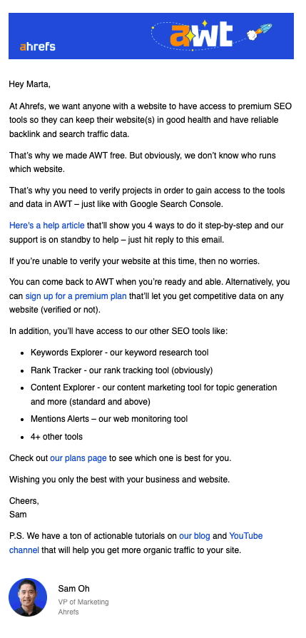
For example, Ahrefs sends targeted emails showing users they’re missing out on competitive insights since they stopped monitoring their keywords.
You can also use surveys for quick win-backs. When users say price is why they left, show a discount code right away. When they say a feature was too hard, add a button to book a support call.
3. Guide users back: When they return, don’t send them to an empty dashboard. Trigger a specific Fflow for revived users to immediately guide them to new features. Start with a welcome message acknowledging their absence: “Welcome back! Here’s what you missed.” Show the tangible product improvements that happened during this time to rebuild their confidence in your development velocity. The more you can get them engaged quickly, the less likely they are to churn.
Fix your customer retention curve and lower churn
No growth hack fixes a broken product. When your retention curve trends to zero, you need to fix your offering, not your marketing. But if your product delivers value and the curve is still declining, you need to take a closer look at your retention strategy.
Userpilot gives you both measurement and intervention tools. Product analytics, session replays, and surveys show you where retention breaks. Engagement tools help you guide users based on what they actually do. Predictive AI can identify at-risk customers before they churn, allowing for targeted campaigns.
FAQ
What is user retention, and why is it important?
User retention measures the percentage of users who continue using your product over a defined period. It matters because acquiring new customers costs 5-25x more than retaining existing ones. High retention indicates Product-Market Fit and predicts long-term business sustainability. Companies with strong retention grow with better acquisition efficiency than those constantly replacing churned customers.
What is a good customer retention rate for SaaS?
Retention varies wildly by product type. Comparing a consumer app to enterprise software would not help here. Instead, use these benchmarks as early signs while focusing on month-over-month improvement:
- Consumer/mobile: Anecdotal data suggests terminal retention of 15-20% is often exceptional, given the high competition and low cost of switching. Products with network effects (social apps) get higher rates than utility apps.
- SMB B2B SaaS: Successful companies maintain annual churn below 5% and retention above 85-90%. Performance below 80% signals serious product or service problems. At this level, it correlates directly with quality and how much you invest in customer success.
- Enterprise SaaS: Enterprise businesses should expect near-perfect logo retention because switching costs are high and integrations are deep. Top-quartile B2B SaaS companies with $25k-$50k contracts achieved Net Revenue Retention of 111% in 2025. Enterprise retention below 90% points to customer success failures, not product problems. Low performance at this scale means the sales team sold to customers who weren’t a good fit.
What are the common mistakes when analyzing retention curves?
- Averaging cohorts incorrectly: Calculating a weighted average will obscure critical behavior patterns you need to see. For instance, if you released a buggy feature in March, that cohort’s retention will be terrible. Averaging March with January and February hides the reason for the drop. Instead, analyze them separately to identify poor releases, ineffective acquisition campaigns, or seasonal patterns. Each tells you what was happening in your product and market at that specific time.
- Ignoring seasonality: B2B products see predictable drops around weekends, holidays, and vacation seasons (summer, December). Using daily retention without accounting for this makes a holiday weekend look like catastrophic churn. Factor in natural patterns. B2B products see lower weekend usage while consumer offerings often see the opposite.
- Focusing only on revenue retention: Net Revenue Retention matters for valuations, but it can hide user dissatisfaction. You might have 110% NRR because big customers are expanding, while 40% of small ones churn. Always look at Logo Retention (user count) alongside revenue to see the full picture. High NRR with declining logo retention means you’re becoming dependent on fewer, larger customers. That’s risky because it limits your market reach and increases customer concentration risk.

