11 Analytics Dashboard Examples for SaaS Insights [+ Best Tools]

![10 Analytics Dashboard Examples to Gain Data Insights for SaaS [+Best Tools]](https://blog-static.userpilot.com/blog/wp-content/uploads/2024/03/10-Analytics-Dashboard-Examples-to-Gain-Data-Insights-for-SaaS-Best-Tools-1024x670.png)

We get it. “Data-driven decisions” is the mantra of the modern business. But with data gushing from every app, platform, and spreadsheet, it’s easy to end up drowning in numbers instead of swimming in insights.
The solution? A well-built analytics dashboard. But not just any dashboard. You need one that’s tailored to your business, easy to use, and packed with actionable insights.
If you’re looking for inspiration, here are 11 analytics dashboard examples to help you build your own.
What makes a great analytics dashboard?
Too often, dashboards fall into the trap of data overload, “feel-good” key metrics yet vanity, static display. To make your dashboards work, here are a few things to consider:
- Clear: A dashboard should be designed to clearly deliver the right information to its target audience and display changes and trends in data over time.
- One-click away: The most important data should be prioritized and immediately accessible, ideally just one click away, so users can quickly get the information they need.
- Intuitive: It should also be intuitive, with a user-friendly interface that can be easily understood by different viewer personas.
- Customizable: Dashboards should be customizable so that they can present data or key metrics across different time periods or for different customer segments.
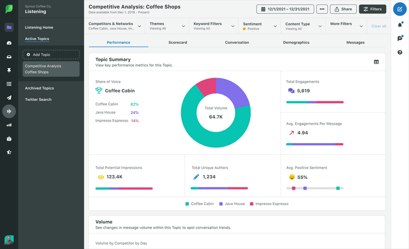
- Know which account is most used by your audience.
- Identify the kind of social content that gets you the highest reach and resonates the most with your audience. You can also find out the platforms on which this type of content is the most popular.
- Evaluate the performance of your social media marketing campaign.
- Discover the account that has the highest engagement level or conversion rates.
- Get actionable insights to further strengthen your social media strategy to meet specific business goals.
11 Analytics dashboard examples for SaaS
Dashboards are built for different aspects of your business, such as feature usage, customer journey, and digital marketing. Therefore, you need to keep different dashboards for different types of analytics.
Here are 11 analytics dashboard examples.
1. Web analytics dashboard
Web analytics dashboards use data generated by customers visiting and interacting with your website. The web analytics dashboard showcases important metrics such as website traffic sources, sessions, bounce rates, devices, unique pageviews, new visitors, and returning visitors.
Web analytics enables you to understand your website’s visitors and use the insights to improve customer experience. It also helps you optimize your content marketing efforts and SEO strategy.
For instance, you might find that your most popular traffic source is organic traffic, while the least effective one is paid channels. Consequently, you would have to invest more resources in your organic strategy.
Google Analytics dashboards give you all-encompassing insights into website activities. By simply logging into your Google Analytics account, you can create reports about your acquisition channels, conversion rates, and engagement levels.
2. Digital marketing dashboard
While web analytics offers rich insights into the performance of your site, digital marketing analytics is much more specific.
A digital marketing dashboard provides a thorough understanding of the impact of your marketing strategy on metrics like conversion rates and digital engagement. It precisely tells you where and how to improve your marketing efforts.
For example, you can use digital marketing analytics to track how individual leads and prospects interact with your digital channels over time. Did an individual find your website via Facebook? Are they converting for paid ads posted on Facebook? Such insights guide your future marketing strategies.
Moreover, digital marketing analytics allows you to gauge the relationship between marketing channels. You can track essential metrics across all digital channels, like blogging and email marketing, and check how multiple channels perform together.
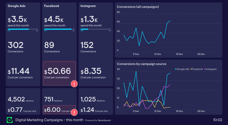
The diagram below shows that although the company spends only $1,000 more on Facebook than Google, the cost per conversion for Facebook is far higher.
On the other hand, Google Ads results in the highest number of conversions. This suggests that the company should shift resources from Facebook to Google Ads to be efficient.
3. Business insight analytics dashboard
On the one hand, you can perform web analytics or user behavior analytics to get specific insights. On the other, you can gather insights based on your overall business goals.
Business insight analytics uses key datasets based on business objectives to improve business decisions. As a SaaS product growth manager, your job is to choose the KPIs that define the success of your business and build dashboards accordingly.
Most companies use databases to organize and store big datasets. Analyzing these data provides information on a wide range of business topics. With the right reporting, you can share dashboards to establish cross-team transparency and alignment with business goals.
4. Social media dashboard
Social media analytics involves collecting and analyzing data based on KPIs from one or several social media accounts. Some core social media metrics include the number of impressions, page reach, audience, post link clicks, etc.
The social media dashboard enables you to gain a deeper understanding of your social media audience. The dashboard helps you:
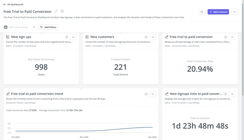
5. Trial to paid conversion dashboard
Your free trial is the gateway to paid subscriptions. It’s where users get to experience the value of your product firsthand. But how do you ensure they don’t just walk through the gate and then wander off?
The trial-to-paid conversion dashboard helps you track the effectiveness of your free trial and identify any leaks in your conversion funnel. It’s like having a map that shows you exactly where users are getting lost on their journey to becoming paying customers.
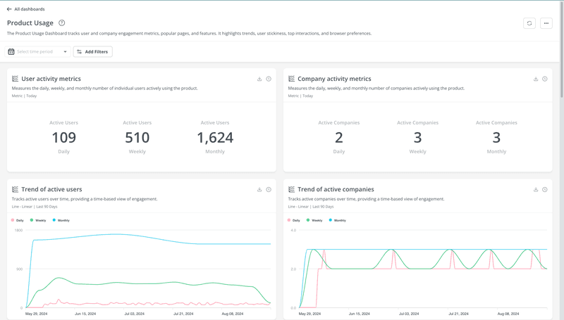
6. Product usage analytics dashboard
In-app product usage analytics lets you see how and when customers are using your product. It helps you make data-driven decisions to boost engagement, increase conversion, and reduce churn. But how does that happen?
By tracking important metrics across several customer segments, you can determine what aspects of your product are the most appealing to each segment.
A product usage analytics dashboard can also highlight data on user interactions during specific time periods. This will enable you to personalize the customer experience and improve engagement.
This data analytics dashboard can also signal potential churn with user stickiness and retention analysis.
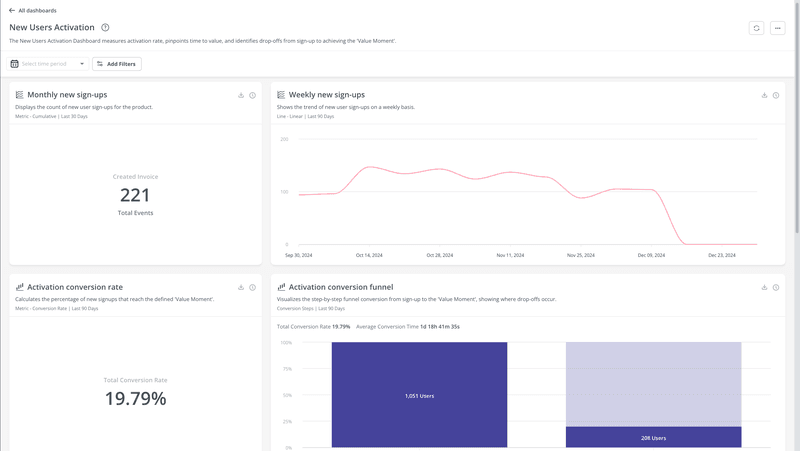
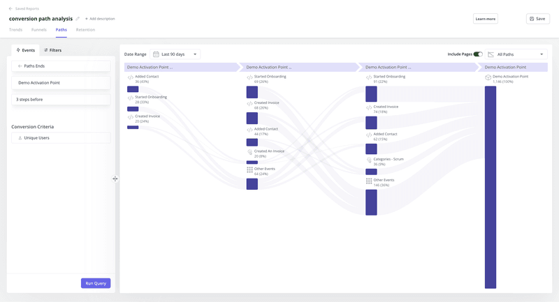
7. User journey analytics dashboard
Track customers across all stages of the customer journey to reflect on and enhance the customer experience.
Here you collect data on each individual user and track metrics like the average length of a user session or how often the customer uses a particular feature in a month.
You can leverage data from the user journey analytics dashboard to map out the path a user takes from signing up to becoming an active customer who also refers your product to others.
This user journey mapping focuses on user interactions with your product. It helps you discover the friction and drop-off points that prevent users from moving forward to the next stage.
You can use customer journey analytics for several user segment categories, like onboarding, engagement, marketing, and revenue.
Below is the user activation dashboard that shows important metrics and reports that reflect user behavior during the activation stage.
8. User behavior analytics dashboard
Customer behavior analytics tells you what customers are doing on your app, learn why they do it, and how you can use data to improve their experience.
The dashboard provides valuable information on user behavior that you can use to segment customers. Identify patterns that either lead to customer success or failure.
For example, you can follow the happy paths taken by power users to identify your strengths and capitalize on them to increase customer success.
Moreover, behavioral analytics offers insights into every user’s milestones in their journey. You can also measure the adoption rate of new features and use onboarding elements like tooltips to drive user engagement if needed.
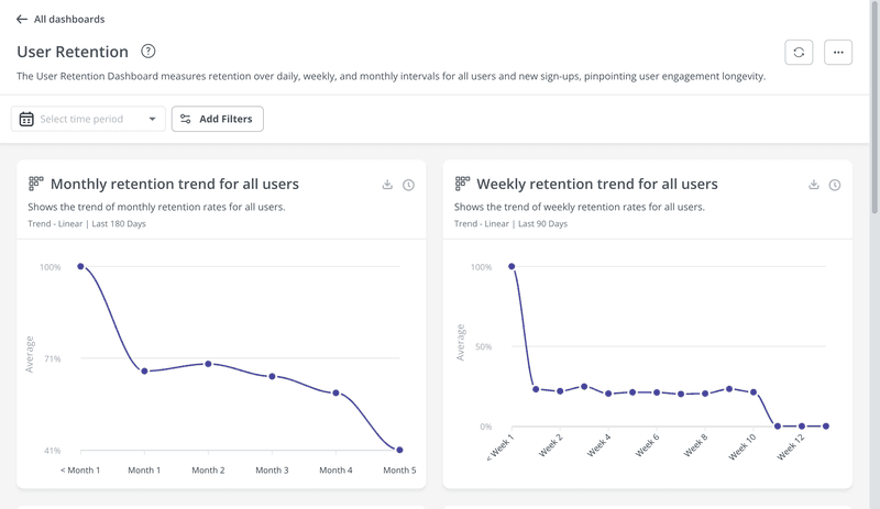
9. User retention dashboard
Such data analytics dashboards show trends and metrics related to retaining customers. This dashboard helps SaaS companies analyze trends, identify issues, and make informed decisions to improve customer retention strategies.
The user retention dashboard shows retention rates and trends for different user segments and for different time periods (daily, weekly, and monthly). You can further filter this information for granular insights.
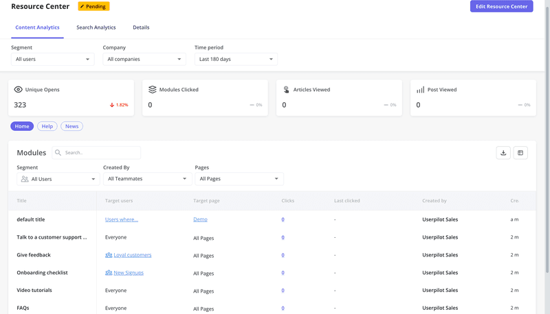
10. Knowledge base engagement dashboard
SaaS companies often use self-service support, such as an in-app knowledge base, to prevent frustration among customers.
The knowledge base engagement dashboard lets you track the real-time performance of self-serve content and see what can be improved or updated.
It lets you know how customers engage with your knowledge base content. You should cross-reference the data with support tickets to see what content is helpful and what is not.
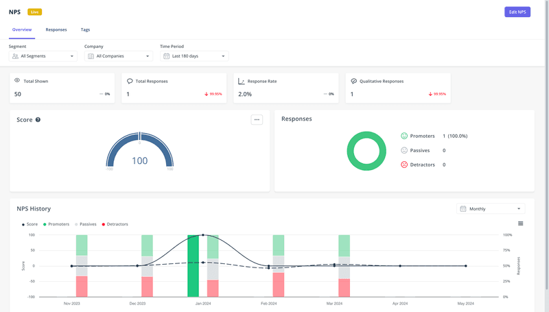
11. Net Promoter Score analytics dashboard
The NPS dashboard shows your NPS score and the percentages of promoters, passives, and detractors. It also displays user sentiment analysis charts, trend charts, and distribution charts.
In-app NPS surveys are used to collect user sentiment data by asking users about their likelihood of recommending your product to others on a scale from 1 to 10. Detractors give a score of 6 or below and are the most likely to churn. On the flip side, promoters are your power users who rate you 9 or 10.
By observing trends in NPS scores over time, you can check the impact of churn reduction strategies on the percentage of detractors. It’s also possible to use loyalty programs and personalization to convert detractors and passives to promoters.
Conclusion
Now that you’ve gone through the analytics dashboard examples, you can start focusing on the different types of product analytics and improve your product growth efforts.
About the author