Behavior Patterns UX: 8 Types & How to Identify Patterns With Data Analysis

Looking for ways to uncover behavior patterns (UX) and optimize your product experience? In this article, you’ll learn:
- Behavioral design principles to incorporate in your user interface and experience.
- Six methods to identify behavioral patterns that influence user behavior.
- Step-by-step process to perform behavioral pattern analysis and improve your UX.
Summary of UX behavior patterns
- User behavior patterns are the systematic ways users interact with a website and app. Understanding these patterns helps behavioral designers identify usability issues, spot user needs, and inform future app development efforts.
8 behavioral design principles to help users enjoy your tool better:
- Deferred choices
- Progressive disclosure
- Satisficing
- Safe exploration
- Instant gratification
- Habituation
- Incremental construction
- Easy repetition
Strategies to identify user behavioral patterns in your product:
-
- User interviews
- Focus groups
- Feedback surveys
- Funnel analysis
- Path analysis
Step-by-step process for performing behavioral pattern analysis
- Analyze the user persona for your target audience
- Collect data to recognize repeat users’ behavior
- Identify which UX aspect needs to improve
Userpilot helps teams like yours understand user behavior through in-depth product analytics and customer feedback surveys. Book a demo now to begin.
What are user behavior patterns?
User behavior patterns are the typical ways users interact with products, services, or interfaces, revealing their habits, preferences, and decision-making processes.
These patterns encompass a range of activities, including how users navigate, how they search for information, the features they use most frequently, and their responses to various design elements or content types.
Analyzing behavior patterns helps you identify usability issues, uncover user needs, and inform future design.
8 Behavioral design principles to incorporate in your user interface and experience
Below are key behavioral design principles to incorporate into your tool, along with examples of how other companies do it.
1. Deferred choices
The deferred choices behavior pattern involves delaying decisions until they are necessary, reducing the effort required from users. This principle assumes that users face analysis paralysis when contended with too many options.
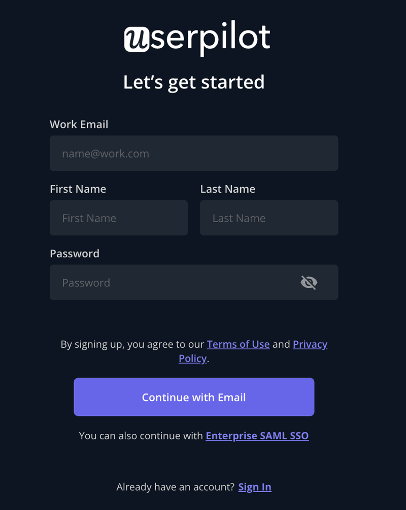
To side-step this, take intentional steps to make tasks easy for your users. For example, long sign-up forms can deter users from completing the registration process due to their complexity and time commitment.
By deferring non-essential choices to later stages—such as company name, job title, or account preferences—users can quickly sign up and engage with the product, reducing form abandonment rates.
2. Progressive disclosure
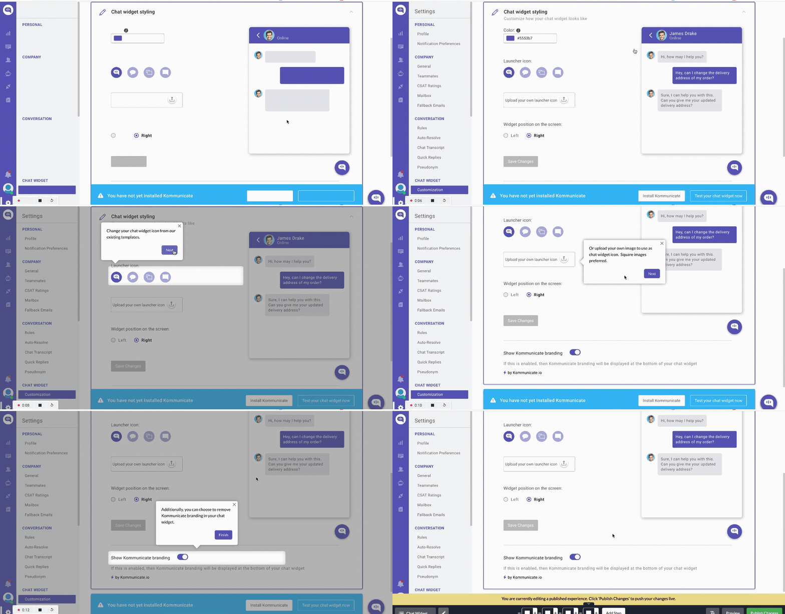
Progressive disclosure means strategically revealing information in stages, presenting only what the user needs at a particular moment. This keeps your UI simple and minimizes overwhelm, allowing users to focus on the task at hand.
A good example of progressive disclosure in SaaS is an interactive walkthrough that reveals key activation tasks one step at a time. This onboarding approach enhances engagement and drives product mastery because users learn by doing.
3. Satisficing
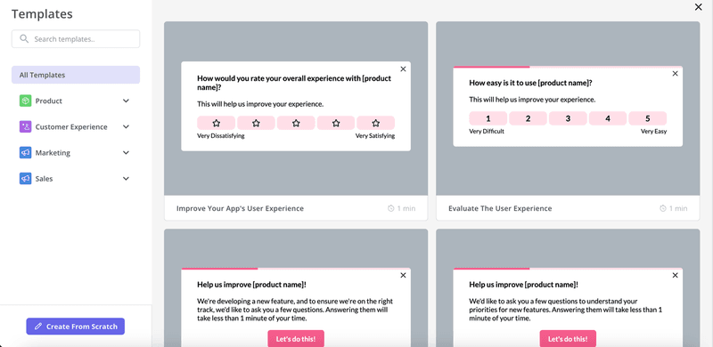
This behavioral design principle comes from two words: satisfying and sufficing. It’s the tendency for users to choose a ‘good enough’ option rather than expend significant effort to find the absolute best solution.
For example, say your platform provides users with a template library for building feedback surveys. Most will open the library and check out the first template that meets their needs. Once it’s satisfactory enough, they won’t bother checking if there are better options.
The key takeaway here is to always make the most important actions and pathways obvious. Reduce unnecessary complexity to accommodate the natural tendency of users to satisfice.
4. Safe exploration
Ever ventured into a new tool for content creation or quick design and worried about losing your progress if you navigated away? Luckily, modern app UI usually auto-saves progress and provides options to save, undo, and redo.
This is a safe exploration at work. This design principle involves providing users with the freedom to experiment and navigate without fear of irreversible consequences.
For example, features like auto-saving in Google Docs ensure that users can explore different formatting options, edits, and revisions, knowing that their work will not be lost. This security enables more creative and fearless interaction with the software, improving overall user satisfaction.

5. Instant gratification
It’s normal human behavior to desire immediate rewards upon completing an action.
Your users aren’t any different; delivering some sort of reward for hitting milestones helps boost engagement, especially early in the user journey.
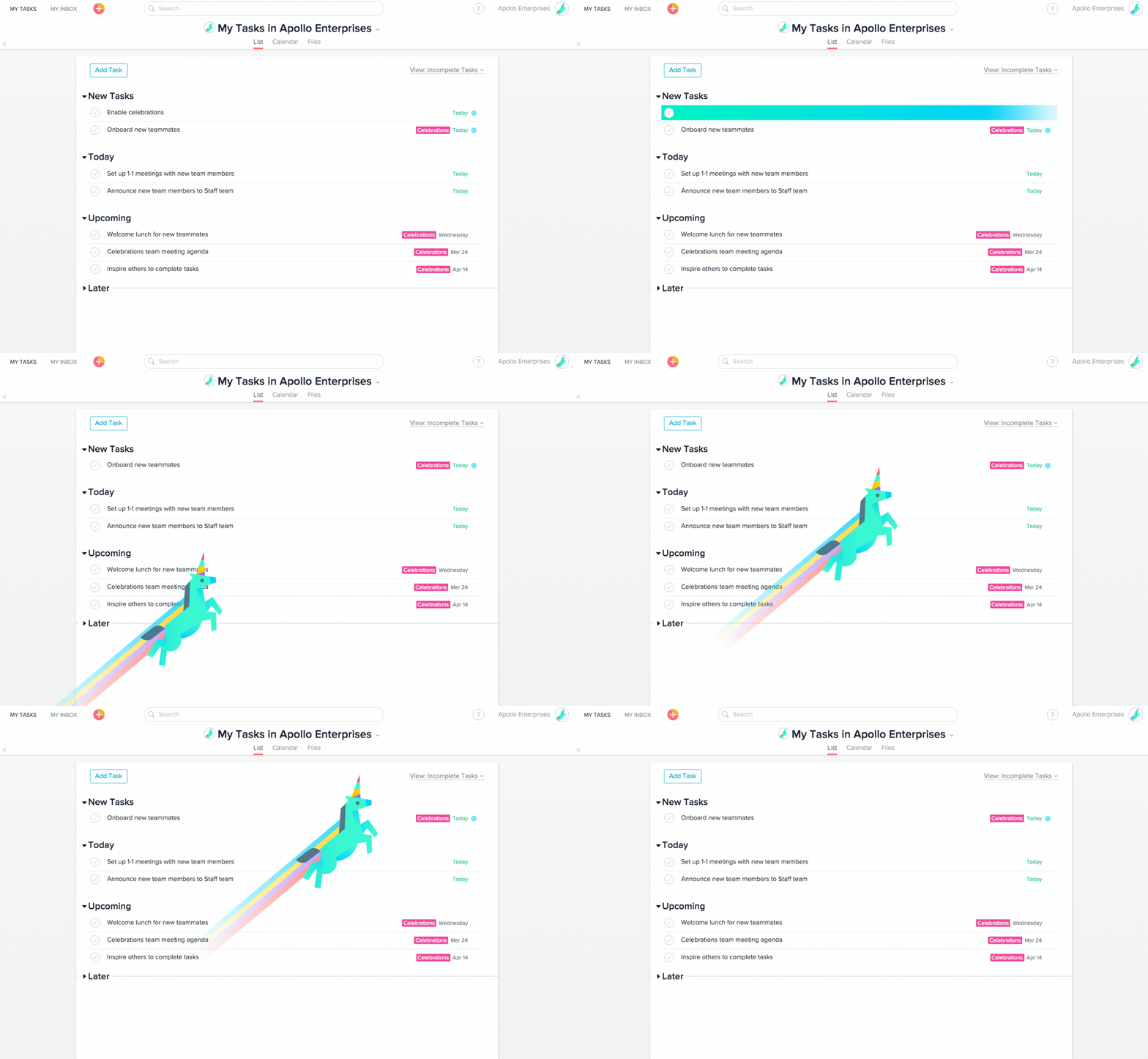
Asana understood this behavioral design principle, so they gamified their onboarding process: a magical unicorn appears each time new users complete onboarding milestones.
This mystery drives users to continue engaging and see what will appear next.
6. Habituation
Habituation is the process of becoming accustomed to repeated patterns.
This principle relies on consistent design systems and conventions that, once learned, reduce the cognitive effort needed to navigate and use a new app. Essentially, habituation is where UX development and behavioral design intersect.
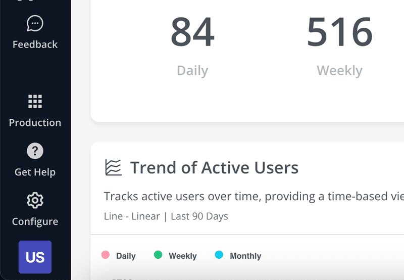
The widespread use of a gear icon to represent settings is an example of habituation. Users have come to expect that clicking on a gear icon will lead them to a settings menu based on their experiences with other platforms.
7. Incremental construction
This behavioral design principle allows users to build or create something in a non-linear fashion, giving them the flexibility to approach tasks in a way that best suits their workflow.
It caters to different styles of working, making the platform more accessible and user-friendly.
Here are two behavioral design examples that demonstrate incremental construction:
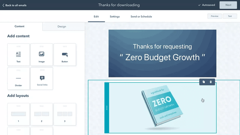
- Design tools such as Figma allow users to add elements and customize them in whichever order they prefer without forcing users to follow a strict sequence.
- HubSpot’s email builder gives users creative freedom to build emails by dragging and dropping elements however they prefer.
8. Easy repetition
Easy repetition focuses on reducing friction for tasks that users need to perform repeatedly, streamlining the process to save time and effort.
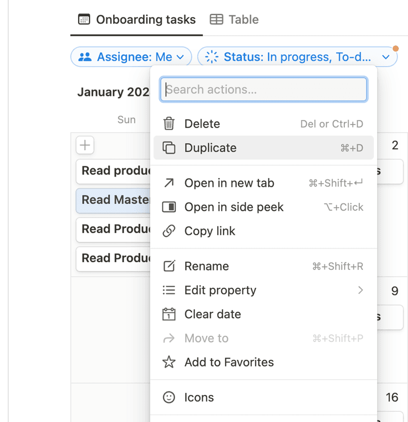
This principle often involves providing templates or implementing features that allow users to duplicate previous actions with minimal steps.
For example, Notion’s task creation feature lets users easily duplicate existing tasks, making it simpler to manage recurring tasks or to use previous work as a template for a new one.
This not only speeds up the task management process but also enhances the user’s ability and motivation to continue engaging.
Ways to identify behavioral patterns that influence user behavior
Here are some strategies to help you understand user activity and spot patterns in their behavior:
- User interviews: User interviews provide in-depth, qualitative insights into why users behave the way they do. To begin, segment a representative sample of your users and ask them open-ended questions to probe their motivations and pain points.
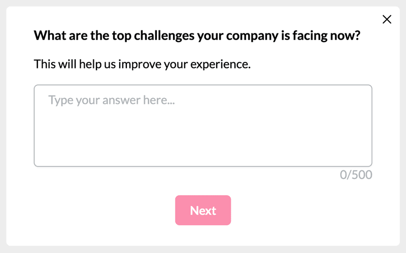
- Focus groups: A focus group is a moderated discussion with a small group of users, where you can explore their collective opinions and experiences around specific topics. To facilitate focus group discussions, trigger an in-app modal or send an email inviting users to register and participate.
- Feedback surveys: Conduct in-app surveys to understand how users feel about your product and where they face problems. Surveys are also great for collecting feature requests and seeing product additions users wished they had.
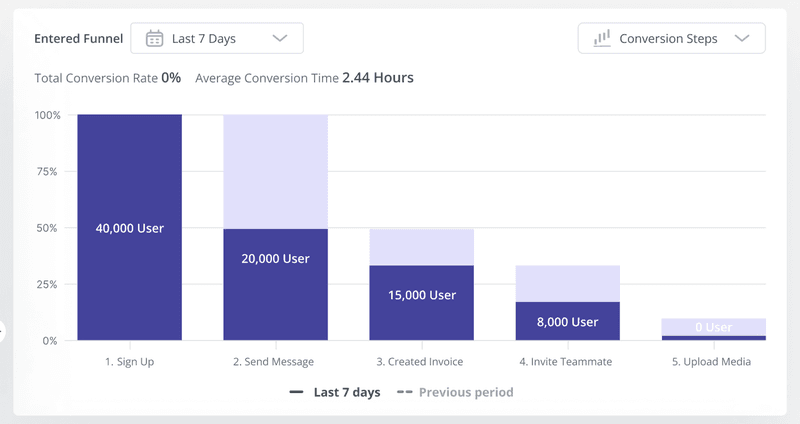
- Funnel analysis: Use tools such as Userpilot to track how users progress through each funnel stage. Analyze the funnel analysis report to identify where users are more engaged and parts of the funnel where drop-offs happen the most.
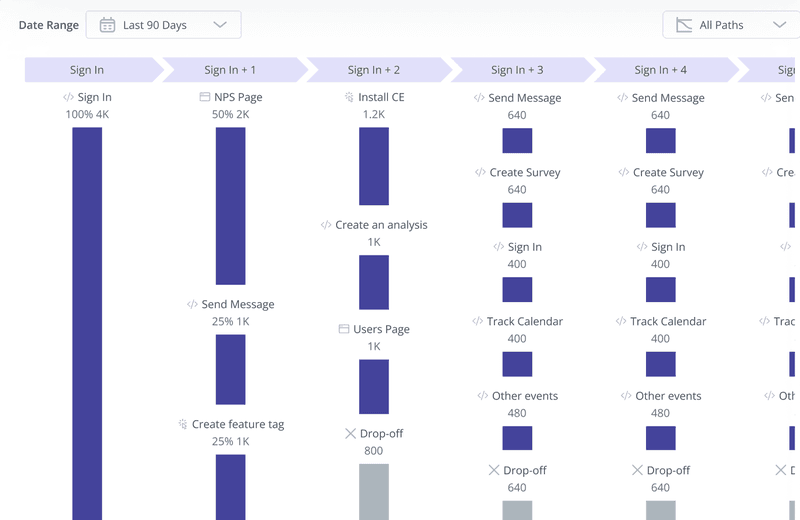
- Path analysis: Track all the paths users take to achieve specific in-app goals. Identify happy paths to reduce churn and improve conversion rates. Users who aren’t on the happy path often lose engagement out of frustration.
Step-by-step process for performing behavioral pattern analysis
Follow these steps to understand user behavior and gather insights to improve the user experience.
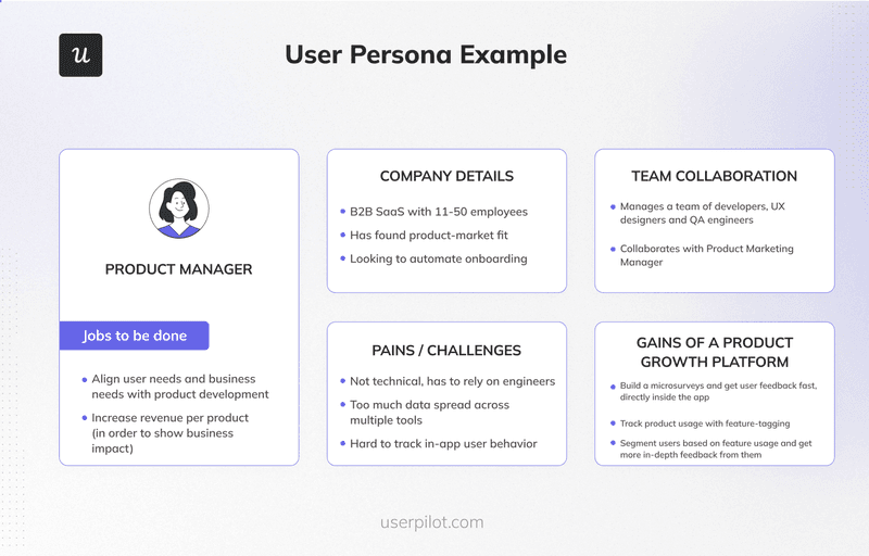
1. Analyze the user persona for your target users
Start by creating detailed profiles of your typical users, focusing on their goals, needs, frustrations, and preferences. These personas should be based on real data and insights from user research.
Next, analyze the user journey maps for your ideal users and observe how they use your tool.
2. Collect data to recognize repeat user behavior
Use tools such as funnel analysis, user interviews, surveys, etc., to understand how users navigate, engage, and interact with different features.
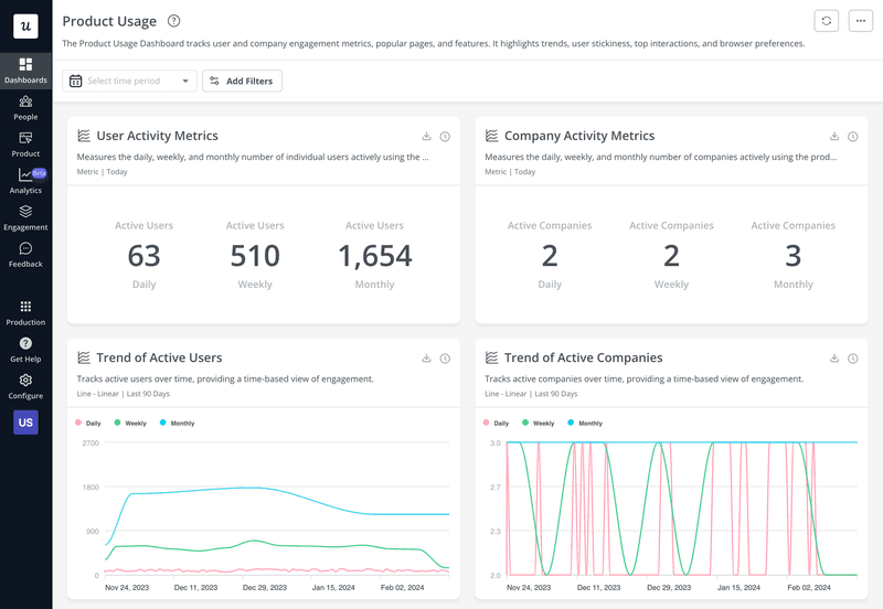
Put your key reports together in a product usage dashboard (like the one below) to analyze multiple reports in one place and spot recurring patterns.
3. Identify which UX aspect needs to improve
Based on the behavioral patterns, identify aspects of your UX that are not meeting user needs or are causing friction, then create contextual solutions.
For example, imagine you noticed most users abandon the onboarding flow at some point. That’s a sign that your onboarding may be too complex.
Once you identify the problem and propose a solution, your UX designers can work on simplifying the onboarding by making it shorter.
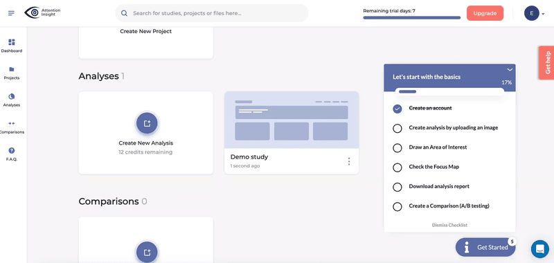
That’s exactly what Attention Insight did to solve their low activation problem.
Conclusion
Regular user behavior analysis helps you stay informed about user needs and preferences.
That way, you can make improvements based on behavior patterns (UX) and enhance the customer experience. Ready to begin? Book a demo call with our team and get started.


