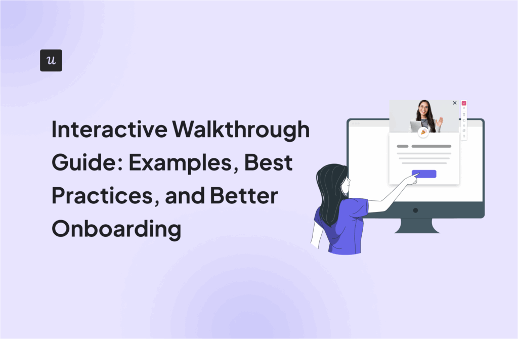
In-App Messaging: Definition, Types, Use Cases, and Best Practices

As a customer success manager at Userpilot, I’ve worked closely with many product and marketing teams who struggle to keep their users engaged after signup. Often, this comes down to missing one critical step—effective in-app messaging.
But great in-app messaging is more than just another pop-up. Done right, these messages don’t interrupt your user’s experience. Instead, they guide users toward value, helping your customers quickly understand your product during onboarding. By using in-app messages to educate new users and highlight key product features at the right time, you can drive engagement with app users from day one.
In this article, I’ll explain how in-app messaging works, how it differs from push notifications, and why it’s essential for your user onboarding strategy. Let’s get started.
What are in-app messages?
In-app messages (or in-product messages) are messages used to communicate with users while they interact with a mobile or web application.
Their main purpose is to engage users and prompt them to take action, provide guidance and support, keep customers up-to-date about product changes, and gather feedback.
What is the difference between push notifications and in-app messaging?
I often get asked about the key differences between push notifications and in-app notifications. Here’s how I usually break it down:
A push notification is sent directly from the server to the user’s device and appears on their screen even when they’re not using the application unless they have opted out of receiving them. Push notifications can be used for alerts, welcome messages, and reminders or to re-engage users who haven’t used the app for a while.
In contrast, in-app notifications are displayed within the app and can only be seen by users actively engaging with it. Users can dismiss it but cannot opt in or out from seeing it because it’s a part of the user experience.
Why implement in-app messaging in your company?
Embedding in-app messaging in your user experience offers clear benefits for your customers and your company. From my own customer experience here at Userpilot, here are some key reasons why you should implement in-app messaging:
- In-app messaging enables you to engage all active users.
- When combined with user segmentation, you can use them to target specific user segments, such as new users with personalized content.
- Their interactive nature promotes user engagement, which can be harnessed to facilitate feature and product adoption, promote customer advocacy, and drive account expansion.
- Contextually triggered in-app messages can help users overcome friction in their user journey, improving their experience and leading to higher customer satisfaction.
- In-app messages are easy to customize and can blend seamlessly into the UI to reinforce your branding.
- Thanks to product analytics, you can gather detailed insights on customer engagement with your in-app messages to refine your messaging and engagement strategy.
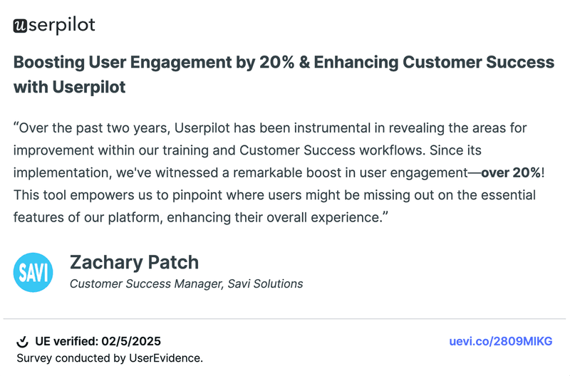
But don’t just take my word for it. Here’s what Zachary Patch, Customer Success Manager at Savi Solutions, said after implementing Userpilot:
How does in-app messaging work?
In-app messaging works by targeting users who are actively engaging with your app and prompting them to take action.
For example, I’ve seen teams successfully use a pop-up modal to introduce new features to their entire user base. These modals include a clear CTA button that triggers an interactive guide, helping users adopt the feature instantly.
I also frequently recommend using event-based triggers alongside user segmentation for contextual messaging. For instance, you could proactively support users who complete specific actions indicating they’re at risk of churning.
Types of in-app messages to use for web applications
Did you know that effective in-app messages can achieve an engagement rate as high as 44% for top-performing apps? Even medium-performing apps see an average of 26% engagement when combining in-app messages with push notifications—making it a powerful tool for improving user experience.
In my experience at Userpilot, I’ve seen firsthand how choosing the right type of message to send users can dramatically boost user engagement.
Let me quickly walk you through the most common types of in-app messages and when I’ve found each to be most effective.
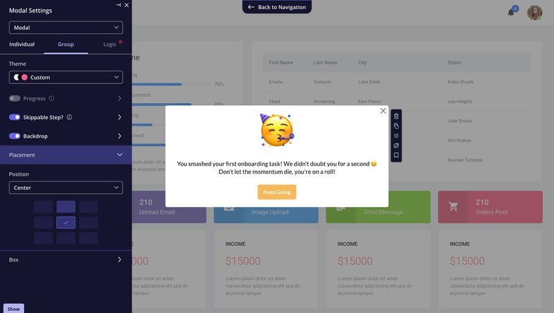
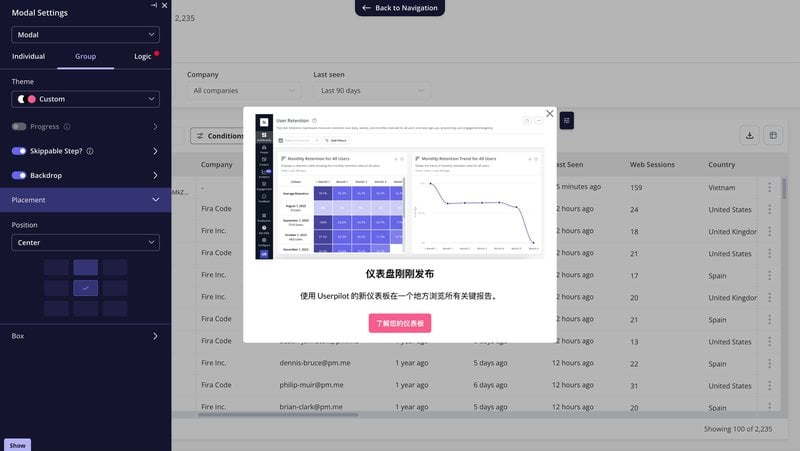
Modals
I often recommend modals as a UI pattern to help you effectively guide your users. They appear in the center of the screen, usually blurring or shading the background to focus user attention on the content. They also temporarily block interaction with other parts of your UI.
Modals work particularly well when you need your users to pay full attention, such as during onboarding or feature announcements. Common scenarios where I suggest using modals include:
- New features and updated announcements.
- Release notes.
- Welcome screens.
- Beta tester recruitment.
- Onboarding gamification.
Take a look at this modal created in Userpilot to announce a new feature:

Banners
Banners are horizontal messages that typically sit at the top or bottom of your app. They’re less intrusive than modals, allowing users to keep interacting freely with the rest of the app. I often suggest banners when your message is important but doesn’t demand immediate action.
While working with the customer service team, I’ve noticed that they frequently use banners to:
- Highlight special deals, discounts, or time-limited offers.
- Inform users about important updates, system statuses, or notifications.
- Provide helpful tips or guidance to enhance the user experience or to onboard new users.
- Advise users about cookies and privacy policies or to gather consent in compliance with regulations such as GDPR.
For example, we created a banner in Userpilot to remind users to verify their email addresses. This action is important but doesn’t block other interactions, making a banner the ideal choice.

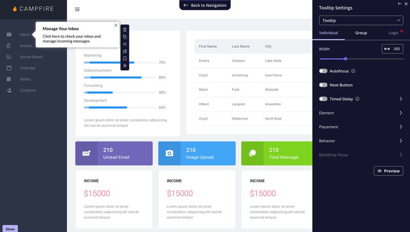
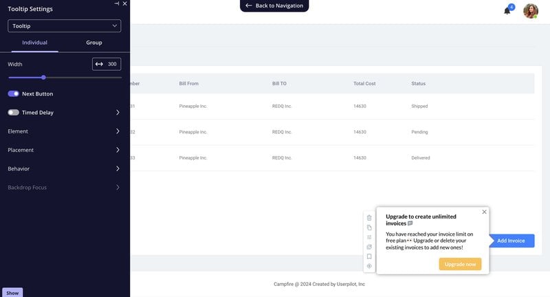
Tooltips
Tooltips are small, informative text boxes that appear when a user hovers over or clicks on an UI element user interface, like an icon, button, or link.
I often recommend tooltips as a great way to enhance the user experience—providing quick explanations or clarifications without cluttering your interface.
Some common ways I’ve seen product teams successfully use tooltips include:
- Explain the function of icons or buttons that have ambiguous symbols or icons.
- Offer more detail about what will happen if a user proceeds with a certain action, like enabling a setting.
- Give extra context or examples for input fields in forms.
- Provide helpful hints or step-by-step guidance for complex tasks or interfaces.
For example, the tooltip below, built using Userpilot, clearly tells users how to manage their inbox, making navigation easier without overwhelming them.
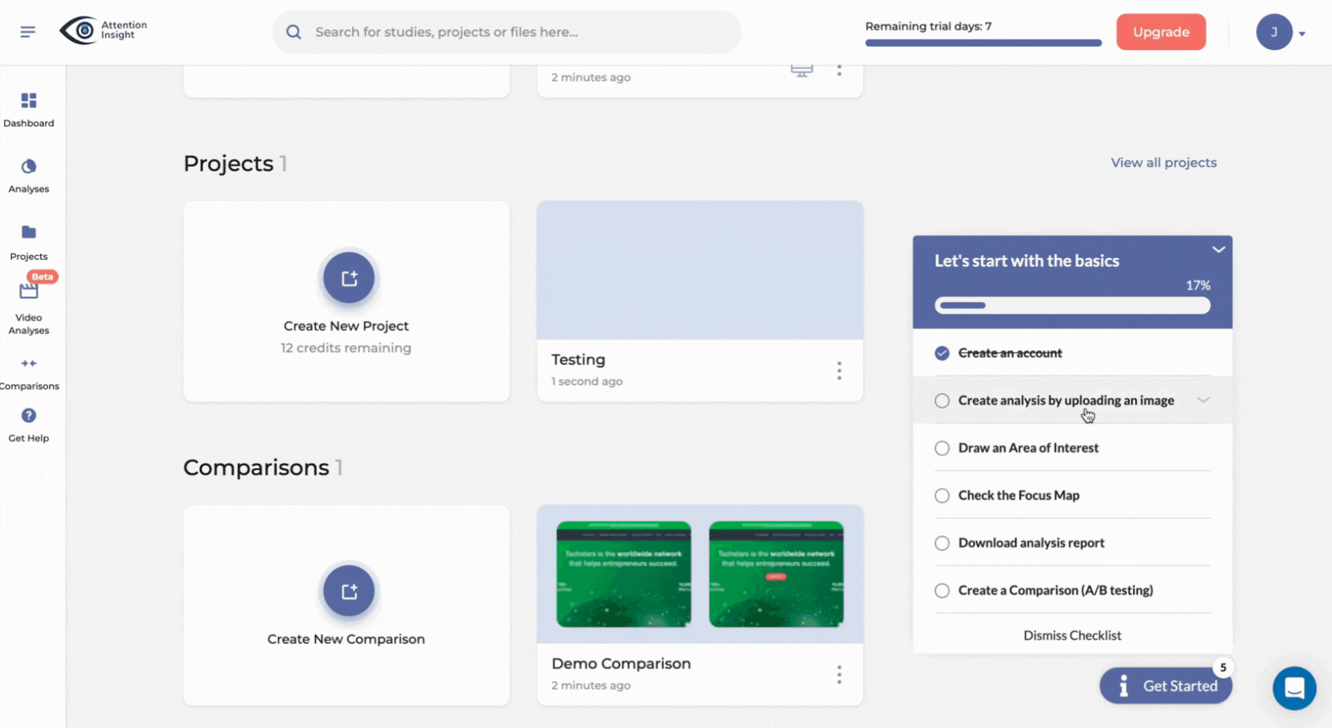
Checklists
As the name suggests, checklists are UI patterns consisting of actionable tasks your users need to complete. I often recommend them to teams focused on user onboarding, as they effectively guide new users through the essential features needed to start experiencing value quickly.
One of my favorite examples is how Attention Insight used Userpilot to easily build onboarding checklists without any coding. Clicking each task in their onboarding checklist triggered an interactive walkthrough, allowing users to learn core features through hands-on guidance.
Here’s how it worked in practice:
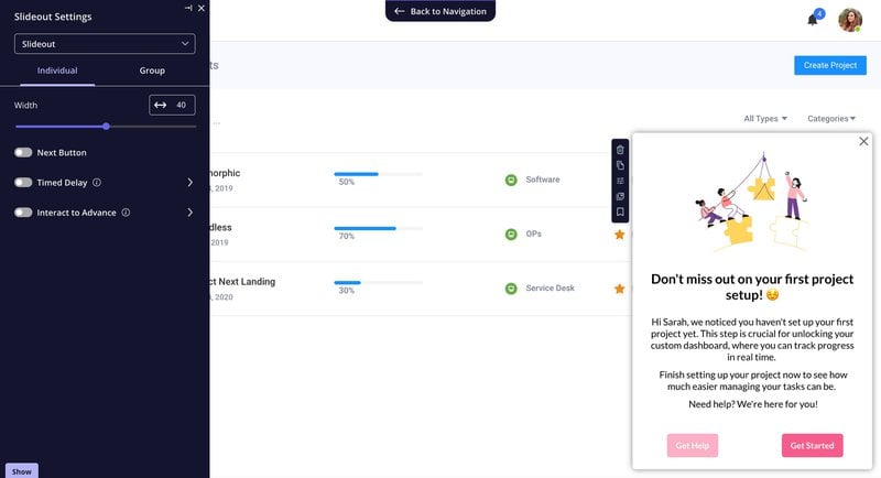
Slideouts
Slideouts, sometimes called “drawers” or “sidebars,” are another UI pattern I frequently recommend to product teams. They slide out from the edge of the screen— typically the left, right, top, or bottom— and appear as a panel over your main content.
What makes slideouts unique is that they offer the perfect balance: They’re noticeable enough to get your user’s attention without being overly intrusive, like modals. While the slideout is displayed, users can still interact freely with the rest of your application.
My team finds slideouts particularly useful for the following:
- Providing quick onboarding guidance for users setting up key features.
- Making contextual announcements, such as reminders or updates relevant to the user’s current action.
- Nudging users toward important next steps, like completing account setup or exploring unused features.
Here’s a great example built using Userpilot—this slideout gently reminds users to complete their first project setup without disrupting their ongoing workflow:
In-app surveys
An in-app survey is a UI pattern I frequently suggest to teams aiming to gather valuable user feedback directly within the app experience. They typically combine closed-ended questions (yes/no, Likert scale, multiple choice) and open-ended questions for deeper qualitative insights.
Just like other in-app messages, surveys can be triggered for all users or targeted to very specific user segments, segments at predefined times, or even contextually when a user completes a certain event.
For instance, 3P Learning uses Userpilot surveys to better understand a user’s behavior, motivations, and experiences. Tom Ulman, Lead Product Designer at 3P Learning, explains:
“Within that survey, we’ll get a better understanding of why they’re taking the placement test, what’s prompted them to do that, and, get a review on their experience so we can enhance it.”
– Tom Ulman, Lead Product Designer at 3P Learning
Types of in-app messages to use for mobile applications
Reaching your users on mobile isn’t always easy. They’re busy, distracted, and quick to swipe away interruptions. But choosing the right kind of in-app message makes all the difference.
I’ll show you the mobile messaging patterns that actually work, plus the best practices I’ve seen to keep your users tapping (not swiping away).
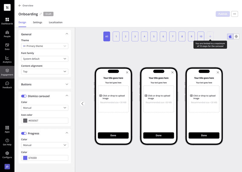
Carousels
Carousels are multi-page, swipeable messages specifically designed for mobile experiences. They appear as a series of visually rich screens that users can swipe through, making them highly engaging, especially during user onboarding or major feature announcements.
At Userpilot, we’ve made creating mobile carousels incredibly simple, even for non-technical teams. With our mobile SDK, you can quickly build carousels (up to 10 slides) using ready-to-go templates—no coding required. This makes carousels ideal for product and marketing teams looking to streamline their onboarding process or drive key user actions.
From my experience, carousels are most effective when used strategically for:
- Welcoming new users and clearly outlining your app’s value.
- Highlighting major updates or important new features.
- Driving key actions like enabling permissions, feature adoption, or attending webinars.
Here’s how it looks in Userpilot’s no-code mobile builder, allowing you to create carousels quickly and easily.
Here are a few quick best practices I always suggest for mobile carousels:
- Keep them brief, ideally between 3-5 slides.
- Prioritize your first slide—it sets the stage for engagement.
- Use high-quality images and concise text to create strong first impressions.
When used thoughtfully, carousels become a powerful tool for enhancing your mobile user onboarding and boosting customer engagement rates significantly.
Slideouts
Slideouts in mobiles are similar to those on web applications. They are mobile-friendly and appear by sliding into view from the edge of your user’s screen.
Unlike carousels, slideouts don’t cover the entire interface, making them less intrusive yet still attention-grabbing—perfect for ongoing engagement without interrupting your user’s flow.
At Userpilot, we’ve built slideouts specifically for mobile apps with our no-code Mobile SDK. Using pre-made templates, your product and marketing teams can effortlessly create slideouts to deliver contextual, timely messages directly within your mobile app.
I’ve found slideouts particularly useful for the following:
- Announcing feature updates or enhancements directly relevant to users.
- Inviting users to leave feedback or app store reviews.
- Nudging users who haven’t fully completed onboarding or critical actions.
Here’s how easy it is to build a mobile slideout using Userpilot’s visual editor:

When designing mobile slideouts, here are a few best practices I recommend:
- Keep it simple: Avoid lengthy text—clear, concise messages work best.
- Right timing: Trigger messages contextually, such as after a specific user action or a certain number of sessions.
- Use deep links: Guide users directly to relevant sections within your app for seamless navigation.
With these tips in mind, slideouts become a highly effective yet unobtrusive way to maintain engagement throughout your mobile user journey.
Use cases of in-app messages to improve the app experience
Now that we have covered the main types of in-app messages and their general applications, let’s take a closer look at some specific use cases where I’ve seen them deliver outstanding results.
Sending personalized messages in the user onboarding process
The onboarding process is about helping users discover the features that they need to accomplish their objectives.
The thing is, different user personas have different objectives and consequently require different functionality.
The solution?
In-app message personalization.
To enable it, you first need to analyze the user behavior of the main user segments to identify the happy paths to activation and adoption, and then you need to design in-app messages to help users progress smoothly.
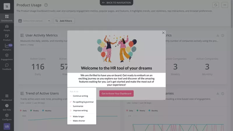
Announcing a new feature to engage users
Apart from primary onboarding aimed at new users, in-app messages also play a key role in secondary onboarding. Their purpose is to introduce more advanced and new features to keep users engaged and help them realize the full potential of the product.
For example, the modal in the image below introduces a new AI feature in an email app. It provides general information about the functionality and its benefits, along with a button that directs users to a more in-depth how-to guide.
To maximize new feature adoption, it’s best to reinforce the message using multiple in-app messages. Alongside modals, tooltips can serve as timely reminders, appearing when users interact with relevant parts of the interface—such as composing an email.
With Userpilot’s target condition settings, you can take this further by sending contextual announcements to specific user segments.
Instead of showing new feature announcements to everyone, you can trigger them only for users who meet certain criteria, such as those who have yet to engage with the feature or who have completed a related action.
Triggering messages to encourage users to upgrade
Even though your new users realize how much value your product offers, it doesn’t mean that they’ll automatically upgrade to the paid account. Sometimes, your customers feel that they need a little nudge, and in-app messages are the perfect tool for this.
You can use them to further increase the customer lifetime value by driving upsells.
Imagine that analytics show you a user could benefit from premium functionality to get more value from the product, or they’re about to exhaust their usage limit. A contextually triggered in-app message may be all it takes to make them upgrade to a higher plan.
Collecting feedback at different stages of the customer journey
Customer feedback is invaluable when it comes to product improvement. It can help you identify bugs that the users experience or areas where you can enhance them. In-app surveys are the most effective way to collect it.
Let me explain why:
First, they allow you to directly reach product end-users and not the decision-makers managing the account, as often is the case with email surveys.
Moreover, in-app surveys, especially when triggered contextually, help you collect feedback when the experience is still fresh in users’ minds. This makes it more reliable.
Finally, in-app surveys have higher response rates, which reduces the risk of bias in the results.

Best practices to follow when creating your in-app messaging campaign
To wrap it up, here are 3 best practices to get the best out of our in-app messaging efforts.
Localize in-app messages for different customer segments
One of the great things about SaaS is that your expansion isn’t limited by physical constraints. Users can easily purchase your tools and use them no matter where they live.
This includes speakers of other languages than your native tongue.
To make the user experience more inclusive for such users and help them make the most out of the product, localize the in-app messages.
We’re not talking about hiring an expensive localization agency. Many user engagement tools, including Userpilot, allow you to translate your microcopy and survey questions automatically in no time.
Write clear and effective microcopy
The effectiveness of your in-app messages depends on the quality of your microcopy, so make sure it’s up to scratch.
No copywriter around to help you with that?
Use an AI writing assistant like the one provided by Userpilot.
It enables you to write copy from scratch or tweak the existing content. In a few clicks, you can shorten or expand it and fix language errors.
Thanks to that, you can also repurpose existing resources, like product docs or how-to guides, to save both your customers and team time.
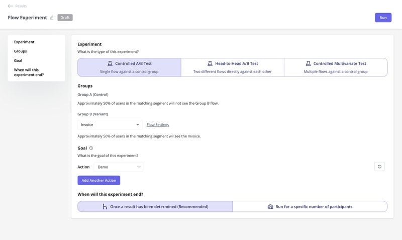
A/B test app messages to maximize user engagement
How do you know which version of your microcopy or in-app message design is the best?
The most objective way to find out is by running experiments.
A/B tests allow you to compare the performance of two different messages by running them in parallel to 2 similar user groups.
Have more messages to test or variables to tweak?
Multivariate tests allow you to do it in one test to save a lot of time.
Enhance user experience with contextual in-app messages!
Whether it’s new user onboarding, customer education and support, or account expansion, in-app messages can play a crucial role in your product strategy.
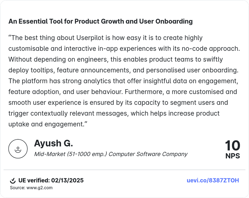
They let you reach specific users with personalized content right when they need it most. As Ayush’s team found, this transforms onboarding from a routine task into an engaging experience—leading to stronger feature adoption and higher retention.
If your team is ready to start crafting engaging, personalized in-app messages (without relying on developers), book a demo today.
About the author