Frustrated trying to design interactive software walkthroughs that drive activation?
It’s a common experience. But don’t worry—this article will provide some inspiration. We handpicked a few of the best SaaS walkthrough examples and explained what made them great. We also covered best practices to ensure your walkthroughs get high user engagement.
What is a software walkthrough?
A software walkthrough is an app onboarding that guides users through key features and processes of a software product.
Usually, specialized walkthrough software is used to create tooltips, modals, progress bars, and other UI elements that can help users understand and adopt the product quickly.
Interactive walkthroughs vs product tours
Walkthroughs are interactive and require users to take action as they learn about features (hence their “interactive” nature). These in-app guides are best for user onboarding and driving feature discovery.
On the other hand, product tours demonstrate core features one by one without requiring input from the user. Tours are static and often longer than interactive walkthroughs. They are best suited for sales activities and providing new users with a general product orientation.
Why use a product walkthrough for user onboarding?
A well-designed walkthrough helps to:
- Improve user onboarding: Walkthroughs ensure users feel supported and confident as they navigate your product. This hands-on approach helps users grasp how to use the application more effectively, making the onboarding process intuitive and engaging.
- Reduce time to value: Interactive product walkthroughs reduce the time to value by immediately showing users features most suited to their use case and how to use them.
- Reduce friction: New features can often be intimidating, leading to user frustration and potential churn. However, a well-designed product walkthrough anticipates customer friction and addresses it to prevent users from getting stuck.
- Increase customer retention: A positive onboarding experience sets the tone for long-term customer retention—users who understand how to use your product effectively are more likely to stick around.
What’s your main goal with interactive software walkthroughs?
How are you currently guiding users?
What’s your biggest challenge right now?
Ready to build better interactive software walkthroughs in minutes?
See how Userpilot can help you create code-free, personalized, and truly interactive experiences that drive user success.
10 Interactive walkthrough examples that guide new users
Now, we get to the core of this article. Below are ten interactive walkthrough examples and why they work.
1. Rocketbots
Rocketbots (respond.io) is an AI-powered customer communication platform designed to manage and automate customer conversations across various messaging apps.
The platform begins its onboarding flow with a welcome screen that eases new users to the interface and collects their data upfront.
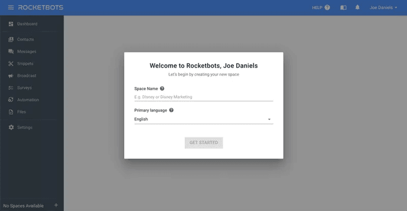
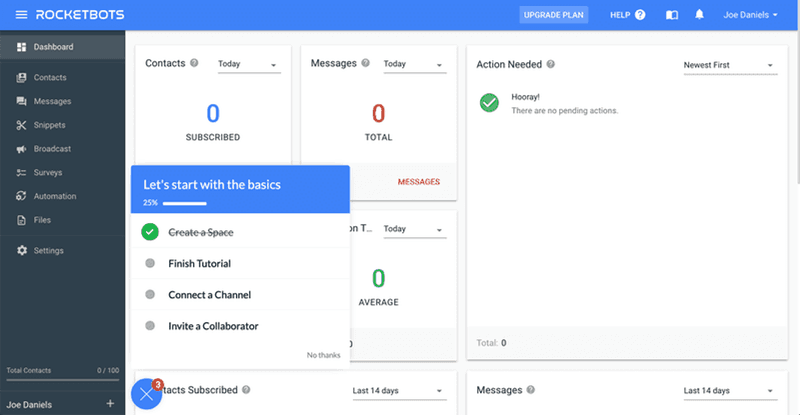
Next, users see an onboarding checklist with a list of tasks to complete. Crossing off the first task for users and showing a progress bar was a good way to motivate action.
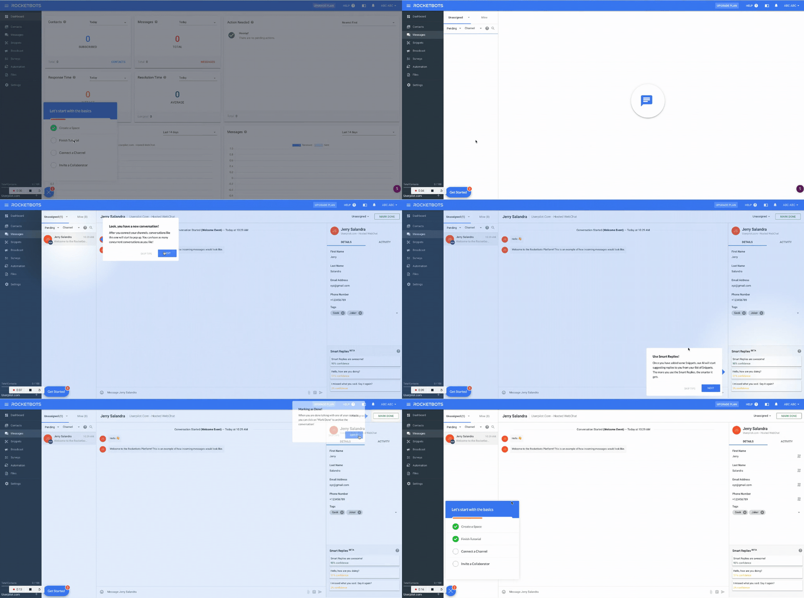
Next, tooltips showcase key features to new users so they can get started right away.
2. Groupize
Groupize is a meeting and event management platform that needed help with easy-to-grasp product walkthroughs. The company utilized Userpilot to create a gamified onboarding flow.
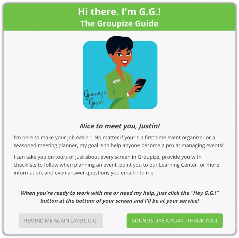
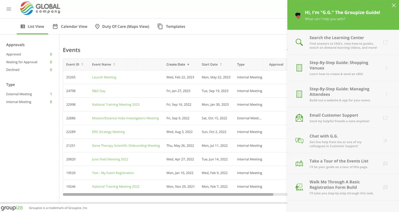
The flow begins with a welcome screen introducing G.G., the interactive assistant that will guide new users through the product. This offered an engaging way for users to learn about the product.
Users also have the option to continue onboarding or shift it to later. This flexibility is important as not all new signups are using your tool for the first time or are interested in following a guided tour.
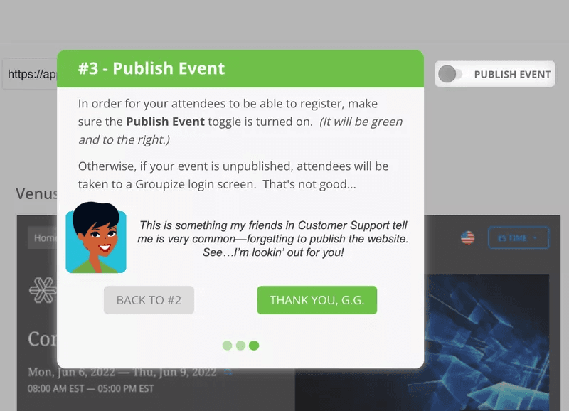
The flow proceeds with a detailed guide, showing users how to achieve their goals with Groupize:
Groupize leveraged an in-app resource center and embedded its onboarding guide so users can access it at any time. This approach alone drastically reduced support tickets, allowing Groupize’s CS team to focus more on issues that can’t be addressed in a resource center.
3. Demio
Demio is a webinar hosting service that supports live, automated, and on-demand webinars.
Its onboarding process begins with a product tour showing the tool’s core features and what a webinar will look like when you host it. This simple tour is available on the website for new visitors to quickly go through and understand the platform.
Upon signing up, users will see a sample event scheduled for them, and a human product specialist will join to show the nitty-gritty of how the product works.
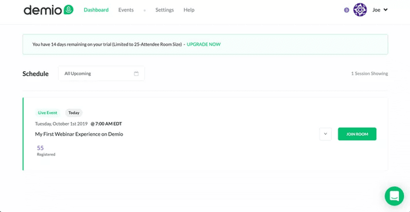
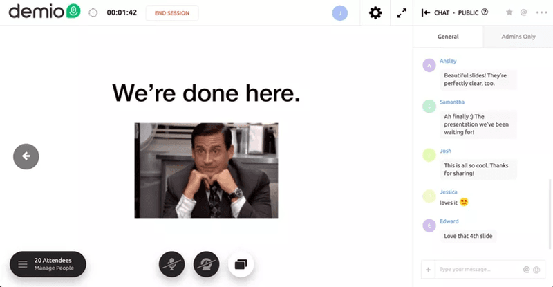
Next is the interactive session. Users will receive an onboarding checklist that serves as a guide to help them independently complete tasks to host a webinar. Demio’s onboarding flow is a good example of how to combine a product tour with an interactive walkthrough to drive sign-ups and boost adoption.
4. Kommunicate
Kommunicate is a customer service platform that enables businesses to automate conversations with their customers using chatbots and live chat.
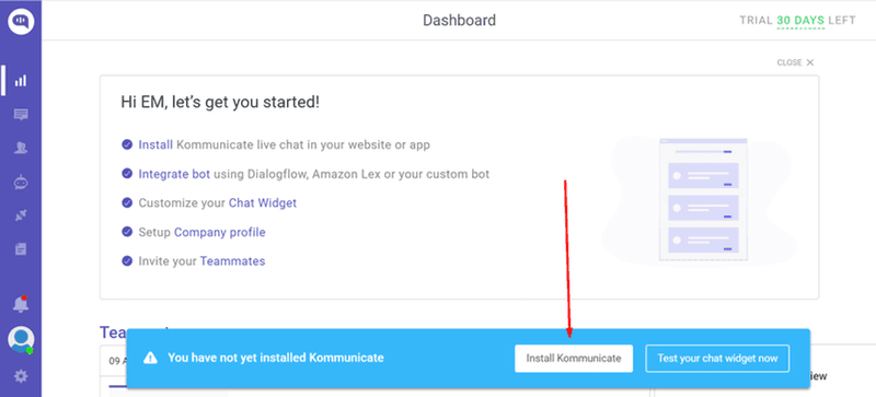
One of the primary adoption drivers for Kommunicate is having new users install the chatbot and begin customizing the chat widget.
Kommunicate created a product walkthrough that makes the process easy for users.
The first onboarding screen listed all the steps users will take from start to finish. Seeing the list of tasks before they get started helps reduce overwhelm and uncertainty about how long or short the process will be.
Once users complete that first task, they’ll see a small checklist showing them the next step to take:
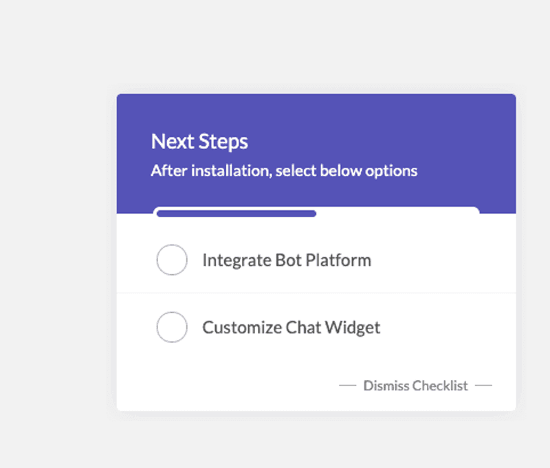
After a user chooses their preferred step, they’ll receive an interactive product walkthrough that shows them step-by-step how to complete it. For example, here’s the walkthrough for widget customization.
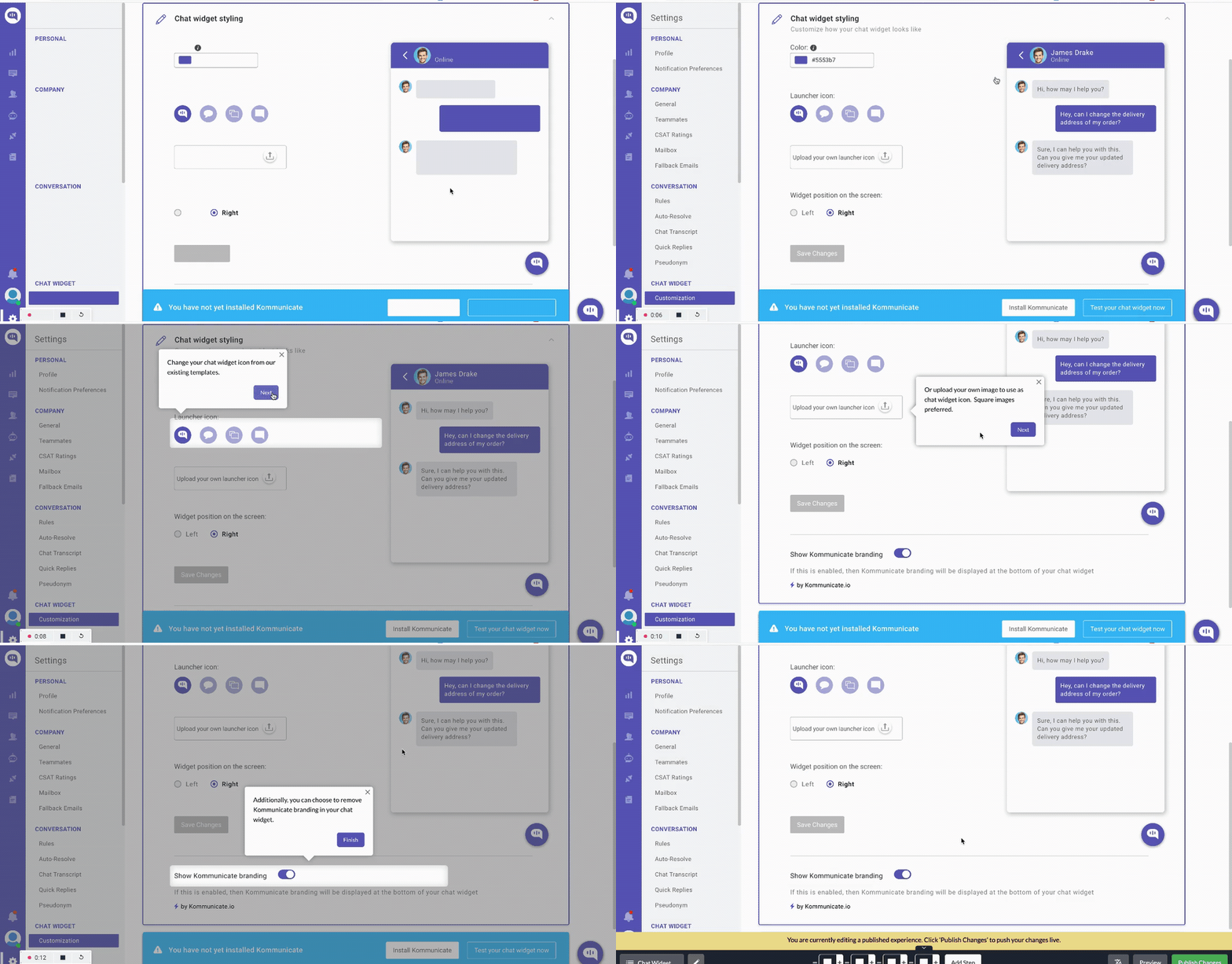
Within a short time of implementing this interactive approach, Kommunicate saw a 4% increase in adoption and 3% boost in product usage.
5. Salesflare
Salesflare is an intelligent CRM platform for small and medium-sized businesses, particularly those operating in B2B sectors.
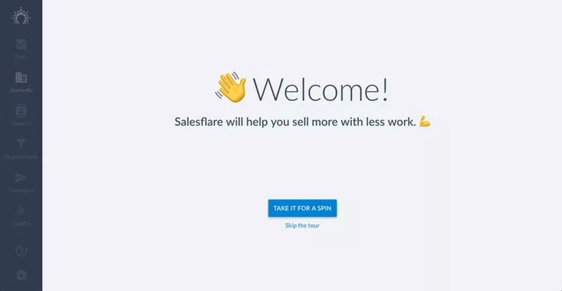
The onboarding begins with a welcome page that gives users an option to skip the walkthrough.
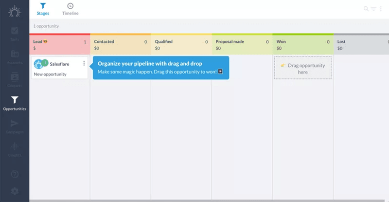
For users who choose to be guided, the walkthrough explains core features using interactive tooltips:
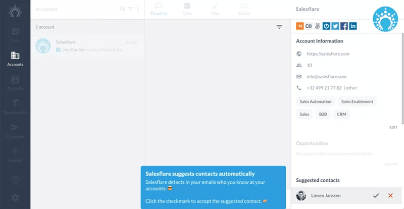
The walkthrough combines information and instructions (top right), helping users get familiar with the product by completing tasks.
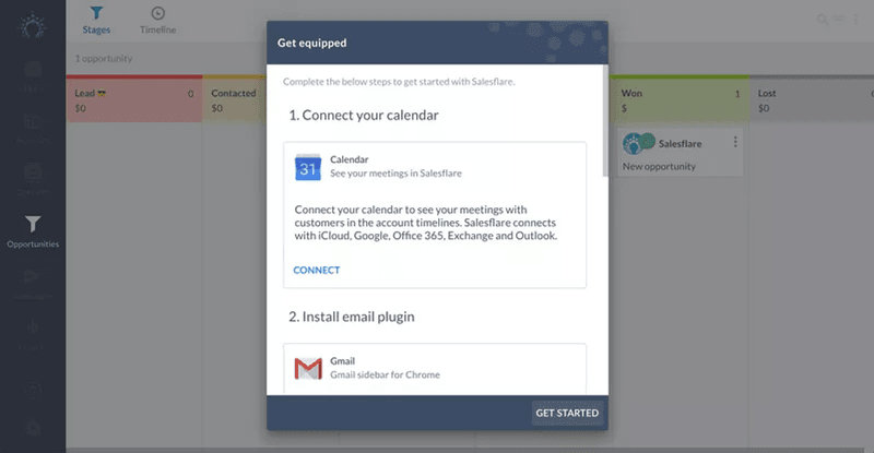
It ends with prompting users to integrate third-party tools that will make sales activities easier.
6. Notion
Notion is an all-in-one workspace where teams and individuals can plan, collaborate, and get organized.
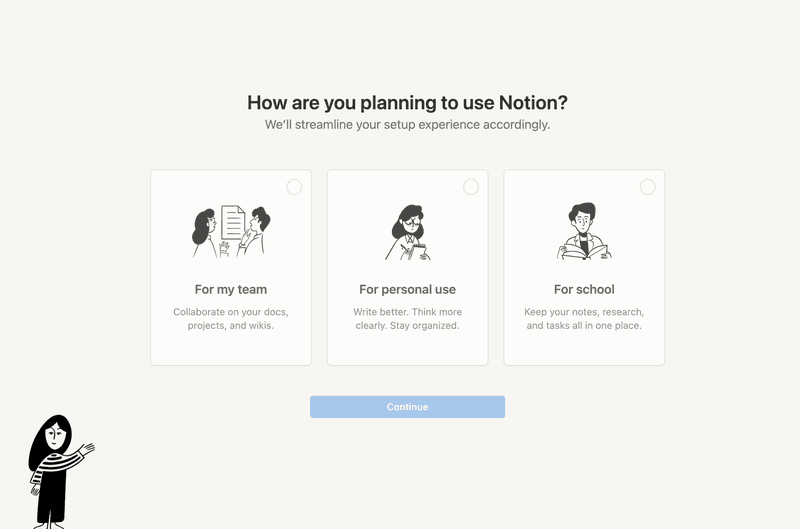
Due to its versatile nature, Notion has different user groups. To cater to each of these groups, Notion decided to use branched onboarding instead of a generic onboarding flow.
The first step was to trigger the welcome survey below to understand user needs and JTBD. The data from this step enables them to branch out their walkthrough and display the most relevant templates for each user.
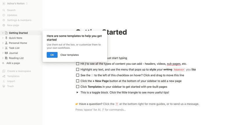
Notion also uses a checklist to help users get started. The onboarding checklist itself demonstrates how Notion pages function, efficiently serving as both a guide and an example.
7. Figma
Figma is a cloud-based design tool widely used for user interface design and prototyping.
Like Notion, Figma provides branched onboarding based on its two main use cases:
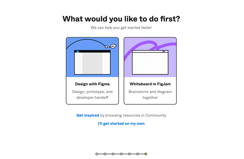
Instead of greeting new users with an empty state, Figma uses onboarding videos and demo content to guide users and help them start designing with confidence.
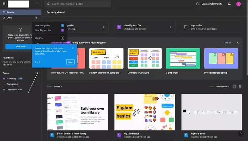
8. ProdPad
PropPad is a product management tool that helps product teams with roadmapping, idea management, and customer feedback.
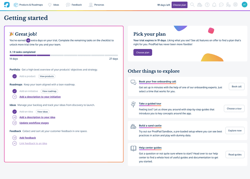
This platform uses gamified onboarding to keep users engaged. For example, trial users can earn extra days on the app by completing the onboarding tasks.
These tasks allow ProdPad to collect data about the user’s project. Completing onboarding tasks leads to a quick aha moment for the user, which makes them more willing to continue the trial and consider upgrading before the trial period ends.
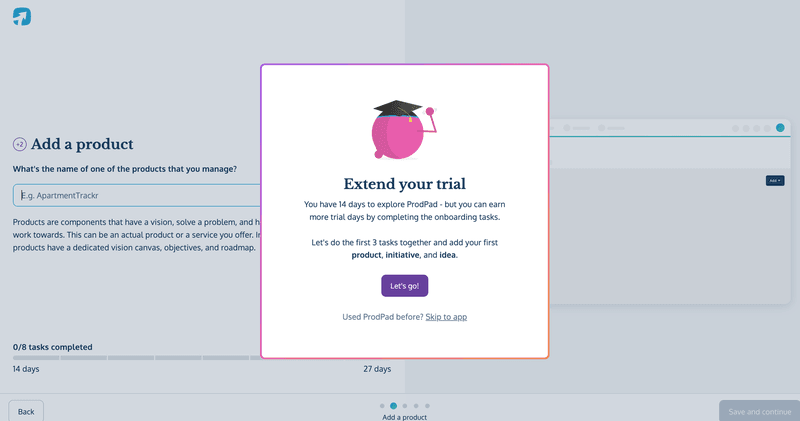
After the user agrees to explore ProdPad, they’re taken to a getting started page that contains a checklist of key tasks and a progress bar showing what remains uncompleted.
9. Slack
Slack is a popular business communication tool that allows teams to communicate with each other, share files easily, and organize team conversations into channels.
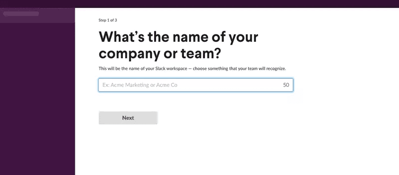
The onboarding starts with a quick survey asking users their company or team name. Slack uses this information to name the company’s workspace, immediately giving users a sense of ownership with personalization.
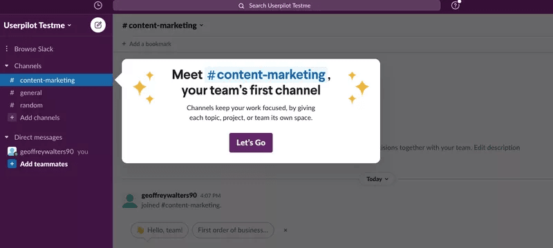
Slack completes the onboarding with a guided tour that teaches users how to create channels, chat with team members, and perform other actions.
10. Canva
Canva is a graphic design platform that simplifies the process of creating digital graphics.
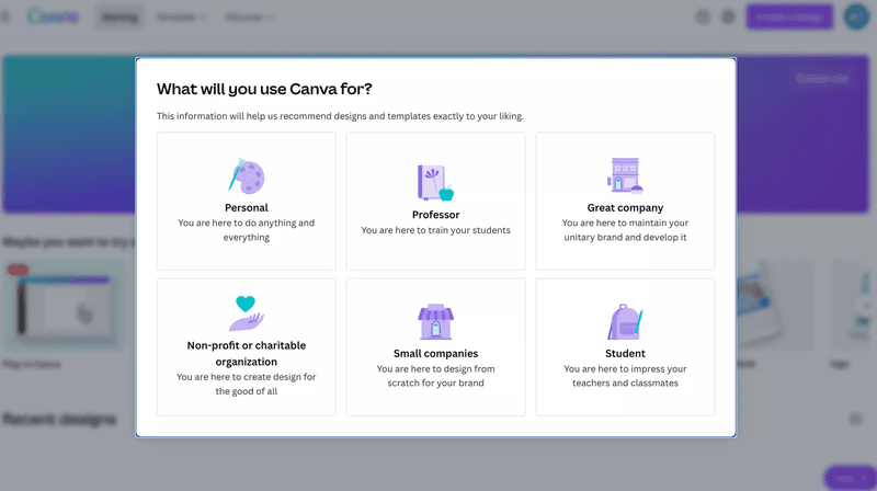
Like most tools with diverse use cases, Canva begins its onboarding process by asking new users what they intend to achieve with the tool.
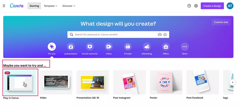
The next onboarding screen prompts users to explore the tool, asking them to “play in Canva.” When new users click that option, they’ll receive a quick in-app walkthrough showing them how to design with Canva’s tools.
How to create walkthroughs that drive product activation
Now that you’ve seen what effective product walkthroughs look like, it’s time to start building yours.
1. Define a specific goal for your product walkthrough
A clear goal gives you a target and lets you measure your walkthrough’s success. Without one, you’ll be designing in the dark.
Here are examples of walkthrough goals you could set:
- Demonstrate product value within the first few uses.
- Reduce churn by guiding users to a paid plan (for freemium products).
- Increase the adoption of underutilized, high-value parts of your product.
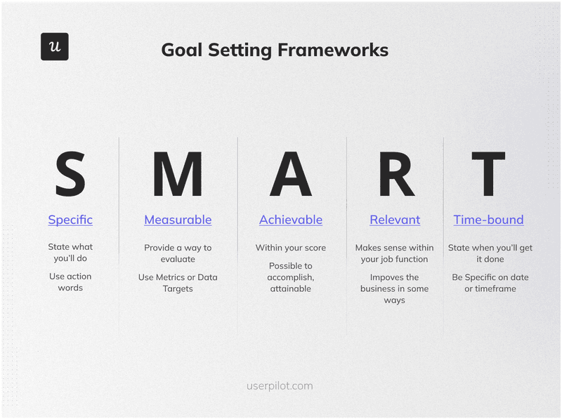
If you’re unsure how to set the right goals, use the SMART goal-setting framework—ensure your targets are Specific, Measurable, Achievable, Relevant, and Time-bound.
2. Dig into user behavior data to identify key features
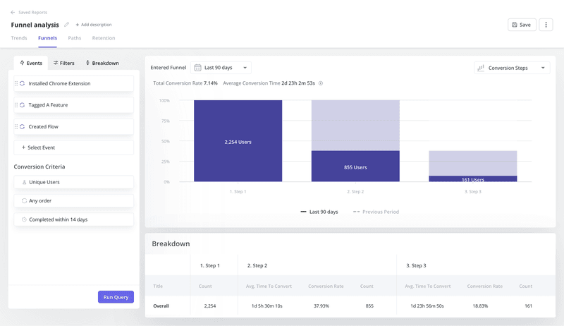
Analyze user behavior data to understand how users interact with your product. Look for patterns that indicate common paths users take that lead to successful outcomes, and identify which features lead to activation.
You can also implement funnel analysis to understand drop-off points in the user journey—this will allow you to identify areas of your tool that need better guidance.
3. Create interactive walkthroughs to educate users
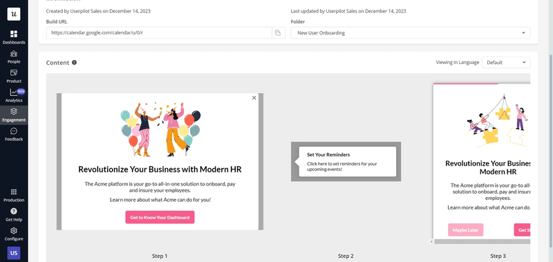
You have two options for this: code from scratch or use walkthrough software.
The second option will save you time and help you iterate quickly. No-code walkthrough tools allow you to customize your walkthroughs as desired without any coding pains or bugs. In addition, it also grants you access to performance analytics so you see what’s working and what areas of your onboarding need enhancements.
4. Monitor how users progress through your walkthrough to optimize it
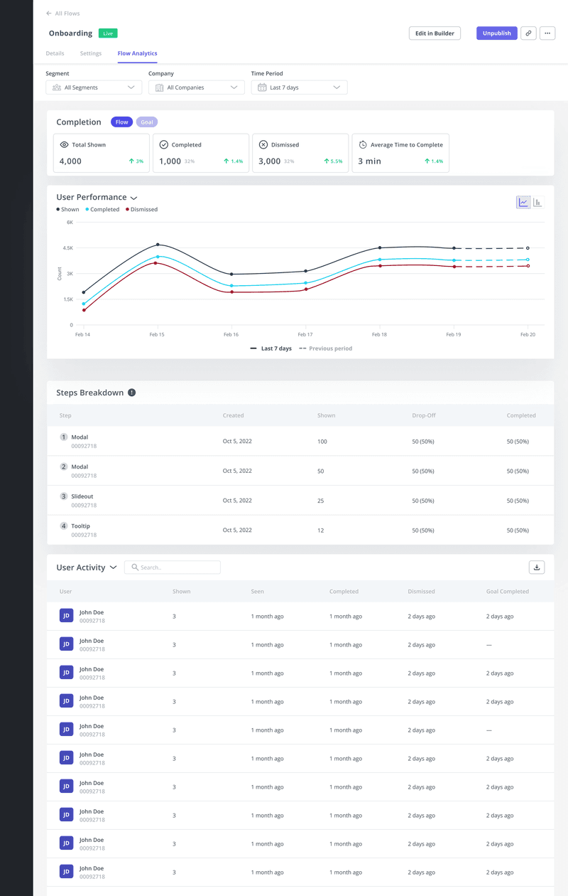
It’s unlikely that your walkthrough will be perfect on the first try, so monitor it to see how it’s performing against your goal. For example, if you want to reduce the time to value and boost adoption, check to see if your adoption rates have changed since you created or updated your walkthrough.
Depending on your objectives, you might need to measure several metrics to determine if you’re succeeding. However, it can be tiring to track metrics across different spreadsheets.
This is where an analytics dashboard comes in. With a dashboard like the one below, you’ll instantly get a snapshot of your key metrics and know which is improving.
5. Collect user feedback to identify friction
In addition to quantitative data, gather qualitative feedback from users about their experience with the walkthrough. Segment users who completed the walkthrough and trigger simple in-app feedback surveys that ask how they feel about the process and where they encountered friction.
Analyze the feedback and find ways to improve your onboarding experience.

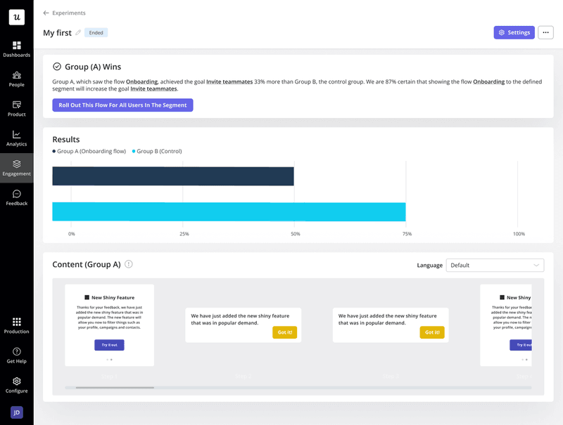
6. A/B test different product walkthroughs to drive better results
Finally, use A/B testing to compare different versions of your walkthroughs. This can involve testing variations in the content, format, length, and interactive elements of the walkthroughs.
By systematically comparing different approaches, you can determine which walkthrough best achieves your defined goals, minimizes user drop-offs, and drives higher product activation.
Best practices for creating a software walkthrough to guide users
To maximize their effectiveness, it’s crucial to design walkthroughs thoughtfully, ensuring they are accessible, engaging, and aligned with user needs and expectations. Here are some best practices to follow:
- Use simple language: Write as if you’re explaining your product to a friend who knows nothing about your tool. This creates a smoother experience and helps you create a more empathic UX, allowing users to grasp concepts quickly.
- Consider adding secondary onboarding: Once users understand core features, gently utilize walkthroughs to highlight less obvious but useful parts of your product. This layered approach helps elevate the user experience and increase product stickiness.
- Localize your walkthrough: Product walkthroughs in a user’s native language make the experience intuitive and inclusive, creating a great first impression. Most walkthrough tools feature content localization.
- Style it to match your brand: Use your walkthrough as an extension of your brand’s personality and visual elements. A consistent visual experience subconsciously assures users they’re in the right place, leading to higher engagement.

