Microcopy UX in 2026: Why Clear Words Still Don’t Stop User Hesitation


Microcopy is the text next to your “Pay now” button, and it has nothing to do with why a user’s cursor sits still on top of it for five seconds before clicking. I’ve watched that pause happen in session recordings more times than I can count, and the copy was never the problem. The user was wondering if they’d get charged twice, and no friendlier wording answers that.
Teams have treated microcopy as a wording exercise for years, using activities like shortening the label, softening the error, and adding a call-to-action that converts. AI can now write all of that in seconds, so the wording part of the job just got cheap. What AI can’t do is sit in on that five-second pause and figure out what caused it.
Also, there’s a second pressure stacking on top of the first, where the users read interface copy with more suspicion than they did five years ago. Princeton researcher Arunesh Mathur and his team crawled 11,000 shopping sites and found 1,818 instances of dark pattern text across 15 types. A good share of your users have already been burned by copy that lied to them somewhere else.
Common advice treats microcopy’s aim as finding the right words, but I think the aim should be answering the question a user is quietly asking in that exact moment: what happens if I click this? Removing that uncertainty is the actual job of microcopy, and it’s a research problem before it’s a writing problem.
I wanted to write something more useful than another list of microcopy best practices, so here’s what this piece covers:
- Why users abandon actions when they’re uncertain, even when the button copy is perfectly clear.
- A four-job framework for what every piece of microcopy needs to do.
- Where products lose user confidence, screen by screen, with a better approach for each.
- Why AI drafts clean sentences but still can’t watch someone hesitate.

Why do users abandon tasks? (they can’t predict what happens next)
Uncertainty, not sloppy grammar, is the biggest source of friction in a form or checkout flow. Baymard Institute’s usability testing found that 31% of e-commerce sites still don’t validate form fields inline, so users only discover a mistake after they’ve already hit submit. Every one of those submissions asks users to guess whether their input was right, and plenty of them guess wrong.
Baymard also found that once someone hits a validation error, they start overfilling optional fields defensively just to avoid a second one. One test subject explained the logic plainly:
“Here I would feel like I have to fill out the phone number field because otherwise I might get in trouble in a little while.”
That’s a user protecting their personal details from a system they’ve already learned not to trust, not a grammar problem.
Before a user commits to almost any action, they’re asking one of four questions without ever typing it out:
- What happens next?
- Can I undo this?
- Is this safe?
- Will I lose my work?
Button copy answers none of these by default. The words have to work harder than a label ever could.
The four jobs every piece of microcopy has to do
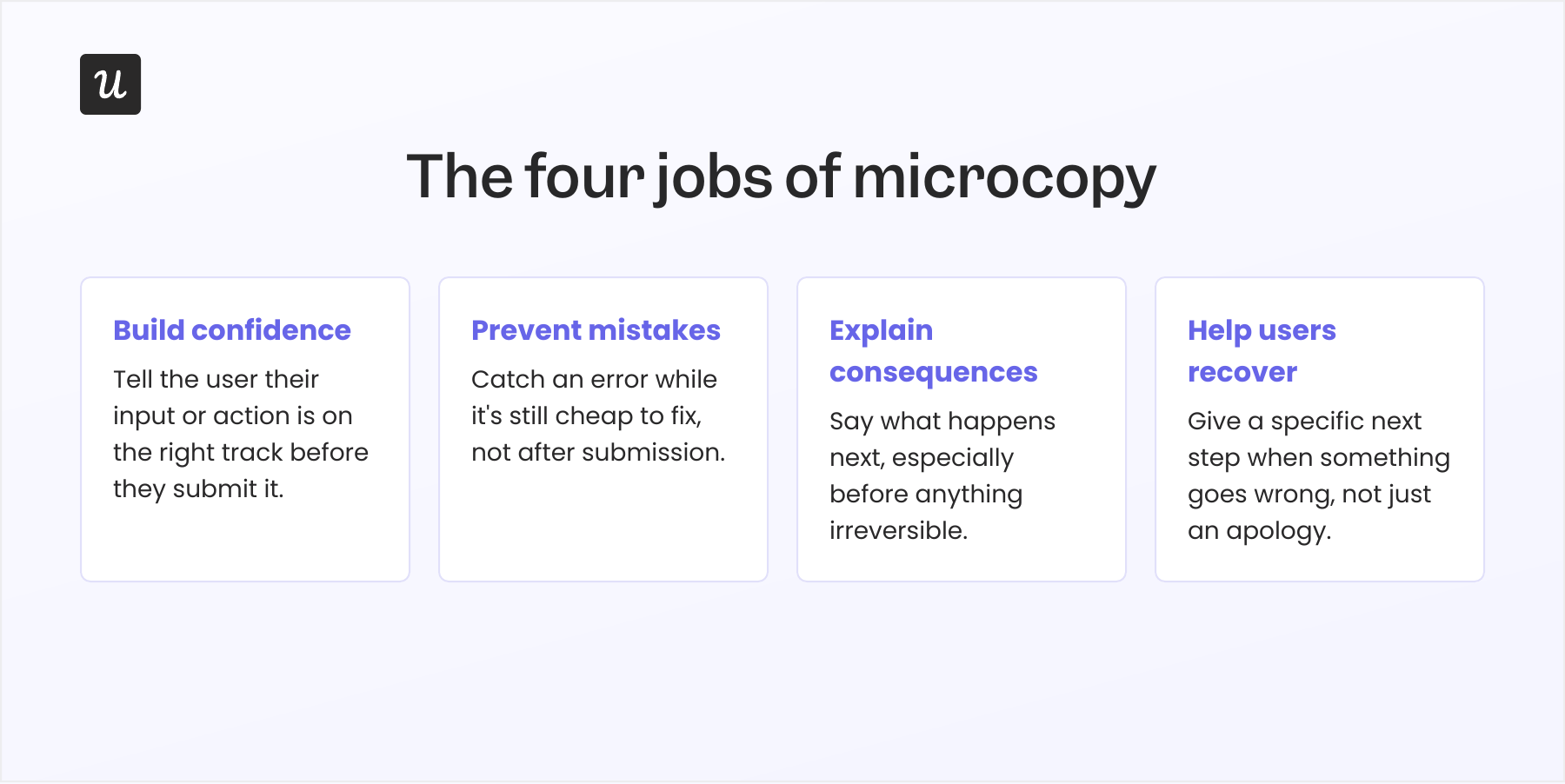
Replace “write shorter copy” with “remove uncertainty,” and a usable set of UX design principles falls out of it. I think of it as the four jobs of microcopy, and every message in your interface should be doing at least one of them.
- Prevent mistakes: Catch an error while it’s still cheap to fix, not after submission.
- Explain consequences: Say what happens next, especially before anything irreversible.
- Build confidence: Tell the user their input or action is on the right track before they submit it.
- Help users recover: Give a specific next step when something goes wrong, instead of just an apology.
This model applies the same way to a user onboarding checklist, a form field, and a delete-workspace button, because all three are really asking the user to trust the product with something. It’s a shorter list to hold in your head than most brand voice guidelines, which is exactly the point.
Writing microcopy that does this well comes down to a few mechanical habits more than talent. Address the user directly instead of describing the system, so “No data to show” becomes “You didn’t add any items to the list yet. Click here to add one.” That single change reassures the user and points straight at the desired action.
Give most users exactly what they need to act, and nothing more: what’s wrong, why, and how to fix it, not a paragraph of caveats. Put that detail at the start of the sentence instead of burying it at the end, since that’s the part someone scanning under stress will read.
Lead with verbs instead of nouns, so “Deletion of workspace” becomes “Delete this workspace.” Good UX copy also reads like a small piece of dialogue between the product and the user, which is why role-playable language beats a technical label almost every time.
Where products lose user confidence (and the fix for each moment)
Microcopy shows up everywhere: onboarding copy that walks new users through an unfamiliar task, placeholder text hinting at what a field expects, a line that fills the loading time on a slow save so it doesn’t feel broken (our loading page examples show that pattern done well).. A 404 page belongs on that list too, and it’s one of the few spots where helpful information or a bit of humor actually eases the frustration of hitting a dead link. None of it carries the same weight, though, and that’s where most tone guides fall apart.
A CTA button and a payment failure page are asking completely different things of a user, so treating them with the same tone guide misses the point. Here’s where I’d focus first, and what actually helps at each moment.
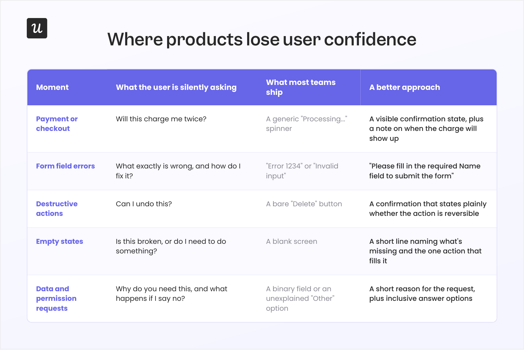
None of this works if the language itself is the barrier. Jargon-heavy copy quietly excludes the users who most need clear guidance: non-native speakers, people new to your category, anyone unfamiliar with your product’s internal vocabulary. Non-inclusive design shows up here too, in copy that ignores accessibility, diversity, and gender, like a form that offers only “Male,” “Female,” or “Other” with no explanation of why the question is being asked at all.
Plain language is the baseline for accessibility, not a nice-to-have, and it’s the only way the useful information in your copy reaches the general public it’s meant for, not just the power users who already know your product’s vocabulary.
Canva’s own error page is a good example of the fix in practice: it names the likely cause of a broken link, a permission change, and gives a one-click way back without turning the moment into a joke, which leaves a better impression than a generic error ever does. None of this is free to ignore. Baymard’s abandonment data shows checkout complexity alone accounts for 18% of US shoppers walking away from a cart, out of an average 70.22% cart abandonment rate across 50 studies.
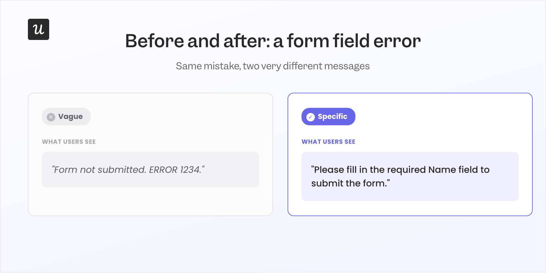
Contextual, real-time in-app guidance that fires before submission does more for that number than a friendlier error message ever will. The error-message row above follows the same pattern that UX Content Collective teaches: state what’s wrong, then say exactly what to do about it. Patrick Stafford, UX Content Collective’s CEO and cofounder, puts the standard bluntly in that guide: never make the user guess what “invalid” means.
AI can write clean interface copy, but it can’t watch someone hesitate
AI is genuinely good at producing a clean sentence that includes shorter labels, friendlier tone, ten drafts in the time it takes to stare at one blank field. It’s also genuinely bad at knowing which sentence the situation calls for, because it has never watched a user’s cursor hover over a button for five seconds.
The 2025 UX Content Collective salary survey of nearly 600 content designers and UX writers found that 58% say AI has improved their work somewhat or significantly. But the top actual uses were summarizing content (45%) and brainstorming (41%), while writing final interface copy wasn’t in the top uses at all.
The same survey found 24% of respondents had been laid off in the past 24 months, with 74% of those finding another content role since. One respondent captured the anxiety plainly:
“I’m nervous that AI is going to take over.”
Another respondent, further along, put it differently: “content design is finally being seen as a strategic function, not just a finishing touch.” Both things are true on the same team in the same year, which is a more honest picture than either one alone.
I’d rather have AI draft ten versions of a button label than spend an afternoon doing it myself, and I use it for exactly that. What I still won’t hand off is the decision about which version is right for a payment failure versus a typo, because that call needs someone who has actually seen what the user was worried about.
Good microcopy starts in usability testing, not in Figma
Before I write a word of copy for a confusing screen, I want to know what makes it confusing, and the only reliable way I’ve found is watching people use it. When our team was deciding whether to cut an underused chart from our product dashboard, session replay showed roughly 10% of users still hovering over it for value, which is a lot once you scale that across every account. We kept it and made it collapsible instead of cutting it outright, and no amount of copy on that chart would have told us to do that on its own.
The same logic applies to onboarding friction. When our email feature launched, the funnel showed a sharp drop-off rate between verifying a domain and adding an email address, a gap that was taking some accounts 60 days to close. Abrar Abutouq, one of our product managers, spotted the drop-off in the data and fixed it inside the product the same day, without filing an engineering ticket:
“Within a few hours, I just created a targeting tooltip and showed it to users and highlighted the correct steps for them to make it clear what to do next.”
That’s placement and sequencing doing the work, not wording, and it only happened because someone was watching the funnel instead of guessing at the copy.
None of this requires a dedicated research team. The sources are the same ones most product teams already have access to:
- Session replay, for watching where people hesitate or backtrack.
- Support tickets, for the questions your copy failed to answer.
- Usability testing, for the moments users can’t articulate until you watch them try.
- Product analytics, for where the funnel actually breaks, not where you assume it does.
How to tell if your microcopy is actually working
The question “does this sound better” is a trap, because two people can disagree on tone forever and never resolve anything. The better question is whether behavior patterns changed:
- Did validation errors drop.
- Did completion rate improve.
- Did support tickets on that flow go down?
None of that replaces watching someone use the copy before it ships. A quick round of usability testing on a new error message or onboarding flow shows whether people read it the way you intended, which is a cheap check against shipping something clever that nobody actually understands.
Product and UX designers are usually the ones already sitting in on these sessions too, which is exactly why the four-job framework belongs to the whole team, not a single role.
This is where A/B testing copy variants earns its place next to A/B testing designs, not as an afterthought. We run these tests on our own in-app messaging the same way, because a hypothesis about what will reduce hesitation is still a guess until it’s tested against real behavior.
Why microcopy decisions now sit with the whole product team
AI is going to keep making the wording part of this job faster, and keeping up with the latest trends in AI writing tools won’t be the hard part. What stays hard is watching a real user hesitate, and that skill is becoming the actual differentiator between products that convert and ones that don’t.
Crafting microcopy will always be part of how your product communicates with someone who’s stuck or about to leave. Getting it right comes down to being helpful at the exact moment someone needs it, more than finding clever language. That’s what adds up to a better overall user experience, and a task users complete instead of abandoning.
If your team is still deciding on copy in a meeting instead of in front of user data, that’s the gap worth closing first. Userpilot pairs product analytics with in-app messaging and built-in A/B testing, so you can watch where users hesitate and test a copy fix against the same account in the same week. If you want to see what that looks like against your own product, book a demo and bring a screen you’re not confident about.
About the author