Best Product Fruits Alternatives for SaaS Based On Different Use Cases
Looking for a good user onboarding tool and wondering if Product Fruits is the best option for your SaaS company?
In our experience, the many available Product Fruits alternatives don’t necessarily make the choice any easier. To make the right choice, we believe you must consider your priorities, including your varied JTBDs, budget, and company size.
In this post, we’ll examine which Product Fruits competitor is the better digital adoption platform for your needs.
What is your biggest challenge with user onboarding?
Understanding your main pain point helps us recommend the best Product Fruits alternatives for your specific needs.
How many monthly active users (MAUs) do you have?
The right tool often depends on the scale of your user base. This helps narrow down the best Product Fruits alternatives for your size.
What is your primary role?
Your role influences which features are most important. Are you focused on product, growth, or user experience?
You’re ready to find the best Product Fruits alternatives!
Based on your answers, Userpilot is a strong fit to help you improve user activation and feature adoption with powerful, code-free tools.
See a live demo tailored to your specific challenges.
What is Product Fruits?
Product Fruits is one of the most affordable user onboarding tools on the market, making it ideal for small startups with a budget under $200.
It offers user onboarding and feedback collection features, but lacks some of the more advanced features, such as limited segmentation options and no A/B testing.
Product Fruits for user onboarding
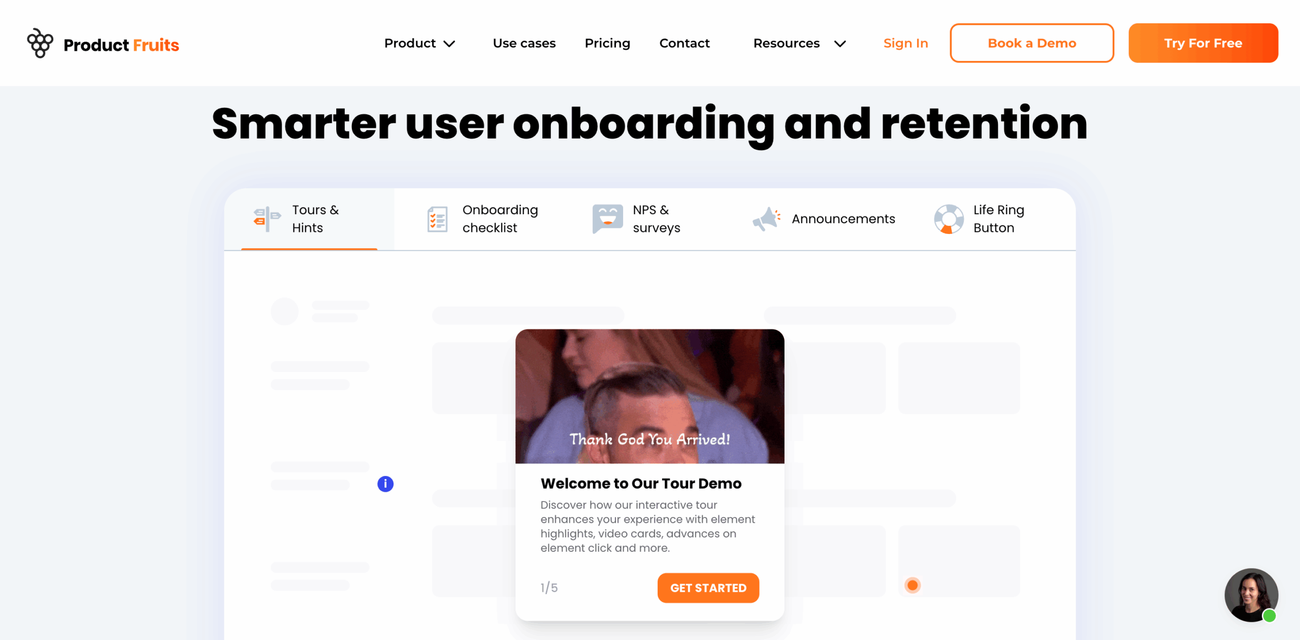
Originally limited to just the basic onboarding features, Product Fruits now allows users to create interactive onboarding flows. The updated UI is also less clunky than before.
Product Fruits offers some useful user onboarding features, including:
- Product tours and walkthroughs.
- Checklists.
- Hints and beacons.
- Tooltips.
- In-app announcements.
- NPS surveys and feedback widgets.
- Integrated knowledge base.
Still, codeless customization options for in-app guidance features remain limited, with one user noting:
Customization options through the interface are limited, but you can edit everything through the CSS if you need more flexibility.
Product Fruits for user analytics
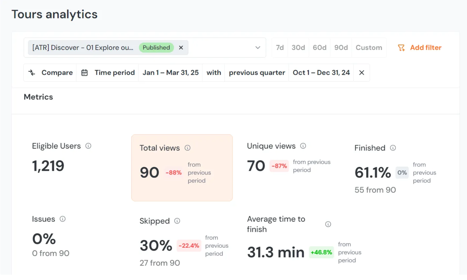
Product Fruits has minimal analytics features. It tracks user interactions with onboarding flows, but not with other product features.
Tour and checklist flows are already visualized as funnels internally. While these are limited to onboarding elements, basic funnel metrics (drop-off, engagement time per step) are provided.
For more detailed analytics, you’ll need the 2-way integration with third-party analytics tools like Mixpanel or HubSpot, which allows you to share and receive data.
Product Fruits for user feedback
Product Fruits surveys are simple and easy to implement.
Features include:
- In-product feedback and surveys without any coding required.
- Adoption Meter to track user moods and understand how users feel about your product or feature.
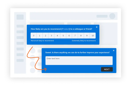
- NPS surveys for measuring user satisfaction and gathering insights for improvement.
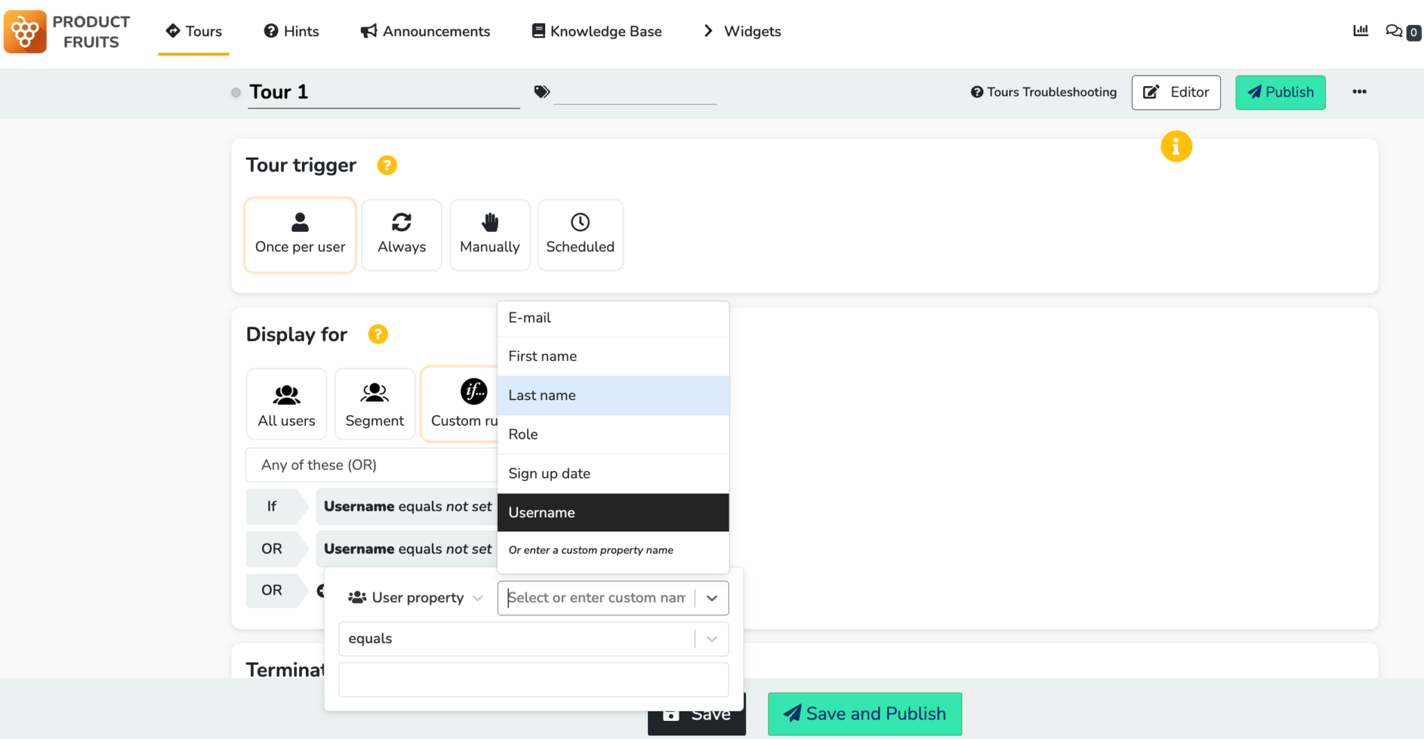
- Decent targeting options using user segmentation and behavioral triggers.
- Easy setup with hassle-free deployment and no impact on app loading or response times.
- Basic analytics.
- No AI-based user sentiment analytics.
Product Fruits pricing
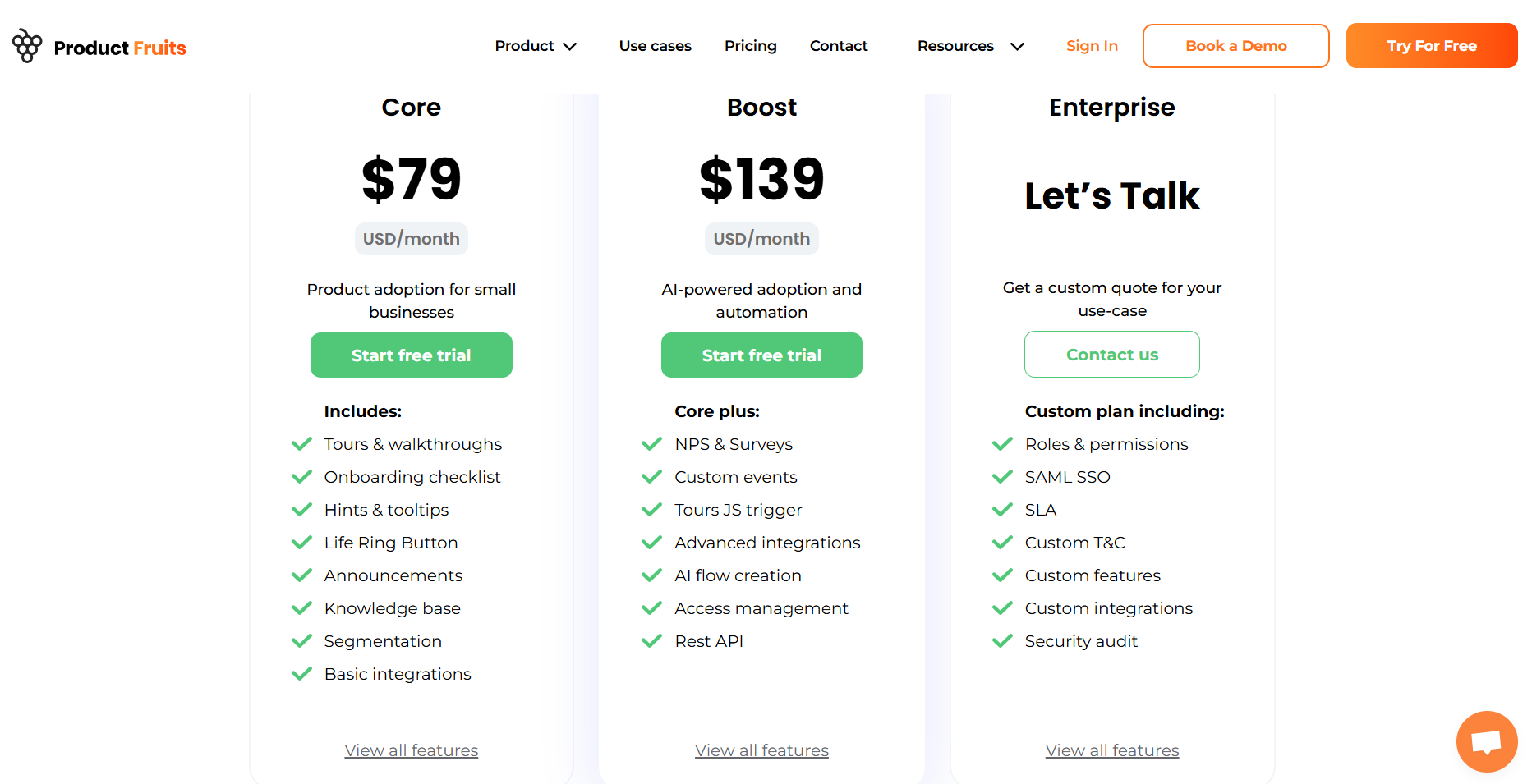
Product Fruits is one of the cheapest solutions on the market, with three pricing plans:
- Core: From $79 for 1,500 users, and $129/month for up to 2,000 users.
- Boost: $139 for 1,500 users, then $2189 for up to 2,000 MAUs.
- Enterprise: Custom quote only.
While both Core and Boost plans cap out at $79–139 for 1,500 MAUs, costs accelerate as your MAU grows: e.g., Core rises to $129/mo and Boost to $189/mo at 3,000 users. If your user base scales beyond small startup levels (5,000+ MAUs), monthly costs can become significant.
Product Fruits reviews
Product Fruits enjoys a 4.7-star rating on G2. Here are a few pros that Product Fruits users frequently mention in the interviews:
Easy to set up a simple product onboarding tour, easy integration no code tour, and hints builder. amazing support and help with custom use cases.
But there are also a few cons, like:
There are some “missing” features that would be nice to have but Product Fruits is always collecting feedback and taking into account the opinion of its users.
Since software is still at early stage, there is a lot of space for improvement. But it’s not actually a disadvantage, since improvements went almost every week.
CSS selection for hints can be tricky sometimes.
7 Reasons why you might need a Product Fruits alternative
From our perspective, you may need an alternative to Product Fruits for several reasons:
- Limited analytics: Product Fruits lacks sophisticated analytics, limiting your ability to track and measure user engagement and the user journey.
- Limited segmentation options: The segmentation options in Product Fruits are limited, restricting your ability to deliver personalized onboarding experiences to different user segments.
- No A/B testing: Product Fruits doesn’t offer A/B testing, which can be crucial for optimizing your product tours based on user feedback and data-driven insights.
- Wobbly element detection algorithm: If the element detection algorithm is unreliable, your product tours may not work as intended, potentially causing confusion or frustration for users.
- Limited survey templates: Product Fruits offers only a handful of survey templates, with limited question types.
- Limited reporting for the Resource Center: The absence of reporting for the “life ring widget” can limit your understanding of how users engage with your resources and content.
- Buggy product tour triggering: Buggy triggers create suboptimal user experiences and may hinder the effectiveness of your onboarding efforts.
Product Fruits alternatives and competitors
Now, let’s examine what we consider the top competitors in more detail to see how they stack up versus Product Fruits.
Product Fruits vs. Userpilot
Userpilot is a comprehensive digital adoption platform (DAP) and our top alternative to Product Fruits. In addition to its various onboarding features, it also enables product teams to track product usage and user behavior.
Unlike Product Fruits, Userpilot offers 3 fully developed product layers: customer onboarding, feedback collection, and advanced analytics. We also offer full native mobile app support for all layers.
We’ll explore each of these to see how they compare with Product Fruits.
Userpilot for user onboarding
It offers extensive customization options and is completely code-free.
Here’s what you’ll get with onboarding:
- A fully no-code platform: Build and extensively customize your onboarding flows using only a visual builder.
- Wide range of UI patterns: Build in-app flows using modals, slideouts, tooltips, hotspots, banners, and driven actions; curate onboarding experiences using checklists, microsurveys, NPS surveys, and an in-app resource center.
- NPS and in-app surveys: Gain access to a built-in feedback and NPS tool for collecting and analyzing user sentiment, enabling you to improve your onboarding process based on real data.
- Integrated analytics: Track user interactions and use advanced product analytics to identify where users need help.
- Advanced user segmentation: Segment users based on user attributes, in-app engagement data, NPS scores, feedback responses, etc., and trigger contextual experiences accordingly.
- Embedded resource center: Create an integrated in-app resource center for responsive customer support. The center can host a knowledge base, video tutorials, in-app guidance materials, etc.
Userpilot for user analytics
Our built-in analytics features are designed to help you drive long-term user adoption and product growth, providing you with a complete picture of your product’s health and enabling you to act on those insights.
Here’s what you’ll get with analytics:
- Autocapture: Automatic recording of all interactions with your product. So, you do not need manual event tracking and can access historical event data whenever you need it.
- Session replay: Watch real user activities in your product to spot bugs, identify friction points, and understand the user journey within your product.
- Analytics dashboard: Track your key performance and user behavior metrics at a glance. You can track the performance of key features or in-app messages, and filter your data (by user, segment, or time frame) to analyze trends.
- Path and Funnel analysis: Identify and analyze common or successful user paths within your product with path analysis. You can also analyze conversion funnels to see where users drop off.
- User retention analysis: Reveal which features users return to. Grouping by cohorts gives you a clear view of what resonates with different user groups.
- A/B testing: Conduct A/B tests with varying survey or flow compositions to identify optimization opportunities.
Userpilot for user feedback
We designedour feedback layer to help SaaS teams collect and quickly analyze user sentiment or product functionality feedback anywhere in the product.
Here’s what you can expect:
- In-app surveys: Choose from several survey templates or create a survey code-free from scratch. This includes NPS, CSAT, CES, and other microsurveys.
- Survey analytics: Each survey’s analytics tab enables you to track response percentages and review qualitative responses.
- NPS dashboard: Get a dedicated NPS dashboard that compiles NPS response data in one place. This includes total views, NPS score, trend lines, response rates, etc.
- Contextual targeting: Control who sees a survey and when with advanced segmentation capabilities. You can target specific user segments, launch surveys following an event trigger, and define where they appear.
- Survey-powered segmentation: Instantly segment your users and trigger the right experience for them using survey response data. For example, you can trigger an interactive walkthrough for a user who gives you a low NPS or CES score due to feature confusion.
Userpilot reviews
Userpilot is highly rated by its users, with a 4.6-star average rating on G2. Here’s what real users like about it:
Userpilot is an incredible, user-friendly software that allows us to create unforgettable experiences for our clients! From basic to complex experiences, we have been able to do them all with ease! I would highly recommend this software to anyone who wants to provide their clients or users with the best product tour experience. The possibilities of what you can create are endless!” – Tayla G.
“It is simple to set up, use, and does not require any dev – which means instant publishing. This is critical for us as a SaaS company that releases new features frequently; we need the ability to inform our customers of changes quickly, and doing this in our platform through Userpilot allows us to reach the right audience, at the right time, in the right place. There have been many awesome extra features we’ve discovered since coming on board, and it’s been great to see new features released frequently. The tool itself is intuitive and reliable. Having used similar products previously that were clunky and buggy this has really made us happy with our decision to move to Userpilot. – Melina K.
Userpilot pricing
Although it is one of the more expensive Product Fruits alternatives, Userpilot offers better value for money as it provides everything from onboarding to analytics, feedback, and session replay in one platform.
Here’s the pricing breakdown:
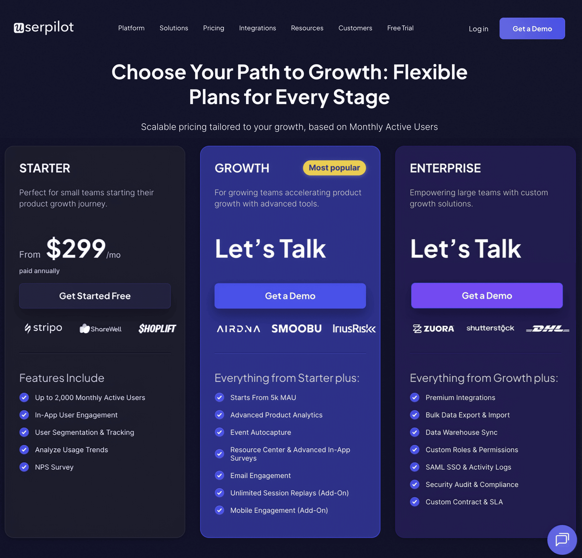
- Starter: $299 per month (billed annually). It gives you a bit of everything, from user engagement to segmentation, user tracking, basic analytics, and NPS surveys.
- Growth: Available on demand at custom prices. It is designed for growing teams needing more advanced analytics, session replays, a dedicated Customer Success Manager, native mobile app support, and more.
- Enterprise: Available on demand at custom prices. It is customized for large organizations with complex needs and boasts exclusive features like bulk data management, premium integrations, SAML SSO, priority support, and more.
Not sure which plan is right for you? Book a demo to talk with our team and find the best fit for your needs.
Product Fruits vs. Appcues
Appcues is another no-code onboarding solution that helps non-technical teams create onboarding flows, track and analyze product usage, and launch surveys.
Appcues is a powerful tool, but in our analysis, there are some key differences. Let’s explore how:
Appcues for user onboarding
Appcues enables you to design flows that make onboarding processes a breeze. Armed with these flows, you can provide in-app communication, guidance, and curated experiences.
Here’s what you’ll get with Appcues:
- A WYSIWYG builder with UI patterns like modals, hints (tooltips), beacons, and slideouts.
- You can create onboarding checklists that outline essential steps and prompt users to take the next step. These are okay but have limited functionality (for example, you can’t trigger JS functions or add gamification elements) compared to alternatives.
- Build custom user segments based on user properties, flows, interactions, or events you set up in the events explorer.
- “Launchpads” to provide users with in-app support on demand. Unfortunately, these resource centers are limited, supporting only external links and not an in-app knowledge base.
Appcues for user analytics
We spent time with Appcues analytics and concluded that it is easy to set up and use, and quite (but not totally) advanced in its functionalities. Unfortunately, its best features are gated to higher plans.
With that in mind, here’s what you can expect from Appcues analytics:
- The Event Explorer feature simplifies the process of viewing, validating, and visualizing events. These events can power goals, trigger flows, and aid user segmentation.
- You can define flow goals and track user engagement with flows to monitor their performance.
- The NPS dashboard tracks NPS scores and feedback in real time. Unfortunately, this score isn’t tied to product usage, making it hard to see the correlation between NPS score and feature adoption.
- You can run basic A/B testing and control group experiments to see how different onboarding flows affect user behavior.
- A powerful segmentation feature enables you to group users based on their properties and in-app behaviors (flow interactions, checklists data, etc.).
Appcues for user feedback
As a product adoption platform, Appcues offers a feedback collection layer. But is it ideal for feedback collection? Not according to our review!
Here’s what we noticed:
- Appcues’ feedback is primarily designed for NPS surveys. They offer pre-built NPS templates, which can be customized using a visual builder.
- For non-NPS surveys, you’ll have to build them using a modal or slideout UI pattern.
- Although there’s some level of survey analytics for NPS surveys, you can’t analyze, break down, or visualize responses for surveys built on modals. You also can’t act on the insights they provide.
- Finally, Appcues’ analytics-backed segmentation is great for survey targeting. You can also customize your survey’s display frequency.
Appcues reviews
Appcues users generally view the product positively, giving it a 4.6-star rating on G2. We found some interesting reviews, including:
The chrome extension works pretty well to create and build flows. Generating these experiences with the benefit of seeing what the look and feel will be like on-the-fly is immensely helpful.
Further, targeting elements is pretty simple, so you won’t have to open up a code editor and dig in to deliver a great experience. It’s a great tool for a number of reasons, but I love the fact that you can deliver specific communication to a specific audience in your application when you need to, without having to leverage a development department. – Verified User
Appcues pricing
All things considered, in our opinion, Appcues does not offer the best value for money. It is expensive and limits its features for basic plan users. Even some of its “advanced functionalities” aren’t as advanced as other Product Fruits alternatives.
For up to 2,000 MAUs, expect to pay:
- Essentials: $375/month (Up to 5 user licenses).
- Growth: $800/month (Up to 15 user licenses).
- Enterprise: Custom pricing (Unlimited user licenses).
Product Fruits vs. UserGuiding
UserGuiding is a no-code product adoption tool that provides various features for onboarding and engaging users. It is designed to help companies increase user engagement and drive customer retention.
But how does it fare as a Product Fruits alternative? Here’s our take:
UserGuiding for user onboarding
UserGuiding has numerous features for creating onboarding flows and guiding new customers through the user journey.
Here’s what you’ll get when you start using UserGuiding:
- Create interactive product walkthroughs without disturbing your developers, as it’s completely code-free.
- Build onboarding checklists and drive customers to the activation point by eliminating the guesswork on what the next step should be.
- Communicate with users using tooltips, banners, slideouts, and pop-ups to help keep users engaged.
- Compile your educational resources into a standalone knowledge base that acts as a customer service platform.
- Take advantage of the advanced customization options to style your in-app guidance materials.
UserGuiding for user analytics
UserGuiding’s analytics features provide insights into how users are interacting with your onboarding flows and in-app experiences.
Although it isn’t the most sophisticated analytics tool on the market, it offers just enough for most users. You can…
- Analyze the performance of your onboarding flows in detail. This will help you identify what’s working and what’s not.
- Track how users interact with your app in a given period and identify product trends.
- Monitor real-time user engagement.
- Segment users based on their interactions or attributes to personalize their product experience.
- Conduct A/B tests, generate impact reports and daily/weekly performance reports, and track goals.
UserGuiding for user feedback
With UserGuiding, you can collect user sentiment data using NPS surveys and microsurveys, even with the Basic plan. Here’s what you get:
- Build NPS and in-app surveys without writing a single line of code.
- Get survey response summaries on your feedback analytics dashboard and segment users based on their responses.
- Customize your survey to match your brand and define custom audiences, segments, timing, and targeting rules to trigger the surveys.
- Unfortunately, you can’t tag qualitative NPS responses to identify the trends between the scores.
- There’s also no support for longer survey forms.
UserGuiding reviews
UserGuiding is a well-loved product, with a 4.7-star rating on G2. Here are some reviews from real users:
Creating guides/checklists are easy to implement. It does not take a lot of time to make adjustments when you need to make changes.
You can go live with a simple guide or checklist within minutes. I was able to go live within a few days of getting started. – Administrator in Computer Software
UserGuiding pricing
UserGuiding offers a range of pricing plans for different business needs. Here is an overview of their current pricing options:
- Support Essentials: Free forever. Supports the creation of a help center suite and a knowledge base.
- Starter Plan: Available at $174 per month (billed yearly) for 2,000 monthly active users. Provides reporting, segmentation, in-app surveys, and other product adoption features.
- Growth Plan: Available at $349 per month (billed yearly) for 2,000 MAUs. Supports A/B testing, goal tracking, and integrations.
- Enterprise Plan: Custom pricing. Supports SOC2 & GDPR, personalized customer support, SAML SSO, and activity logs.
Product Fruits vs. Chameleon
Chameleon is a digital adoption platform designed with a focus on customization, empowering product teams to tailor onboarding flows to suit their needs.
But how does it compare to Product Fruits and its other alternatives?
Chameleon for user onboarding
Chameleon provides a competitive suite of onboarding features. Here’s what you get:
- A variety of UI patterns, including tooltips, modals, banners, and beacons (hotspots). You also get a tour builder for creating multi-step guided walkthroughs.
- You can customize the styling (font, color, opacity, etc.) of your tours. However, you might need to add some CSS styling for advanced customization.
- Chameleon’s Launchers support checklists, small help widgets, and notification centers. The downside is that you can’t have one launcher with multiple types of content.
- You can target content to different user segments based on multiple data sources, including custom event triggering.
Chameleon for user analytics
In our review, we found that Much like Product Fruits, Chameleon doesn’t have a robust product analytics layer. Still, it does enough to help you understand your users.
Here’s what you can expect:
- In-app guidance analytics, including views/impressions, interactions, and time spent.
- A/B testing to help you measure the impact of flow changes on sample user groups.
- Segment users based on user properties, custom user events, in-app experience activity, etc.
- You can also create a two-way integration with third-party platforms like Amplitude, Mixpanel, and Google Analytics to help you get deeper analytics insights from these platforms.
Chameleon for user feedback
Here’s how you can collect user feedback with Chameleon:
- Build different types of microsurveys (limited to 5 on the Startup plan) such as NPS, CSAT, CES, Opt-in, and custom feedback types.
- Personalize the surveys as you wish (you will need help from a developer or may require CSS skills).
- You can select the survey’s frequency and whether you want it to repeat.
- You get access to basic completion reports. Most of the additional data will need to be analyzed in your analytics tools that Chameleon integrates with and sends data to.
- You will see your NPS score in the reports, but you will need analytics tools for the rest of the microsurveys.
Chameleon reviews
Chameleon is the lowest-rated product on this list, with a 4.4-star rating on G2. Here’s what one user has to say about it:
I love the variety of formats we can build in Chameleon, from interactive tooltips to progressive tours and launchers! It’s also really easy to track performance of each of these and adjust accordingly. The interface still feels quite clunky whenever I’m in build mode. For instance, I don’t like that I have to use markdown and CSS when formatting text instead of having an inline styling menu to select from. Then there’s also the issue of surveys or tour steps appearing where they’re not supposed to, apparently mistaking an element in another page for the anchor. – Nikki D
Chameleon pricing
There are four pricing plans to select from:
- HelpBar: Free forever.
- Startup: $279/month for 2,000 MAUs. Supports unlimited tours, 5 microsurveys, and 1 launcher.
- Growth: $1500/month for 2,000 MAUs. Includes A/B testing, goal tracking, and unlimited experiences.
- Enterprise: Custom pricing. Supports unlimited seats, localization, etc.
Conclusion – Which of the Product Fruits alternatives is the best?
As you can see, there are many different competitors and alternatives to Product Fruits. We’ve discussed a few above, but which one is the best?
The answer is “it depends.” However, we strongly believe that if you’re a mid-market SaaS company looking for a great user onboarding and product analytics tool, Userpilot is the best option for you.
Hopefully, we’ve given you a helpful breakdown. If you need any help understanding how Userpilot differs, we are always happy to talk!

