The onboarding process for SaaS platforms covers the entire funnel, from initial signup to product activation and adoption. It should deliver value to the customers as early as possible and let them learn the product hands-on. As such, the onboarding experiences should live mostly in your app. And the easiest way to set them up is with onboarding software.
The best tool for onboarding new customers should strike a balance between a variety of UI patterns and personalization options, and a simple, no-code setup. You should also consider whether you need user onboarding software only, or maybe a complete product engagement and analytics platform.
So in this guide, I’ll help you choose the right user onboarding tools. I’ll break down the must‑have features of onboarding software and review the five platforms that meet this criteria.
What’s your biggest challenge with user onboarding right now?
Identifying your primary challenge is the first step toward finding the best tools for onboarding new customers. Whether it’s activation, adoption, or conversion, the right platform can help.
How technical is the team that will manage the onboarding process?
The technical skill of your team is a key factor. No-code tools empower non-technical teams to create and manage the entire client onboarding process without engineering help.
What’s your primary goal with a new onboarding tool?
Your goal determines the scope of the solution you need. Some tools offer basic guidance, while all-in-one platforms provide a holistic view of the user journey.
The best tools for onboarding new customers are versatile & no-code.
Based on your answers, you need a powerful, no-code platform that combines deep analytics with easy-to-build in-app experiences. Userpilot is an all-in-one product engagement platform designed to help you activate users, drive adoption, and gather feedback seamlessly.
Try Userpilot Now
See Why 1,000+ Teams Choose Userpilot
Must-have features of onboarding new customers tools
As I mentioned, user onboarding software has one primary goal: to help new sign‑ups reach the activation stage as fast as possible.
So after trying many user onboarding tools throughout my career, I identified eight must-have features:
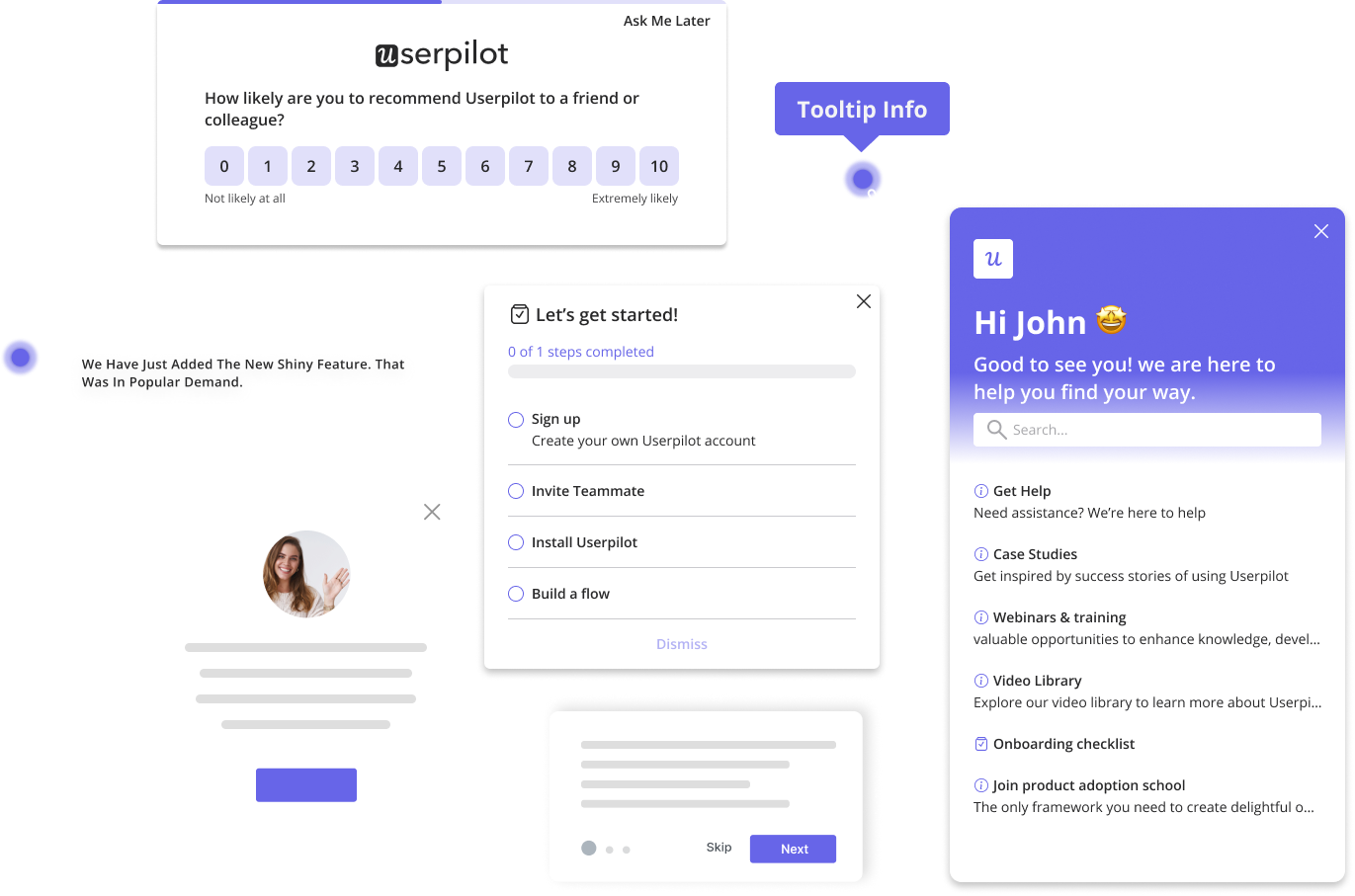
- Interactive walkthroughs: I want a builder that gives me various UX elements such as modals, tooltips, hotspots, slideouts, and checklists. This way, I can ensure the interactive onboarding flows fit the product’s UI.
- In‑app help centers: Adding an in-app resource hub (think of a widget or “?” button) lets users search tutorials, watch videos, or file a support ticket without ever leaving the product.
- Email and mobile onboarding: Triggering emails or push notifications can re‑engage users who drop off and nudge them back to the app. Plus, it’s essential for omnichannel customer engagement.
- User insight tools:In-app surveys help me learn if users are satisfied with the onboarding experience.
- Product analytics: I need to see where users churn inside the onboarding funnel, why they get stuck, and what the results of my experiments are. Funnel charts, path analysis, and cohort reports help me create hypotheses to improve the onboarding process.
- No‑code implementation: A no‑code tool allows our non-technical teams to manage the client onboarding process without requiring engineering help.
- Segmentation and personalization: Onboarding must be personalized based on role, plan, lifecycle stage, or behavior. User segmentation and targeting are indispensable for this.
- Customization and localization: Full control over fonts and colors ensures that flows look native to the app. Plus, localizing content makes it more accessible to users from multiple countries.
5 Best new user onboarding tools: Reviews, Key features, Pricing
To save you a dozen demo calls, I’ve put the five most popular customer onboarding software side‑by‑side, comparing them on the metrics that matter:
| Tool | Key onboarding features (high‑level) | Channels | Pricing | G2 score | All‑in‑one product platform? |
| Userpilot | Interactive walkthroughs, checklists, resource center, surveys, analytics, A/B testing | In‑app, email, mobile | Starter from $299/mo, Growth and Enterprise plan is custom | 4.6/5 | Yes |
| UserGuiding | Product tours, checklists, resource center, AI assistant, surveys, basic analytics | In‑app (web) | Starter from $174/mo, Growth from $349/mo | 4.7/5 | No |
| Appcues | Walkthroughs, email/mobile workflows, resource center, surveys, A/B testing | In‑app, email, mobile | Essentials from $300/mo, Growth from $750/mo | 4.6/5 | No |
| Chameleon | Product tours, launchers, checklists, surveys, embedded cards, analytics | In‑app (web) | Startup from $279/mo, Growth from $999/mo | 4.4/5 | No |
| Pendo | Product tours, checklists, resource center, surveys, robust analytics & AI | In‑app, email, mobile | Free plan (≤500 MAU), all paid plans need a quote (MAU‑based) | 4.4/5 | Yes |
Userpilot: Complete product insights and user engagement platform
This is my biased opinion, but if you’re looking for an all-in-one product platform that combines onboarding experiences with feedback collection and detailed product analytics, Userpilot is the best option.
The tool lets you design omnichannel interactive walkthroughs. You can personalize the onboarding process based on detailed user segmentation and advanced targeting and triggering options. You can also track product metrics as well as the performance of your flows with product analytics and session replays, and run A/B tests to find opportunities for improvement. All of that can be set up completely no-code, so non-technical teams will require zero engineering help.
Userpilot’s key features for new customer onboarding
Here are all the Userpilot features that help us keep customers engaged during onboarding:
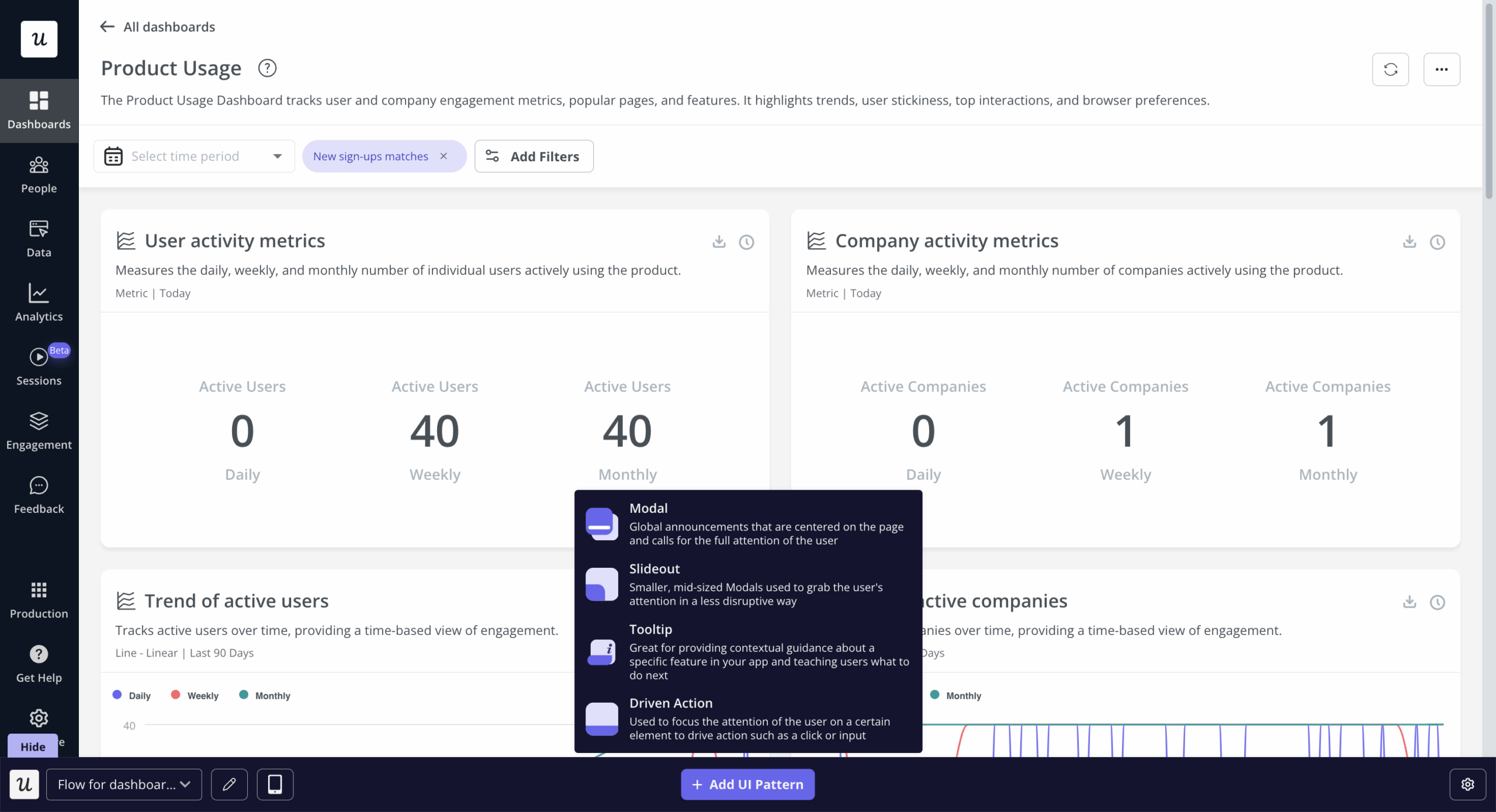
- Interactive walkthroughs. The Chrome-extension-based builder includes modals, tooltips, slideouts, hotspots, and checklists. I can put them together into multi‑step flows or trigger a single nudge to, for example, introduce a new feature.
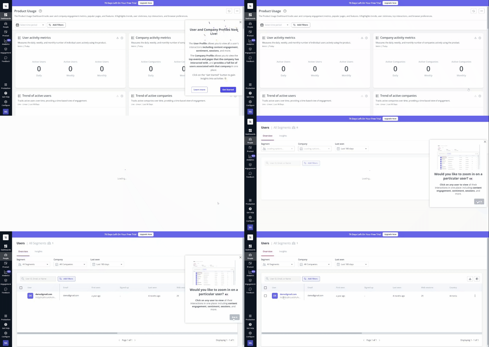
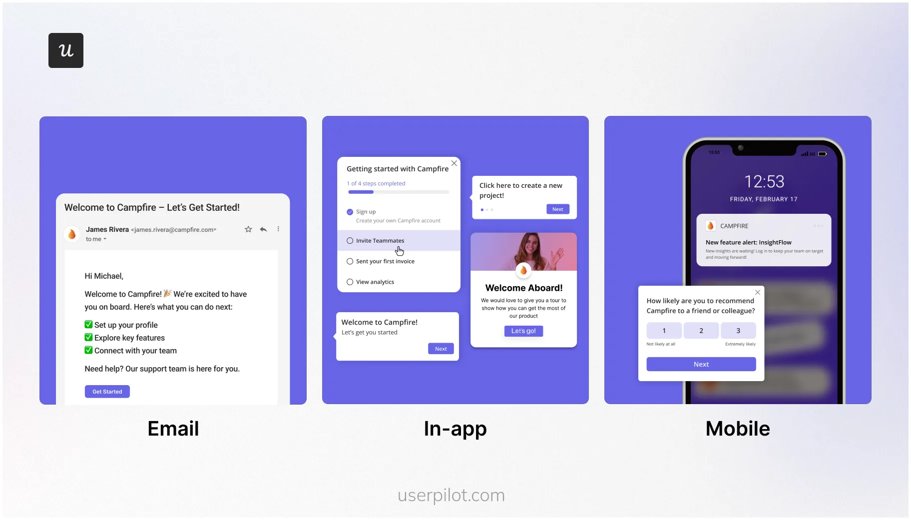
- Omnichannel onboarding (in‑app, email, mobile): Even when users are not in the app, I can send a reminder email or a push notification to get them back in.
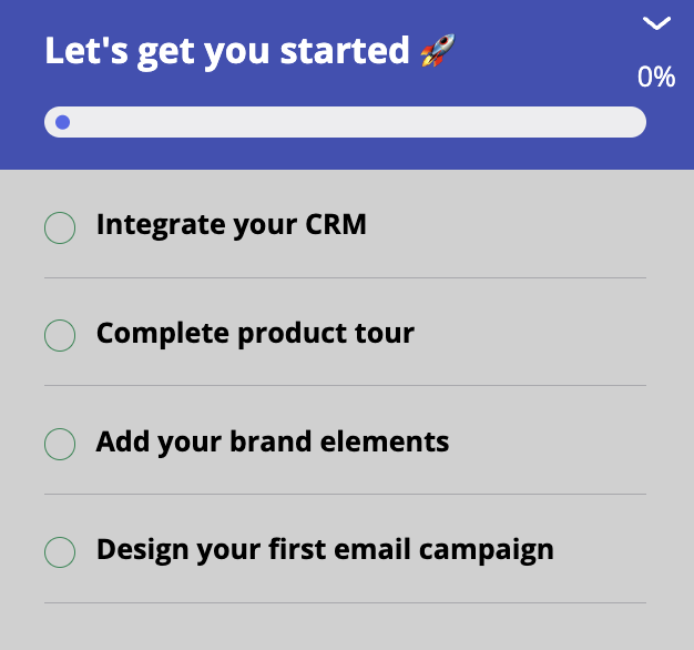
- Onboarding checklists: An onboarding checklist helps users track onboarding progress and review onboarding tasks. Additionally, each item can launch its respective guide. This makes it easy for users to pick up where they left off.
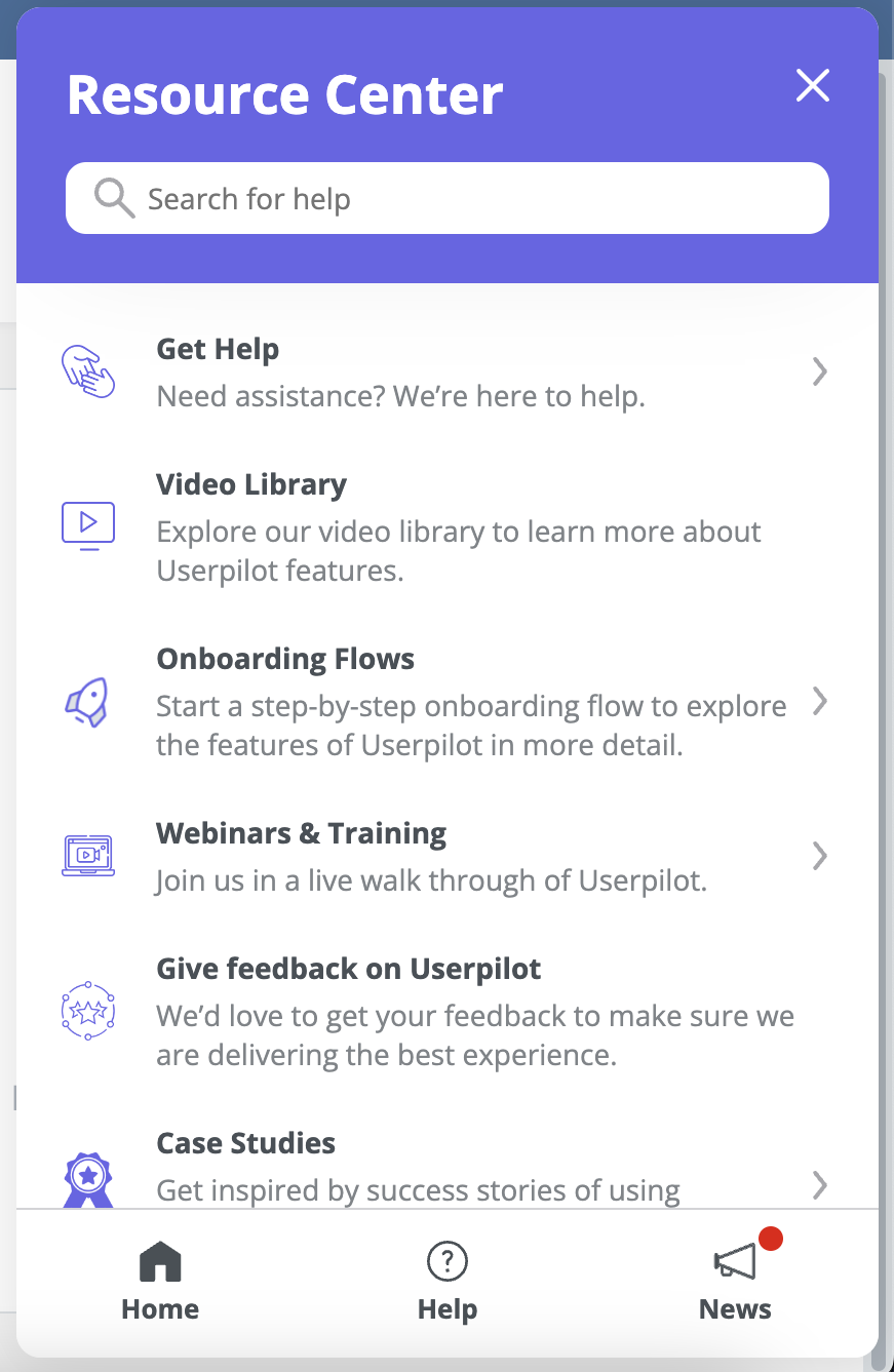
- Resource center: I can embed a resource center as a customizable in‑app widget. There, users can access onboarding flows, tutorials, webinars, support docs, and personal assistance.
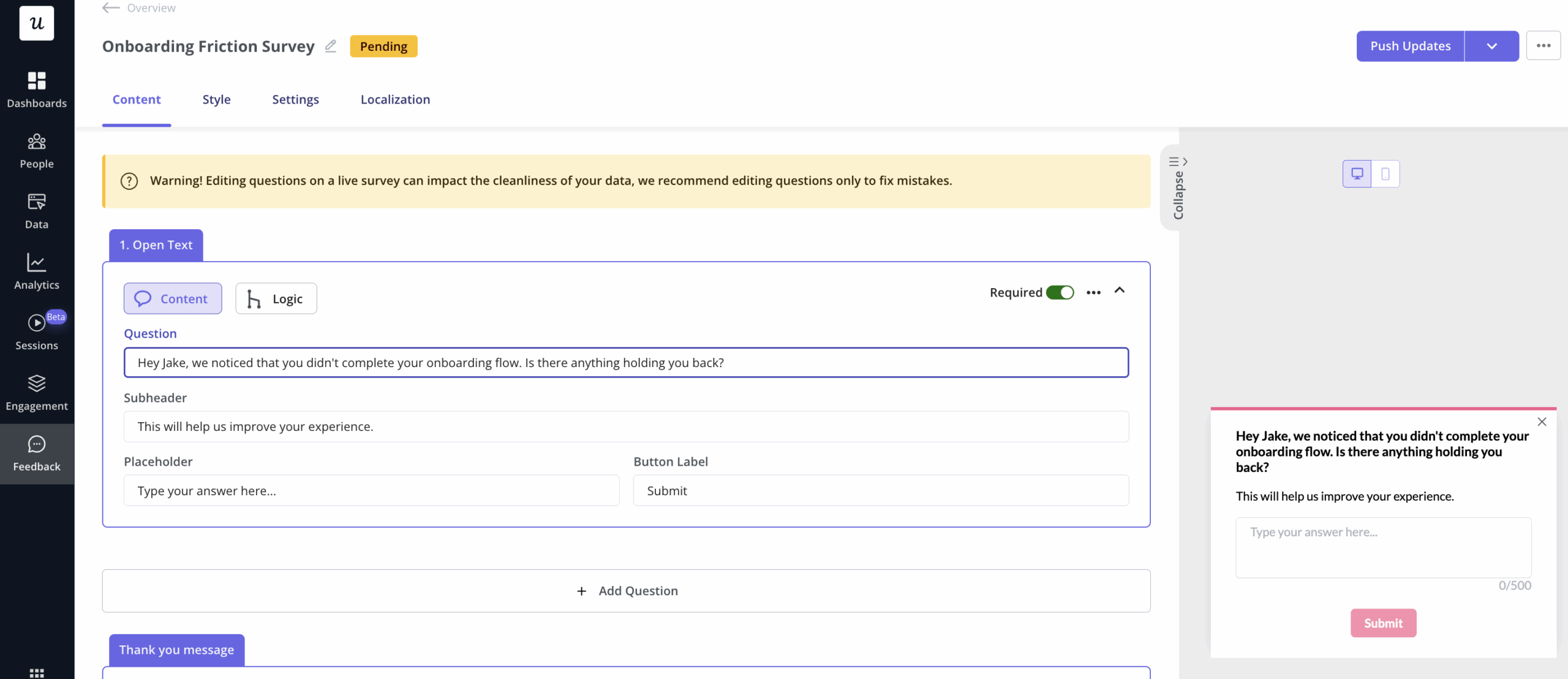
- Surveys: Userpilot can collect onboarding feedback from fully customizable surveys (with templates for NPS, customer satisfaction, CES, PMF, etc). Plus, it supports branching logic, which means I can trigger them contextually based on in-app activity.
- AI localization: I can translate all our onboarding resources with AI without having to export, translate, and import our content manually.
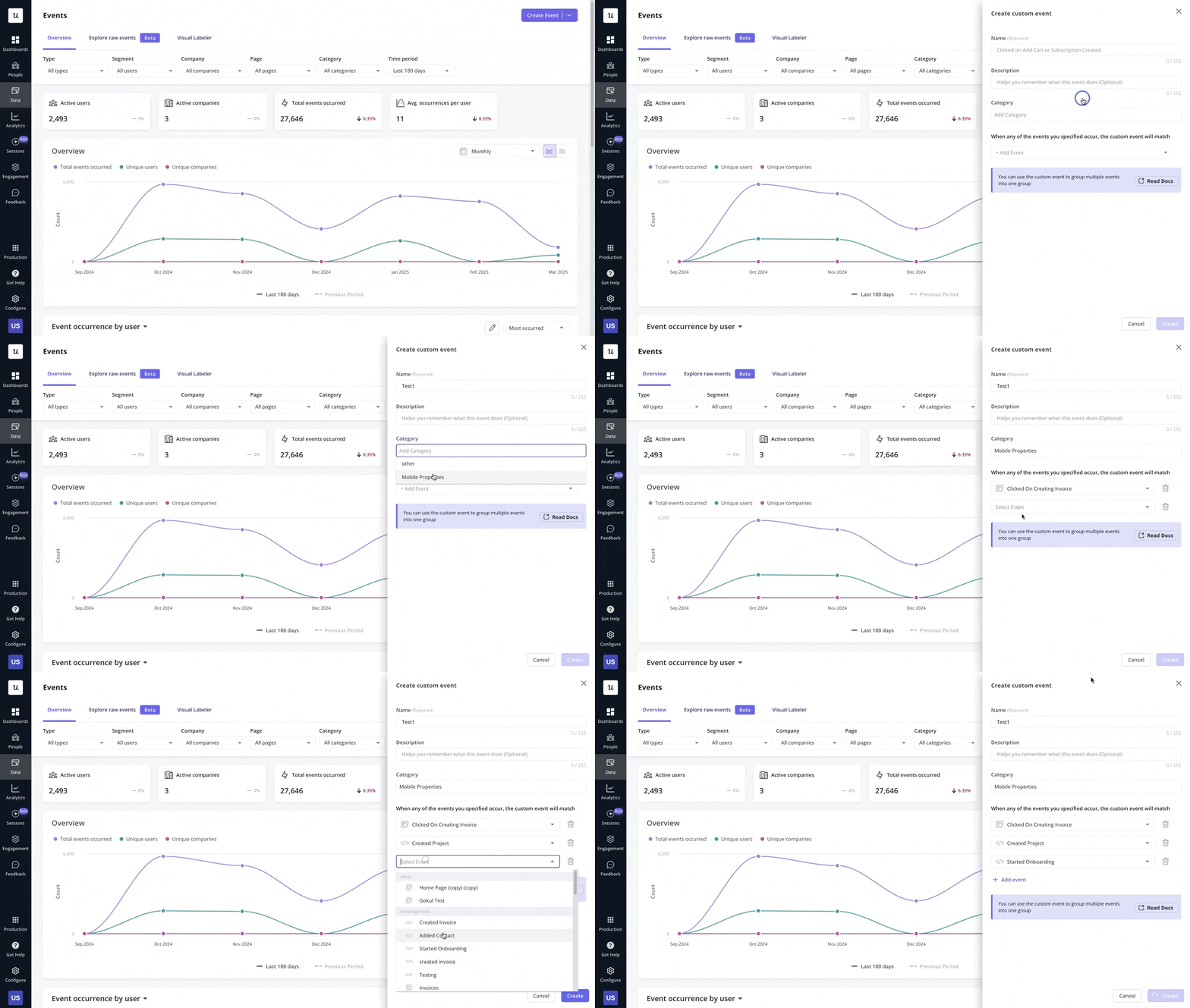
- Auto-captured events: Userpilot starts tracking all user interactions after installing its SDK. So if I want to analyze specific interactions during the onboarding phase, I can just label the events I need and analyze them without coding.
- Segmentation and personalization: Userpilot offers everything I need to personalize the onboarding experience. I can segment users based on their company data, their in-app activity, their survey responses, and more. And with this, I’m able to target highly relevant flows based on their job or in-app behaviors (e.g., if a user drops off the in-app onboarding, they can get an automatic re-engagement email).

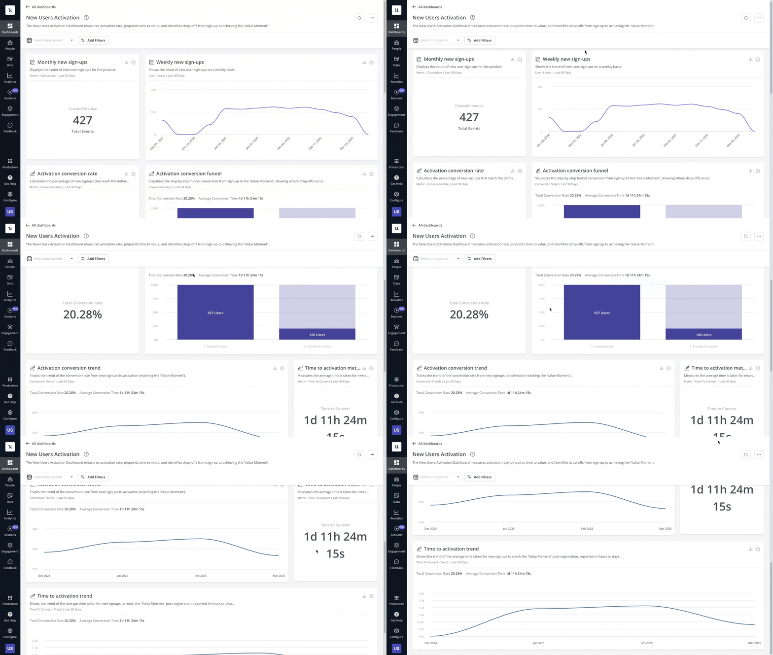
- Product analytics: Userpilot’s analytics tools allow me to watch over the entire onboarding process. For instance, I can create a funnel chart to spot friction in my current process and improve drop-offs.
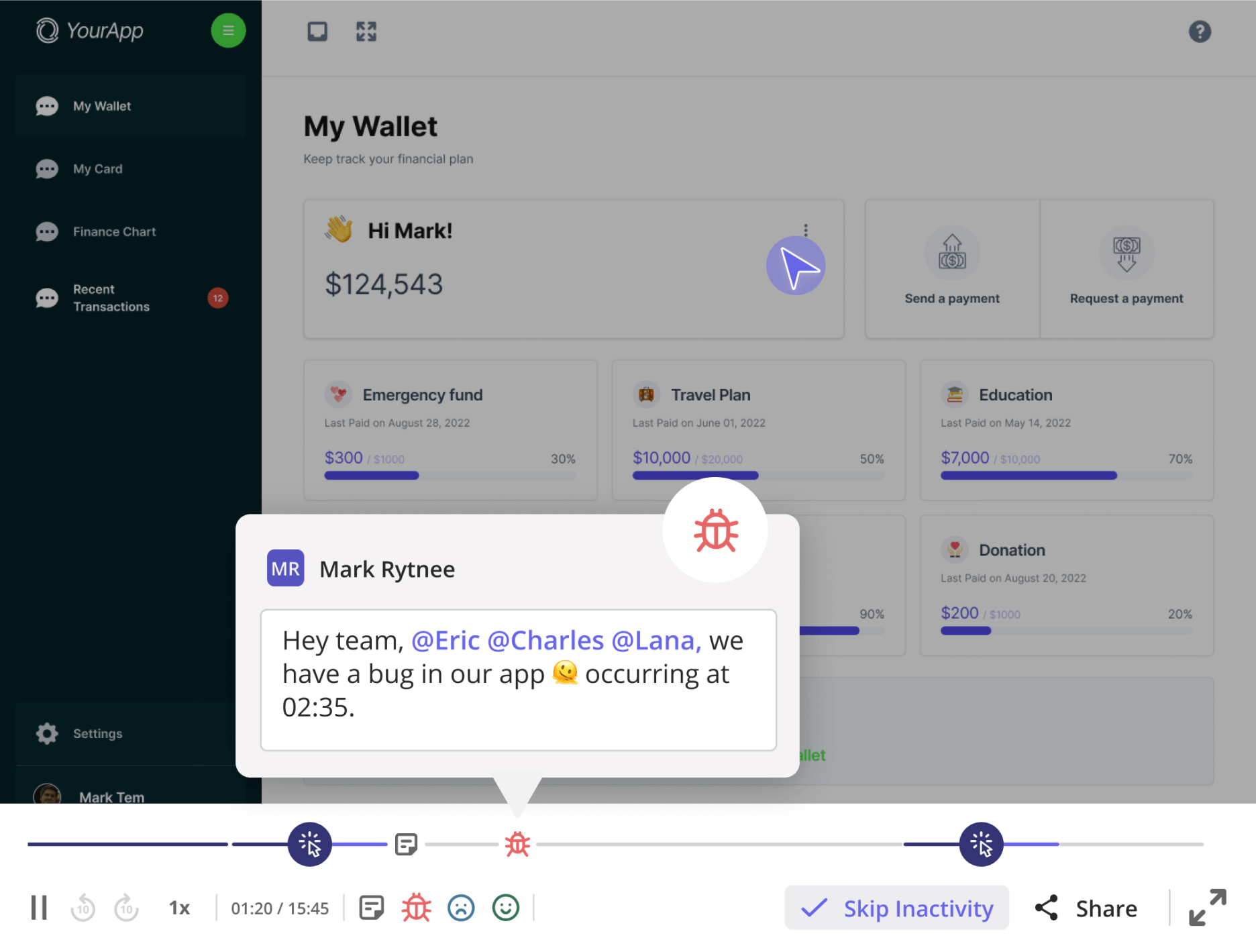
- Session replays: Userpilot records user sessions and also allows me to filter them, skip the idle moments, collaborate with teammates, and tag bugs so developers can fix them quickly.
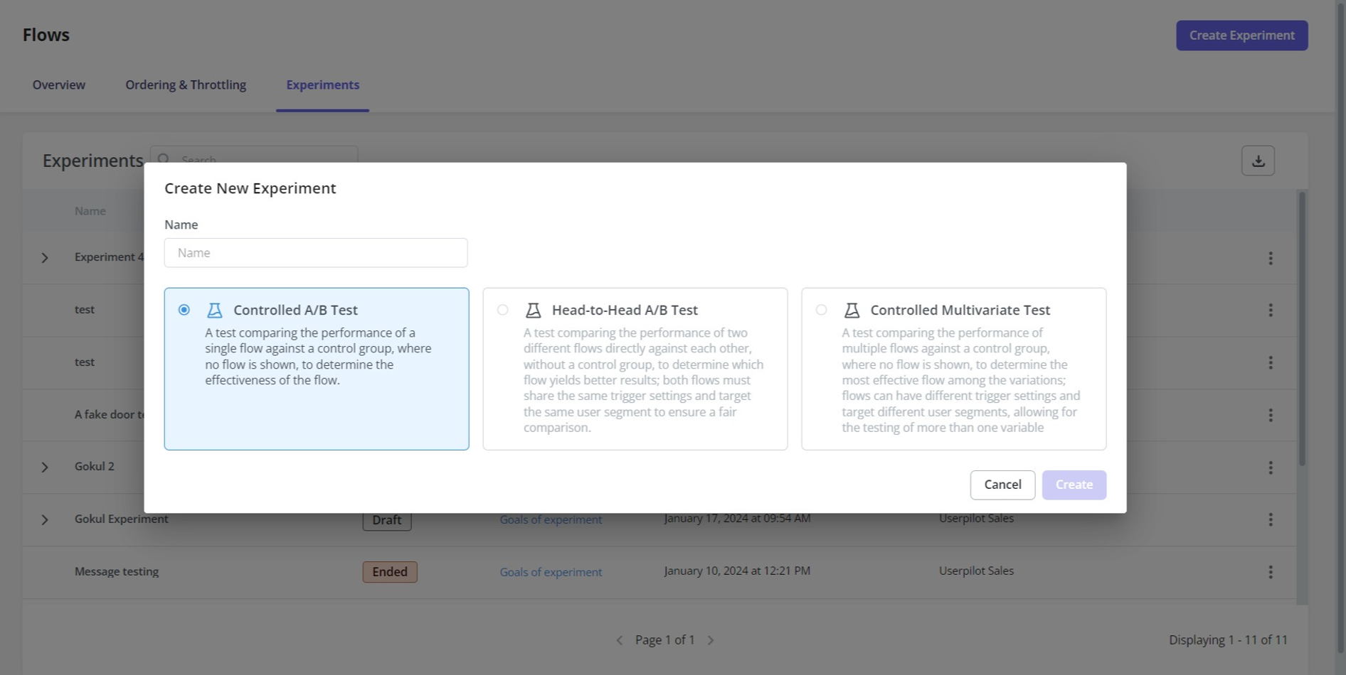
- A/B testing: Userpilot supports controlled, head‑to‑head, or multivariate A/B tests. It helps me validate which UX copy or checklist tasks convert more customers.
Pros and cons of Userpilot
Here’s a breakdown of its pros and cons:
| Userpilot pros | Userpilot cons |
| ✅ Multiple UI patterns. Modals, slideouts, hotspots, tooltips, and checklists are available across every paid plan. | ❌ No employee onboarding support. The platform focuses on customer apps. |
| ✅ Deep customization. Can design flows to match your product’s UI and translate the content to the user’s language. | ❌ No forever free plan. After the 14-day free trial, you need a paid tier. |
| ✅ No-code setup. Builder, event tracking, dashboards, and custom events are fully no-code. | ❌ Pricey for early-stage startups. Entry pricing can feel steep for smaller budgets. |
| ✅ Comprehensive analytics. Product usage, flow data, funnels, and survey results all live in one workspace and can be monitored in pre-built or custom dashboards. | |
| ✅ Integrations and webhooks. Native hooks for Segment, Amplitude, Mixpanel, HubSpot, Salesforce, Slack, plus outbound webhooks to connect with existing tools. | |
| ✅ All-in-one product platform. Guidance, feedback, and analytics are all combined in one platform, ensuring easy setup and data access. |
What users say about Userpilot
Userpilot holds a 4.6 out of 5 rating on G2 based on hundreds of verified reviews. Our customers praise three main aspects: the speedy no‑code builder, the depth of analytics, and our proactive customer success team.
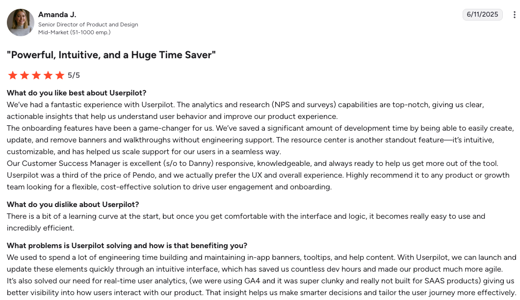
For example, Amanda, a Senior Director of Product and Design, praised Userpilot’s onboarding tools and UI elements for being easy to set up and saving precious development time, as well as a great price-to-offering ratio.
Other reviews mention the following:
“We cut weeks of development work by letting product and customer success teams own walkthroughs and banners.”
“It feels native, and we can update help articles or videos without shipping a new release.”
“We left a well‑known tool that was three times the price and still needed another platform for surveys.”
Userpilot pricing
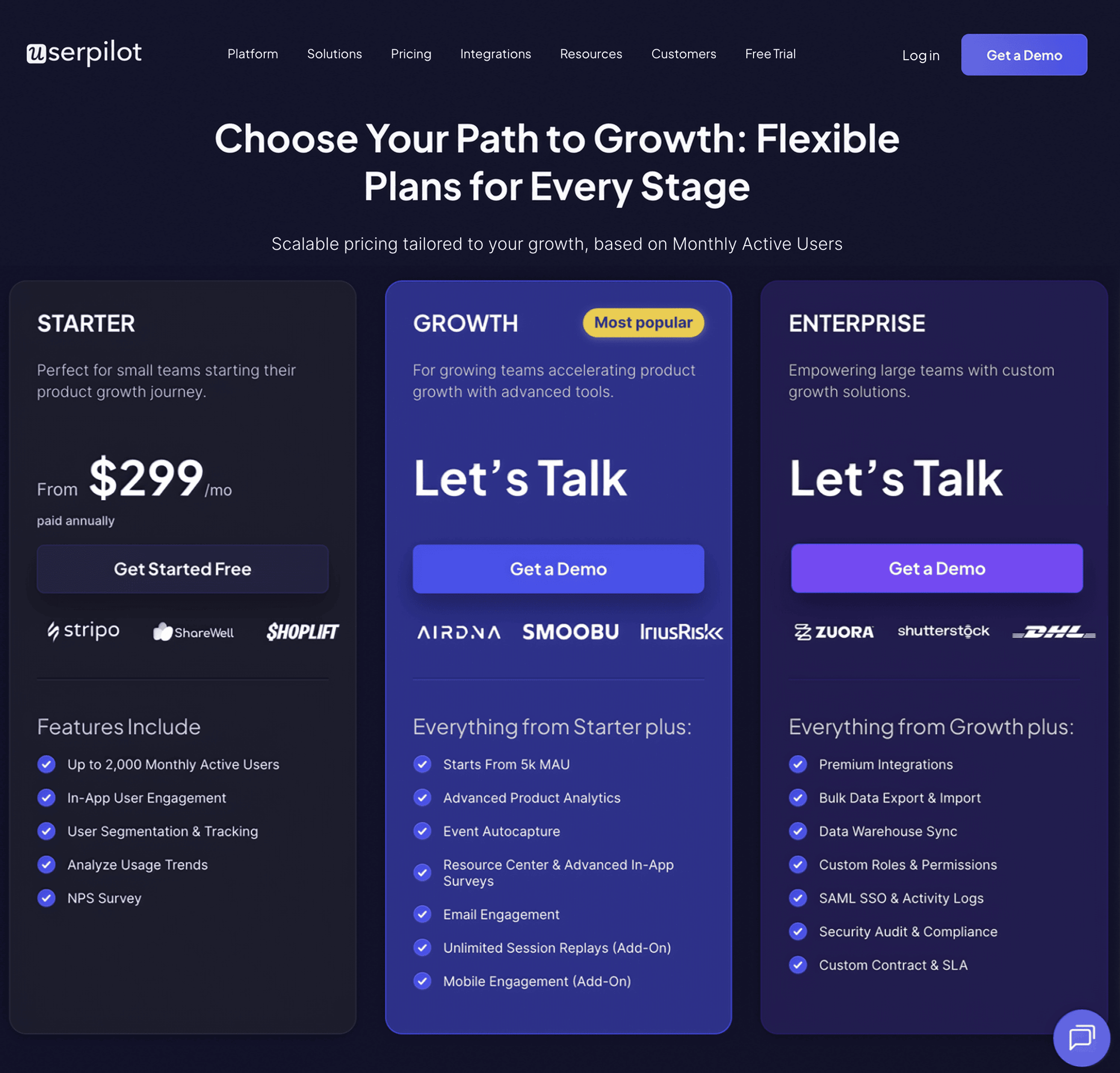
Userpilot offers three clear tiers with no hidden costs: Starter, Growth, and Enterprise plans.
- Starter: $299 per month for up to 2,000 monthly active users. Includes in‑app engagement data, basic segmentation, usage trend analytics, and NPS surveys.
- Growth:Custom pricing. Adds product analytics, event autocapture, session replays, in‑app surveys, resource center, and localization options.
- Enterprise: Custom pricing. Builds on Growth with premium integrations, bulk data export/import, custom permissions, SAML single sign-on, activity logs, priority support, security compliance audits, and a tailored contract.
Plus, you can test every tier with a 14‑day trial before you commit.
UserGuiding: Self-serve in-app experience platform
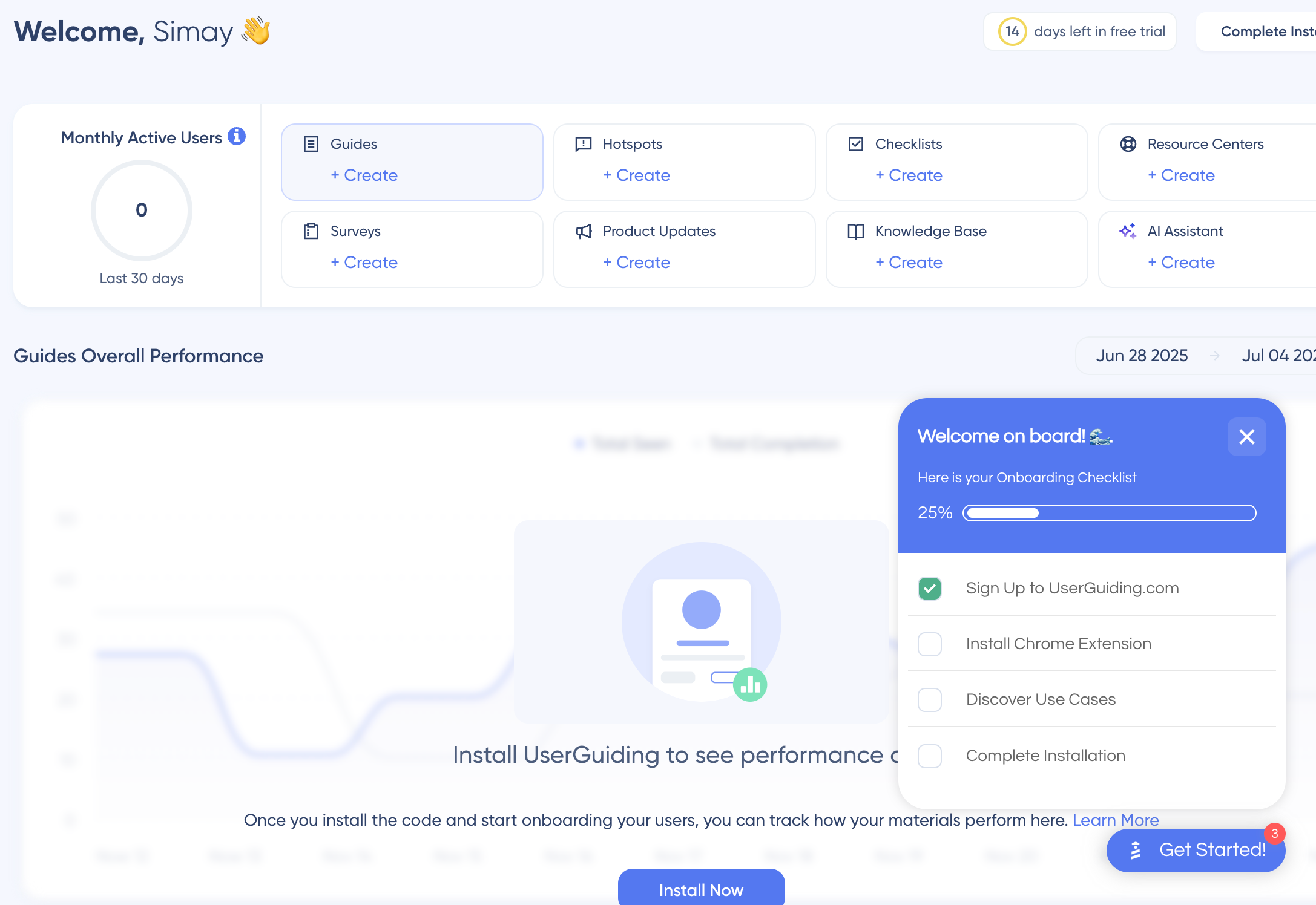
UserGuiding is a lightweight user onboarding software that helps companies onboard new customers and boost product adoption. It offers a no-code builder, segmentation options, and UI patterns like hotspots, tooltips, and modals.
UserGuiding’s key features for new customer onboarding
This is what’s included when you use UserGuiding to onboard first‑time customers:
- Interactive product guides: You can build tours with modals, tooltips, hotspots, and step-by-step flows that walk users through activation tasks.
- Checklists and resource center: Checklist slideouts track the onboarding progress, and the resource center sits as a widget in your app and gives access to guides, knowledge base articles, or chats with the customer success team.
- AI assistant: The built-in assistant can draft UX copy, refine tone, or translate text with a few clicks. It also localizes flows.
- In‑app surveys: Trigger short surveys to capture contextual feedback while the experience is fresh. The responses integrate with the analytics dashboard and show how user sentiment correlates with guide completion.
- Segmentation: It can group users and target flows based on user role, plan, lifecycle stage, or custom events. Segments update in real time.
- Onboarding experimentation and analytics: Supports A/B tests to optimize guides for completion or conversion. The analytics dashboard shows completion rates, session duration, and drop-off trends.
Pros and cons of UserGuiding
Now, let’s go over UserGuiding’s pros and cons:
| UserGuiding pros | UserGuiding cons |
| ✅ Multiple UI patterns. Includes tours, hotspots, checklists, and the resource center. | ❌ Limited UI patterns on free and Starter plans. With the free plan, you can only set up the resource center. Starter only offers a limited number of each active element. |
| ✅ No-code flow builder. Chrome extension lets anyone create guides without engineering help. | ❌ No email or mobile channels. Guidance is web-only, which can limit your onboarding strategy. |
| ✅ Customization. Adjusts UI patterns to your brand colors and fonts. | ❌ Onboarding-only platform. You need a separate product analytics tool for deeper insights. |
| ✅ Unlimited free plan. Gives small teams a risk‑free option to get started. | ❌ Event tagging needs developer input. You must touch the code base to capture custom events. |
UserGuiding pricing
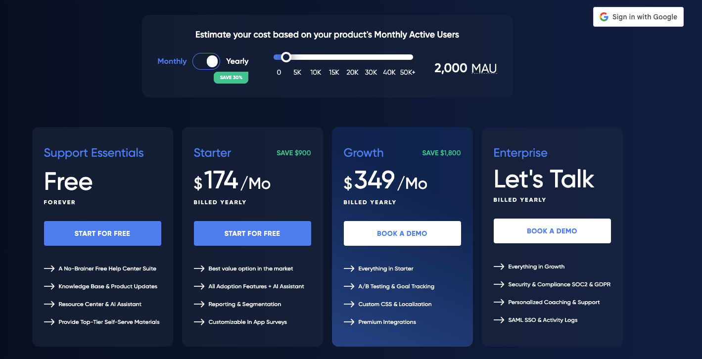
Prices vary with monthly active users and are billed monthly or yearly.
- Free forever: Includes a help center suite, knowledge base updates, the resource center, and the AI assistant.
- Starter: $174 per month (if billed annually) for 2,000 monthly active users. The Starter plan adds more UI elements, A/B testing, segmentation, plus basic reporting.
- Growth: $349 per month (if billed annually) for 2,000 monthly active users. Adding more users increases the price. It includes custom CSS, localization, premium integrations, goal tracking, and detailed analytics.
- Enterprise: Custom pricing. Adds security compliance, personalized coaching, SAML single sign-on, and activity logs.
What users say about UserGuiding
UserGuiding carries a 4.7 rating on G2. Customers praise its no‑code builder and friendly support team.
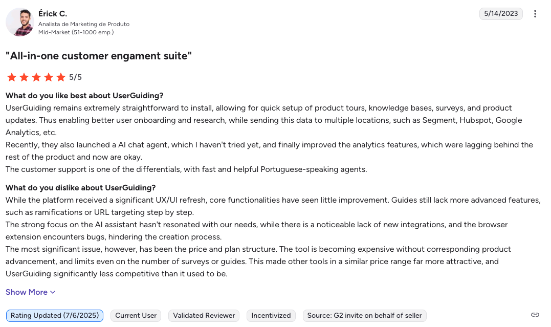
“UserGuiding remains extremely straightforward to install, allowing for quick setup of product tours, knowledge bases, surveys, and product updates.”
“UserGuiding makes it incredibly easy to create interactive onboarding experiences without needing to dive into complex coding.”
On the other hand, some users point out the limits of analytics and the cost at higher MAU tiers:
“The most significant issue has been the price and plan structure. The tool is becoming expensive without corresponding product advancement.”
Appcues: All-in-one platform for user engagement
Appcues helps PLG teams create onboarding flows across web, mobile, and email without coding. Its workflow builder makes it easy to map multi-channel journeys, while the analytics layer shows how each step influences activation and feature adoption.
Appcues’ key features for new customer onboarding
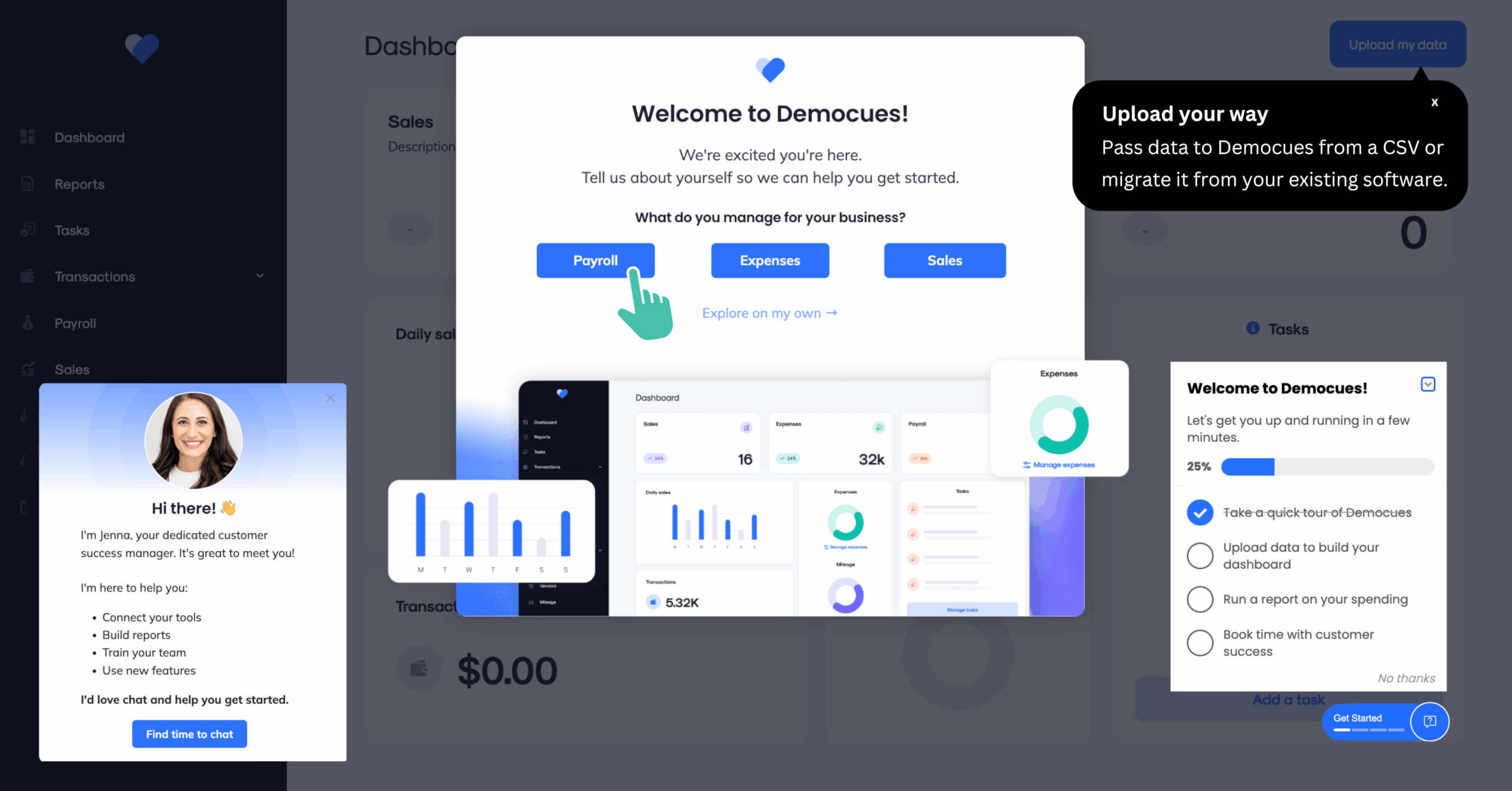
Below are the features that stand out when you use Appcues to welcome first‑time users:
- Interactive walkthroughs: You can craft tours with modals, slideouts, tooltips, and hotspots that trigger at the right moment with a drag-and-drop builder.
- Email and mobile onboarding: Appcues supports omnichannel client onboarding so you can send triggered emails and in-app mobile messages.
- Workflow automation: Uses the visual canvas to plan and automate onboarding flows. Conditions and delays make it simple to personalize timing for each segment.
- Resource center: Adds a self-serve hub that gives users access to guides, articles, or live chat without leaving the page.
- Surveys: Collects NPS, customer effort, or open text feedback inside the app. The survey results appear in the Insights tab so you can filter by segment and spot friction points.
- Segmentation and personalization: It groups users by event, property, or cohort so you can personalize all your onboarding resources to fit your users’ jobs-to-be-done. What’s worth noting is that segments update hourly, not in real-time.
- Flow analytics:Tracks engagement, funnel conversion, and time-to-value from all channels. You can also integrate events with tools like Amplitude or Mixpanel for deeper analysis.
- Experimentation: Runs an A/B test on any flow to see which flows drive the highest completion rate.
Pros and cons of Appcues
Let’s take a look at where Appcues shines and where it may fall short.
| Appcues pros | Appcues cons |
| ✅ No-code setup and design. The builder lets non-technical teams launch and edit flows. | ❌ High price. Prices are higher than similar customer onboarding software with more features. |
| ✅ Multiple UI patterns. Includes modals, slideouts, tooltips, hotspots, and checklists. | ❌Limited number of experiences. Every plan caps the number of published flows, so you may hit limits fast. |
| ✅ Customization. Gives control over colors, fonts, and CSS to make flows feel native. | ❌ Add-ons on low-tier plans. NPS, the resource center, and branching workflows require an upgrade. |
| ✅ Omnichannel onboarding. Web, email, and mobile messages can run in one workflow. | ❌ Limited data analytics. For deep product data, you need a separate solution such as Amplitude. |
Appcues pricing
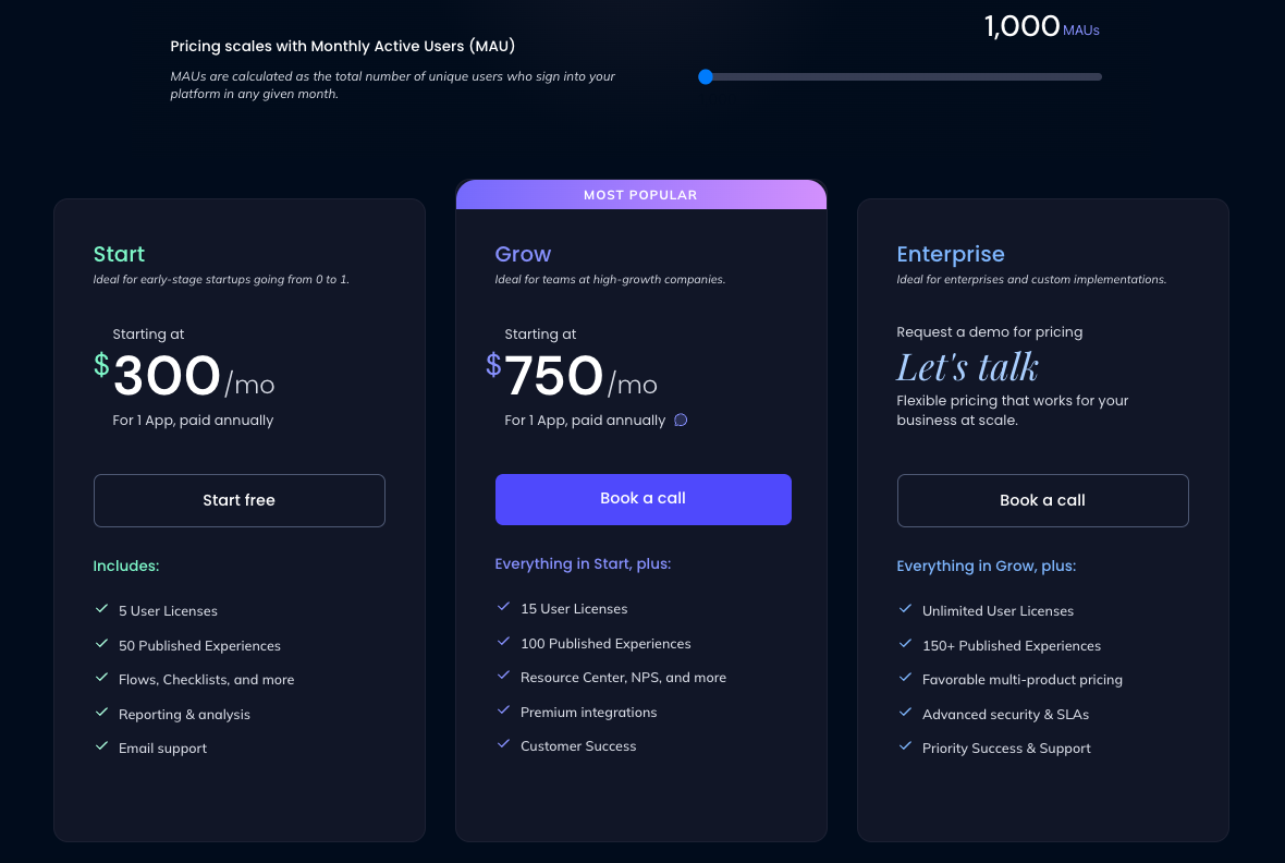
Appcues prices depend on monthly active users and are billed annually.
- Start: $300 per month for 1 app and 1000 MAUs (increasing the number inflates the price). Comes with 5 user licenses, 50 published experiences, flows, checklists, and reporting.
- Grow: $750 per month for 1 app and 1000 MAUs. Includes 15 user licenses, 100 experiences, the resource center, NPS, premium integrations, and a customer success rep.
- Enterprise: Custom pricing. Adds unlimited user licenses, 150 published experiences, multi-product discounts, advanced security, service level agreements, and priority support.
What users say about Appcues
Appcues holds a 4.6 rating on G2. Reviewers like the user-friendly builder and how product teams can publish flows without developer help.
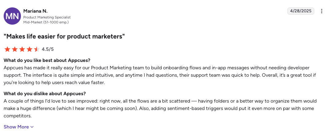
“Appcues has made it really easy for our Product Marketing team to build onboarding flows and in‑app messages without needing developer support.”
“Appcues allows me, a non‑technical marketer, to implement product experiences that would otherwise need engineering time. I can test and iterate all on my own.”
However, common critiques mention that the audience builder is slow and that it gets pricier when you reach the usage cap.
“I dislike the audience build and the user lookup features. They’re both pretty slow to populate and it takes a while to get a preview of what you’re looking for.”
“I’m on an account with certain limits and I want to upgrade sooner than I thought. So now I have to ask for more budget!”
Chameleon: Product adoption platform for in-app experiences
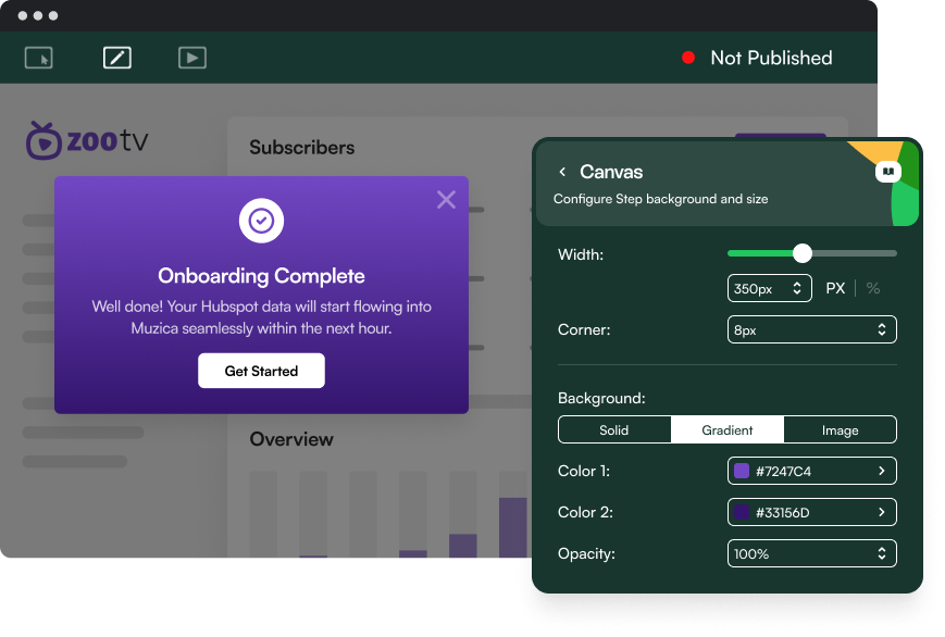
Chameleon positions itself as a product adoption tool for teams that want customized in‑app experiences. The Chrome extension editor offers granular control over style and animation, along with a growing library of launchers and embedded cards to streamline onboarding.
Chameleon’s key features for new customer onboarding
Here is what you can do with Chameleon client onboarding software:
- Product tours: You can combine tooltips, banners, lightboxes, and slideouts to guide users through activation. Each step can target a specific CSS selector so the experience feels native.
- Launchers: Add a help widget with videos, flows, feature announcements, or training content without interrupting workflow. It also includes a checklist where each item can trigger a product tour.
- Embedded cards: Use them to place contextual tips or upsell messages directly inside your product grid or sidebar. These cards update dynamically based on the user segment.
- Interactive demos: Build a product demo quickly by recording your process. Then, AI will set up all the steps correctly. You can embed a demo into your onboarding flow.
- Surveys: You can launch micro‑surveys separate from the onboarding experience to capture sentiment.
- Segmentation: Target onboarding content by user attribute, plan, or behavior so different user personas can experience personalized guidance.
- Analytics: You can track tour views, completion rate, and conversion rates inside the Insights tab, or send them to other tools via integrations.
Pros and cons of Chameleon
Here’s where Chameleon excels and where it may fall short:
| Chameleon pros | Chameleon cons |
| ✅ No code design. The visual editor lets anyone design tours and launchers without coding | ❌ No email or native mobile support. Guidance is limited to web apps, so you need other tools for an omnichannel customer journey. |
| ✅ Wide choice of UI patterns. Impressive selection compared to other onboarding tools, including tooltips, banners, lightboxes, slideouts, launchers, and embedded cards. | ❌ Not a complete product platform. You must connect to a third-party tool to track core product events or analyze data. |
| ✅ Customization and localization. You have control over color, font, and language. | ❌ Limits on low plans. It caps experiences and locks A/B testing, rate limiting, and localization behind higher-tier plans. |
| ✅ All integrations are available on every tier. Connects with Segment, HubSpot, Mixpanel, and more without upgrading. |
Chameleon pricing
Prices scale with monthly tracked users and are billed either monthly or yearly.
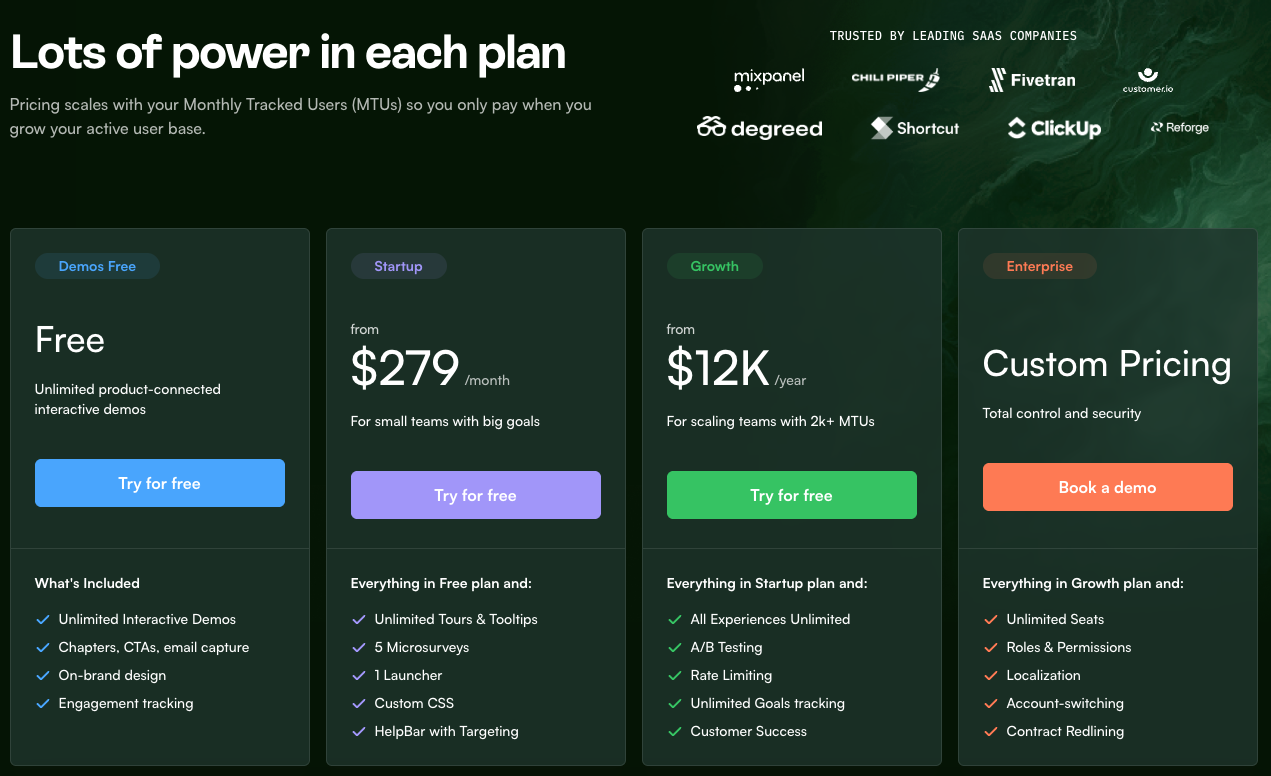
- Free plan: Offers unlimited interactive demos with customer engagement tracking, calls to action, and email capture.
- Startup: $279 per month. Adds unlimited tours, five microsurveys, one launcher, custom CSS, and a targeted HelpBar.
- Growth: $12,000 per year for teams with more than 2,000 monthly tracked users. Unlocks all experiences, A/B testing, rate limiting, unlimited goals, and dedicated customer success.
- Enterprise: Custom pricing. Provides unlimited seats, permissions, localization, account switching, advanced security, and contract redlining.
What users say about Chameleon
Chameleon scores 4.4 on G2. Their users are usually happy about the flexible designer and the wide variety of UI patterns.
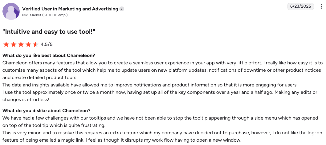
“Chameleon offers many features that allow you to create a seamless customer experience in your app with very little effort.”
“The range of experiences is extensive, allowing for a high level of customization.”
Yet, some users have pointed out that it gets buggy, has a steep learning curve, and has feature gaps in analytics.
“We have had a few challenges with our tooltips and have not been able to stop the tooltip appearing through a side menu.”
“I wish tooltip labels supported localization and I wish you could filter microsurvey responses by user traits.”
“The product is hard to use in practice, buggy in many areas, and insufficient in most.”
Pendo: Software Experience Management (SXM) Platform
Pendo markets itself as a software experience management (SXM) platform. It’s an all-in-one tool that offers detailed product usage analytics (page views, click paths, retention, etc.), essential tools for roadmapping, and lets you create walkthroughs, tooltips, banners, or in-app polls for your product.
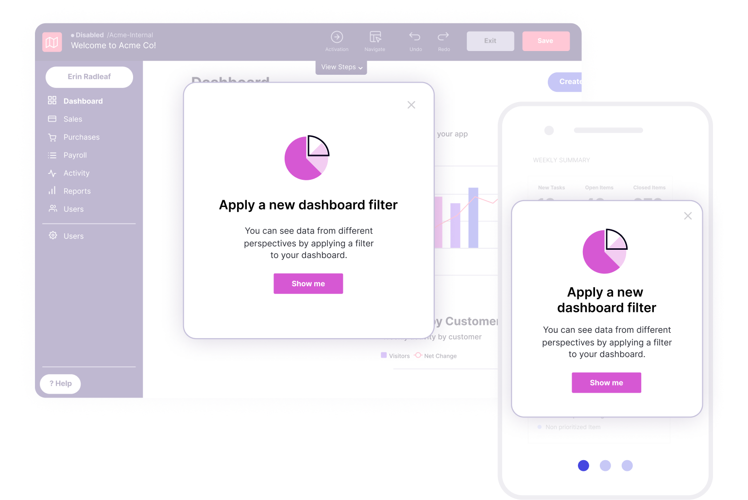
Pendo’s key features for new customer onboarding
Here’s the range of onboarding features you get with Pendo:
- Product tours: Builds multi‑step walkthroughs with modals, tooltips, and lightboxes that guide users through core tasks. The visual editor is no-code.
- Checklists and resource centers: Pendo integrates checklists with an in-app resource center that links to help docs or a support chat.
- Email and mobile onboarding: It covers channels other than in-app, so you can set up an omnichannel experience.
- Surveys inside guides: You can add NPS or open‑ended polls to a tour to collect feedback. Responses connect to user profiles for later analysis.
- Segmentation: Pendo offers detailed segmentation based on both attributes and user behavior.
- Analytics and AI insights: It offers detailed product analytics dashboards, behavioral reports (funnels, paths, trends, etc), and even analytics for AI agents.
Pros and cons of Pendo
Let’s take a look at Pendo’s pros and cons:
| Pendo pros | Pendo cons |
| ✅ Visual builder. You can create onboarding journeys without writing code. | ❌No public prices. The site lists no pricing, so planning a budget is tricky. |
| ✅ Customization and localization. Design guides to match your brand and translate copy for global users. | ❌ Fewer UI patterns. Misses some of the UI patterns offered by the other client onboarding software, e.g., hotspots |
| ✅ Robust analytics. Combines customer data with product usage, feedback, or user testing data in one platform. | ❌ Feature limits on entry plans. Email journeys, surveys, and guide logic cost extra on lower tiers. |
| ✅ Employee onboarding on third-party apps. Creates guides for Salesforce, HubSpot, or any internal tool. | ❌ Not fully no-code. Tagging custom events requires developer help. |
| ✅ All-in-one platform. Includes guidance, analytics, and feedback. | ❌ No live data monitoring. Pendo doesn’t update all product data in real time, e.g., events refresh hourly. |
Pendo pricing
Pendo lists four paid tiers plus one free plan that covers 500 monthly active users. Exact prices of paid plans are available only by quote.
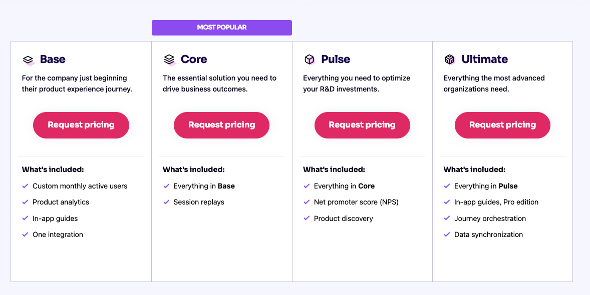
However, Vendr pricing data shows that the median cost for Pendo is around $48,063/year.
What users say about Pendo
Pendo holds a 4.4 rating on G2. Reviewers often mention its deep analytics and the convenience of running guides and surveys in the same workspace.
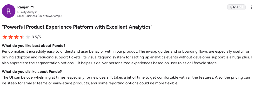
“Pendo makes it easy to understand user behavior and the tagging system for analytics events is a huge plus.”
“The platform becomes intuitive over time and running NPS surveys without code deployments is a big win.”
However, many users warn about the complex workflows and rising cost as usage scales.
“It is very complex and requires a learning curve; tagging an element is confusing if you are not tech savvy.”
Outside of G2, our client, Shelterluv, mentioned that Pendo was too difficult to use, and the price quickly became too steep:
“One of the biggest feedback the team had about Pendo was we just don’t know how to use it. It’s hard to figure out, and we don’t have the time to sit and read through everything to figure out how to use it.” — Matthew Brown, Senior Customer Solutions Manager at Shelterluv
Which customer onboarding tools should you choose for the best onboarding process?
All of these tools for onboarding new customers fit my criteria. But, in my opinion, the right user onboarding software for your company always falls back to one factor: value-for-money.
While all the onboarding software listed above are the right tools for setting up onboarding workflows, only Userpilot and Pendo are “all-in-one” platforms that integrate multichannel onboarding with product analytics. However, Pendo’s custom pricing is known to be very expensive, while Userpilot keeps its tiers transparent and stable.
So, book a Userpilot demo today to see how you can improve your onboarding process and turn new sign‑ups into loyal customers.
FAQ
Why is onboarding new customers important?
Because the faster a customer reaches their first success with your product, the higher the chance they will stay, upgrade, and advocate. An effective onboarding process shortens the CAC payback and lowers churn. It’s best to choose a user onboarding software to help you with the task.
What are customer onboarding tools?
The best client onboarding software allows product teams to design a customer onboarding process for their products, including in-app guidance, emails, and mobile pushes. You can replace hard‑coded tours and static help docs with more dynamic onboarding experiences.
Why do you need customer onboarding software?
Manual onboarding does not scale, and code‑only tours slow product velocity. Customer onboarding solutions allow non-technical teams to create onboarding guides, collect feedback, automate repetitive tasks, and improve the entire customer lifecycle without wasting engineers’ time. The best client onboarding software also combines other product data for deeper insights.

