Product Engagement Metrics in 2026: The Human Stream Is Only Half the Picture


Product engagement metrics in 2026 have a reliability problem, and most product teams haven’t noticed it yet. The standard set (DAU, session length, feature adoption rate, churn, NPS) still appears on every PM dashboard, but two of those metrics are now actively misleading without additional context, and an entire category of user activity doesn’t register in any of them. And those users are AI agents that complete tasks through MCP connections and API calls without opening sessions and clicking around like your regular user would. Stats back this up: At Netlify, 80% of new signups are now AI agents, not humans.
This post covers every core product engagement metric: what it measures, how to calculate it, the benchmark you’re competing against, then maps each one to its agent-stream equivalent for teams starting to see agent traffic in their data. As a PM at Userpilot I track these metrics daily, and what follows is what I’d walk a new PM through on day one. For the full two-stream framework and instrumentation guide, read product usage in 2026: How it’s shifting in the AI agents era. This post is the metric definitions.

The product engagement metrics worth tracking in 2026
None of the metrics below have become obsolete. What has changed is how to weight them relative to each other, and which ones need a flag once agent traffic enters your data. I’ll note those explicitly in each section.
Product engagement score
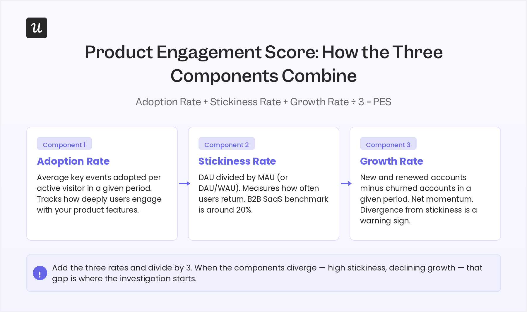
The Product Engagement Score (PES) is a composite metric that combines three rates into a single product health number:
- Adoption rate (average key events adopted per active visitor).
- Stickiness rate (DAU/MAU or DAU/WAU).
- Growth rate (new and renewed accounts minus churned accounts in a given period).
Add the three rates and divide by three. The result gives you a directional read on product health without needing to watch each component independently every day.
The PES earns its place precisely because it is composite. A product can have high stickiness and declining growth, or strong adoption numbers that are masking a churn spike underneath. The combined score surfaces those divergences faster than any single metric.
One bottleneck is that PES only reflects human-stream behavior, so once you start seeing meaningful agent traffic in your accounts, treat it explicitly as a human-engagement score rather than a total product health number.
Activation rate and week-1 engagement
Activation is the moment a new user reaches their first meaningful outcome: not “completed profile” (a setup task that predicts nothing downstream), but something outcome-tied: published a first report, invited a first teammate, sent a first campaign. Top-quartile PLG companies hit 40 to 60% activation; best-in-class reach 70% or above. The uncomfortable benchmark: only 34% of PLG companies actually track activation at all, which means the majority are optimizing for a conversion they can’t see.
Week-1 engagement is the activation proxy for teams that haven’t defined a formal milestone yet. If a user isn’t interacting meaningfully in the first seven days, they almost never recover to full product adoption, regardless of how good the product becomes after product onboarding.
The causal link is consistent: low week-1 engagement predicts churn more reliably than most later-stage indicators. Tracking where new users succeed or stall in that first week is what tells you where to intervene. For example, when we launched Userpilot’s email feature, a funnel showed a sharp drop at the domain verification step, and within a few hours I built a targeting tooltip to guide users through it, and drop-off closed within days without an engineering ticket.
Feature adoption rate
Feature adoption metrics measures the percentage of active users who interact with a specific feature within a given period. To calculate it: take the number of monthly active users for a specific feature, divide by total user logins, multiply by 100.
A high rate signals that users find real value in the feature while a low rate signals poor discoverability, low relevance, or a gap in the onboarding flow that’s preventing users from reaching it at all.
The practical rule I use at Userpilot: track feature adoption for every new release and flag any feature that hasn’t crossed 10% adoption six months post-launch. That feature either needs a second onboarding push, a UX review, or an honest conversation about whether it belongs in the product.
Product stickiness
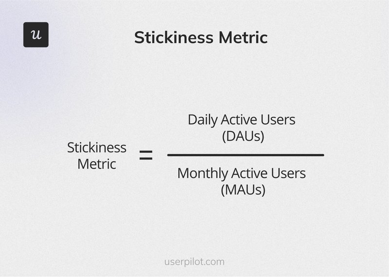
Product stickiness measures how frequently users return to your product within a given period, calculated as daily active users divided by monthly active users (or DAU divided by WAU for weekly-cadence products). The DAU/MAU benchmark for B2B SaaS sits around 20%.
Stickiness is one of the cleaner leading indicators of renewal because habit formation tends to precede expansion: users who return consistently are building your product into their workflow.
However, in 2026 you need to calculate stickiness on meaningful actions, not raw logins. Agents and automated workflows can inflate your DAU count without adding any human engagement signal, and a stickiness number inflated by agent activity will mislead you on renewal risk.
Retention rate
Customer retention rate is the percentage of customers who stay with your product over a given period. To calculate it: total paying customers at end of period divided by the number at the start, multiplied by 100. Amplitude’s benchmark data puts average B2B SaaS monthly retention at 14% at month one, 12% at month two, and 11% at month three, meaning the average product loses the majority of new signups before the end of the first quarter. Improving that retention curve is the highest-leverage growth move most teams have available.
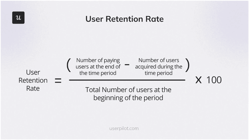
High customer retention compounds in ways that acquisition can’t replicate: retained customers generate recurring revenue, refer new accounts, and provide the behavioral data that makes your product smarter over time. Maximizing customer lifetime value starts with consistently measuring and improving retention, not with acquisition spend.
Churn rate
Customer churn rate is the inverse of retention: the percentage of customers who stopped doing business with you within a given period. Calculate it as customers lost during the period divided by customers at the start, multiplied by 100. Recurly’s benchmark data puts median SaaS churn at 4.67%, with business and professional services slightly higher at 6.59%. Anything above 8% annually is a signal that something structural in your product or onboarding is broken, not a pricing problem.
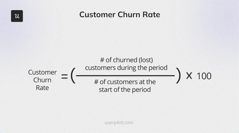
Early churn detection is where this metric earns its keep as an essential engagement metric: tracking drops in daily app usage or session frequency before cancellation gives you a window to intervene. Running a churn survey on accounts that have gone quiet (not just accounts that have already cancelled) surfaces the reasons before it’s too late to act on them.
Time to value
Time to value measures the gap between a user’s first session and the moment they reach their first meaningful outcome. It is the single highest-leverage metric in any product-led motion because it predicts everything downstream: activation rate, retention, expansion revenue. The benchmark has compressed significantly: under ten minutes was acceptable for B2B SaaS two years ago, and leading PLG products in 2026 are delivering value on first touch, before account creation.
Time to value also exposes where onboarding is broken in the most actionable way. A long time to value almost always maps to one specific drop-off point in the funnel: a confusing step, missing tooltip, or required action the user doesn’t understand. That drop-off is findable via funnel analysis and fixable via targeted in-app guidance, often without an engineering ticket.
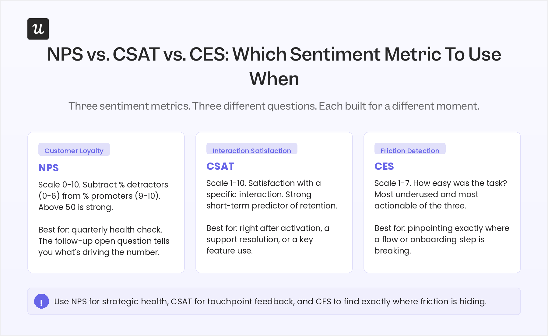
NPS, CSAT, and CES: The sentiment triangle
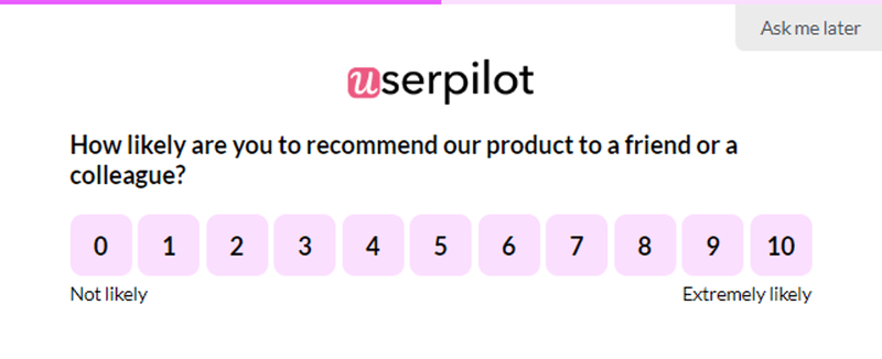
Net Promoter Score (NPS) asks users how likely they are to recommend your product on a scale of 0 to 10. Subtract the percentage of detractors (scores 0 to 6) from the percentage of promoters (scores 9 to 10) and that’s your NPS. Above 0 means more promoters than detractors; above 50 is strong. Its real value is not the number but the follow-up question in an in-app survey, which surfaces what’s specifically driving satisfaction or frustration across your entire user base at scale.
Customer Satisfaction Score (CSAT) asks users to rate their satisfaction with a specific interaction on a scale of 1 to 10. Unlike NPS, which captures overall loyalty, CSAT is interaction-level feedback and a strong short-term predictor of customer retention decisions. It works best immediately after a key touchpoint (first activation, a support resolution, a major feature use) when the experience is still in working memory.
https://blog-static.userpilot.com/blog/wp-content/uploads/2026/04/csat-survey_716f926d03e367e67f0a46a1c62a2859_800.png
Customer Effort Score (CES) measures how easy it was for a user to complete a task, typically on a scale of 1 to 7. CES is the metric most directly tied to friction and is the most underused of the three. High effort scores on a specific flow almost always mean the UI or onboarding for that flow needs work, and unlike NPS and CSAT, CES points directly at where to fix the customer experience, not just how bad the problem is. It’s the most actionable friction-reduction signal most product teams aren’t tracking yet.
Two product engagement metrics that are starting to mislead you
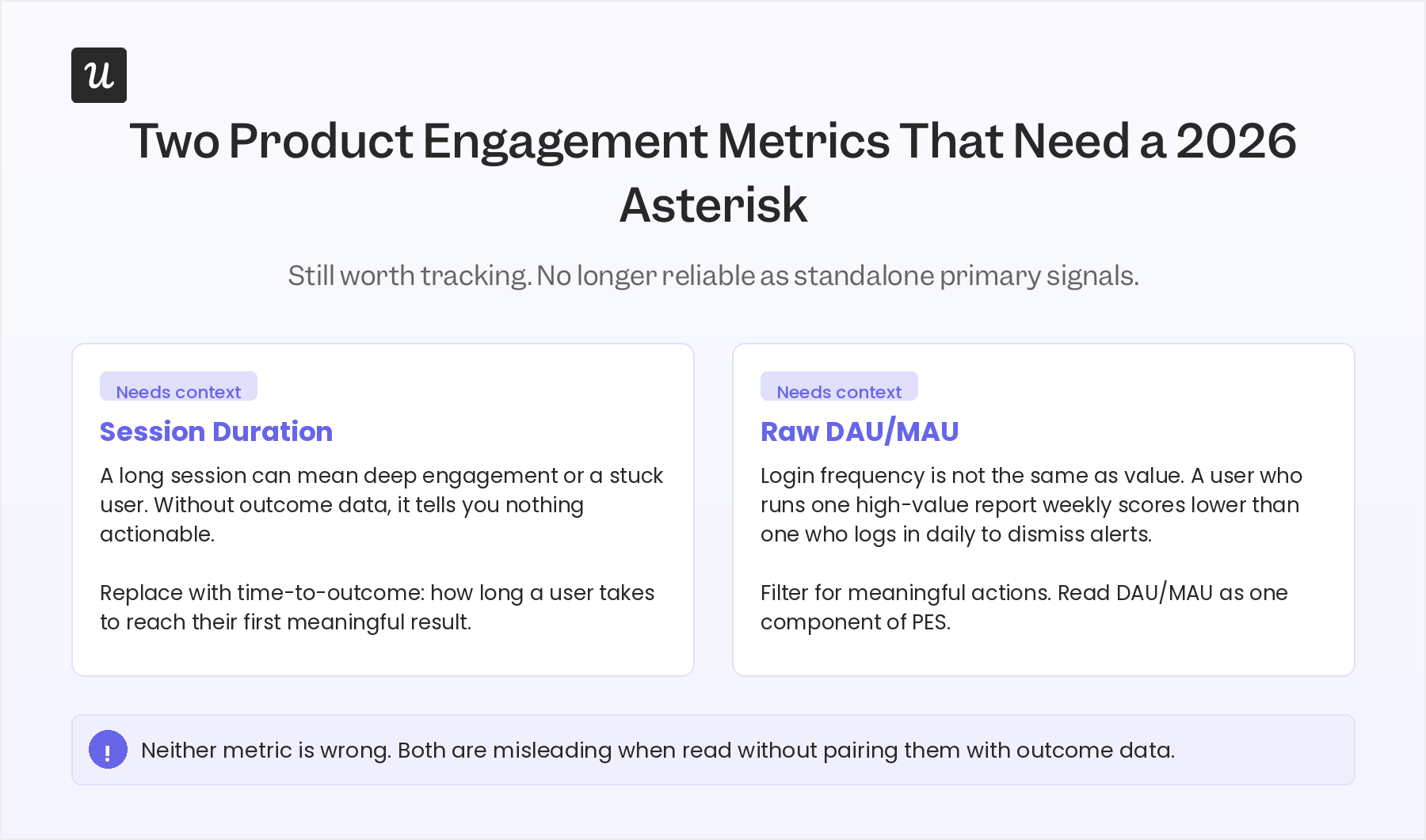
These metrics are not wrong but they have become unreliable as primary signals in 2026 for a specific reason: both produce false positives as agent activity enters your product data, and both have always needed context that most teams weren’t requiring of them.
Average session duration as an engagement proxy
A long session can mean deep engagement, or it can mean a user is stuck and can’t find what they need. Without pairing session length with session recordings or task completion data, average session duration tells you almost nothing actionable about the quality of engagement. The metric also breaks when agents start generating automated workflows on accounts: what looks like a long engaged session in your dashboard might be an overnight script, not a human exploring a feature. The metric you actually want is time to outcome: how long it takes a user to complete a meaningful task, not raw time in product.
Raw DAU/MAU as a headline number
As i mentioned when explaining the stickiness metric, chasing DAU/MAU as a north star metric pulls product decisions toward features that maximize login frequency rather than features that drive outcomes. A B2B user who runs a high-value report once a week is more valuable than one who logs in daily to dismiss a notification, and raw DAU/MAU treats them identically. The fix is not to stop tracking it, but to stop reading it as a standalone signal. Filter for meaningful actions rather than logins, set it against your product’s natural usage cadence, and read it as a component of the PES rather than an independent KPI.
The agent-stream equivalents your dashboard isn’t tracking
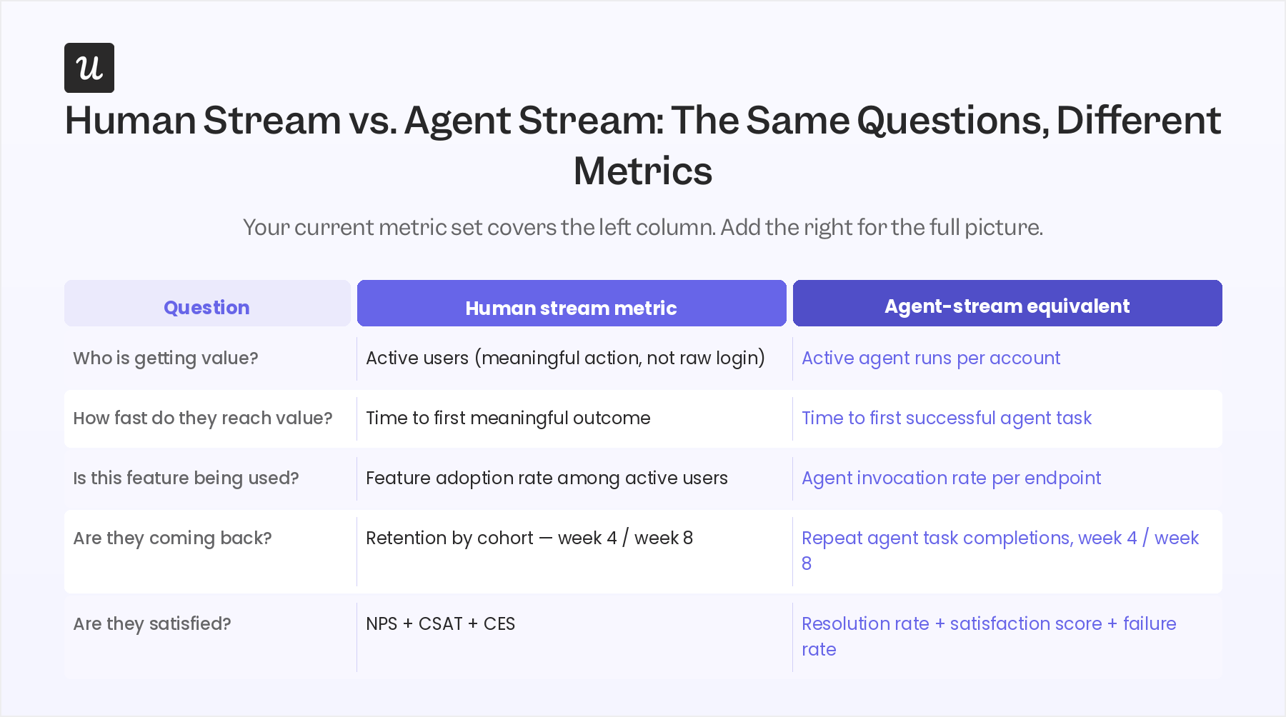
An agent user is any AI system completing tasks in your product: a third-party agent like Claude querying through an MCP server, an internal agent your customer built on your APIs, or an automated workflow running through a tool like Cursor or Cowork. These agents generate API calls, MCP requests, and task-completion events, making event-based analytics essential for measuring their behavior, not sessions, not clicks, not survey responses. Measuring their engagement requires a different metric set.
The Galileo agent evaluation framework and Arthur AI’s 2026 observability playbook both converge on the same five agent-stream metrics. These are worth adding to your analytics taxonomy now, even at low agent volumes, because the data you don’t capture this quarter is the diagnostic gap you’ll be paying for next year.
Task completion rate
Task completion rate is the percentage of agent runs that finish successfully without human intervention. It is the agent-side equivalent of activation rate: it tells you whether the agent is reaching an outcome or stalling and requiring a re-prompt. Galileo’s enterprise benchmarks show 60% success on single agent runs, dropping to 25% across eight chained runs. For any account where agents are central to the workflow, a low task completion rate is a leading indicator of frustration and eventual churn.
Resolution rate
Resolution rate is the percentage of agent conversations or queries that end in a successful outcome: the issue was resolved, the question answered, the action completed. It differs from task completion in that it captures the user’s perspective (did the agent actually help?) rather than just the technical outcome (did the run finish?). A high task completion rate alongside a low resolution rate usually means the agent is completing tasks correctly but solving the wrong problem.
Agent satisfaction score
Agent satisfaction can be explicit (the human rates or approves the agent output) or implicit (no re-prompt, no escalation, no abandoned session). Explicit satisfaction requires a minimal in-product rating after task completion. Implicit satisfaction tracks re-prompt patterns and escalation rates by topic. The implicit version is higher-volume and less biased; the explicit version is more actionable for improving specific use cases.
Failure rate by topic
Failure rate measures the percentage of agent runs that fail outright or return an unhelpful output, broken down by failure type: instruction following, tool selection, or retrieval accuracy. Each failure type points to a different fix. Instruction-following failures usually mean the agent prompt needs work. Tool-selection failures often mean your API schema is ambiguous. Topics with consistently high failure rates are also your product roadmap in disguise: they’re exactly where your product or documentation hasn’t solved the user’s actual problem.
Agent invocation rate
Agent invocation rate measures how often agents call a specific feature endpoint, expressed as a percentage of total agent runs. It is the direct equivalent of feature adoption rate for the agent stream. A feature with high human adoption but low agent invocation has not been made agent-accessible in a useful way. A feature with high agent invocation but low task completion around it has a broken agent integration. Both patterns are actionable, and neither is visible without this metric.
Segmentation: The prerequisite that makes every other metric reliable
If your event taxonomy doesn’t distinguish human traffic from agent traffic, every aggregate metric above is mixing two populations with completely different behavior patterns. A human who logs in twice a week and an agent running 200 API calls overnight are both “active users” in an unsegmented dashboard, but they require entirely different responses. Analyzing product engagement data by user type is the prerequisite that makes every other metric actionable, not an optional reporting layer.
The same logic applies within the human stream. Customer segmentation by user persona or subscription tier consistently surfaces patterns that aggregate data hides: an underused feature that power users love and free-tier users never see, or a retention problem concentrated in one vertical that the overall rate is masking. The minimum viable 2026 segmentation: tag agent traffic at the API level by calling agent identity, define two to three human personas based on job-to-be-done, and set subscription tier as a first-class dimension on every metric you track. With that in place, the engagement data you already have becomes significantly more diagnostic.
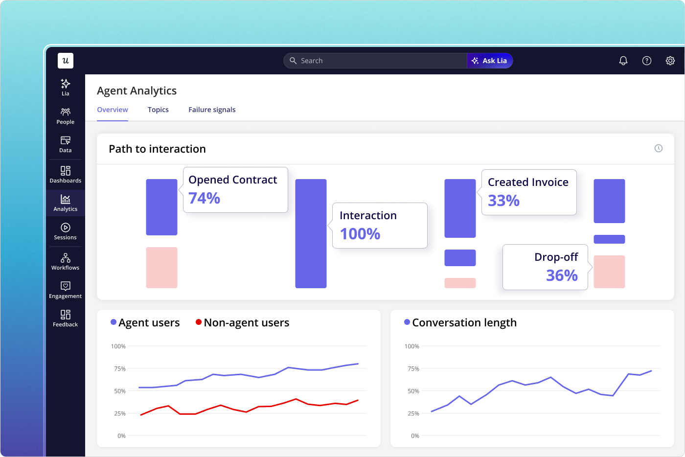
For teams running Userpilot, AI Agent Analytics handles the agent-stream measurement with no additional instrumentation setup: conversation volume, queries per user, resolution rate, satisfaction score, conversation entry points, and failure rate by topic are tracked out of the box. Lia, Userpilot’s always-on AI agent, monitors both streams in parallel and surfaces what’s pushing a metric up or putting it at risk, with specific next steps, without you having to pull a report.
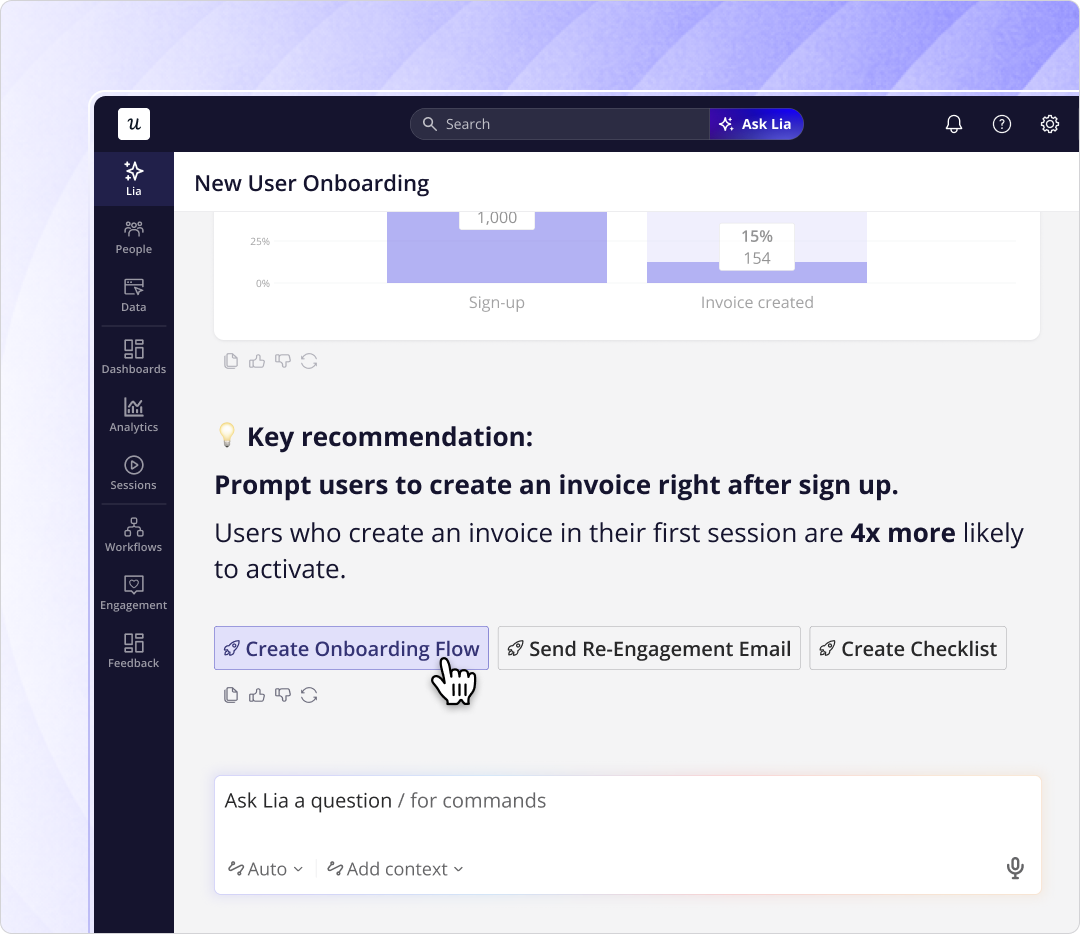
If you want to see how Userpilot tracks both streams from one platform, book a demo and we’ll walk through it with your product’s specific context.
About the author