I Tested the Best Tools for Interactive User Guides: Here Is What I Think

Here’s a scene: a user logs into your app, clicks around a bit, hits a dead end…and leaves.
No welcome pop-up. No educational tooltip. No “here’s how this works.”
Just a vague sense that maybe they’re the problem.
They’re not. You just haven’t given them a guide they’d want to engage with.
And by “guide,” I don’t mean a dusty PDF. That’s static content. In a world where interactive content generates 52.6% higher engagement rates than static content, your documentation process needs to be an active, in-app experience.
Something that actually nudges people forward and helps you build comprehensive user manuals right within your product. But building one means choosing the right tool first.
I evaluated this list of the best tools for interactive user guides based on each tool’s:
- Range of UI patterns.
- Targeting and segmentation depth.
- Pricing transparency and scalability.
- Quality of analytics and reporting quality.
- Engineering expertise required to get started.
The best tools for interactive user guides: Summary
These are the five best tools for creating interactive user guides, depending on your priorities (and your budget):
|
Tool |
Best for |
Key differentiator |
Starting price |
| Tango | Automated step-by-step documentation | Captures your workflow once, generates a polished guide instantly | $22/user/month (billed annually) |
| Guidde | AI-powered video walkthroughs | Records your screen and auto-generates a narrated video guide in seconds | $19/creator/month (billed annually) |
| Userpilot | In-app onboarding and interactive walkthroughs | Real-time event-based triggers + no-code builder | $299/month (billed annually) |
| Appcues | Smaller teams launching onboarding flows fast | Beginner-friendly builder with multi-channel messaging | Custom pricing |
| Whatfix | Enterprise training and cross-platform deployment | Export to LMS, video, PDF, and SCORM formats | Custom pricing |
1. Tango: Best for automated, step-by-step documentation
| Overall Tango G2 rating |
4.8/5 ⭐ |
| Overall Tango Capterra rating |
4.8/5 ⭐ |
Tango is a user documentation tool that captures your screen as you complete a process and instantly generates a polished, shareable technical documentation.
Best for: Operations, IT, and enablement teams that need to document processes and software workflows quickly and share them without having to chase anyone for engineering time.
Best Tango features
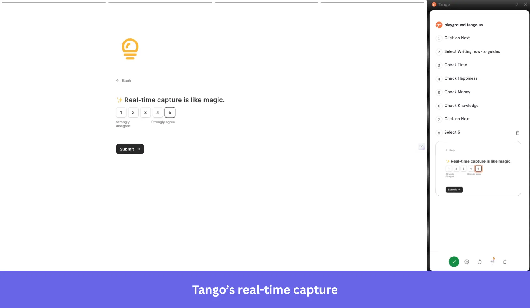
- Automated workflow capture: Tango captures every click, keystroke, and screen change as you work. When you stop recording, a fully structured guide is ready; steps numbered, screenshots taken, and instructions written by AI.
- AI-generated step descriptions: After capture, Tango’s AI generates a natural-language description of each action. You can edit any step by reviewing what the tool wrote for you rather than writing instructions from scratch.
- Desktop and browser capture: Capture workflows across web apps and installed desktop software, including Figma, Salesforce, and any legacy internal tool.
- Screenshot annotation and redaction: You can draw on screenshots, add callouts, crop to focus on a specific area, and manually blur any sensitive data before sharing.
- Workflow branching: If a workflow has two valid routes depending on user role or product version, you can document both in one place rather than maintaining two separate guides.
- On-screen guided walkthroughs: You can pin a Tango guide inside the software it documents. Instead of opening a link in a new tab, users see the step-by-step instructions overlaid on the interface.
Tango pros
✅ The setup is genuinely straightforward. Install the extension, record once, and your guide is ready in minutes: no templates, no dragging screenshots into a doc.
✅ Its intuitive interface makes it easy for non-technical users to own documentation end-to-end.
✅ Tango lets you share public workflow links that recipients can open in their browser without creating a Tango account. It’s useful for sharing guides with external users or new hires.
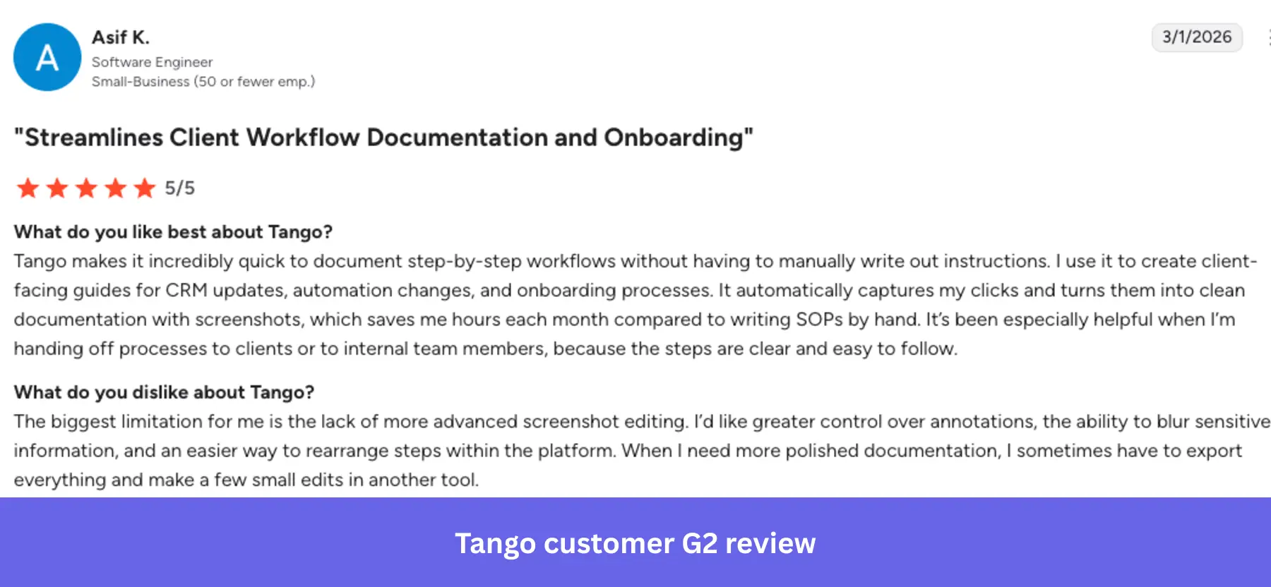
As one Asif K. puts it:
“Tango makes it incredibly quick to document step-by-step workflows without having to manually write out instructions.”
Tango cons
❌ Some users report that the tool occasionally captures duplicate steps when an action triggers multiple screen changes. You can delete them with one click, but it adds a review step to every capture.
❌ Customization is limited for complex or conditional workflows on lower plans. Branching logic is Enterprise-only, so if your process has more than one valid path, you’re either documenting them separately or upgrading.
❌ The free plan caps you at 5 shared workflows, which is enough to evaluate the tool but not enough to run documentation for a real team.
One G2 reviewer flags the pricing honestly:
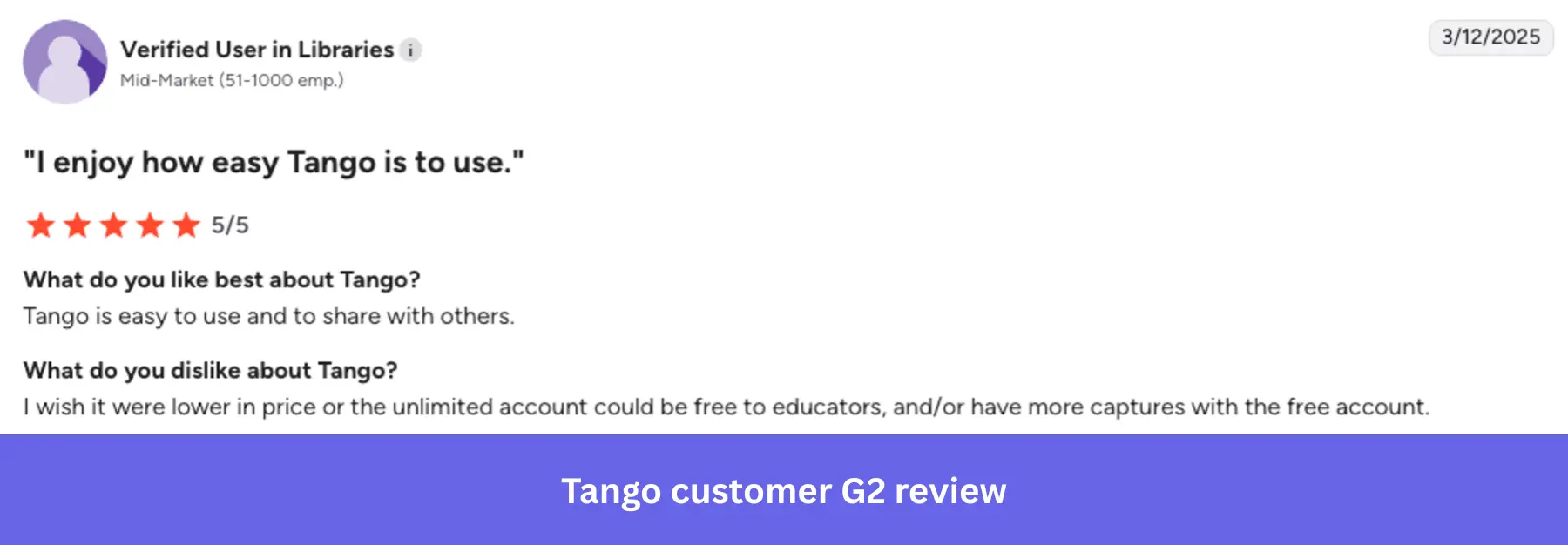
“I wish it were lower in price or the unlimited account could be free to educators — the free version should have more captures.”
Tango pricing
- Free: 5 shared workflows, browser capture only, up to 10 users per workspace. Good for a single-team evaluation, not production use.
- Pro Personal: $22/user/month (billed annually), for 1-2 users. Includes unlimited workflows, desktop capture, voice transcription, branded exports, screenshot annotation, and viewership insights.
- Pro Team: $15/user/month (billed annually), for 3 or more users. Same feature set as Pro Personal at a lower per-seat cost.
- Enterprise: Custom pricing, adds SSO, SCIM, workflow branching, automatic PII detection, translation into 10 languages, 365-day version history, audit logs, on-screen guided walkthroughs, and dedicated onboarding support.
2. Guidde: Best for AI-powered video walkthroughs
| Overall Guidde G2 rating |
4.8/5 ⭐ |
| Overall Guidde Capterra rating |
N/A |
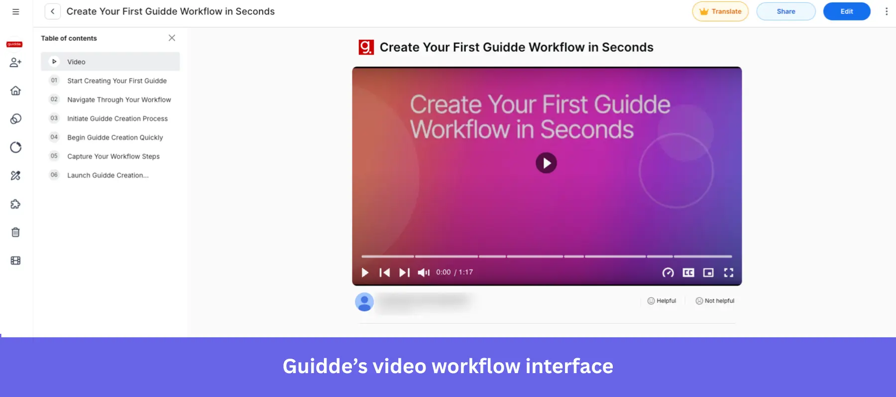
Guidde is a documentation tool that produces narrated video walkthroughs. You record your screen once, and Guidde’s AI engine generates a structured, step-by-step video with voiceover, annotations, and captions.
Best for: Customer success, support, and enablement teams that need to produce high-volume how-to video content without hiring a video production team.
Best Guidde features
- Magic Capture: Guidde detects every action, generates a screenshot for each step, writes a narrative script, and produces a structured video via screen recording.
- AI voiceover in 50+ languages: Once your guide is captured, Guidde’s AI assigns a natural-sounding narrator voice to the script. You can choose from 200+ voices across 50+ languages. This makes it practical for global teams to produce localized training materials without separate recording sessions for each market.
- Dual-output format: Guidde produces both a narrated video and a step-by-step written guide from a single recording session. It’s efficient for teams that need to serve different learning preferences (i.e., visual learners who want video, scanners who want text.
- Interactive elements: You can add clickable CTAs to individual steps in a video, letting viewers branch to related content or take a specific action mid-watch.
- Broadcast and integrations: Guidde connects directly to Zendesk, Salesforce, Slack, Confluence, and Notion. The Broadcast module pushes guides into the tools your users already work in, rather than requiring them to find documentation elsewhere. For example, you can embed video FAQs into a help center.
- Analytics: Track view counts, unique views, watch duration, completion rates, and click-through rates on CTAs. This tells you whether your guides are being watched and where viewers drop off.
- Magic redaction: Automatically detects and blurs personally identifiable information during capture.
Guidde pros
✅ The speed from recording to published guide is genuinely fast.
✅ The dual output (video + text guide from one recording) removes a production step that normally requires two separate tools or two separate recording sessions.
✅ The voiceover quality is strong enough for professional external use, which matters for customer-facing content.
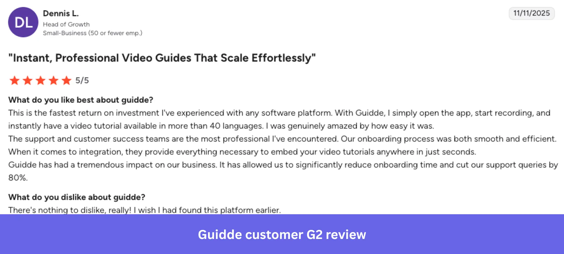
As Dennis L. puts it:
“This is the fastest return on investment I’ve experienced with any software platform. I simply open the app, start recording, and instantly have a video tutorial available in more than 40 languages.”
Guidde cons
❌ The most useful features (analytics, desktop capture, interactive elements) are locked behind the Business plan at $39/creator/month (billed annually). The Pro plan at $19/creator/month (billed annually) covers unlimited videos and voiceover, but it can’t tell you whether anyone is watching them.
❌ Customization and editing options are limited, especially in terms of fine-tuning content for custom branding.
❌ The per-creator pricing model scales steeply. A five-person team on the Business plan costs $2,340/year. A ten-person team costs $4,680/year. Consider that jump before you commit.
One G2 reviewer specifically flags the organizational limitations:
“The organization – placing videos in various folders to manage user access is not great.”

Guidde pricing
- Free: Up to 25 videos, browser extension only, no AI voiceover, Guidde watermark on all exports. Sufficient for evaluating the tool, not for team use.
- Pro: $19/creator/month (billed annually), unlimited videos, Brand Kit, manual blur for sensitive data, full MP4/GIF/PDF export options.
- Business: $39/creator/month (billed annually), up to 5 creators, adds desktop app access, text-to-voice generation with 200+ voices and 50+ languages, analytics and engagement tracking, and an advanced editor with interactive elements.
- Enterprise: Custom pricing, increased voices for text-to-speech generation to 400+, adds Magic Redaction (automatic PII detection), SSO, and studio-quality narration.
⚠️ The jump from Pro to Business is over a 100% per-seat cost increase. If analytics and desktop capture matter to your use case, and they likely do, budget for Business from the start rather than planning to upgrade.
3. Userpilot: Best for in-app onboarding and interactive walkthroughs
| Overall Userpilot G2 rating |
4.6/5 ⭐ |
| Overall Userpilot Capterra rating |
4.6/5 ⭐ |
Userpilot lets you build tooltips, checklists, modals, and walkthroughs that appear directly in your interface: triggered by what users do, who they are, and where they are in their customer journey.
Best for: Product, growth, and CS teams that want to deliver personalized onboarding flows and event-triggered in-app guidance across the full user lifecycle: from first login to feature adoption.
Best Userpilot features
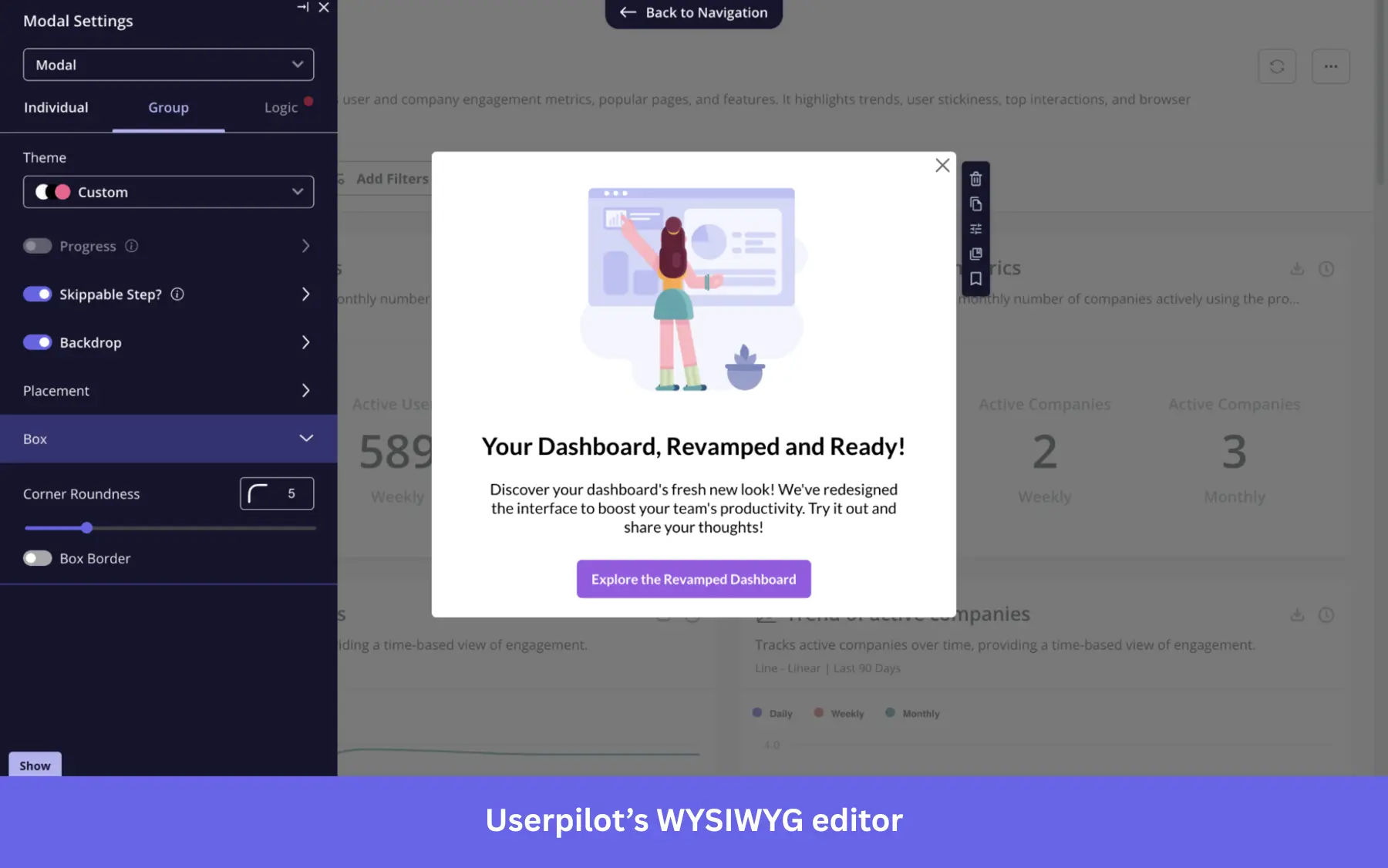
- No-code WYSIWYG builder: Build flows by clicking directly on your live product interface through a Chrome extension. Point at an element, choose your pattern, write your copy, and publish. No engineering handoff needed.
- Multiple UX patterns: Userpilot supports tooltips, modals, checklists, hotspots, slideouts, banners, and driven actions. Unlike a tooltip that points to a button, a driven action requires the user to click the button before the flow advances, reducing passive browsing and driving engagement.
- Advanced segmentation: Trigger any experience based on user attributes (plan, role, company size), behavioral signals (features used, flows completed, NPS score), or custom events you define. A trial user who skipped onboarding and navigated to your reporting dashboard can see a targeted tooltip, while it doesn’t appear for paying users who already know how.
- Built-in localization: Translate flows into multiple languages directly inside the builder without duplicating the entire flow for each locale. You maintain one flow, manage translations alongside it, and deploy regionally.
- Flow analytics: Every published guide includes a built-in analytics panel that shows completion rates, drop-off points, and step-by-step engagement data. Then, funnel analysis helps you trace whether guide completion correlates with activation or conversion.
- Session replays: Watch recordings of individual user sessions to see exactly how users’ interactions play out with your flows (rage clicks, ignored checklists, stuck steps) rather than inferring behavior from completion data alone.
Userpilot pros
✅ Non-technical teams can build and launch flows without engineering involvement.
✅ Segmentation and behavioral targeting give you precise control over who sees what, without third-party tools.
✅ Session replays and product analytics are built into a unified platform, removing the need to stitch together separate tools.
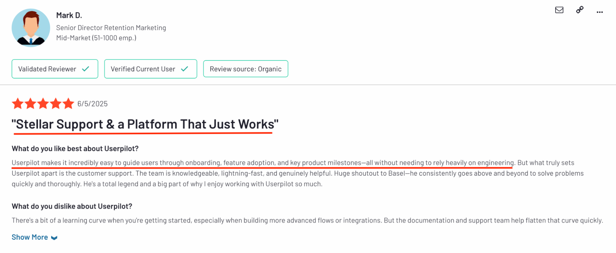
As Mark D. notes:
“Userpilot makes it incredibly easy to guide users through onboarding, feature adoption, and key product milestones — all without needing to rely heavily on engineering.”
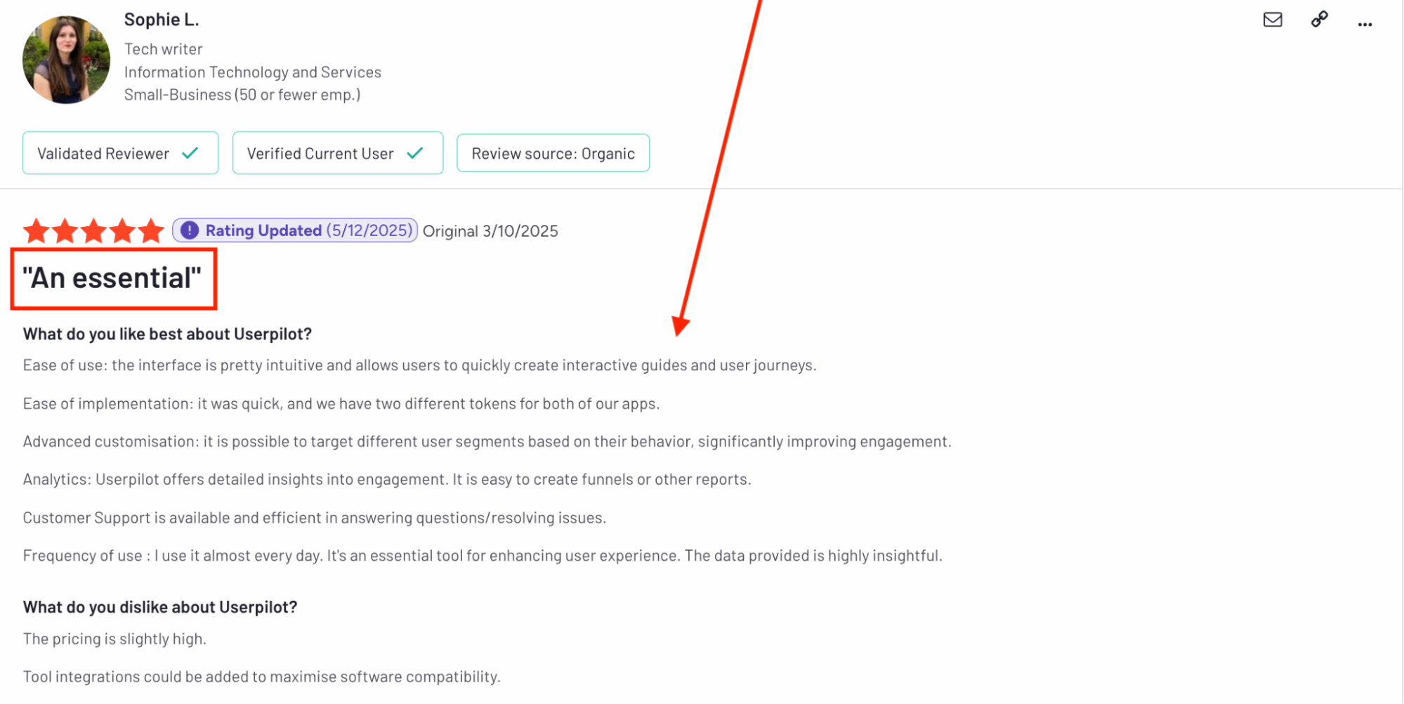
Another verified user, Sophie L., praises Userpilot for being able to
quickly create interactive guides and user journeys.
Userpilot cons
❌ A slight learning curve exists, but it’s a “feature-rich” kind of curve, not a “why is this UI from 2007?” kind.
❌ Some advanced features (mobile support, localization, resource center) are gated behind higher plans.
Userpilot pricing
Userpilot’s pricing is divided into three tiers:
- Starter: $299/month (billed annually), for up to 2,000 MAUs, includes in-app engagement, user segmentation, and NPS surveys.
- Growth: Custom pricing; adds advanced analytics, localization, email, and session replay and mobile engagement as add-ons.
- Enterprise: Custom pricing; adds SSO, audit logs, SLAs, and dedicated support.
4. Appcues: Best for smaller teams launching onboarding flows fast
| Overall Appcues G2 rating |
4.6/5 ⭐ |
| Overall Appcues Capterra rating |
4.8/5 ⭐ |
Appcues helps non-technical teams create and go live with onboarding flows as fast as possible. It also provides multi-channel engagement across in-app, email, and push messages from the same platform.
Best for: Small to mid-size SaaS teams that want to launch polished onboarding flows fast and extend reach across email and push messages, without engineering dependency.
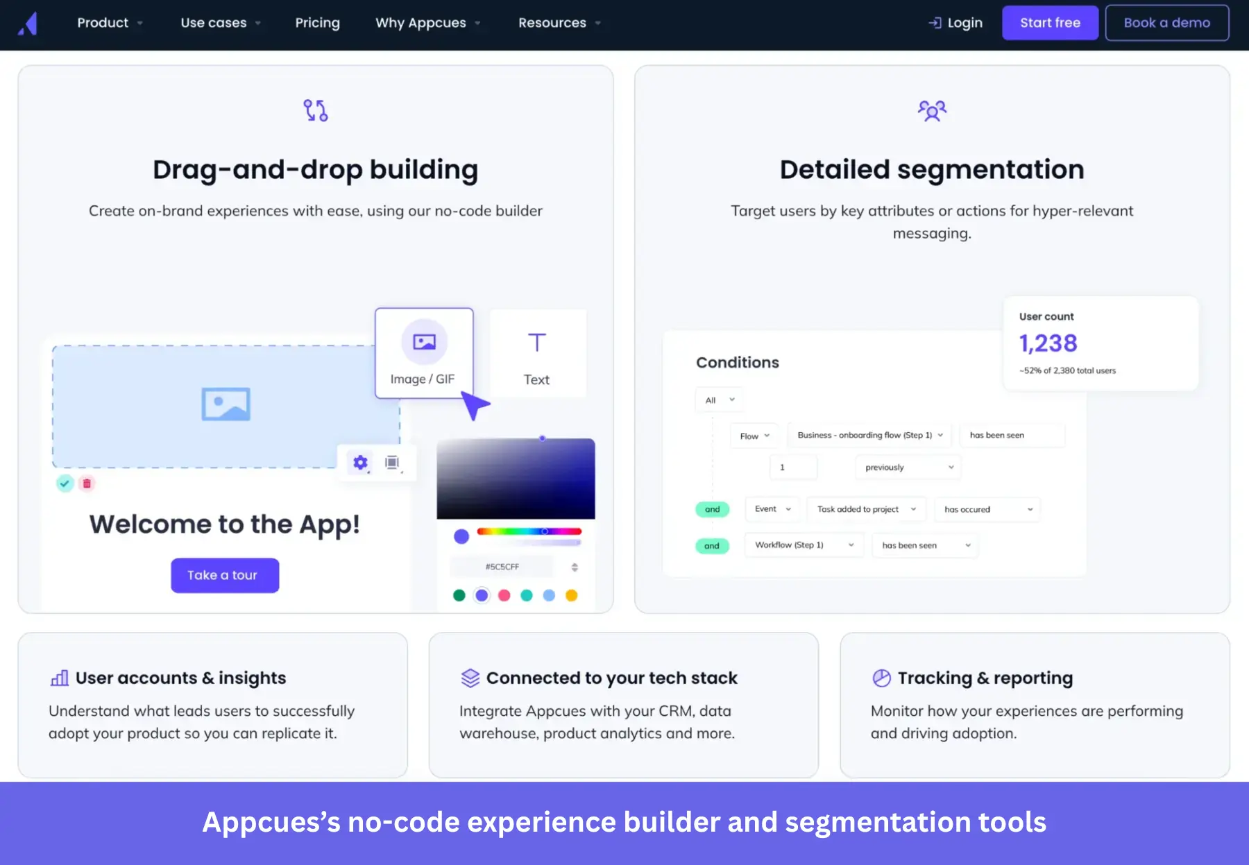
Best Appcues features
- No-code visual builder: Creating user manuals directly inside your product through a Chrome extension lets you point at any element, select a pattern, and configure it in a side panel without writing HTML or CSS.
- Prebuilt templates: Appcues ships with ready-made flow templates for common onboarding scenarios: welcome modals, feature announcements, NPS prompts, checklists, and product tours.
- Multi-channel messaging: Send email and mobile push notifications from the same platform, triggered by the same behavioral data. A user who completes your checklist can receive a follow-up email; one who hasn’t logged in for seven days can get a push notification.
- Flow analytics: Every published flow includes step-level reporting and goal tracking to measure if users interact with the flow.
Appcues pros
✅ It’s easy to get started without leaning on developers.
✅ Appcues’ builder has a user-friendly, intuitive interface that is quick to learn, especially for teams that regularly create flows, announcements, and onboarding experiences.
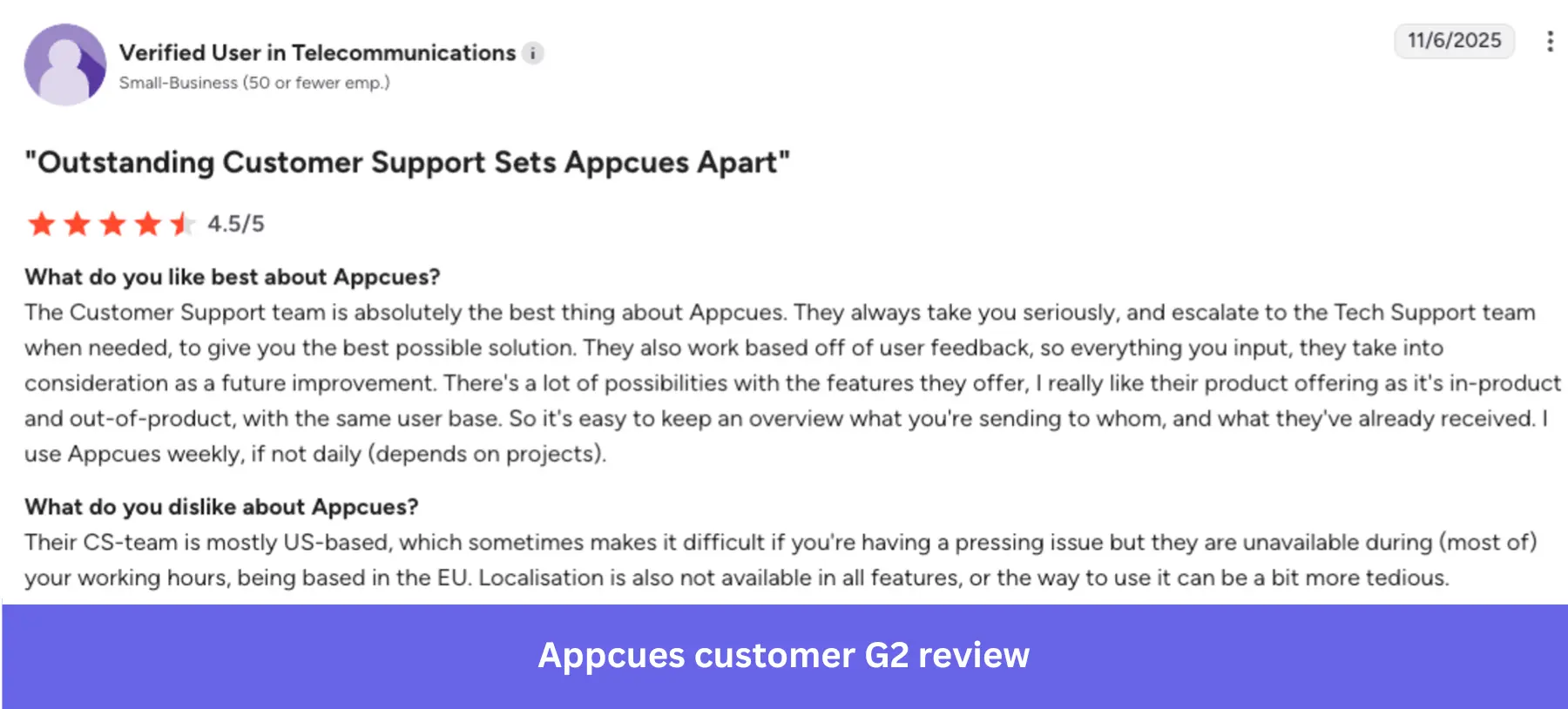
✅ A responsive support team that’s willing to act on customer feedback.
As a verified user notes:
“They always take you seriously, and escalate to the Tech Support team when needed, to give you the best possible solution.”
Appcues cons
❌ It lacks more advanced sentiment-based triggers that some competitors offer.
❌ If your team is outside the US, urgent issues can be harder to resolve quickly because support availability may not fully overlap with your working hours.
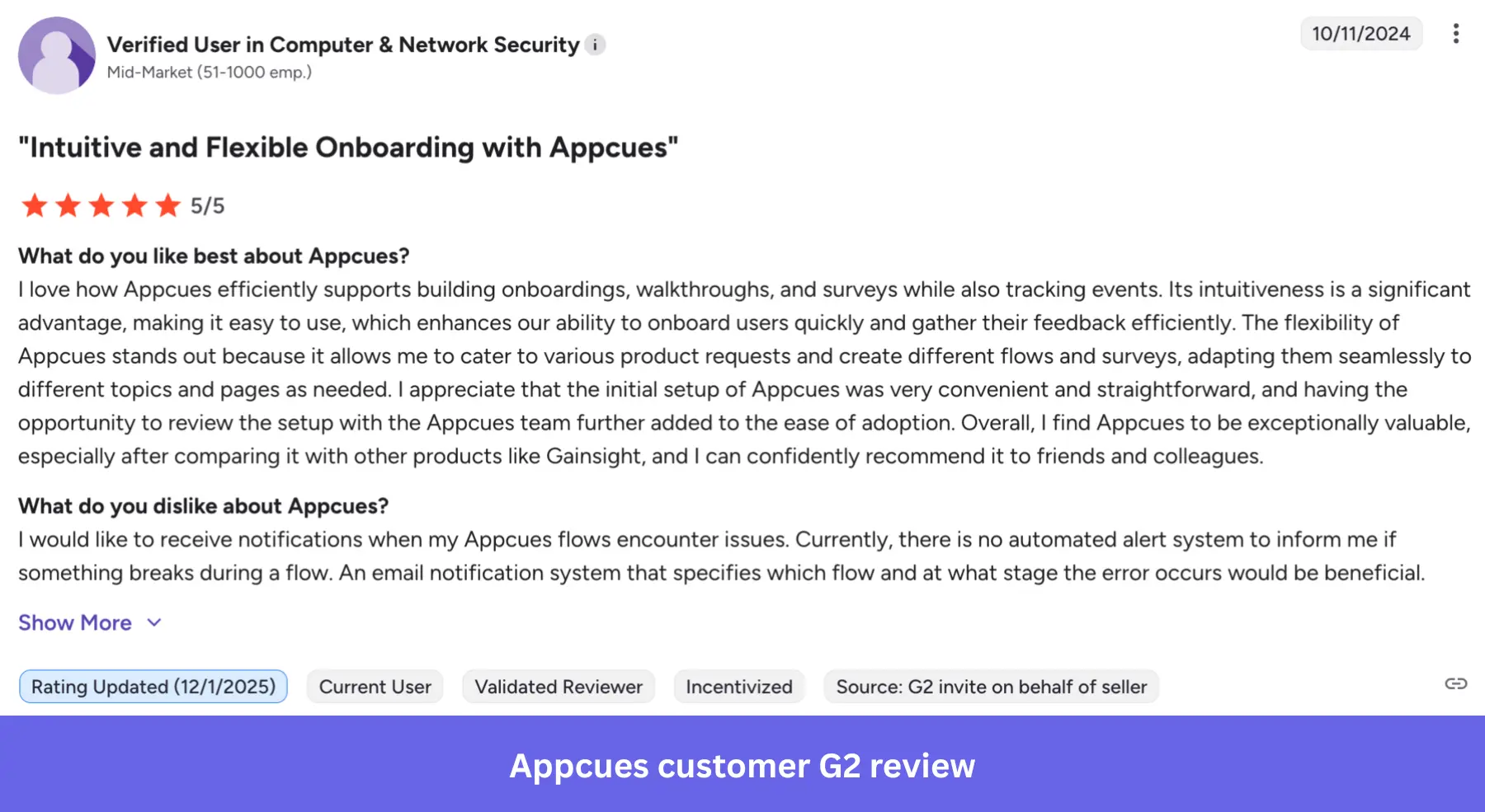
❌ Appcues doesn’t appear to offer native automated alerts when a flow breaks or encounters an error.
For example, this user states:
“Currently, there is no automated alert system to inform me if something breaks during a flow.”
Appcues pricing
All Appcues pricing plans require a demo booking. However, according to Vendr data, Appcues’ median cost is $15,000/year.
- Start: Up to 3,000 MAUs. Includes 10 published experiences, up to 1,000 emails, 12 months of reporting history, onboarding, and a dedicated CSM.
- Grow: Up to 50,000 MAUs. Includes 25 published experiences, up to 5,000 emails, 24 months of reporting history, implementation services, onboarding, and a dedicated CSM.
- Enterprise: Custom MAU volume. Includes 100 published experiences, custom email volume, 36+ months of reporting history, implementation services, priority support, and advanced security, compliance, and SLAs.
⚠️ Appcues pricing is based on monthly active users (MAUs), not seats. Appcues also packages plans by app scope. If you exceed your MAU limit, Appcues will keep your content running, contact you, and charge a prorated upgrade fee to move you to the correct MAU tier. To avoid inflating your MAU count, don’t install Appcues on public-facing pages like your marketing site or login page.
5. Whatfix: Best for enterprise training and cross-platform deployment
| Overall Whatfix G2 rating |
4.6/5 ⭐ |
| Overall Whatfix Capterra rating |
4.6/5 ⭐ |
Whatfix is a digital adoption platform (DAP) designed for enterprises that manage software rollouts across multiple applications, such as Salesforce, SAP, Workday, and ServiceNow simultaneously. It functions as a component content management system (CCMS) for in-app guidance.
Best for: Enterprise IT, L&D, and change management teams that need to drive software adoption at scale across multiple platforms (web, desktop, and third-party enterprise tools).
Best Whatfix features
- Multi-format publishing: Build a guide once and export it as an interactive in-app walkthrough, PDF, slide deck, video, or SCORM/xAPI package for multi-format support and LMS delivery.
- Cross-platform support: Whatfix extends beyond web apps to desktop applications, internal portals, hybrid HTML5 mobile apps, and third-party enterprise software, including Salesforce and legacy HR tools. An L&D team can build walkthroughs across all of these from the same editor while maintaining consistency.
- Smart interactive walkthroughs and beacons: In-app guidance includes walkthroughs with branching logic, Smart Tips triggered by user behavior or location, task lists that persist across sessions, and beacons that draw attention to specific elements without blocking the user interface.
- Enterprise-friendly features: Ensured version control through role-based permissions, SSO and SCIM provisioning, multi-language localization, SOC 2 Type II compliance, and detailed audit logs. The Guidance Analytics layer tracks walkthrough completion rates, self-help widget usage, most-searched queries, and task list performance at the individual-user and aggregate-cohort levels.
Whatfix pros
✅ Great for large-scale onboarding and training new employees.
✅ For large, complex organizations, features like AI Quick Capture help more internal teams create guidance quickly instead of relying on a small group of specialists.
✅ Whatfix’s Diagnostics feature helps content creators catch unstable elements earlier, so they can test guides more reliably before pushing them live.
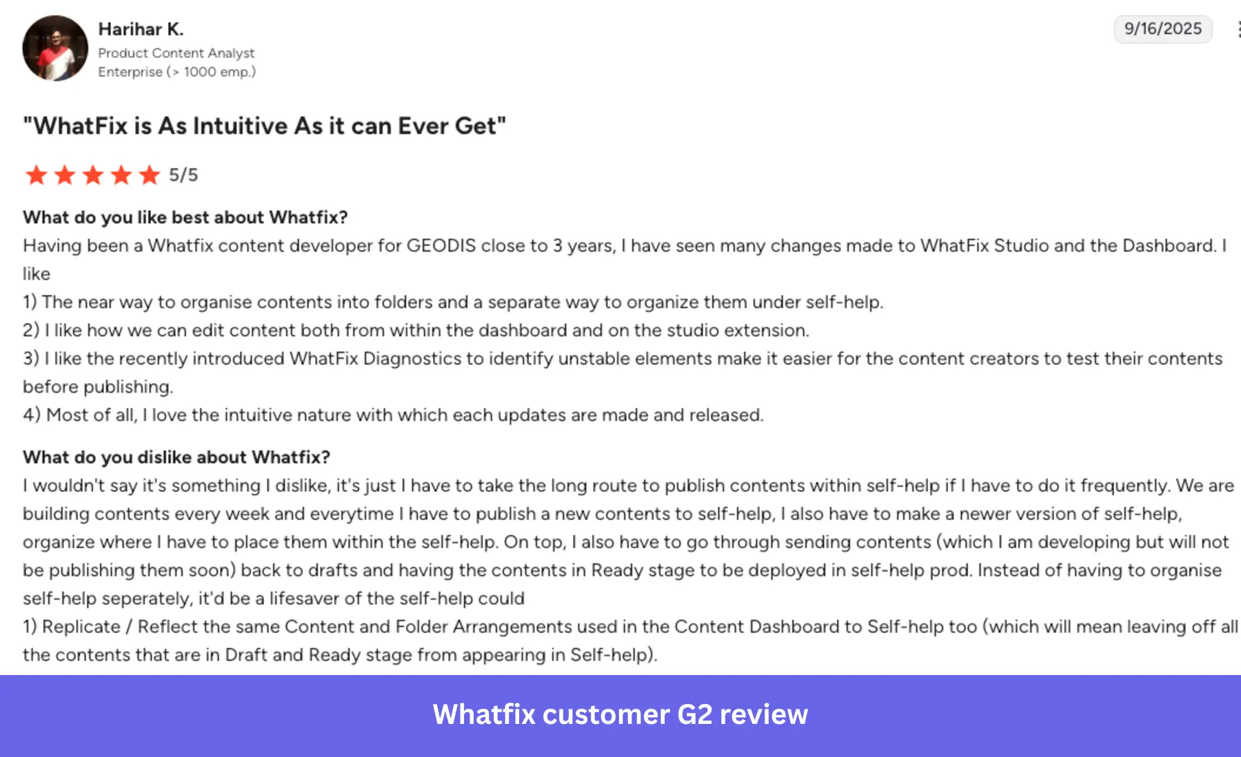
As Harihar K. notes:
“I like the recently introduced WhatFix Diagnostics to identify unstable elements make it easier for the content creators to test their contents before publishing.”
Whatfix cons
❌ If your product relies on submenus or dynamic pages without dedicated URLs, targeting the right pages can get cumbersome. That can lead to tips appearing where they shouldn’t, making the experience feel intrusive.
❌ Whatfix does not publish clear pricing publicly, so budgeting can be difficult, especially when quotes vary by use case, supported apps, and user count.
❌ If you only need basic tooltips or lightweight documentation, Whatfix may be more than you need.
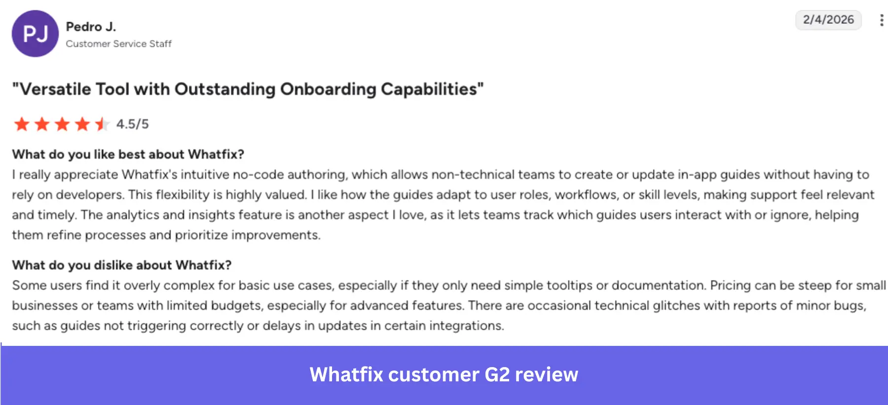
As Pedro J. notes:
“Some users find it overly complex for basic use cases, especially if they only need simple tooltips or documentation.”
Whatfix pricing
Whatfix pricing consists of a flat fee plus user license fees, with the license fee based on total users with access to employee-facing applications or monthly active users for customer-facing applications.
For web and desktop apps, there are three DAP tiers:
- Standard: Includes the full in-app guidance, manual language translation, out-of-the-box surveys, content aggregation up to 2,000 articles, and up to 2 integrations.
- Premium: Adds automatic contextual guidance delivery, unlimited content aggregation, custom surveys, auto translation, auto testing, and unlimited integrations.
- Enterprise: Custom multi-app plans designed for organizations deploying Whatfix across multiple applications at scale.
⚠️ Costs scale with both the number of applications you deploy Whatfix on and your user volume, which can add up quickly for organizations managing multiple enterprise tools. I suggest that you request a scoped quote based on your specific application count and deployment type before committing.
Key features of a user guide software applications
When a user arrives at your guide, they want to answer two questions instantly: “Does this solve my specific problem?” and “How fast can I get it done?” Here is what you should look for:
- No-code functionality: You should be able to edit and create interactive user guides without relying on developers. This makes it faster to ship onboarding flows and test iterations.
- A solid mix of UI patterns: Modals and tours on the welcome screen. Checklists to drive users toward their Aha moment, hotspots to surface features passively, and slideouts to deliver contextual help without taking over the screen.
- Segmentation: Look for targeting beyond URL rules: behavioral signals, plan or role attributes, and custom events you define.
- Event-based triggers: A static guide responds to where users are; a reactive one responds to what they do. A user who completes step one should see step two, and a user who skips onboarding and navigates to settings is telling you something a good tool lets you act on.
- Product usage analytics: At a minimum, you want to track views, completions, and drop-offs. Bonus points for goal tracking and funnel analysis.
Depending on your product, team size, or compliance requirements, you may also need:
- Automated localization: If you serve users across multiple regions, manually cloning and translating flows doesn’t scale. Look for tools that let you manage translations alongside the original flow, rather than maintaining separate versions for each locale.
- A/B testing: Running two versions of a guide against each other tells you which approach actually moves the metric (completion rate, feature adoption, conversion) rather than relying on gut instinct. Not every tool offers this natively, and those that do often gate it behind higher plans.
- Advanced roles and permissions: Once more than one team is building guides, you need controls over who can publish, edit, or view what. Without them, a well-intentioned update from one team can override another team’s live flow with no audit trail.
- Enterprise-grade security: For teams in healthcare, finance, or any regulated industry, SOC 2 compliance, GDPR compliance, and data residency options are the minimum required to clear procurement.
Final verdict: Which user guide software tool should you pick?
The right answer depends on what kind of guide you’re trying to build and where you need it to live.
- Tango: If your main problem is documentation, i.e., your team keeps answering the same questions, your SOPs live in a Google Doc nobody reads, and you want to capture processes once and share them as polished step-by-step guides.
- Guidde: If video is the format your users actually engage with. It’s purpose-built for teams that need to produce high-volume how-to content fast (customer education, employee training, support FAQs) without a video production budget.
- Userpilot: If you want real-time, in-app guidance with the targeting depth and analytics to back it up. Move fast without engineering involvement and want session replays, segmentation, and behavioral analysis in the same platform.
- Appcues: If you’re a small team that wants to get onboarding flows live quickly and extend their reach across in-app, email, and push notifications from one place.
- Whatfix: If you’re managing software adoption across multiple enterprise applications (ERP, CRM, internal portals, desktop tools) and need multi-format publishing, LMS integration, and enterprise governance.
At the end of the day, the best user guide software for your team depends on where guidance needs to happen (inside your product, in a shared doc, or in a video library) and how much targeting, analytics, and scale you need to get there.
Best practices for building a user guide that people actually engage with
Choosing the right tool is only half the battle. If you write a terrible guide, even the best software cannot save you. Here are some best practices to follow when creating interactive user manuals to keep users engaged.
- Get straight to the point: When a user opens your guide, they are trying to solve a problem, not read an introduction. Cut every word that does not directly help them take the next step. A tooltip that says “Welcome to the Reports tab! Here you’ll find all your analytics” should say “Click Export to download your data as a CSV.”
- Accommodate skimmers: Use clear, descriptive headings, break instructions into single-sentence steps, and lean on bullet points wherever a paragraph would slow the reader down. This is one of the most important UX best practices you can adopt.
- Show, don’t just tell: Whenever possible, replace text with an image, a GIF, or a triggered in-app action. If you want a user to click the Settings gear, don’t write a paragraph describing where it lives. Use a tool like Userpilot to place a spotlight directly over it and reduce user friction caused by ambiguity before it becomes a drop-off point.
- Track the data and iterate: You cannot launch a guide and walk away. Monitor your customer success KPIs, e.g., if 80% of users drop off at step four, step four is broken. Gather data through automated customer feedback collection, test a new variation, and watch how the metrics change.
- Don’t overwhelm the user: Triggering a massive product tour the second someone logs in is one of the most common mistakes product managers make, and it annoys people. Instead, use in-app messaging to deliver bite-sized hints only when relevant. For example, one tooltip when a user first navigates to the reporting tab. This way, you respect their time and drive product stickiness.
FAQ
What is a software user guide?
A software user guide is a set of UI patterns that help users understand how to use a product without having to leave the product to find guidance elsewhere.
There are two main types: full product tours, which walk users through a broad set of features in a linear sequence, and interactive demos, which use tooltips and real-time guidance to provide contextual help at the exact step where a user needs it.
What is an example of software user documentation?
User documentation takes many forms depending on where a user is in their journey:
- A tooltip that appears when a user hovers over a “Reports” tab for the first time.
- A checklist that walks a new user through setting up their profile.
- A slideout triggered when a user lands on a page they’ve never visited.
- A product tour that highlights new features after a major update.
What is a user guide used for?
User guides help reduce confusion, shorten the onboarding ramp, and improve feature adoption and customer satisfaction. The most common use cases are:
- First-time user onboarding: Walking new users to their first activation event before they bounce out of a confusing empty state.
- Feature adoption: Surfacing functionality that existing users haven’t discovered yet, triggered when they’re most likely to use it.
- Reducing support ticket volume: Answering questions in-context so users don’t need to email support or search a knowledge base.
- Self-serve support: Linking users to related resources like video tutorials or knowledge base articles at the exact moment they need more depth.
How are interactive user guides different from traditional help docs?
Traditional help docs like knowledge base articles, online manuals, and support pages require users to leave the product, search for an answer, interpret it, then return to the product to apply it.
Unlike static manuals, interactive user demos or guides eliminate that loop by delivering guidance directly within the product when the user encounters the problem. For example, a tooltip that appears when a user hovers over a confusing field.
When should organizations invest in user guidance software?
The clearest signal is when your support agents keep answering the same questions. If your inbox is full of “how do I set up X” or “where do I find Y,” that’s a guidance gap. A tool that closes that gap in-product is faster and cheaper than hiring more customer support team members.
Other strong signals: your onboarding completion rate is below 30%; users are activating slowly or not at all; you’ve shipped features that most of your user base hasn’t discovered; or your team is spending engineering time building and maintaining in-app tooltips manually.
About the author