Best SaaS Onboarding Experiences: Examples + How to Build It
What is SaaS onboarding?
SaaS onboarding refers to the process of helping new users learn how to use your product to achieve their goals (and hence, realize the value of the product quickly).
What are SaaS onboarding experiences?
User onboarding experiences are all the interactions that a user has with your SaaS product onboarding at the beginning of their user journey.
Starting from the signup flow, you’ll generally have a welcome screen and some initial experiences/interactions, including a SaaS onboarding checklist.
In the first few seconds, your user may have a positive onboarding or mobile onboarding experience that will lead them to the Aha! moment (the moment when they realize the value of your product). They’ll likely activate and maybe convert from the free trial to the paid plan.
Or, they might have a terrible and confusing experience (think empty states, irrelevant flows) and decide to end their adventure with your product.
Best practices for building the best SaaS user onboarding experience
There are some tweaks you need to make to your SaaS onboarding process to create a positive experience and increase customer satisfaction. Let’s look at some best practices in detail below.
1. Reduce friction in the signup process
As a rule of thumb, the less friction your user encounters in their onboarding process, the better. For example, remove any unnecessary steps or fields from your signup flow.
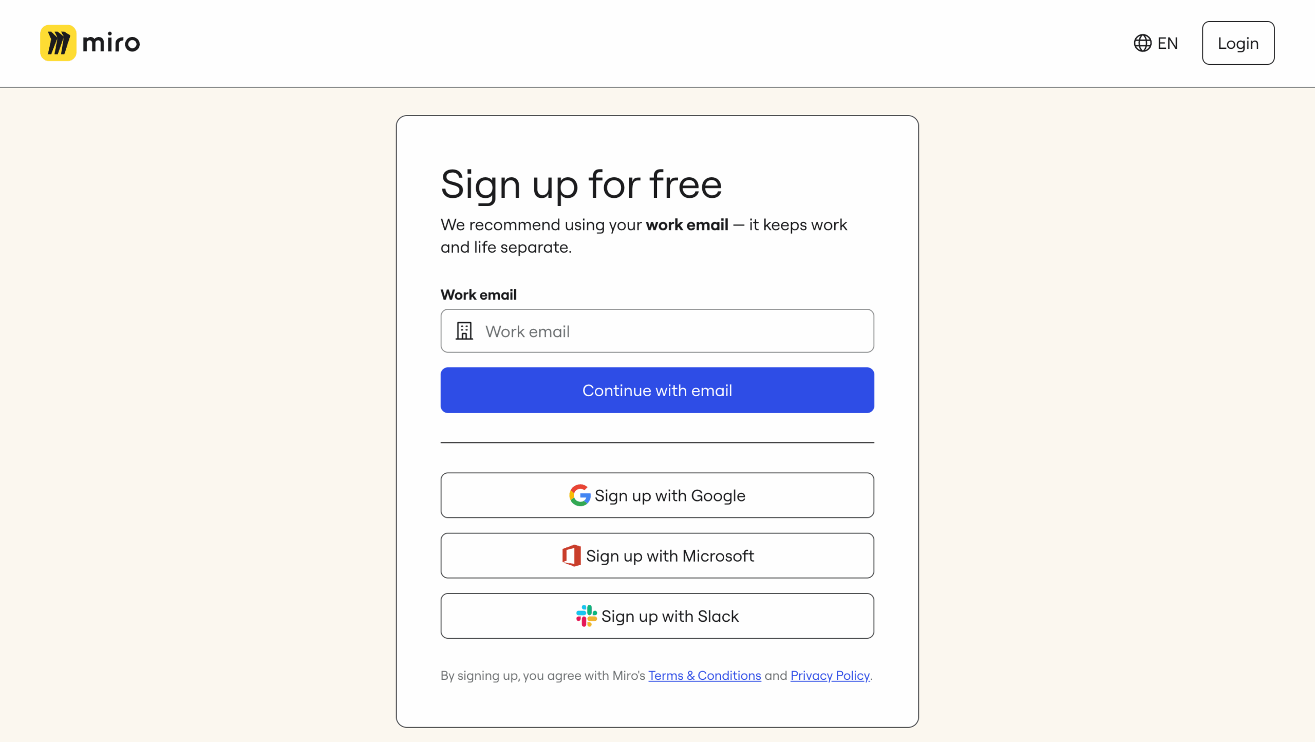
Take the example of Miro’s sign-up page below – it only asks for the work email address and enables prospects to sign up using Google, Microsoft, and Slack.
Disclaimer: sometimes friction-based signup flow may be beneficial (e.g., highly complex enterprise platforms that require a lot of technical setups and human help in the initial stages of the customer journey).
2. Start with a welcome screen, ideally with a microsurvey
Once your user signs up for your tool, welcome them!
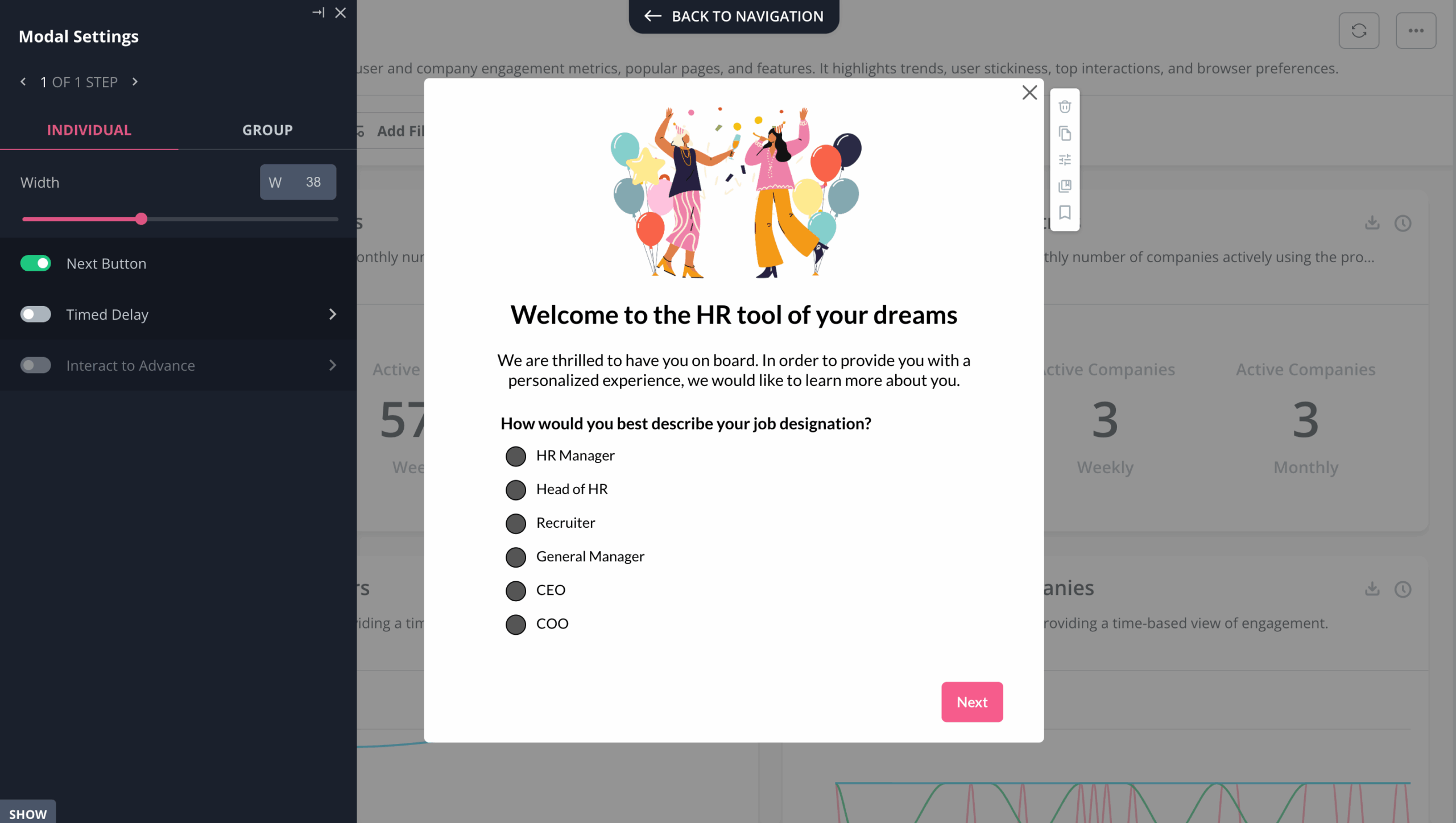
But make it worthwhile by asking them 1-2 questions about what they want to accomplish (their goals, jobs to be done), or by adding buttons that would allow them to “choose their own journey” – select the course of action they want to accomplish first.
Using the welcome screen to segment your new users by the goals they want to achieve can be game-changing.
You will get them to accomplish their jobs to be done faster, reduce their time-to-value, and generally help them activate much sooner than if you drag them on a one-size-fits-all 20-step-long product tour.
3. Segment your users to personalize the onboarding process
Personalization in SaaS onboarding is another tactic that helps your users get to their goals faster. But few SaaS companies personalize their onboarding flows really well. It’s not so much about adding “personal touches” to the flow (e.g., the “{first name}” tags) as understanding the user needs and customizing the flows respectively to reflect that.
Using that initial microsurvey from the welcome screen, you can personalize your SaaS user onboarding to the user’s specific persona, role, goals, and use case.
Say, you have an email marketing tool and two new users: one is a brand-new freelance online store owner who has never used an email marketing tool and doesn’t have an email list.
Another is a seasoned e-commerce business owner who is switching from another email marketing tool with a list of 20,000. Obviously, their needs will be quite different and will need different onboarding!
- User one (“the beginner”) may want to watch a short onboarding video on the best practices of using an onboarding tool, and then learn how to set up a signup form to collect their first subscribers.
- User two (“the seasoned user”) may just want to quickly find out where to upload their email list and set up the first email campaign/automation workflow.
This is what real SaaS onboarding personalization is about – it helps your users achieve their goals (rather than just showcasing your product) and makes your onboarding more relevant, engaging, and effective.
This kind of personalization makes onboarding more efficient and effective. Cledara is a great example of this in action. They moved away from high-touch onboarding and generic email campaigns and started using Userpilot to segment users based on in-app behavior and specific use cases. That allowed them to trigger personalized in-app messages—like flows for due diligence prep or feature announcements—at exactly the right moment for each user.
As a result, Cledara saw a significant increase in customer engagement within just one week, with in-app messages generating far more responses than emails ever did. The key? Granular segmentation and in-app targeting.
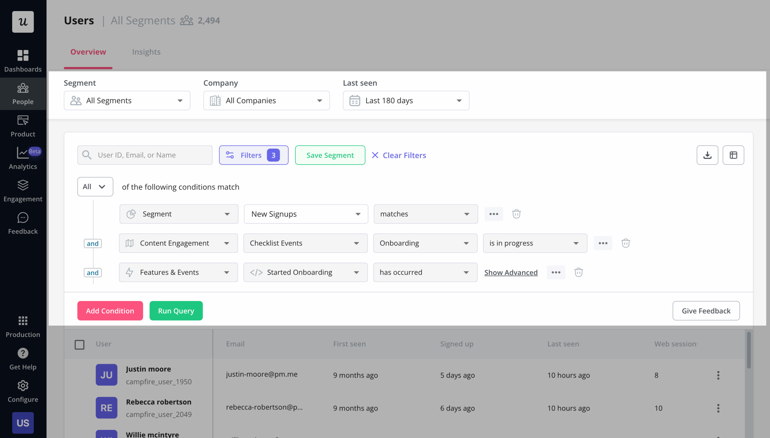
The first step to personalizing your SaaS onboarding is segmenting your audience by the relevant user attributes and events. The answers to the microsurvey in the welcome screen are one factor to consider, but there may be many other important factors to consider (depending on your product, plans, and how many user personas you have), especially at the later stages of the onboarding flow.
Attributes like the plan, the time when the user signed up, and how many web sessions they had in the last e.g. 7 days – may all be important for triggering the right content at the right time.
SaaS onboarding software like Userpilot allows you to build sophisticated user segments for onboarding personalization.
And with Userpilot’s mobile features, you can also onboard and engage mobile app users by creating personalized messaging, push notifications, and surveys.
4. Create an onboarding checklist with a progress bar
The purpose of good user onboarding in SaaS is to take the user on the shortest path to value. You need to know what the user wants to achieve and then show them the fastest route to achieving this goal/result.
Luckily, checklists are proven to naturally trigger our need to “close the open loop” and push the users to complete the activation points. If you’ve heard of the psychological phenomena of the Zeigarnik effect (the urge to complete unfinished task lists) and the endowed progress effect – you will instantly get why user onboarding checklists are so effective in pushing new users to activation.
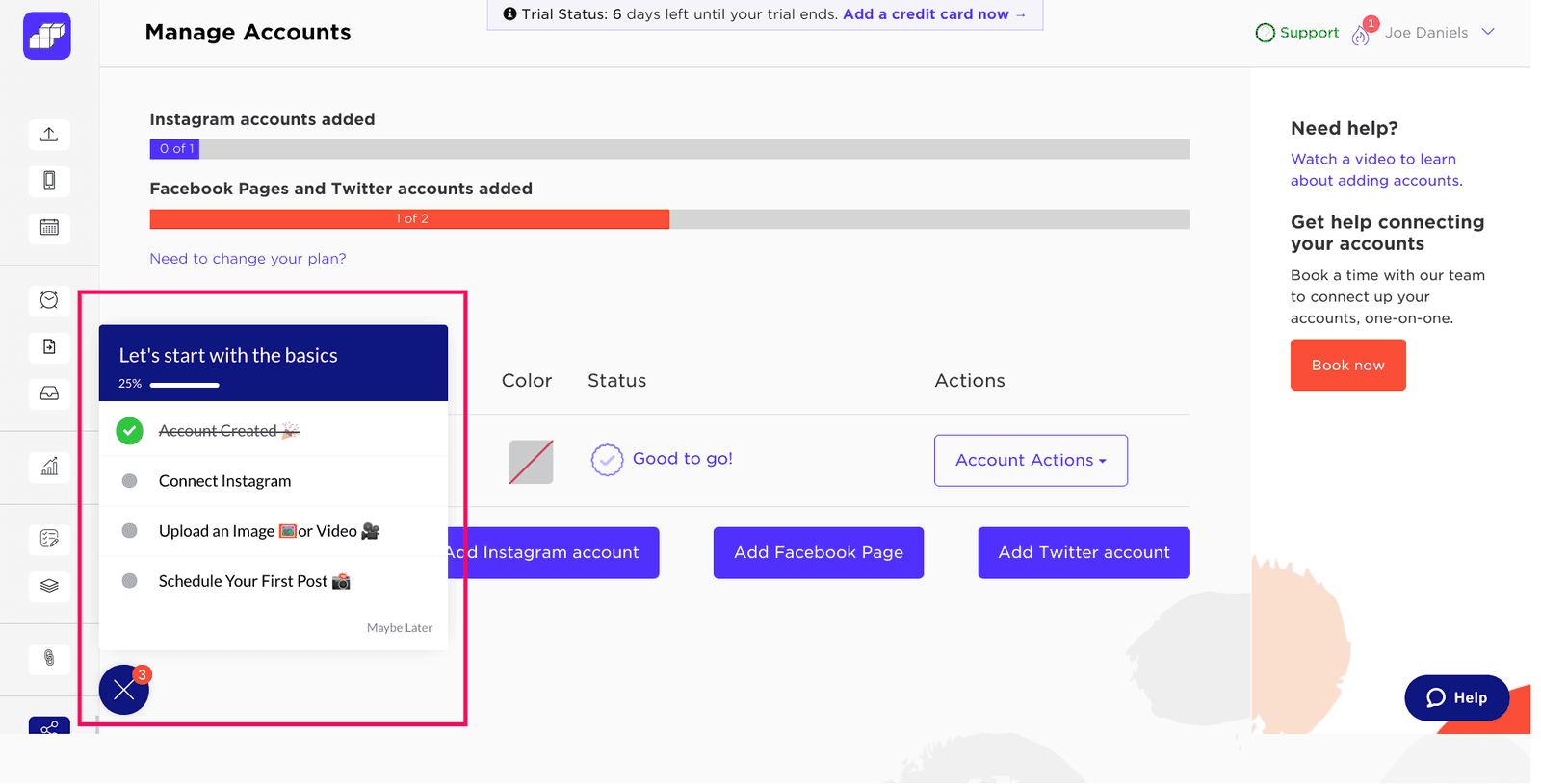
A successful checklist build means that users get to the Aha! moment and activate quickly. Sked Social saw this firsthand: users who completed their four-step onboarding checklist were 3x more likely to convert into paying customers. They kept it simple—just four tasks—and used psychological nudges like a progress bar and pre-checked items (endowed progress) to motivate users. Each task is linked directly to an in-app action or flow, guiding users step by step until completion, and closing with a celebratory message.
But be careful, don’t overload your checklist! Remember to throw in an incentive at the end to reward your new users for completing the tasks – for example, a discount voucher, or additional credits for their account.
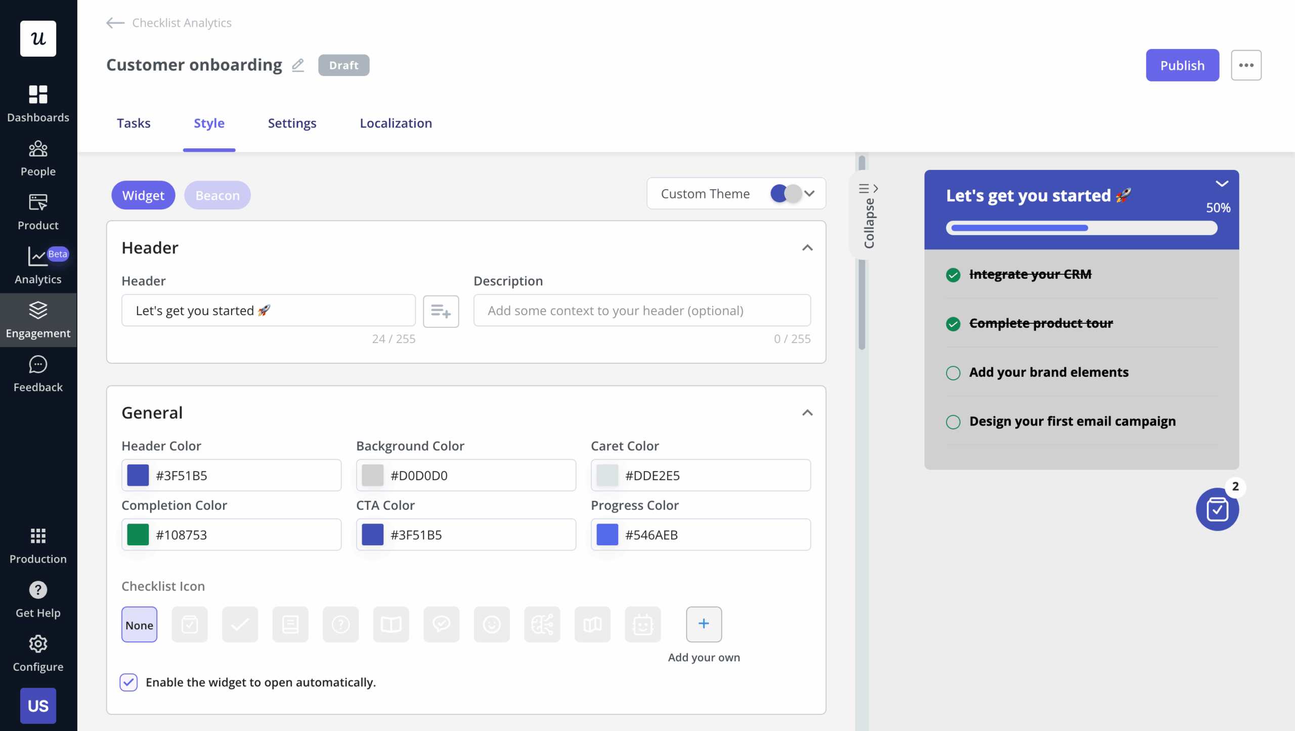
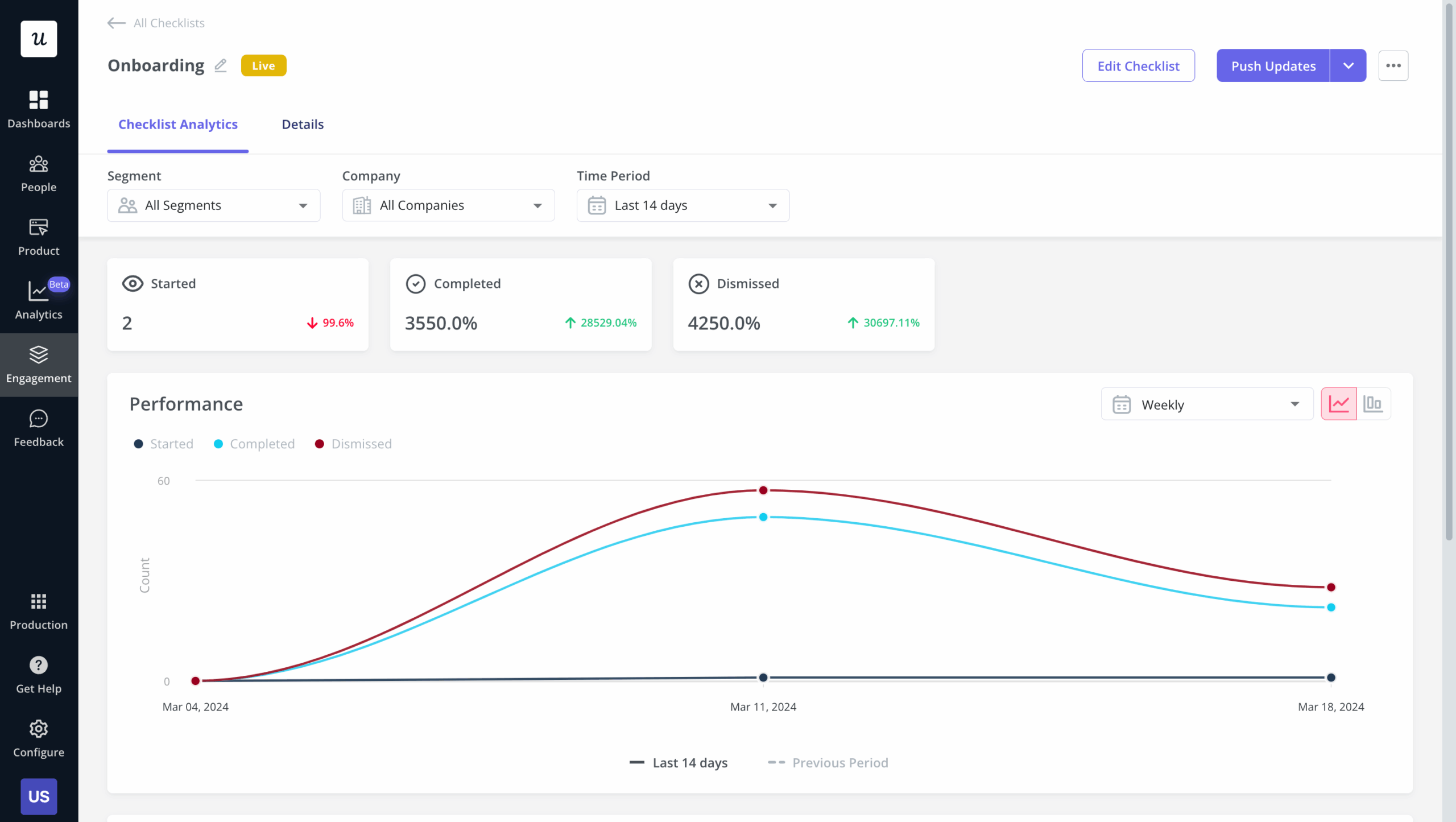
Userpilot checklists come with their own set of analytics, so you’ll be able to see engagement stats and where people are dropping off so you can keep improving:
5. Build interactive walkthroughs, not linear product tours
Instead of a lengthy multistep product tour showing your users features that they may not immediately need (and likely won’t remember when they need them) consider creating interactive walkthroughs instead.
What’s the difference between an interactive walkthrough and a classic product tour?
Interactive walkthroughs teach the users by doing – they push the users to complete certain actions before continuing the tour. Each step in their onboarding flow (or walkthrough) should be triggered only when the user has actually completed the required action from the previous step.
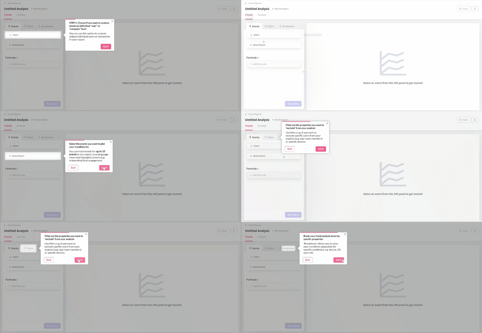
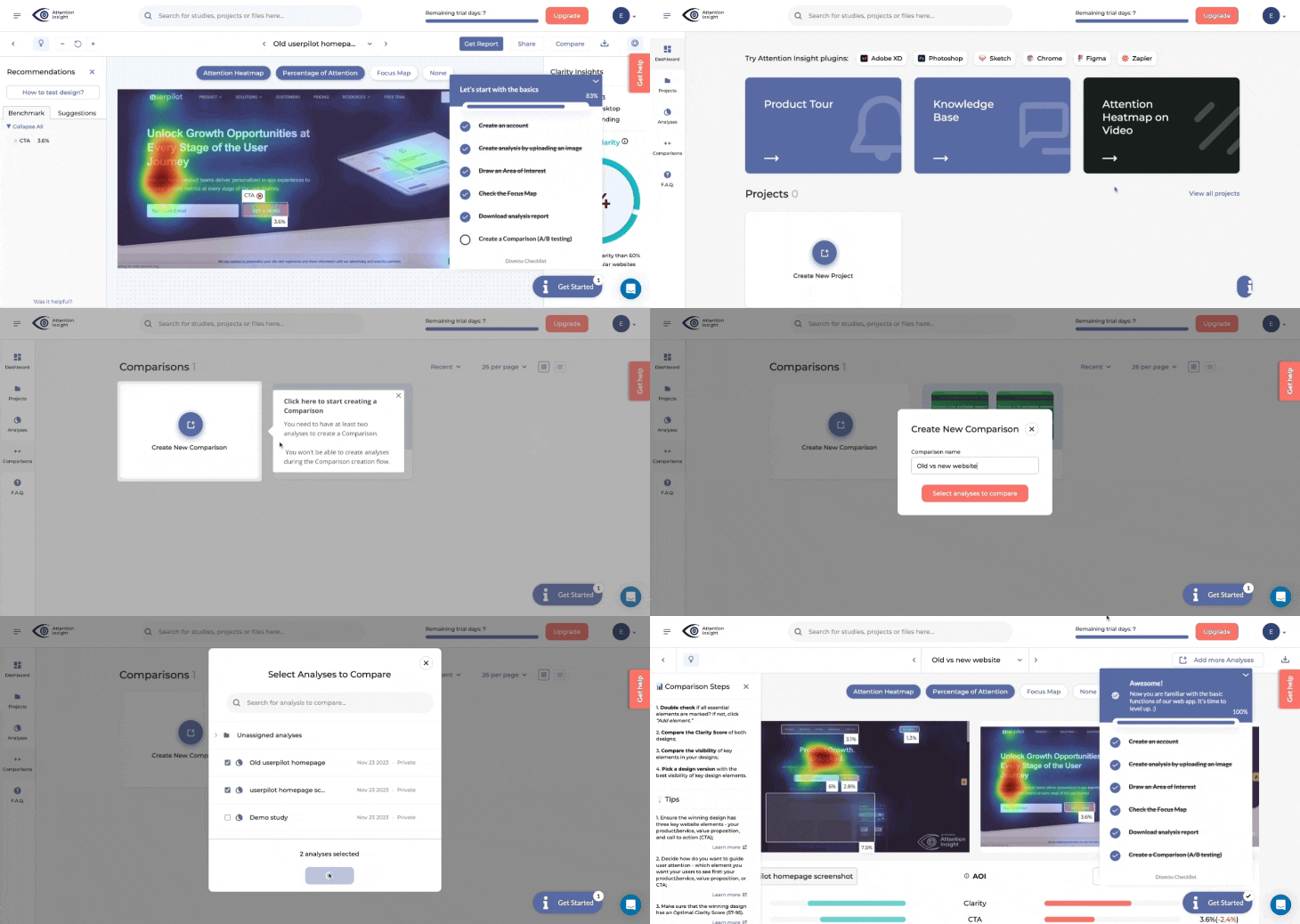
This approach has proven highly effective in practice. When Attention Insight implemented interactive walkthroughs with Userpilot, they saw their activation rate increase by 10% and time spent in the app grow by 24%. Their Head of Product, Miroslav Vargan, had identified a significant challenge with feature discovery that was resolved through guided experiences requiring users to complete each action before moving forward. The transformation from passive viewing to active participation made a remarkable difference in how users learned and adopted their platform’s capabilities.
Compare it to a linear product tour:
It consists of a number of tooltips showing the user all the different features one by one, and requiring them to just press the “next button” before proceeding. This obviously means a lot of users will just…be hitting all the next buttons to get rid of the product tour, without learning anything.
Not sure how to build interactive walkthroughs to improve the new user onboarding in your SaaS? Book a demo with Userpilot, we’ll show you!
6. Make your onboarding contextual
As you gather more user behavior or user attribute data, you should work to keep onboarding experiences as relevant as possible to what your user is doing in your app.
Imagine you’re a user of a social media scheduling tool. You are supposed to schedule some posts for next week, but inspiration eludes you. You are typing a few words into the editor, deleting them, typing again… You don’t have any posts in your queue.
Wouldn’t a helping hand pointing you to the ready-made post calendar with content templates be great?
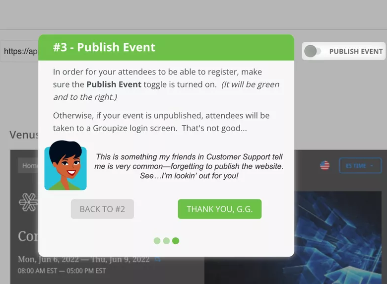
This isn’t just theoretical – Groupize saw remarkable results when they implemented contextual onboarding with Userpilot. Justin Peticolas, Manager of Implementation and Onboarding at Groupize, described G.G. as “like having a professional event planner that spent years on the job inside the app, that our users can ask for advice anytime.” By implementing contextual guidance through interactive elements, resource centers, and guided tours, Groupize noticed their support tickets became more focused and directed. Users began using G.G. as their first line of defense, resulting in fewer basic questions and more specific queries that truly required human intervention.
Contextual user onboarding in SaaS outperforms traditional linear onboarding any day of the week.
Contextual onboarding relies on two things: subtle in-app experiences such as native tooltips, hotspots, and banners, and triggers based on user behavior and custom events. You can trigger these experiences in real-time in response to the in-app events the users are performing in your product with only a few onboarding tools (and yes, Userpilot happens to be one of them 😎).
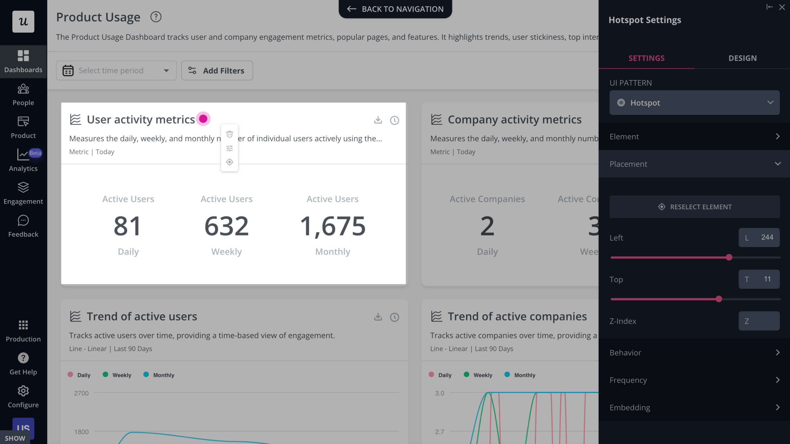
In sum – contextual onboarding reduces the time to value as well as allows you to create personalized flows and provide a great user onboarding experience.
7. Use native tooltips
A good practice for your new user onboarding in SaaS is to use the more subtle native tooltips, especially at later stages in the user journey.
Native tooltips are tooltips appended to your native UI that only unfurl when the user hovers over them. They are less disruptive than onboarding walkthroughs and can help especially with secondary feature adoption that the users can discover on their own.
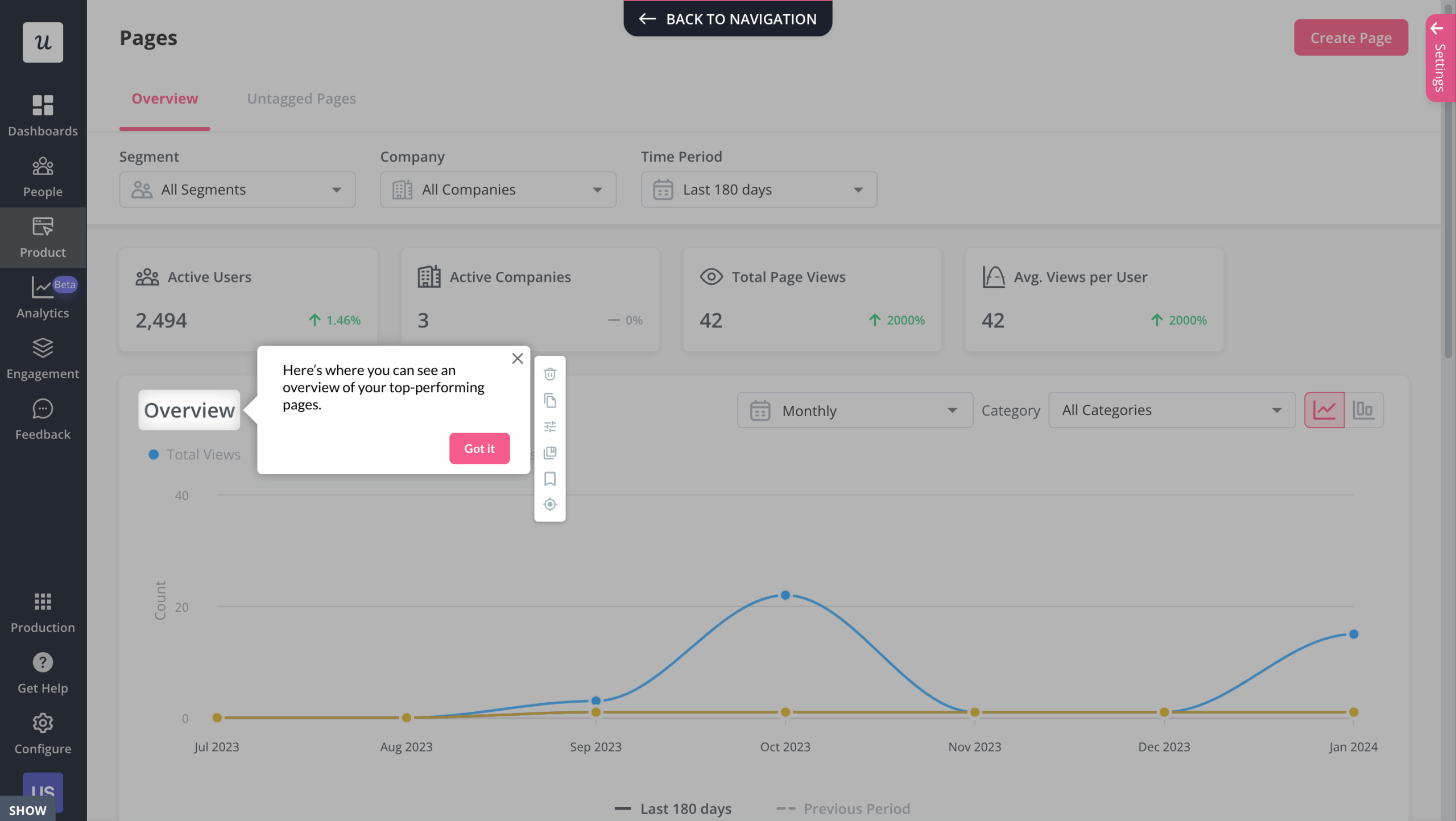
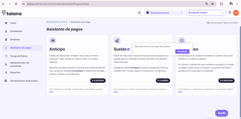
This strategy has been effective in real-world use cases. Talana, an HR tech platform with dynamic URLs and multiple user roles, implemented native tooltips using Userpilot and saw impressive results. Despite facing onboarding challenges with their previous tool (Intercom), switching to Userpilot allowed them to create dynamic, context-sensitive tooltips tailored to each user. As a result, 31% of Talana’s users actively engaged with tooltips—a significant boost in self-guided learning and product adoption.
8. Make sure your SaaS onboarding flow is self-serve
Ideally, your users should be able to go through your user onboarding process without having to wait for a customer success manager to find time for them. Self-serve, product-led SaaS should be accessible to its users 24/7.
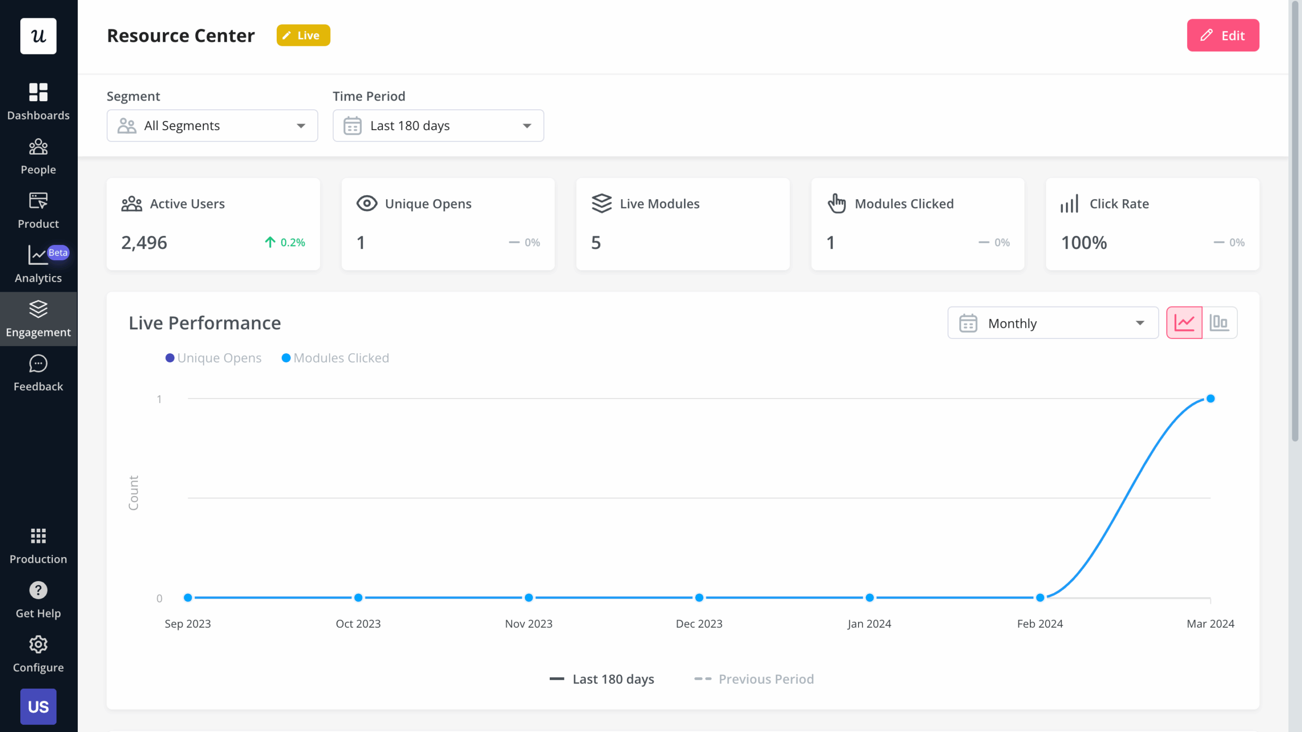
Adding a resource center to your SaaS app allows the user to search all your help resources, video tutorials, onboarding flows, and knowledge base help documents on-demand, by keyword. This can improve the user onboarding experience immensely by providing your users with instant answers to frequently asked questions.
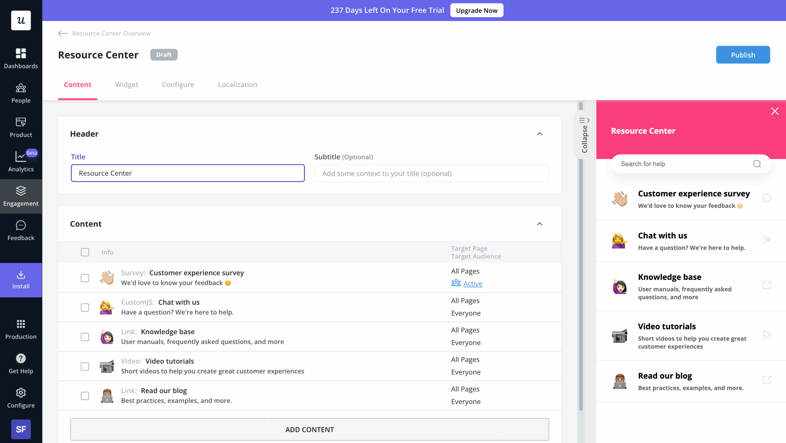
Just like with checklists – our resource center comes complete with analytics – to help both your product managers and customer support team understand what your new users struggle with:
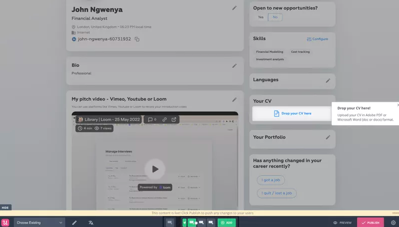
The Room, a platform connecting elite African tech talent with global employers, experienced this firsthand when tackling their activation challenge. Their Senior Product Manager, Arjoon Talukdar, identified a critical problem: new members weren’t uploading their CVs after signup, which prevented them from being discovered by potential employers. Instead of deploying customer success managers to guide each user, they implemented a self-serve onboarding flow with Userpilot that featured a “driven action” – a UI pattern that guided users to click the “upload CV” button. The results were remarkable: CV uploads increased by 75% (from 200-210 to 300-350 per week) within just 10 days. What made this approach particularly effective was that Arjoon could build these flows without engineering resources, allowing for quick implementation and iteration based on user engagement data.
9. A/B test your onboarding process and continuously improve it
Product managers/marketers responsible for onboarding often see it as a one-off ‘set it and forget it’ activity. This mindset can be really disastrous. Your product evolves all the time, your positioning, market, and user personas change, and so should your user onboarding.
You should also keep introducing more advanced features at the later stages of your customer onboarding journey to push for upgrades and expansion revenue.
You should also constantly iterate and experiment with your onboarding. To help you understand which versions of your user onboarding flows are most impactful in terms of helping your users, you may also run A/B tests to test different versions of your flows:
Of course, we offer you this option in Userpilot too.
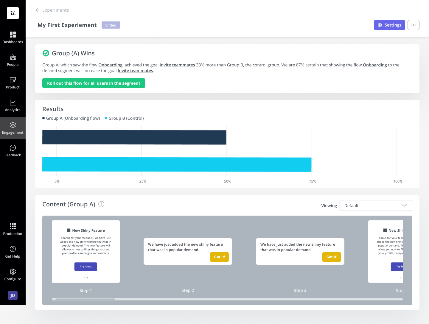
The Smoobu team conducted an A/B test to evaluate the impact of triggering a channel connection tutorial on new users after creating an account.
Using Userpilot, they tested two variations: one group was shown the channel walkthrough immediately after sign-up, while the other group received no guidance. Both groups were part of their French market.
Want to implement the best practices you’ve just learned about into your SaaS onboarding? Book a demo with Userpilot and we’ll show you how! On top of user onboarding flows, Userpilot offers behavior analytics, microsurveys, and surveys, all 100% customizable to your branding.
But wait, how do you improve your existing user onboarding experience?
If you’ve already built your SaaS user onboarding and just want to improve it, here are a few ways to troubleshoot and improve:
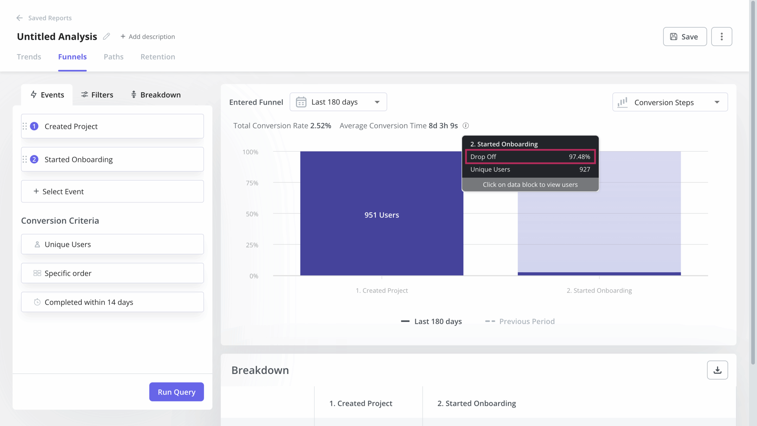
- Look at your user behavior analytics tools and see where users are dropping out or getting stuck. Funnel analysis will help here. You can also pair it with session recordings for granular insights.
- Come up with some hypotheses on how to improve your onboarding experiences.
- Implement the improvements to your onboarding flows.
- A/B test your new onboarding flows.
The 8 best SaaS onboarding examples to inspire you
Now that we know all about SaaS onboarding best practices let’s look at some real-life examples of great onboarding experiences in SaaS. These user onboarding specialists and customer success teams did a great job – so take a leaf out of their book!
Best user onboarding experience #1: Box
Box offers a secure platform for content management, workflows, and collaboration.
Here’s how it onboards new users…
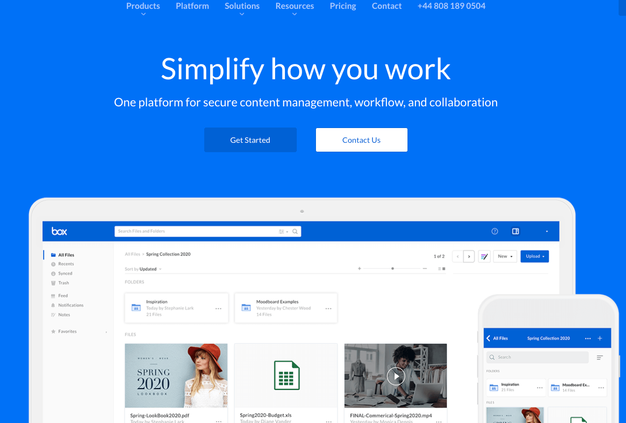
Box has a fairly simple home page layout, with a prominent CTA, enabling new users to get up and running as soon as possible.
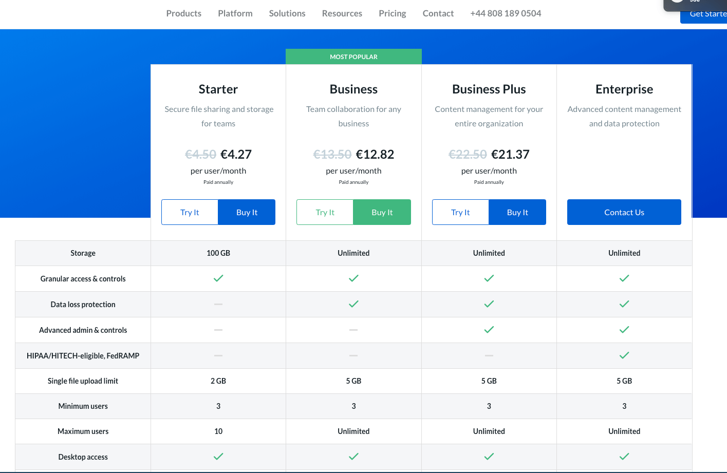
Clicking the CTA takes users to the pricing page, where they can see a breakdown of each price plan. This means users can immediately choose the most relevant plan for them. It also highlights the value proposition of Box.
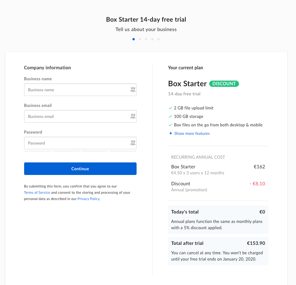
Box then provides a fairly simple sign-up form, only asking for a few key details. It also repeats the main benefits of the product so that they’re fresh in the user’s mind.

Once users access Box, they’re shown a brief tour of the product, with tooltips explaining how the product works. Note that the tooltips also explain the benefits of the feature, not simply how it works.
Box also makes use of empty states, by providing sample content in the form of a welcome pdf. This shows users how the product will work for them.
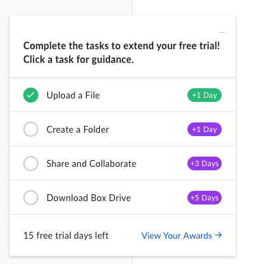
Here’s where Box’s onboarding gets really clever. When a user starts their free trial with Box, they’re given 14 days to use the product.
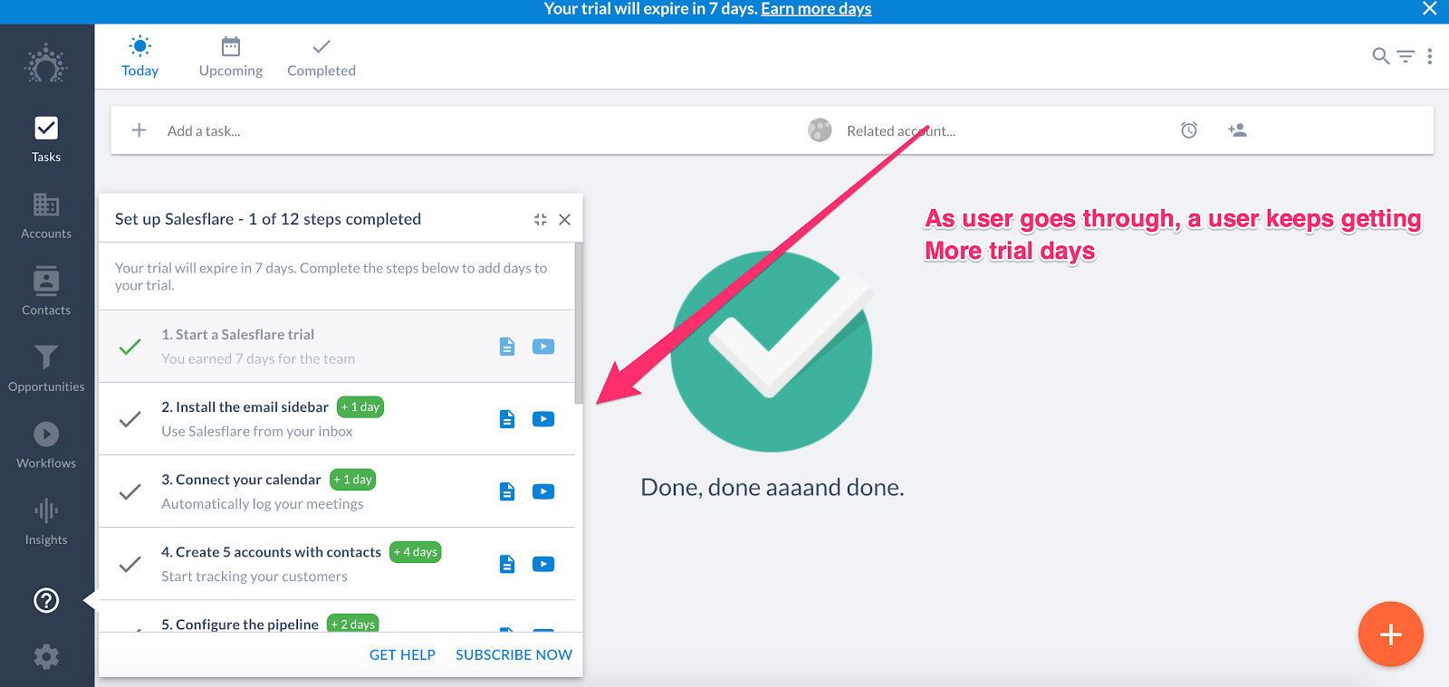
However, Box provides a checklist of onboarding tasks. Completing these tasks will extend the trial. It’s a great way of rewarding positive interactions with the product, and means new users are likely to reach the eventual Aha! Moment.
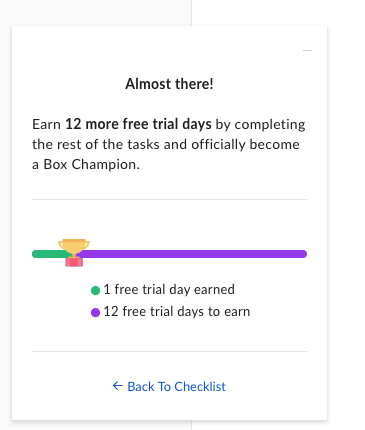
Box’s checklist also provides a progress line so users can see how close they are to completion.
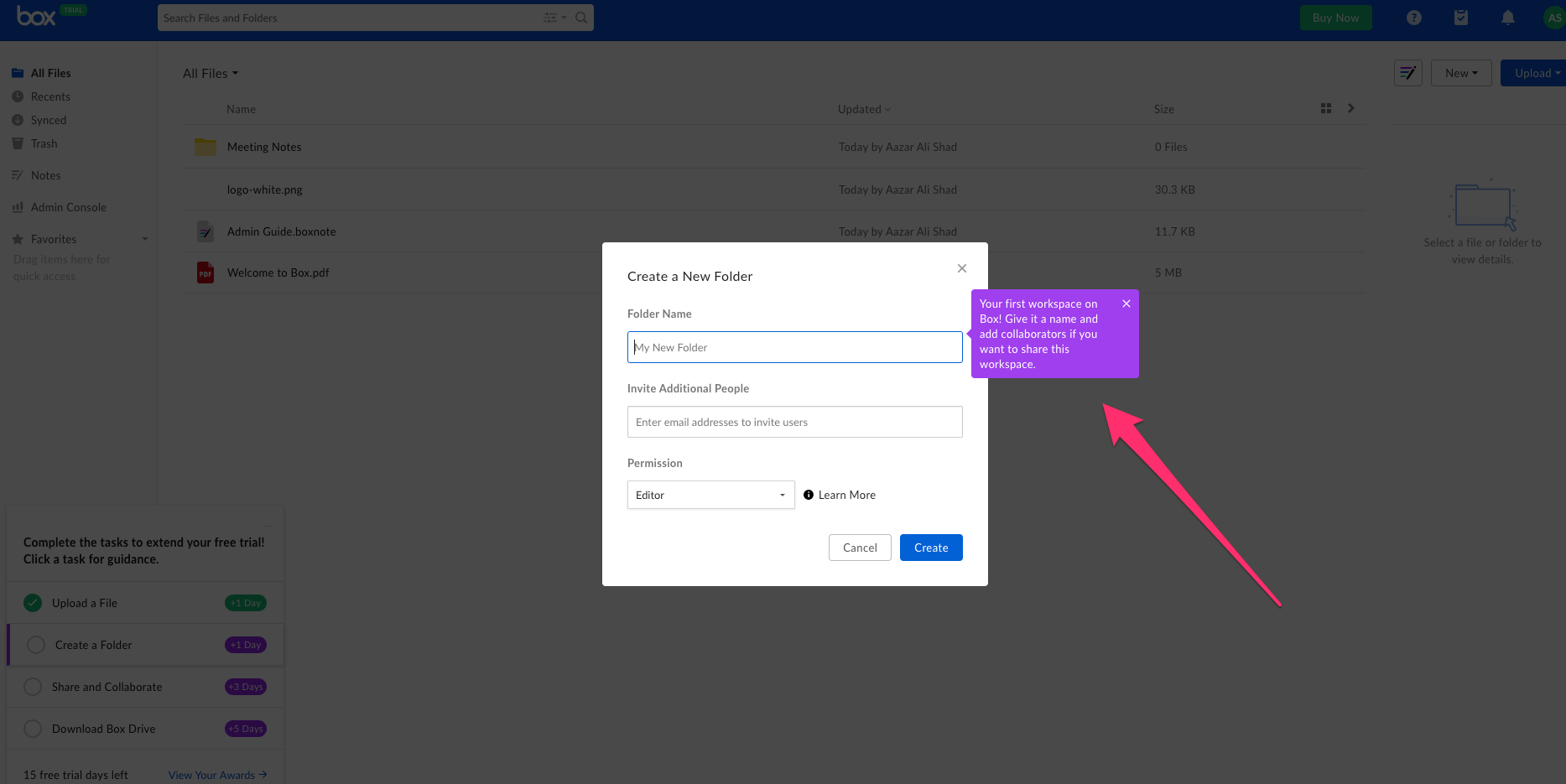
Every time a user starts one of the checklist tasks, Box ensures they know exactly what to do with useful and clear tooltips.
What we love about Box’s onboarding experience:
- Guides new users through every aspect from sign-up to first using the product.
- Gamifies the checklist by offering an extension to the free trial.
- Clear and compelling tooltips that not only show users how to do something, but why it’s so great.
Best onboarding experience #2: Productboard
Productboard is a product management tool, designed to help you gather feedback and then act on it.
Here’s what Productboard’s onboarding flow looks like…
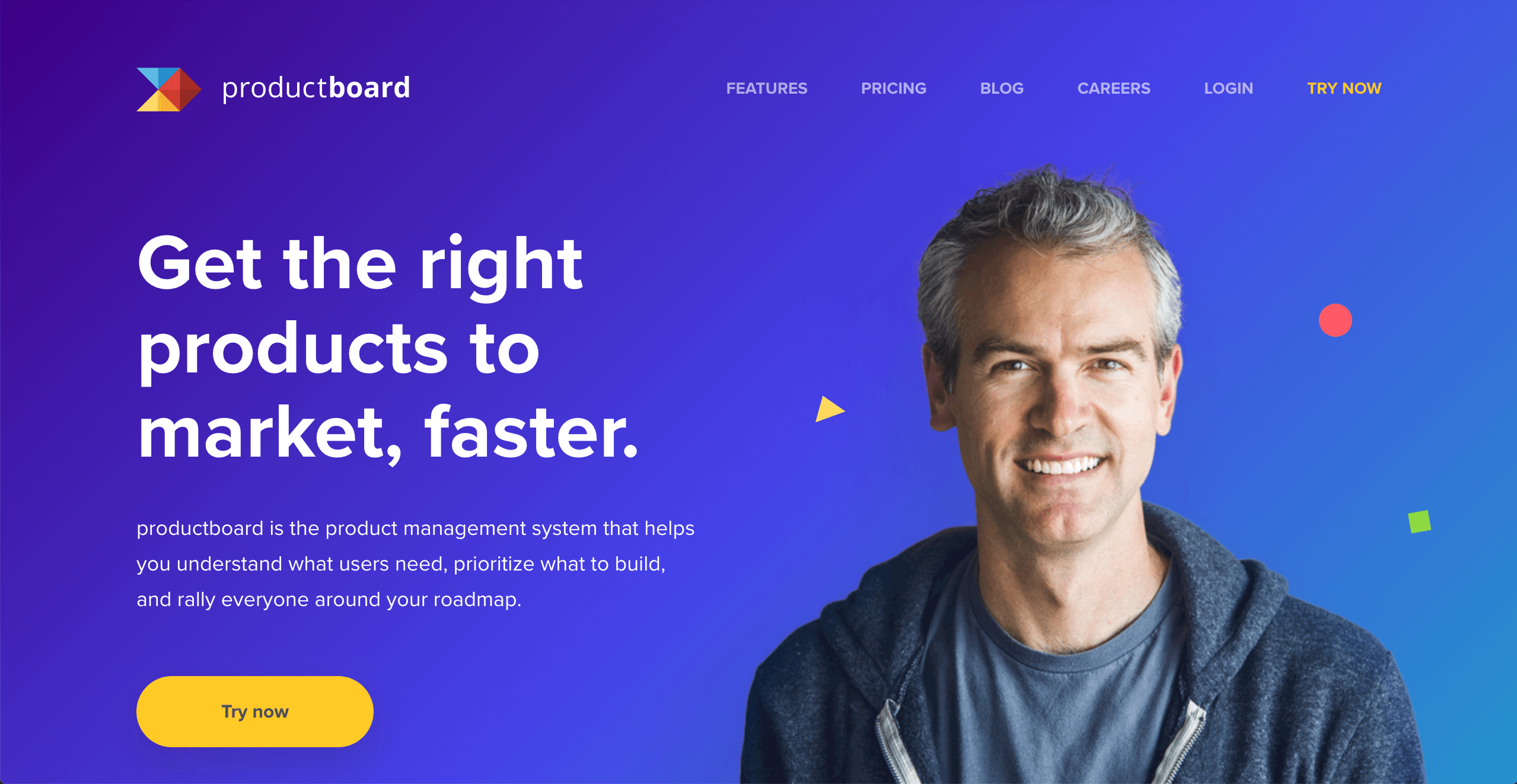
The home page features a large “Try now” CTA that stands out thanks to the vivid color.
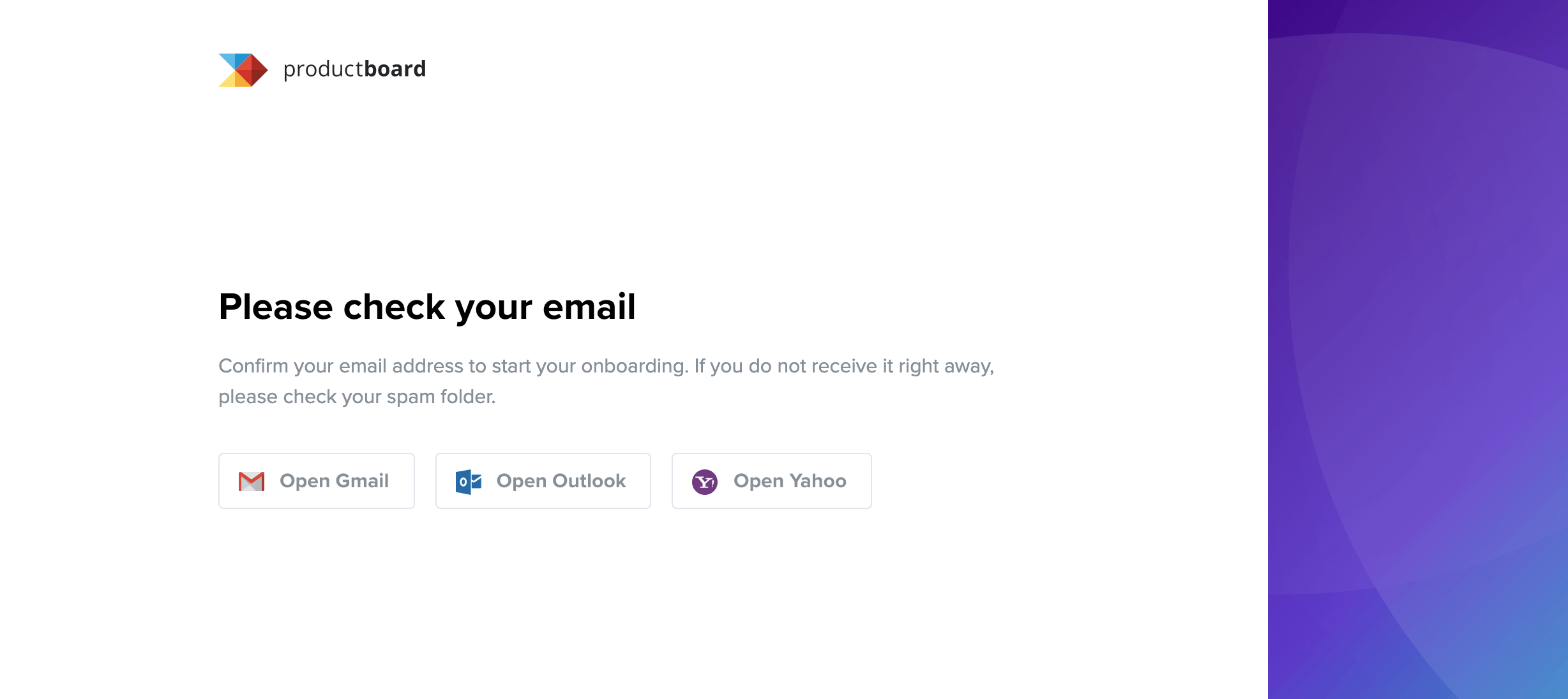
Once you enter your email address, Productboard asks you to validate it. Note how they provide links to the most popular email clients, reducing the friction as much as possible.
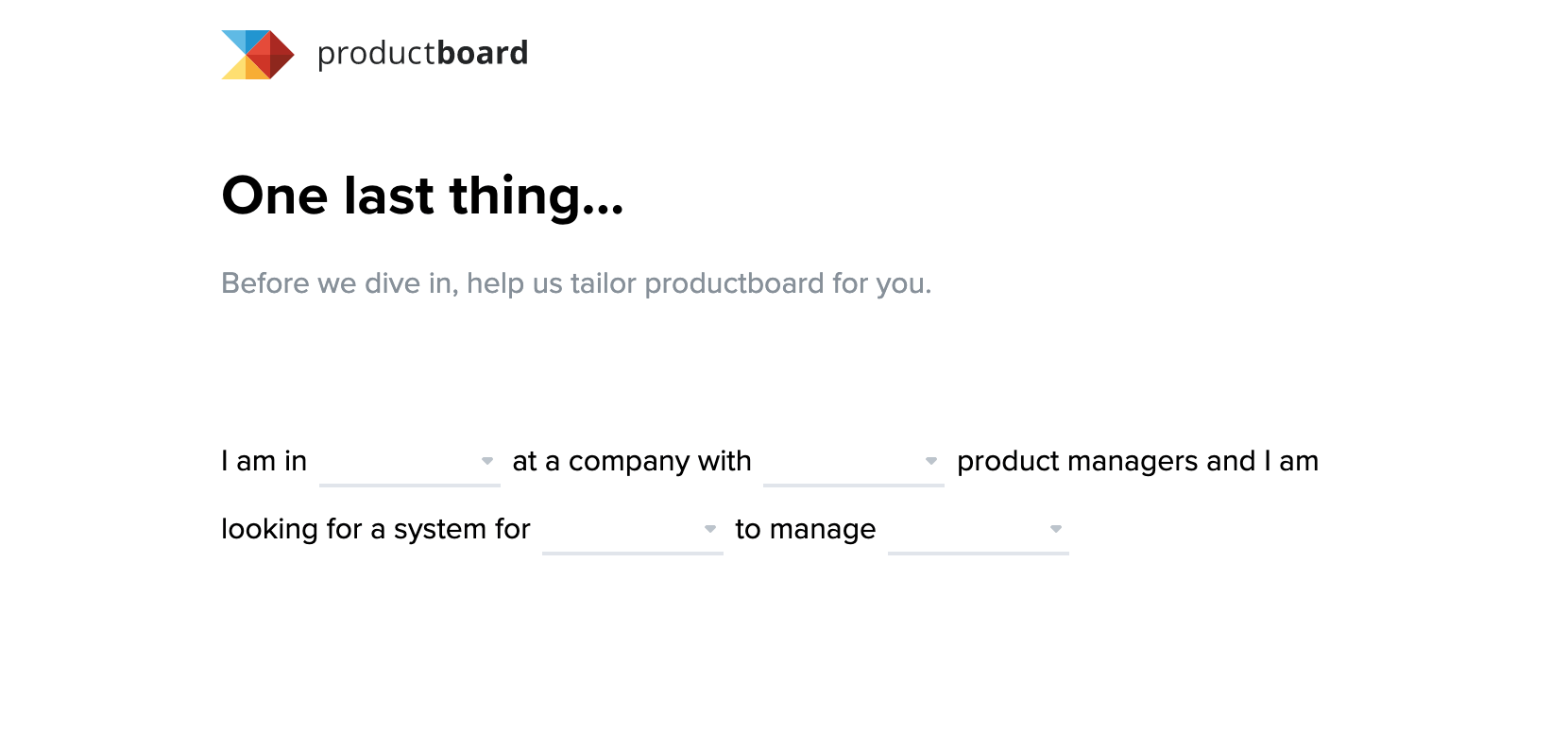
After clicking the link in the email, you’re presented with this screen. It uses a clever fill-in-the-blanks method of finding out more about you and your specific use case.
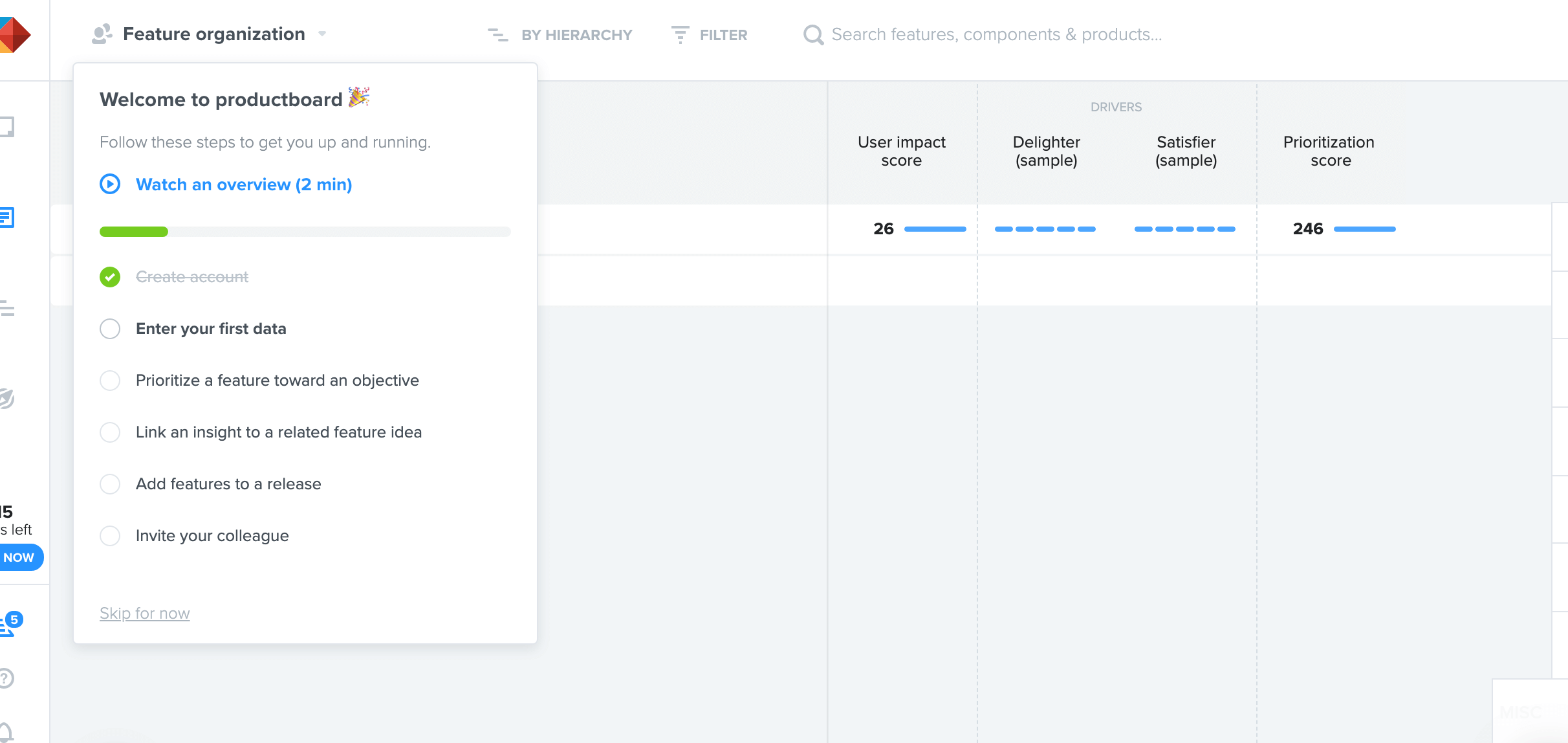
Finally, you’re taken inside the app and are immediately presented with a checklist. The items are designed to show you the key features that Productboard provides, enabling you to reach the Aha! Moment.
What we love about Productboard’s onboarding flow:
- Tries to reduce friction as much as possible, especially when validating your email address.
- An interesting and unique way of understanding your use case.
- It uses a checklist to drive user action.
Best SaaS onboarding example #3: FullStory
FullStory records and reproduces real user experiences on your site, helping you support customers, boost conversions, and debug faster.
Here are a few things we’d like you to take note of from Fullstory’s user onboarding experience:
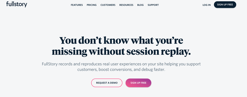
The landing page has a strong value proposition, with a clear CTA to sign up for free. The highlighted ‘sign up free’ CTA pushes users in a subtle way to dive quickly into FullStory and initiate that first contact with the product.
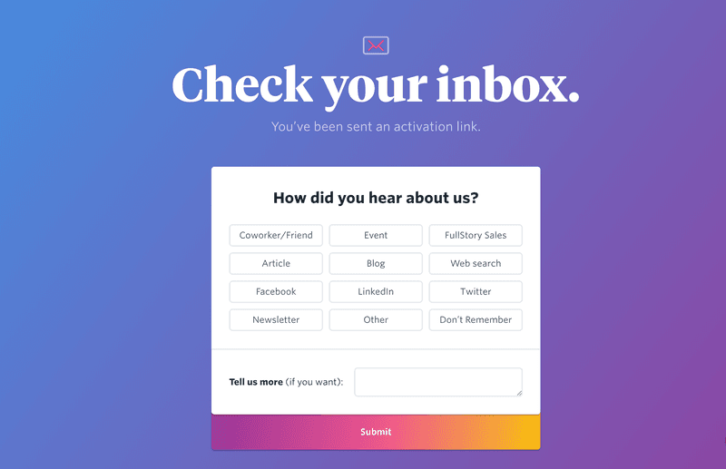
As it waits for you to validate your email, FullStory takes a chance to gather feedback with a beautiful ‘How did you hear about us’ modal.
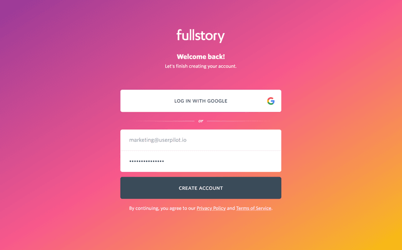
FullStory welcomes you back once you finish validating your email. It’s a friendly, personal touch that helps develop your relationship with your product.
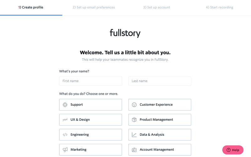
The signup flow continues with persona-based questions. This helps FullStory enhance your experience as they continue learning about your use cases.
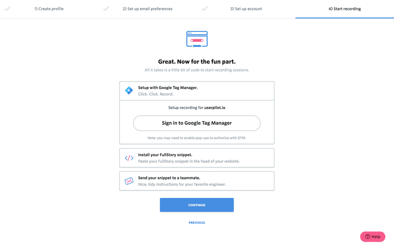
FullStory instantly pushes for activation. You will get almost no value if you don’t install the script, therefore they include this step in the signup onboarding experience.
What we love about FullStory’s onboarding experience:
- As a product with many use cases and various user personas, FullStory excels in learning about each user. This helps it personalize the onboarding for each persona and provide the most value for each specific use case.
- It pushes for activation (installing the JS code) early on during the signup process. This helps FullStory show the value the minute the user lands on the main product UI, as they instantly start seeing real-time session playbacks.
- Beautiful trustworthy UI.
Best Onboarding Experience #4: Airtable
Airtable works like a spreadsheet but gives you the power of a database to organize anything. It’s a productivity and workflow alternative to spreadsheets.
Here are a couple of screenshots from their signup flow.
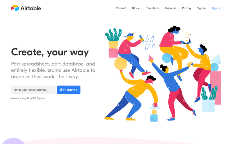
It’s easy to get started with Airtable, thanks to the clear CTA on the homepage.
Airtable’s onboarding flow starts with a video to reiterate value and make you excited for that first-run product experience.
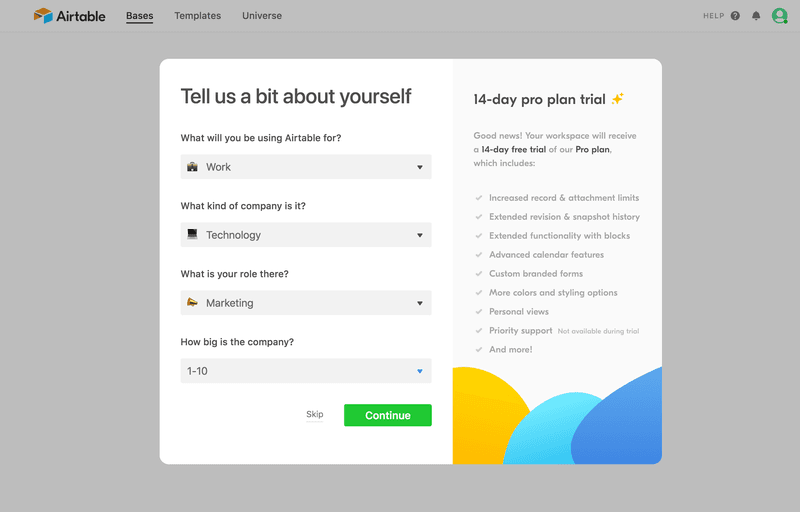
Just like the FullStory example, Airtable tries to understand a new user’s persona and any relevant use cases.
Empty states where there’s currently no data are a great opportunity to drive action. Airtable makes the most of these empty states with a clear CTA.
What we love about Airtable’s onboarding experience:
- Gets you into the UI without email verification — less friction, faster time-to-value.
- Takes advantage of empty states to push user action to create a new base.
- User persona questionnaire to learn more about use cases.
- Resource and Learning tab to help users ease into the UI.
- Simple and easy-to-use UI.
Best onboarding experience #5: Userpilot
Userpilot is a SaaS growth tool, designed to enable product teams to improve their product’s onboarding without any coding knowledge required, analyze user behavior, create bespoke in-app experiences, and collect customer feedback.
It’s also our own product, and we’re pretty pleased with how we onboard our users…
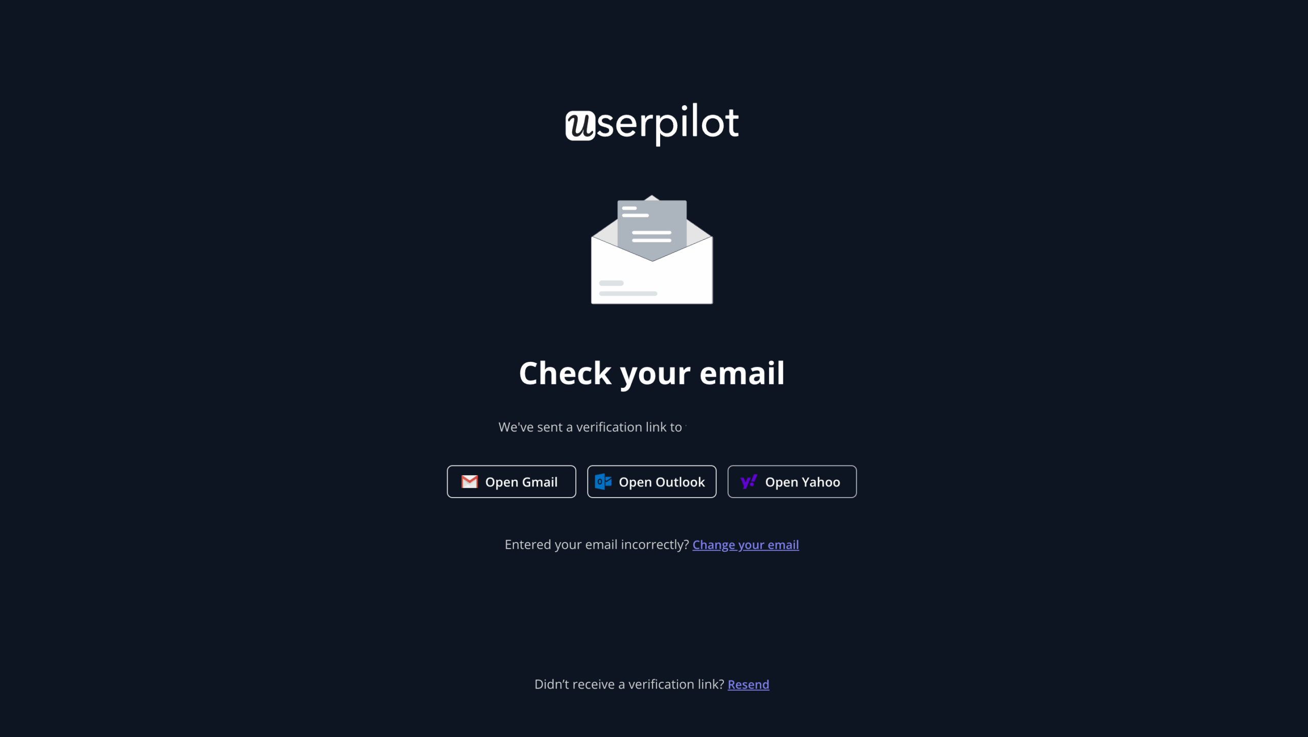
Once a user signs up for the free trial, they are asked to verify their email address before they are onboarded.
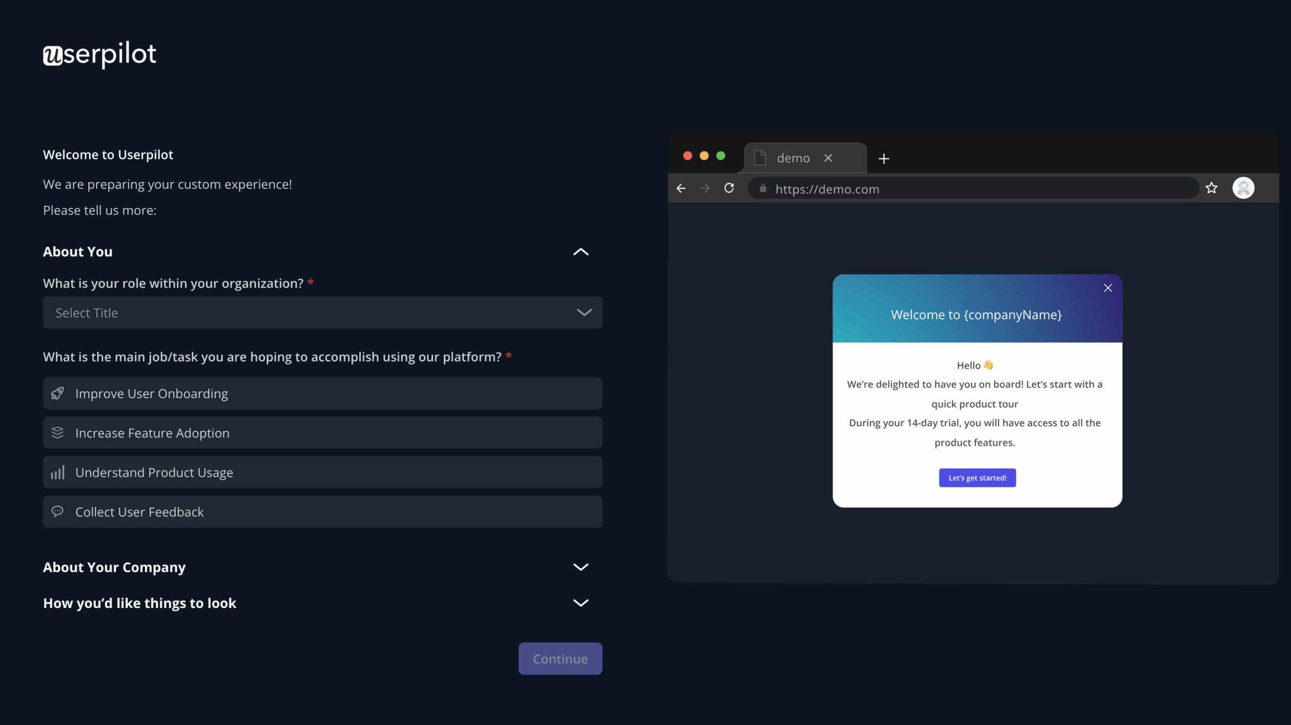
To personalize customer experiences and get to know more about the customers, they are asked to fill out a short welcome survey. This includes their role, goal for using Userpilot, and company information. Customers are also prompted to customize the tool with their branding colors.
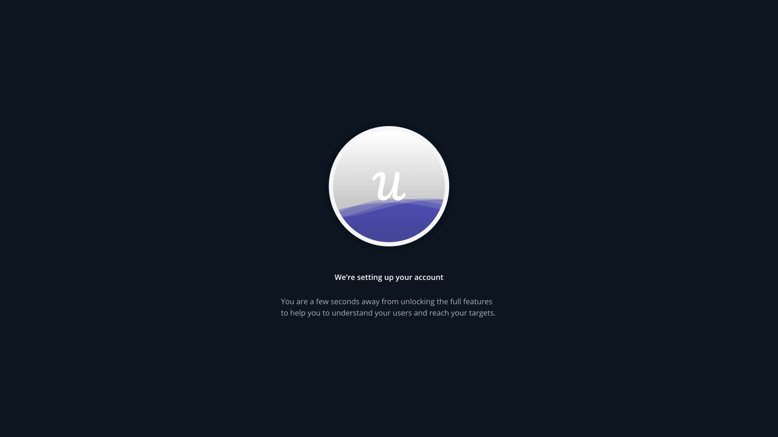
This is followed by a loading page, informing the customers they are moments away from leveraging the tool.
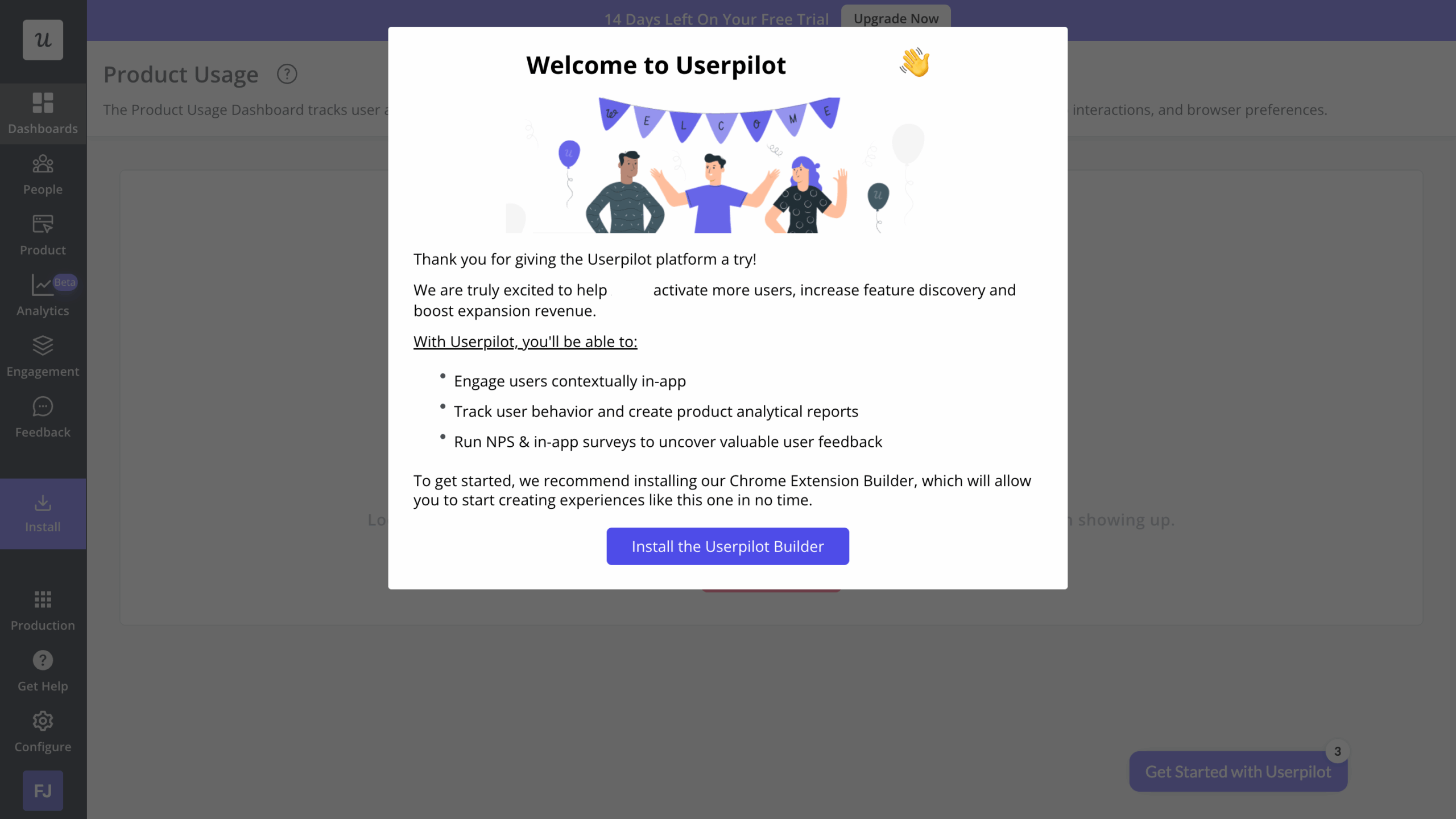
Once inside the product, the signed-up customers are greeted with a welcome message. The latter thanks them for signing up, gives a brief overview of the product’s capabilities, and encourages users to install the Chrome Extension to get started with building in-app experiences.
What we love about Userpilot’s onboarding:
- Reduces onboarding friction as much as possible.
- Includes attractive visuals and easy-to-understand microcopy.
- Uses a welcome survey to personalize experiences from the get-go.
SaaS onboarding example #6: StoryChief
StoryChief is a content marketing tool for startups, SEO marketers, and editorial teams.
Here’s a quick breakdown of their user onboarding flow:
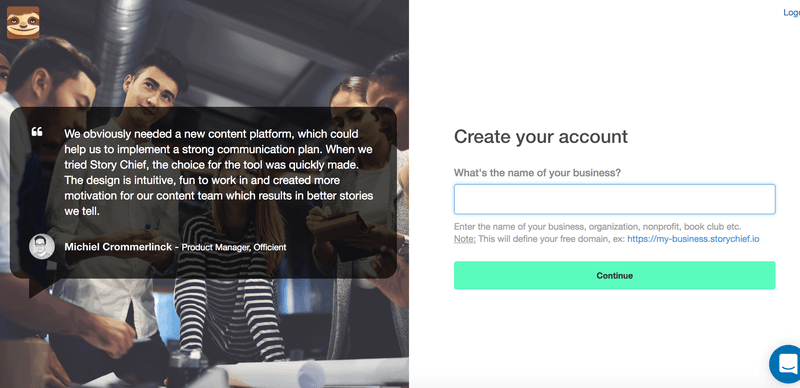
Storychief includes a customer testimonial in the signup flow to demonstrate trust. This reassures new users that they’ve made the right choice.
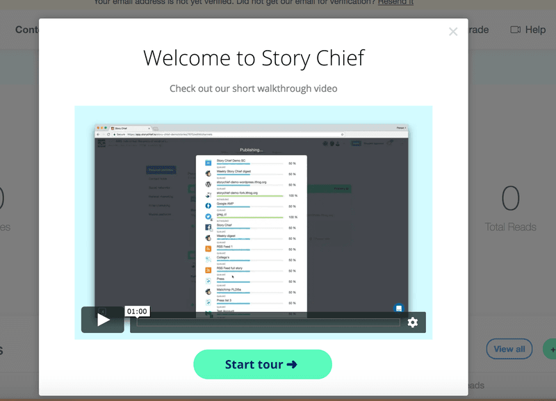
The onboarding experience starts with a welcome modal. It includes a brief video that introduces you to the product.
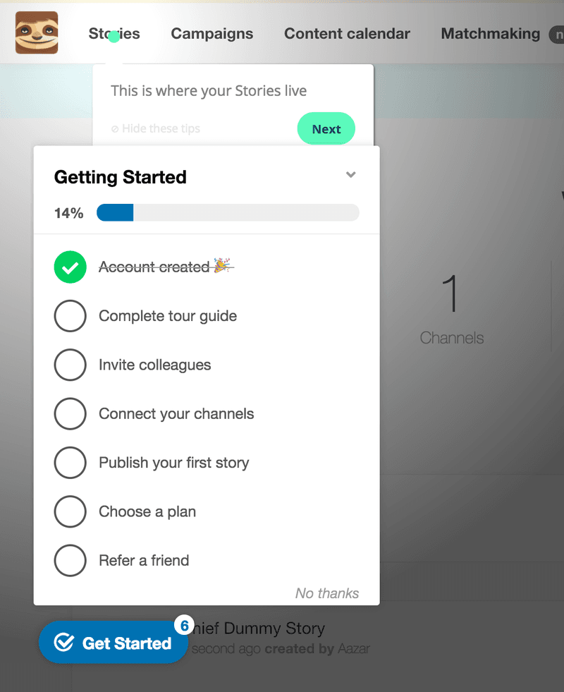
StoryChief then provides you with a checklist that drives users to take a linear path toward activation.
What we love about StoryChief’s onboarding experience:
- Efficient use of testimonials in the signup process.
- A beautiful and brief product tour to get you started with their UI.
- Takes advantage of onboarding checklists to accelerate user activation.
SaaS onboarding example #7: Salesflare
Salesflare is a popular CRM, designed to automate most of the work.
It employs an interactive walkthrough to help drive users towards the Aha! Moment.
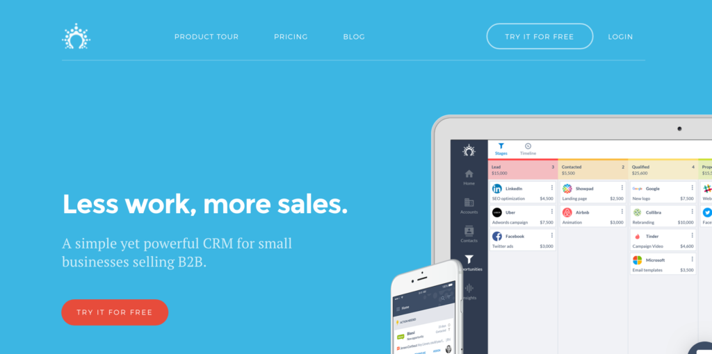
Salesflare’s home page features a striking CTA button. The red button contrasts with the blue background, making it stand out further.
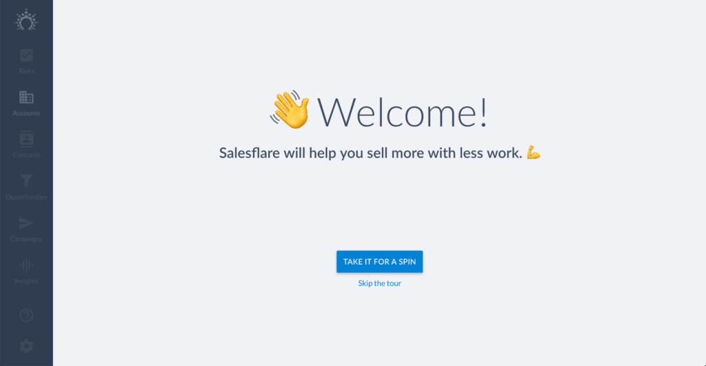
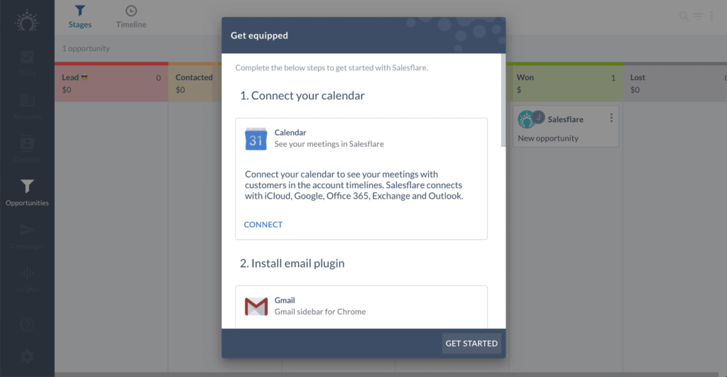
The welcome screen introduces you to Salesflare and asks you to take the interactive tour.
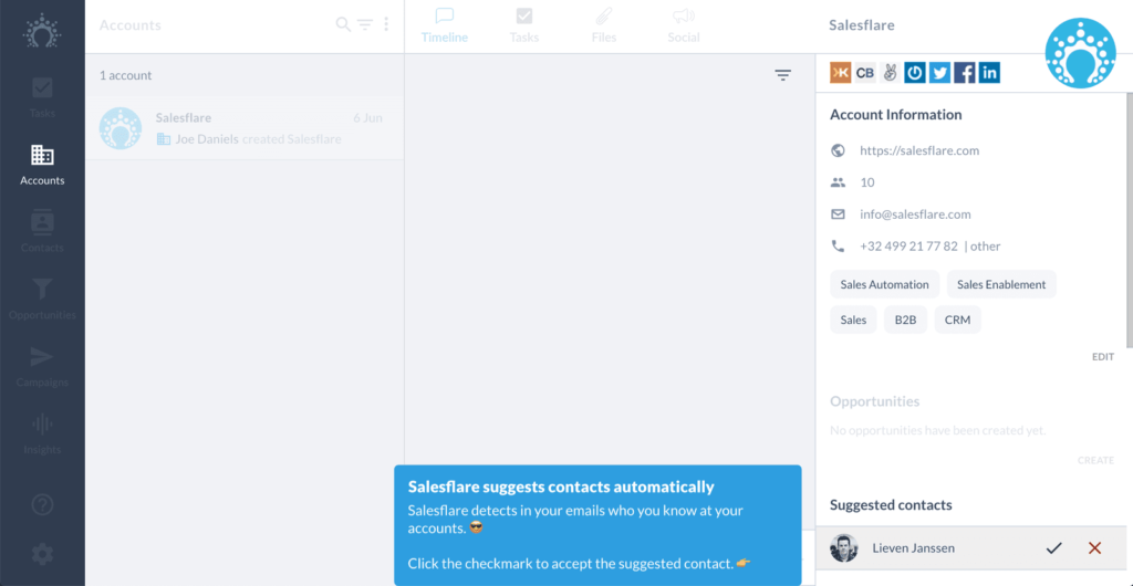
The tour then shows you some of the key features that Salesflare provides. The key part, however, is that you have to complete actions as you go along. This helps you to learn by doing.
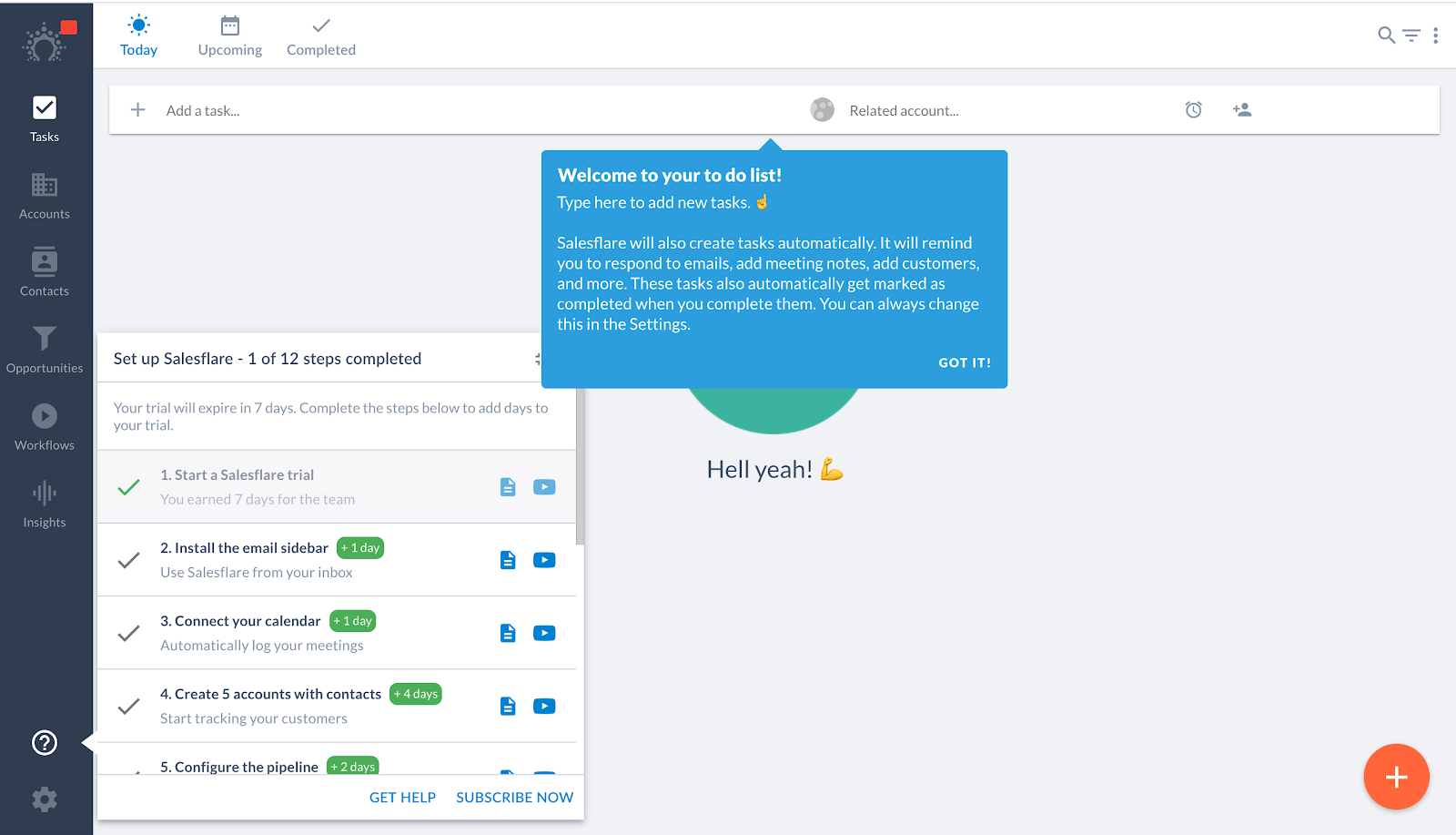
They’ve also added a checklist + help widget to educate the user.
They’ve everything to set up as a self-serve customer.
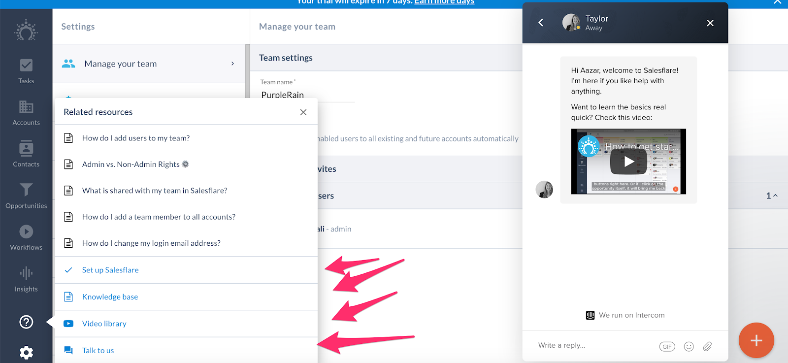
Instead of an academy, they have a video library.
At the end of the tour, right as you experience the Aha! Moment, Salesflare prompts you to connect with a range of different services. This is how they activate new users.
What we love about Salesflare’s onboarding:
- Uses an interactive tour so that new users learn by doing.
- Prompts activation right as users experience the Aha! Moment.
- A conversational approach to onboarding.
Best SaaS onboarding example #8: Feedier
Feedier lets you collect valuable feedback by easily rewarding your customers.
Here are a couple of screenshots from their onboarding flow:
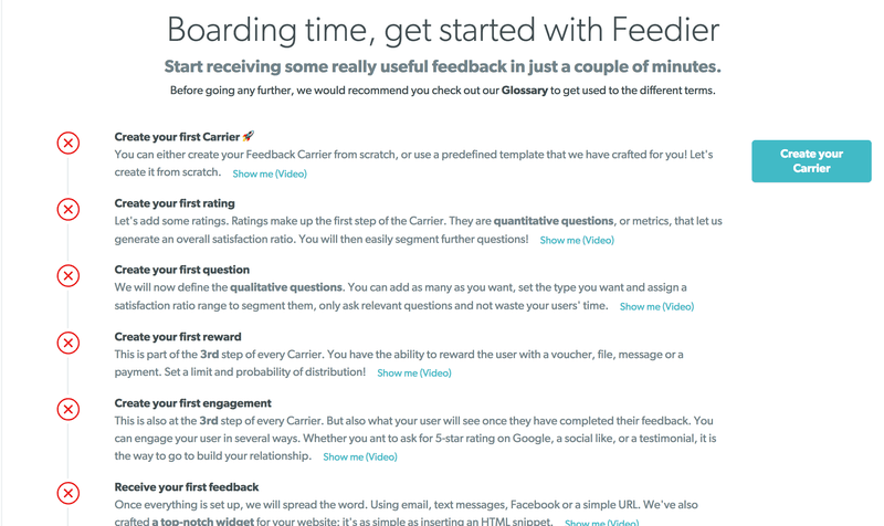
We love checklists, especially native ones. This one makes onboarding so much easier. You’re even given a video for each step to provide more information if you need it.
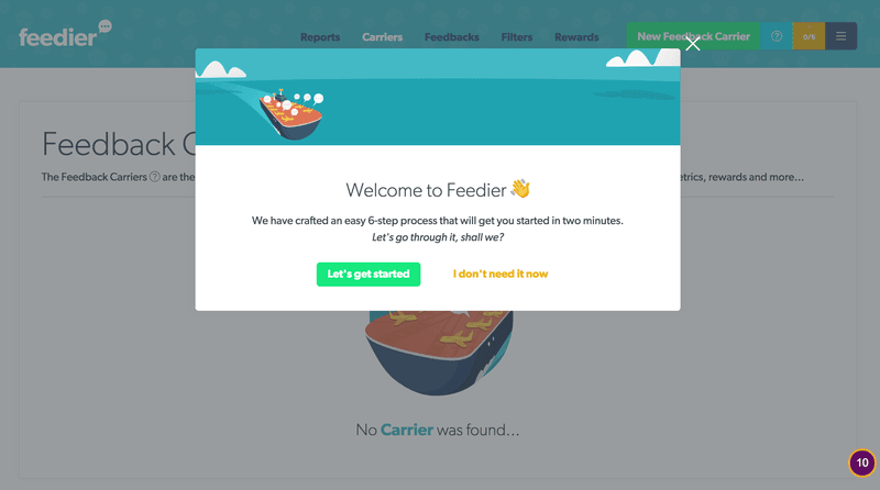
A beautiful modal welcomes new signups and enables you to opt-in for the product tour. Note how it reassures you that it won’t take long (two minutes) to get started.
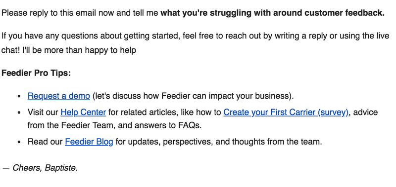
Feedier supplements its user onboarding flow with timely email onboarding sequences to enhance the overall user experience.
What we love about Feedier’s onboarding experience:
- Native checklists to get you set up through the journey of activation.
- Event-driven onboarding email sequence to keep pushing users through the activation process.
Conclusion
So what’s the takeaway here?
- The onboarding process starts right from the landing page – make sure your value proposition is clear
- If your product attracts different types of user personas or use cases, then make sure to include personalization in the onboarding process
- Get users to that initial ‘Aha!’ moment as soon as you can in the onboarding flow. If your product requires an essential integration before you can show value, then push for activation during the signup process
- Use ‘Get Started’ pages or onboarding checklists to help guide users through the activation process
- Take advantage of empty states in your product whenever you can. These empty states are a great way to natively push for user action
- Want to get started on building amazing user onboarding experiences with Userpilot? Book a demo today!

