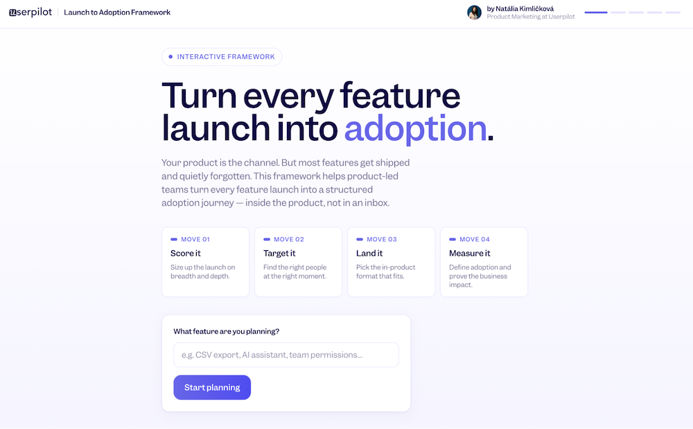
How to Make Sure Your Next Feature Launch Actually Lands [Interactive Framework]


AI tools and vibe coding have made building products accessible, compressing what used to take quarters into weeks. But shipping velocity and user attention move in opposite directions. Most teams haven’t caught up to that yet, leaving adoption opportunities on the table.
Even the best features won’t stick if you don’t pair the feature release with a solid and intentional launch campaign. That’s because releasing is a code event: a deployment, a changelog entry, a Slack message in #product. But launching is a behavior change. It means a real person, in the middle of their actual workday, discovers your feature exists, understands why it matters to them, and works it into how they operate.
In this article, I’ll show you my Launch to Adoption Framework. It consists of four moves that take a feature from released to actually used: score it, target it, land it, and measure.
The Launch to Adoption Framework: Four moves for better adoption and stickiness
Below, you’ll find a ready-to-go playbook for SaaS product launches that you can start applying today.
If you want to follow along, here’s an interactive version where you can build a real launch plan while you read.
👉 Launch to Adoption Framework
Move 01: Score it
Before you put any resources into the launch, ask: Does this feature actually deserve a launch campaign? And if so, how complex should it be?
. Before every release, assess the feature on two things:
- Breadth: how many users have the unmet need this solves?
- Depth: how much does it change the way they actually work?
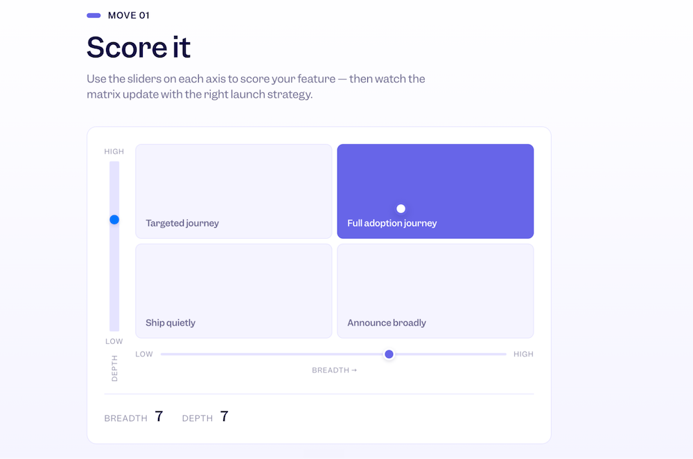
This gives you four strategies:
- High breadth + high depth → Full adoption journey. This is your biggest launch investment. A feature that affects most of your users and fundamentally changes how they work deserves behavioral triggers, a guided first experience, and metrics tracking from day one.
- Low breadth + high depth → Targeted journey. This feature type transforms how a specific segment works, but most of your users don’t need it. A mass announcement here creates confusion more than excitement. Find the exact users it matters to, wait for the right behavioral signal, and build a guided experience just for them.
- High breadth + low depth → Announce broadly. Users don’t need to fundamentally change how they work; they just need to know the update exists. An in-app banner or a well-timed email is the right investment; a walkthrough is not needed.
- Low breadth + low depth → Ship quietly. A small improvement for a small slice of users doesn’t require an announcement. Add event tracking, ship it, and come back in 30 days. If the numbers surprise you, invest more. Spending launch energy here pulls attention away from the features that actually need it.
Move 02: Target it
This is the biggest mindset shift in the whole framework. Most teams know who they built the feature for in a general sense. Far fewer know how to find those users inside the product at exactly the right moment. That’s the difference between a campaign and an adoption journey.
A real segment is built from three layers, and you ideally need all three, especially for high-priority launches.
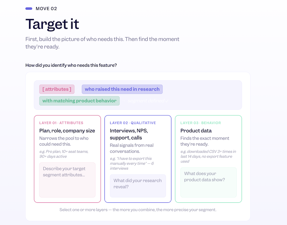
- Attributes: plan, tier, role, and company size. Attributes are a great starting point for targeting, but they’re only useful when combined with more granular data on how users use your product. This is where most teams stop, and it’s not enough. Attributes they tell you who might care, but they can’t tell you when.
- Qualitative data: interviews, NPS, Gong calls, support tickets. These sources need to answer two questions: who is describing the pain point your feature solves, and how? Getting this right does three things for your launch:
- It crystallizes your messaging into language that resonates with the recipients, speaking directly to their pain points.
- It reveals segments you wouldn’t have thought to target.
- It surfaces use cases that never made it into the original spec, sometimes the most valuable ones.
Qualitative research used to take days. But with the right AI setup, you can connect your notes, your Jira, your support tool, and surface insights in minutes.
- Behavior: your actual product data such as drop-offs, repeated manual actions, limits being hit, or workflows abandoned halfway through. All PLG teams have this data, but not many use these signals to improve communication.
There are four signals that cover most launch scenarios:
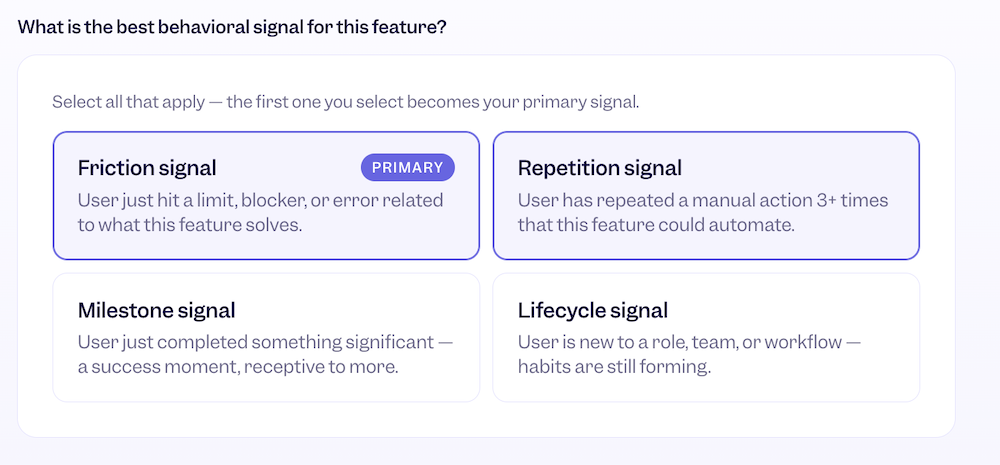
- Friction signal. Display an announcement right when the user hits a wall that your feature removes. This is the best targeting window you’ll get, because the problem is live in their head right now. Show up immediately. Lead with the fix, not the feature name. “You’ve hit your export limit. Here’s how to automate this” will always outperform “Try our new Export Scheduler.”
- Repetition signal. Show the user a better way of using your product after they’ve done the same action three or more times. Hand them the shortcut at the moment they take the same walkaround.
- Milestone signal. Show a new feature the moment the user just completes something significant, like publishing their first report, hitting a usage threshold, or finishing onboarding. This is peak satisfaction, the moment users are most open to what’s next. Use a celebratory tone here.
- Lifecycle signal. Introduce new features the moment the user changes role, plan, or workflow inside the product. Your users are now in learning mode, and people in learning mode are receptive to being shown a better way. This is one of the most underused signals in PLG.
If there’s one place to spend disproportionate time in this whole framework, it’s here. Right targeting and segmentation are the core of launch success.
Move 03: Land it
Seeing that a feature exists is not the same as adopting it. You can have perfect targeting, the right moment, the right message, and still lose people if the first experience is confusing, too long, or asks too much too soon.
Every feature has an Aha! moment, which is when the user feels the value and wants to come back. Your job is to design the shortest possible path to that moment.
Two questions determine the right format:
- How complex is the first use?
- Is this a brand new area of the product or an enhancement to something users already do?
Based on your answers, there are four courses of action you can follow.
- Simple first use + new area. The feature is new but not complicated, so the user needs orientation more than guidance. A feature spotlight is the right call: a highlighted callout that introduces the new area, explains what it does in one sentence, and invites a single action. The goal is to make the unfamiliar feel immediately accessible, not to explain everything at once. Show it once on the first relevant visit and let the feature do the rest.
- Simple first use + enhancement: The user already knows this part of the product, so they don’t need a tour. They just need to know something changed and where to find it. A contextual tooltip fired at the exact interaction point is enough, not on page load for everyone, but at the specific moment the user is doing something related to the enhancement.
- Complex first use + enhancement. Familiar context creates assumptions, and assumptions make people skip steps they actually need. A spotlight combined with a progressive tooltip sequence works best here. The spotlight announces the change and resets expectations, then the tooltips guide the user through the updated workflow one step at a time, each one firing at the relevant interaction point rather than all at once. Two to three prompts maximum, so it feels like guidance rather than a tutorial they’re being pushed through.
- Complex first use + new area. This is the highest investment format and the one that gets misused most often on features that don’t actually need it. When the first use requires five or more steps, involves real setup, or fundamentally changes how someone works, you need to hold their hand through it.
- An interactive walkthrough guides users through the critical path inside the real product UI, letting the feature teach itself through doing rather than explaining. Keep it to the minimum steps needed to reach the first meaningful outcome and cut everything else. Users can explore the rest once they’ve had that first win.
- An onboarding checklist works best when the set-up spans multiple sessions. It gives users agency over their own pace and creates a sense of progress that pulls them back. It should include five items maximum, because the completion rates drop sharply above that, and if setup genuinely requires more, two shorter checklists at two stages of the journey will always outperform one overwhelming list.
There is also one more thing to remember about: throttling and frequency. You can have the perfect format, the perfect trigger, the perfect copy, and still lose people by showing too much too often. If someone gets an in-product prompt every session, they stop reading them. They start dismissing before they even register what it says.
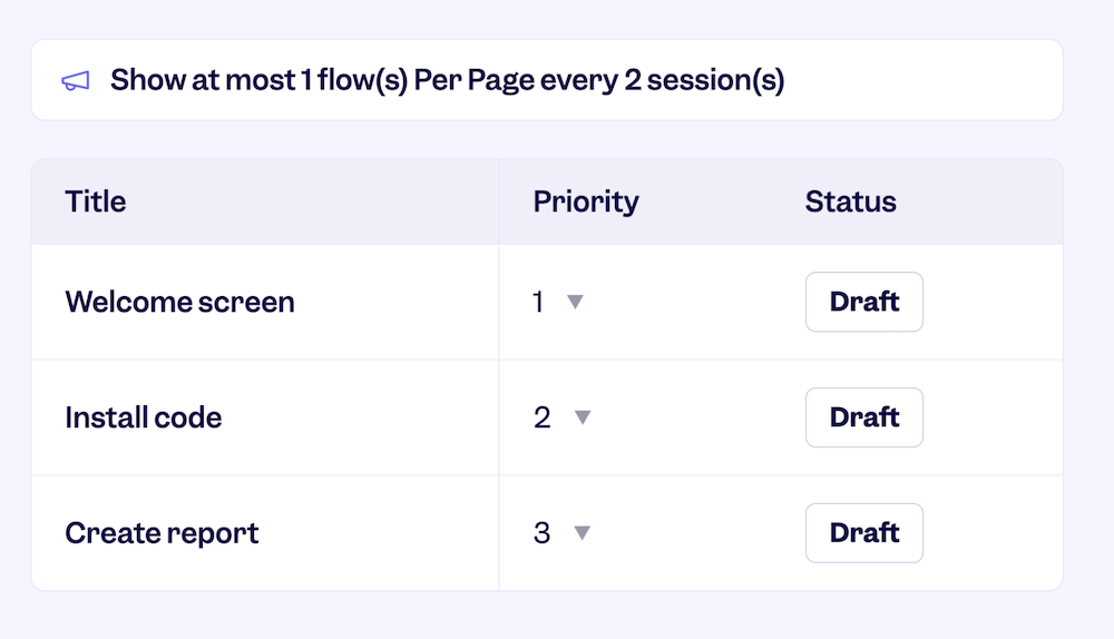
Frequency needs to be intentional. Set a hard limit on how many in-product experiences a user sees within a given time period. Without that guardrail, every team shipping a new feature assumes their nudge is the most important one, and your users end up drowning in prompts from six different launches at once.
The other side is a priority. Before anything goes live, answer one question: what is the single most important thing for this segment to discover right now? Focus on the one thing that moves users to the next stage. Everything else waits until they’ve gotten there.
Move 04: Measure it
Most teams either don’t measure launches at all or measure the wrong things in the wrong way. The two mistakes I see most often: measuring adoption against the whole user base instead of just the audience you targeted, and counting the first click as adoption.
There are four metrics that tell the complete story, and they work as a sequence. Each one diagnoses a different part of the launch.
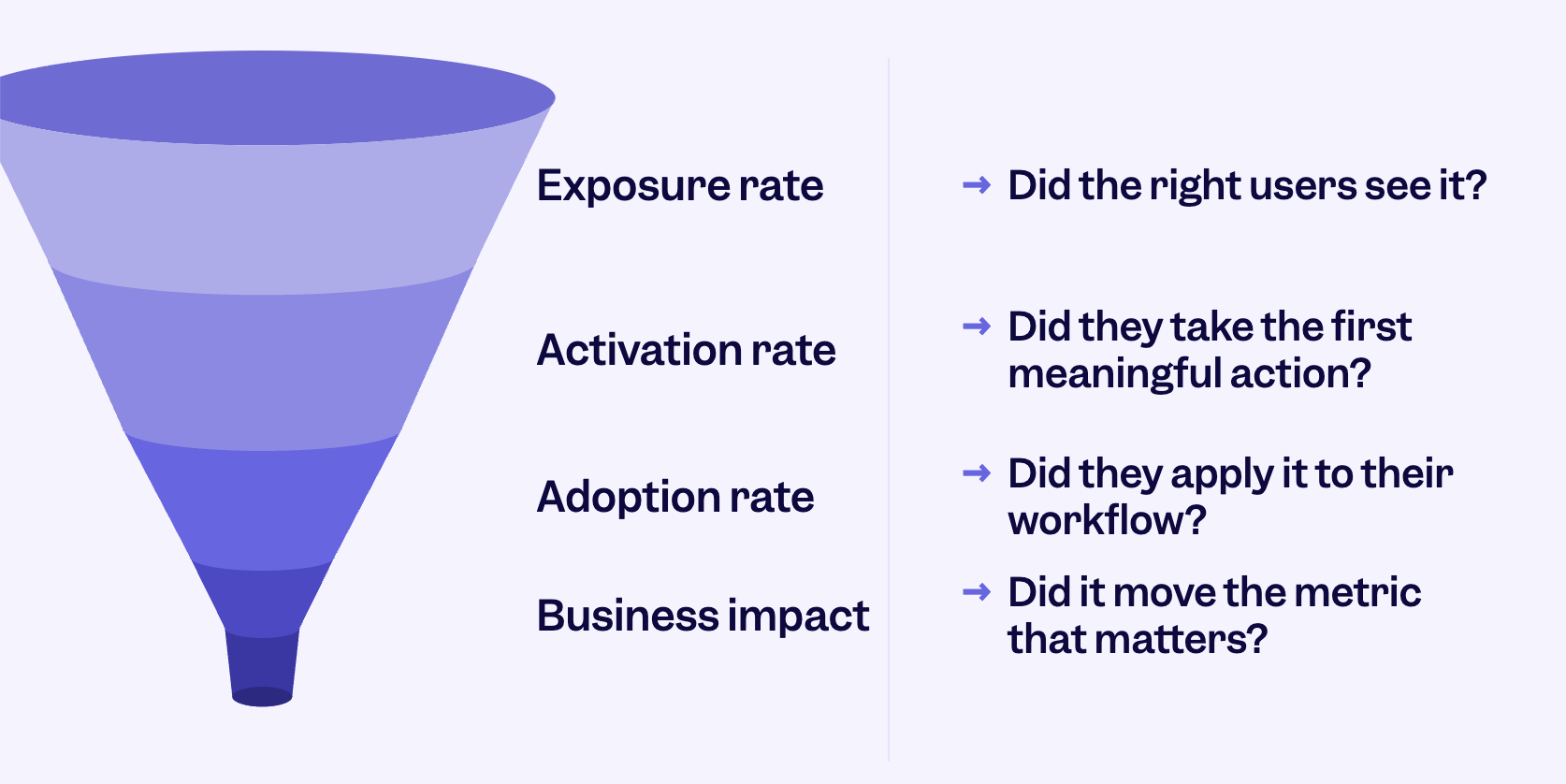
- Exposure rate: Of the users you targeted, what percentage actually saw the feature? This is the first thing to check and the most skipped. If your exposure rate is below 40%, your trigger isn’t reaching the right people. The feature might be perfectly designed, and nobody is seeing it. Go back to Move 02 before you touch anything else.
- Activation rate: Of the users who were exposed, what percentage took the first meaningful action? Not clicked, not dismissed, but actually did the thing the feature exists for. Below 20% means something is broken between exposure and the first value. The path is too long, the UI is confusing, or the moment is wrong. This is where your format and copy decisions from Move 03 get tested.
- Retention rate: Of the users who activated, what percentage came back and used the feature again within 30 days? This is the metric most teams forget to define before launch. High activation plus low retention is the sneaky failure mode: the feature worked once but didn’t fit into a recurring workflow. When you see this pattern, ask whether it’s a product problem or a timing problem. Did users try it and find it wasn’t ready? Or did they try it at the wrong moment in their journey?
- Business impact: Do adopters churn less, upgrade more, and engage more deeply than comparable non-adopters? This is the only metric that connects a feature launch to actual product growth. Everything above is a leading indicator of this. Run the comparison at 60 and 90 days. If adoption is moving but business impact isn’t, you’re optimizing the wrong feature.
One more thing on timing. Your measurement window should match how the feature actually delivers value.
For features where value is immediate (a single action that produces a clear outcome), set your activation window to day one and judge retention at day 14. If users aren’t coming back within two weeks, the feature either didn’t land or didn’t fit the workflow.
For features where value accumulates over time (repeated use, collaborative workflows, and habit-forming behaviors), give it a 30 to 45-day activation window before drawing any conclusions. Check for the first meaningful use at day 14, but treat day 30 as your real signal. This is where you’ll see whether the feature made it into how people actually work, or whether it was tried once and forgotten.
Try the launch framework on a real feature
I built an interactive version of this framework that walks you through all four moves and generates a one-page launch plan at the end. You put in a feature you’re actually working on and apply each move to it.
👉 [Launch to Adoption Framework]
About the author