Heuristic Evaluation in UX: How to Find UI Mistakes Fast


Jakob Nielsen’s research shows that heuristic evaluation in UX design identifies, on average, 50% of usability problems found in user testing. But it’s common for teams to skip this step and save time, only to end up spending more on support tickets for broken flows or onboarding issues.
Heuristic evaluation works because it is systematic. You examine your product’s user interface against a checklist of established usability principles, documenting specific violations like missing feedback messages or confusing navigation. You catch objective interface problems instead of guessing at user frustrations. It is a pragmatic, cost-effective tool with a clear return on investment that helps you build a better product, faster.
In this guide, I’ll show you how to conduct a heuristic analysis, when to deploy it during your design process, and how to transform findings into prioritized fixes that actually improve user satisfaction and conversion rates.
What is heuristic evaluation in UX?
Heuristic evaluation in UX is an expert review method used to identify usability problems in user interface design. It serves as a primary usability inspection method where a small group of evaluators examines the interface and judges its compliance with recognized usability principles (the “heuristics”).
This inspection finds and fixes obvious flaws before you spend significant time and money on extensive user testing. A 2024 survey of UX professionals found that half of them used heuristic and expert reviews, making it a foundational method in the industry.
I rely on this heuristic UX evaluation process to:
- Critique early-stage designs on wireframes to catch architectural and interaction design issues.
- Audit existing products to identify, catalog, and prioritize usability debt.
- Get fast feedback on design prototypes when time or budget is tight.
- Prepare for formal usability testing by fixing the “low-hanging fruit” first, ensuring user feedback is more insightful.
Bringing together 3-5 trained evaluators working independently can uncover up to 75% of major usability problems. It is important to note that these are broad rules, not specific usability guidelines, making heuristic evaluation UX one of the most efficient ways to improve product usability without extensive resources.
When and why should you conduct a heuristic evaluation?
Run your heuristic evaluation early. Ideally, do this after you have developed wireframes or prototypes but before committing resources to visual design and development.
Teams that catch structural and interaction design problems at the wireframe stage fix them when changes cost hours instead of weeks. Waiting until production means expensive rewrites, frustrated developers, and delayed launches.
Here are three reasons heuristic evaluation belongs in every UX workflow:
- Early problem identification: This method pinpoints issues before they reach users or consume testing budgets. Identify usability problems early, make informed design decisions in days rather than weeks, and save enormous effort downstream.
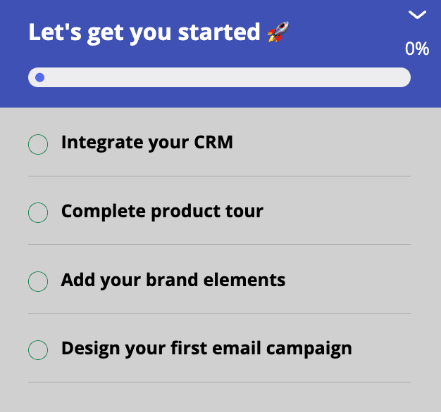
- Reduce time to value: Users receive a more ready-to-use product from launch, resulting in desired outcomes and better satisfaction. Eliminating obvious usability problems before launch helps users accomplish their goals faster and with less frustration.
- Fast and cost-effective: Compared to other product research methods like user testing, heuristic evaluation is significantly quicker. A single evaluation session can be completed in a few days with minimal overhead, while formal usability testing requires recruiting participants, scheduling sessions, and analyzing hours of replays. Heuristic evaluation serves as an excellent solution when pressed for time, complemented later by more extensive methods.
But that said, heuristic evaluations cannot replace user research.
User-experience design is highly contextual, and what works in one scenario may not work in another. Teams still need to test with actual users to understand how they interact with your product, uncover context-specific issues, and validate that fixes solve real problems.
The 10 usability heuristics for a thorough UX audit
To run an effective evaluation, your team needs to agree on the rules of engagement. I rely on Jakob Nielsen’s 10 Usability Heuristics as the gold standard. While based on decades of research, these established heuristics remain incredibly relevant for auditing modern digital products.
They consistently catch issues that would otherwise slip through to user onboarding flows and production interfaces.
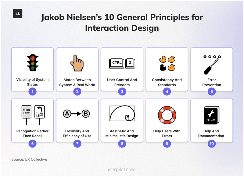
1. Visibility of system status
Uncertainty breeds anxiety and erodes trust. When a user interacts with your software, they need immediate, appropriate feedback to know the system is working, helping them maintain a healthy human-computer dialogue. If a user is left guessing whether their request went through, the experience fails. You must keep users informed. A simple “Saving…” message or a spinning wheel provides the necessary reassurance.
Practical example: If a user starts a large data export, show a progress bar with an estimated time remaining rather than a static screen. Similarly, when a user completes a step in an onboarding flow, visually check it off the list so they can see their momentum.
2. Match between the system and the real world
Your interface should speak the user’s language, not your developers’. Avoid internal jargon in favor of words, phrases, and concepts familiar to your audience. The flow should follow real-world conventions and align with the user’s existing mental model. Information should appear in a natural and logical order to help users understand the interface.
Practical example: An accounting app should use industry-standard terms like “Accounts Receivable” and “Ledger” rather than database labels. In an e-commerce context, we could use a shopping cart icon because it relies on natural mapping and is a universally understood metaphor for purchasing. Even your resource center icons should use familiar language and corresponding symbols.

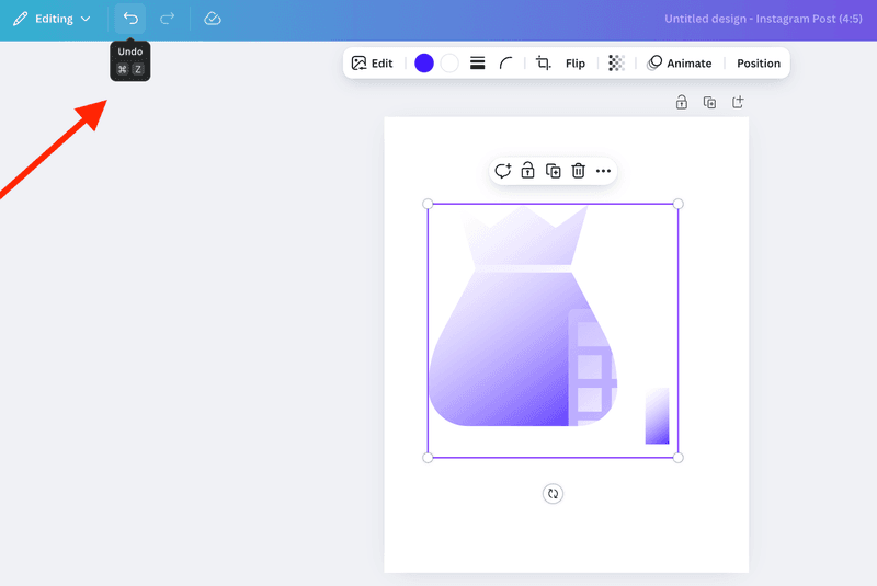
3. User control and freedom
Users will make mistakes. When they do, they need a clearly marked “emergency exit” to leave the unwanted state without jumping through hoops. You can give your users control so they can reverse an accidental click and explore the product with much more confidence.
Practical example: The “Undo” notification that appears immediately after a user deletes a file creates a moment of relief. Designing a forgiving interface encourages users to try new features without fear of breaking something.
4. Consistency and standards
According to Jakob’s Law, users spend most of their time on other sites. They expect your site to work the same way as the ones they already know. So, make sure you follow platform conventions to reduce cognitive load. Furthermore, every element within your app needs to look like part of a cohesive whole rather than a patchwork of different styles.
Practical example: A gear icon should always represent “Settings.” Your primary call-to-action button should share the same style and placement on every page. This applies to adoption tools as well. In Userpilot, for instance, you can build flows that correspond directly with the native UI elements of your original app so the experience feels seamless.
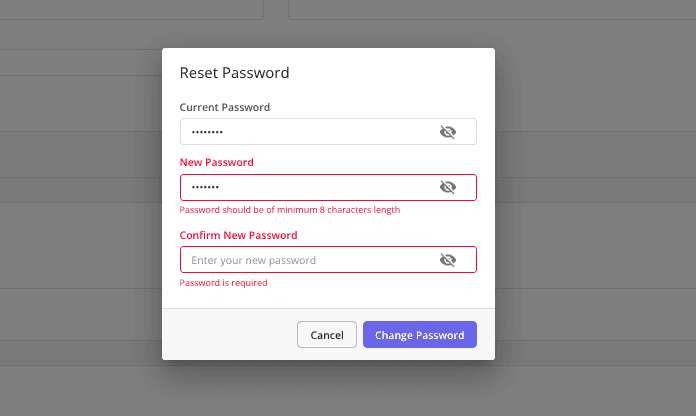
5. Error prevention
The best error message is the one you never have to show. You can eliminate error-prone conditions by designing better constraints. Distinguish between simple “slips” (attention errors) and conscious errors (misunderstandings), and guide users away from both using smart defaults.
Practical example: Disable the “Submit” button on a form until all required fields are filled. Use a date picker to prevent users from typing invalid formats. Make a user type a line into a field before they take an irreversible action.
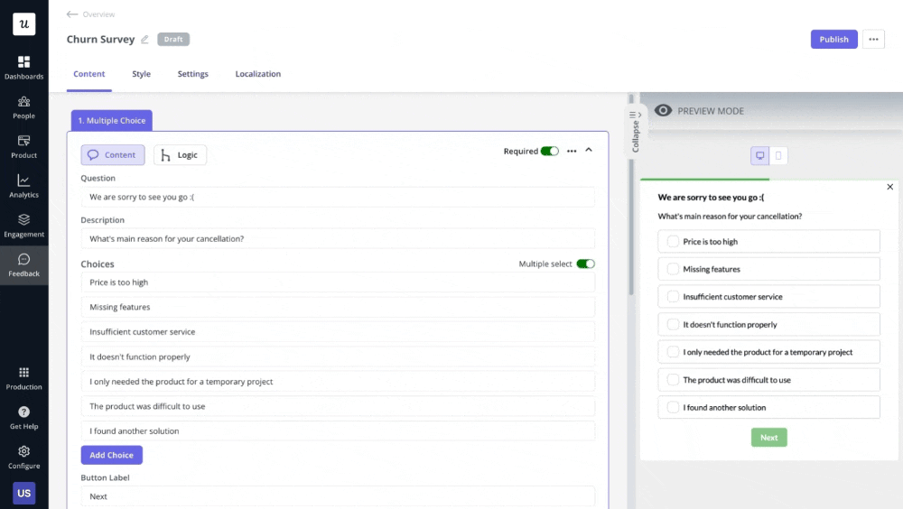
6. Recognition rather than recall
Users should not have to memorize instructions from one part of the interface to apply them to another. Every step should be self-explanatory. Keeping objects, actions, options, and instructions visible reduces the cognitive load because recognizing a cue is faster than recalling it. This approach makes the interface feel more intuitive.
Practical example: For a password field, always display the requirements (like “One uppercase letter”) and tick them off as the user types. This is far superior to forcing the user to guess the rules or remember them from a previous screen.
7. Flexibility and efficiency of use
Great interfaces cater to novices and experts simultaneously. You need accelerator features that speed up interactions for the expert user while remaining invisible to beginners. This allows you to tailor frequent actions to the user’s proficiency level.
Practical example: A project management tool might require new users to click through menus to create a task, while allowing experts to hit “T” on their keyboard to open a quick-add dialog. Similarly, complex configurations like user surveys can be broken down into simple steps for new users, while experienced admins get a more efficient, direct path.
8. Aesthetic and minimalist design
Interfaces should not contain information that is irrelevant or rarely needed. Every extra piece of information in an interface competes with the relevant information and diminishes its relative visibility. Keep the design clean and focused entirely on the user’s primary goal to improve relative visibility.
Practical example: When designing a screen, ask yourself if every element supports a core user task. If the answer is no, remove it. Google’s sparse homepage remains the ultimate example of eliminating distractions to focus on utility.

9. Help users recognize, diagnose, and recover from errors
Even with the best error prevention, issues will arise. Your error messages should be expressed in plain language (no cryptic error codes), precisely indicate the problem, and constructively suggest a solution.
Practical example: “Error #502” is useless and only increases user anxiety. A better message is “The credit card number you entered is invalid. Please check the number and try again.” HubSpot points directly to the field with the error and provides inline guidance on how to correct it.

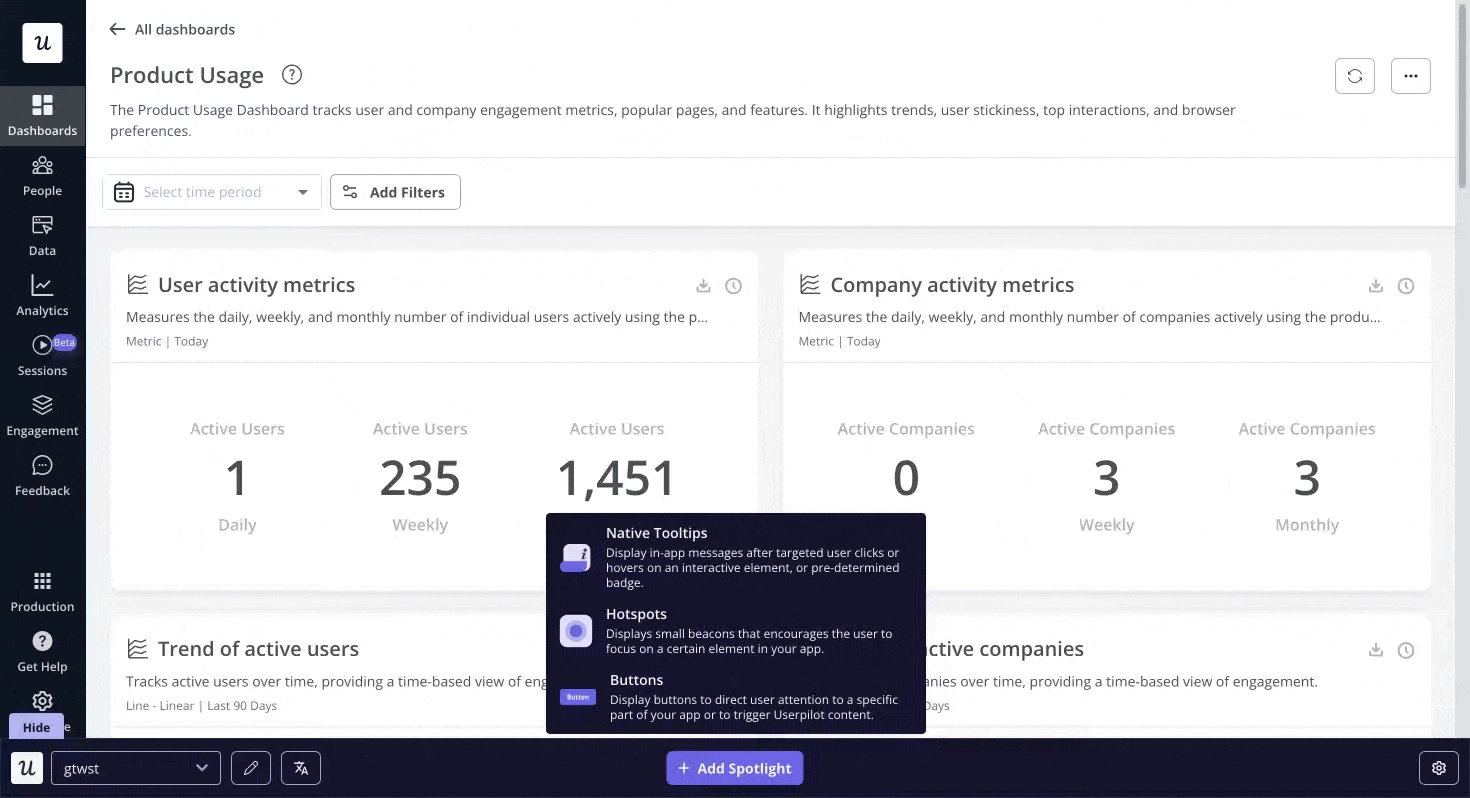
10. Help and documentation
While the best systems function without user documentation, you need to keep help available when necessary. This information must be concise, searchable, and focused on the user’s current task, sometimes requiring specific usability guidelines. Bring the help to the user contextually rather than forcing them to leave the screen.
Practical example: Place a small question mark icon next to a complex setting. This can open a tooltip with a brief explanation, show hotspots that pulse gently to indicate additional information is available, or a link to your knowledge base, giving the user instant clarity without interrupting their workflow.
How to conduct a heuristic evaluation: A 3-step UX process
Without a structured process, a UX audit can quickly turn into a simple list of opinions. To get results your product team can actually use, I recommend breaking it down into three distinct phases.
Phase 1: Prepare your scope, team, and materials
Before you take the first step, you need to define exactly what you are auditing. If you try to evaluate the entire product at once, you will spread your focus too thin. Instead, pick a specific, high-impact flow like the checkout process or report generation.
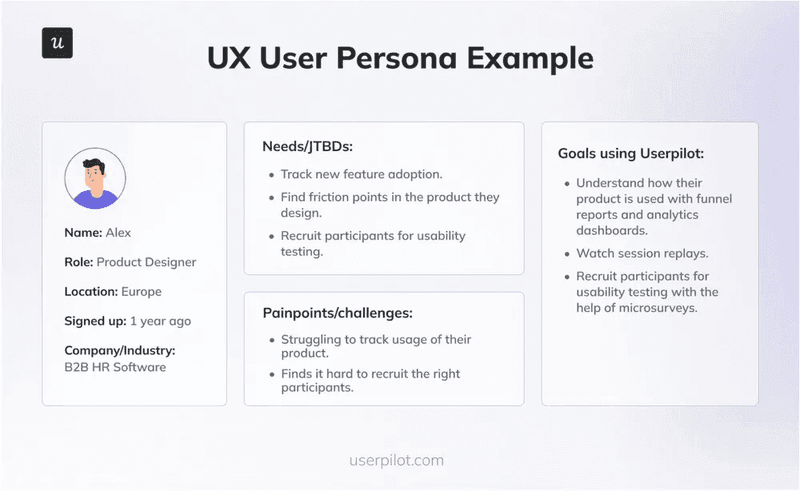
Once you have the scope, anchor it with a persona. You do not need a novel. Just a few bullet points on their goals and technical savvy will help the user group of evaluators see the product through the user’s eyes.
Next, gather your team. You really only need three to five evaluators to catch the vast majority of issues. Designers, product managers, or UX-minded engineers are all great candidates.
Adding more people yields diminishing returns, so keep the group small and focused. Then, equip them with a simple spreadsheet for logging issues, with columns for the issue description, location, heuristic violated, and severity rating.
Phase 2: Inspect the UI independently
This phase is critical, and each evaluator must work independently to prevent groupthink and ensure diverse findings.
I highly recommend a “two-pass” approach. On the first pass, use the product to complete the scoped tasks, getting a holistic feel for the flow and overall user experience. Understanding the user’s journey without the immediate bias of a checklist helps you walk through the interface as your target user would, noting emotional reactions and moments of confusion.
On the second, more methodical pass, go through the flow screen-by-screen with the list of heuristics, actively looking for violations and documenting them. Strong findings are specific and actionable, including:
- A clear description of the problem (e.g., “The ‘Save’ button is not visible on 13-inch screens without scrolling”).
- The specific heuristic(s) it violates (e.g., “Violates #1 Visibility of system status and #8 Aesthetic and minimalist design”).
- A severity rating (e.g., Critical, Major, Minor, Cosmetic) to help with prioritization.
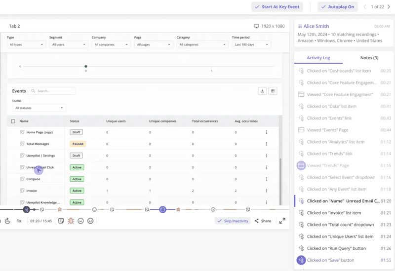
- A screenshot or session replay to provide visual context for the product team.
Phase 3: Consolidate findings and prioritize fixes
After independent evaluations are complete, bring everyone together for a debrief session. The goal here is to synthesize individual findings into a single, master list of all identified usability problems. Go through each evaluator’s list during the meeting, consolidate duplicates, and discuss any disagreements on severity ratings to reach a consensus. This calibration creates reliable output that engineering teams can actually act on.
The final result is not a collection of raw notes but a single, prioritized, and actionable report that can be directly translated into tickets for your product backlog. Focus on the critical and major issues that have the biggest negative impact on user experience.
Heuristic evaluation vs. usability testing: Which UX research method is right?
Many teams treat heuristic evaluation as a substitute for usability testing, but that is a misconception. These two methods are complementary partners in your UX research strategy because they solve different problems at different stages of the design process.
- Heuristic evaluation asks: “Does this design violate a known principle?” It relies on trained evaluators to spot objective UI flaws like inconsistent button placement or missing error messages. Research actually shows that heuristic evaluations catch about 50% of the problems found in user testing, including most of the severe ones.
- Usability testing asks: “Can a real person actually achieve their goal?” This is where you find friction points related to specific user contexts. Real people will struggle with things an expert might miss, such as misunderstanding an icon due to cultural differences or getting stuck because the workflow doesn’t match their real-life process.
My advice is to start with a heuristic evaluation to quickly and cost-effectively fix the obvious flaws. Once the low-hanging fruit is picked, you can use your budget for usability testing to uncover deeper insights. Nielsen himself argues that user testing remains the most important method, but combining the two gives you the best of both worlds.
Avoiding common pitfalls in UX heuristic evaluation
Heuristic evaluation is a powerful tool, but when misapplied, it can lead to wasted effort and team friction. Here are the most common traps I’ve seen teams fall into and how you can sidestep them.
1. Using untrained evaluators
Your evaluators need a foundational understanding of the UX principles and the specific heuristics to be effective. Otherwise, they will focus on subjective preferences rather than objective usability problems.
The fix: Provide a 30-minute training session on the 10 heuristics before the evaluation begins. Walk everyone through each principle with concrete examples from your product category. If possible, select evaluators from design, product, or research backgrounds who are already familiar with user-centered design concepts. An initial investment in training also pays immediate dividends in the quality and consistency of findings.
2. Treating heuristics as inflexible rules
Remember that heuristics are “rules of thumb,” not immutable laws. Sometimes an interface violates a rule for a valid reason. For example, a video game might intentionally obscure information to create a sense of discovery. That technically violates the visibility heuristic, but it serves the user’s actual goal of entertainment.
The fix: Require every finding to cite the specific heuristic violated and to justify its severity rating based on the impact on the user’s goals. This simple practice anchors the feedback in objective principles rather than personal opinions. When a potential violation is identified, evaluators can discuss whether it actually harms the user experience in this specific context or serves a legitimate design goal to conclude their discussions.
3. Drowning in minor findings
Research suggests that 43% of heuristic findings can be false alarms or low-impact problems. If you hand a report with a massive list of items to a developer, they won’t know how to prioritize, which will delay important fixes.
The fix: Be ruthless during the prioritization phase. Your final report should focus exclusively on critical issues that block users from their goals, with minor issues saved for a separate backlog. This clear hierarchy ensures the engineering team tackles the most impactful problems first.
Integrate heuristic evaluation into your UX workflow
Heuristic evaluation works best as a consistent habit. Research from the Nielsen Norman Group consistently demonstrates that systematic evaluation methods catch problems that would otherwise frustrate users and increase support costs. A good user experience can increase conversion rates by up to 400%.
I recommend building evaluations into your design process at key milestones. Train your entire team on the heuristics so everyone can spot obvious problems. Use the findings to inform your user testing plans so you’re asking the right questions. For complex systems with multiple user workflows, schedule regular evaluation cycles to maintain usability standards as features evolve.
So don’t stop at reading this article. This week, grab two colleagues, pick one critical user flow in your product, and spend 90 minutes evaluating it against the ten principles we discussed above. I guarantee you will find information that makes a real, immediate difference for your users.
Userpilot helps you build a working heuristic evaluation engine. Confirm your findings with user data, spot bugs with session replays, and implement user engagement elements, such as tooltips or hotspots, to point to buttons users omit or explain more complex flows. Try it out now!
About the author