How to Announce UI Updates To Users: Best Practices and Examples
Every SaaS company implements UI updates from time to time, but users don’t always respond positively to new changes.
Sometimes, the issue is not the update itself but how you communicate it. Today’s article aims to help you announce product updates in ways that motivate users and drive engagement rather than frustrate them.
What is a UI update?
A UI update is a change to a product’s user interface (UI) to make it easier to use, more intuitive, and more visually pleasing.
An update could be as simple as changing an icon or as complex as a complete overhaul.
UI updates can include:
- Visual redesign: Changes to the color schemes, fonts, icons, or overall aesthetics to improve the look and feel.
- Improved layout: Adjustments to the positioning of elements for better usability and navigation.
- UI additions: Creating new interactive components, such as buttons, forms, or menus.
- Performance improvements: Optimizing loading times and animations to enhance the user experience.
What are the business benefits of UI updates?
Revamping your UI isn’t just about aesthetics; it’s a strategic investment with tangible business benefits. Here are some of those benefits:
- Enhanced user engagement and retention: An intuitive interface reduces friction, making it easier for users to navigate and interact with your product. This leads to longer session durations, increased feature adoption, and—with time—higher customer retention rates.
- Increased conversion rates: A well-designed UI improves clarity and guides users down the customer journey—whether that’s completing an onboarding process or upgrading their accounts to enjoy more advanced features. This directly translates to more conversions and increased revenue.
- Reduced support costs: Good UI design minimizes the need for users to seek assistance, which results in a less burdened support team and happier customers.
- Strengthened brand image: A visually appealing and consistent UI reflects positively on your brand, conveying professionalism, innovation, and attention to detail. It helps you stand out from competitors and establish a strong brand identity.
What are the main reasons behind UI changes?
If you’re unsure whether UI changes are necessary, see if any of the following apply to your product:
- Outdated look and feel: If your product’s design appears old-fashioned or lacks the modern aesthetic that users expect, it may deter new users and reduce engagement. UI trends change over time, and maintaining contemporary design helps to keep your product appealing.
- Low engagement and conversion rates: Low engagement and retention point back to usability issues in your product. A redesign can help correct these problems and contribute to product growth.
- Negative customer feedback on current user interface design: As a customer-centric company, feedback should be at the heart of your decisions. Negative feedback often means one thing: your UI design is challenging to understand. See it as an opportunity for product improvement and do your best to create a more user-friendly design.
- New features and product upgrades: Adding new features to your product may require you to make some changes to your main user interface to accommodate those features and make them accessible/visible to customers.
How to announce UI updates to the user base?
It’s not enough to release new UI updates; you need to announce them to ensure users are aware of the changes and ready to navigate them.
Here are some methods:
Communicate product updates via in-app messages
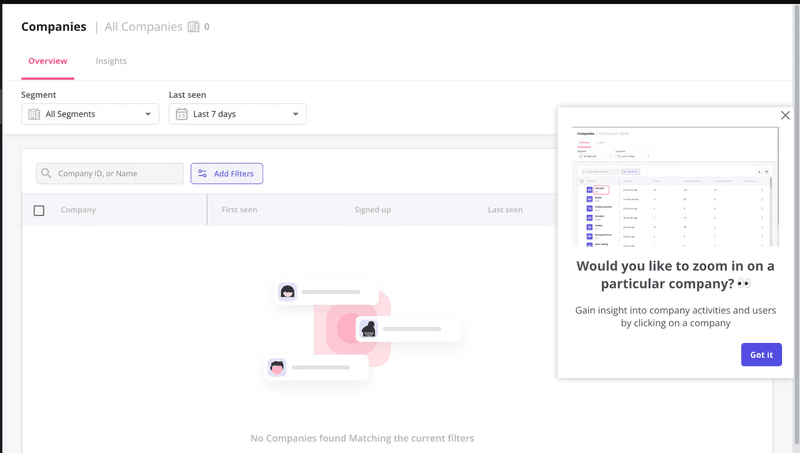
In-app notifications are contextual and timely. Compared to other announcement methods, they’re more engaging as users start using the updated product right away without changing their environment.
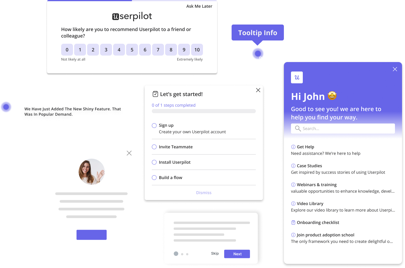
There are several UI patterns you can use to announce product changes in-app. The most popular ones are modals, slideouts, banners, and tooltips.
Send product launch emails to your users
Companies try to avoid email for announcements because it’s a crowded channel where you have to compete hard for attention.
That’s true, but look at the bright side—with emails, you get to communicate product upgrades with both active and inactive users. Someone who hasn’t visited your tool for weeks might see your update email and take action because the new change is something they’ve been clamoring for.
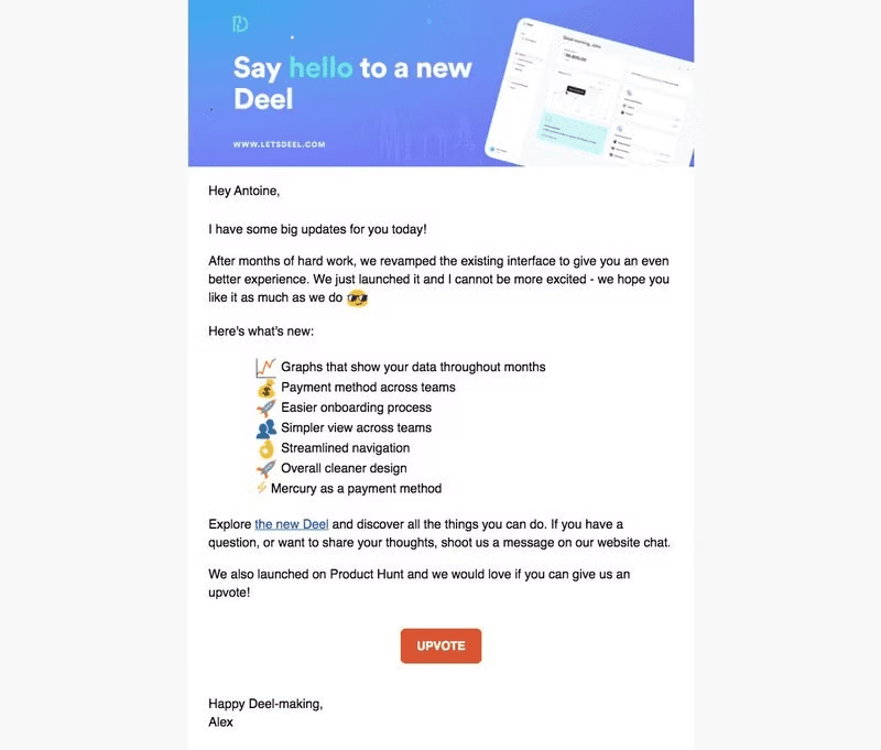
For example, Deel uses personalized email messaging to announce product updates. Every email they send tells a story and connects back to the customer’s pain points.
Right before the email ends, they list the product’s benefits and end with a strong CTA that prompts users to upvote on ProductHunt and later interact with the improved UI.
Share the product changes on social media platforms
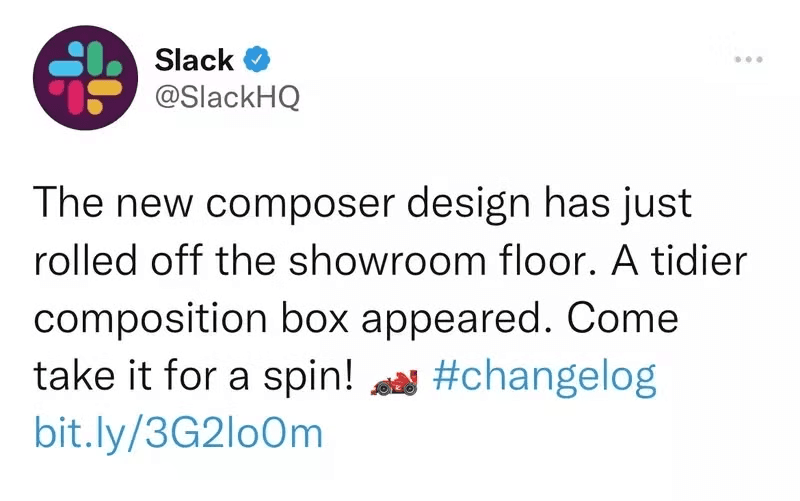
Social media is great for reaching out to a larger audience, announcing news of upcoming changes, and getting users excited about the updates.
The important part here is identifying the social media platform where your target audience hangs. Most B2B SaaS customers use LinkedIn and X (Twitter) for business activities.
But, of course, don’t assume—confirm through proper user research.
Add product update plans to a customer-facing roadmap
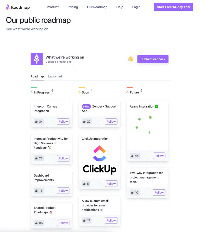
Make your product roadmap public and use it to communicate your company’s mission and vision to customers.
Add the features, integrations, and UI change ideas you’re developing to keep users in the loop.
Most importantly, allows users to share their thoughts on upcoming updates and use their insight when implementing.
Best practices for releasing UI updates
Let’s go over a few best practices to ensure the best results:
Beta- test your user interface with a small group before launching
Doing a soft launch helps you uncover usability issues and fix them before launching it to the rest of your customers and risking disappointing them.
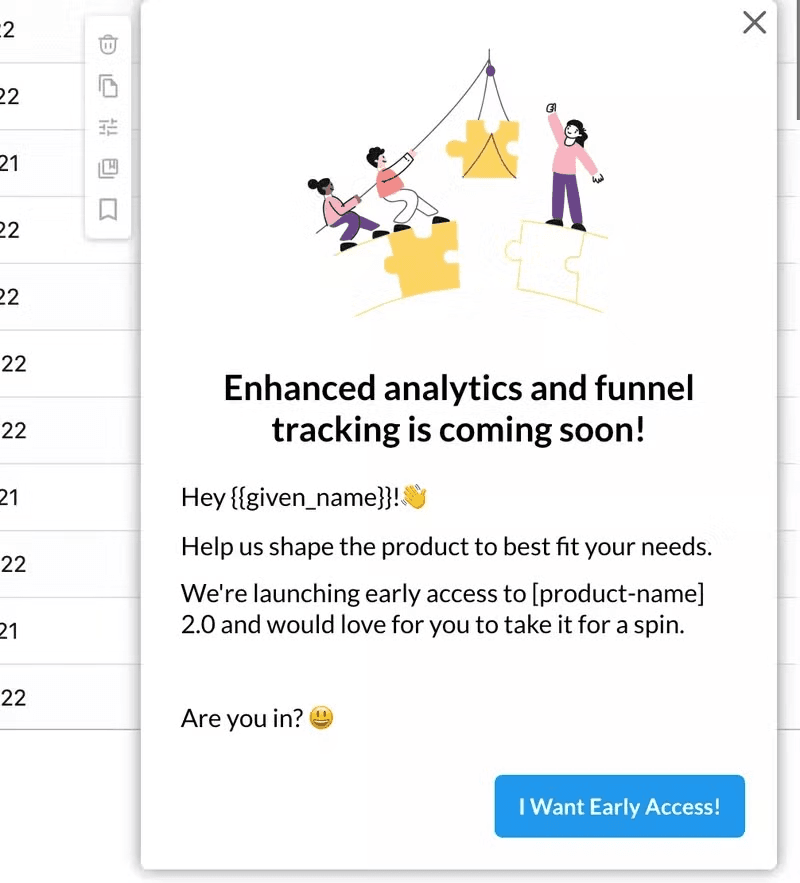
Loyal customers and raving fans are good segments for running beta tests. They love your brand and are more likely to invest their time in helping you.
Dig into your product analytics data or customer feedback to identify loyal customers. Then, segment them and trigger an-app message inviting them to the test:
Choose the right method for announcing the update
Not all updates require the same level of announcements. So, it’s important to categorize your updates based on their importance before determining the best ways to announce them.
Here are four UI patterns to consider for different degrees of UI updates:
Use attention-grabbing modals for announcing major changes
If you’re announcing a major release or product redesign that concerns all users, you need to ensure that nobody misses it.
In such cases, it’s best to use the UI elements called “modals”. Modals are pop-up windows that overlay the main content of an app, requiring users to interact with them before returning to the main interface.
Usually, the modal window gives a quick overview of the new major feature. From here, users can choose to exit the window or click on the button to learn more at their own pace.
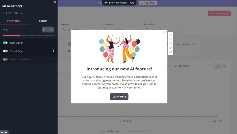
While modals are great for capturing users’ full attention, they can also be intrusive and cause unnecessary friction, so limit their usage and utilize them carefully.
Use tooltips to announce medium-sized product changes
Although medium-sized updates can still be significant, they generally don’t require much attention compared to major ones.
Such updates may appear a couple of times monthly and disrupt the user experience. Announcing every single enhancement can frustrate users and even lead to churn.
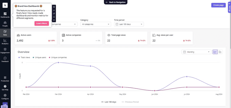
In these situations, use subtle UI patterns to strike a balance between being considerate and assertive.
Tooltips are your best friends for this. These small text boxes provide additional information and enhance customer communication without cluttering the interface as modals do.
Use subtle hotspots for minor product updates
Tooltips and modal windows prioritize immediate information delivery and potentially interrupt the user flow to ensure critical context is not missed.
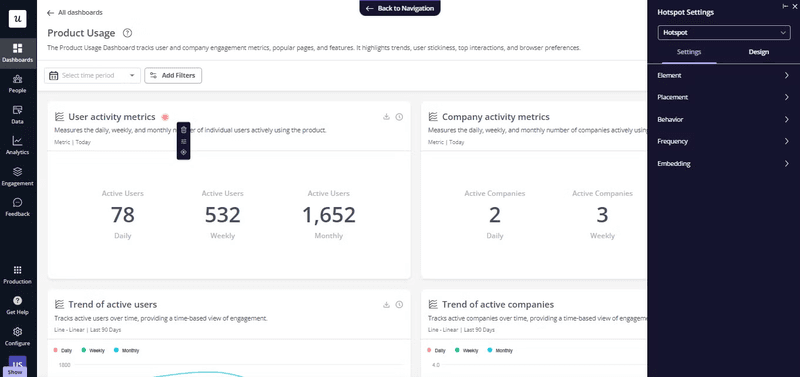
In contrast, hotspots preserve a cleaner interface by hiding supplementary details until the user actively seeks them out.
These small icons, usually in the form of pulsing circles, can be placed on different elements and reveal more information when users click on them.
Use banners to announce small UX enhancements
Like hotspots, banners are subtle and non-disruptive.
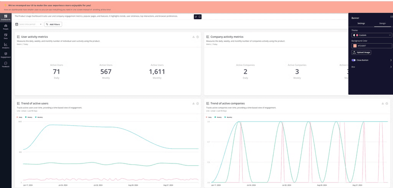
These horizontal notification bars displayed at the top or bottom of the interface remain visible as users interact with the page but do not require immediate action like modals.
The user can choose to ignore them, continue using the app, then act on the information much later.
Segment users to personalize update messages
There’s a high chance your product serves multiple user personas.
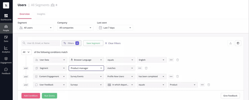
To make the communication more relevant for all of them, group users according to shared characteristics and deliver tailored messages to specific groups based on how the update will affect them.
This helps you avoid the alert fatigue effect and ensures your updates have a better engagement rate.
You can segment users based on different characteristics such as demographics, in-app behavior, product usage, and so on.
Launch interactive walkthroughs to guide users inside the app
If it was a big update, it might be useful to trigger an interactive walkthrough that helps users familiarize themselves with the new interface and its layout.
Prompt this walkthrough only when they’re interacting with the change for the first time. After that, you can provide more subtle guides, such as tooltips, hotspots, or in-depth help docs, that they can read anytime from your in-app resource center.
Test UI product update messages to boost engagement
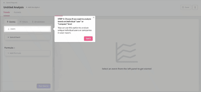
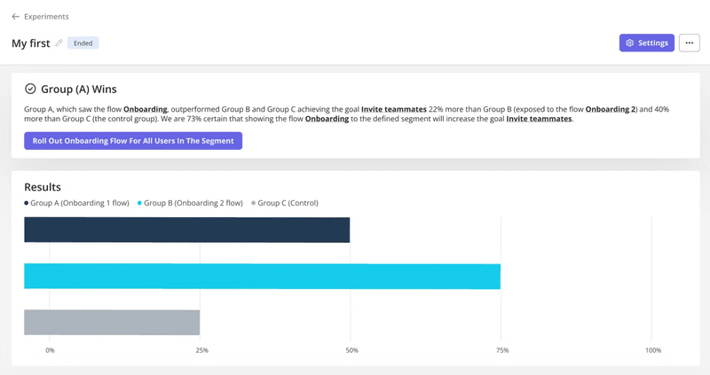
Conducting A/B and multivariate tests is a great way to identify which messaging resonates with users.
Test everything: UI patterns, timing, and microcopy. Keep testing on a small scale and limit variations to two elements. For instance, you can increase the font size or add a new icon to see what works better.
Iterate and optimize your UI product update messages to better capture user attention, improve communication, and ultimately drive higher engagement.
Measure the success of your UI update and improve
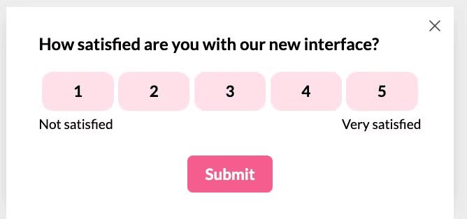
After customers interact with the updated elements, trigger a short survey to learn about their experience. This will help you determine whether all set goals have been achieved.
You can combine both quantitative and qualitative questions to collect comprehensive insights.
For example, after asking customers to rate their satisfaction with your new interface, you can trigger a follow-up question that asks them to optionally explain the reasons for their score and provide any additional details they would like to share.
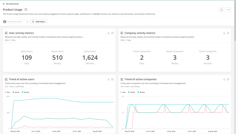
In addition to user surveys, track your key product metrics to evaluate the success of your updates. While surveys provide qualitative insights into user satisfaction, metrics offer quantitative data to assess how the changes impact user behavior and overall product performance.
Some key metrics to track include number of sessions, feature adoption rate, time to value, and retention rate.
To do this, use analytics dashboards that allow you to easily visualize and monitor your data.
How can you promote UI updates with Userpilot?
Userpilot is a product adoption platform with features to help you announce updates, track product performance, and make immediate changes.
Here’s how:
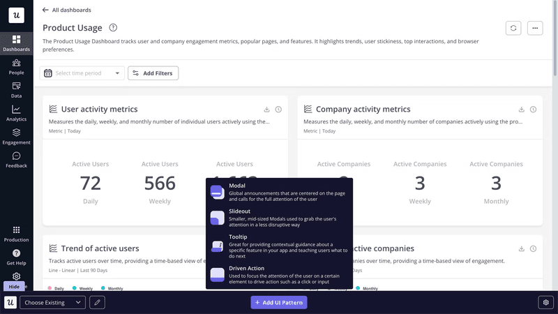
- Create in-app notifications using different UI patterns: With just a few clicks, Userpilot lets you create and customize modals, tooltips, slideouts, hotpots, banners, and driven actions. You can have full control over the design of your in-app message, from fonts to colors – everything is customizable. Additionally, you can embed images and videos for enhanced engagement.
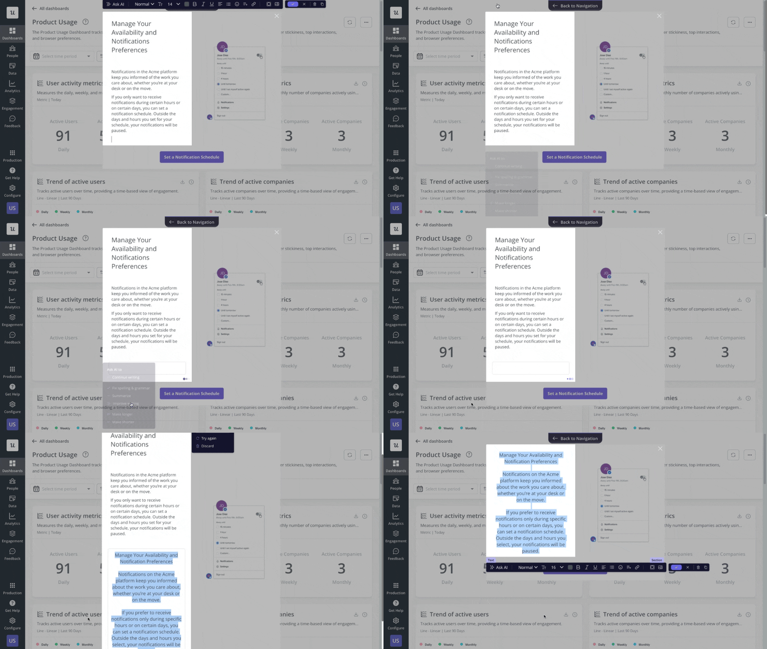
- Use a built-in AI writing assistant to refine update messages: Not sure what to write or how to make it clear enough with the small space UI patterns provide? Userpilot’s writing assistant can help improve your copy, fix spelling and grammar, and summarize existing content.
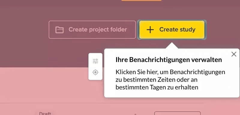
- Localize update messages for a personalized experience: With Userpilot, you can auto-translate your announcement using the content localization feature. This helps you reach a wider audience and make the product more relevant for them.
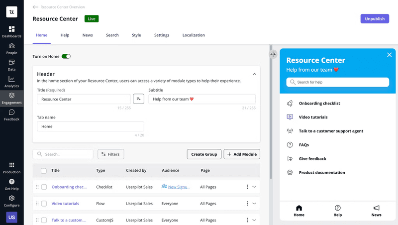
- Create a resource center to keep users updated with changes: Users might sometimes require additional support to understand and comfortably interact with your new UI updates. This is where a resource center comes in. With Userpilot, you can create a code-free in-app resource center and include different types of support materials. You could even have a “news” section to help users easily identify support resources for the last updated UI.
Conclusion
It’s normal to need a UI refresh as your SaaS tool grows and you add new features. However, how you approach this change can make the difference between delighting and annoying users.
As discussed, only use prominent modals when you need immediate user action. Otherwise, opt for tooltips, hotspots, and slideouts.
Ready to get started? Grab a demo to see how Userpilot can help you announce UI updates and drive product adoption.


