Try Userpilot Now
See Why 1,000+ Teams Choose Userpilot
Chameleon vs Stonly vs Userpilot: Comparison summary
- Chameleon is a famous digital adoption tool that offers great onboarding and segmentation features. However, it doesn’t offer a self-service resource center. Plus, it’s on the expensive side, and users have to go through a steep learning curve to truly adopt the product.
- Stonly is a budget-friendly option that enables its users to create helpful knowledge bases. However, it has a confusing builder and an even more confusing installation.
- Userpilot is another digital adoption tool that provides great onboarding, feedback, and analytics features. It includes impressive UI patterns that you can use for in-app messaging. However, it’s only for web applications.
- If you’re looking for a complete product growth tool for your SaaS which offers great value for money, give Userpilot a try. Book a demo to learn more.
What is Chameleon?
Chameleon is a digital adoption platform with a difference: while the other tools discussed are mostly no-code, Chameleon will require some developer involvement.
Nevertheless, it’s a powerful and effective tool that works in a similar way to Userpilot and offers similar features: styling, analytics, templates, goals, A/B testing, and checklists.
However, it doesn’t offer a resource center or dedicated NPS, and it’s a lot worse value for money with limited features in the basic plan, which is over $150 more expensive for the same number of MAUs.
What is Chameleon best for?
Typically, SaaS Product Managers consider Chameleon for the following reasons: they want to improve their user onboarding, they need product adoption, and want to measure their user feedback. How does Chameleon perform when it comes to these top-three use cases? Let’s examine it all, and then compare it to the other tools we’re discussing in this post.
Chameleon for user onboarding
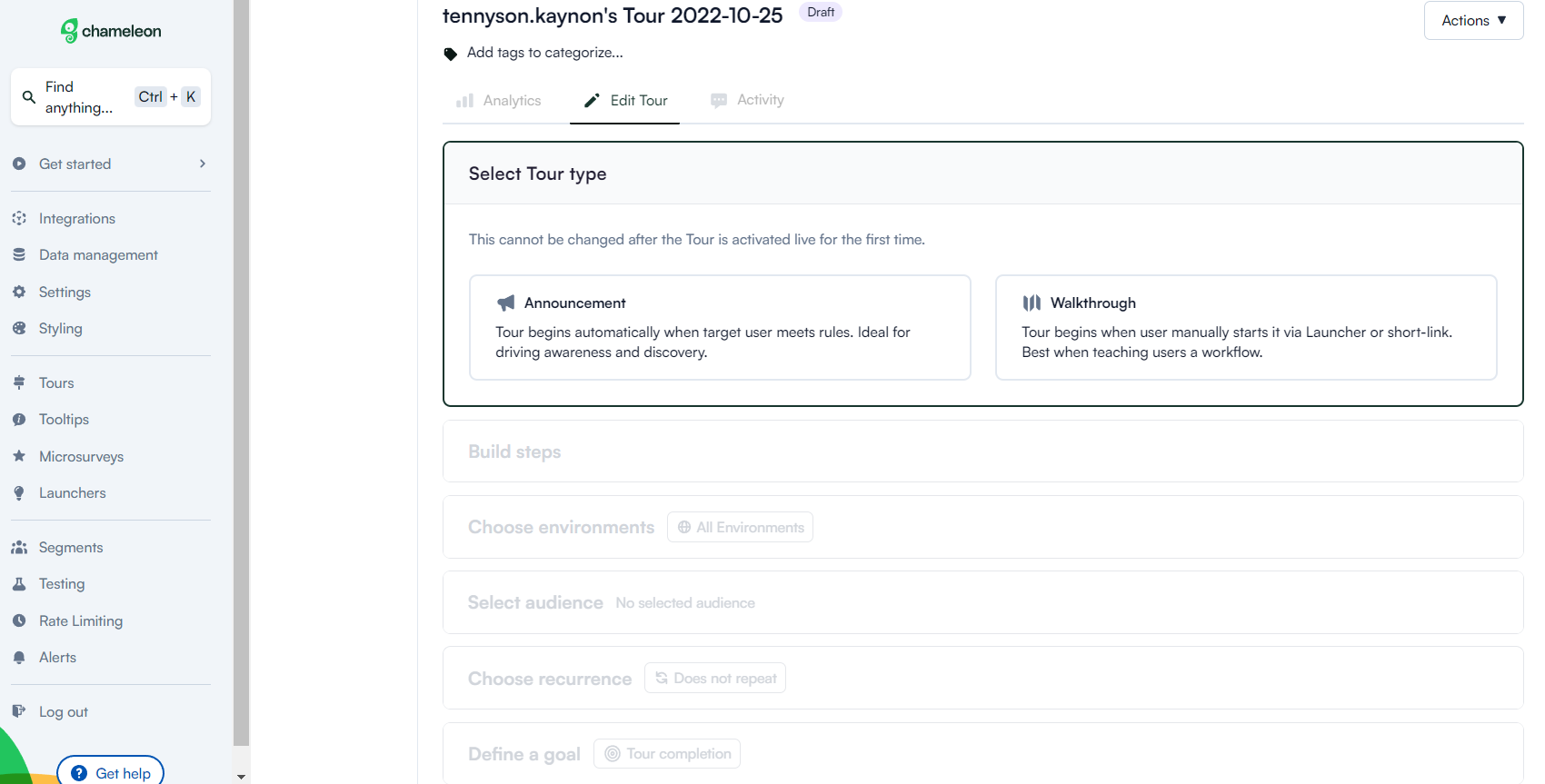
You can build widgets (launchers) and classic guides and tours with Chameleon as the main drivers of user onboarding.
Here’s how Chameleon’s main functionality helps with user onboarding:
- Chameleon’s product tours help you build flows for guidance. You can use several UI patterns for this: modals, banners, tooltips, and hotspots.
- You can customize the styling (font, color, opacity, etc) of your product tours and even add in some CSS styling if you want advanced branding.
- Launchers are where Chameleon is different compared to its competitors. These are in-app widgets that can open checklists, small help widgets, or notification centers. The downside is that you can’t have one launcher with multiple types of content.
- You can target content to different user segments based on multiple data sources including event triggering.
- Ability to use micro surveys with great customization and question-and-answer types.
- On Growth Plan and higher, you also get access to more functionality like A/B testing, multiple environments, localization (Enterprise plan only), and advanced integrations like HubSpot.
All in all, Chameleon has good functionality for user onboarding but will be very limited on the Startup plan as you only get one Launcher and five micro surveys.
To build contextual and efficient user onboarding you will need more than that. Considering what you get for the money, Userpilot offers much better value.
Chameleon for product adoption
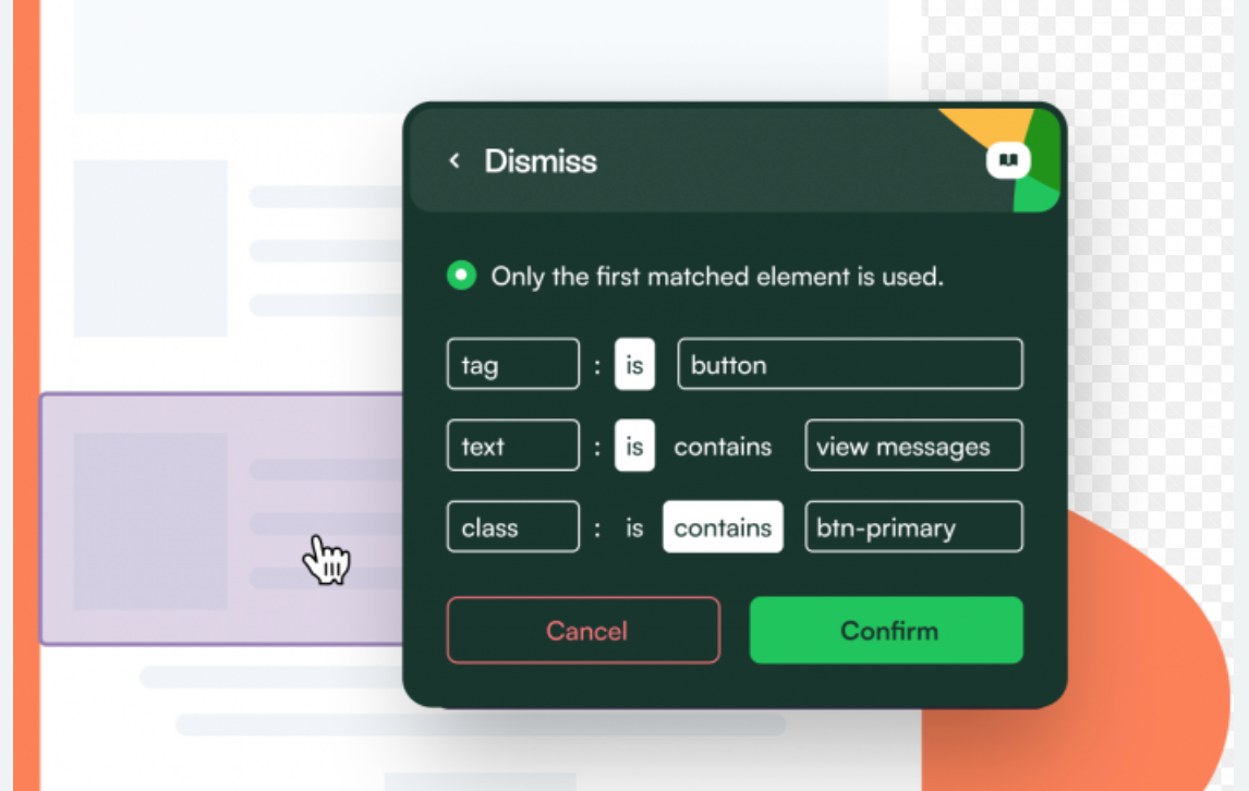
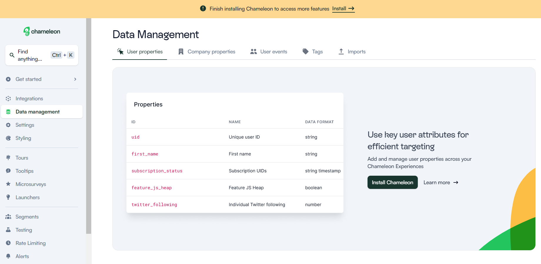
Chameleon is a no-code solution for SaaS product adoption. It offers four key products:
-
Step-by-step tours: to guide users through the product
-
Self-serve launchers: for easy access to resources
-
Tips for unblocking users and giving best practices
-
In-product microsurveys: for gathering contextual feedback
By allowing you to personalize customer experiences, you’re able to create user flows that will lead to the successful adoption of your products.
Additionally, Chameleon offers highly customizable styling, allowing you to create experiences that look native rather than like external products.
Chameleon for user feedback
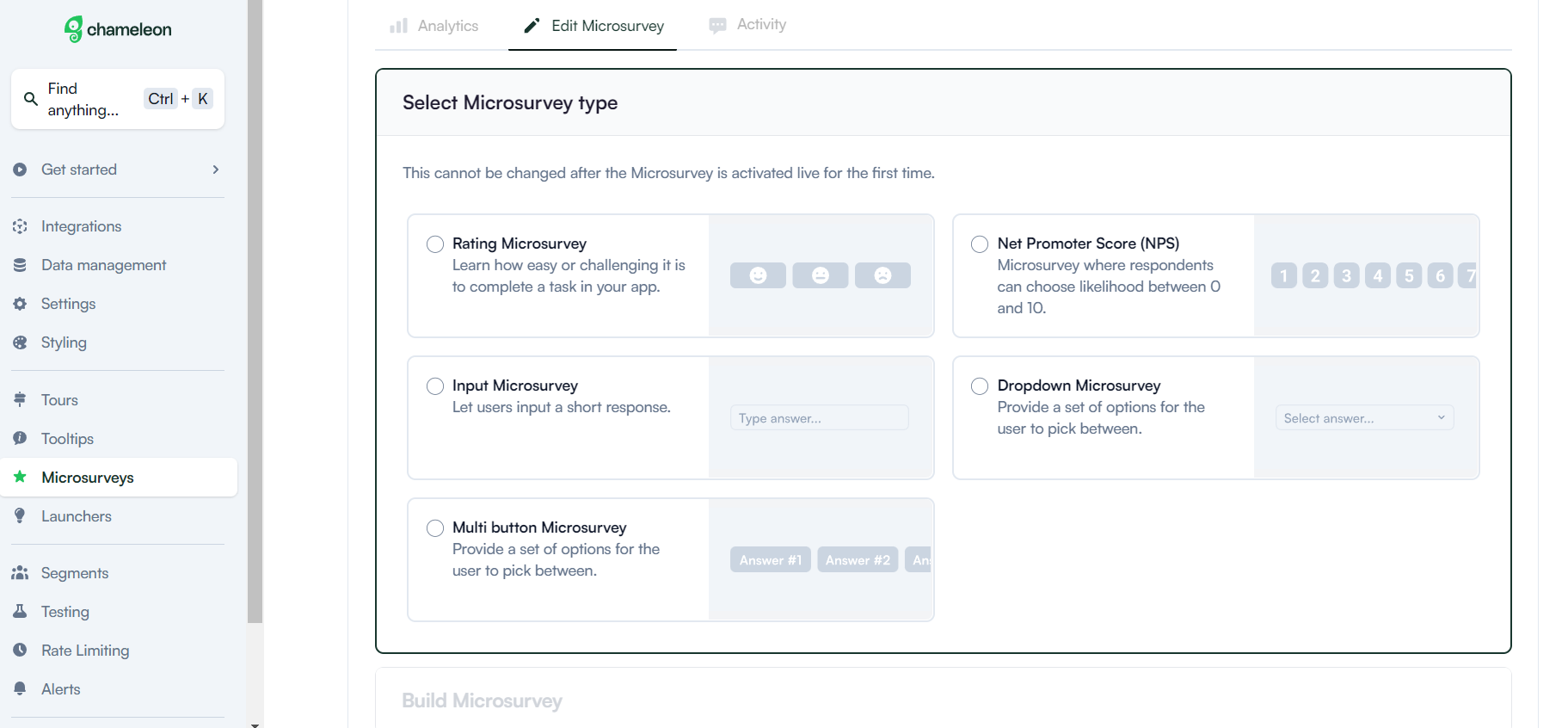
Here’s how you can collect user feedback with Chameleon:
- Build different types of micro surveys (limited to 5 on the Startup plan) such as NPS, CSAT, CES, Opt-in, and custom feedback types.
- Personalize the surveys as you wish (you will need help from a developer or may require CSS skills).
- You can select the survey’s frequency and whether you want it to repeat.
- You get access to basic completion reports. Most of the additional data will need to be analyzed in your analytics tools that Chameleon integrates with and sends data to.
- You will see your NPS score in the reports but for the rest of the micro surveys, you will need analytics tools.
It’s great that Chameleon lets you build beautiful micro surveys but it might not be the best tool if you want to analyze the data and most importantly act on it. For example, with Userpilot you can create custom user segments based on survey responses or NPS scores and trigger specific in-app flows for them.
There is a better tool for your SaaS than Chameleon!
What is Stonly?
Stonly positions itself as a budget-friendly alternative to its more expensive competitors, but in fact – it’s more of a CS tool for building knowledge bases than a product adoption tool for onboarding. Similarly, as with Intercom Product Tours, Stonly’s tour builder feels like a makeshift add-on to the Knowledge Bases rather than a fully-fledged product (compared to its competitors like Userpilot or Appcues).
So it may be good for startups and small businesses with few users and a per-view pricing model (which may become super-expensive once you have more users!) and that want a tool primarily for the Knowledge Base use case.
What is Stonly best for?
Similar to Chameleon, Stonly is typically considered for user onboarding. Let’s examine Stonly for this use case before we compare it to Userpilot.
Stonly for user onboarding

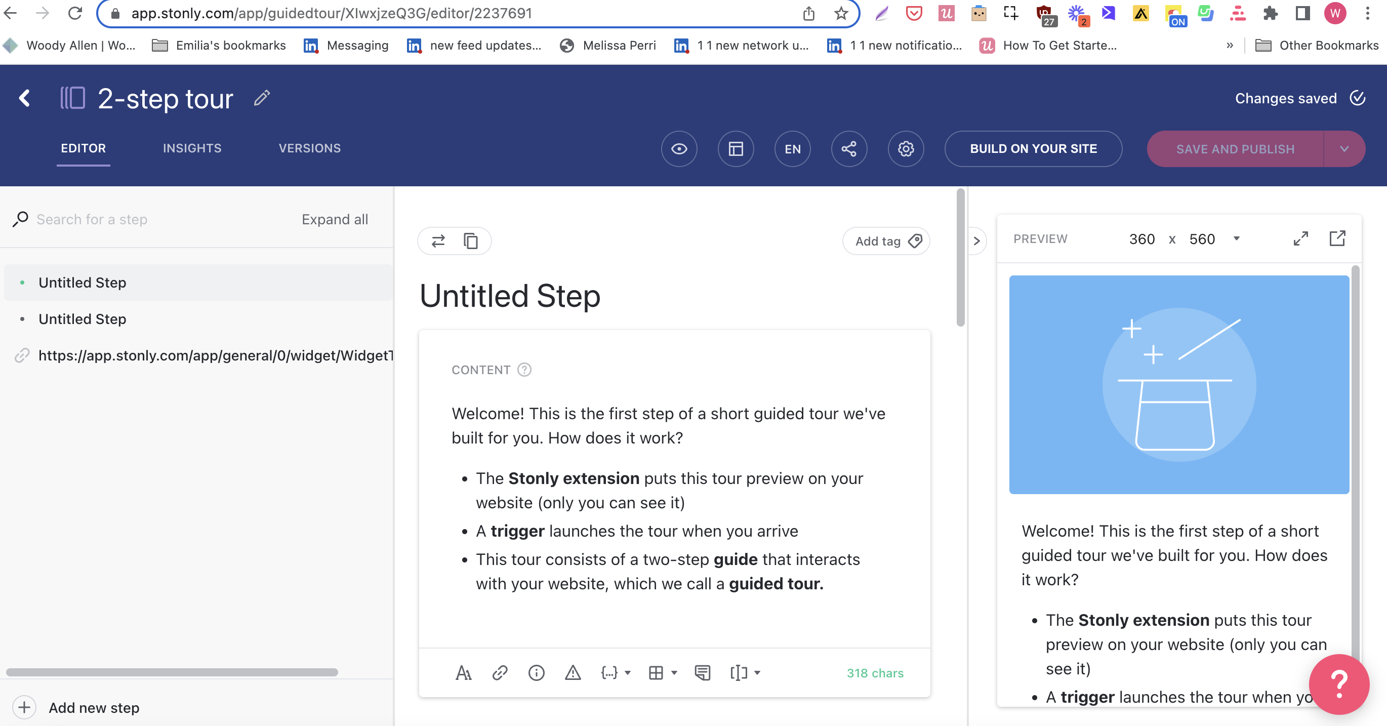
Stonly’s product tours are not the most intuitive (and require quite a bit of coding), and they come with limited integrations. In fact – its setup and builder are extremely confusing: you can build the tours both in the Stonly dashboard and on top of your app, but then you need to go back to the dashboard to edit the content of the steps you’ve just built in the Chrome Extension? 🤔 This doesn’t make much sense…
Additionally, Stonly is focused mainly on user onboarding. You can’t use it for increasing adoption or collecting feedback.
Try a better tool for your SaaS than Stonly!

Chameleon vs Stonly vs Userpilot – is Userpilot the best choice?
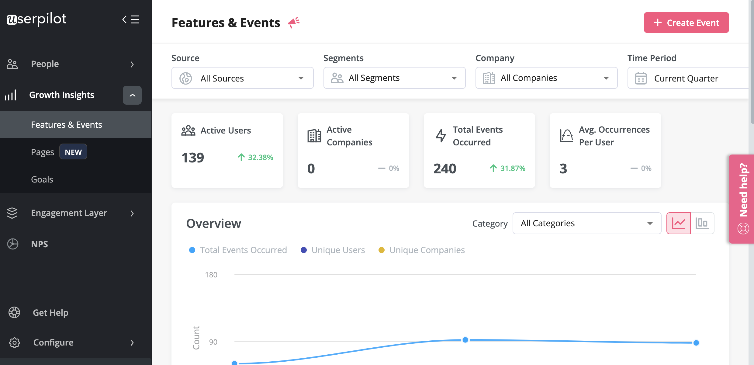
Userpilot is a comprehensive digital adoption platform (DAP). It enables product teams to track product usage and user behavior to guide product development and optimize the user experience.
In addition, it allows them to gather user feedback and design personalized onboarding experiences to drive product adoption. All of this is possible without coding.
What is Userpilot best for?
Userpilot is used for similar use cases as Stonly and Chameleon. Let’s see how Userpilot compares to the tools we discussed before it comes to user onboarding, product adoption, and user feedback.
Userpilot for user onboarding
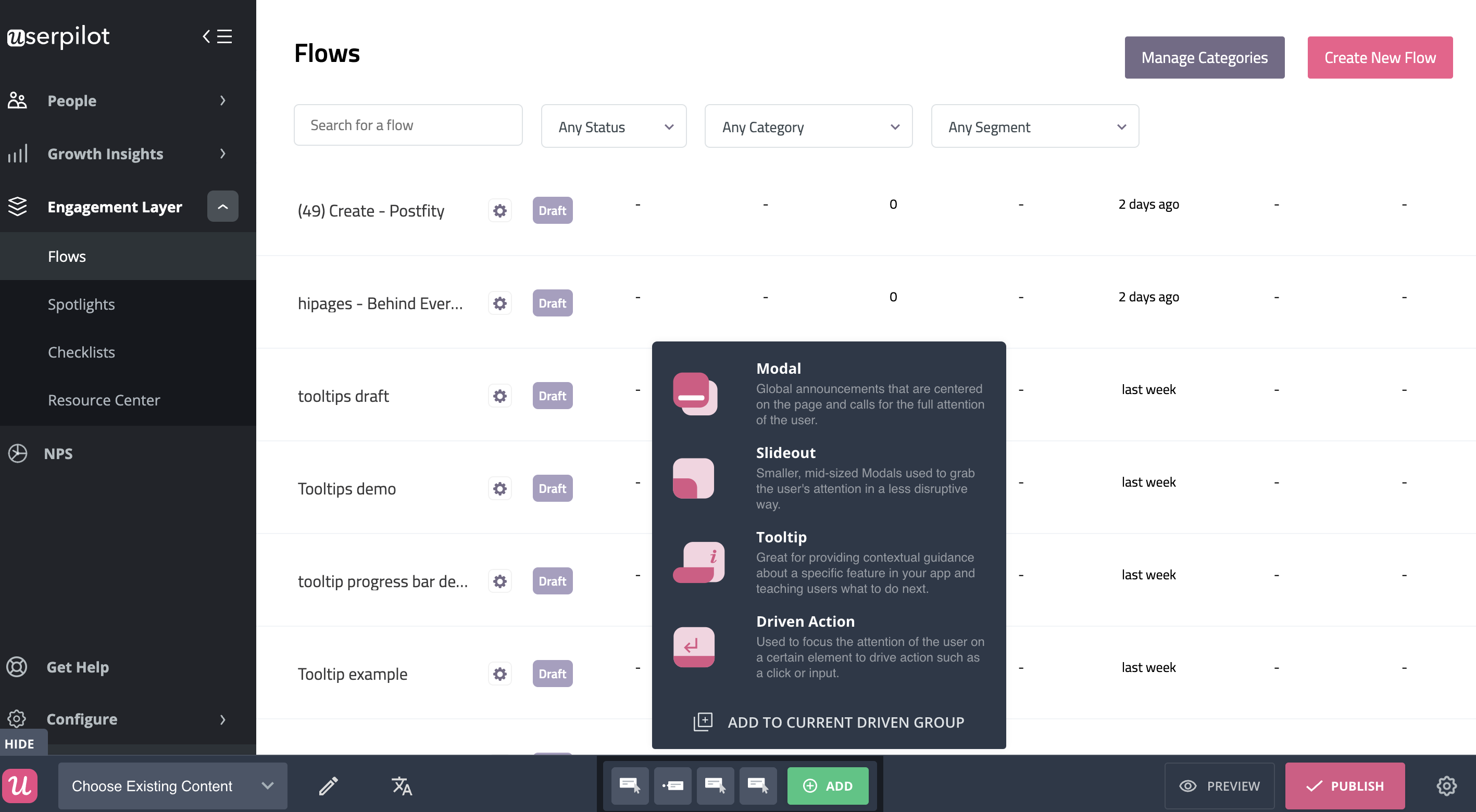
Userpilot was built specifically for SaaS product teams that want to improve their user onboarding experience and boost user activation.
You can build a huge variety of user onboarding experiences and in-app guidance flows without needing to code.
Here’s what you’ll get when you start using Userpilot:
- Forget about coding in-app experiences: Userpilot is a no-code solution and only requires your dev to install a line of javascript inside your app and for you to download a Chrome extension that opens up the visual builder.
- Build in-app flows using the largest range of UI patterns (modals, slideouts, tooltips, hotspots, banners) and in-app onboarding experiences (checklists, micro surveys, NPS surveys, in-app resource center).
- Get access to a built-in NPS tool for collecting and analyzing user sentiment so you can improve your onboarding process based on real data.
- Create and track combinations of in-app events like clicks, hovers, and form fills, and then analyze all these interactions under your own custom events, which can be built without code or API calls.
- Use advanced product analytics and in-app flows analytics to identify where users need help and create granular user segments to trigger in-app experiences contextually (segment based on user identification data, in-app engagement, custom events, clicks, hovers, form fills, user feedback responses, NPS scores and more).
- Enhance the onboarding experience with in-app help by launching a Resource Center directly inside your app. Add in-app guides, and video tutorials, and give users access to search the knowledge base or reach out to support. Self-service has never been easier.
The best user onboarding is contextual and it happens right where the users need it, inside your app. There isn’t a better user onboarding tool out there that offers more value for the money than Userpilot.
Schedule a demo with our team and get ready to build the best onboarding experiences your users have seen.
Userpilot for product adoption
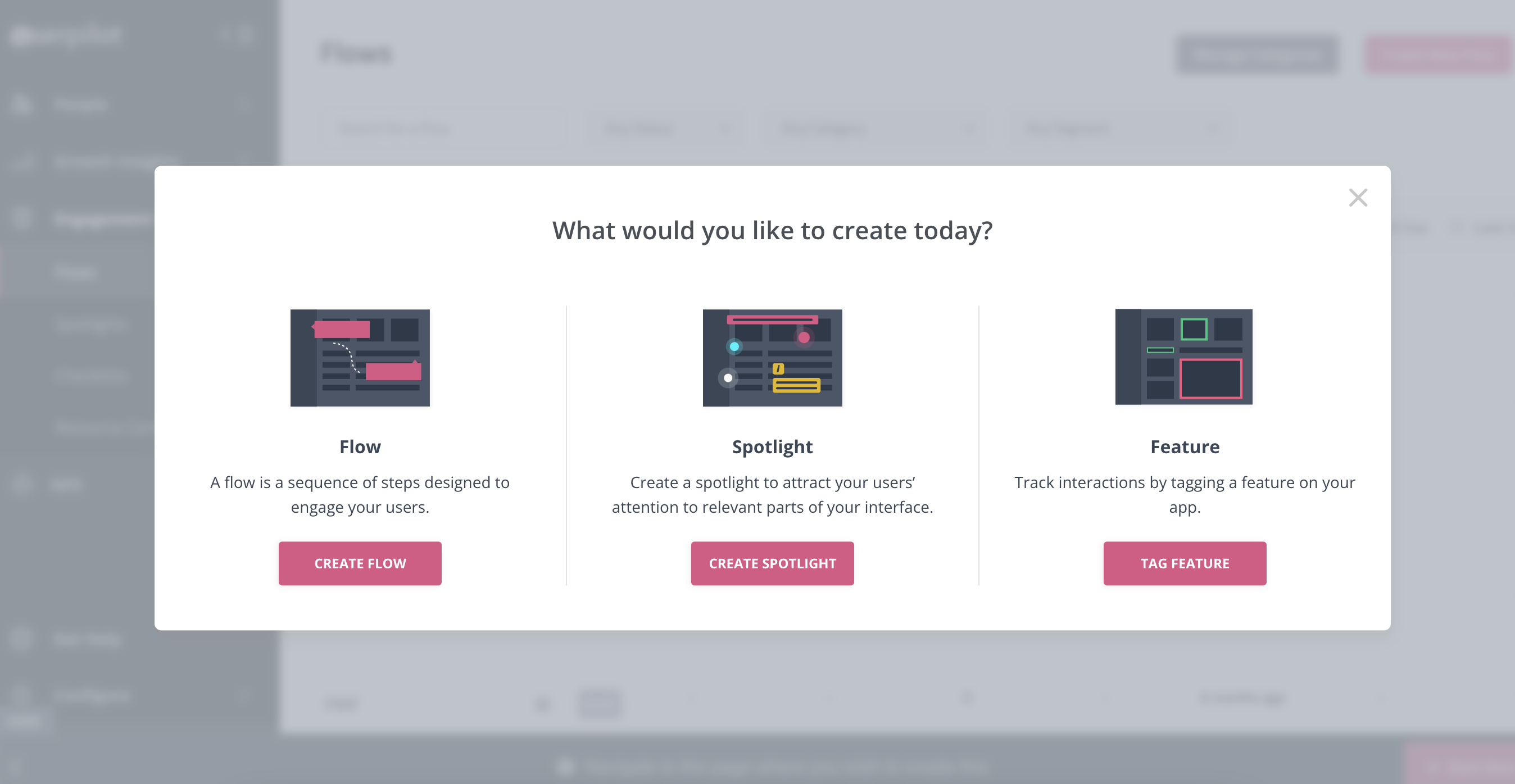
Product adoption describes the process of getting users to the point where they are experiencing value from your product.
Userpilot is a powerful product adoption platform that enables you to quickly build personalized and contextual in-app experiences targeted to different user experiences – all without writing a line of code.
It’s a great option for enterprise users too since it’s SOC 2 Type II certified and offers robust features for large-scale usage.
Here are some of Userpilot’s product adoption features that you may find helpful:
- A broad range of UI patterns to build fully customizable, contextual, and interactive in-app flows: modals, slideouts, tooltips, hotspots, driven actions, banners, and more. And – most importantly – you are not limited by plan when it comes to how many UI patterns or designs you can build.
- Advanced in-app checklists with built-in gamification elements like progress bars or ”automatically marked complete” tasks: checklists also come with analytics so you can track who is interacting with them and how.
- Fully interactive walkthroughs walk users through engaging and adopting specific features of your app.
- The self-service in-app resource center lets users search your knowledge base directly inside the app, access chat, and support but also launch guides and tutorials when they get stuck.
- User feedback tools allow you to collect insights to improve the product and the user experience, thus leading to a higher product adoption rate. You can also collect NPS data and tag responses to uncover patterns into what makes users stick, or build micro surveys for more granular data. Then you can use all the feedback collected to build user segments based on the answers and personalize the path to higher product adoption for each segment.
Want to see Userpilot in action? Get a demo and improve product adoption with contextual and personalized in-app flows that actually help users.
Userpilot for user feedback
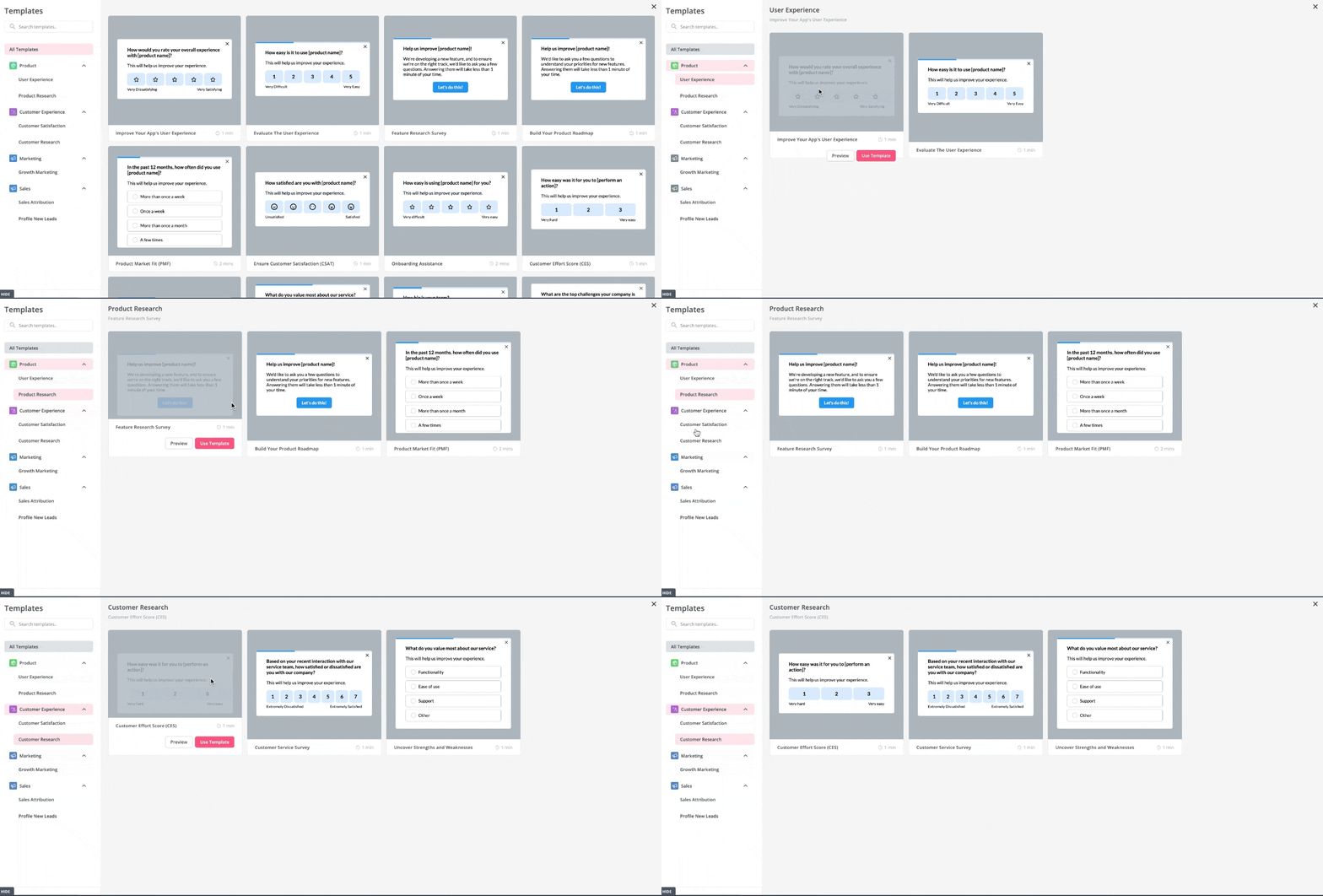
There are two types of feedback you should be focusing on collecting to better understand the health of your product and users.
First, you have user sentiment which looks at user satisfaction and effort scores or loyalty (using NPS surveys). Then you may also want to collect feedback on the functionality of the product or specific features.
You can do all these with Userpilot. In short, you can:
- Collect and track (NPS) in-app with a built-in NPS widget that allows you to fully customize the survey look and feel, and set the trigger frequency and specific targeting.
- Analyze NPS scores, tag responses, and use the data to create specific user segments.
- Build and trigger in-app micro surveys like the classic PMF survey, or similar ones and mix multi-choice and open-ended types of questions to collect specific insights.
- Be in charge of who gets which survey type and when with advanced segmentation capabilities, and of course, you can use the answers to segment your audience.
The advantage of using Userpilot for collecting feedback over other survey tools is that you can better control who sees the surveys but also you can instantly use the data collected to segment your user base and trigger the right experience for them.
For instance, if your users give you a low NPS score because they think you’re missing a critical feature (that you actually have already), you can push an interactive walkthrough guiding them to find and explore this feature.
Tired of bad Digital Adoption tools? Try Userpilot for your SaaS for free!

So Which tool should you choose – Chameleon, Stonly, or Userpilot?
As you can see, Chameleon, Stonly, and Userpilot cater to most of the use cases Product Managers typically look for in their SaaS companies. There are some differences between the tools when it comes to how those use cases are executed in each, of course. So if you’re still on the fence – there are two more factors that can make a difference for you – the tools’ pricing, and its reviews. Let’s have a look at both below!
Chameleon pricing
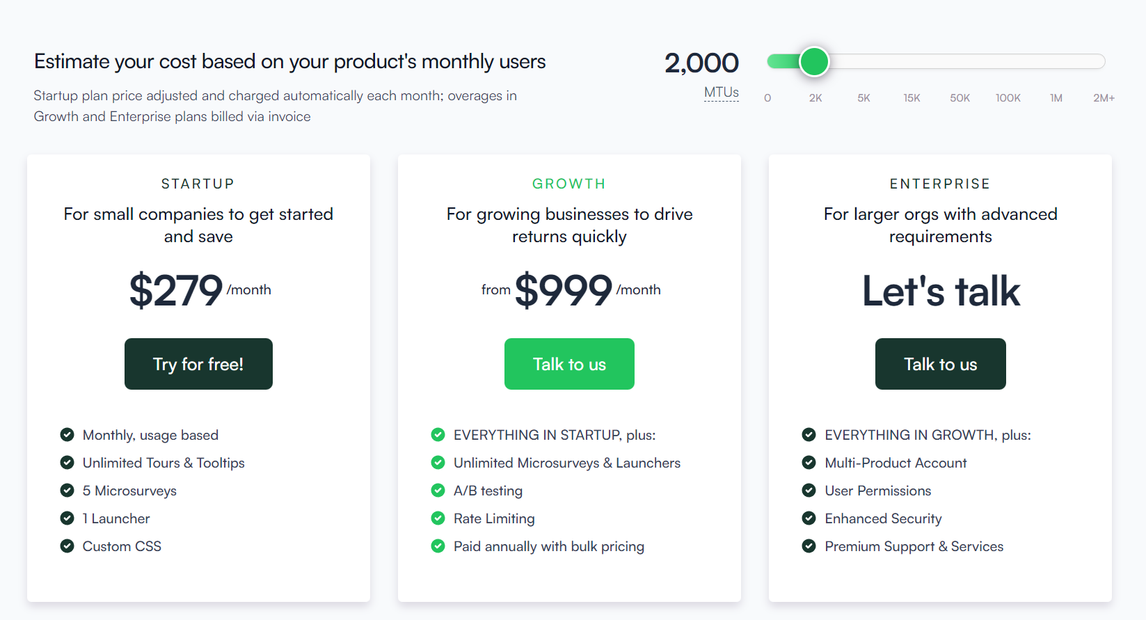
Chameleon split their pricing options primarily by the number of monthly active users, but you should keep in mind that the Startup plan also has limited features and might not be enough for interactive user onboarding and adoption for SaaS products:
- 0 – 2500 MAUs: Startup plan from $349/mo, Growth plan from $1249/mo
- 2000 – 3000MAUs: Startup plan from $419/mo, Growth from $1299/mo.
- 3000 – 5000 MAUs: Startup plan from $489/mo, Growth from $1449/mo.
- 5000 – 10,000 MAUs: Startup plan from $629/mo, Growth from $1749/mo
Disclaimer: with the Startup plan you only get 5 microsurveys and 1 launcher, no A/B testing, no Goals, and no localization.
Stonly pricing
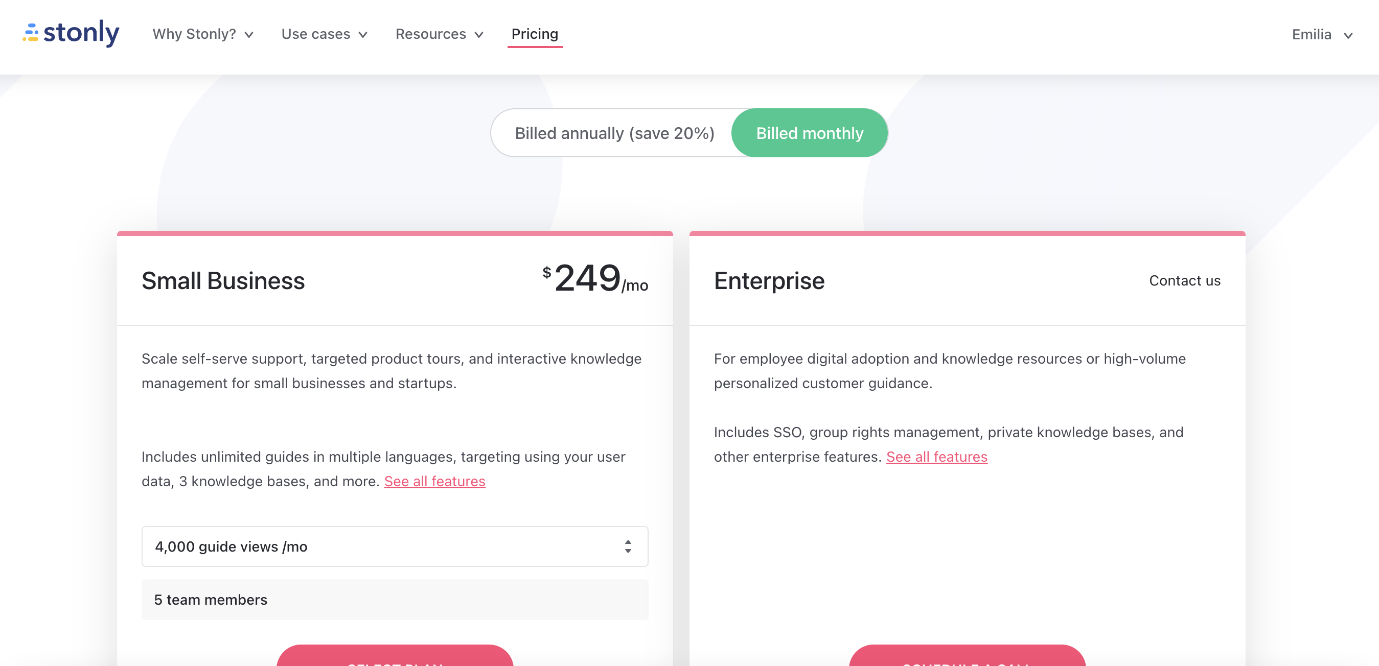
Stonly offers two main pricing plans for its customers, catering to different business sizes and needs. The pricing details are as follows:
- Small Business: Starting at $199/mo (billed annually), this plan is designed for small businesses and startups looking to scale self-serve support, targeted product tours, and interactive knowledge management. Features include:
- Unlimited guides in multiple languages.
- Targeting using your user data.
- 3 knowledge bases.
- 4,000 guide views per month.
- 5 team members.
- Enterprise: Pricing is available upon contacting Stonly, this plan is geared towards employee digital adoption and knowledge resources or high-volume personalized customer guidance. Features include:
- SSO (Single Sign-On).
- Group rights management.
- Private knowledge bases.
- Other enterprise features.
Customers can save 20% on both plans when billed annually.
Userpilot pricing
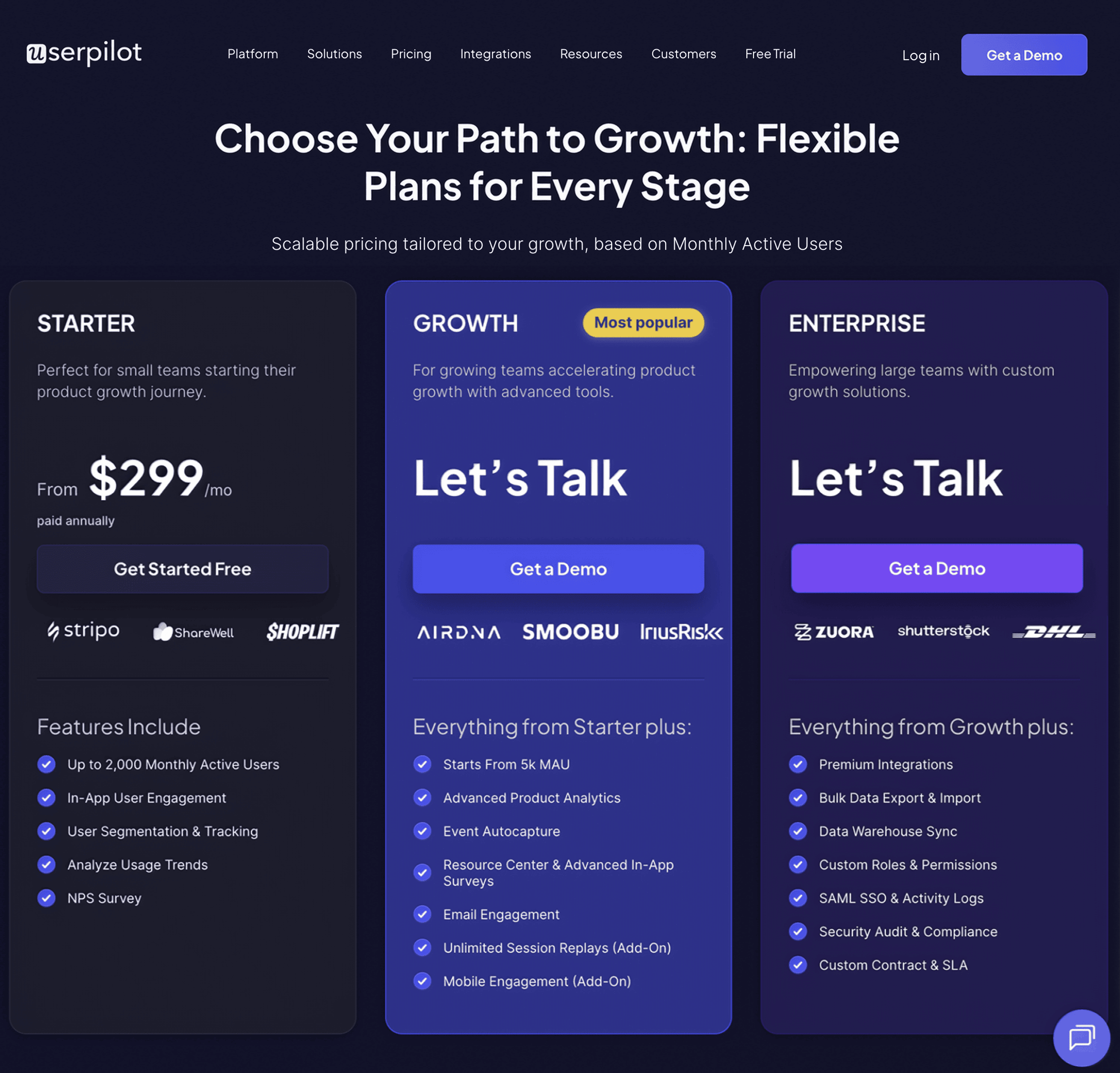
Compared to other tools in the market, Userpilot offers greater value for money as it provides all the necessary tools like engagement, analytics, feedback, and session replays inside one platform. Here’s the detailed Userpilot pricing breakdown:
- The Starter plan is customized for designed for small teams or startups with up to 2,000 monthly active users. It includes in-app engagement tools such as walkthroughs, checklists, and banners, along with limited segmentation (up to 10 segments), basic analytics, NPS surveys, and email/live chat support.
- The Growth plan is customized for growing teams needing more advanced product analytics and feedback mechanisms. It includes all Starter features and adds unlimited segmentation, retroactive event tracking, advanced analytics like funnels and retention, as well as various in-app surveys including PMF, CES, and CSAT. It also enables localized content, content throttling, and access to a self-service Resource Center. Add-ons include session replays and mobile support. This tier comes with a dedicated Customer Success Manager, phone support, and domain customization.
- The Enterprise plan is customized for large organizations with more complex needs. It includes everything in the Growth plan plus additional features such as premium integrations, custom roles and permissions, bulk data management, SAML 2.0 SSO, and activity logs. It also offers priority support with service-level agreements, security audits, and custom billing options. Pricing for this plan is provided upon request.
What do users say about Chameleon vs Stonly vs Userpilot?
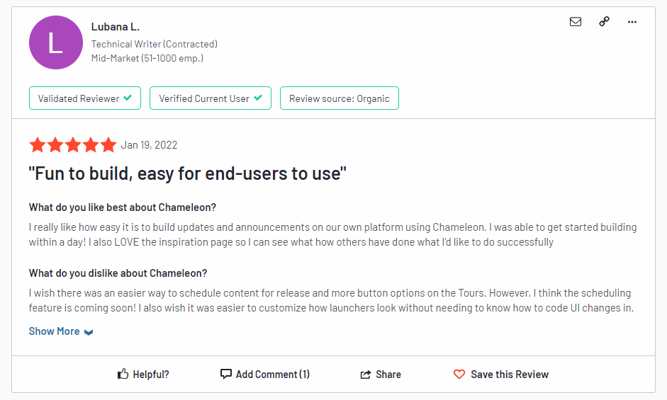
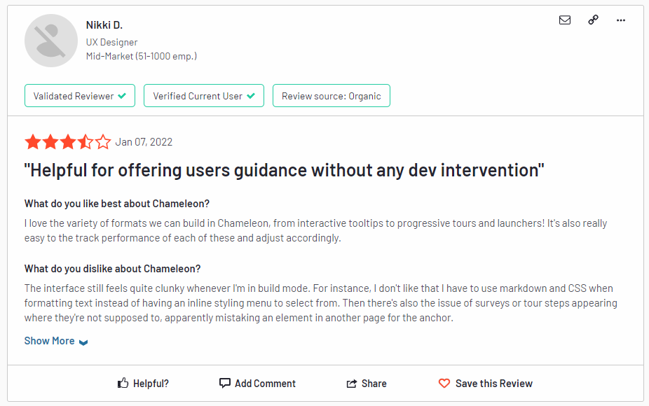
Chameleon reviews
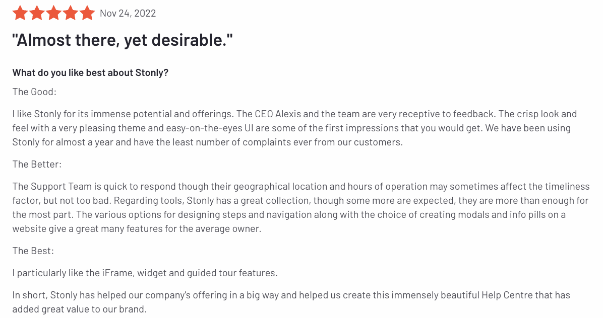
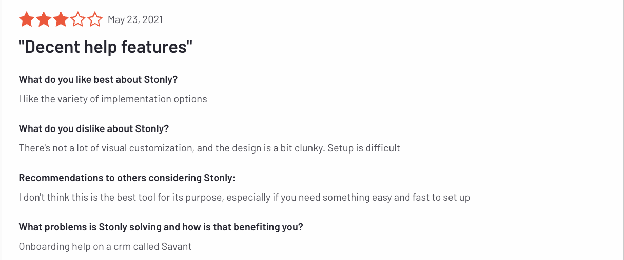
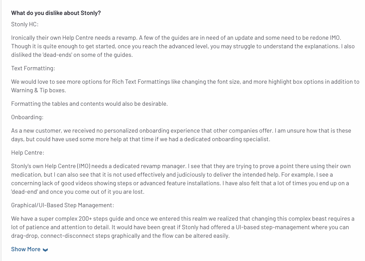
Stonly reviews
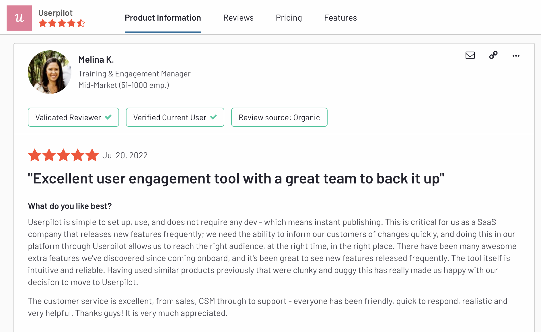
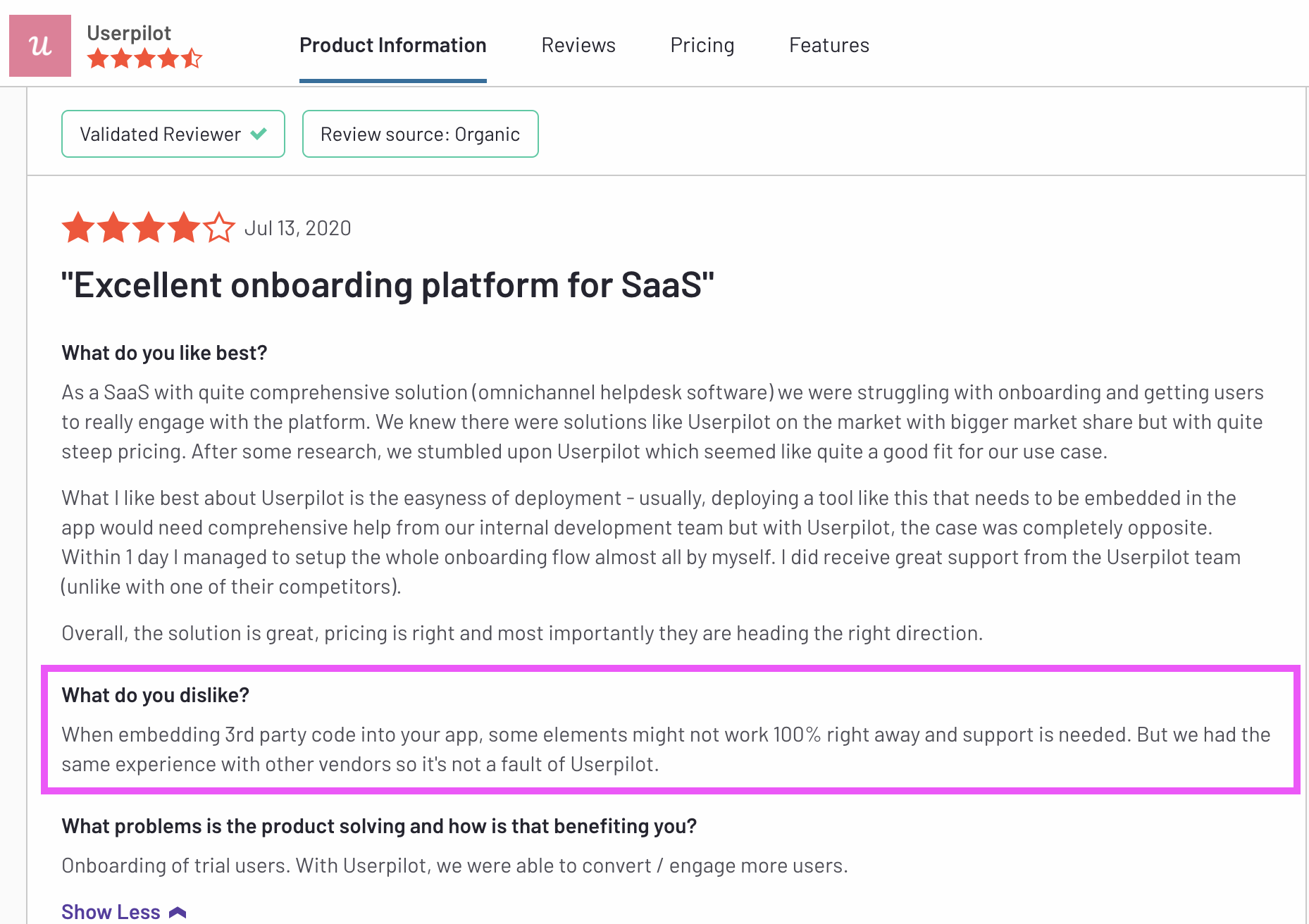
Userpilot reviews
The final countdown: Pros & Cons of Chameleon, Stonly, and Userpilot
Chameleon pros
Chameleon is a robust tool for your onboarding and adoption needs. Here are the main pros to consider if you’re still deciding:
- Offers a good range of in-app messaging and UI patterns. You can create custom modals, slideouts, tooltips, hotspots, launchers (checklists or resource hubs), and more.
- Good segmentation options, you can either build different user segments inside the product, or you can integrate your Chameleon account with other tools and import your data.
- Can be used on 3rd party tools, meaning you can use it for employee onboarding too.
- Offers a good range of two-way integrations: Mixpanel, Segment, Intercom, Customer.io, Segment, HubSpot, etc.
Chameleon cons
While Chameleon is a great tool, the main downside is the cost and restrictions you get with it. Here are the main cons of the tool:
- There are some limitations to user onboarding flows. You can’t run multiple in-app experiences at the same time, as you can in Userpilot. Instead, Chameleon enables you to create user onboarding campaigns (different sequences of product tours shown over time).
- It’s built for single-page apps: Chameleon can’t build flows that run over multiple URLs.
- Doesn’t offer a self-service resource center where users can access multiple guides and tutorials or contact support. It does provide launchers that are similar but more restricted. A launcher can be a checklist or a list of resources, but can’t be both.
- It has a steeper learning curve and it’s not a completely no-code tool.
- The Startup (starter) plan is quite restrictive and expensive (starts at $349/mo for 2500 MAU and includes 1 Launcher only and 5 micro surveys). You will need to go for Growth ($1249/mo) if you want to drive product adoption.
Stonly pros
Stonly has a number of advantages:
-
The ability to support multiple languages
-
Small companies with fewer initial views will benefit from this pricing model
-
Integrated analytics
-
Front, Zendesk, Freshdesk, and Segment integrations
-
Knowledge base functionality included
Stonly cons
There are also several considerable downsides to using Stonly though:
- Extremely confusing builder
- Pretty code-heavy product tour setup for a “no-code tool”
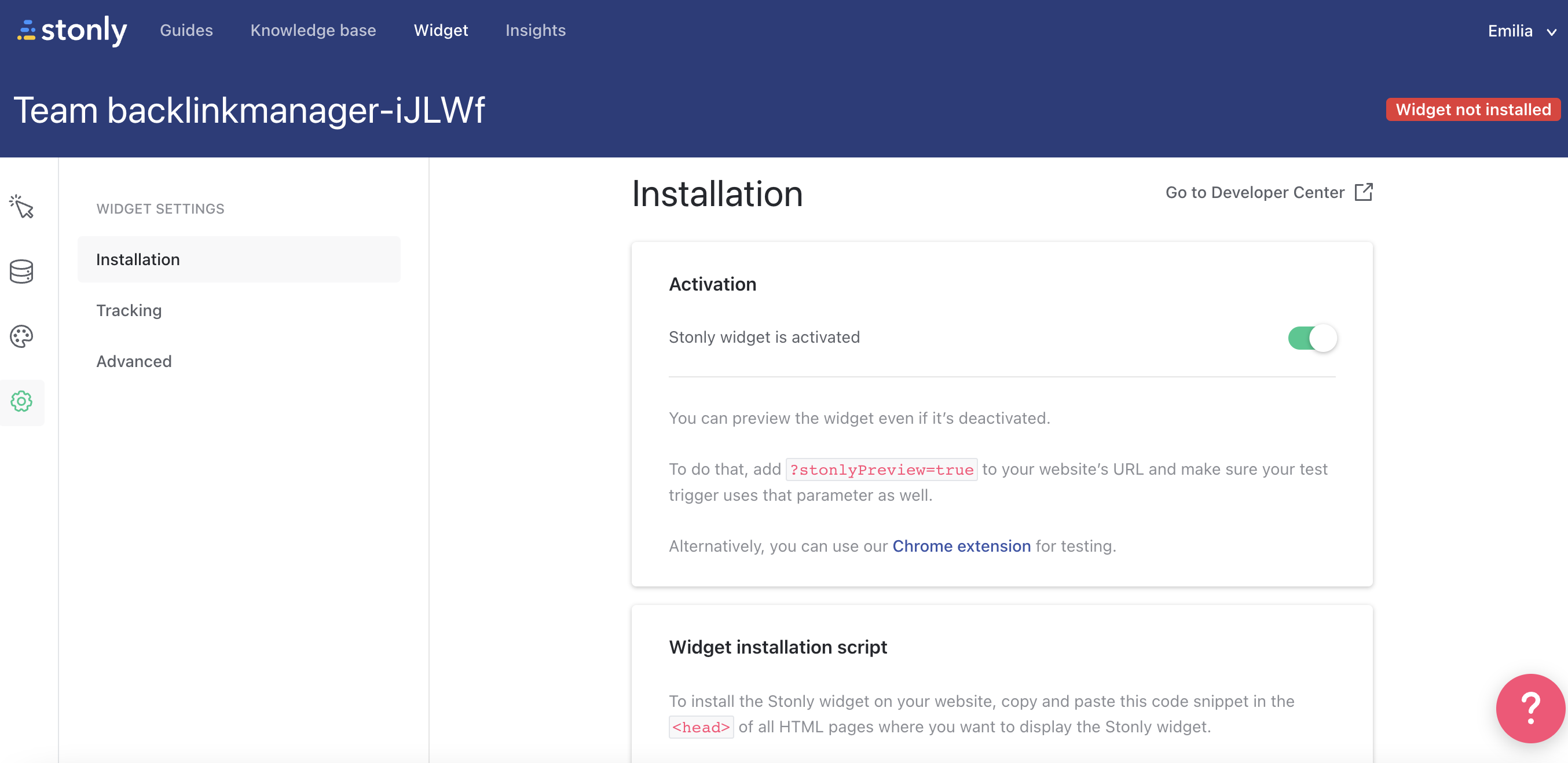
- Confusing installation: it’s impossible to install it for a non-technical user:
Stonly installation
-
Requires some knowledge of CSS to customize – the customization options are worse than the market standard
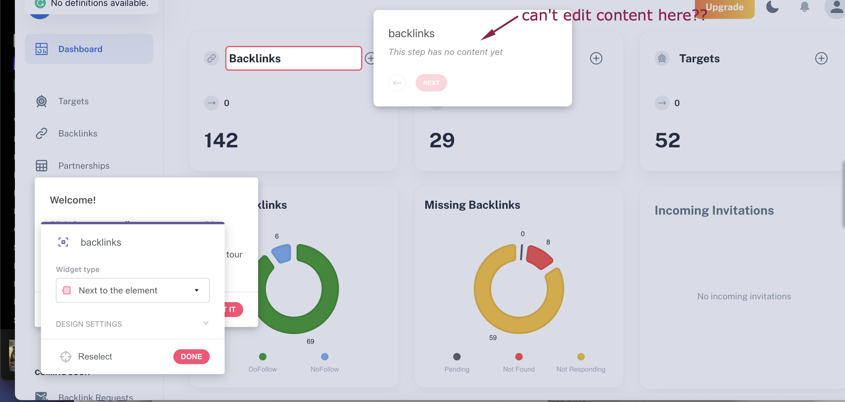
- Doesn’t allow you to add content to your product guides (text) directly in the Chrome Extension:
-
There is a lack of certain popular product tour features, such as progress bars and checklists
Userpilot pros
Userpilot has a number of advantages, especially for mid-market SaaS companies looking for a robust but at the same time very easy-to-use, no-code tool for user onboarding, product adoption, and simplified product analytics. Let’s have a look at the pros of using Userpilot:
- No-code builder – Userpilot comes with an easy-to-use Chrome Extension builder.
- Multiple UI patterns – choose from a range of options to build customized flows: modals, slideouts, banners, tooltips, hotspots, and checklists are all at your disposal.
- UI patterns are not limited by plan – you get access to all of them on every single plan, meaning you get value even with the Traction plan (this is the entry-level one).
- Engaging walkthroughs and onboarding flows – build interactive walkthroughs targeted to distinct user segments.
- In-app help – build a resource center offering self-service support to your users, customize it with your branding, and select from a range of help options to boost user satisfaction (i.e., videos, in-app flows, chat, and more).
- Experimentation – built-in A/B testing for flows lets you explore and quickly iterate based on direct user behavior.
- Powerful feedback options- integrated NPS surveys with analytics and response tagging unlock insight into how your users feel.
- Advanced analytics and segmentation- analyze product usage and in-app flow engagement and build user segments using the data.
- Event tracking and feature tags- tag UI engagement (clicks, form fills, hovers) and group them into one custom event to track what really matters.
- Userpilot’s mobile SDK includes a full suite of engagement tools, carousels, slideouts, push notifications, and in-app surveys (NPS, CSAT, CES) that enable personalized user interactions.
- More value with integrations- unlock value faster with built-in integrations with popular tools like Segment, Amplitude, Mixpanel, Kissmetrics, Intercom, Heap, and more.
Userpilot cons
There are, however, some downsides to Userpilot as well:
- Doesn’t support employee onboarding- The tool is better suited for customer onboarding than for employee onboarding as you can’t build in-app guides on third-party tools.
- Missing integrations – doesn’t have built-in integrations with some tools, but it has webhooks, and Zapier is coming soon.
- Not appropriate for small startups on a shoestring budget (<$100)- Userpilot is a powerful, mid-market to enterprise-level tool. So $299 a month might be too expensive for really small startups.
Try the best tool for user onboarding for FREE!

Conclusion
This wraps up our detailed comparison between Chameleon, Stonly, and Userpilot. Hopefully, you’re now able to make an informed decision regarding which tool to invest in for your SaaS. Remember, the ultimate decision boils down to your goals, feature requirements, and budgets.
If you’re looking for a tool with an impressive suite of features and that too with great value for money, give Userpilot a go. Book a demo to see it in action.

