7 Best User Onboarding Teardowns to Inspire Product Teams

Looking for user onboarding teardowns to help you create an onboarding process for your SaaS?
You’re in the right place.
Read the article to learn how 7 well-known SaaS businesses skyrocketed their activation and adoption rates. From the structure to the exact in-app experiences, we unpack the ingredients of their success, so that you don’t have to reinvent the wheel.
Overview of user onboarding teardowns
- A user onboarding teardown is an analysis of the onboarding steps and tactics.
- Userpilot leverages its own tool for onboarding. It focuses on creating a frictionless sign-up process to get users inside the product ASAP.
- Groupize gamified its onboarding with an interactive assistant, G.G. It provides guided tours, checklists, and live chat to support users.
- Attention Insight used interactive walkthroughs and checklists to enhance user activation by 47%.
- Sked Social uses a simple checklist and walkthroughs to automate onboarding. Users can also arrange an onboarding call.
- A 4-step checklist and tooltips helped Rocketbots double its activation and increase MRR by 300%.
- Grammarly uses demo content to teach users how to use its proofreading features.
- To keep your sign-up flow short, ask only for essential information, enable SSO, and delay email verification if possible.
- Personalized onboarding reduces time to value by focusing only on relevant features.
- Onboarding checklists, especially with progress bars, successfully drive desired user behaviors by leveraging strong psychological processes.
- Use funnel, path, and session recording analyses to identify friction in the onboarding process.
- Collect user feedback to identify opportunities to enhance your onboarding flows.
- Want to find out more about Userpilot onboarding features? Book the demo!
What is a user onboarding teardown?
A user onboarding teardown is an in-depth analysis of a product onboarding process.
Its goal is to evaluate the steps and experiences used to introduce new users to the product, assess how well they drive activation, adoption, and retention, and identify areas for improvement.
7 Best user onboarding teardowns to inspire you
7 successful SaaS products and 7 user onboarding teardowns. Ready to explore?
1. Userpilot
Userpilot is a product growth platform. It’s designed to help companies increase activation, adoption, and retention rates and drive account expansion and customer advocacy in their web apps.
So we know a thing or two about user onboarding.
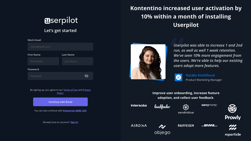
The sign-up form consists of 4 fields: work email, first name, last name, and password.
To dispel their potential doubts, we use social proof. The sign-up page contains our customer logos and a testimonial.
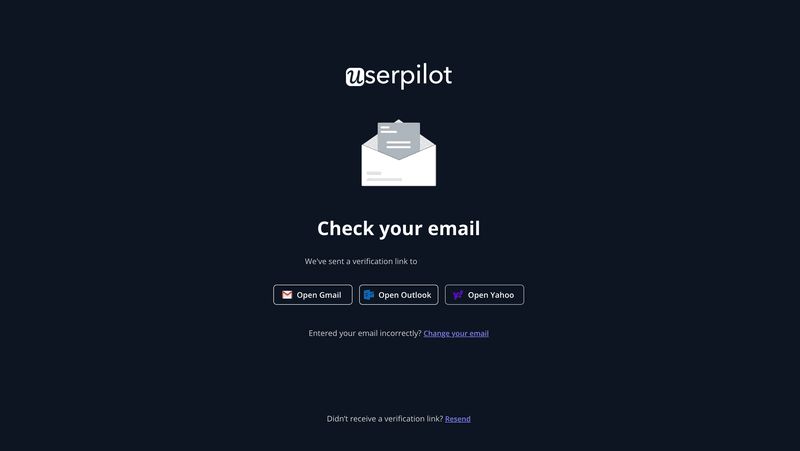
Once the user submits their form, they need to verify their email address via the link we send them.
We can’t skip this stage. But we try to make it as frictionless as possible by adding buttons with shortcuts to popular email providers: Gmail, Outlook, and Yahoo.
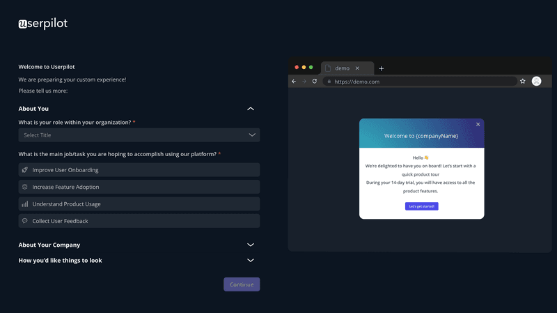
The first thing that a new user sees after logging in is the welcome survey. We use it to profile users and personalize the experience.
In the survey, we ask users about their company role and their main goal. We also want to know the name of their company and size. Users can also customize the UI by choosing between the dark and light themes.
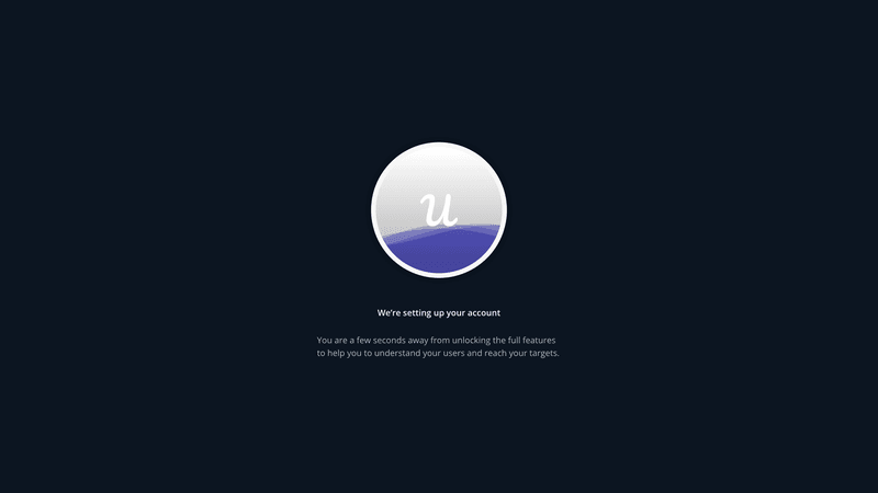
As the setup can take a moment, we’ve designed a cool preloader that keeps users engaged while waiting.
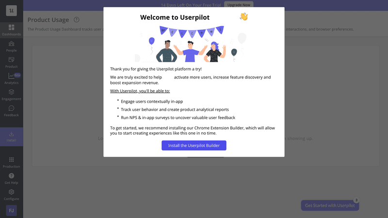
When the account is ready, a welcome message greets the user.
It reiterates Userpilot benefits and contains a CTA button, ‘Install the Userpilot Builder’, a Chrome extension essential for using Userpilot.
Key takeaways from Userpilot’s onboarding teardown
Userpilot eats its dog food. By using our tool for onboarding our customers, we showcase its unique qualities and help them create effective flows for their users.
2. Kommunicate
Kommunicate.io is a chat-based customer support platform.
The company used Userpilot to design its user onboarding process. Their main focus was on improving feature adoption.
The result?
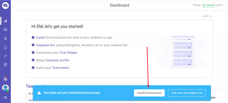
The integration rate for the chatbot, their key feature, increased from 40-45% to 55-60%.
They achieved it with a simple notification banner.
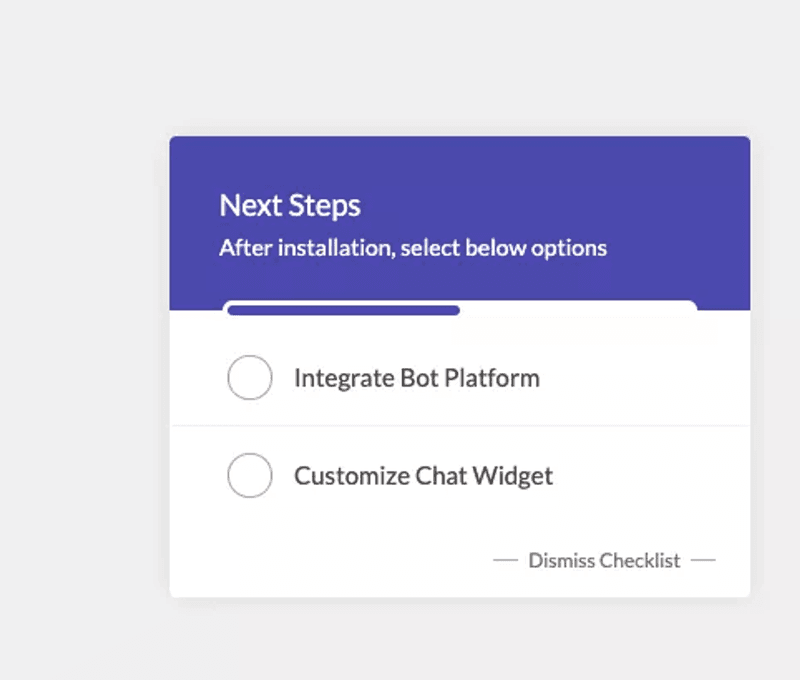
To increase the adoption of its main 5-7 features, they used a checklist. This boosted the adoption rates from 28% to 41%.
One of Kommunicate’s key features is chat widget customization.
By using an interactive walkthrough, the team managed to increase its adoption by 3% – to 86%.

Key takeaways from Kommunicate’s onboarding teardown
Before building any onboarding experiences, Kommunikate used analytics to identify key activation and conversion events linked to free-to-paid conversions. Only then did they design relevant processes.
Analyzing customer behavior before building onboarding experiences is a vital step that shouldn’t be missed.
3. Groupize
Groupize is a meetings management platform.
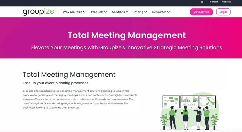
The company used Userpilot to gamify its onboarding. They did this by creating an interactive assistant, G.G.
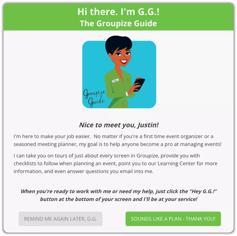
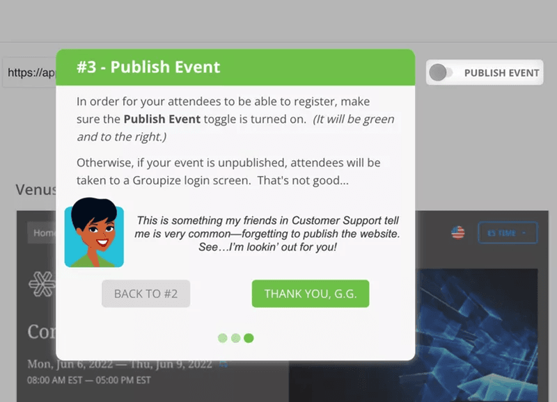
G.G. provides users with step-by-step guidance via onboarding tours and checklists.
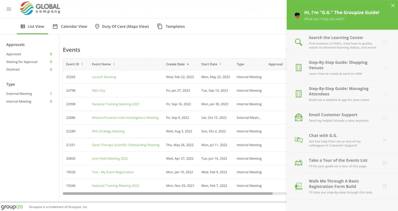
Users can access its assistance from the resource center. That’s where they can also find links to guided tours and other support resources.
How successful is it?
Its implementation reduced the number of support tickets.
Users don’t ask for simple instructions anymore. Instead, they try to resolve their issues independently and reach out for help only when it doesn’t work.
Key takeaways from Groupize’s onboarding teardown
- Gamification is a powerful way to drive user engagement.
- A centralized hub, like a resource center or a knowledge base, frees up the support team bandwidth necessary to deal with more complex issues.
4. Attention Insight
Attention Insight is an AI-powered platform that enables users to create attention heatmaps of their websites, ads, or other designs.
All you have to do is upload the design and Attention Insight does all the work.
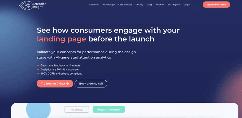
Its onboarding process focuses on activating 2 main features: heatmap creation and setting ‘areas of interest.’
To help users create their first heatmap analysis, Attention Insight used interactive walkthroughs created in Userpilot. They consist of driven actions.
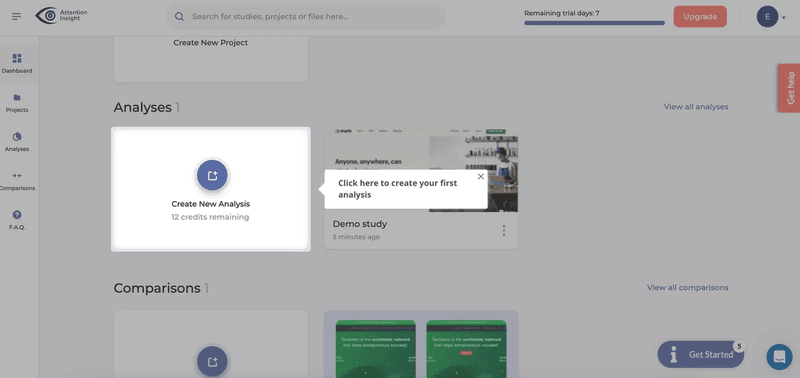
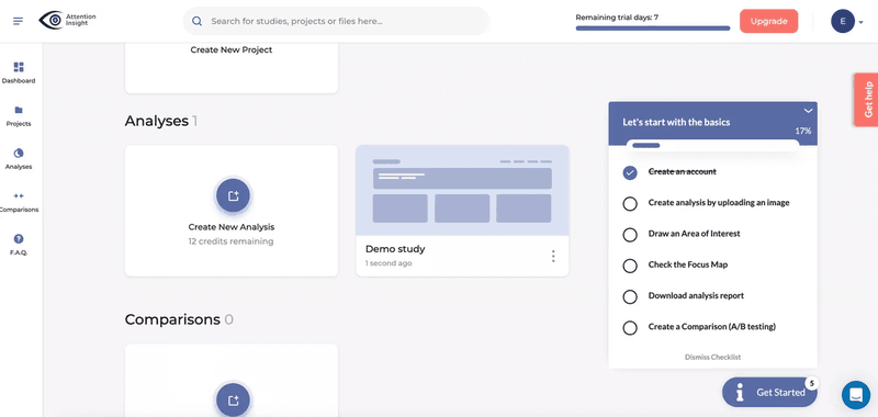
To structure the process of creating heatmap analysis and tagging areas of interest, they use a checklist that includes 6 tasks.
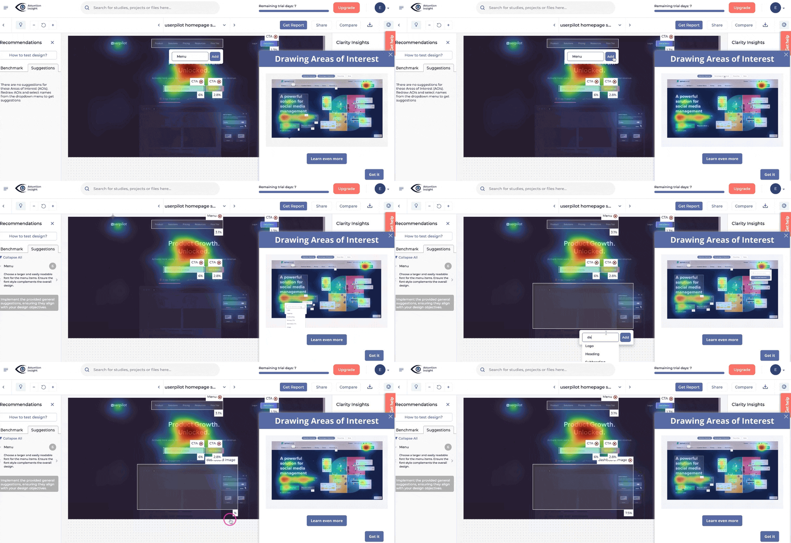
To activate the Areas of Interest feature, the team created a dedicated flow, which shows users how to tag them and explains the feature benefits.
Hotspots, pulsing UI patterns, are used to attract user attention to less conspicuous interface features. And there is a resource center where users can find all the guides and docs.

Attention Insight uses gamification in their onboarding too. Congratulatory slideouts appear to give users an extra boost when they create their first heatmap analysis and tag areas of interest.
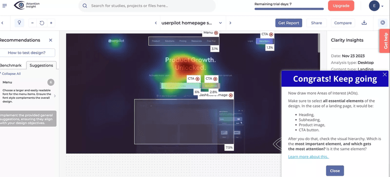
Artificial Insight’s onboarding is incredibly successful. The team increased their new user activation by 47% in the first 6 months.
Key takeaways from Attention Insight’s onboarding teardown
Attention Insight skillfully combines two powerful onboarding tools to drive activation: checklists and interactive walkthroughs. The latter are linked to checklist tasks and provide step-by-step guidance.
5. Sked Social
Sked Social is a social media management platform. And yes, you got it right, they use Userpilot to cover their onboarding needs as well.
Here’s what it looks like:
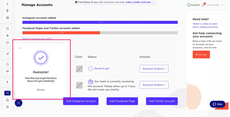
When the user first joins, a welcome modal appears. That’s when they can choose between a phone call or automated onboarding.
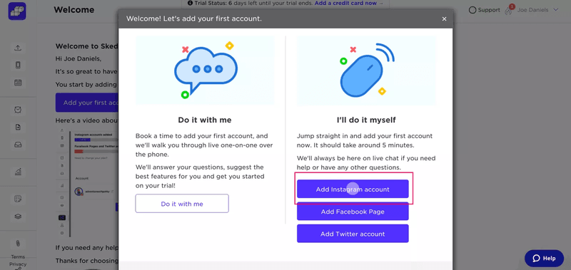
When they choose the self-serve onboarding, an onboarding checklist pops out. It consists of 4 tasks and guides users through the set-up and onboarding process.
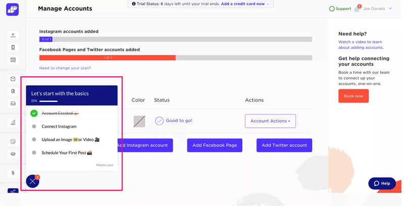
Each task in the checklist is linked with other in-app patterns, like walkthroughs, for more detailed guidance.
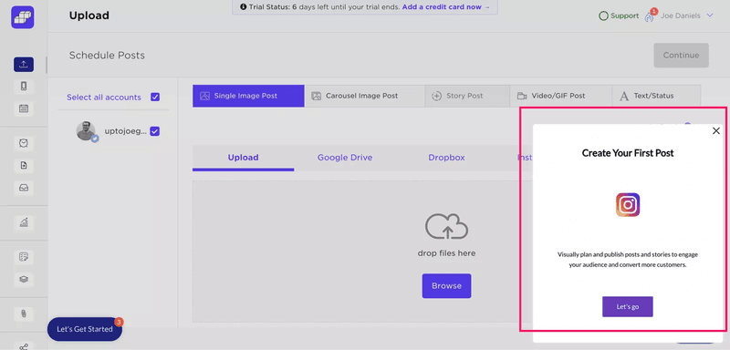
Just like Attention Insight, Sked Social uses gamification to further motivate users. When they complete the checklist, a congratulatory modal encourages them to schedule posts.
Key takeaways from Sked Social’s onboarding teardown
Sked Social realizes that primary onboarding cannot be overwhelming. Their checklist includes only 4 items and focuses only on main settings and features. To reduce time to value.
6. Rocketbots
Rocketbots is a messaging CRM. It allows users to integrate various communication channels, like Slack or WhatsApp, to gather all customer communication data in one place.
Onboarding experiences created in Userpilot helped the company double its activation rate from 15% to 30% and increase its conversion rate from 3% to 5%. This translated into a 300% boost in MRR.
What was the magic trick that enabled such success?
There was no magic there, just a checklist.
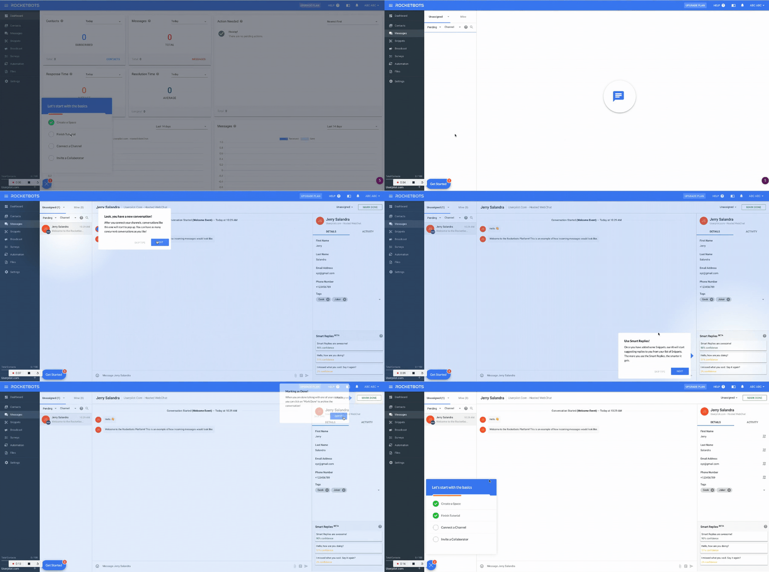
The checklist consists of 4 tasks needed to reach the Aha moment.
Once the user clicks on a task, tooltips help them complete it – so they never walk alone.
Key takeaways from Rocketbots onboarding teardown
The checklist is the foundation of Rocketbots’ successful onboarding process. Just like in the other products, it is short (4 tasks), and clicking on each item triggers in-app messages with more detailed assistance.
7. Grammarly
Grammarly is a writing assistant best known for its proofreading capabilities. It offers a web app and browser extensions and works on mobile devices as well.
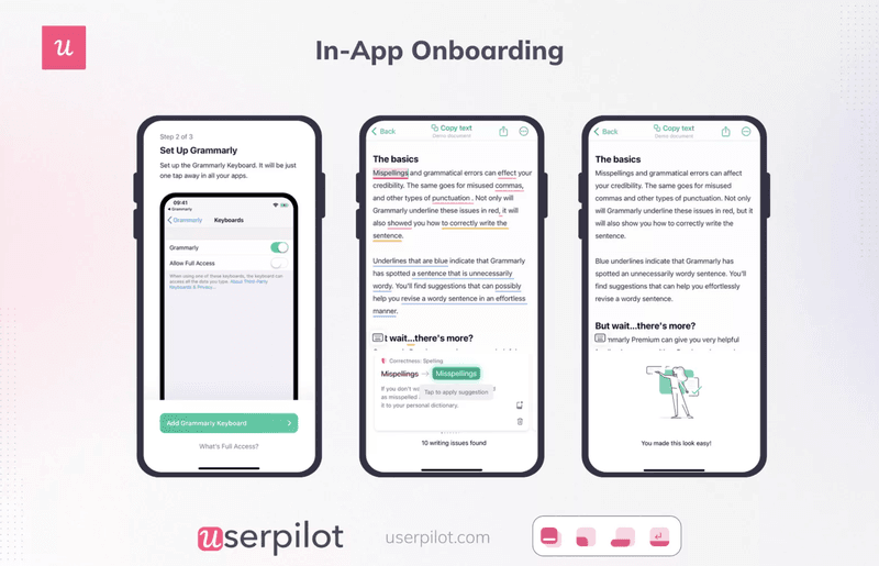
To onboard mobile users, Grammarly uses a 2-step process.
First, it shows them how to enable Grammarly in the keyboard settings.
Next, it uses demo content to illustrate how its correction code works. By correcting the various types of mistakes, users learn how to use the app in practice.
Key takeaways from Grammarly’s onboarding teardown
- Keep onboarding for mobile apps short and use simple patterns. Elaborate onboarding might not work because of short attention span and small screen size.
- Use demo content to encourage active user participation instead of telling them how to use the app.
Best practices for creating great onboarding experiences
Let’s wrap up with a few best practices for designing excellent onboarding and mobile onboarding experiences inspired by the teardowns.
Keep the signup flow short and straightforward
At the signup stage, your goal is to get the users inside the product as quickly as possible. The longer it takes, the more likely they are to disappear into thin air before you have a chance to wow them with your cutting-edge functionality and delightful user experience.
So? Keep the signup flow as simple as possible:
- Ask only for essential information: Email + full name is all you need (3-field forms convert better than 2-field ones).
- Enable single sign-on (SSO) so that users can sign up using their existing email or social media accounts.
- If possible, delay the email verification request until the user starts using the product.
Personalize the onboarding process for different segments
Personalized onboarding leads users to value along the most direct route, so the process takes less time. This increases the odds of successful activation and adoption.
How do you find the most direct route?
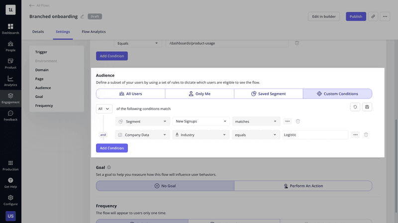
Use product analytics to analyze the paths of successful users with specific use cases and design onboarding flows to guide them along those happy paths.
During a user’s first session, trigger a welcome survey to segment them based on their use case and launch a relevant flow.
Encourage new users to complete the onboarding flow with a checklist
As you’ve seen above, checklists can do miracles when it comes to user activation.
They provide structure to the onboarding process and hinge on strong psychological principles to drive user action.
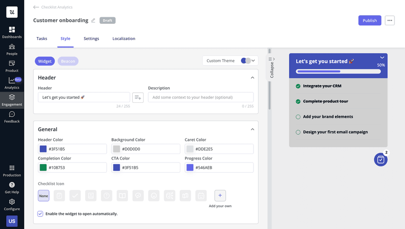
To make them even more compelling, add a progress bar so that users know how much they’ve achieved and how much is still left.
Another effective trick is adding a task they’ve already completed, like ‘Create an account’ to give them an instant sense of success before they even start. This is called ‘endowed success.’
Remove friction from the onboarding experience
Friction slows users down and in many cases – it causes drop-offs.
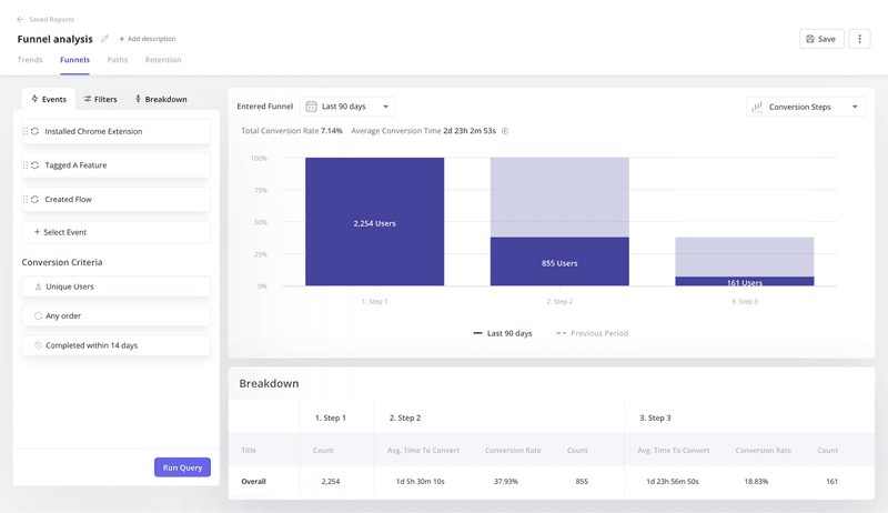
To free your onboarding process from excessive friction, analyze your flow performance with product analytics.
Specifically, conduct funnel analysis to identify the area where users experience friction. Dive deeper with path reports and session recording analysis to pinpoint the cause.
Once you identify the friction points, tweak the onboarding experience to smoothen it.
This could be as simple as removing unnecessary steps or refining your microcopy. If the solution isn’t obvious, run A/B or multivariate tests to try out the best-performing option.
Collect customer feedback to improve the onboarding process
Another way to identify areas for improvement is by asking users.
How?
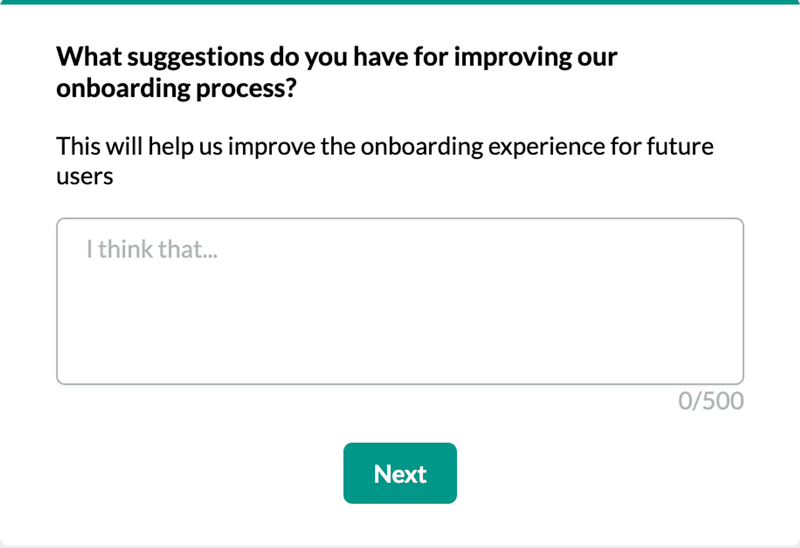
Use in-app surveys and mobile surveys to collect feedback during onboarding. You can trigger them at a specific time, for example, 2 days after a new user first logs in or, contextually, after they complete a stage in the process.
Keep your surveys brief and ask both closed-ended and open-ended questions to capture in-depth qualitative feedback.
Then use AI to analyze the responses for patterns and themes.
Conclusion
User onboarding teardowns can help you design better onboarding experiences. They don’t give a blueprint that you can copy but enable you to identify best practices and tactics that others have successfully adapted.
If you’d like to learn more about Userpilot onboarding features, book the demo!

