Product Funnel: What Is It and How to Create One?
How do you create a robust product funnel for your SaaS? This is the main question we explore in the article.
We also explain:
- How product funnel differs from marketing and sales funnels.
- Why it is important for your product management efforts.
- Its different stages.
- Key metrics to track at each stage.
It’s quite a lot of ground to cover, so without further ado, let’s get right into it!
Summary of a product funnel
- The product funnel is a framework outlining the stages of the customer journey, starting from its discovery and ideally leading to customer loyalty and advocacy.
- Product funnel is a wider concept, focusing on the whole customer journey, while marketing and sales funnels concentrate on its early stages. In practice, all 3 often overlap.
- A well-designed product funnel enables teams to evaluate and optimize their marketing strategy for more targeted and personalized customer engagement.
- It also helps organizations improve conversion rates and create a positive customer experience leading to higher satisfaction and loyalty.
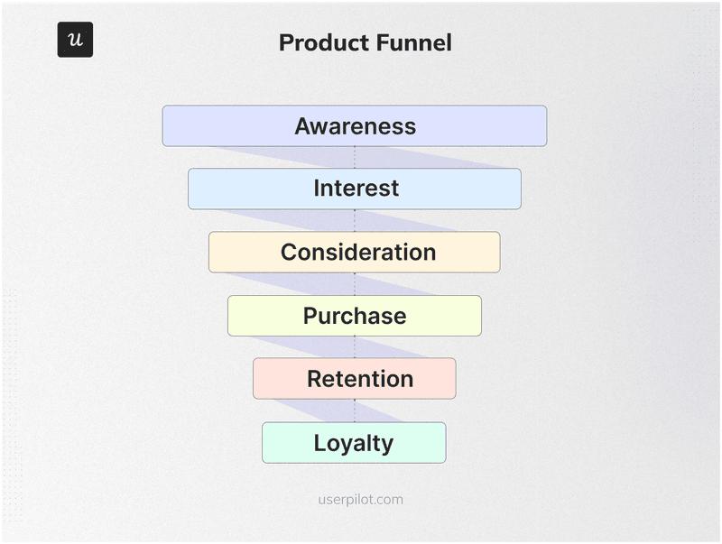
- The typical stages in a product funnel are Awareness, Interest, Consideration, Purchase, Retention, and Loyalty.
- There are multiple product and marketing metrics to track at each stage of the funnel. For example, at the Retention stage, you could track the churn rate and CSAT.
- Building a funnel starts with customer research to identify their needs and pain points, using tools like product analytics, surveys, and interviews. This helps create user personas.
- Next, use the research insights to map out the customer journey for each persona, focusing on their actions at different touchpoints, challenges, and conversion events.
- For best results, use multiple acquisition channels, like SEO, PPC adverts, or WOM.
- When creating marketing content, focus on the middle and bottom-of-the-funnel topics as they drive the most conversions.
- To let users experience the product value, consider a freemium plan or free trial, and create onboarding flows to guide them to activation.
- When users adopt the core features, trigger secondary onboarding experiences to introduce more complex functionality.
- To find and remove friction points from the customer journey, conduct funnel analysis.
- Regularly gather customer feedback, for example, via in-app surveys, to enhance their experience and retain them.
- To turn users into loyal customers and product advocates, consider loyalty programs and referral schemes.
- Want to see how Userspilot can help you optimize your product funnel? Book the demo!
What is a product funnel?
A product funnel outlines the journey that a customer goes through, from the moment they find out about the product to becoming a paying customer and a loyal product advocate.
Its purpose is to help teams understand user behavior at different stages of the journey and improve the process of converting prospects into customers and maximizing their lifetime value.
Why the term funnel?
Because fewer and fewer users reach the next stages of the journey and if you visualize that in a chart, it gets narrowed towards the bottom, just like a funnel.
Product funnel vs. marketing funnel vs. sales funnel
Product funnels, marketing funnels, and sales funnels are very closely linked. What distinguishes them is their focus.
The marketing funnel stages focus on customer acquisition. That’s when the user learns about the product, explores its features, compares it to competing products, and experiences its value.
Users who get through the marketing funnel are called Marketing Qualified Leads (MQLs), and in product-led companies – Product-Qualified Leads (PQLs).
MQLs and PQLs are then passed to the sales team, and that’s technically when the sales funnel (aka purchase funnel) starts. Its purpose is to further score leads and nurture the Sales Qualified Leads (SQLs), for example, through phone calls, in-person meetings, or product demos, to close the deals.
The product funnel encompasses the marketing and sales funnel and goes beyond it. It focuses on customer retention, loyalty, and account expansion.
That’s the theory.
In practice, the funnels overlap a lot. For example, account expansion could be the domain of both marketing and sales, with the two teams collaborating closely to achieve the product and business goals.
Why are product funnels important?
There are a few good reasons why SaaS organizations love product funnels.
Let’s have a look at a few of them!
Optimize marketing campaigns and efforts to acquire customers
Product funnel allows you to optimize marketing efforts and improve customer acquisition.
For starters, it helps you identify the most successful customer acquisition channels and strategies for different prospect segments. For instance, some users may respond better to paid ads while others – to social media or content marketing.
Thanks to that, you can allocate your resources adequately and reduce customer acquisition costs.
More importantly, the insights enable better targeting and personalization of the marketing tactics based on the customer journey stage.
A good example is driving customer expansion with upsells and cross-sells only when the user has adopted the product and is ready to upgrade.
Improve conversion rates across key customer journey stages
One of the main benefits of the product funnel is that it enables teams to boost conversion rates at different stages of the customer journey.
By knowing where users experience roadblocks, you can optimize the user flows and enable them to smoothly progress to the next stage.
In practice, this means more customers signing up for free trials, booking demos, experiencing the Aha! moment, adopting the product, converting to paid accounts, and promoting the product via WOM or referrals.
Increase customer satisfaction and customer loyalty
There’s another benefit of knowing where users experience friction:
By helping users achieve their goals more easily in less time, you increase their satisfaction and this often leads to higher customer loyalty and retention.
Think about it:
If the product satisfies their needs and offers a delightful user experience, they have no reason to leave, especially as switching to a different product is expensive and labor-intensive.
What are the different stages of the product funnel?
What exactly your product funnel looks like depends on your unique product characteristics. However, we can generally distinguish 6 main stages in the process: Awareness, Interest, Consideration, Purchase, Retention, and Loyalty.
Awareness stage
During this marketing funnel stage, the potential customer finds out about the product.
This could be from blog articles, social media posts, paid ads, or a recommendation from a colleague.
At this stage, the goal is to capture the interest of the target audience and encourage them to learn more about the product.
Interest stage
Once aware, the customer may show more interest in the product.
This could be by subscribing to the company’s newsletter (like our Product Rantz), following the brand on social media, or attending its webinars.
For the company, this is an opportunity to provide valuable information, showcase product benefits, and differentiate it from competitors.
Consideration stage
At this stage of the product funnel, prospects start considering the product as a solution to their problem.
That’s when they sign up for the free trial, request the demo, read case studies, look for reviews and testimonials, or look for detailed comparisons with similar products.
This is the key stage in the conversion funnel, where you can win or lose users, so make sure to provide them with adequate support and top-notch customer service to ensure a positive customer experience.
Purchase stage
The customer finally decides to buy the product! Congratulations!
It’s your job to make the transaction as smooth as possible and address any last-minute concerns. You want your customers to feel excited and convinced they’ve made the right choice, not give them an emotional hangover.
Retention stage
For SaaS organizations, selling the product is just the start.
Once they swipe the credit card, the focus shifts to keeping the customer satisfied and engaged so that they remain a subscriber.
This involves providing quality customer support, collecting and acting on user feedback, updating the product, and releasing new features to add value and meet the evolving needs of the customer.
It is also the time to start driving the account expansion through upsells and cross-sells.
Loyalty stage
At the loyalty stage of the product funnel, the relationship between the customers and the company deepens.
As you’re consistently delivering value and satisfying their needs, customer satisfaction grows to the point where they have no reservations about recommending the product to their friends and colleagues.
So while it may be the last stage of the funnel, it marks the beginning of a new cycle as the referrals and WOM help you acquire new customers.
Important metrics to track at key product funnel stages
As each of the stages in the product funnel has different objectives, there are different metrics to track at each of them. Let’s have a look at a few examples, starting with marketing funnel metrics.
- Awareness stage
– Website traffic – the total number of visitors to your site from different sources (organic, referral, paid ads, social media).
– Social media engagement – user interactions (likes, shares, comments) on your social media platforms. - Interest stage
– Content engagement – how prospects engage with your content, including page views, time on page, and bounce rate.
– Newsletter open rates – an indication of how effective your email marketing campaigns are in capturing and retaining interest. - Consideration stage
– Free trial sign-ups or demo bookings – the demand for more in-depth information and the desire to try out the product are direct indicators of serious interest in your product.
– Product Qualified Leads (PQLs) – the number of users who have experienced the product value enough to consider purchasing the product. - Purchase stage
– Conversion rate – the percentage of leads that turn into paying customers, critical for understanding the effectiveness of your sales process.
– Customer Acquisition Cost (CAC) – the total cost of acquiring a new customer, essential for evaluating the efficiency of your marketing-sales funnel. - Retention stage
– Churn rate – the rate at which customers cancel their subscriptions, vital for understanding customer satisfaction and long-term value.
– CSAT – a customer satisfaction score, indicating how good the product is at addressing customer needs and delivering a positive customer experience. - Loyalty stage
– Referrals – the total number of times when customers refer new users.
– Net Promoter Score (NPS) – a metric indicating how likely users are to recommend the product to others, a valid indication of user trust.
How to create a product funnel?
Funnel definitions? Tick. Benefits? Tick. Funnel stages? Tick. Metrics? Tick.
Looks like you’re ready to build the product funnel for your SaaS!
1. Research and create different user personas
The process starts with customer research. After all, you need to know who you’re building the funnel for!
First, reach out to your existing customers and gather the necessary data through in-app surveys, interviews, focus groups, usability testing sessions, and product analytics.
If you need more data, tools like Hotjar give you access to pools of potential research subjects.
What information should you look for?
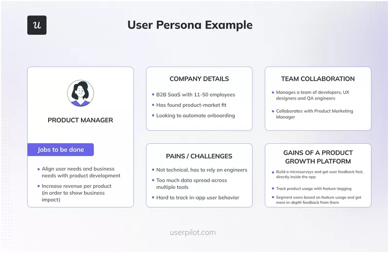
Focus on customer JTBDs, needs, wants, pain points, and how the product benefits them. Also, gather info about their role in the company, the organizational background, and the teams they collaborate with.
The output of this step should be user personas representing typical users of your product.
2. Map out the stages of the customer journey
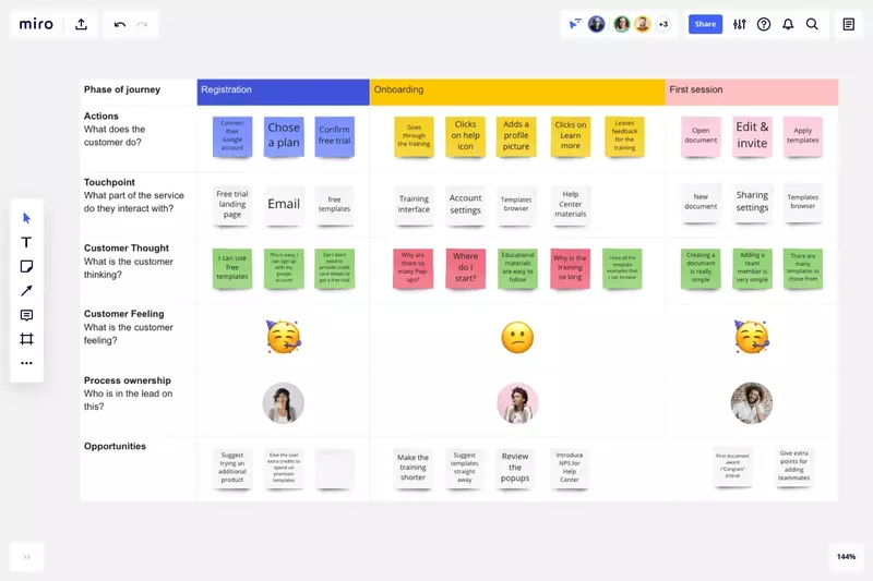
Each user persona may engage with the product differently to achieve their goals, so map out customer journeys for all of them.
In the map, include information about:
- The key stages of the funnel.
- Main touchpoints.
- User actions at each touchpoint and associated emotions.
- Conversions events, indicating progressions from one stage to another.
Need help with the visualization of the journey?
Check out Miro or Canva templates.
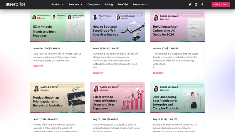
3. Acquire potential customers through multiple channels
As mentioned, various customer acquisitions may be successful for different prospect segments.
That’s why make sure your acquisition strategy leverages multiple channels.
These include:
- Content marketing and SEO.
- Webinars.
- PPC and social media ads.
- Social media marketing.
- Referrals.
- Email marketing.
- Affiliate marketing.
4. Develop different types of content to generate leads
Ever heard of product-led content marketing?
The idea is to deliver value to the customer by showing them how to solve their problems using your product.
In this way, you kill two birds with one stone: deliver value to prospective and existing customers, and sell your product.
If you want to give it a bash, you will need quality middle-of-the-funnel (MOFU) and bottom-of-the-funnel (BOFU) content, as that’s what drives most conversions.
MOFU content focuses more on the problem and a solution and only plugs the product in as a side. An example blog MOFU post title could be Maximizing Your Social Media ROI: Strategies That Work.
BOFU content is all about the product. Examples of such posts could be Hootsuite vs. Buffer or 10 Buffer Alternatives.
5. Offer a free trial or a freemium plan to showcase product value
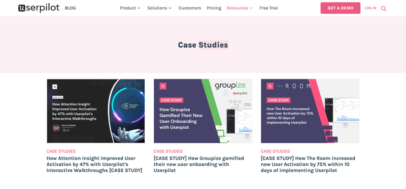
Product-led growth relies on customers experiencing the product value to acquire paid customers.
There are two main ways to achieve this: freemium or free trials.
In freemium, you give users access to limited product functionality or usage caps. If they want to use all the features without the limits, they have to upgrade.
In free trials, the users have access to all the features but for a limited time only. This gives them a good idea of what the product is worth but can’t use it forever unless they upgrade.
6. Onboard customers to guide them toward activation
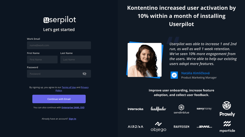
The problem with freemium and free trials is that users may not necessarily be able to discover all the features and experience the product value on their own.
The solution?
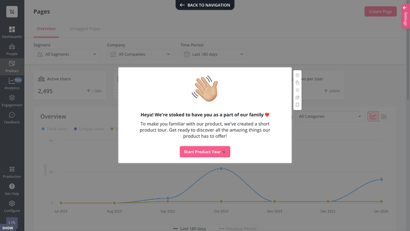
This could be in the form of a welcome screen or welcome survey, followed by a checklist or interactive walkthrough, and backed up with contextual in-app messages guiding users to engage with relevant features.
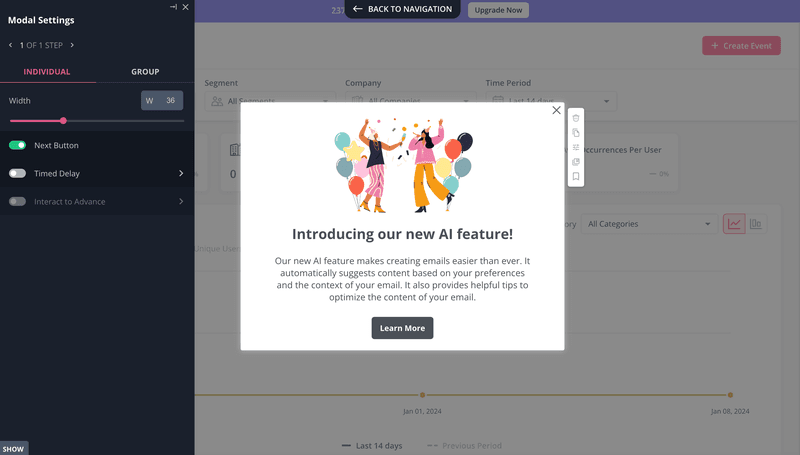
7. Announce additional features to existing customers
Once you help users adopt the main functionality, they’re ready for the more advanced features that allow them to realize the full potential of the product.
This is called secondary onboarding, and it leverages the same tools and techniques as primary onboarding.
For instance, you could trigger a modal to bring the feature to the users’ attention and follow up with a walkthrough, teaching them how to use it.
How do you know they’re ready for the more complete features?
By tracking their in-app behavior with product analytics.
8. Analyze the conversion funnel to remove friction points
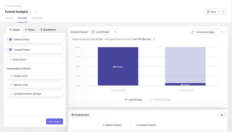
Product analytics also help you optimize the funnel.
Funnel analysis is particularly useful for identifying friction points in the customer journey that lead to customer churn.
How so?
In a nutshell, it’s a visualization of how many users progress from one stage to another.
Funnel reports also offer information about retention and drop-off rates and time to convert. The latter is important because friction manifests itself not only in churn but also in delays.
What do you do with the insights?
Sometimes the solutions are obvious. If the landing page has no CTA button, users can’t book their demos. Most of the time, however, finding the friction cause requires further analysis, using techniques like session recording analysis.
9. Retain customers by collecting and implementing their feedback
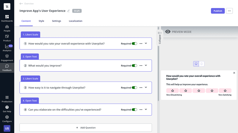
Another way to find out what causes friction, or customer dissatisfaction in general, is by collecting customer feedback.
The easiest way to do it is via in-app surveys.
In Userpilot, you just pick a template from the library, customize it in the visual editor, tweak the questions, and set which user segments to target and how to trigger the survey – either at a specific day/time or contextually, when a user completes an event.
What about inactive or churned users?
Try to reach them with an email survey or invite them to an interview.
10. Reward customers to turn them into brand advocates
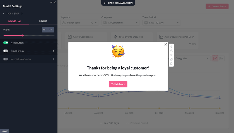
If your product delivers value, satisfies user needs, and offers an outstanding experience, it will drive loyalty and word-of-mouth recommendations organically.
However, there’s no harm in accelerating the process by offering users a bit of an incentive. A discount, extra credits, or a free upgrade can go a long way in promoting customer loyalty and advocacy.
For example, experiment with loyalty programs or referral programs that reward the most loyal customers or product champions.
Conclusion
Product funnel helps organizations understand how customers move across different touchpoints in their journeys. Such insights allow them to improve customer experience and enable customers to realize their objectives more easily and in less time.
For companies, this means more loyal paying customers with higher lifetime value and lower acquisition and support costs.
To see how Userpilot can help you optimize your product funnel, book the demo!

