When customers run into trouble, they can just contact customer support. When that option exists, what’s the need for going over these help center examples?
Because customers don’t want to contact support anymore. In fact, 67% of customers prefer self-service resources over reaching out to support. So to continue meeting customer expectations, you may need to introduce independent troubleshooting options like help centers.
That’s where these help center examples come in. They’ll guide you to create effective and user-friendly help centers that actually assist customers.
What makes a good help center?
All the best help centers share some key characteristics that make them “good”, which include:
- Easily identifiable: Simple to find on the product’s website or in-app, using commonly recognized design elements.
- Structured logically: A good resource center is organized with clear categories and an efficient search bar function, making it easy for users to quickly find what they need.
- Designed with accessibility in mind: Easy-to-follow instructions for all, following accessibility standards like readable fonts and color contrasts.
- Includes a variety of content formats: Offers a mix of articles, videos, step-by-step guides, and FAQs to cater to different preferences and learning styles.
20 Great help center examples from successful companies
To help you find some inspiration for your own help center design, let’s have a look at some companies that nailed it.
21. Etsy help center examples
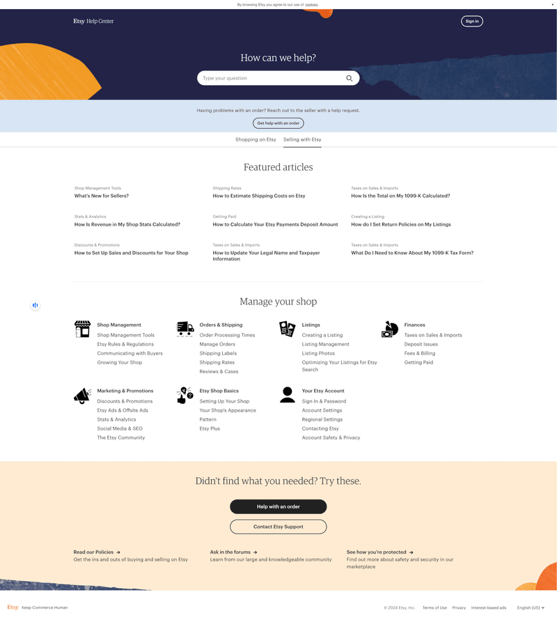
The last of the help center examples is Etsy, the famous online two-sided marketplace. It has a simple help center page layout, starting with a search bar. Other elements include featured articles, knowledge base articles, a contact support option, and assistance via Etsy’s forums.
Why it works:
- Separate categories for different user personas, catering to both shoppers and sellers by providing quick switching between resources for both.
- Well-organized design, presenting information in a digestible manner and using colors to clearly differentiate sections.
- Large community groups for knowledge sharing and help.
2. Slack’s help center page example
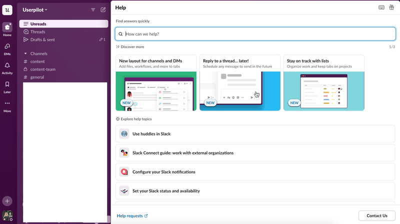
Slack is a popular messaging platform designed for team communication. Next to your Slack profile icon is a question mark icon that launches Slack’s in-app help center.
At first glance, its help center page is divided into 2 main sections using different visual cues, i.e. larger and smaller rectangles:
- The top part introduces users to new features and capabilities, linking to relevant articles.
- The lower part suggests more resources for sort of a secondary onboarding with Slack.
But beyond these sections, there are more useful elements too. These include a search function, a “Contact us” button, and the help requests launcher.
Upon launching the help center, you’re greeted by a search bar for quickly finding topics. A “What’s new in Slack” banner quickly introduces the latest Slack features by release date. You also have suggestions for the most asked questions and an arrangement of help topics by theme.
Why it works:
- Searchability, with the search bar positioned front and center.
- Easy discoverability by highlighting the latest releases.
- Straightforward UI, using plenty of white space to keep information easily digestible.
3. Miro’s help center design example
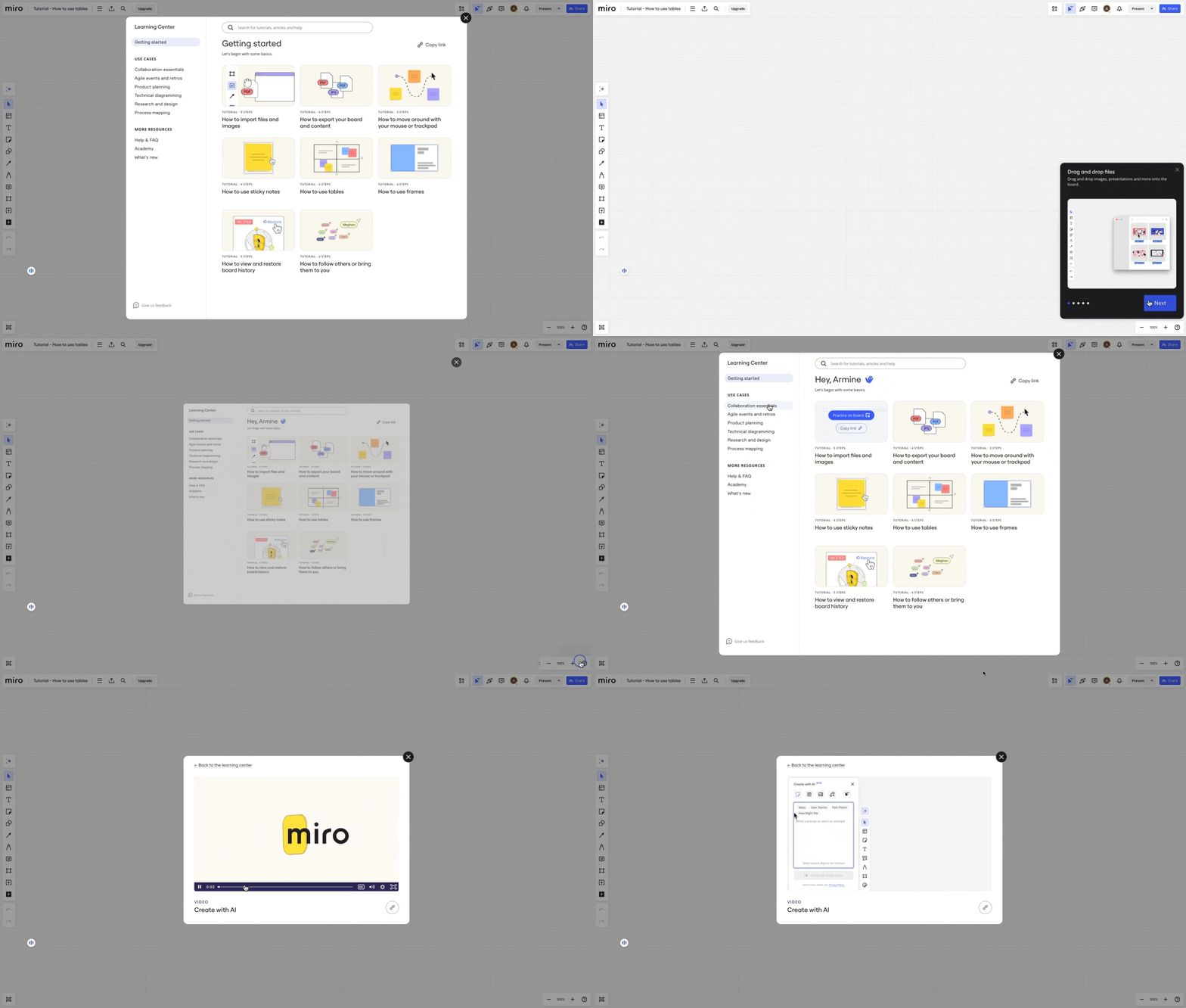
Miro, a visual collaboration software, allows teams to brainstorm together. When you first click the help icon in Miro, the pop-up support center is categorized into 3 main sections:
- Getting started, where you see the common workflows within the app. Clicking on these triggers an interactive walkthrough for each functionality.
- Popular use cases.
- More helpful resources (FAQs, Miro Academy, and latest releases).
Why it works:
- Copyable links, an impressive feature where users can copy the links to specific guides/walkthroughs for later reference.
- Video tutorials allow users to explore relevant use cases by watching videos directly in-app.
- Pops of color: Miro, as a tool used for designing, needs to be visually appealing to engage users. The hints of color incorporated in the center design accomplish that effectively.
4. Groupize help center example
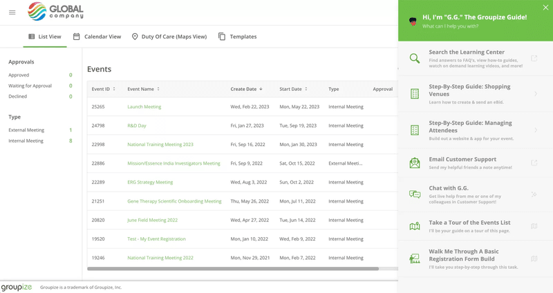
Groupize, a meeting and event technology platform, doesn’t divide its help center into categories or sections but rather lists specific resources. Here’s what that means:
- Specific support articles (e.g., a tour, guide, or walkthrough of a certain feature).
- Support contact resources via email and chat.
- Search bar.
Why it works:
- Numerous content formats, searching the learning center brings up FAQs, how-to guides, videos, etc.
- Quick access to common workflows, with page-relevant resources working well to streamline learning.
- Dynamic help resources, since users can trigger guided tours of each individual page once they’re on it.
- Gamification UX, using the gamified assistant “G.G.”, which makes seeking support more engaging and user-friendly.
It was this gamification that earned Groupize a nomination for the Skift Idea Awards 2022. You can continue exploring Groupize’s journey to optimizing its help center with this case study.
5. RecruitNow help center example
RecruitNow is a recruitment performance platform for staffing agencies.
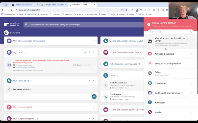
Its help center is divided into 6 categories, providing access to control settings, conversations, dashboards, and company and candidate lists. There’s also a search bar where users can look up and learn more about specific modules or features.
Why it works:
- Easy access to commonly used key features.
- Localized content that makes the product accessible to all users in foreign markets with different languages and cultures.
RecruitNow was able to provide ongoing support and onboarding, supplemented with localized content, reducing the need for face-to-face training. This case study highlights more tips on how RecruitNow’s refined help center enabled them to save 1,000+ customer training hours.
6. Attention Insight’s resource center example
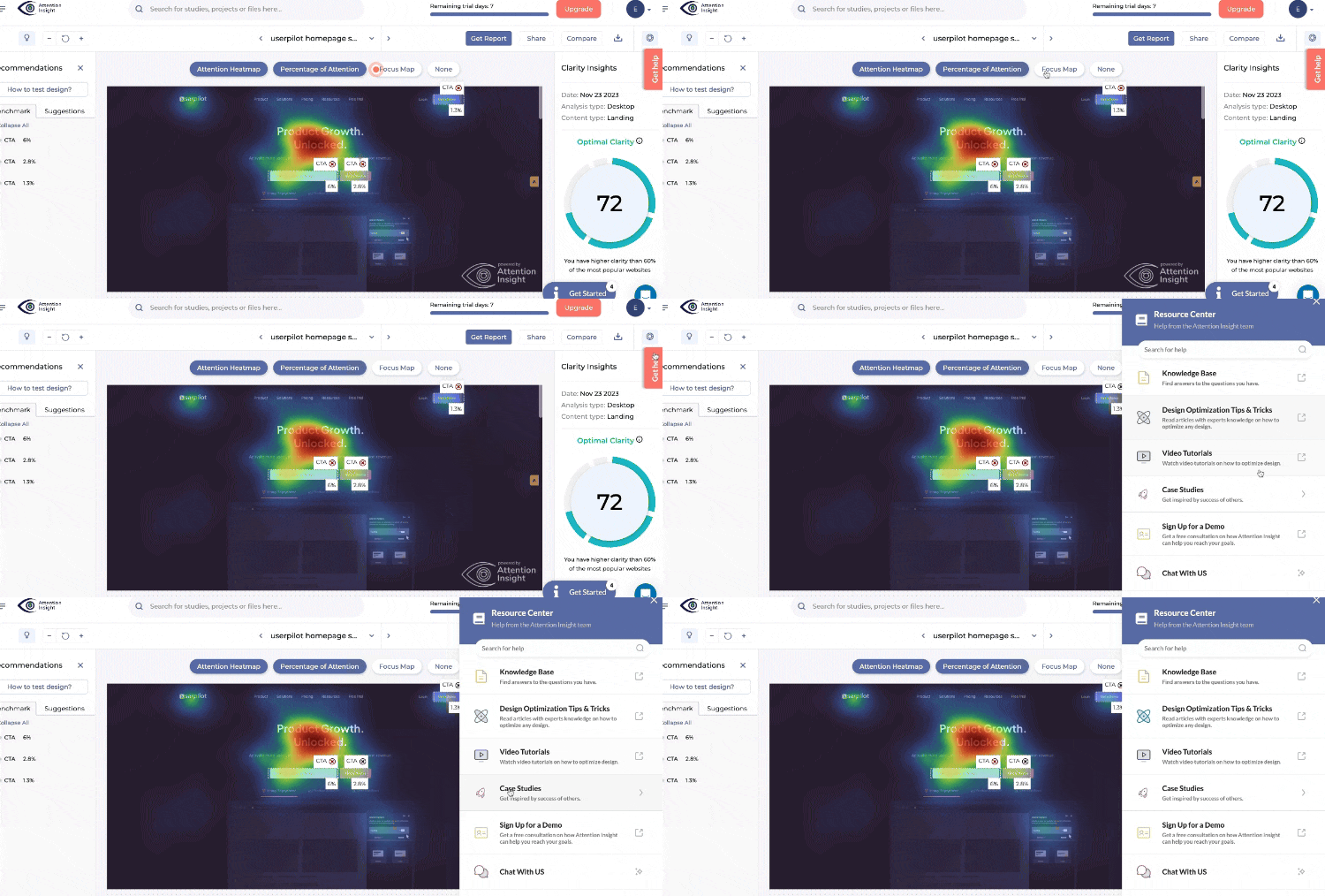
Attention Insight, an AI-powered design analytics software, divides its resource center into 6 categories, along with a search bar for accessible self-service. Here’s how the resources are grouped:
- Knowledge base.
- Design optimization tips & tricks.
- Video tutorials.
- Case studies.
- Sign up for a product demo.
- Chat with us.
Why it works:
- Several content formats, with videos, help center articles, and FAQs.
- User-friendly interface with intuitively grouped resources and recognizable icons.
- Quick access to support with in-app live chat.
Attention Insight built this resource center to reduce support requests while increasing user activation. Explore this case study to learn how they accomplished the feat, driving the activation rate by 47%!
What to improve:
Certain elements, like video tutorials or signing up for a demo, open external sites/pages instead of in-app. This disrupts the user’s workflow and could increase user frustration.
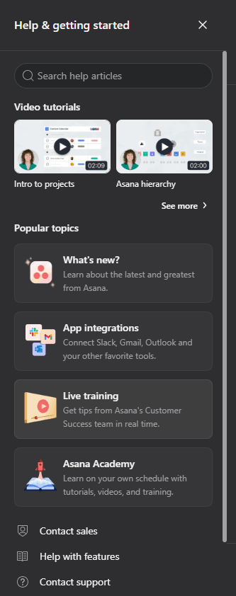
7. Asana’s help center example
Asana, a project management tool, breaks down its help center into 5 main sections. These include video tutorials, sales and support contact options
Popular topics (latest releases, app integrations, tips from customer support, and Asana Academy).
- Contact sales.
- Help with features.
- Contact support.
A truly comprehensive help center example, with clearly labeled categories, leaving no room for confusion.
Why it works:
- Minimal disruption, as the videos are playable in-app.
- Combination of formats, offering videos, use cases, and help articles.
- Live personalized training allows users to receive direct training from a support agent for their specific challenges.
- Granular content showcasing videos for specific workflows, facilitating faster learning.
8. Loom’s help center example
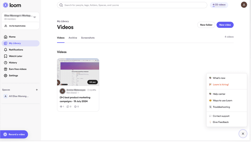
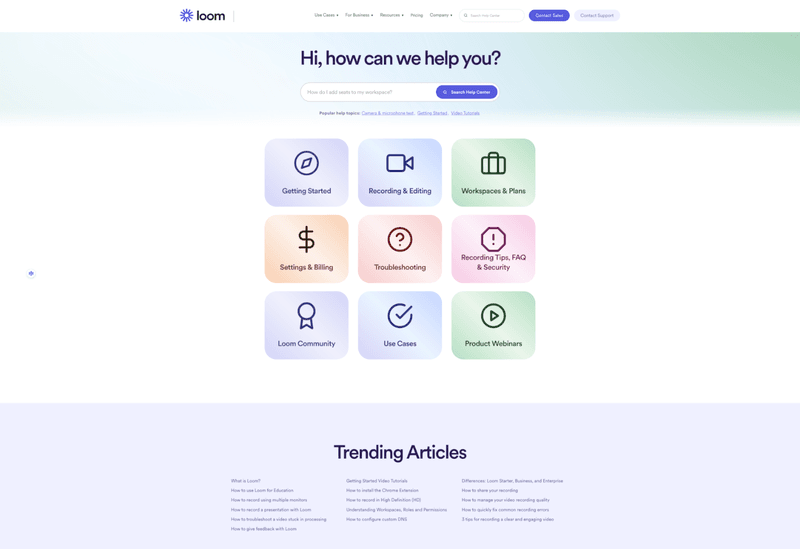
Loom, the video communication software for work, hosts its help center page on its main website and only provides a quick link to it within the app. This creates a minimal in-app support pop-up, that includes 7 broad sections.
The most important ones include a What’s new section, a link to the help center, ways to use Loom, troubleshooting, contact support, and a feedback option.
Why it works:
- User-friendly interface with minimal clutter, possible by only linking to the help center page instead of adding all resources in-app.
- Customer feedback widget, gathering insights for future product improvements.
9. FullStory’s help center example
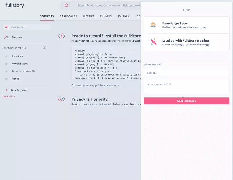
FullStory is a B2B customer experience software designed to help businesses track and monitor customer activity. Its help center is perhaps the simplest one you’ll see, with only 2 main categories:
- Knowledge base.
- FullStory on-demand training videos.
Both of these redirect to pages on the website. However, similar to Loom’s minimalistic approach, FullStory’s design is a conscious choice between simplicity vs. clutter.
Why it works:
- Multiple content formats, with videos, tutorials, help center articles, etc.
- Integration of email support directly in-app, allowing customers to contact support instantly.
What to improve:
Currently, FullStory only offers search functionality on its support page hosted on the website. For quicker access and an easier navigation UX, it could benefit from incorporating a search bar in-app.
10. HubSpot help center examples
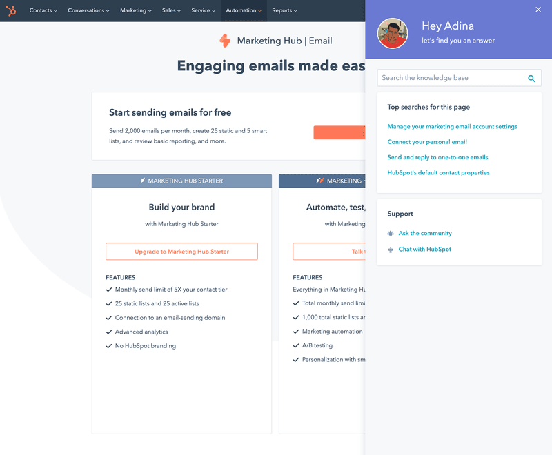
Help center examples are incomplete without mentioning the leading CRM software HubSpot. The in-app support center is kept simple, with a search bar and the following 2 main categories:
- Top searches for this page, with the suggestions customized to show resources relevant to the exact page the user is on.
- Support, which further includes links to community forums and live chat support.
Why it works:
- Autocomplete search bar, making it even easier by suggesting pages you might be looking for.
- Community groups where users can seek help from others like them.
- Personalized customer service with resource suggestions tailored to each page.
- Customer support in-app via chat for more complex problems.
11. Gleap help center example
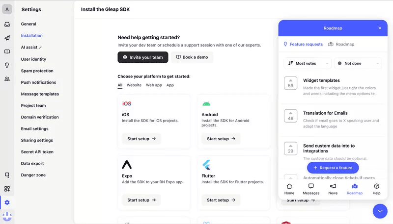
Gleap, a customer feedback tool for visual bug reporting, categorizes its resource center into 3 sections:
- Report an issue.
- Request a feature.
- Send us a message.
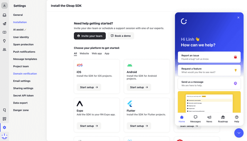
Besides these elements, you can see other icons at the bottom of Gleap’s center as well. These include product roadmap and news, messages with Gleap’s chatbot, and a help center with various features’ guides.
Why it works:
- Reduced decision fatigue by only adding clear, action-oriented categories, like “Report an issue,” to guide users to the right place quickly.
- Easy access to updates through the feature prioritization list that gets users excited about new features they want to see.
- AI-powered chatbot support provides immediate assistance in-app.
12. Jira’s help center example
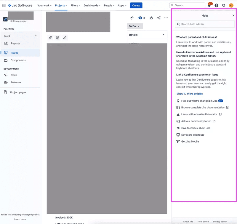
Given its complexity, the issue-tracking and project-management tool Jira’s help center provides an overwhelming amount of information. Apart from a search bar, other notable sections include featured articles, updates/changes in Jira, a community forum, and a link to Atlassian University.
Why it works:
- Minimized UI clutter; with an already complex UI, adding more content in-app would further complicate navigation. This is why opening links externally makes sense for Jira.
- Community help, which serves as crowdsourced help centers where users assist each other.
- Quick learning articles, with the top 20 most frequent issues customers have with Jira already linked to.
- Detailed technical documentation provides a comprehensive resource for both beginners and power users.
13. Monday help center example
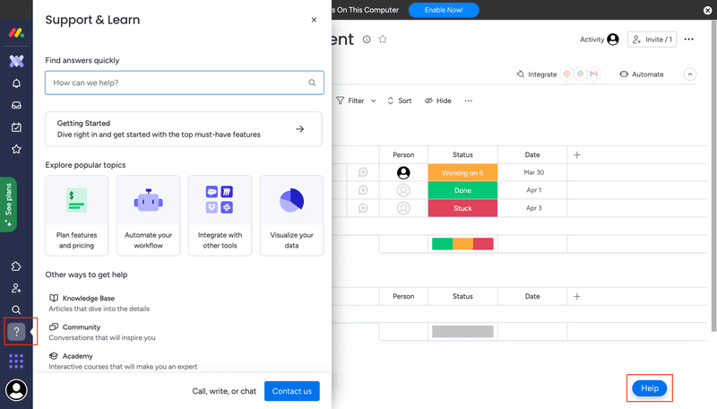
Monday, a powerful project management system, divides its help center into 4 broad sections. These include the search bar, Getting Started, featured articles, and additional ways to get help, like knowledge base, community, and academy.
Why it works:
- Conveniently accessible from both sides of the product dashboard, via the side menu bar and the floating button.
- Great UI design, with the icons placed in the middle, helping break all the text.
- Community forum where users can ask questions and solve problems together.
- Resources for all user types, since the “Getting started” links cater to new users while advanced content in the knowledge base and academy helps existing users.
14. Zapier help center example
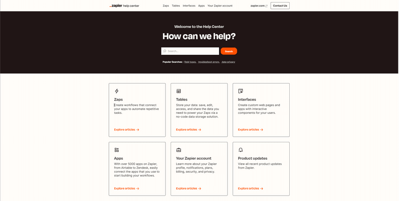
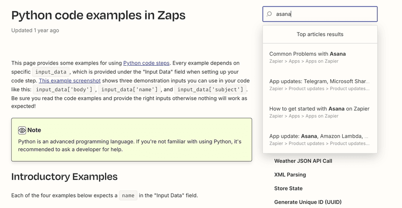
Zapier, a popular workflow automation platform, has one of those help centers that are hosted on the website instead of in-app. The support page includes 6 categories of help articles, along with a search bar for easy discoverability.
Why it works:
- Intuitive grouping, with the help center articles categorized by topics so they’re easier to find (e.g. Apps, Interfaces, Product updates, etc.).
- Autocomplete search bar on each page, so you can quickly find related articles.
- Search results are grouped by category, making filtering content easier.
15. Vimeo help center example
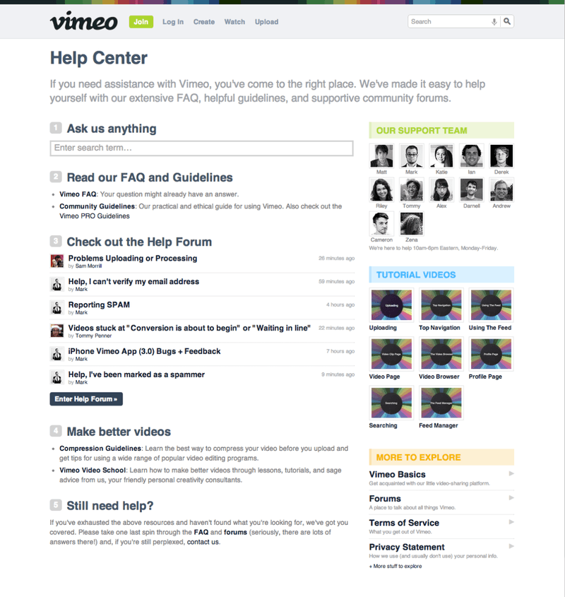
Vimeo, the video hosting platform, has a help center page that is flooding with information.
Apart from a search bar, the page might just have the most sections we’ve seen throughout all the help centers covered. The most important ones include FAQs and guidelines, the help forum, and tutorial videos.
Why it works:
- Successful branding, since Vimeo is able to reinforce its brand image as a video tool by adding several video tutorials created with its app.
- Builds a connection by adding the customer support team’s images, which works to humanize the product.
- Variety of content formats, including FAQs, guides, videos, and even community help.
What to improve:
Vimeo’s support page is extremely cluttered, with an outdated UI and little contrast differentiating the sections. Such hard-to-navigate help center examples cause fatigue and frustration as users struggle to find answers.
16. Freshdesk help center example
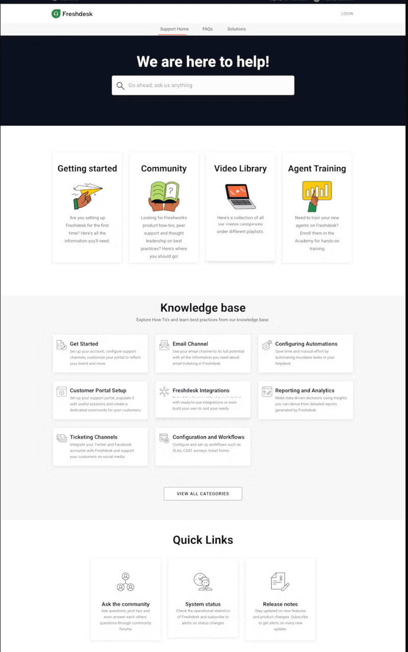
Freshdesk, a customer engagement solution, hosts its help center page on its website. The support page is divided into 4 broad sections:
- Search functionality.
- Library of “Getting Started” articles, videos, training academy, and user community.
- Knowledge base (with categories of articles and best practices).
- Quick links (to the community forum, system status, and release notes).
Why it works:
- Well-organized center design, with plenty of white space, no clutter, and well-defined sections.
- Smart categorization, with the knowledge base grouped by product features.
- System status updates, a unique feature to see if a feature is down for everyone before you start searching for a solution.
- Community hub to troubleshoot issues and get help from other users.
- Universal search of not just the support articles but the community conversations as well.
17. Figma help center example
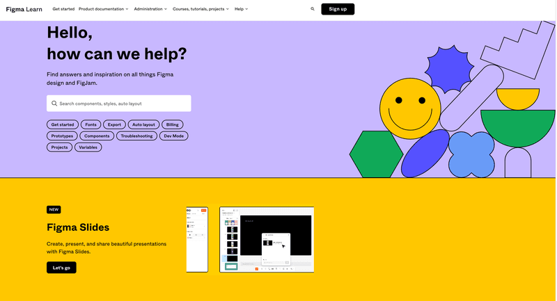
Figma is an interface design tool. So it comes as no surprise that it stands out as the best help center in terms of design – just a straightforward support page with minimal categories, yet effective as ever.
Why it works:
- Effective branding, incorporating eye-catching colors and images that reflect Figma’s design capabilities.
- Convenient search suggestions, with commonly searched keywords listed under the search bar for quicker access.
18. Dropbox help center example
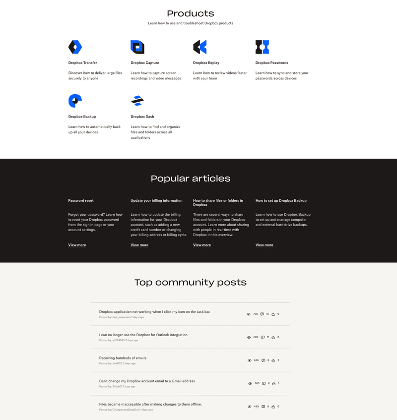
Dropbox, the famous file hosting service, also utilizes a minimalist help center design. The support page is divided into 3 sections, namely product guides, popular articles, and top community posts. Though simple, the help center provides all the necessary information.
Why it works:
- Simple categories, with help articles grouped by product types, like Replay, Transfer, Capture, etc.
- Active community of Dropbox enthusiasts with tips and solutions for any problem.
- Quick access to common problems like resetting passwords, changing billing information, etc.
19. Mural’s help center example
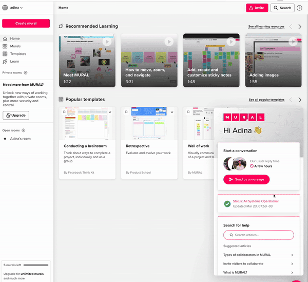
Mural is a visual work platform built for collaboration, similar to Miro. Its simple in-app help center includes the basics – customer support chat, a knowledge base with search functionality, suggested articles, and the system status.
Why it works:
- Real-time system status, so you’re well-informed about possible reasons for specific features not working.
- Direct chat feature offers additional support in case the knowledge base doesn’t suffice.
- Effective expectation setting by letting you know how long it will take the support team to reply.
What to improve:
Mural’s center design misses the mark. It fails to reinforce Mural’s brand image as a design tool for creating visually appealing art.
20. Mixpanel help center example
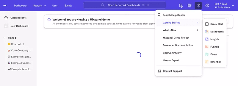
Mixpanel, a real-time analytics platform, hosts an in-app help center. The center offers a search bar along with several other resources, including:
- Getting Started, which includes further resources on specific features like dashboards, funnels, etc.
- What’s New section.
- Links to Mixpanel demo project, developer documentation, and the community forum.
- Contact customer support button.
Why it works:
- Centralized access to key resources, letting users access everything from Getting Started guides to developer docs and customer support in-app.
- Community help, offering peer support for effective problem-solving.
- Quick demo access, letting you discover features through a pre-built demo project, saving you time.
What to improve:
The help center’s navigation isn’t very user-friendly, since users won’t intuitively know to check “Getting Started” to unlock guides for relevant features.
Conclusion
Now that you know all the best practices for building good help centers, just one last bit of advice.
Even with these tips and examples, you won’t perfect your help center design overnight.
Instead, it’s a continuous process that requires you to focus on collecting feedback and continuously iterating in order to truly support users the way they need.
FAQ
Why do you need a help center?
A help center follows a self-service support model where customers can easily find answers to common questions without contacting support. This empowers customers to resolve issues independently, saving them time, which translates into higher customer satisfaction.
For your business, help centers can help reduce support ticket volume, ultimately saving you time and lowering support costs.
Help center vs. knowledge base
A knowledge base is typically a dedicated section focusing on detailed articles and guides. It can either be part of your in-app help center or a standalone section on your website.
In contrast, a help center is a broader support hub, always located in-app, offering multiple resource types like FAQs, live chat, and other troubleshooting tools.
How to design a help center?
Here are the steps for designing the best help center:
- Identify customer needs: Focus on common issues and questions.
- Choose the right platform: Pick software with appropriate content management features.
- Organize content: Group related topics under clear labels and categories.
- Create simple content: Use easy language, visuals, and various content formats.
- Add support options: Include contact forms or live chat.
- Test and update regularly.

