Pendo Analytics: In-Depth Review (+Better Alternative)


Pendo Analytics is a top player in the field of product analytics and user engagement, with an established user base and feature-rich offering. However, does the tool live up to its hype?
In this comprehensive review, I’ll dig into the details of Pendo Analytics. I’ll examine its functionalities, assess its strengths and weaknesses, and introduce an alternative that offers a more comprehensive solution with better value for money.
What is Pendo?
Pendo is a software experience management adoption platform that lets product teams monitor product usage, analyze user behavior, and publish in-app guides. The no-code solution focuses on increasing user engagement and driving feature adoption.
Additionally, Pendo lets you survey and segment customers, build product roadmaps, and see how many site visitors or MAUs your web app is getting. However, certain features like data explorer, product engagement score, resource center, product discovery and journey orchestration suites, or NPS surveys are only available on the highest-tier plans or as costly add-ons.
Pendo for product analytics: Summary
Pendo has powerful product analytics capabilities, with a rich selection of native features and several third-party integrations. The core Pendo Analytics products are accessible even in the Pendo Free plan.
Here’s a closer look at Pendo’s user behavior and product analytics functionalities:
- Native analytics: Pendo collects data on everything that happens in your app. You’ll be able to track the number of views, clicks, and interactions that specific in-app guides or product areas get. Once you install Pendo, you can collect data even retroactively. However, the data isn’t displayed in real time and only refreshes once an hour.
- Unlimited page and feature tagging: Pendo lets you tag pages and features without code, which simplifies event tracking. You can then monitor their performance and uncover trends.
- Paths: The paths analytics section of your Pendo account shows you which paths users take when coming from a specific page or which path they took to get to a particular page. You’ll also be able to sort this data by specific segments and date, or see the paths taken by individual visitor IDs.
- Retention: Pendo’s retention analytics dashboard lets you see cohort retention data from month to month. You’ll also be able to toggle between visitors and accounts, switch between weekly or monthly views, and measure retention for specific segments.
- Funnels: Pendo’s funnel analytics can tell you how many unique visitors have seen your funnels, how many attempts have been made to get through them, and the average time it takes to complete the funnel. You’ll also be able to see completion rates and sort by date or segments.
- Data explorer: Data explorer provides insights into user behavior by querying event, guide, or app data and visualizing trends. You can filter by metadata and event properties, compare segments and date ranges, or add formulas. Data Explorer is available on Pendo’s paid plans.
- Workflows and workflow journeys: You can analyze which users complete workflows set up with Pendo Orchestrate, a paid add-on.
- Web analytics: Web analytics shows where users come from and what they do next. It uses channel, referrer, and UTM data. Available on paid plans.
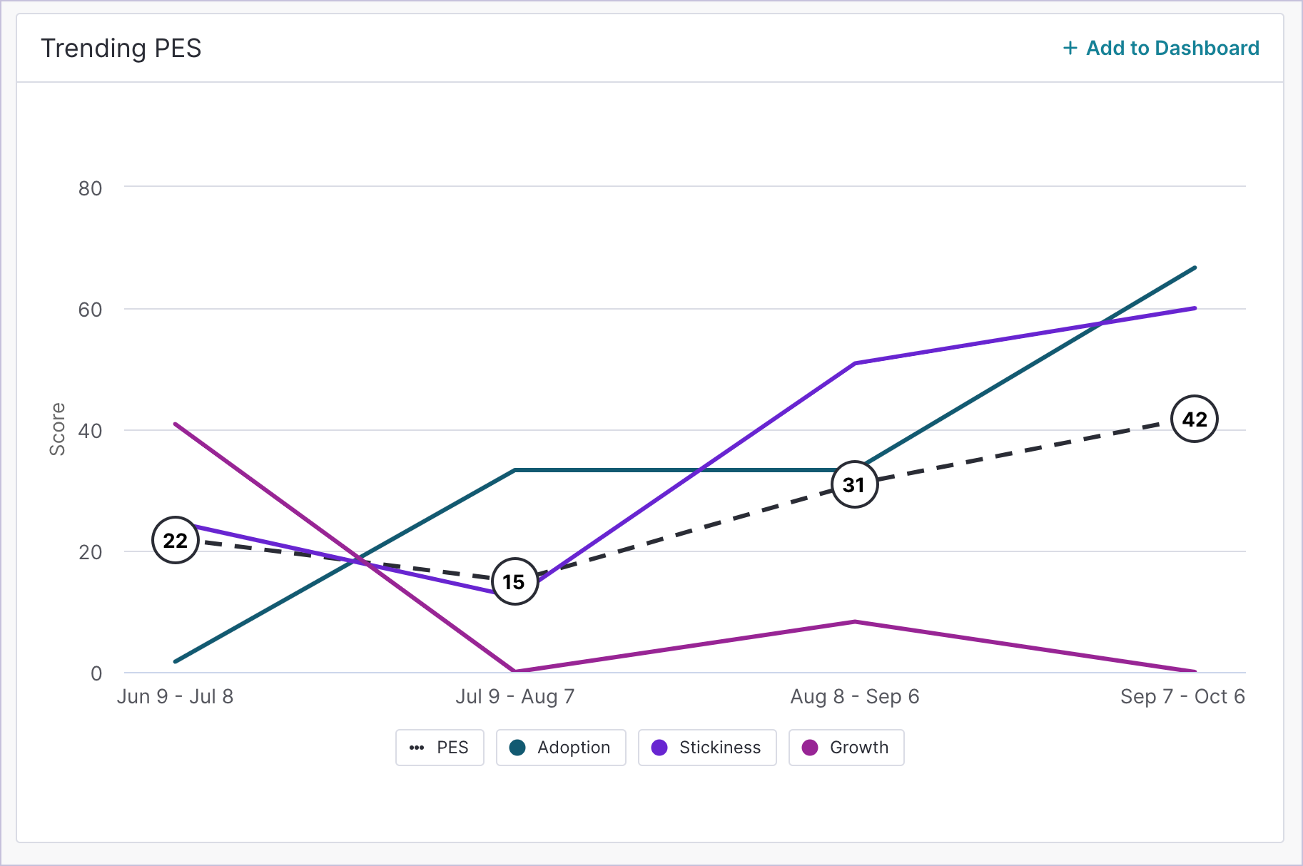
- Product Engagement Score (PES): The Product Engagement Score report allows you to assess your product’s overall performance and health based on behavioral metrics: Adoption, Stickiness, and Growth. Available on paid plans.
- Session replays: With Pendo’s session replay module, you can watch real-time user sessions.
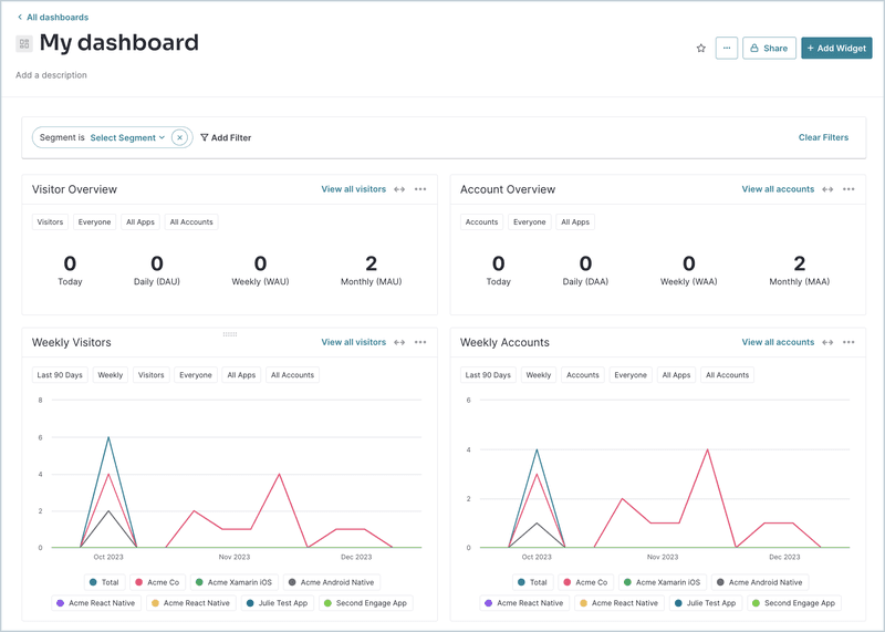
- Analytics widgets: Pendo’s home dashboard lets you choose which widgets you’d like to add or remove. You’ll be able to select from various analytics widgets that track product goals, feature adoption, guide views, time-on-app, and other core metrics.
- Third-party integrations: Pendo has integrations with tools like Salesforce, Intercom, Segment, Slack, and more. Linking your Pendo account with these third-party solutions will make syncing and sharing data seamless.
Now, let’s go into Pendo’s most crucial individual reports and dashboards in more detail.
Pendo’s user base reports
Pendo lets you get a granular view into your customers and analyze them on the visitor and account level. Let’s take a look at which views the platform offers.
- Visitor report: Visitor report lets you monitor data on your customers split into segments, including their metadata, product usage, and survey responses.
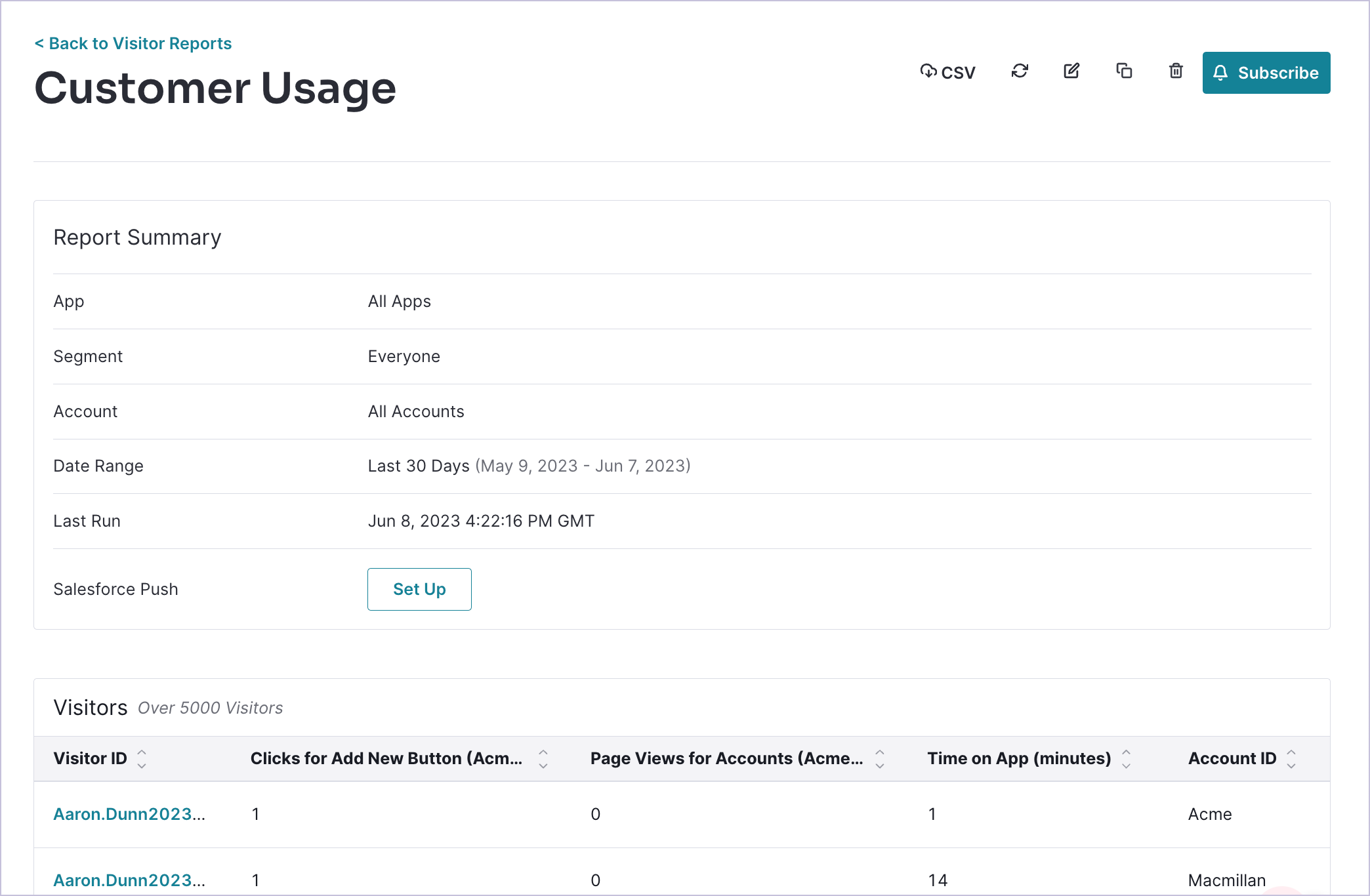
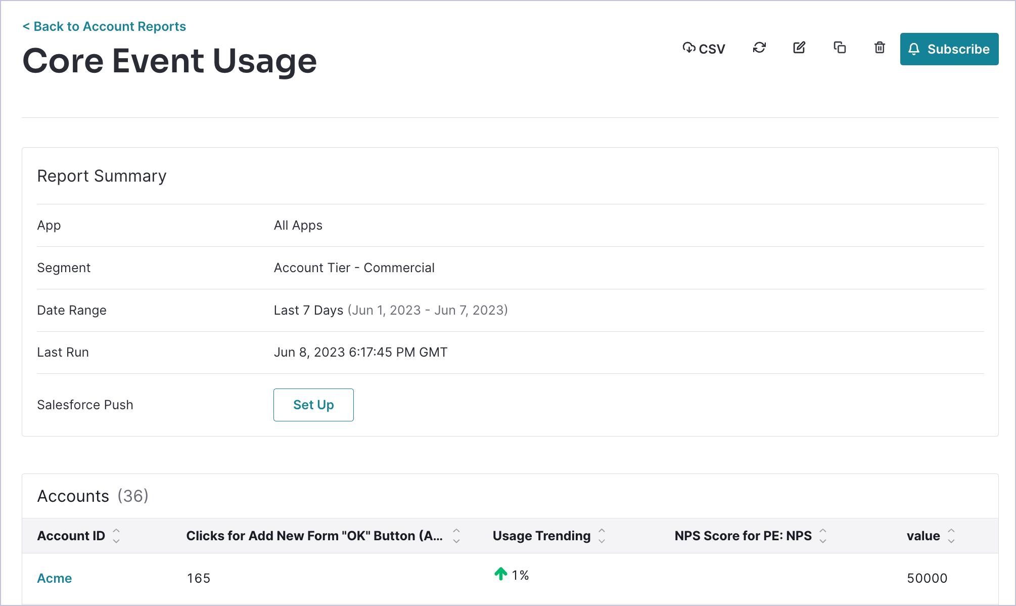
- Account report: Similarly, you can create a summary report on the company level to see how given accounts use your product.
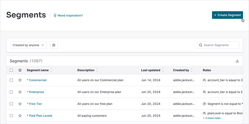
- Segments dashboard: The segments dashboard lets you view all segments and filter by the teammates who created the segment. You’ll also be able to see when the segment was last updated, which user created it, and the rules associated with it.
Pendo user behavior reports
User behavior reports let you uncover how users interact with your app. You’ll be able to see user journeys, track conversions and retention, and detect friction points to optimize user experience. Let’s take a look at a few report types that Pendo offers.
Pendo for funnel analysis
User funnels help you track the customer journey from the awareness stage to conversion or even advocacy. Here are the Pendo features you can use for funnel analysis and tracking:
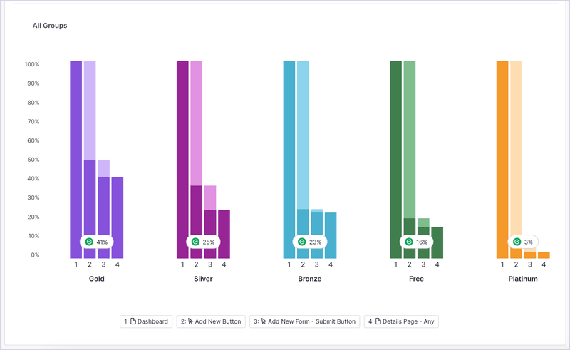
- Funnel charts: Pendo lets you generate funnel charts that help you visualize multi-step funnels, see which stages most users get stuck on, and view the average completion time for each funnel within your product. You’ll also be able to track the overall completion rate of funnels and group your funnels.
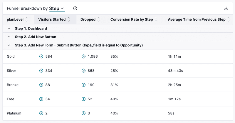
-
Step breakdown: This view will give you data on the total number of unique visitors a funnel got, the conversion rate on each step, and the step duration. Also, you can export your funnel data as a step breakdown CSV file for further analysis.
Pendo for path analytics
Understanding the in-app paths your users take is just as important as being familiar with the conversion path they’re on before subscribing. Path reports let you uncover real product navigation patterns and the most successful (and unsuccessful) user flows. Here’s what Pendo offers:
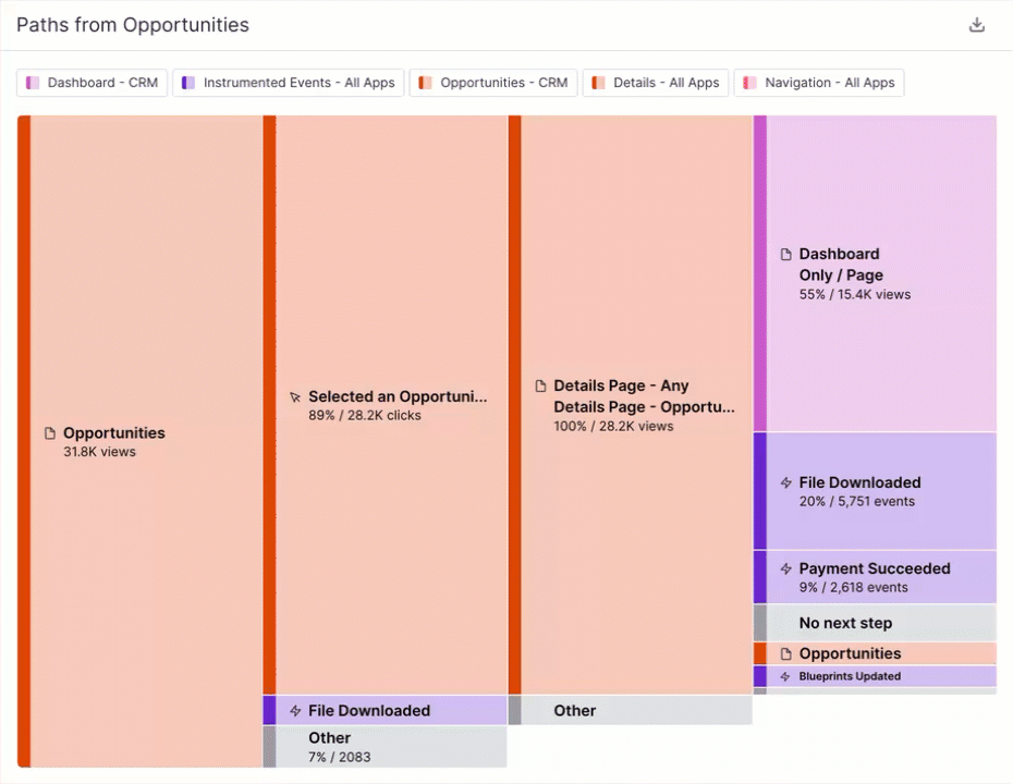
- Path builder: Pendo’s no-code path builder lets you create a new path by selecting the starting page, date range, and target segment. If you have a multi-app subscription, you can also enable cross-app path analysis.
- Visual reports: Pendo’s path reports are generated in a chart format to help you visualize the paths. You’ll also be able to zoom in on each step of the path to get more detailed insights, share reports with teammates, and export them as CSV files.
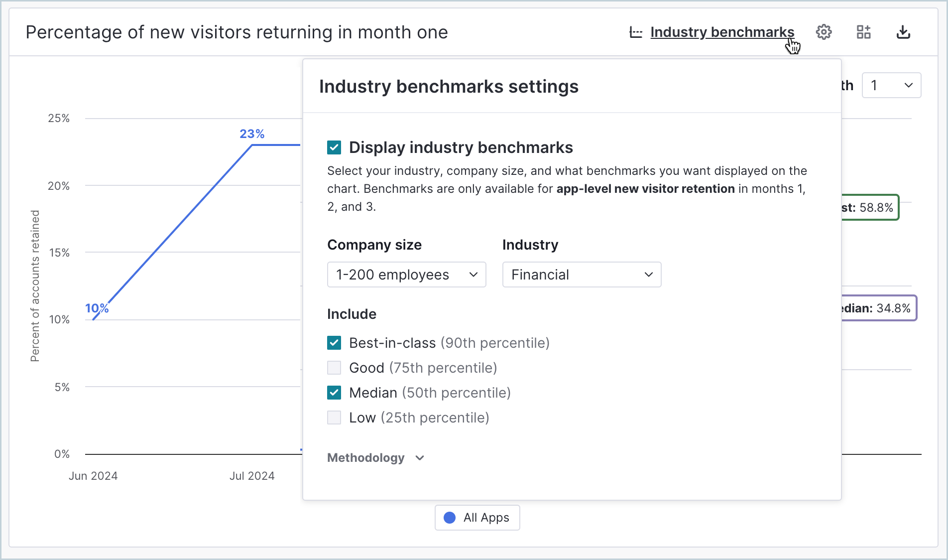
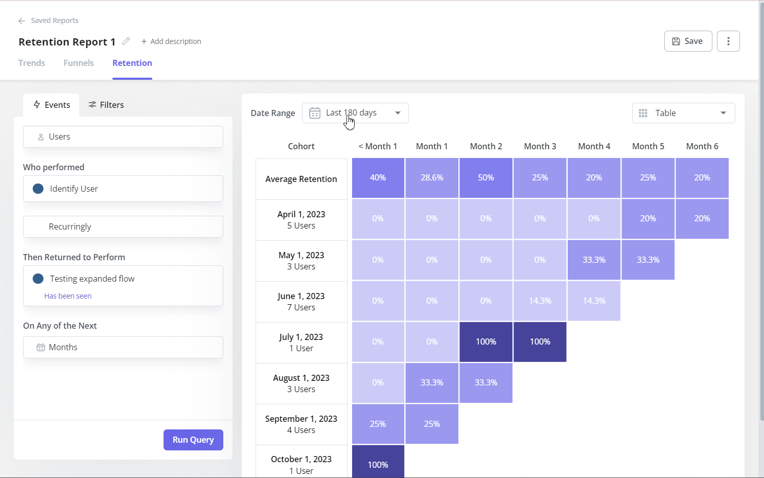
Pendo for retention analytics
Retention analysis is a crucial part of understanding why customers abandon your product, so you can implement churn prevention strategies.
Here are the selected features of Pendo’s retention analysis reports:
- Cohort analysis: You can conduct cohort retention analysis by seeing what percentage of each cohort is retained on a month-to-month basis. You can also sort this retention data by segment, cohort size, or date range to filter results.
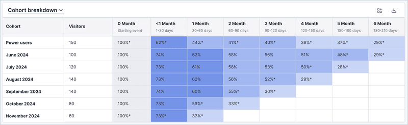
- Benchmark reporting: Pendo lets you compare your retention rates with industry standards to set goals.
Pendo workflow reports
With Pendo’s workflows reports, you can analyze if the users are taking crucial activation steps in your app, from the start to the endpoint. Workflows are available for paid plans.
Here’s how Pendo approaches workflow reporting:
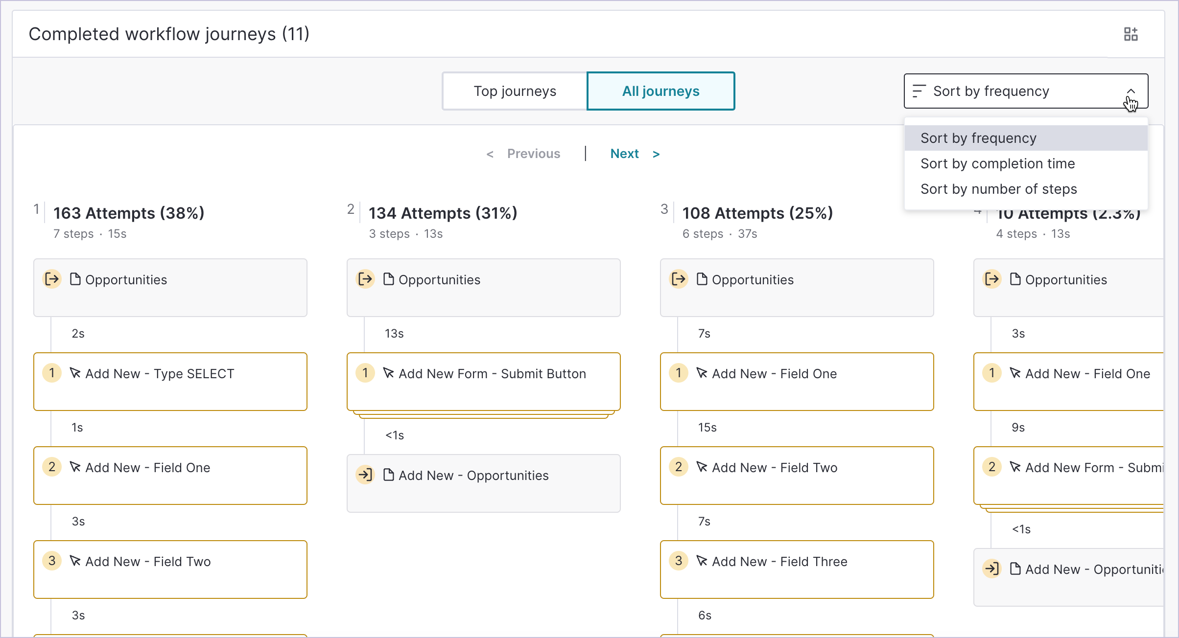
- Workflow completion and attempt rates: You can view the number of visitors who completed or started a workflow within a given time frame, and filter the reports by specific in-app guides to determine if they affected completion rates. You can also track time-to-complete.
- Workflow journeys: For completed workflows, you can access a view that lets you compare different journeys. You can, for example, see how many completed attempts each route generates, average completion times, or insights that highlight friction points.
Product engagement score (PES)
Product Engagement Score is Pendo’s original metric that’s supposed to objectively measure customer engagement based on their in-app actions. The metric is calculated based on Adoption, Stickiness, and Growth factors. After initial configuration, Pendo automatically tracks and updates the score.
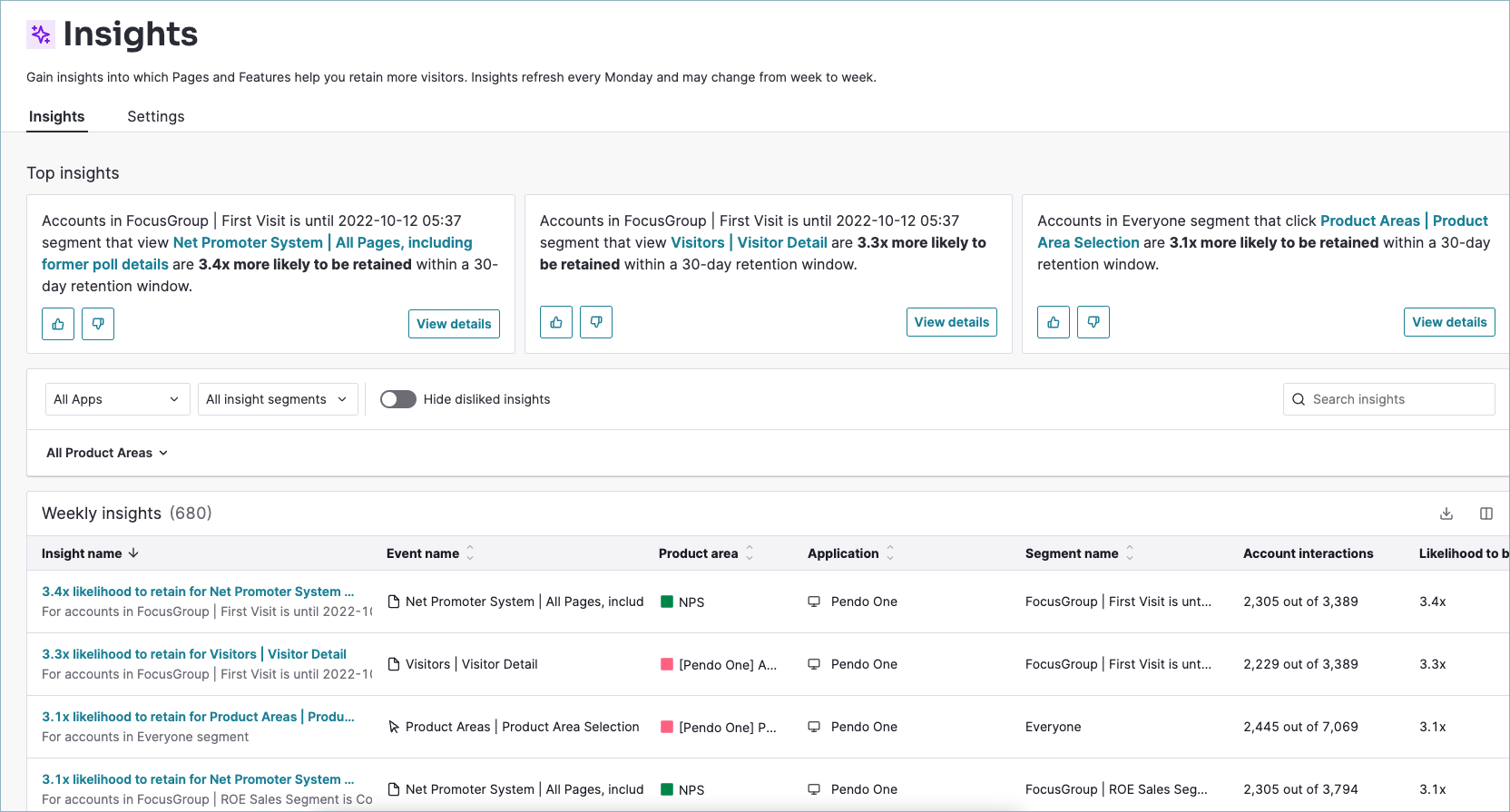
Pendo Insights
Pendo Insights is an AI-powered analytics tool that automatically summarizes data points, providing automated advice on the best actions to increase user retention. The insights are account-level and refresh weekly.
Pendo dashboards for product growth analysis
Monitoring growth analytics and extracting insights from product KPIs are crucial for any SaaS business. Cross-referencing different reports helps the product teams spot patterns and correlations, which translates to more informed product decisions.
Pendo offers customizable dashboards that combine different data points and reports. You can use templates or compose them out of different widgets with reports on user behavior, product usage, NPS, and more.
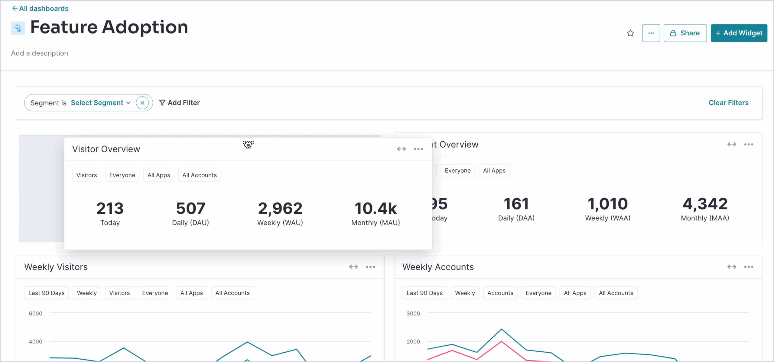
Apart from the metrics and reports I already mentioned above, here are a few more examples of visualizations that you can add to your dashboards:
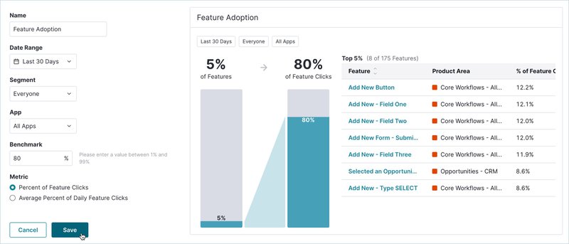
- Feature adoption: Pendo’s feature adoption report lets you see features that drive a certain percentage of all click volume within your product. This helps you identify your growth drivers.
-
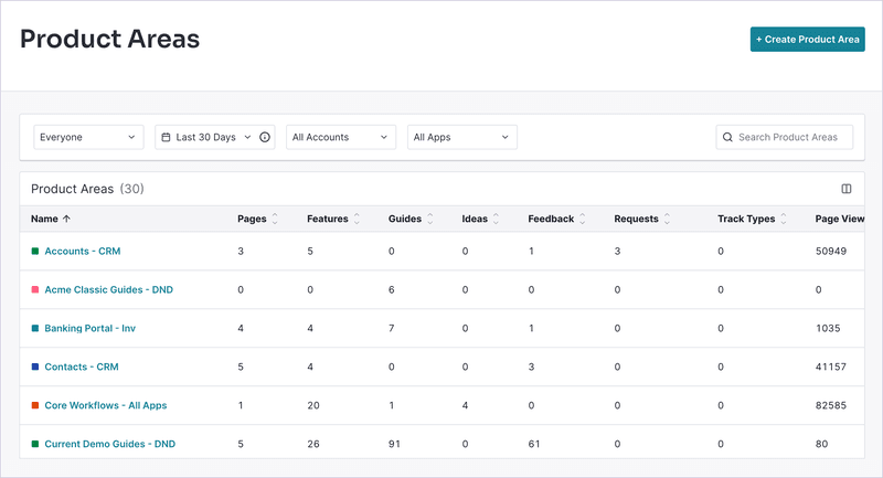
Product Areas: Product areas let you sort analytics, monitor adoption, track events, and keep tabs on overall growth across each section. Note that you’ll need to upgrade to a paid plan in order to use this feature.
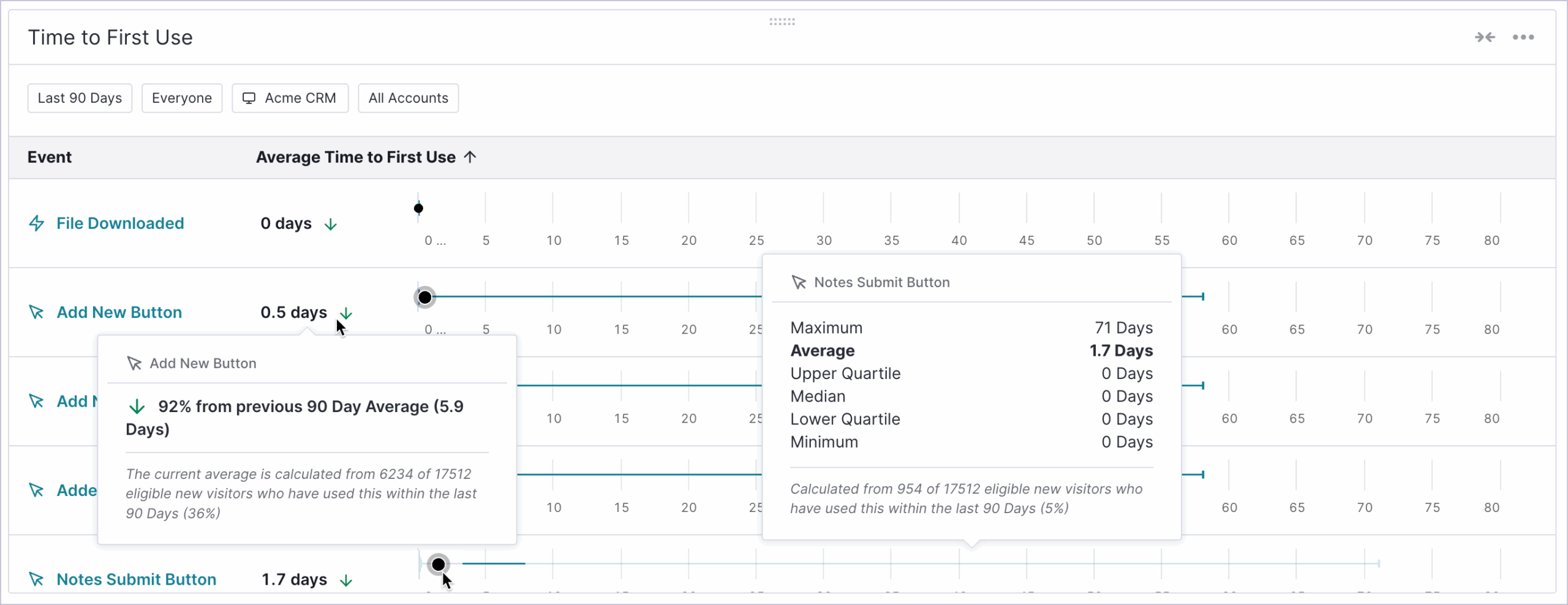
- Time to first use: It lets you understand the average time it takes visitors to first engage with one or more selected events.
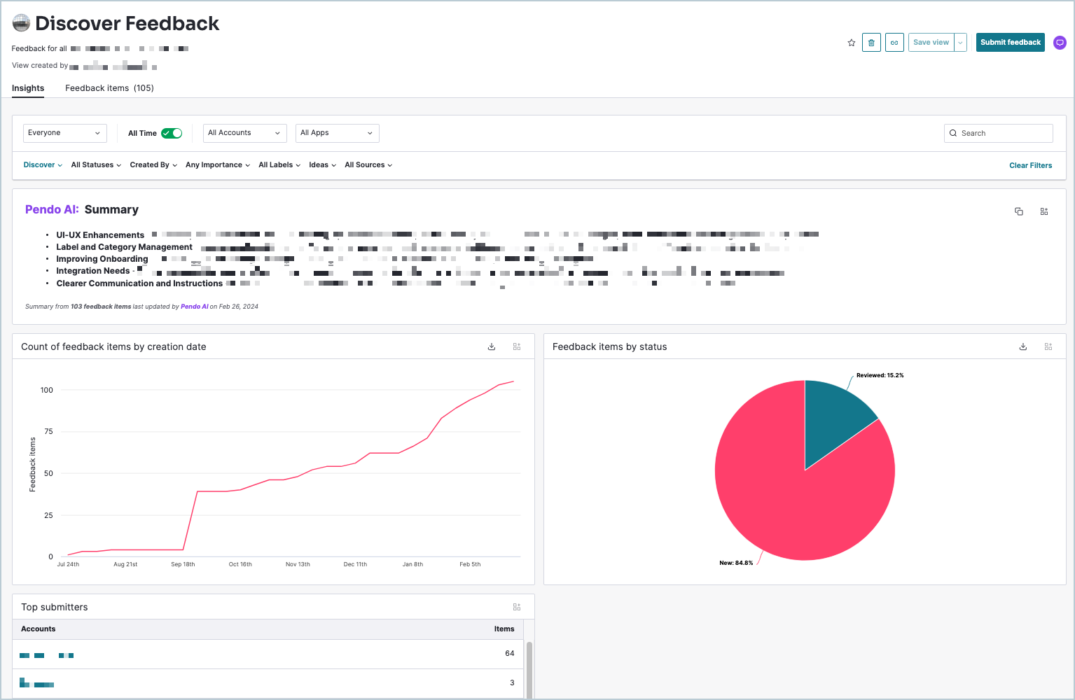
Pendo analytics for user feedback
Pendo enables feedback collection through NPS surveys and polls (which are part of in-app guides). Pendo users can also manually add user feedback in the Pendo Listen platform. As you can see, Pendo’s approach to feedback is decentralized, with survey data analytics scattered between different places in the tool.
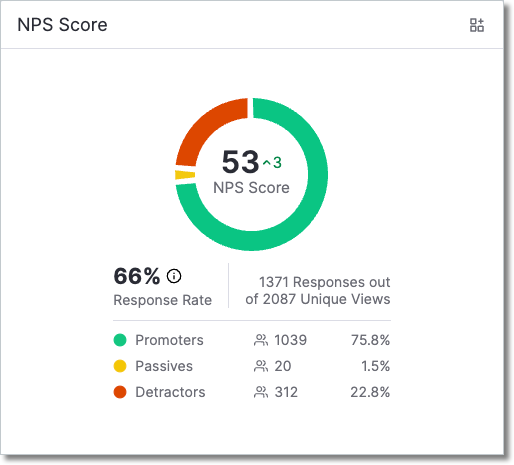
- NPS: NPS is a separate module, so it comes with a dedicated report and a dashboard widget. You can track your NPS score, the number of detractors and promoters, or page and feature usage for each group.
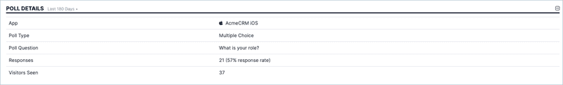
- Polls analysis: You can access poll metrics through guide analytics and sift through questions, responses, or activity rates. On top of that, you can add Pendo’s poll widget to the home dashboard. Unfortunately, each widget can only track one poll, and it only shows summarized data rather than showing you the full responses.
- Pendo Listen: Available on the two highest-tier plans, Pendo Listen is a product discovery platform. It has a roadmapping and idea validation functionality, but also centralizes customer feedback and provides tools to tag, organize, and uncover trends.
Pendo analytics for in-app guides
One of Pendo’s core features is in-app guides, which let you set up interactive walkthroughs and onboarding flows to help your users navigate the app. You can analyze the guides’ performance in an independent report or correlate it with other metrics on the dedicated dashboard.
- Tracking guide goals: Pendo lets you track how many visitors took a specific action after viewing the guide.
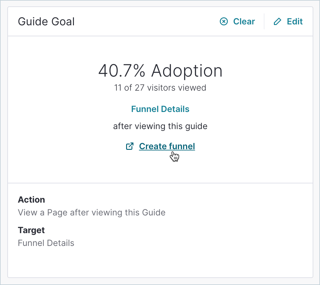
Monitoring key metrics: A comprehensive guide dashboard provides a bird’s-eye view of your guides’ performance, including top stats, guide views chart, feature overlay, time-on-guide, activity, poll responses, and more.
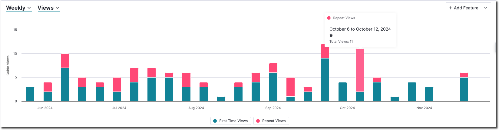
- Guides dashboard widget: Guides are yet another widget you can add to the dashboard to cross-reference guides usage data with product usage and user behavior data. This helps you see how your in-app engagement elements actually affected activation and adoption.
Pendo for predictive analytics
Pendo’s product analytics product focuses on retrospective behavioral metrics. There is no built-in “predictive analytics” feature in Pendo Analytics itself; you’d need Pendo Insights (a separate AI-driven offering) for predictive modeling.
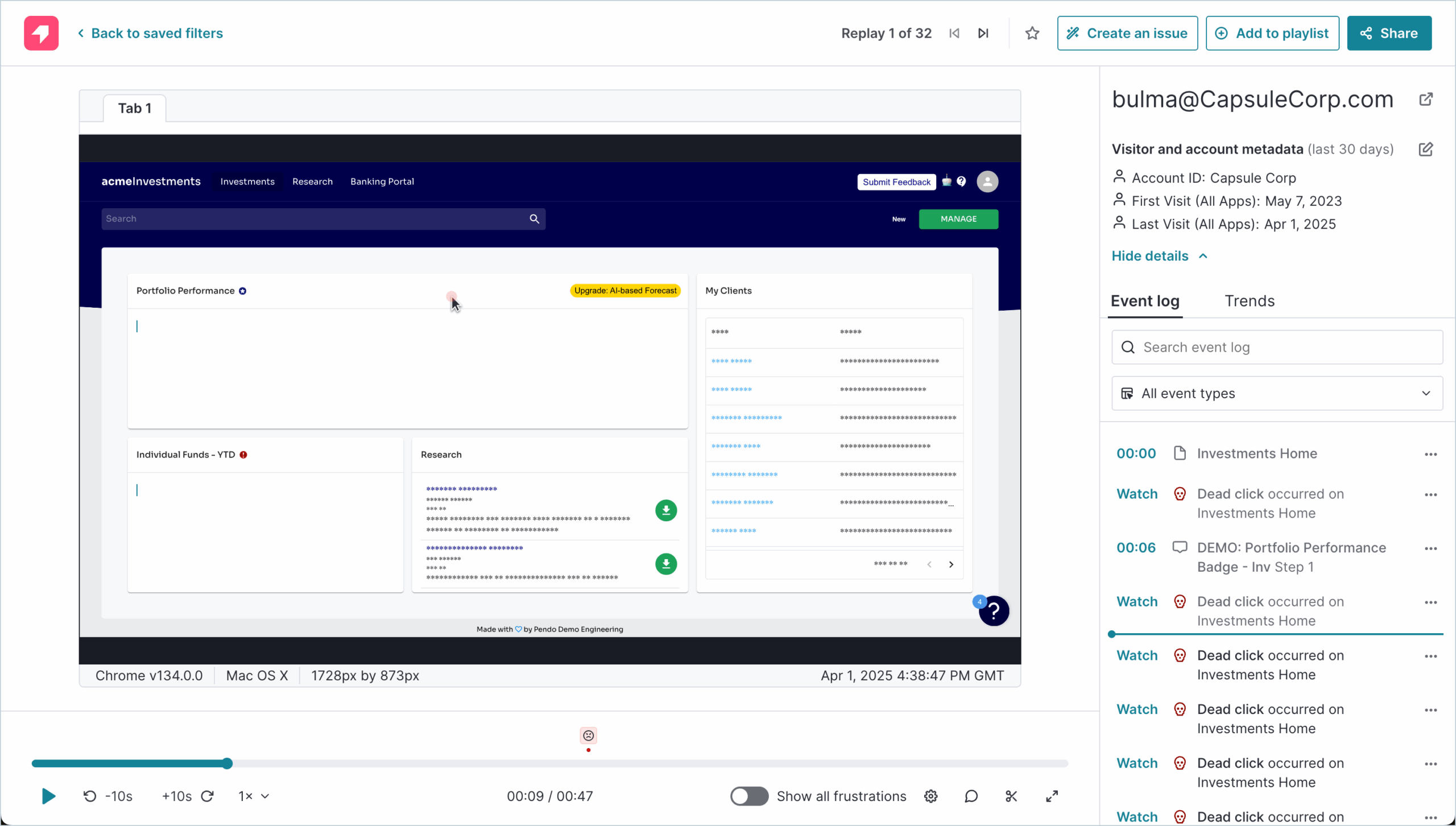
Pendo’s session replays
Session replays are a valuable product analytics tool, and a part of Pendo’s analytics offering from the Core plan onward. With the session replay tool, you can watch playbacks of users’ interactions with your web apps to uncover friction points and UX issues.
- Pendo replay library: Pendo lets you save clips, create playlists, and file issues. Replays are stored in the library, where you can filter the clips based on accounts, features, frustration signals, and more.
- Flexible replay viewings: The library is not the only place to watch session replays in Pendo. Notably, you can also access them through funnels or path reports, details pages, and add a dashboard widget.
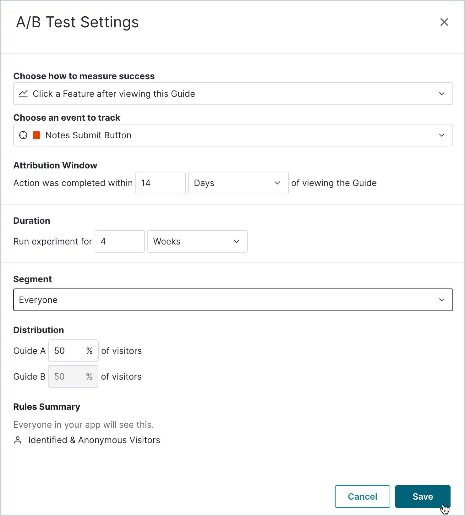
Pendo for A/B testing
Pendo natively supports A/B tests through its Guides module. You can create two (or more) random user segments and compare outcomes in the Guide Metrics dashboard.
Pendo also lets you define your key success metrics, whether that’s click-through rate on a call-to-action, guide completion percentage, or feature adoption lift, and then monitor each variant’s performance. You can set statistical confidence thresholds to know exactly when a winner emerges, schedule experiments to run only during peak usage windows, and automatically roll out the top-performing guide to all users.
Pendo pricing
As you could see, the list of Pendo’s user behavior and product analytics features is long. Now, how much do you have to pay for all of that?
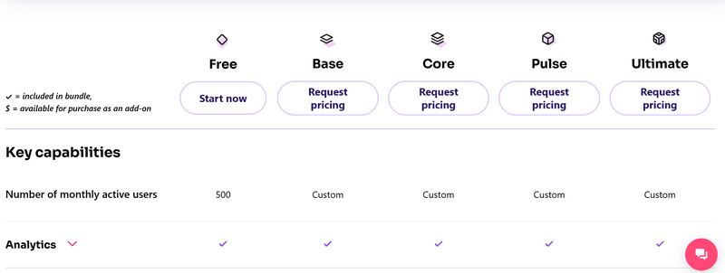
Pendo’s paid plans are custom-quoted (no public list prices). The Free, Base, Core, Pulse, and Ultimate plans each introduce more advanced features. However, many of them are available only on the highest plans (e.g., no NPS or Listen below Pulse) or as paid add-ons (extra costs for guide experiments, journey orchestration, or data synchronization on all plans but Ultimate).
There is also a Pendo Free plan (with up to 500 MAUs, which won’t last you long) and a 14-day trial of its paid tiers so you can test everything before you buy.
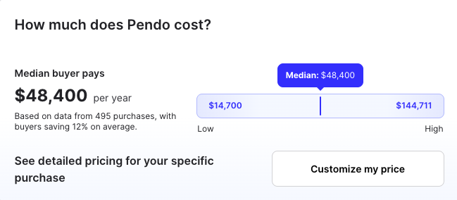
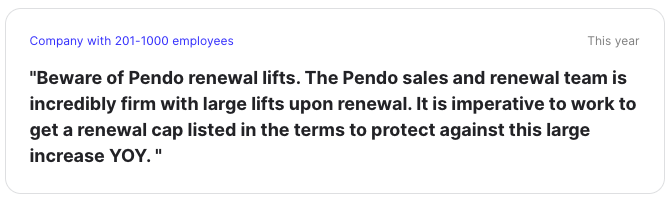
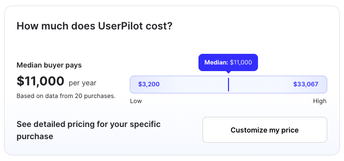
According to Vendr, Pendo’s median price is $48,400, which is much higher compared to competitors. Vendr users also cite unpredictably growing prices and uplifts on renewals.
Pros and cons of Pendo’s product analytics
Pendo Analytics is a feature-rich suite for user behavior and product analytics that can help uncover product usage data. As long as you have time and resources to go through the various data points and reports, you can refine your product analytics processes.
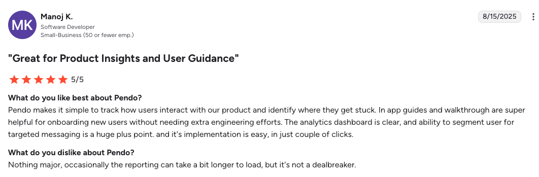
What do users say about Pendo Analytics? It scores 4.4 on G2, with many positive reviews. However, there are a few recurring complaints, mostly revolving around complex UI, unjustified pricing, and occasional data discrepancies.
Let’s take a look at Pendo Analytics’ pros and cons in more detail.
Pros of Pendo analytics
✅ Comprehensive feature set: Pendo offers a wide array of features for product analytics. The variety of reports, views, and data points helps dive deep into user insights and spot growth opportunities. Additionally, since in-app user engagement and user feedback features live on one platform, all the collected data is easy to compare and correlate, removing the necessity for a separate analytics software.
✅ Out-of-the-box functionality: Pendo offers “out-of-the-box” analytics, requiring minimal setup and configuration, with many features set up mostly no-code. This means you can start gaining insights into your product usage quickly.
✅ Segmentation and targeting: Pendo allows you to segment your user base and target specific user groups with customized messaging and experiences. This can be a powerful tool for improving user engagement and conversion rates.
Cons of Pendo analytics
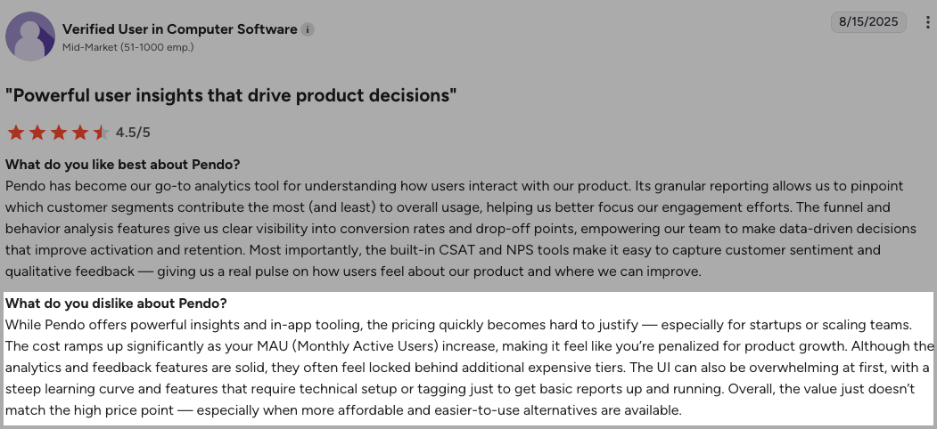
⚠️ High and non-transparent pricing: If you want to access the whole suite of Pendo analytics products, things will get very expensive, very fast. Opaque MAU-based pricing with undisclosed add-on fees, as well as uplifts at renewal, make total costs unpredictable (and often substantially higher than initial quotes). Pendo also requires multi-year commitments to lock in pricing caps.
⚠️ Limited data integration: Pendo’s data integration options may not be as extensive as some other analytics platforms. Additionally, only one integration is included in the initial price. This could limit your ability to combine data from various sources for a more holistic view.
⚠️ Learning curve: Pendo has a steep learning curve, especially for users who are new to analytics platforms. The feature-richness turns into a double-edged sword when you actually have to dig through the tool to uncover insights. This sentiment is often cited by our customers who switched to Userpilot from Pendo. For example, Shelterluv felt the complexity didn’t allow them to use the tool to its full potential.
“One of the biggest feedback the team had about Pendo was like, we just don’t know how to use it. And it’s hard to figure out. We don’t have the time to just like, sit and read through everything to figure out how to use it.” – Matthew Brown, Senior Customer Solutions Manager at Shelterluv
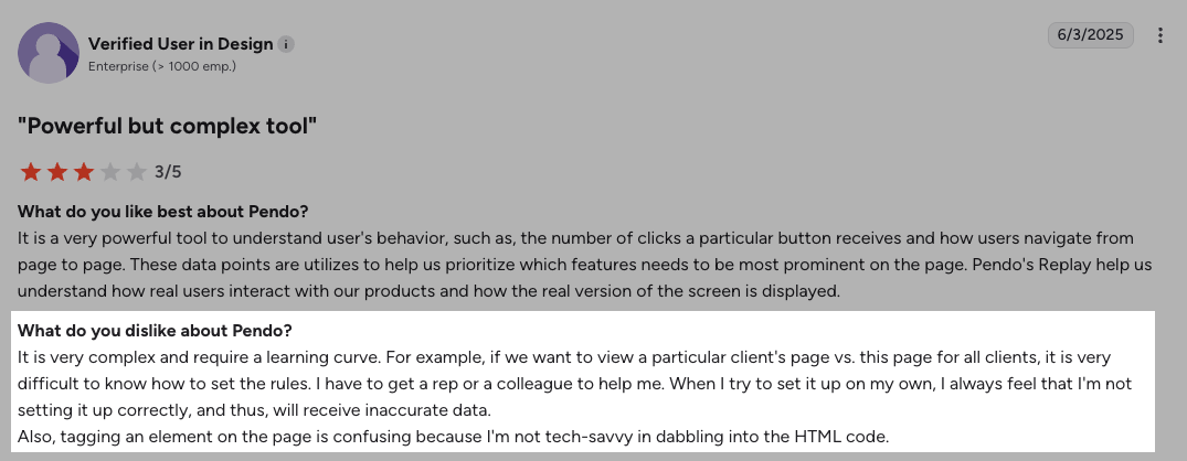
⚠️ Customization complexity: While Pendo is easy to set up initially, customizing it to suit unique business needs can be more complex. Advanced configurations may require technical expertise.
⚠️ No real-time data: In all of Pendo’s reports, data refreshes hourly.
⚠️ Modular licensing complexity: Core features (NPS analysis, branching logic, AI, resource center) live in separate add-ons or top tiers. So, the promise of a comprehensive product analytics platform is only fulfilled after you purchase multiple packages.
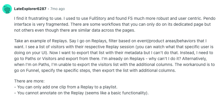
⚠️ Fragmented analytics UI: Reporting split across Data Explorer, Guides, Listen, and Dashboards significantly slows time to insight. Additionally, surveys and NPS live in different modules. This can lead to data discrepancies.
Userpilot: A better alternative to Pendo analytics
If you feel the cons listed above may affect Pendo’s value for money too much to justify the purchase, consider looking into Pendo’s alternatives, such as Userpilot.
As a fast, reliable, and comprehensive product growth platform, Userpilot offers robust analytics features, plus allows you to collect and analyze user feedback and trigger personalized omnichannel experiences spanning in-app guides, email, and mobile.
Why should you choose Userpilot over Pendo?
When it comes to product analytics, there are a few reasons why Userpilot is a better choice than Pendo.
- Easy to use and set up. Userpilot has a more intuitive UI, which makes it easier to use all the features to their full advantage. It’s an argument we often hear from our customers who switched over from Pendo. For example, Cuvama felt the complexity makes them use the tool’s product analytics very rarely:
“High price was one of the decision criteria to move from Pendo because we were paying lots, and we were not using it.” – Leyre Iniguez, Customer Experience Lead
- Centralized product and user data. In Userpilot, you have all the product data you need under one roof, with readily available reports. For Pendo, reporting is split between modules, which may cause problems trying to connect different data points and build dashboards.
- Real-time data. Unlike Pendo and their hourly refresh, Userpilot lets you see real-time user data whenever you log in.
- Clear pricing and higher value for money. Userpilot’s pricing starts at $299 (billed annually), with most features readily included in a plan. Therefore, you don’t risk running into unexpected pricing ramp-ups necessary to use all the product analytics features you need. It’s much more cost-effective, according to Vendr, too.
Overview of Userpilot’s analytics functionality
Userpilot’s product analytics lets you collect and analyze user behavior and product usage data. You can observe granular product analytics, such as which features have the highest adoption rates, and big-picture insights like trend reports.
Here are Userpilot’s top product analytics features:
Take a deep dive into product analytics with intuitive dashboards
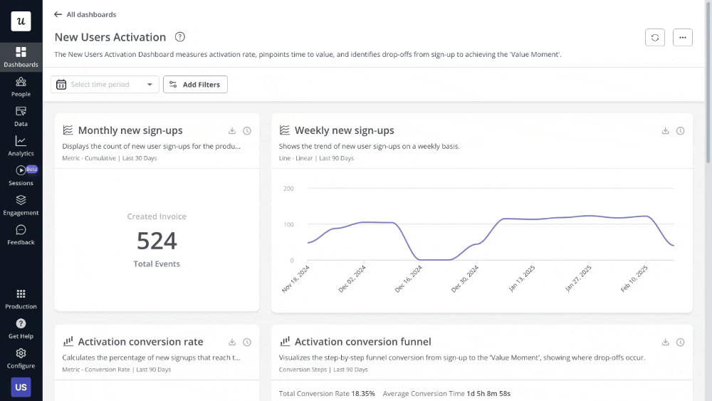
Userpilot’s analytics dashboards let you track and correlate different data points, reports, and trends. You can build them from scratch, but Userpilot also offers multiple templates that show crucial insights on product usage, new user activation, core feature engagement, user retention, and more, so the time to value is much shorter than for Pendo Analytics.
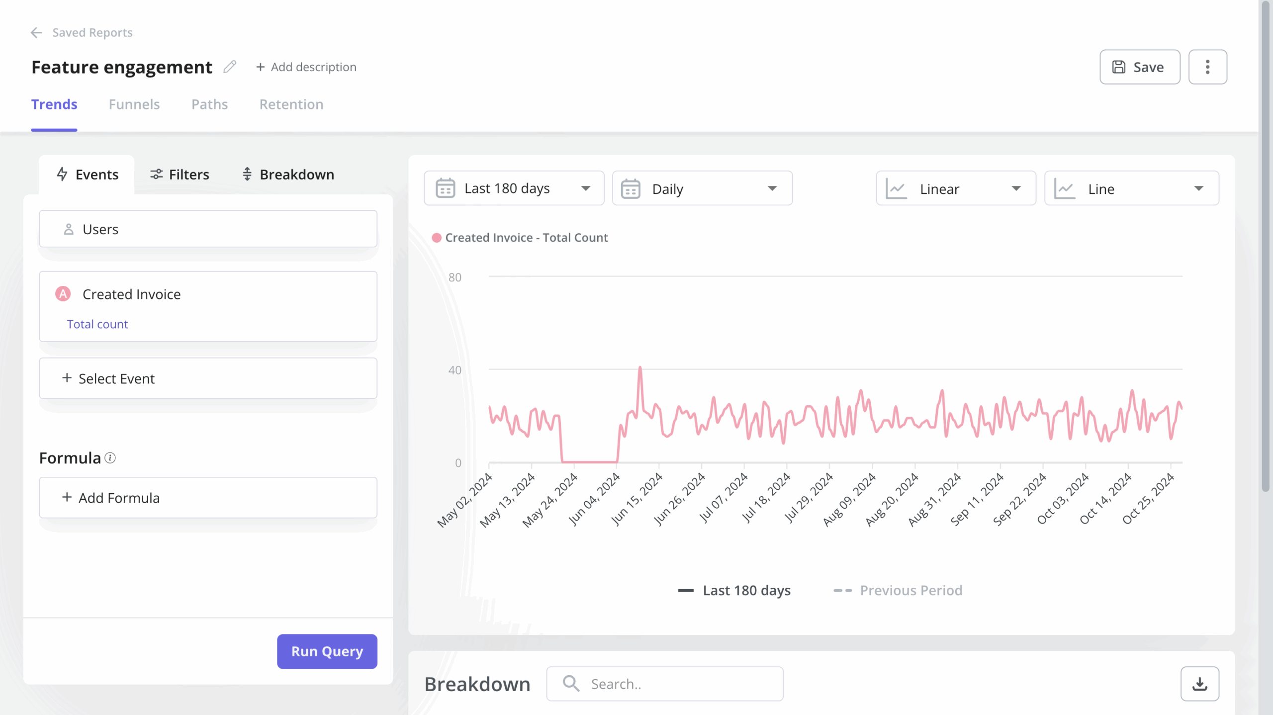
Uncover usage trends with data analysis trends report
Trend analysis allows you to visualize event data at the user and company levels.
For example, you could visualize the total number of users who completed a particular event (including custom events), unique users, active users (DAUs, WAUs, and MAUs), as well as the count per user.
This is not limited to a single event either. You can use the feature to visualize multiple trends in one graph. For example, you could use it to track main activation events like ‘created a flow’ and feature usage.
Of course, the feature enables product managers to filter the event analytics data for more granular analysis. For example, you could filter data by company name or device type. You can also add custom formulas and export the data into a CSV file.
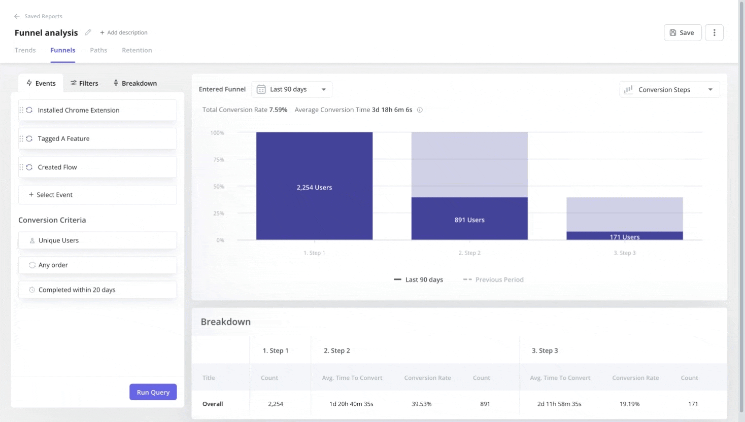
Unveil conversions across key stages with funnel analysis
Funnel analysis allows you to track conversion rates at key stages of the user journey and view the average conversion time.
Thanks to that, you will be able to easily identify friction points and drop-offs. If lots of users fail to progress from one stage to another, that’s the spot that needs optimizing.
Of course, identifying the exact source of friction will require further investigation. You could target the users who have dropped off with surveys or watch their session recordings.
Funnels in Userpilot will allow you to break down the data for detailed analysis of the conversion rates. For example, you could display conversion data across different price plans or user segments next to each other in one funnel chart.
Track user retention and user engagement trends with retention reports
User retention is critical for the success of digital products. It’s linked to the product’s ability to consistently deliver value to the users and is a key measure of business health. Userpilot will let you easily assess user engagement over time by tracking who performs a given action and when. You can see the results as a trend view or a cohort table and see which users retained.
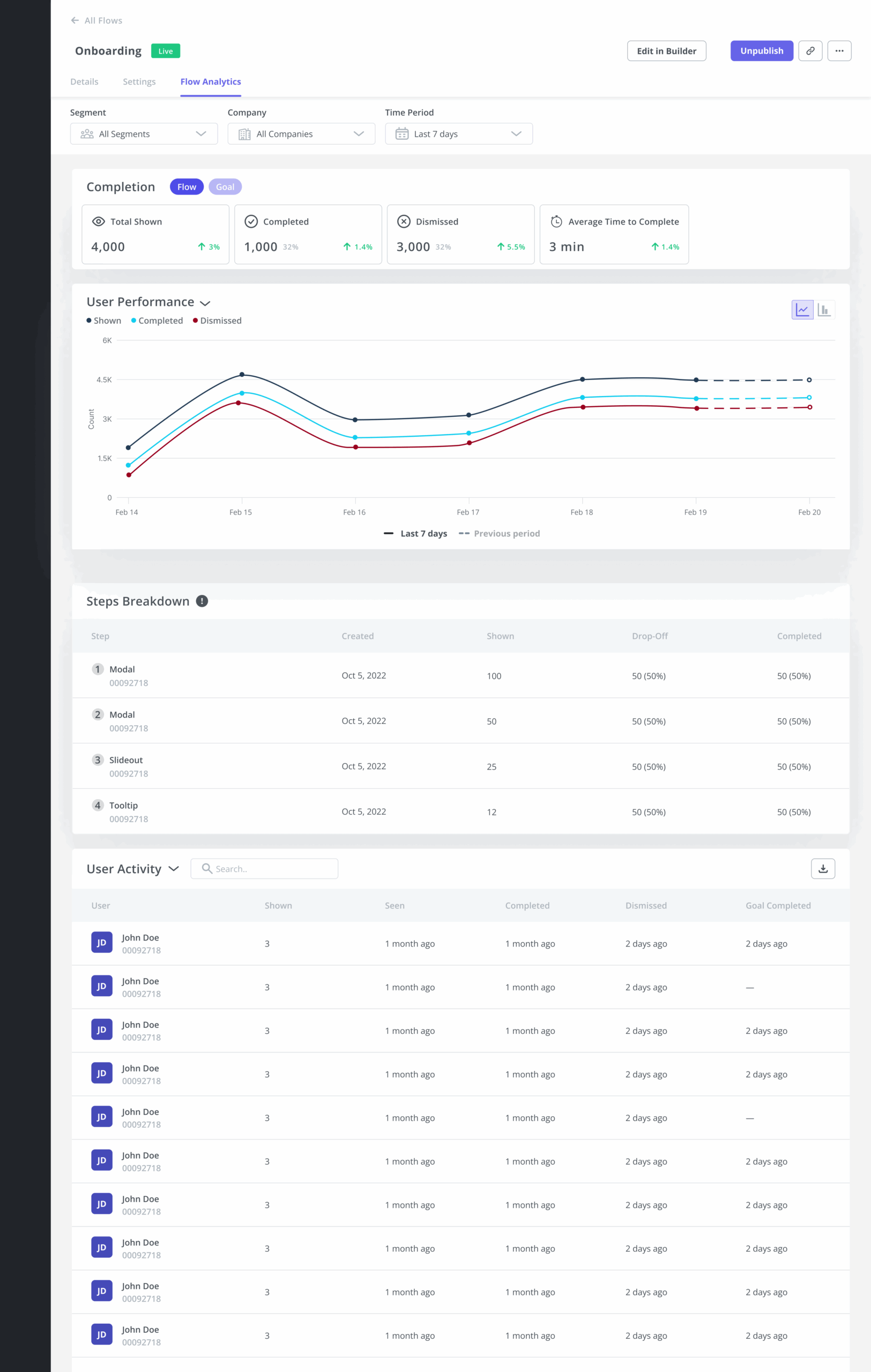
Enhance app experiences through flow analytics
Flow analytics enables product teams to extract granular insights about user interactions with in-app experiences at the step level.
For example, if your onboarding flow consists of a number of in-app messages, you will be able to analyze in detail which users interacted with them and completed the step, and which of them dropped off.
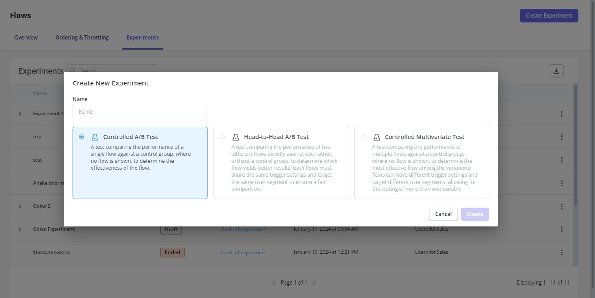
Test and experiment with A/B testing
A/B testing feature allows you to conduct different experiments on your in-app flows. These are:
- Controlled A/B Test: To assess the effectiveness of a single flow by comparing its performance against a control group that doesn’t see the flow.
- Head-to-Head A/B Test: To compare the effectiveness of two different flows.
- Controlled Multivariate Test: To compare the performance of various flows against a control group.
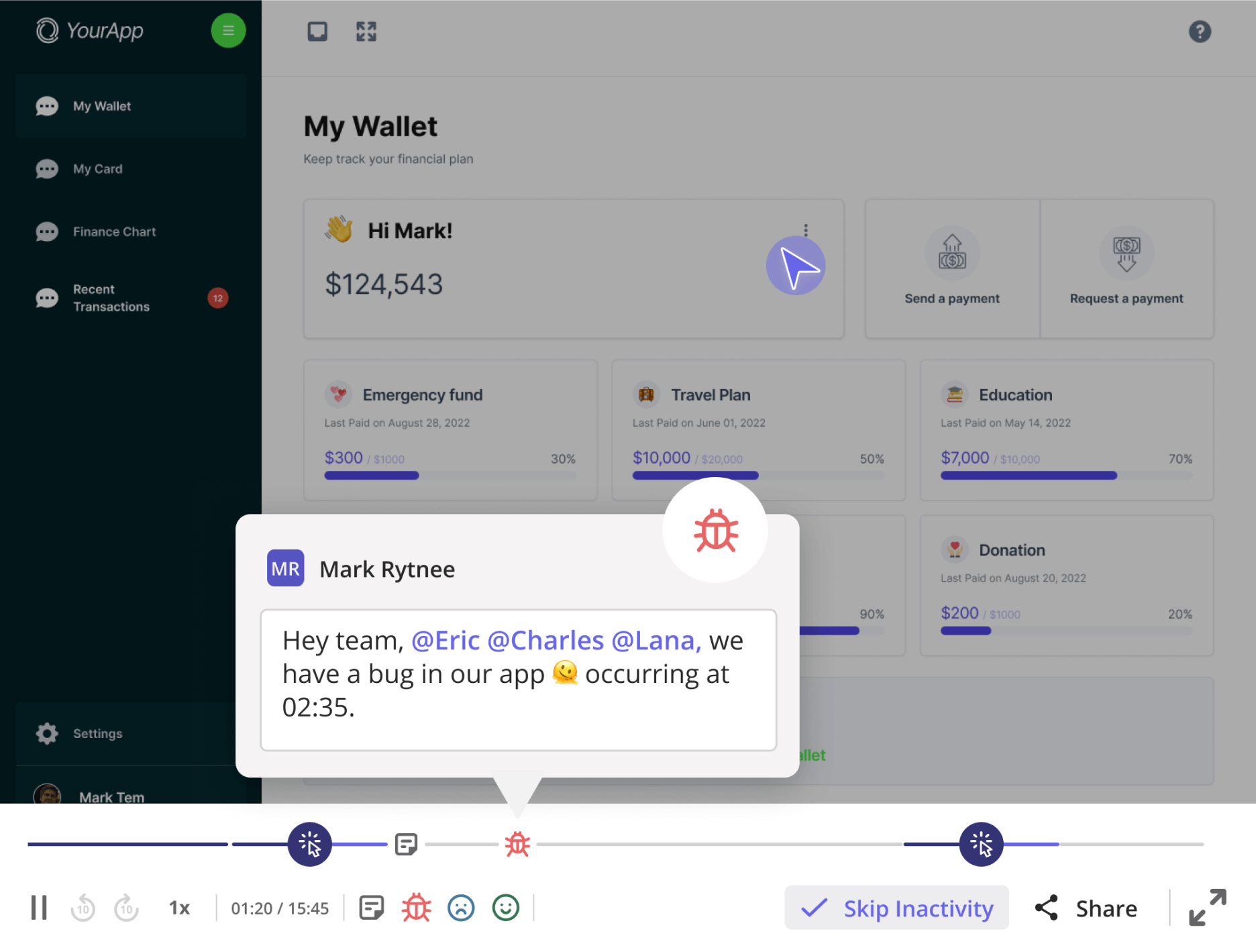
Learn more about user behavior with session replays
Userpilot’s session replays give you the “why” behind quantitative data in real time. You can tag user sessions, add comments, and collaborate with other teams to resolve issues faster.
Track user behavior and product usage with Userpilot product analytics
Pendo Analytics offers a comprehensive feature set for user behavior and product analytics. I especially like the flexibility of their widget-based dashboards and the easily-accessible session replays.
That being said, getting the full advantage of Pendo’s rich offering is not that easy. First of all, Pendo Analytics has a steep learning curve. Without a dedicated data team, you may find it time-consuming to manually set up all the dashboards.
Additionally, a lot of Pendo’s features are hidden under expensive add-ons, so Pendo’s price tends to grow exponentially with time, especially for companies in a rapidly scaling phase.
Pendo also underperforms in terms of in-app feedback and polls, with the data points scattered between different modules, and NPS only available for high-tier plans.
To get better value for money with an easy-to-use UI and real-time, centralized data, why not try Userpilot? Test it out by booking a demo today.
(And if you’re already a Pendo analytics user and would like to make a switch to Userpilot, we now offer a 50% off your current Pendo contract price or renewal rate, plus free and full access to Userpilot until your Pendo contract expires.)
Userpilot strives to provide accurate information to help businesses determine the best solution for their particular needs. Due to the dynamic nature of the industry, the features offered by Userpilot and others often change over time. The statements made in this article are accurate to the best of Userpilot’s knowledge as of its publication/most recent update on August 29th, 2025.
About the author