The Ultimate Guide to User Activation SaaS: How to Measure & Improve
Wondering how you can optimize user activation SaaS to increase your trial to paid conversion rates? Then you’re at the right place.
User activation is one of the most important SaaS metrics for determining long-term revenue and success. A 25% increase in user activation brings about a 34% increase in MRR over a year.
Let’s dive into what user activation is and how you can effectively measure and improve it.
What is user activation in SaaS?
The next stage after user acquisition, the user activation process in SaaS occurs when your free trial users discover and experience the value of your product.
It’s an important milestone in the user journey and is concerned with the first experience of your users with your product by going through certain user activation steps.
To reach the activation stage in SaaS, users must engage in a series of key activation points, which generally include the core features of your product.
User activation vs Aha moment
Many people confuse the Aha moment with the activation point.
Similar to the user journey stages, product adoption journey stages reflect the steps a user goes through on their path to adopting your product.
We call this the user adoption flywheel, which has seven stages (yes, we like to focus on details).
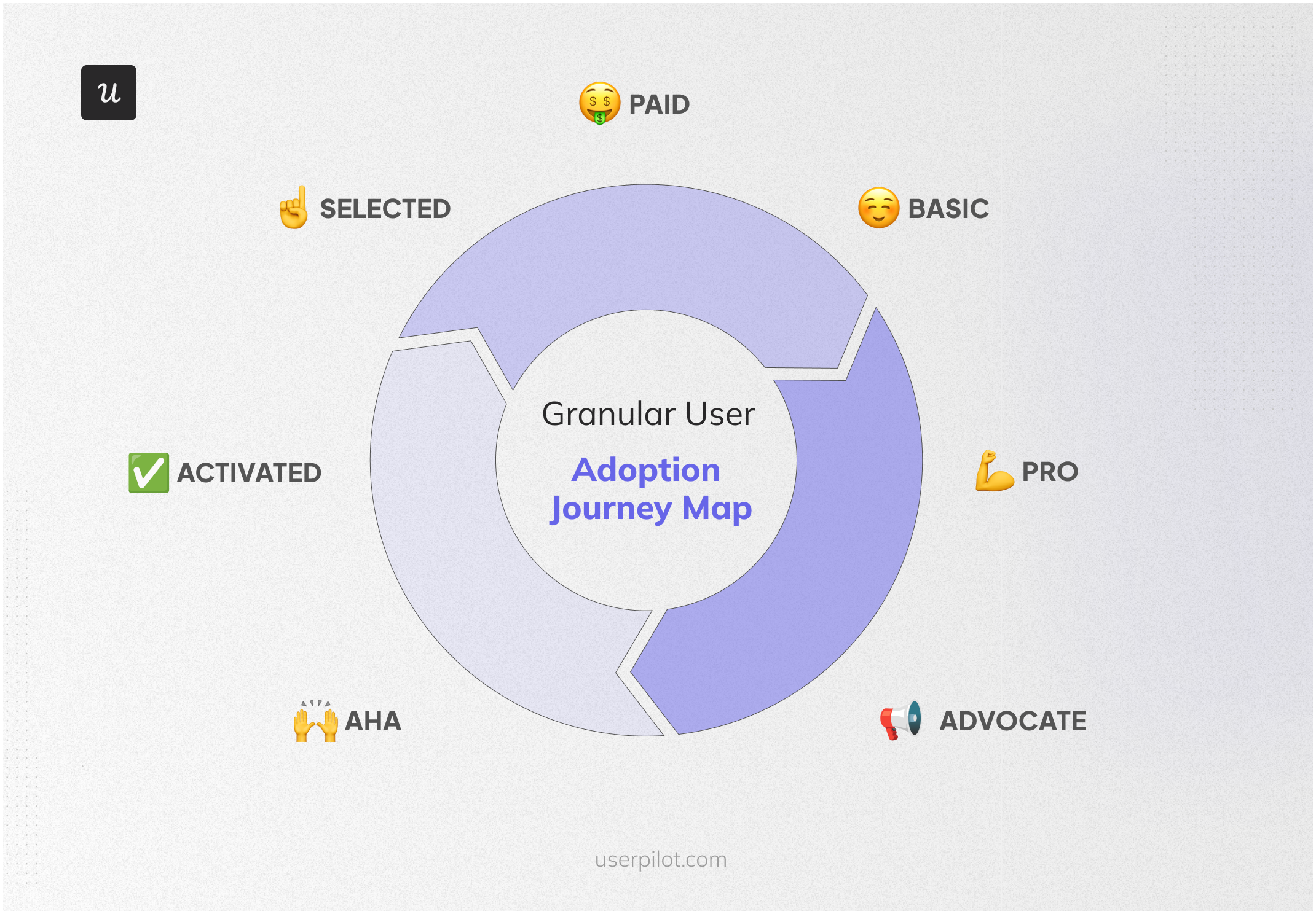
Notice how the ‘Aha Moment’ and ‘Activated’ are two separate stages in the journey?
For users, the Aha moment is the point where your users realize the value of your product. On the flip side, user activation occurs when they also experience that value.
For example, a business owner, Julian, wants to track and analyze the success of his social media marketing efforts. He searches for the best social media analytics tools on Google and comes across an article containing product reviews. He finds a tool that provides all the features he needs, including custom reports tailored to his company’s KPIs.
Julian now experiences an AHA! Moment. He signs up for a free trial and derives the required benefits from the tool. He then becomes an activated user.
User activation operates differently not only for different products but also within the same product for different personas and use cases.
What is the user activation point in SaaS?
After the user signup during the user acquisition stage, you want to quickly provide value and make sure the user completes key events and enters the customer lifecycle.
Once your users activate, they experience the value of your product, which leads to key feature adoption.
Activation in one key metric of the Pirate Metrics framework for SaaS companies. If users don’t activate, well… they won’t have anything else to do with your product other than simply abandon it.
To reach the user activation milestone, users must perform a series of key actions that will let them experience your product in a relevant and useful way.
Consider a social media scheduling tool, for instance, the key features/actions might be the following:
- Connect social media accounts
- Create a post
- Schedule the post
- Publish the post
How do you define user activation points in SaaS?
The process can differ depending on whether your company is just starting or you have analytics to back up your decision.
When you’re just starting:
- Begin with each user persona and highlight the job to be done.
- List each key feature that users must use to get the job done.
- Track performance and remove unnecessary steps.
It would be best if you built each persona by determining exactly what the job-to-be-done (JTBD) for each is first. JTBD helps clarify the user’s end goals – the reason they’re purchasing your product and the outcome they are seeking.
It’s vital because it will help you develop empathy for the user so you can find out the pain points that are preventing them from achieving their goal.
When you have the data you need:
- Look at the users who converted to paid accounts and the in-app events they triggered.
- Identify the path that leads them there using user journey analytics.
How to measure user activation rates?
User activation rate, also called product activation, determines how many users from the ones that started a trial reach the activation point.
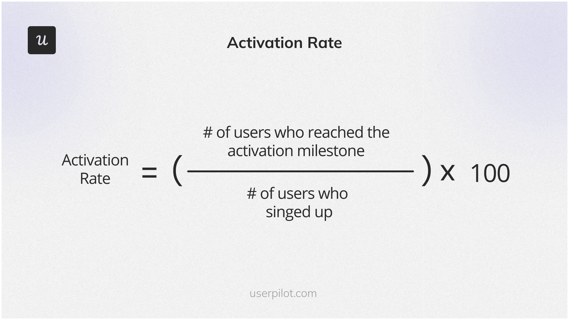
You can calculate it by dividing the number of users who reached the activation point or milestone by the number of users who signed up and multiplying it by 100.
What are user activation rate benchmarks for SaaS companies?
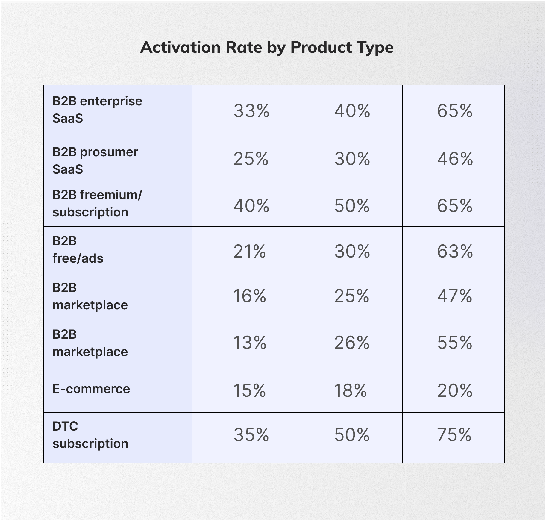
What counts as a good activation rate? Generally, you’re on the right track if 25% to 30% of your users reach the activation milestone.
Let’s put this into perspective with some numbers. On average, the activation rate sits around 34%, with the median being 25%. But these figures can vary based on the type of product.
For example, the average activation rate in SaaS is higher at 36%, with the median at 30%. These numbers are a great benchmark to compare your product’s performance against.
8 Strategies to increase user activation in SaaS companies
Here are some of the best strategies to improve user activation.
1. Use the sign-up flow to showcase the product’s value
Signup flow involves the steps a user must go through before they get into your product.
By using the signup flow to showcase what your product does (and collect user activity data), you achieve two things:
- Set expectations of what your product does.
- Remove empty states from your product.
The signup flow ensures you don’t present a blank canvas to customers and instead use personalized, engaging templates to reduce time to value and double activation.
2. Use welcome screens to personalize the user onboarding process
Contextual and personalized user onboarding means building branched user experiences designed for specific user needs.
Contextual onboarding ensures that you give users real-time information on product features when it’s most relevant to them.
A welcome screen is a perfect way to welcome users plus find relevant information about your user persona such as role and job to be done.
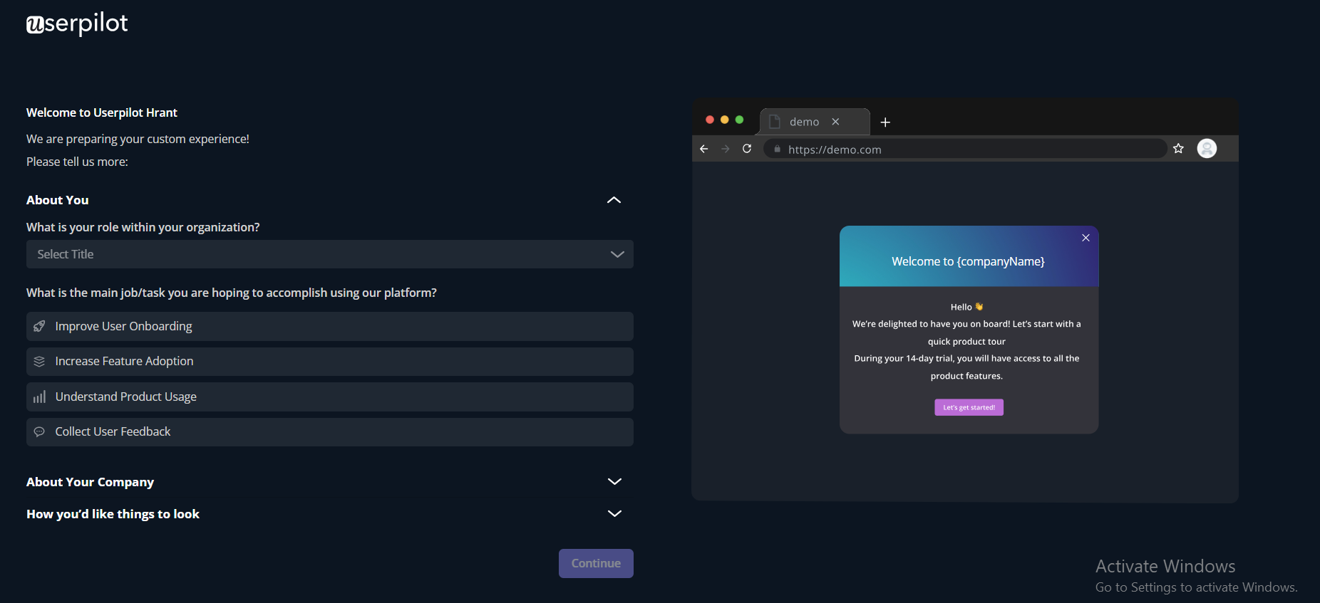
This will enable you to identify the persona segment they are in and personalize the in-app onboarding journey accordingly.
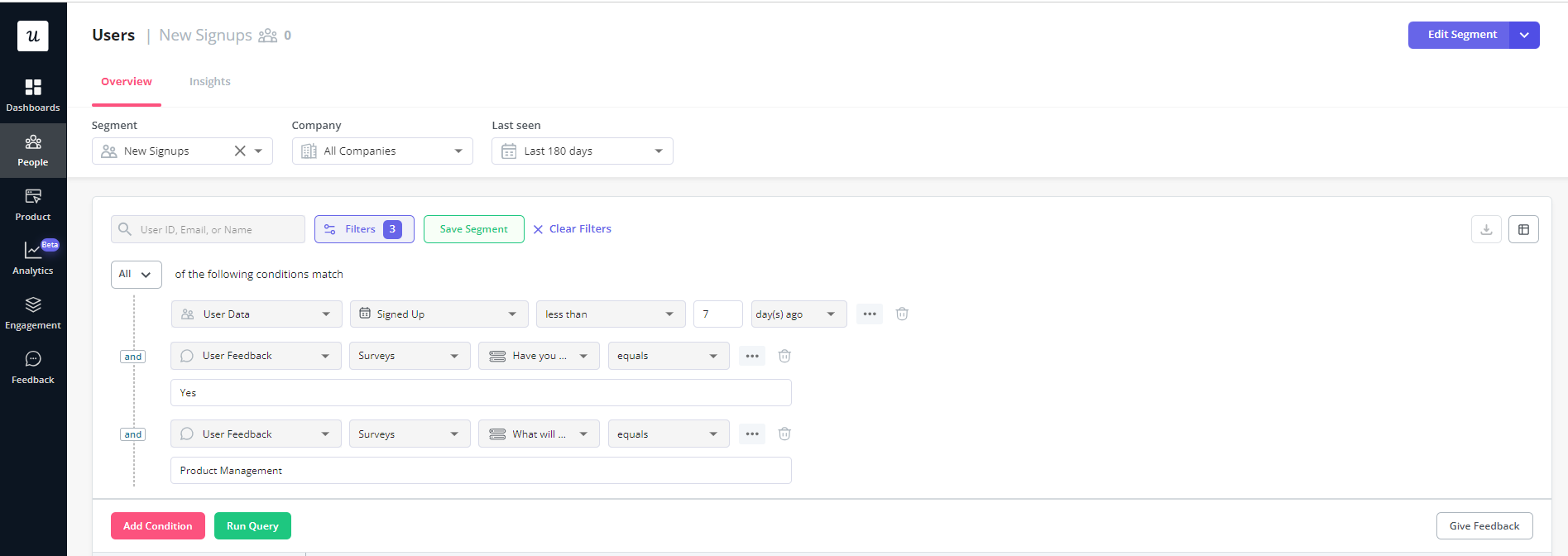
3. Use in-app checklists to drive users to the activation point
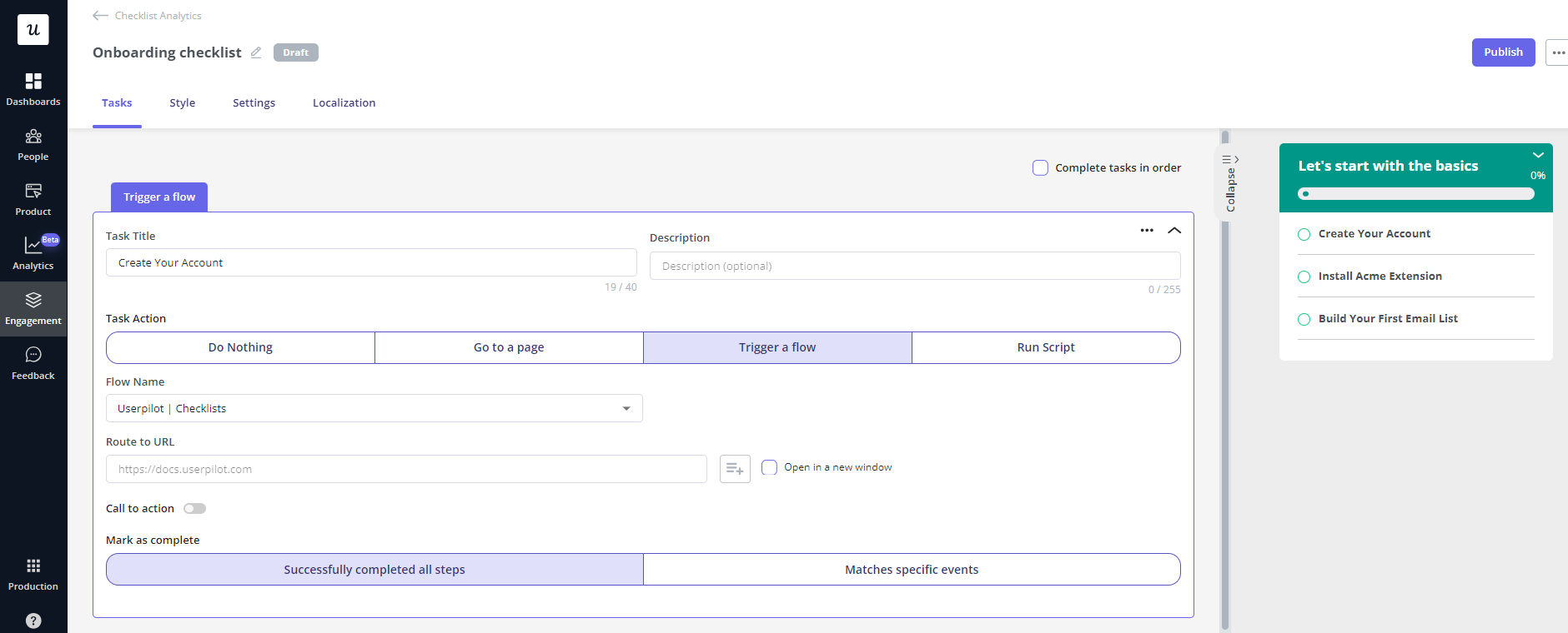
Checklists are a form of in-app messaging. They’re a great way to steer new users to the activation events.
Once you are aware of the key actions a user must take, you can include them in an in-app checklist to prompt them to take action.
4. Use interactive walkthroughs to help users perform key actions
Most SaaS companies greet users with a product tour to provide in-app guidance. The problem with these is that they are long, boring, and not tailored for different use cases.
On the other hand, interactive product walkthroughs can help users complete each step in the activation funnel by guiding them step by step through every step of engaging with specific product features.
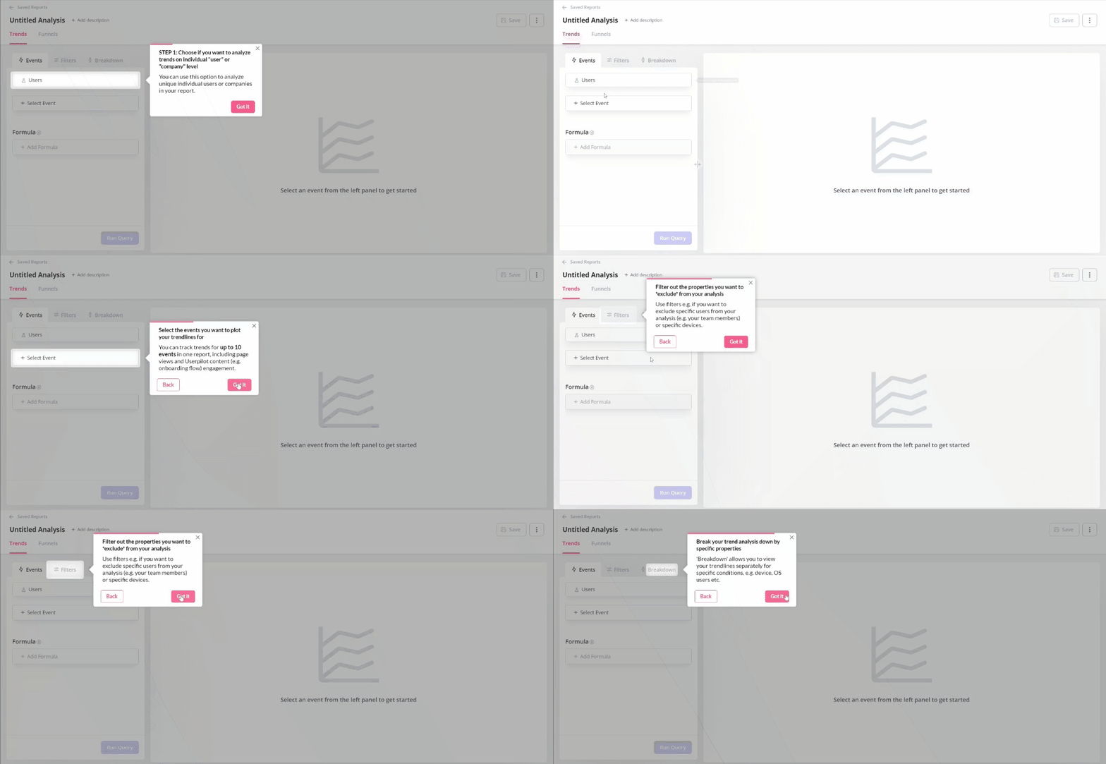
Interactive walkthroughs encourage users to interact with your product not only sit while you present every single feature to them.
5. Use gamification elements to improve user engagement
Onboarding gamification means introducing fun elements to encourage users to complete different tasks. It usually includes a reward as an incentive, like discount coupons, badges, points, and leaderboards.
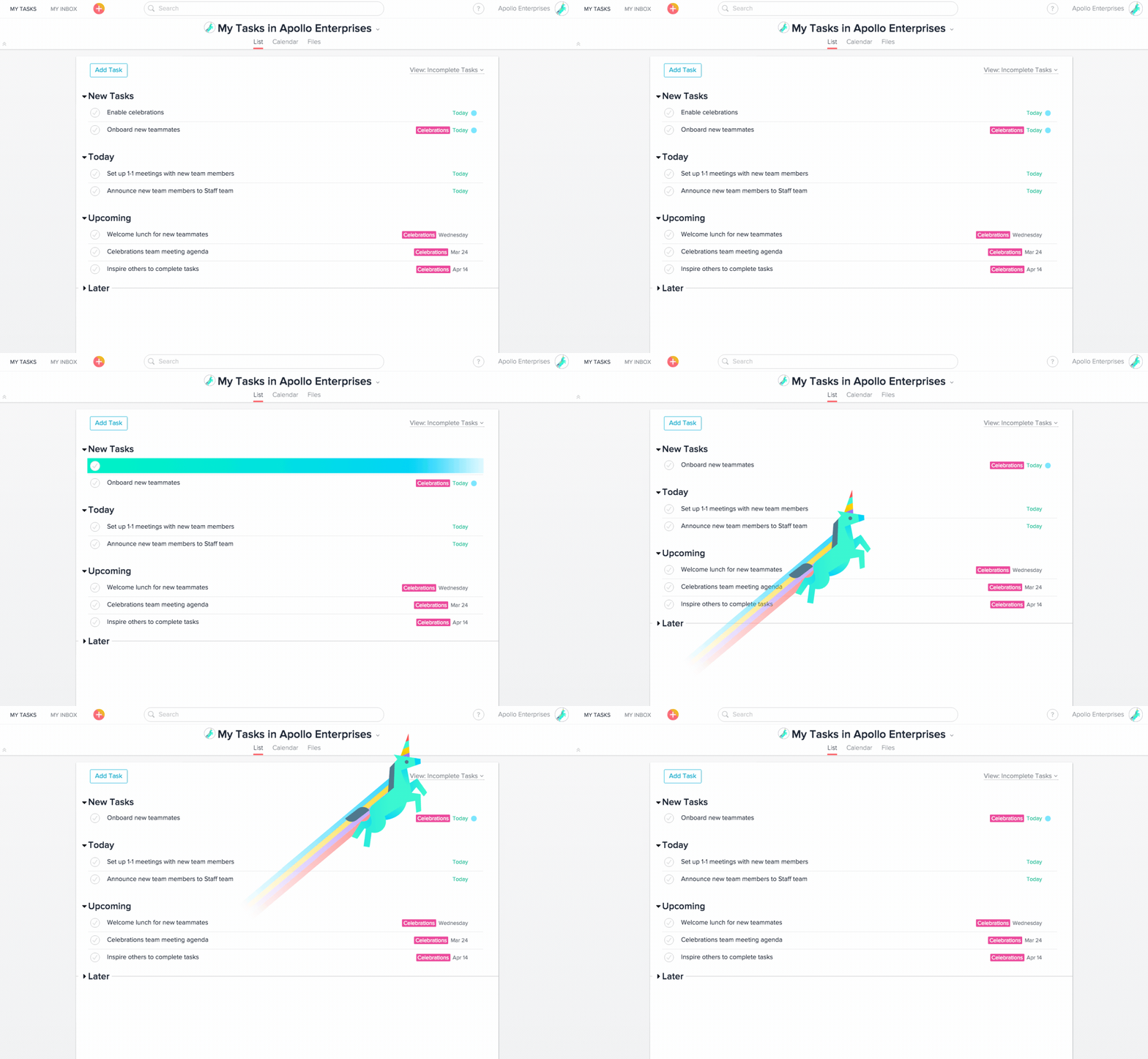
Investing in gamification can be worthwhile when you want to enhance adoption metrics and activation rates.
6. Offer in-app support to help users reach the activation point effortlessly
An in-app resource center is more than just a knowledge base that sits on your website.
It’s the one place where users go for help and it’s right there, in your product.
An in-app resource center acts as a help center. You can add a variety of resources to educate the users, launch in-app experiences, add micro-videos, open chat, etc.
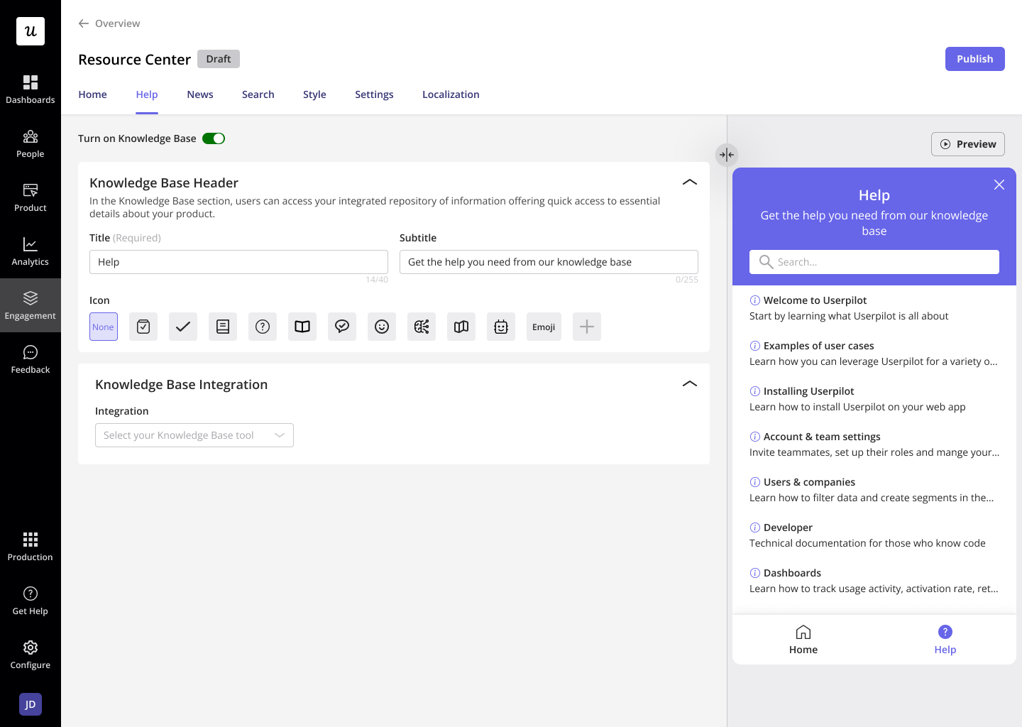
Some help centers even automatically exhibit relevant help documents based on the pages users are on. You can even connect them with user activation events.
A help center helps your SaaS business by improving activation through self-service support.
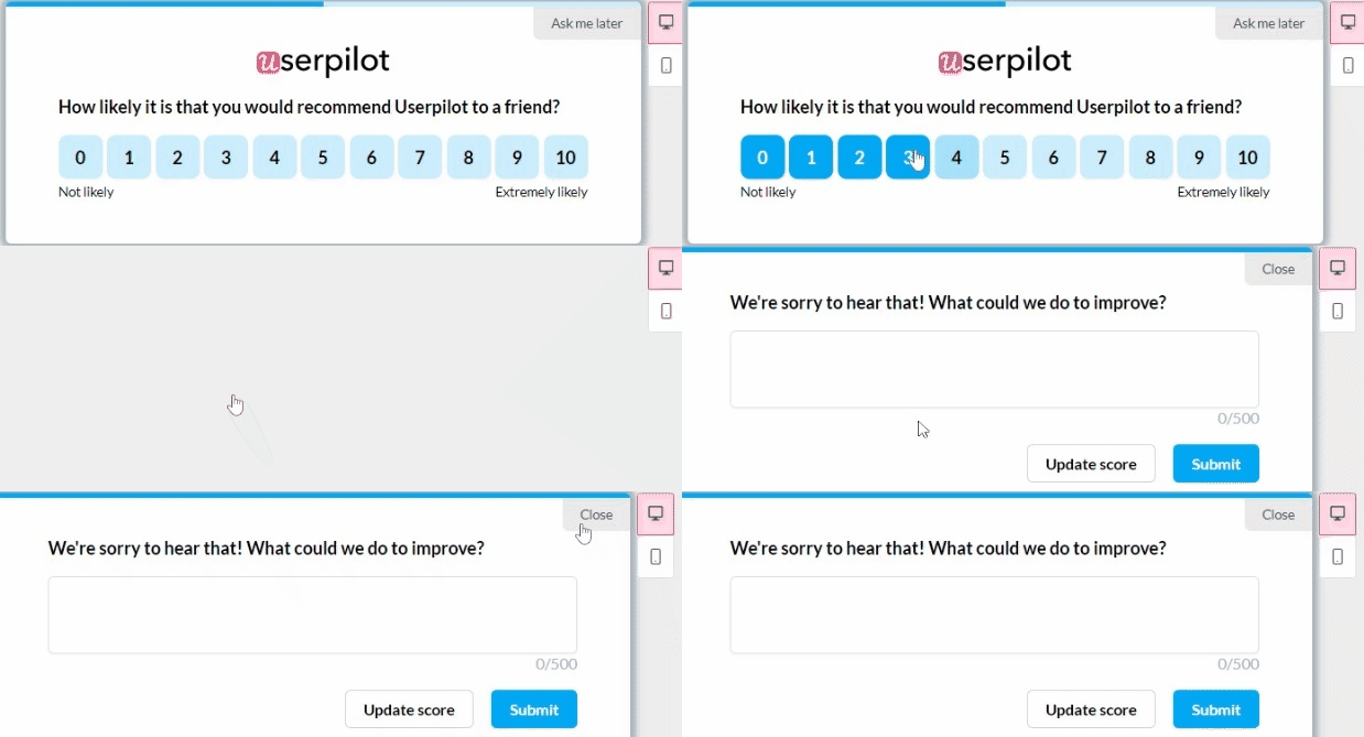
7. Collect user feedback from paying customers to improve user activation rate
By leveraging feedback from a paying customer who was once a free trial user, you can gain valuable insights and make targeted improvements to your SaaS user onboarding strategy and user experience, ultimately leading to higher user activation rates among trial users.
8. Use email to bring back inactive users and increase activation
In-app engagement won’t work if users are not inside the app. Hence, you require a strategy to engage with users outside the app and bring them back. This is where an email marketing tool comes in handy.
And a contextual email marketing strategy is all you need.
It works parallel to your in-app engagement efforts mentioned above by educating and nurturing the user throughout the trial.
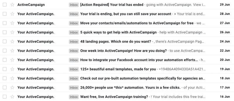
Here’s how ActiveCampaign, an email marketing automation tool, uses email to bring users back into the app.
They start by welcoming users to their app and ”showing” them around by highlighting the main actions they can take to get started.
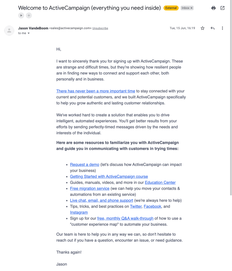
Then, they follow with extra guidance and benefits through a series of emails meant to highlight the product’s value and give you a reason to start using the product.
How famous brands improved their activation rates
This section delves into the success stories of SaaS companies that have mastered increasing their activation rates. These case studies showcase how adjustments can improve engagement and activating users.
How Attention Insight improved user activation by 47% with interactive walkthroughs
Attention Insight, an AI-powered tool offering attention heatmap analysis, faced low user activation rates. To address this, they implemented onboarding flows. This included interactive walkthroughs and an onboarding checklist.
This strategy led to a significant increase in user engagement with key features. The result was a 47% relative increase in users creating heatmap analyses. They also had an 83% increase in engagement with the ‘Areas of Interest’ feature, which is crucial for the product’s value realization.
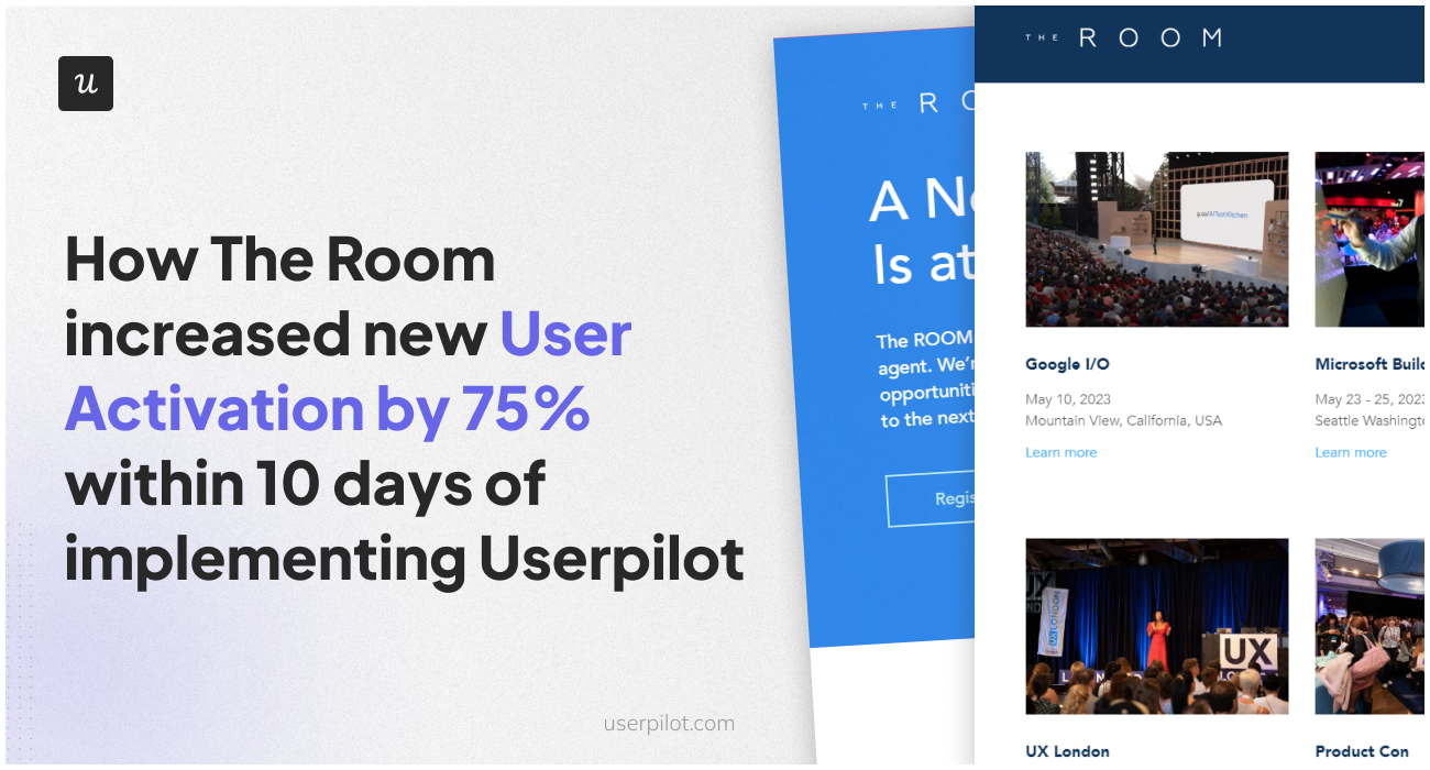
How The Room increased new user activation by 75% within 10 days of implementing onboarding flows
The Room, a platform connecting African tech talent with global companies, faced a challenge with new members not uploading their CVs, a key activation point.
Implementing onboarding flows, which included a “driven action” UI pattern to encourage CV uploads, significantly increased user engagement.
Within ten days, The Room saw CV uploads increase from 200-210 to 300-350 per week, marking a 75% increase in customer activation.
How ClearCalcs improved activation with cohort analysis
ClearCalcs, the “Netflix for Engineering Calculations,” improved customer activation rates through cohort analysis and bespoke in-app onboarding experiences.
They focused on making the discovery of relevant calculators easier for new users, enhancing their initial experience.
By segmenting users based on roles, goals, and company size, ClearCalcs personalized the onboarding flow for different user needs, thus improving user activation in each segment.
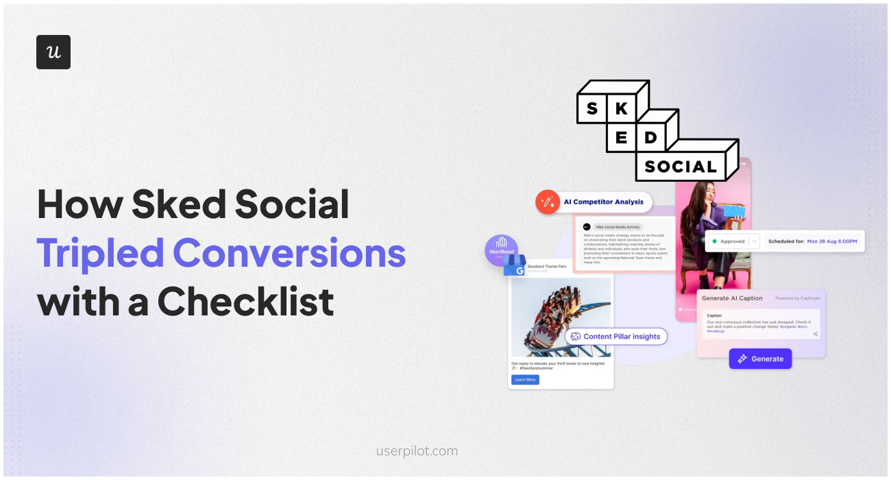
How Sked Social tripled activation rate and conversions with a checklist
Sked Social, a social media management platform, successfully tripled its conversion rates by incorporating an onboarding checklist into its user experience.
This checklist, containing four tasks, utilized psychological techniques like a progress bar and “endowed progress” (where one task is already checked off), guiding users through its product.
Users who completed the checklist were three times more likely to convert to paying customers than those who didn’t, highlighting the effectiveness of a well-structured and minimalistic onboarding process.
How Kontentino increased new user activation by 10% in the first month
Kontentino, a social media management tool, achieved a 10% increase in user activation within the first month of using a user engagement platform. They focused on two main activation points: linking social media accounts and scheduling the first posts.
Implementing an interactive walkthrough and a checklist contributed to this success. Kontentino’s approach to user onboarding was interactive and engaging, guiding users through essential steps in a way that was both easy and enjoyable, leading to a notable improvement in user activation.
How Getcraft saved weeks of dev time and doubled their user activation rate
Getcraft, a premium creative network, doubled its user activation rate by integrating Userpilot and Segment. This integration allowed Getcraft to create in-app experiences without coding, saving weeks of development time.
They focused on enhancing user onboarding, especially completing profiles, which was a major challenge.
Introducing interactive walkthroughs and checklists led to a substantial increase in profile completion rates, from 20% to over 40%, and significantly reduced customer support inquiries.
Conclusion
Increasing user activation SaaS is an important task within your company. Without it, you could miss out on stages that only need some fine-tuning to increase the rate.
Some of the tactics like checklists, interactive walkthroughs, and collecting feedback can be done with Userpilot. And without any technical knowledge. Do you want to get started with user activation rate optimization? Get a Userpilot Demo.

