Best User Tracking Tools: Complete Guide to User Analytics Software


A user tracking tool is software that monitors and records how people interact with your digital product, whether that’s a web app, mobile application, or SaaS platform.
These platforms turn raw interaction data into actionable insights that inform product development, marketing strategies, and user experience improvements. When a visitor lands on your website or opens your application, tracking tools begin recording their journey. Every page view, button click, form interaction, and navigation path becomes part of a comprehensive behavioral dataset.
This granular visibility enables teams to understand not just what happened but why it happened.
The core capabilities that define effective tracking tools include:
- Session recording, which captures individual user interactions as video-like replays.
- Heatmap generation, which visualizes aggregate click and scroll patterns.
- Funnel analysis, which tracks progression through multi-step processes.
- Event tracking, which monitors specific actions like feature usage or button clicks.
In this guide, I’ll cover 14 tools across all those categories, evaluated on what each one actually does well and where it falls short, so you can match the tool to the specific question your team is trying to answer.
How user tracking software works
User tracking platforms start with a lightweight code snippet, SDK, or tag manager embedded in your product. This code monitors real-time interactions like clicks, scrolls, form inputs, and navigation transitions. Mobile SDKs do the same for touch events and screen changes.
Raw interaction data then moves through a processing pipeline that groups actions into sessions, applies analytical frameworks, and generates visualizations. Advanced platforms layer in machine learning to detect anomalies and surface trends automatically.
The underlying data, including event timestamps, user identifiers, session context, and custom properties, is stored in a cloud infrastructure built to scale. This structured foundation powers all reporting and analysis downstream.
Best user tracking tools for collecting valuable insights
| Tool | Best for | Main use cases | Starting price | G2 rating |
|---|---|---|---|---|
| Mixpanel | Cross-platform event analytics | Funnel analysis, cohort tracking, marketing attribution | $24/month | 4.6/5 |
| Amplitude | Product analytics at scale | Event tracking, user journeys, experimentation | $49/month | 4.5/5 |
| Hotjar | Qualitative behavioral data | Session recordings, heatmaps, in-app surveys | $32/month | 4.3/5 |
| Google Analytics | Website traffic analysis | Real-time reporting, conversion tracking, audience insights | Free / Enterprise | 4.5/5 |
| Pendo | Mobile and web product analytics | Session replay, in-app feedback, paths analysis | Free / Custom | 4.4/5 |
| Crazy Egg | Heatmap-focused website optimization | Snapshots, error tracking, traffic analysis | $49/month | 4.2/5 |
| Tableau | Data visualization and BI | Custom dashboards, AI-powered insights, data connectors | $15/month | 4.4/5 |
| SimilarWeb | Competitive traffic intelligence | Web traffic analysis, competitor benchmarking, SEO insights | $125/month | 4.2/5 |
| Zendesk | Customer service interaction tracking | Embedded analytics, support reporting, historical trends | $55/month/agent | 4.3/5 |
| Salesforce | Sales and marketing pipeline tracking | Pipeline health, customer 360 view, AI-powered forecasting | $25/month/user | 4.3/5 |
| Sprout Social | Social media engagement tracking | Social listening, crisis alerts, audience timing | $249/month | 4.4/5 |
| ChartMogul | Subscription and revenue analytics | MRR/ARR tracking, churn analysis, revenue forecasting | Custom | 4.6/5 |
| AppDynamics | Infrastructure and APM tracking | Performance monitoring, customer journey correlations | Custom | 4.3/5 |
| Userpilot | In-product analytics + engagement | Autocapture, session replay, funnels, in-app engagement | $299/month | 4.6/5 |
1. Mixpanel: Best cross-platform user behavior tracking tool
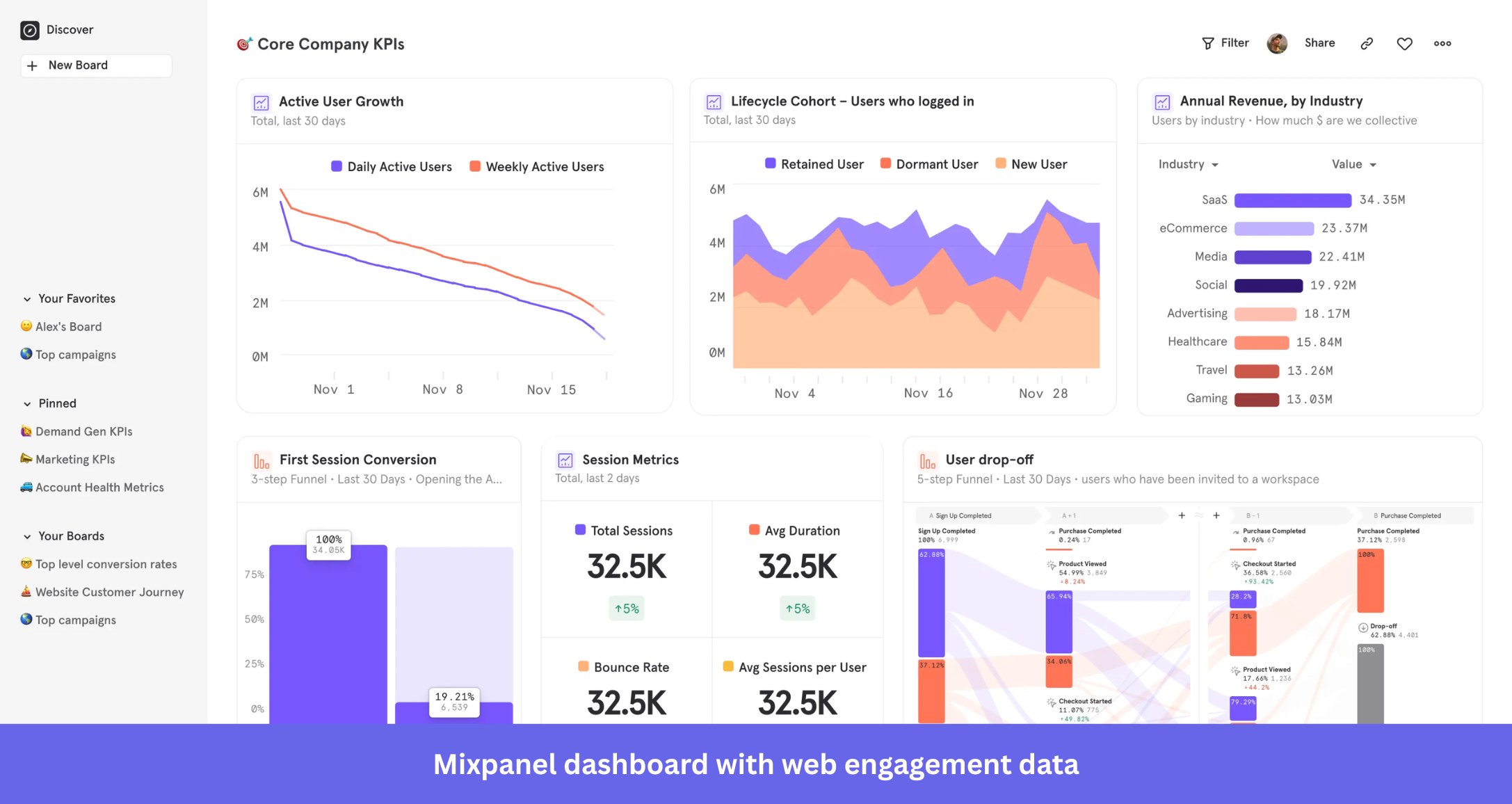
Mixpanel is an event analytics software that tracks user interactions with web and mobile applications. It’s built around the idea that understanding behavior at the event level, rather than the session or page level, gives product teams the most actionable signal.
Mixpanel’s main features for user tracking
- Flow analysis: Mixpanel’s flow analysis lets teams trace the full customer journey, including where users drop off and what actions preceded the drop. It’s one of the stronger implementations of drop-off analysis available at this price point.
- Marketing analytics: Multi-touch attribution connects behavioral events to downstream conversions, and identity resolution pairs anonymous sessions with authenticated user profiles as they sign up or log in. This is especially useful for B2B teams tracking trial-to-paid conversion.
- Data integrations: Mixpanel connects to tools across the product and marketing stack, from product growth platforms to customer experience optimization tools. The bidirectional sync with data warehouses (BigQuery, Snowflake) is well-regarded by data teams.
Mixpanel pros and cons
| Pros | Cons |
|---|---|
| Flexible event schema that lets you track almost any interaction without rigid data models. | Steeper setup curve than no-code alternatives. Requires some technical investment upfront. |
| Strong retroactive analysis so you can query historical data against new event definitions. | UI is a bit confusing to navigate and keeps changing often, which prevents you from learning the tool. |
| Generous free plan for startups under 5 years old. | Session replay is relatively new and lacks the maturity of dedicated tools like Hotjar. |
| Per-event pricing can escalate unpredictably for high-volume products. |
The retroactive querying is what most Mixpanel users point to first. Drew P., Business Owner, puts it well:
I appreciate the clear visibility into the full customer journey across all my channels, allowing me to see what’s driving behavior and revenue. Mixpanel lets me validate experiments quickly.
That speed comes with a setup cost, though. Aaron T. reflects what I hear from most first-time users:
The learning curve can be a bit steep for those who have never used a product analytics platform before. There are also often syncing issues when you are trying to make multiple edits quickly.
Mixpanel pricing
Mixpanel has event-based pricing, which makes it genuinely flexible at early scale, but worth watching as volume grows.
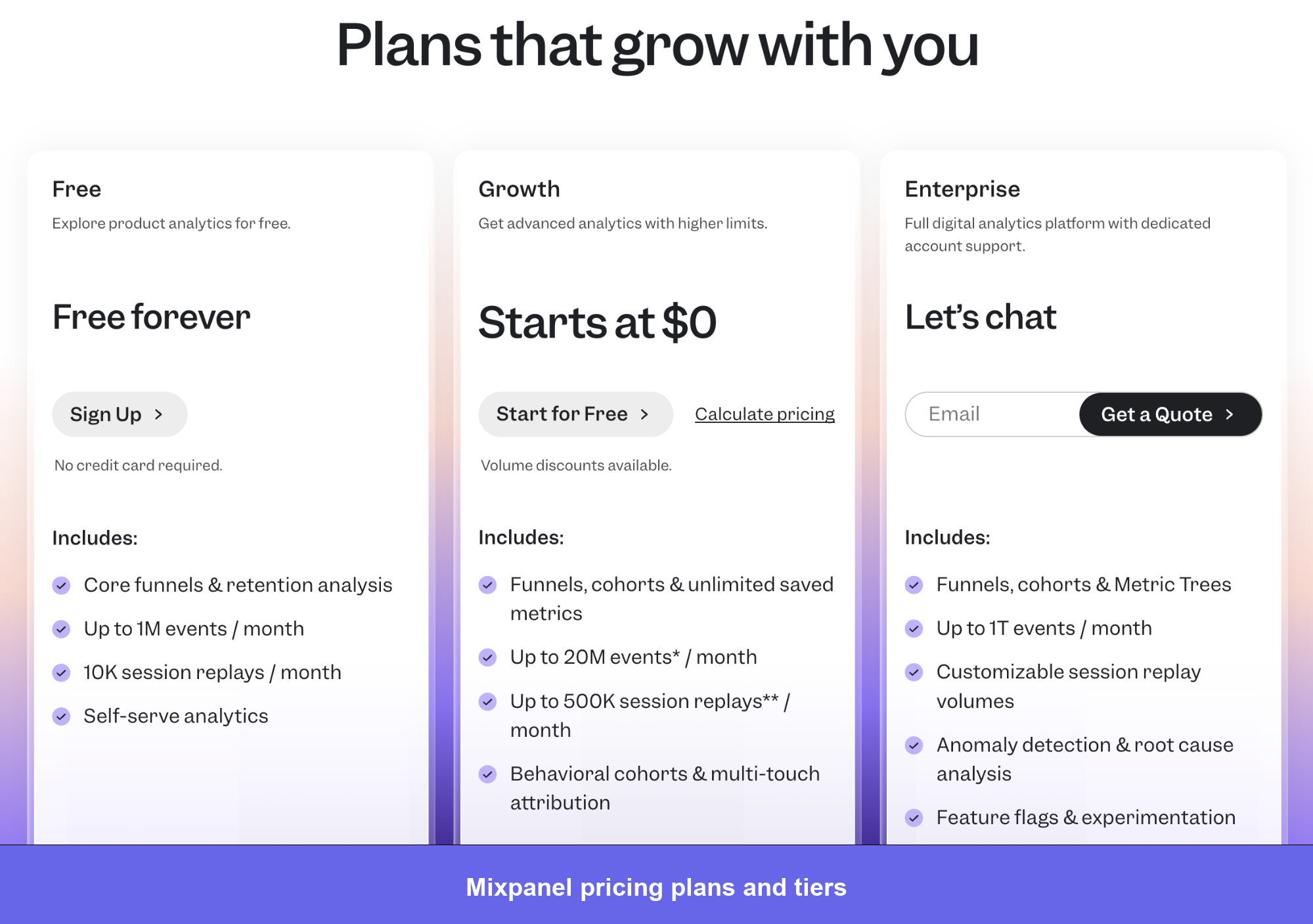
Mixpanel pricing:
- Free: 1 million events/month, 5 saved reports, 10K session replays, core funnels and cohorts. Solid for pre-PMF teams who want to test the data model before committing.
- Growth: Starts at $24/month for 10K events, scaling to ~$2,289/month at 20M events ($0.28 per 1K events after the first million). Unlocks unlimited saved reports, 20K session replays, multi-touch attribution, and anomaly detection. Best for small-to-mid SaaS teams running active funnel and retention work. Startups under 5 years old get the first year free.
- Enterprise: Starts around $23,000/year based on reported quotes. Adds data governance, custom data views, access controls, and dedicated support.
Most G2 reviews that talked about pricing referred to how quickly it scales. Radhika, a Software developer said:
Another downside is pricing. As data volume grows, costs can increase quickly, which can be challenging for smaller teams or early stage products
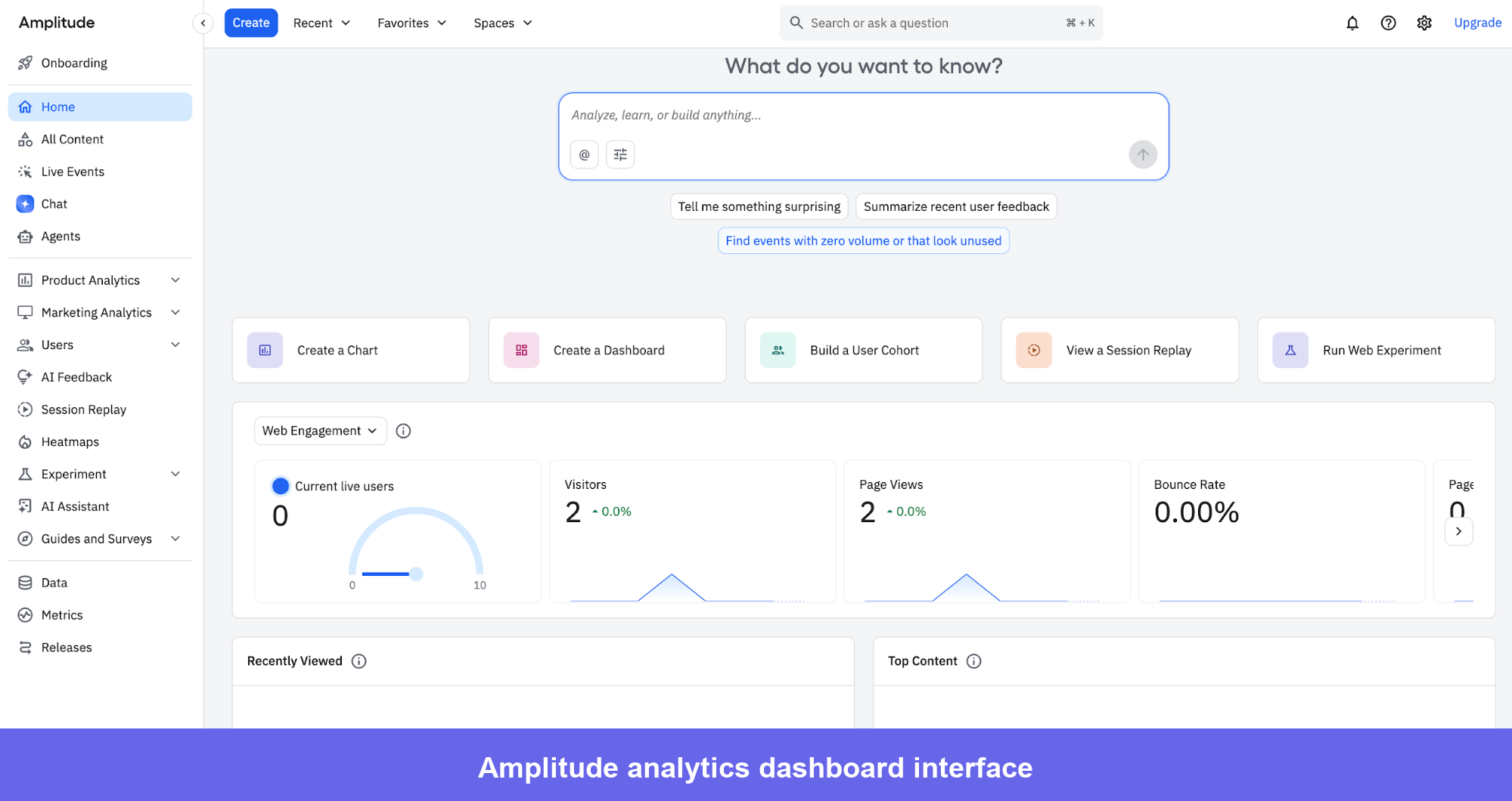
2. Amplitude: Best event tracking software
Amplitude is a product analytics software best known for its advanced event-tracking capabilities. Where many tools focus on acquisition metrics, Amplitude is built around understanding what happens after users sign up, making it the go-to tool for PLG teams focused on activation and retention.
Amplitude’s main features
- Goal tracking framework is well-integrated with behavioral cohorts, making it easy to see which user segments are on track versus which are lagging.
- Funnel analysis: Visualizes conversion through any defined sequence of events and supports segment comparison within the same view. You can compare how enterprise versus SMB accounts move through onboarding, for example, in a single report.
- Session replay with direct integration into its analytics: You can jump from a funnel drop-off directly into relevant recordings. The implementation is solid, though not as feature-complete as dedicated session recording tools.
Amplitude pros and cons
| Pros | Cons |
|---|---|
| Industry-leading behavioral cohort analysis | Pricing can become significant as data volume scales |
| Clean integration between session replay and quantitative analytics | Feature flags can be confusing to configure; multiple users report setup frustration |
| Strong documentation and community resources | Event instrumentation requires technical investment. Amplitude is not a no-code tool |
| Built-in A/B testing and experimentation module | Steeper learning curve compared to simpler analytics platforms |
Amplitude makes it easy to analyze behavioral cohorts, as Isaac L. stated:
I use Amplitude Analytics for product, cohort, and UX analysis. I like that it allows building intuitive dashboards without needing to know SQL.
However, building the perfect dashboard with the right set of data needs clean instrumentation right from the beginning. Dan R., Head of Customer Success, learned this the hard way:
Amplitude Analytics is fairly dense and we needed developer assistance to get started. We also had some struggles with attributing account-based analytics vs user-based analytics.
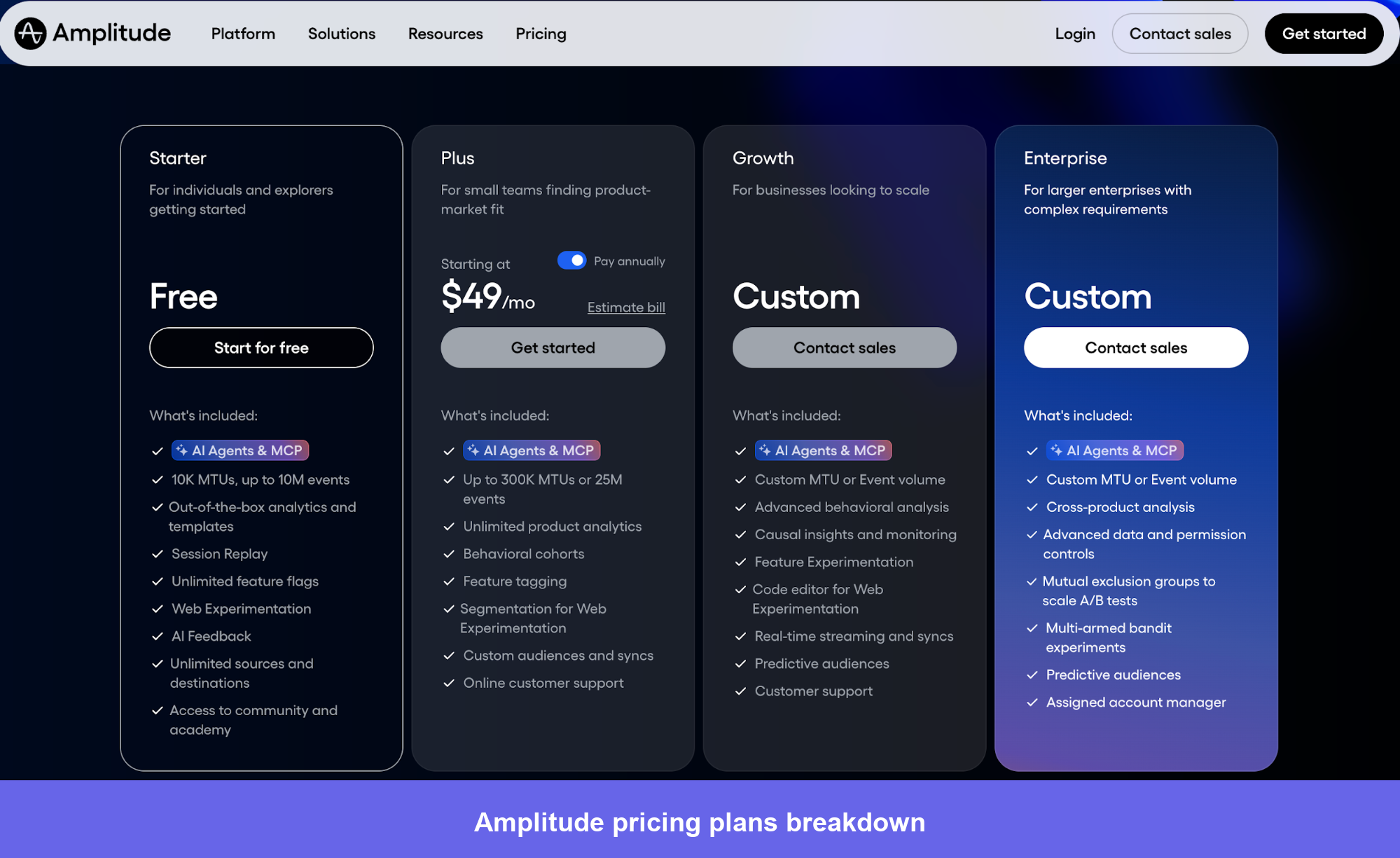
Amplitude pricing
Amplitude’s Plus plan starts at $49/month billed annually. Growth and Enterprise plans use custom pricing. A free plan and a 14-day free trial are available.
Amplitude charges based on Monthly Tracked Users (MTUs), which makes costs more predictable than event-based models for teams with stable user volumes.
Costs escalate quickly at scale, though, with real-world enterprise contracts typically running $23,000–$340,000/year based on Vendr data.
While the pricing is transparent, it scales fast. Most reviewers echoed the sentiment that Himanshu, a product and marketing lead, shared:
Amplitude Analytics’ pricing model is determined by data volume, meaning that the more events you track, the higher the cost.
This structure discourages teams from tracking additional events, even though product teams generally want to collect as much data as possible. In our organization, this has become a significant obstacle.
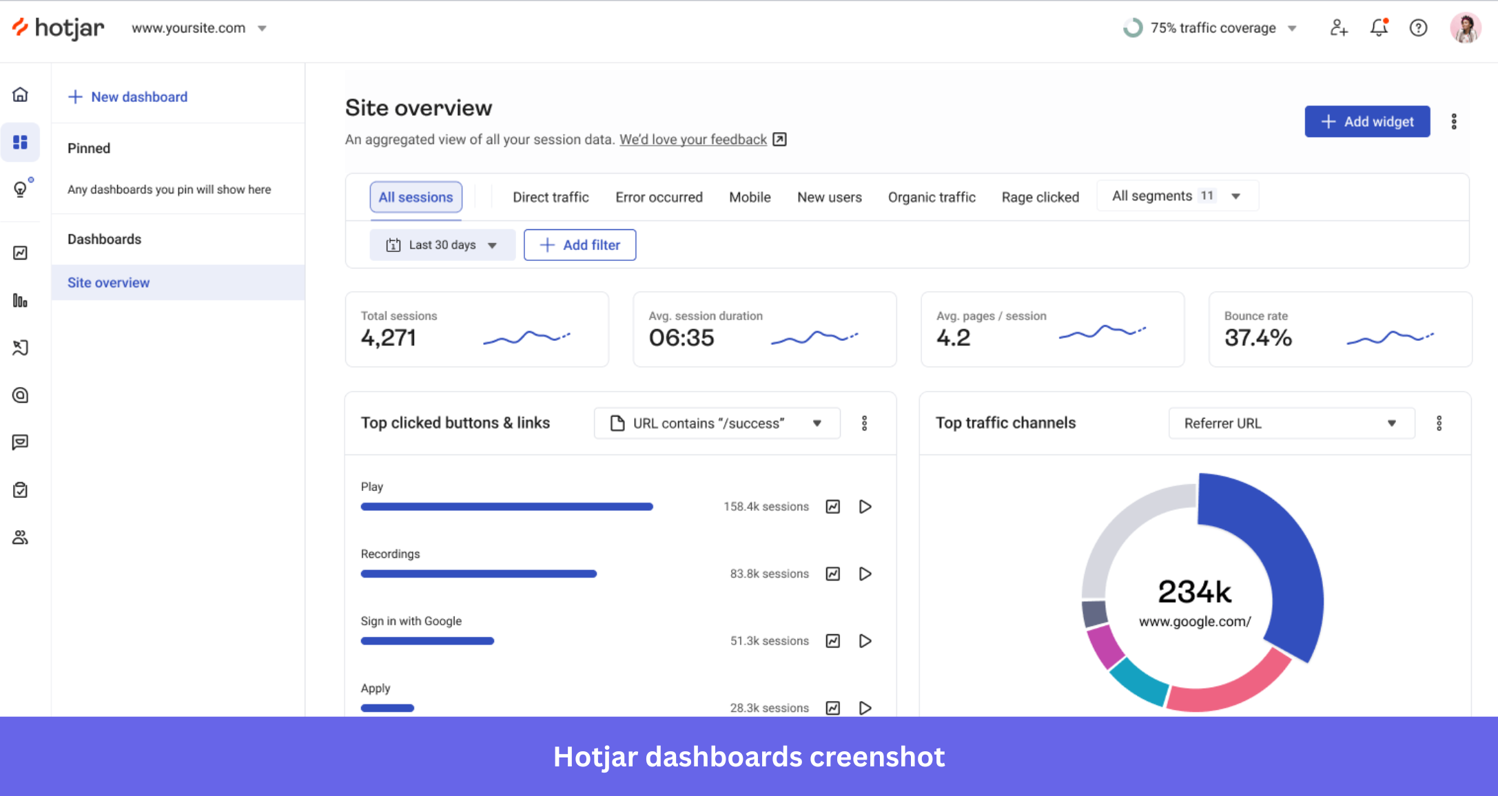
3. Hotjar: Best tool for tracking users with session recordings
Hotjar is a behavioral analytics platform best known for its session recordings and heatmaps. It’s widely used by UX teams and product managers who want qualitative behavioral data without a heavy technical setup.
Hotjar’s main features
- Session recordings: Captures user interactions with visible frustration signals like rage clicks, U-turns, and dead clicks that indicate friction to help you correlate customer experience with qualitative data. This surfacing of friction patterns is one of the more refined implementations in its category.
- Heatmaps and scroll maps: Show where users click and how far they scroll on specific pages. In my experience testing it, the tooling is reliable and quite intuitive to set up for non-technical teams.
- Surveys: Hotjar uses AI to help generate in-app surveys, which reduces the time to launch feedback collection. The survey tool integrates with session recordings so you can see the behavioral context around a specific response.
Hotjar pros and cons
| Pros | Cons |
|---|---|
| Among the easiest session recording tools to set up and use | Limited quantitative analytics; not a replacement for event-based platforms |
| Frustration signal detection (rage clicks, dead clicks) is genuinely useful | The free plan’s session recording limit (35 sessions/day) is restrictive for active products |
| Most popular for heatmap tooling trusted by UX teams for years | No mobile SDK. It is web-only limits coverage for app-heavy products |
Hotjar’s biggest strength is how easy yet comprehensive its session recording tools are. Kalinda N., Product and Growth Manager, captures this:
Heatmaps and session recordings clearly highlight where users pause, scroll or drop off which makes analysing visitor behaviour surprisingly straightfoward.
But while the setup is easy, the session limits can make recording those sessions quite restrictive. Sarita, an executive mentioned that:
The session limits feel restrictive on a busy website.
Hotjar pricing
Hotjar is now part of Contentsquare, and the pricing reflects that. Four tiers, all session-based, with data collection pausing rather than sampling once you hit your monthly limit.
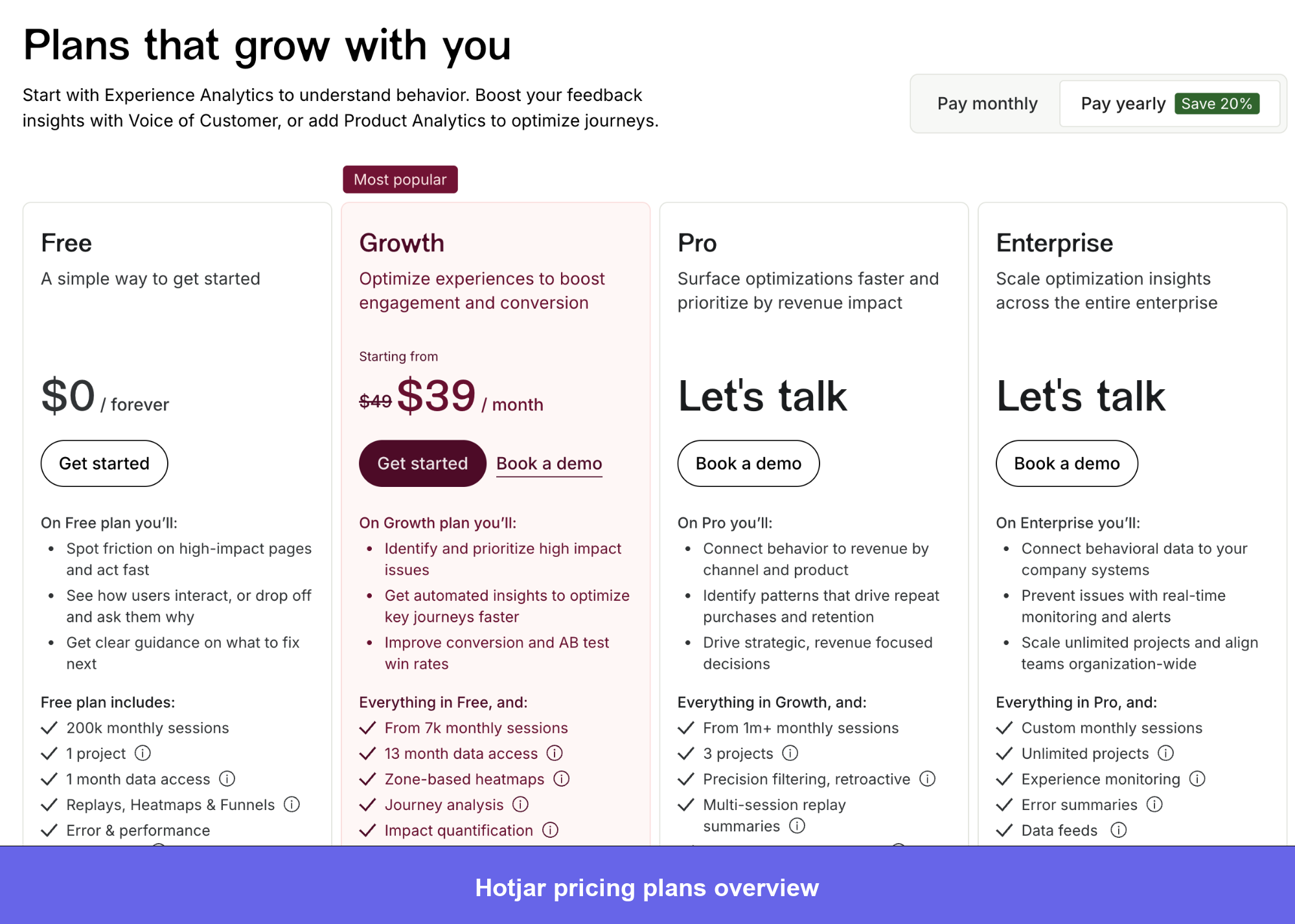
Hotjar pricing plans on Contentquare (parent)
- Free: 200,000 monthly sessions, unlimited heatmaps, session replay, standard filters, and one month of data retention. Enough to run a real diagnosis on a low-to-mid traffic site without spending anything.
- Growth: $40/month (billed annually). Adds funnels, 13 months of data access, frustration scoring, advanced filtering, AI-powered Sense insights, zone-based heatmaps, and 15+ integrations. The right tier for teams actively running CRO or onboarding optimization work.
- Pro: Custom pricing, for sites at 1M+ monthly sessions. Adds journey analysis, retroactive precision filtering, and revenue impact evaluation.
- Enterprise: Adds digital experience monitoring, data feeds, and unlimited projects across regions.
The pricing tiers could be more flexible for mid-sized businesses experiencing rapid growth. — Art B., Conversion Rata Optimisation Manager
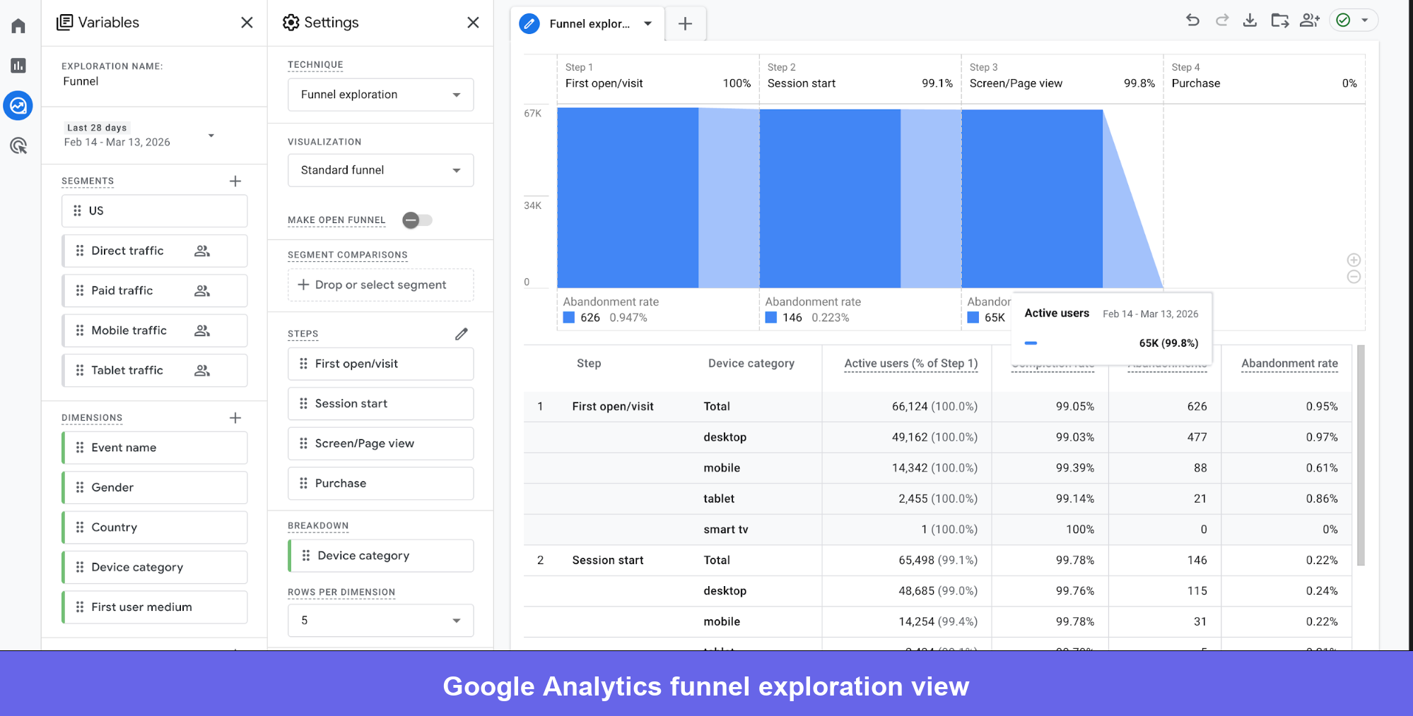
4. Google Analytics: Best website visitor tracking software
Google Analytics is a freemium web analytics platform and is still one of the most widely deployed tracking tools. GA4 brings improved event-based tracking and cross-platform measurement.
GA4 main features
- Real-time reporting: Google Analytics surfaces user activity as it happens, including active users, current page views, traffic sources, and conversion events in real time.
- Engagement reports: Show a detailed breakdown of user interactions, conversion reports measure marketing effectiveness, and screen reports highlight the most-visited landing pages.
- Cohort and user exploration: Support user segmentation by acquisition date, demographics, or behavioral properties. The User Explorer lets you drill deeper into individual user journeys and improve customer experience, though this capability is less detailed than dedicated product analytics tools.
Google Analytics pros and cons
| Pros | Cons |
|---|---|
| Free plan is genuinely powerful for most website analytics needs | GA4’s interface is a steep adjustment for teams coming from Universal Analytics |
| Deep integration with Google Ads and Search Console | Limited behavioral depth for in-app product analytics compared to specialized apps on the market. |
| Strong community, documentation, and third-party support ecosystem | Privacy compliance requires careful configuration. It’s less straightforward than privacy-first alternatives |
For web analytics, GA4’s free tier is hard to argue with. Anukant S., SEO & Performance Marketing Consultant, reflects the core value:
Google Analytics provides deep, reliable insights into user behavior, traffic sources, and conversions. It helps me clearly understand how users interact with websites, which channels drive quality traffic, and where drop-offs happen in the funnel.
But the transition from Universal Analytics is where most teams hit friction. Vishnu G., SEO Analyst is candid:
The learning curve, especially with GA4, can be challenging for new users. Some commonly used reports are not as straightforward as before, and certain data comparisons require extra configuration. Documentation exists, but clearer in-tool guidance would make it more beginner-friendly.
Google Analytics pricing
GA4 is free for virtually all teams with no session or user caps. Most SaaS teams will never need the paid tier.
- Free: Unlimited users and sessions, real-time reporting, event tracking, conversion measurement, audience segmentation, and full Google Ads and Search Console integration. Covers the vast majority of web analytics use cases at any company size.
- Google Analytics 360: This plan adds hourly data freshness (vs. daily), unsampled reports, BigQuery export, higher hit limits, and dedicated support. Only relevant for very high-traffic organizations where data sampling skews report accuracy, or teams with financial reporting SLA requirements.
I appreciate the ecosystem of Google’s products. They offer extensive features at great pricing and have a widespread user base, facilitating access to numerous resources and support online. — Ajay J., Growth Marketing Lead
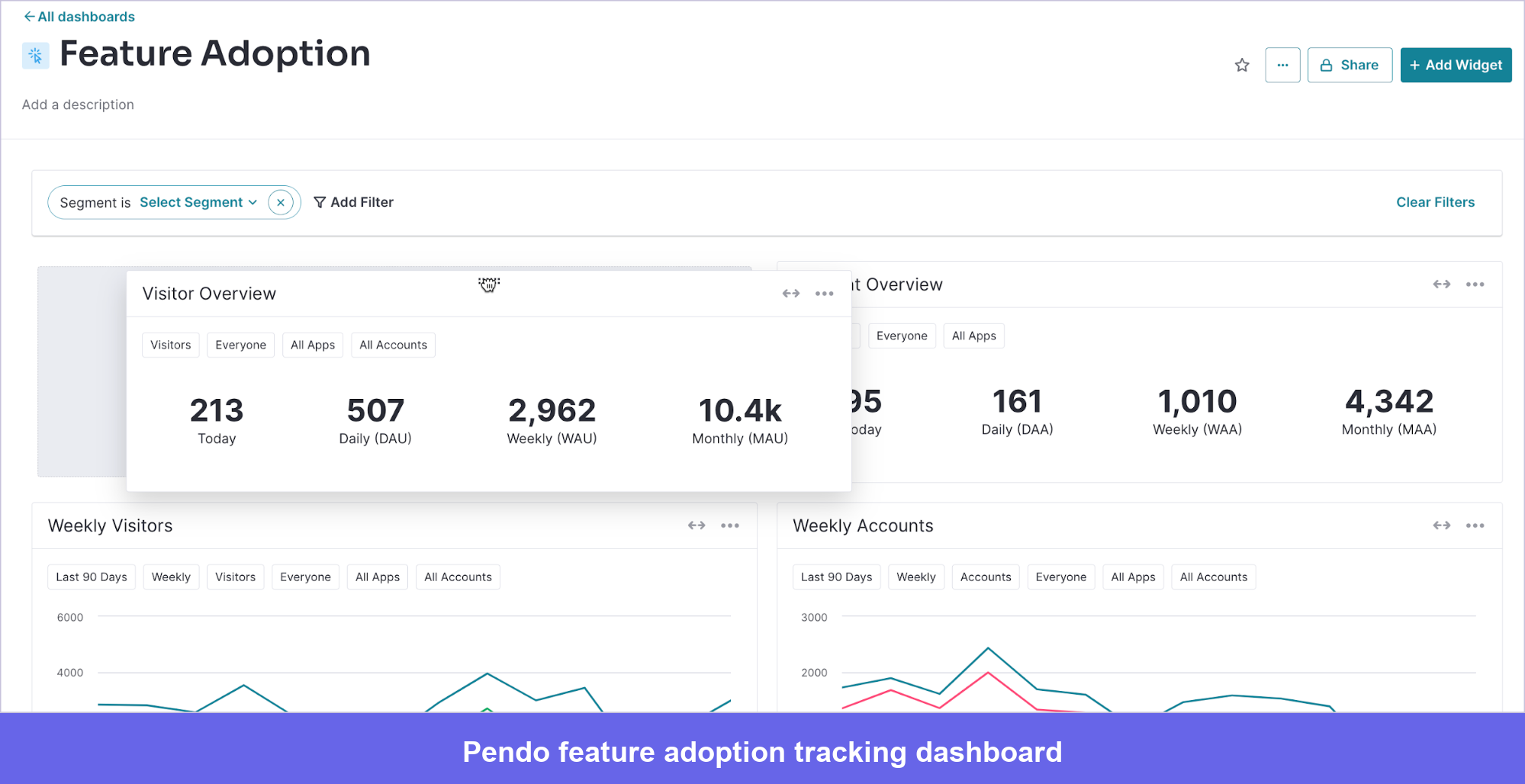
5. Pendo: Best for tracking mobile users
Pendo is a product experience platform for web and mobile apps. It’s particularly strong for teams that need to manage both web and native mobile experiences from a single platform, since most competing tools require separate implementations for each.
Pendo main features
- Session replay: Uncover explanations behind user actions, from conversion to user churn. Pendo keeps user information private through automatic PII masking on every session recording.
- Feedback collection: Build a feedback form and collect information with Pendo’s no-code in-app surveys. The Pendo Feedback module lets users vote on features, which gives product teams a prioritization signal that’s grounded in actual customer demand.
- Paths tracking: Conduct a path analysis of the entire customer journey. You can filter paths into different criteria, like visitor identification, date, and more, to isolate behaviors within specific user groups.
Pendo pros and cons
| Pros | Cons |
|---|---|
| Strong cross-platform tracking covering both web and native mobile | Quote-based pricing makes it difficult to assess cost before a sales conversation |
| In-app guides and onboarding features built into the same platform | Can be complex to implement correctly for teams without technical resources |
| Feature voting and feedback collection in a single tool | Analytics depth is less than dedicated tools |
| NPS surveys and walkthroughs included | Reporting customization can feel limited compared to more analytics-focused tools |
Pendo’s cross-platform tracking is what sets it apart from most tools in this list. Patricija B., a Junior Product Designer, confirms:
I love that I can leverage its various analytics tools to gather usage statistics and see a list of the most used devices/resolutions/language, etc. across our web and mobile applications.
The pricing is where most teams are forced to slow down. A user in computer software reflects this:
The cost ramps up significantly as your MAU (Monthly Active Users) increase, making it feel like you’re penalized for product growth.
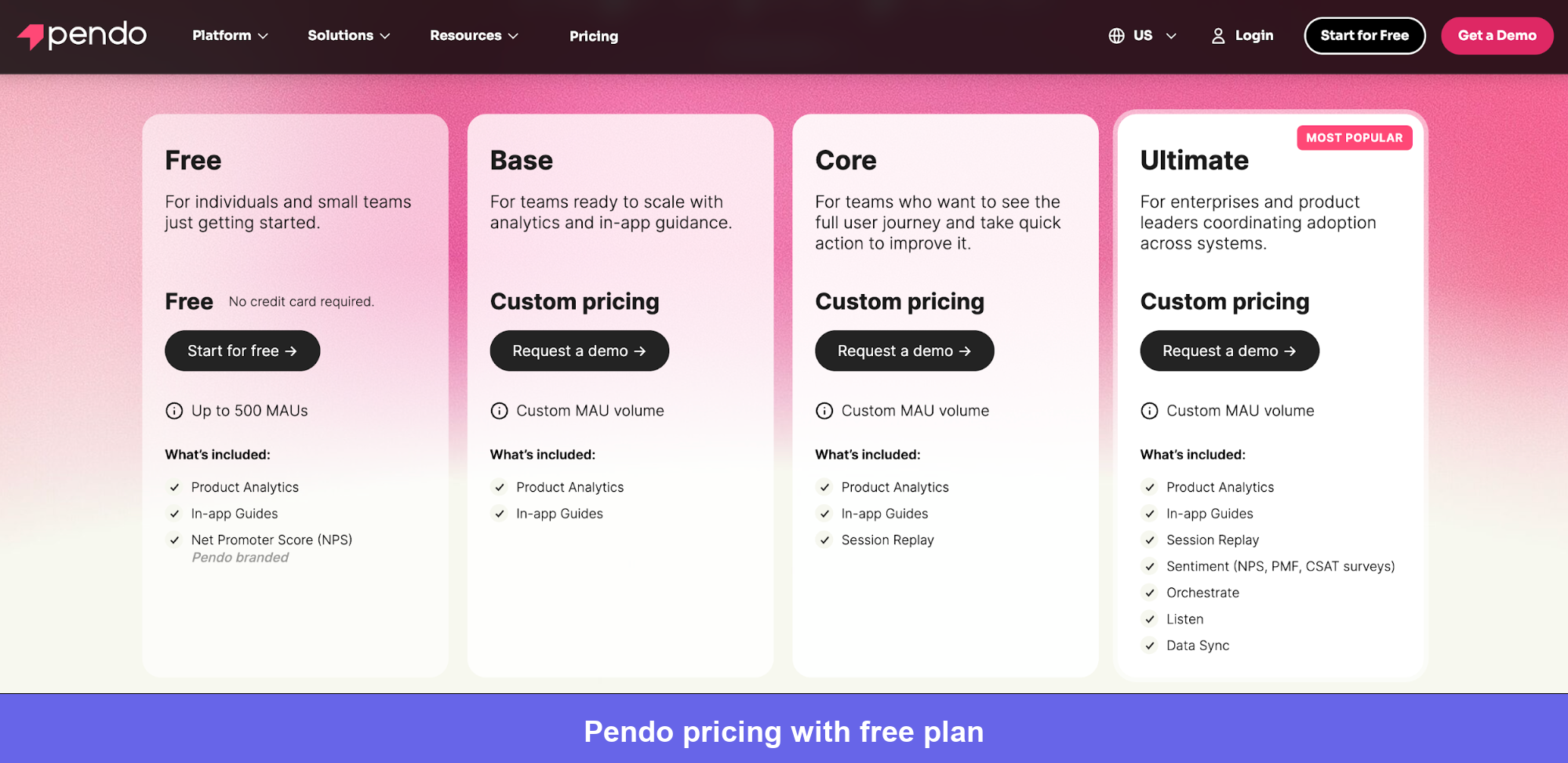
Pricing
Pendo’s pricing is based on MAUs and is entirely quote-driven. No public pricing, no self-serve paid signup. Based on Vendr data, budgets typically run $17,000–$146,000+/year depending on tier and MAU volume.
My personal take, before you sign up for a plan, confirm what’s bundled vs. a separate line item: session replay, the feedback module, and mobile analytics have appeared as add-ons in some procurement conversations.
Pricing is my biggest concern when it comes to adopting Pendo. For businesses with only a small customer base, their pricing model can easily exceed the budget you’d typically set aside for analytics software. — Angelo A., Team Lead and Senior Software Engineer
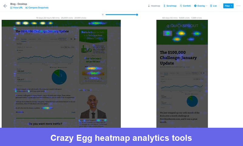
6. Crazy Egg: Best heatmap analytics tool for tracking website visitors
Crazy Egg is a product optimization tool equipped with website visitor tracking tools, specifically heatmap analytics. It’s designed with simplicity in mind, and teams typically get it installed and generating actionable heatmap data within an hour of signing up.
Crazy Egg’s main features
- Snapshots: Give you five visual reports for a single snapshot. Get common reports like heatmaps and scroll maps, or utilize the confetti report that doubles as a cohort analysis tool by showing which traffic sources and segments click where.
- Traffic analysis: Discover your top 10 traffic sources and analyze the performance of your marketing campaigns from different platforms. This is useful for understanding whether paid and organic audiences interact with your pages differently.
- Error tracking: JavaScript errors can be disastrous for your conversion and retention rates. Crazy Egg notifies you when errors happen and provides a session recording to give a qualitative account alongside the technical context. Crazy Egg also gathers contextual information regarding the error, from visitor identification to IP addresses.
Crazy Egg pros and cons
| Pros | Cons |
|---|---|
| Very fast to implement and generate actionable heatmap data | Limited product analytics beyond heatmaps and recordings |
| Confetti report provides segmented click analysis without extra setup | No mobile app tracking support |
| Error tracking with session recordings is a useful diagnostic combination | Doesn’t integrate with product databases for user attribute segmentation |
Speed to first insight is Crazy Egg’s clearest strength. Tricia T. reflects this:
Crazy Egg is so intuitive. It’s quick and easy to set up heatmaps and split tests. It gives us the ability to do more testing and get significantly better data than our landing page platform allows for.
The documentation is a little sparse. Alexander David B. puts this plainly:
“Once you need anything beyond heatmaps and basic recordings, you’ve hit the ceiling. We use it for CRO work but we still need a separate tool for anything funnel-related.”
Crazy Egg pricing
Crazy Egg prices on tracked pageviews rather than sessions. All plans include unlimited domains, unlimited team members, and unlimited surveys. No overages: when you hit the monthly limit, data collection pauses and resumes on the 1st.
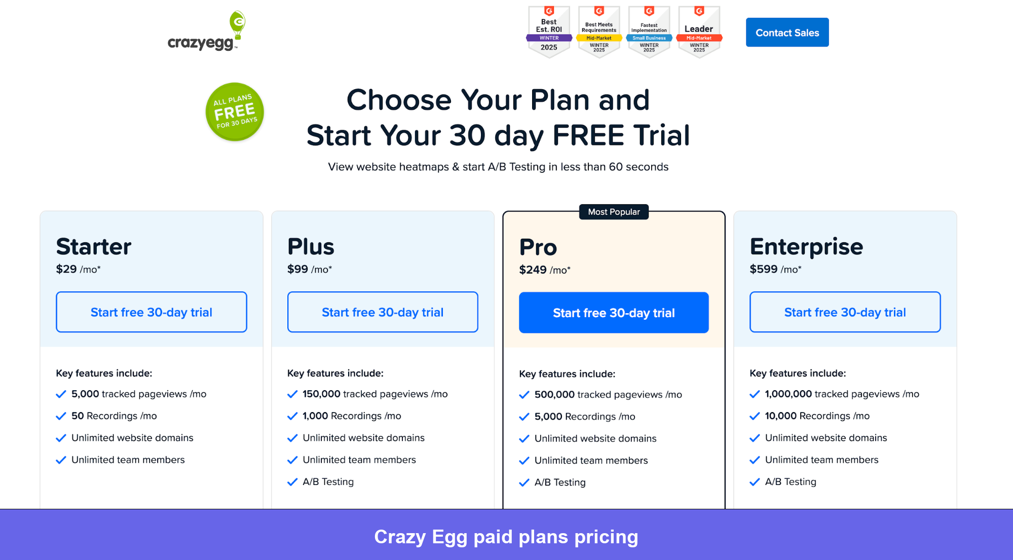
- Starter: $29/month (billed annually). 5,000 tracked pageviews, 50 recordings. Right for small blogs or single landing pages. No A/B testing at this tier.
- Plus: $99/month. 150,000 pageviews, heatmap reports, 1,000 recordings, A/B testing, and error tracking. The tier where Crazy Egg becomes a genuine CRO tool. A/B testing alone from dedicated tools typically costs $150–$500/month elsewhere, so the bundling is good value.
- Pro: $249/month. 500,000 pageviews and 5,000 recordings. For higher-traffic sites running ongoing optimization programs.
- Enterprise: $599/month. 1 million pageviews. A 30-day free trial is available on all plans.
7. Tableau: Best user data visualization tool
Tableau is a business intelligence and analytics software focused heavily on data visualization. It’s not a user tracking tool in the traditional sense, but it’s frequently used alongside tracking platforms to visualize and present behavioral data.
Tableau’s main features
- Dashboards: Depict relevant, industry-specific metrics at a single glance. You can connect user tracking data from external sources and build presentation-quality views that non-technical stakeholders can actually read and act on.
- AI-powered insights: Automatically detect drivers, trends, and outliers for metrics you track, with visualizations that present a complete rundown of what changed and why. This is particularly useful for surfacing anomalies in behavioral data that might not be obvious from standard reports.
- Data connectors: Data connectors give Tableau access to data it didn’t collect directly, expanding the scope of visualization and analysis. ODBC connectors allow Tableau to access and use data from different databases, making your data analysis more nuanced.
Tableau pros and cons
| Pros | Cons |
|---|---|
| Best-in-class visualization flexibility and dashboard customization | Not a tracking tool. It requires data from external sources to be useful |
| Strong AI-assisted insight detection through Tableau Pulse | Steep learning curve for building advanced custom dashboards |
| Wide range of data connectors for centralizing analytics data | Can be expensive when licensed across larger teams |
| Excellent for presenting findings to non-technical stakeholders | Setup and maintenance require upfront time investment |
For presenting complex, multi-source data to leadership, Tableau is what most data teams reach for. Randi R., reflects this:
The visual presentation of analytics with charts and dashboards is very beneficial, aiding in making KPIs more robust and data more accessible on a single page.
On the other hand, the UI is hard to work with. Sandy T., Lead Data Analyst reflects what I’ve seen mentioned in many reviews:
It doesn’t work well for non-technical users and is hard to navigate for dashboards. Tableau Reader is a terrible program and doesn’t work for many people.
Pricing
Tableau uses role-based per-seat licensing. You pay based on what each person needs to do with the data, not a flat per-user rate. All plans require an annual commitment.
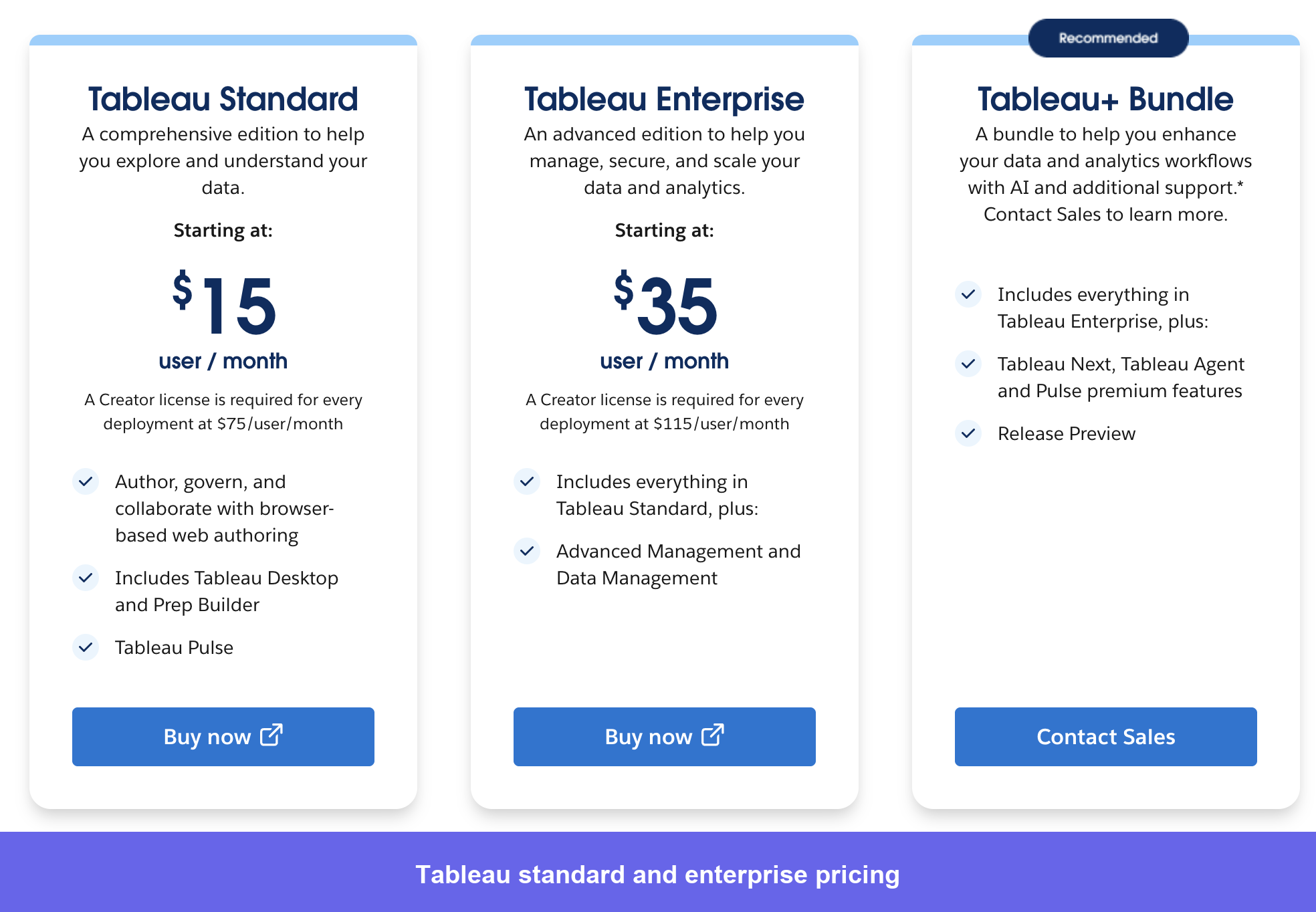
- Viewer: $15/user/month ($180/year). Can interact with and view published dashboards. Best for executives, business stakeholders, and decision-makers who consume analytics but don’t build anything.
- Explorer: $42/user/month ($504/year). Can explore data and do ad-hoc analysis from published data sources but can’t connect new raw data or build Prep flows. Best for analysts running their own queries from existing sources.
- Creator: $75/user/month ($900/year). Full access: Tableau Desktop, Tableau Prep, and publishing rights. For data analysts and engineers building and maintaining dashboards and pipelines.
- Enterprise: Volume discounts available from around 20–50 licenses. Teams in the Salesforce ecosystem can negotiate 15–25% off bundled contracts. Nonprofits and academic institutions can access free or deeply discounted licenses.
I find the pricing of Tableau challenging. The cost, including continued subscriptions and add-ons to the Salesforce application, is increasingly difficult to justify to leadership. — Christopher P., Lead Academic Advisor
8. SimilarWeb: Best tool for tracking website traffic
SimilarWeb is a data aggregation tool specializing in web analytics. Unlike most tools on this list, it provides intelligence about websites you don’t own, making it particularly valuable for competitive benchmarking alongside your own first-party analytics.
SimilarWeb’s main features
- Website visitor tracking dashboard: Surfaces monthly visitors, geography, referring sites, social and search traffic, and engagement metrics like bounce rate and pages per visit. The depth of data available without site ownership is SimilarWeb’s clearest differentiator.
- Website ranking by estimated visit volume: Provides industry category rankings, making it useful for competitive positioning and market sizing exercises.
- Competitive analysis: Shows how competitor sites are performing across SEO, PPC, and referral channels. This is particularly valuable for teams building SEO strategies or evaluating market expansion opportunities.
SimilarWeb pros and cons
| Pros | Cons |
|---|---|
| Unique external traffic intelligence with no competitor access required | Traffic estimates are modeled, not exact so accuracy varies by site size and vertical |
| Effective for competitive benchmarking and market research | Premium competitive features are expensive relative to the use case frequency |
| Clean interface with clear dashboards that non-analysts can navigate | Not a product analytics tool; offers no insight into in-app user behavior |
| Some free functionality is available without an account | Data freshness can lag; real-time tracking is not available |
The ability to benchmark competitors without any access to their data is SimilarWeb’s defining capability. Thibault D., Chief Marketing Officer, captures it:
I use Similarweb to benchmark our closest competitors on a monthly basis. It is a best way to not only assess marketing performances on top of internal data but also get learnings on competitors’ best practises (e.g. referrals list, top search keywords and sources of traffic).
But the accuracy varies depending on how you use the data. Emma W., Head of Marketing, flags a real limitation:
I have concerns about the data accuracy. The data sometimes does not align with internal reports or other sources, so it makes me hesitant to trust the data for us and our competitors based on these observations.
Pricing
SimilarWeb uses a modular pricing structure across five product lines. Web Intelligence is the most commonly purchased for competitive traffic analysis. No pricing is publicly listed beyond the entry-level tier, so most teams go through sales.
Based on procurement data from Vendr, the median buyer pays around $37,851/year, with deals ranging from $15,000 to $86,500 depending on product line, data volume, and contract length.
I find the pricing quite high, so I’m always thinking if it’s worth it. I don’t use it too often on a monthly basis because finding the origin of the user or user acquisition channels for competitors is too expensive. — A verified reviewer on G2
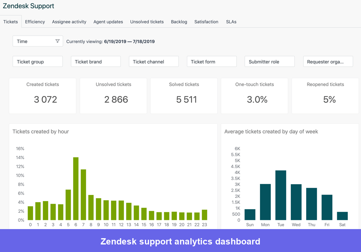
9. Zendesk: Best for tracking user interactions with the customer service team
Zendesk is an AI-optimized customer service software with visitor tracking capabilities. It’s primarily a support platform, but the analytics and reporting layer make it relevant as a user tracking tool specifically for teams who want to understand how customer behavior connects to support demand.
Zendesk’s main features
- Embedded analytics: Let teams gather and analyze incoming data embedded directly into the product or application. Teams also have the option to set up a standalone portal, depending on their workflow and audience.
- Reports: Deliver premium insights into user experience. You can access historical data to understand trends or make quick adaptations with real-time data. Utilize their pre-built dashboards or build a custom one for your specific support metrics.
Zendesk pros and cons
| Pros | Cons |
|---|---|
| Strong support analytics connecting tickets to user experience data | Primarily a support tool and not suited for product or marketing analytics |
| Pre-built reporting dashboards for common customer service metrics | Zendesk Explore (the analytics module) requires a higher-tier plan |
| AI-powered features for automated ticket routing and analysis | Can be expensive per agent at scale compared to alternatives |
| Large ecosystem of integrations with CRM and product tools | Learning curve for building custom reports in Explore |
Zendesk Explore’s intuitive dashboards help get started quickly. Brian B. shares this:
The interface remains clean and intuitive, making it easy for new team members to get up to speed quickly. I also appreciate the ticket organization, macros, and reporting features that help teams manage high ticket volumes more efficiently.
The per-agent pricing is what catches teams off guard as they scale. Balkishan N., Senior Software Engineer notes:
While Zendesk is powerful, the pricing can become expensive as your team grows or when adding advanced features. Some useful capabilities are locked behind higher-tier plans, which can make scaling costly.
Pricing
Zendesk charges per agent per month. Real-world costs are typically 2–3x the base plan rate once AI add-ons are factored in: Advanced AI ($50/agent/month), Quality Assurance ($35/agent/month), and Workforce Management ($25/agent/month) are all separate.
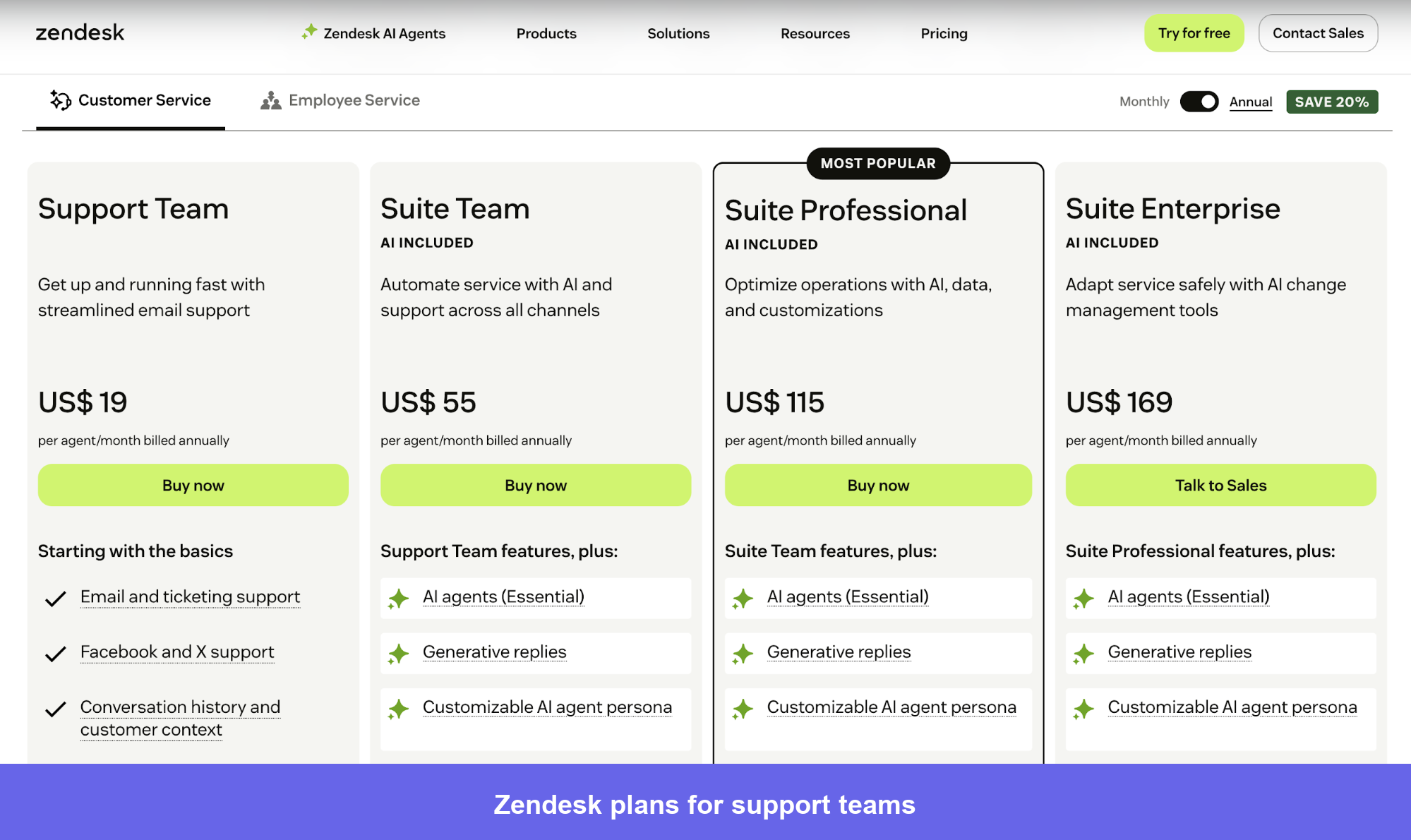
- Support Team: $19/agent/month. Email and social ticketing only. Most teams outgrow this quickly once customers expect chat or phone support.
- Suite Team: $55/agent/month (billed annually). Omnichannel ticketing, basic AI agents, and one help center. The realistic entry point for most support teams needing multichannel coverage.
- Suite Professional: $115/agent/month. Skills-based routing, HIPAA compliance, up to 5 help centers, custom reporting, and Copilot writing tools. The minimum viable tier for teams with meaningful SLA tracking or compliance requirements.
- Suite Enterprise: $169/agent/month and up. Up to 300 help centers, custom agent roles, and sandbox environments. Built for global enterprise support orgs.
10. Salesforce: Best user tracking tool for sales and marketing teams
Salesforce is a visitor identification tool and customer retention management software for marketing and sales teams. It’s the dominant CRM globally, and its tracking capabilities are most relevant for teams who need to connect behavioral data to pipeline and revenue outcomes rather than product usage patterns.
Salesforce’s main features
- Opportunity health signals: Whether a sale is about to close or customers are about to drop, you get notified of changes so you can grab opportunities before they pass.
- Customer 360-degree view: Customer data from every step of the journey is captured in one place. This shared view enables teams to work together to deliver personalized experiences and build trusted relationships with customers.
- Augmented marketing analysis: Create forecasts that predict user behavior. Einstein’s predictive scoring is particularly useful for identifying at-risk accounts before they churn.
Salesforce pros and cons
| Pros | Cons |
|---|---|
| Best-in-class CRM with strong pipeline and account tracking | Complex and expensive to implement correctly, especially for smaller teams |
| AI-powered predictions for churn risk and deal health | Costs escalate quickly with add-ons and additional seats |
| Excellent for connecting user activity to revenue outcomes | Not a product analytics tool. It’s limited for in-app behavioral tracking |
| Huge integration ecosystem across sales, marketing, and support | Customization often requires a Salesforce administrator or implementation partner |
The AI-powered querying and predictions in Salesforce speed up work. Krista K., a Director mentioned this in her review:
I find the ability to use AgenTek AI with Agentforce from a customer service standpoint incredibly valuable. It allows us to respond quickly, providing the confidence customers need as they self-serve.
The admin dependency is the part most teams underestimate before buying. A verified user on G2 shared this honestly:
The fact that it’s easy but there is the need for an admin or company to help setup more complex workflows.
Salesforce pricing
Salesforce charges per user per month. Beyond the license cost, budget for implementation ($25,000+ to start), an admin or Salesforce-dedicated resource, and AppExchange add-ons. According to Vendr data, an enterprise deployment typically runs anywhere from $12,000 to $239,000, with the median being $73,000 per year.
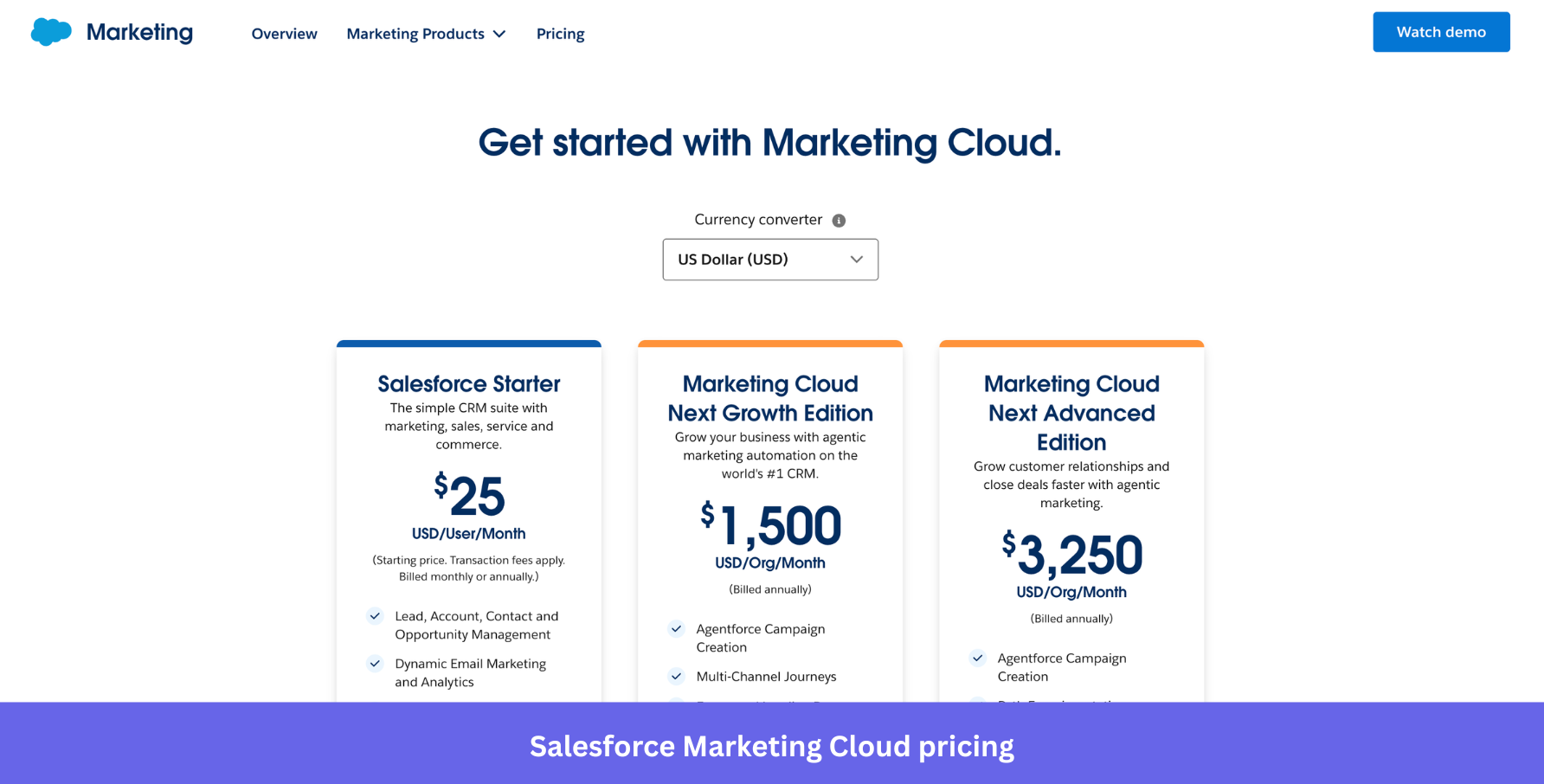
- Salesforce Starter: $25/user/month (billed monthly or annually). Basic CRM covering sales, service, and marketing with lead management, dynamic email, built-in sales flows, and Slack integration. Best for small teams with straightforward CRM needs.
- Marketing Cloud Next Growth: $1,500/org/month (billed annually). Adds Agentforce-powered campaign creation, multi-channel journeys, and forms and landing pages. For teams ready to run agentic marketing automation at scale.
- Marketing Cloud Next Advanced: $3,250/org/month (billed annually). Everything in Growth plus path experimentation and two-way SMS and WhatsApp conversations. For teams running complex, multi-channel customer engagement programs.
With Salesforce being an enterprise-focused platform, the pricing reflects that, and so do the reviews.
I find the pricing structure for Salesforce Customer Success to be more expensive than I’d like. Additionally, the approach of hard selling can be off-putting and is something I would prefer to see reduced. — Kristi V., Director of Sales Operations
11. Sprout Social: Best tool for tracking user engagement across social media
Sprout Social is a social media management and web analytics tool with user engagement and customer analytics as key features. For teams whose products have a significant social media presence or community, Sprout Social provides the behavioral signal layer that pure product analytics tools miss entirely.
Sprout Social’s main features
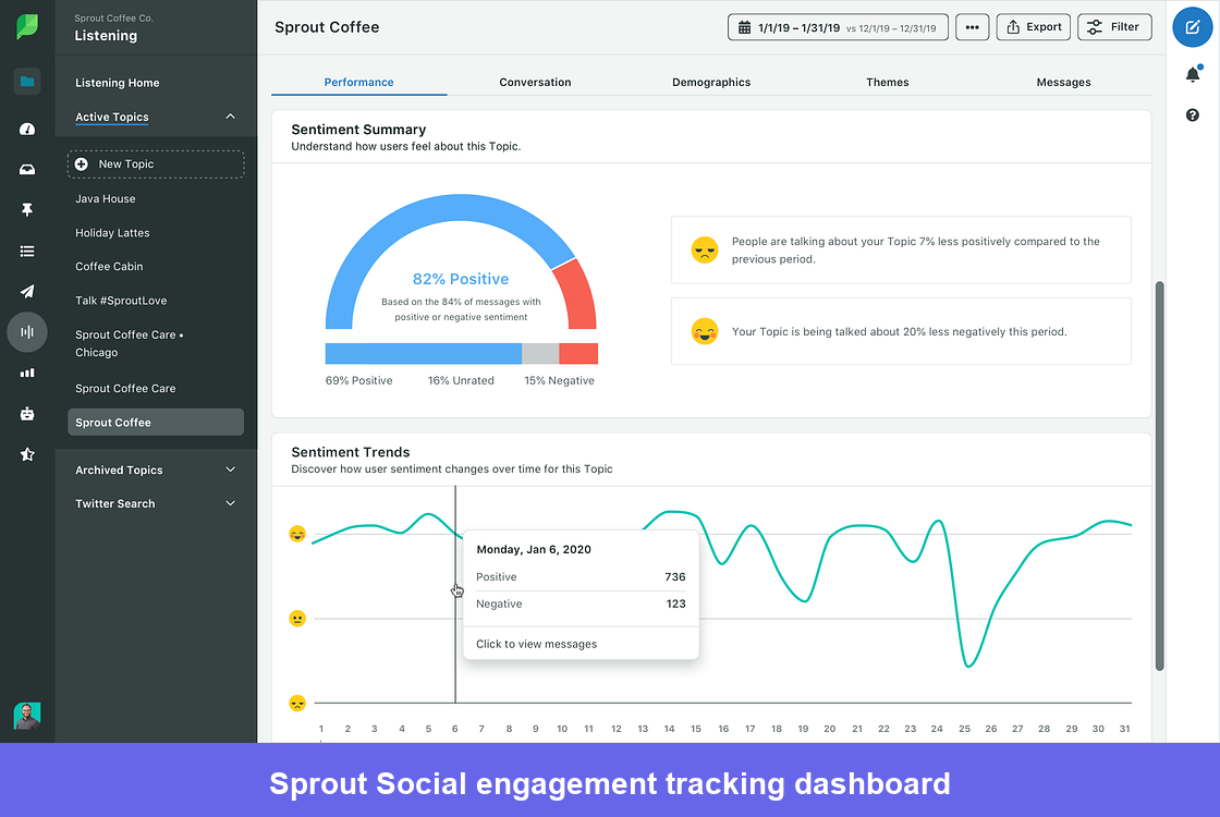
- Social listening: Scours millions of social media posts daily to gauge your brand perception among your customer base. This gives product teams a signal that doesn’t show up anywhere in in-app analytics: what users say about your product when they’re not using it.
- Crisis notifications: Notifies businesses of potential PR disasters with message spike alerts. When Sprout Social detects an anomalous increase in @mentions, it notifies teams to address the issue before it becomes a broader crisis.
- Audience engagement maximization: Discover the optimal time to post with Sprout Social’s Optimal Send Times feature. Sprout Social analyzes up to 16 weeks of audience data to calculate the best posting windows for your specific audience.
Sprout Social pros and cons
| Pros | Cons |
|---|---|
| Strong social listening across multiple platforms in a single interface | Very expensive compared to most social media management tools |
| A crisis detection and alert system is genuinely useful for brand-sensitive companies | Analytics depth is social-first; it doesn’t connect to product or revenue data |
| Comprehensive posting, scheduling, and engagement management | Some users find the UI has become cluttered after recent updates |
| Competitive social benchmarking against industry peers | AI features can surface noise alongside genuine insights |
The social listening depth is what separates Sprout from cheaper scheduling tools. Mark D., Marketing and Business Development Manager, is direct:
What I like best about Sprout Social is how effectively it centralizes social media management without sacrificing depth..
For smaller teams, the value calculation depends heavily on how consistently the listening features get used. Kimberly D., Founder and CEO stated:
I was particularly interested in exploring the social listening capabilities, as I think they could add tremendous value for my clients, but the cost was unfortunately well beyond my current budget.
Pricing
Sprout Social charges per user per month, which makes team costs compound fast. To top that off, sentiment analysis, crisis alerts, and Optimal Send Times are only available on Advanced ($399/seat/month), which is effectively the minimum viable tier for brand and social listening teams.
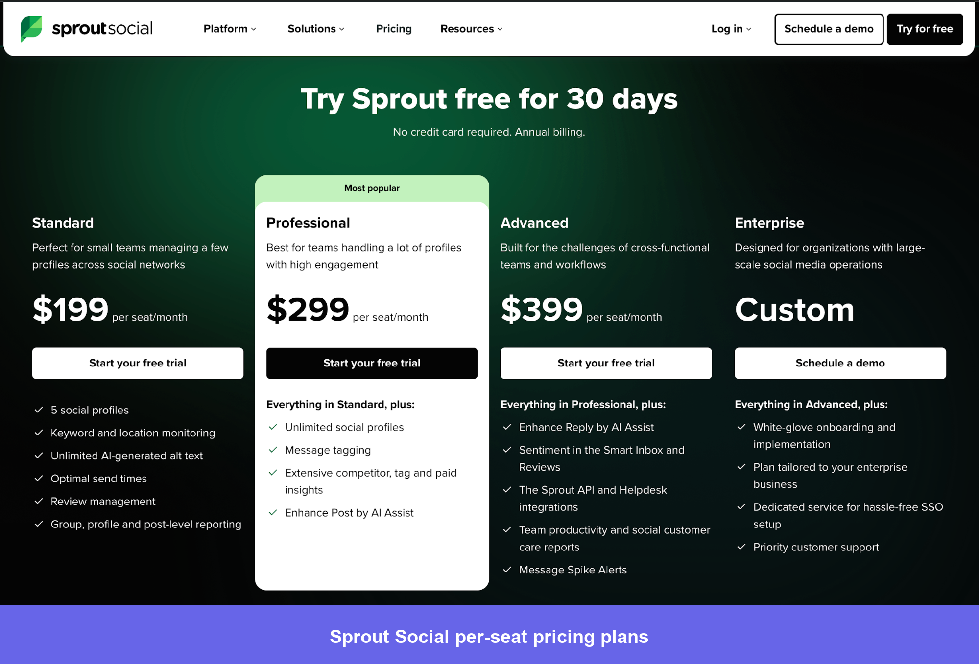
- Standard: $199/user/month. 5 social profiles, scheduling, post analytics, basic engagement. Missing sentiment analysis, competitive reports, and crisis alerts. Best for solo social managers focused primarily on publishing.
- Professional: $299/user/month. Unlimited profiles, competitive reports, and custom workflows. Where most 2–5 person marketing teams land.
- Advanced: $399/user/month. Unlocks sentiment analysis, crisis alerts, chatbots, digital asset management, and Optimal Send Times. Required for teams where social listening is a core function.
- Enterprise: Custom pricing. Premium analytics and dedicated support. Nonprofits qualify for a 25–50% discount through the sales team.
While Sprout Social is a powerful tool, there are a few drawbacks. The pricing can be steep, especially as teams grow and additional users are added. — Marie M., Associate Marketing Specialist
12. ChartMogul: Best subscription and revenue tracking software
ChartMogul is an analytics platform and revenue-tracking software for subscriptions. It’s purpose-built for SaaS businesses that need accurate MRR and ARR analytics rather than a generalist tool retrofitted to handle subscription data.
Chartmogul’s main features
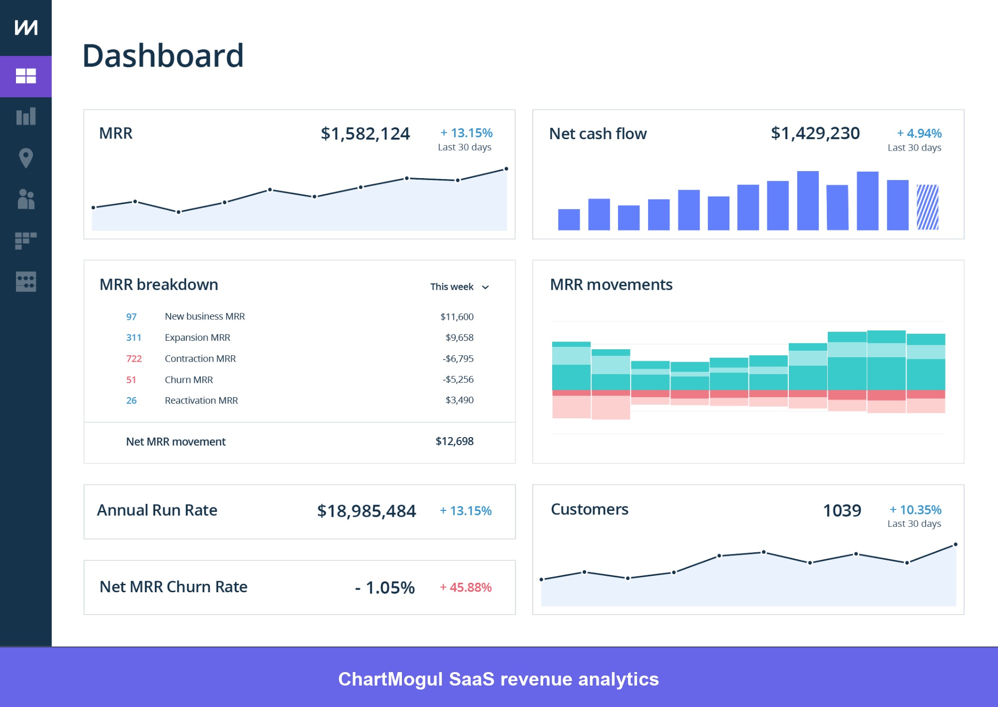
- Subscription analytics: Track user behavior that translates to significant changes in your ARR. You can also investigate the impact foreign exchange movements have on your metrics, which is relevant for any SaaS company with international customers.
- Customer retention insights: ChartMogul’s CRM platform gives teams access to analytics tools like sales funnel analyses and revenue forecasts, presenting a clearer picture of performance at the individual account level alongside aggregate subscription metrics.
ChartMogul pros and cons
| Pros | Cons |
|---|---|
| Purpose-built for SaaS subscription metrics like MRR, ARR, and churn | Limited scope beyond revenue and subscription data |
| Excellent cohort-based churn analysis and revenue forecasting | Not a product analytics or user behavior tool |
| Clean, intuitive interface compared to generalist BI tools | Pricing for larger enterprises requires a sales conversation |
| Strong Stripe, Recurly, and Chargebee integrations | Some users note the CRM features are less mature than dedicated CRM tools |
For subscription businesses, ChartMogul’s revenue reporting accuracy is what most users point to first. Sophie N., a CFO, reflects this:
ChartMogul has a great UI and clear visuals to help you quickly understand performance. It comes packed with out-of-the-box reporting covering the most essential KPIs for a SaaS business.
The scope is intentionally narrow, which is worth knowing before you buy. Alex R. puts it plainly:
“It’s excellent at revenue analytics and nothing else. If you want behavioral product data alongside your revenue data, you still need a separate tool, which means you’re always switching contexts.”
“Proper definitions of SaaS KPIs by definition + easy integration with billing platforms.” — Piotr K., General Partner, Founder
“It doesn’t update with things like HubSpot for better data analysis.” — Steven P., Co-Founder & CEO
Pricing
ChartMogul scales pricing directly with MRR, which means costs grow in proportion to revenue rather than ahead of it. The model is one of the more founder-friendly in this list.
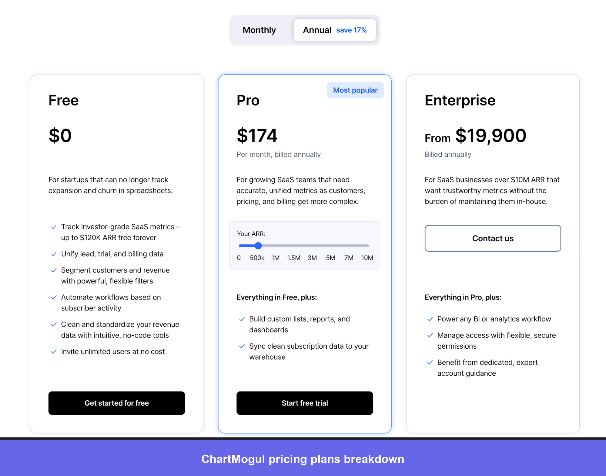
- Free: Up to $120K ARR. Includes core subscription analytics (MRR, ARR, churn, LTV, cohort retention), one CRM Pro seat, and integrations with Stripe, Recurly, and Chargebee. Genuinely useful for early-stage SaaS teams who want accurate revenue metrics without committing budget.
- Pro: Starts at $99/month. The pricing increases with your ARR. At $600K ARR = $174/month, $1.2M ARR = $249/month. Adds advanced segmentation, multi-currency reporting, full API access, and additional CRM Pro seats at $39/user/month. Best for growing SaaS businesses with predictable revenue.
- Enterprise: Starts from $19,000 annually for brands over $10M ARR or with complex billing setups. This plan offers the typical enterprise add-ons like dedicated support, custom integrations, and SLA guarantees. Early-stage startups can apply for a $50/month discount for 12 months through the Startup Program.
I find ChartMogul’s pricing model to be fair and reasonable. The cost is based on our monthly recurring revenue, which aligns with our business growth. — Philipp R., Co-CEO
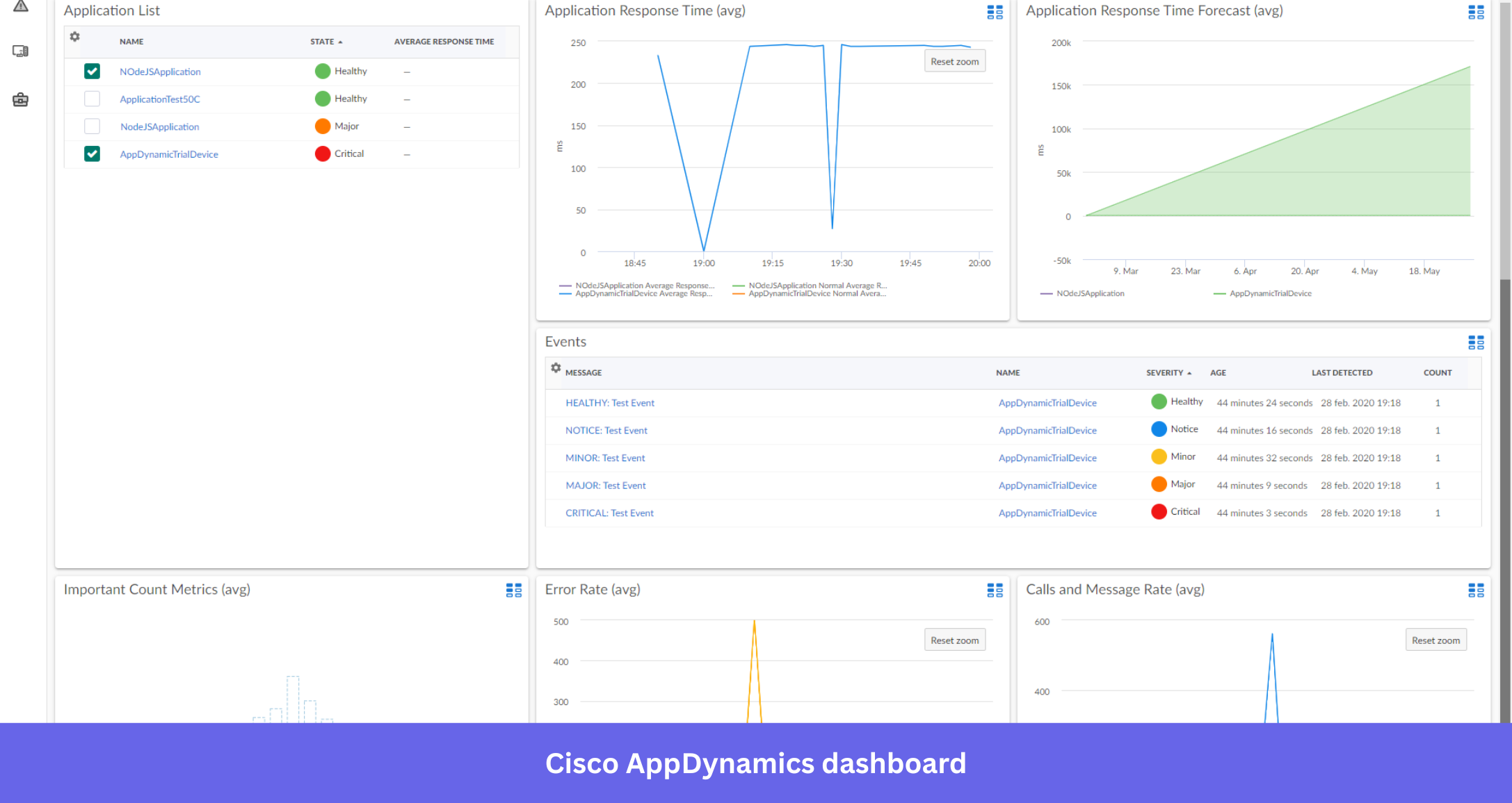
13. Splunk AppDynamics: Best infrastructure tracking software
AppDynamics is an observability platform and infrastructure tracking software for performance insights and lifecycle management. It sits at the intersection of IT operations and product analytics, connecting backend performance data to customer-facing outcomes in a way that most product-focused tools don’t attempt.
Main features
- Infrastructure optimization: You can take metrics and events from user journeys to identify weak points in your infrastructure and correlate them with customer experience degradation.
- Application performance monitoring: Keep users satisfied with their experience, correlating business outcomes with faults found within IT performance. Response time anomalies can be automatically flagged and traced to specific service calls.
- Customer journey insights: Conduct funnel analysis and correlate drop-offs with backend issues in the IT infrastructure. This is the feature that product and engineering teams find most useful: understanding not just that users abandoned a step, but whether a performance degradation caused it.
AppDynamics pros and cons
| Pros | Cons |
|---|---|
| Unique ability to correlate user experience with backend infrastructure performance | High renewal pricing and enterprise costs put it out of reach for smaller teams |
| Strong APM capabilities for detecting and diagnosing performance issues | Less relevant for product or marketing teams without strong engineering collaboration |
| Cisco integration adds network and security visibility | Features can feel overwhelming for users without an IT operations background |
AppDynamics helps you easily detect anomalies in data. Brajesh P, a Senior Software Engineer, captures it:
It is useful in detecting and monitoring problematic transactions to enhance the productivity of our business.
The features on the app can make navigating and using the app too complicated. Meghan J. mentioned this in a review:
Although the interface is simple to use, it can be difficult to access essential information fast. It is strongly advised that a newcomer go through a training session before using this software.
AppDynamics pricing
AppDynamics uses per vCPU/month pricing billed annually, structured around three core editions with optional add-ons.
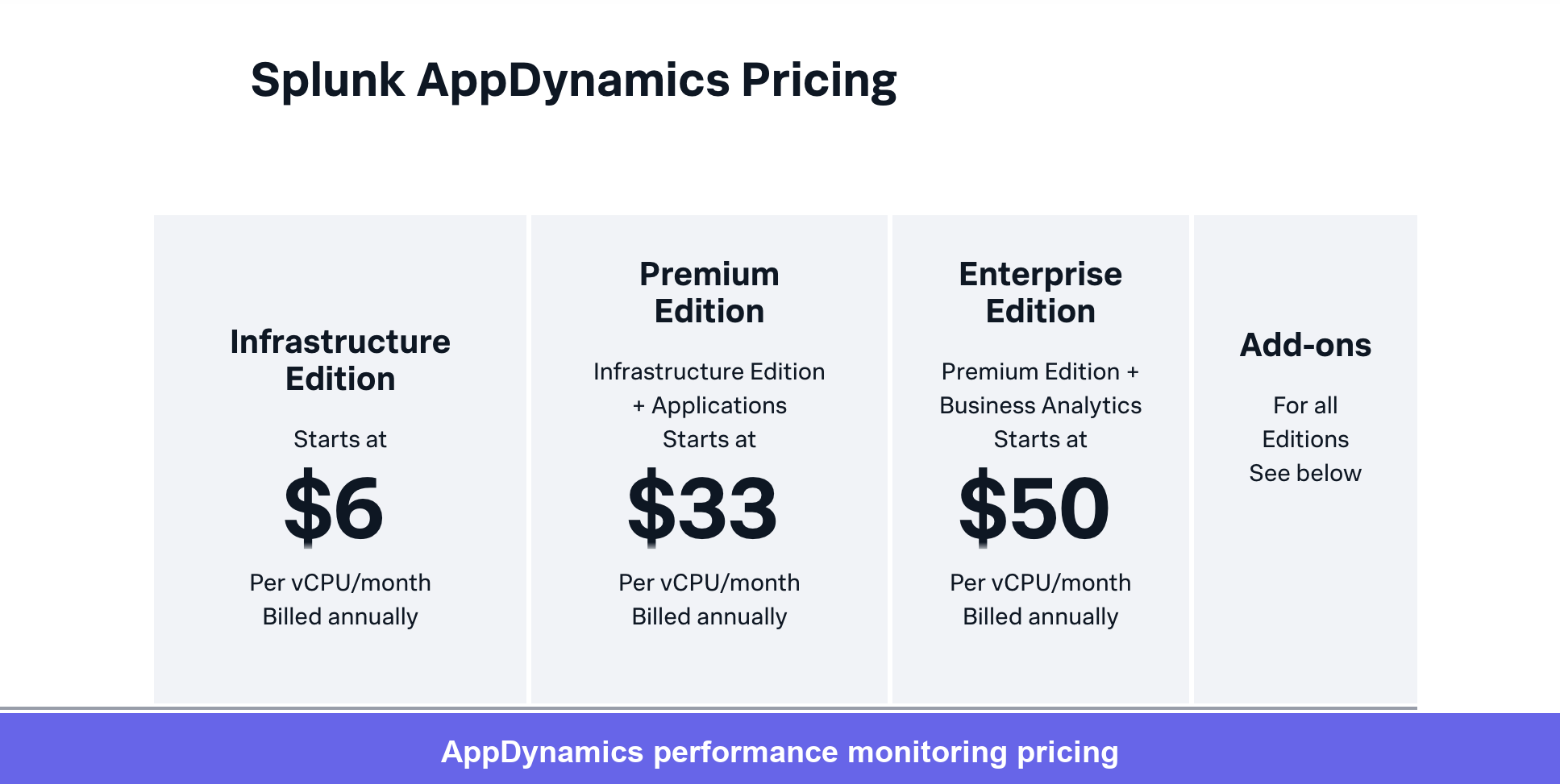
- Infrastructure Edition: $6/vCPU/month. Real-time infrastructure monitoring, automatic dependency mapping, and Kubernetes visibility. Best for teams that need infrastructure health monitoring without full APM.
- Premium Edition: $33/vCPU/month. Everything in Infrastructure plus full APM, end-to-end transaction tracing, AI-driven anomaly detection, and business outcome correlation. Where most engineering teams run production APM land.
- Enterprise Edition: $50/vCPU/month. Everything in Premium plus Business Analytics for connecting application performance directly to business KPIs.
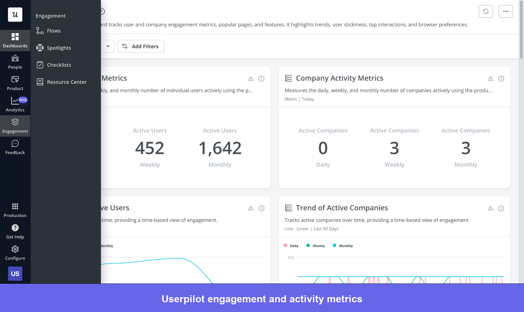
14. Userpilot: Comprehensive product analytics platform
Userpilot is a product growth platform for enterprises possessing user tracking for web and mobile to increase adoption and reduce churn.
Userpilot’s main features
- Autocapture: Automatically record key user actions, like feature clicks and page visits, with absolutely no extra setup. This means you get meaningful, ready-to-analyze data right away without waiting around or manually tagging.
- Session replay: Watch real user interactions with your product, as if you were right there with them. You can see where they click, how they navigate, and what slows them down. This is especially useful for identifying usability issues or understanding why users get stuck. For example, if a feature isn’t being used as intended, session replays let you see exactly what’s confusing.
- Analytics dashboards: Place relevant metrics (such as active users, session duration, etc.) into different dashboards for their convenience. In a future update, Userpilot will offer dashboard customizability that will let teams house metrics of their choosing.
- Funnel analysis: Gauge the efficacy of their user funnels by showing how users progress through each step of the funnel. Discover areas where users fail to proceed, identify drop-off points, and optimize stages that hamper conversions.
- Path analysis: Analyze the efficacy of different paths and discover the best path that users take the most.
- Retention tables: Analyze retention data by cohort and see which of your segments behave positively and which of your segments require increased marketing efforts.
- Customer profiles: Gain insights on a granular level. Understand user behavior by tracking in-app events and collecting user feedback for each user.
- Data integrations: Import and export data to different tools and get a more holistic picture of user behavior. Currently, Userpilot supports integrations with Google Analytics, Mixpanel, Kissmetrics, Heap, Amplitude, Google Tag Manager, Segment, Intercom, HubSpot (two-way), and Salesforce (two-way).
Userpilot pros and cons
| Pros | Cons |
|---|---|
| Combines analytics, session replay, and in-app engagement in one platform | Starter plan ($299/month) is a meaningful commitment for early-stage teams |
| Autocapture reduces time to first insight; no instrumentation sprint | HubSpot and Salesforce integrations are Growth and Enterprise only |
| No-code setup for flows, surveys, and event tagging | |
| Bidirectional CRM integrations enable closed-loop analysis |
The integrations that Userpilot enables have gained a lot of praise from users. A verified reviewer on G2 puts it this way:
I like how Userpilot easily connects with our platform and understands who our users and customers are. It allows us to segment and measure them effectively, avoiding the need to manually transfer data and keeping it always up to date
Currently, a lot of the reviews talk about wanting deeper analytics. Merry mentioned:
I would appreciate deeper analytics insights and more visual reporting options to better measure user behavior and campaign impact.
Pricing
Userpilot charges based on MAUs across three tiers. The Starter plan gives full access to all UI patterns (tooltips, modals, checklists, and more) from day one, which is more generous than comparable tools that gate engagement features behind higher tiers.
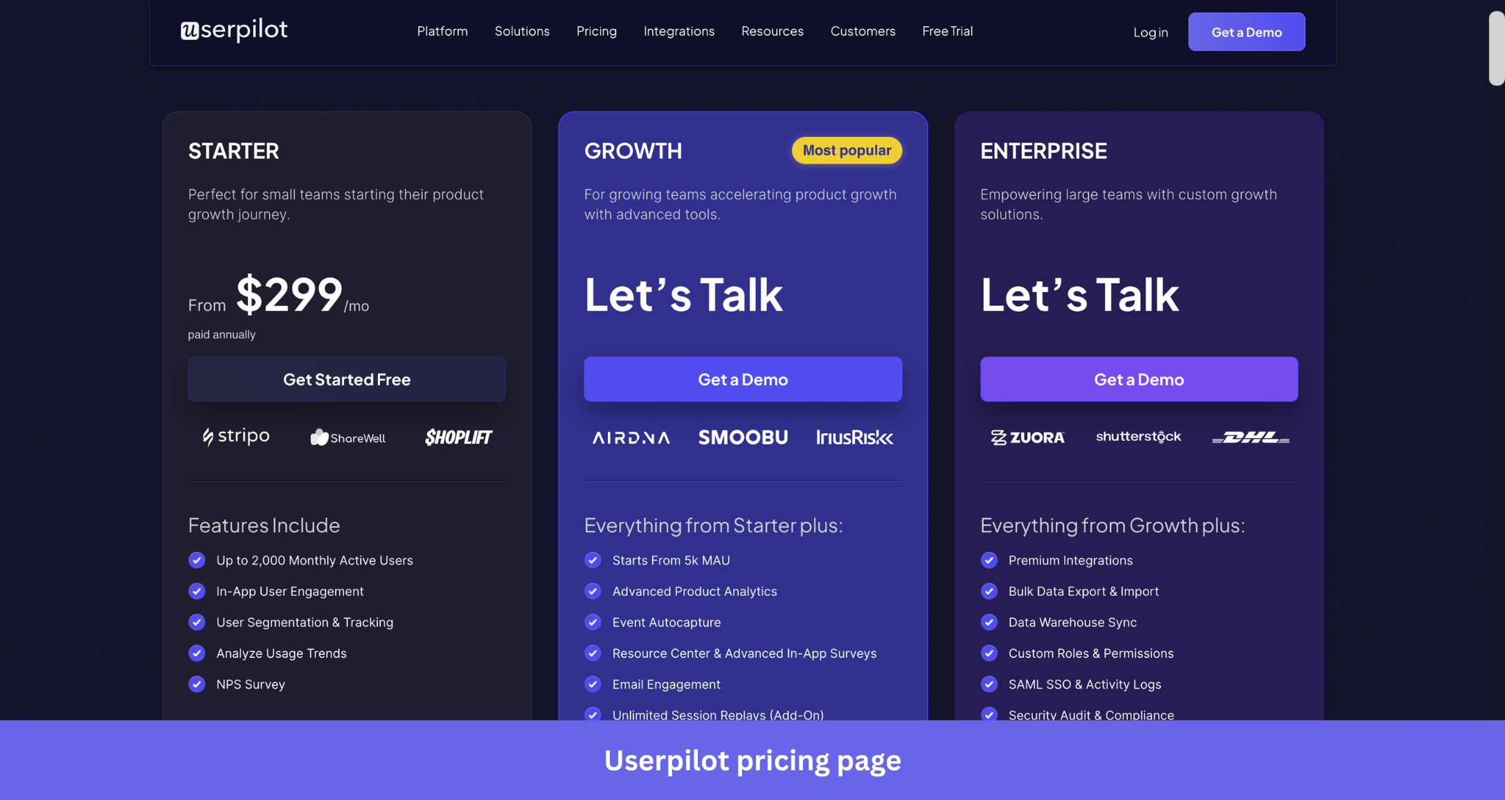
Here’s an overview of Userpilot’s pricing plans:
- Starter: Entry-level plan costs $299/month, is billed annually, and supports up to 2000 MAU, 10 user segments, 10 feature tags, a built-in NPS dashboard, and access to third-party integrations (except HubSpot/Salesforce).
- Growth: Uses quote-based pricing and includes everything in Starter plus unlimited feature tagging, an in-app resource center, A/B testing options, AI-powered content localization, analytics dashboards, event-based content triggering, a dedicated customer success manager, and extra integrations like HubSpot/Salesforce.
- Enterprise: Uses quote-based pricing and includes enterprise features such as custom roles, permission management, premium integrations, priority support, activity logs, security audits, SOC 2/GDPR compliance, and more.
Types of user behavior tracking data
Effective user tracking encompasses multiple categories of behavioral data, each providing unique insights into how people interact with your product.
Key user data categories include:
- Product and feature engagement data
- User sentiment and feedback data
- Session replay and interaction data
- User experience and journey analytics data
Product and feature engagement data
Event-based analytics track discrete user interactions like button clicks, feature activations, and content engagement to show which parts of your product resonate and which go unused. This helps product teams spot adoption patterns, measure the impact of new releases, and prioritize development based on real usage rather than assumptions.
The granularity goes beyond simple click tracking. You can see how many times a feature was used, how long users stayed, and what they did next. That sequential view reveals the natural workflows users build inside your product, pointing to where you can streamline common tasks or surface the right features at the right moment.
User sentiment and feedback data
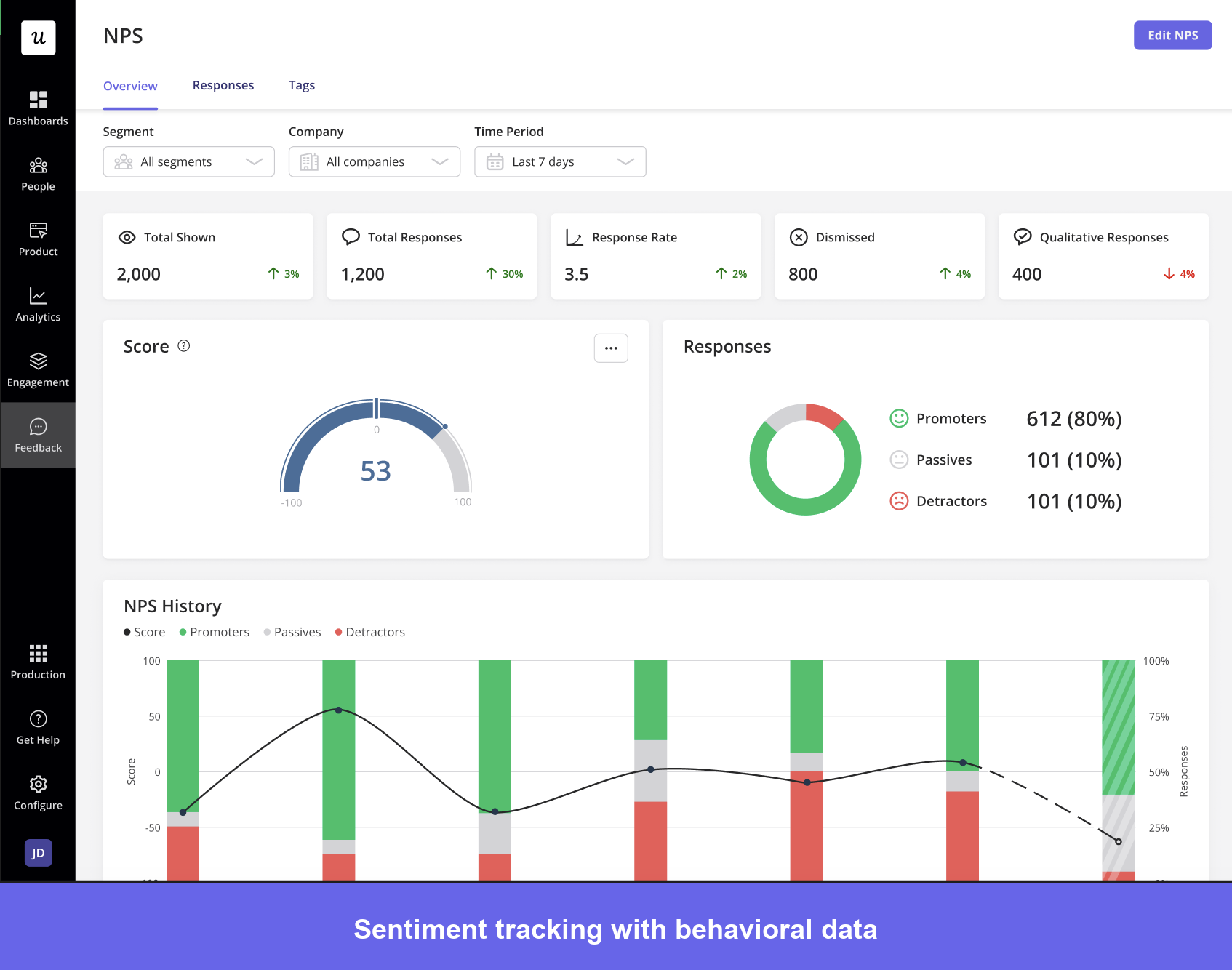
Behavioral data shows what users do; sentiment data shows how they feel. It captures user experience through in-app surveys, NPS, CSAT scores, and open-text responses.
Sentiment becomes most valuable when paired with behavioral data. Low satisfaction scores among users who complete a workflow can reveal friction that completion rates alone would miss.
The same logic applies in reverse: high sentiment around specific features tells you what’s working and worth doubling down on.
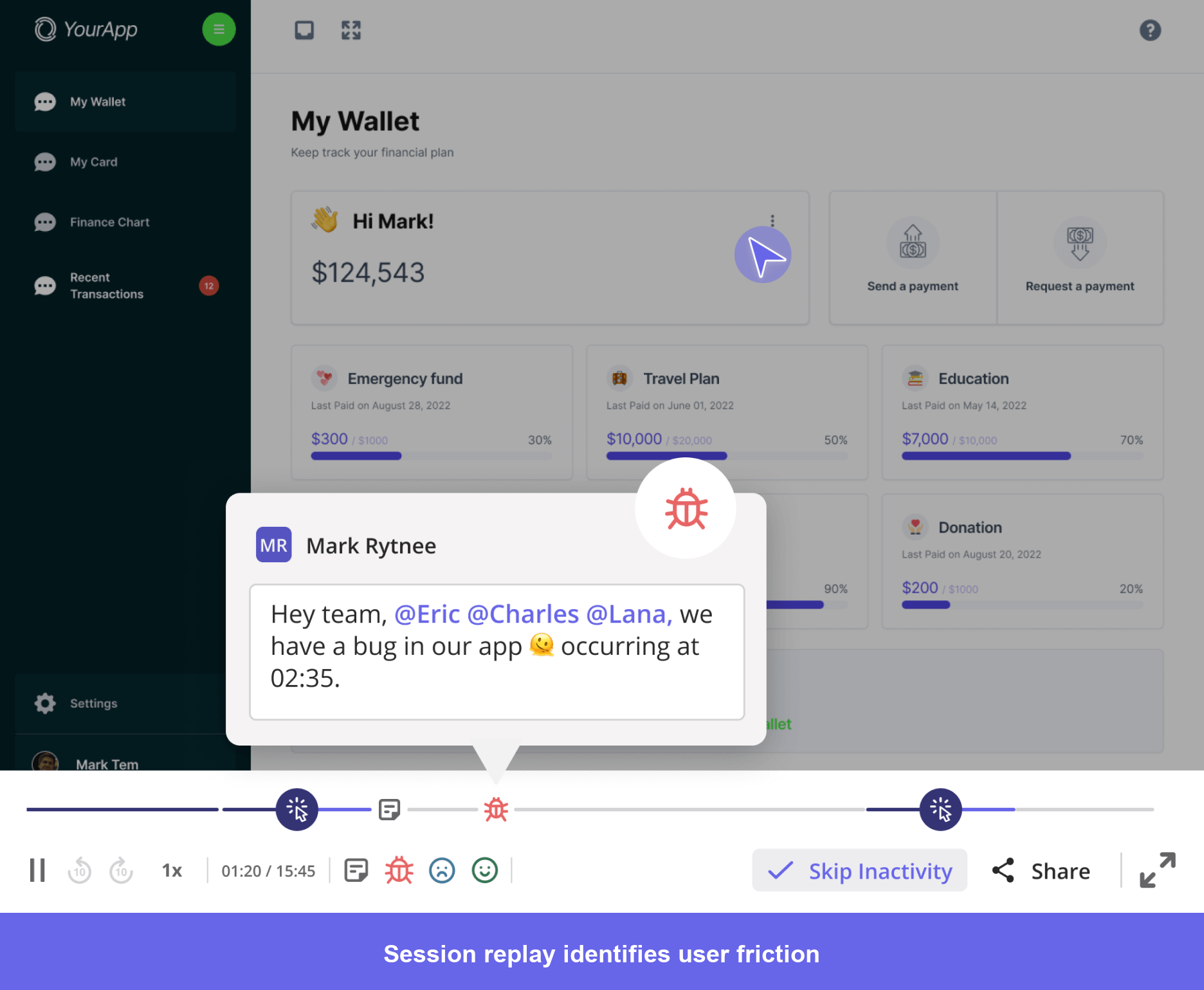
Session replay and interaction data
Session replays capture complete user interactions as they happen, showing exactly how someone navigated your product, where they hesitated, and where they ran into trouble. They add the “why” behind quantitative metrics.
This is most useful when investigating specific problems. A high drop-off rate at an onboarding step tells you something is wrong; watching replays of users who abandoned at that point shows you exactly what, whether it’s a confusing UI element, a technical error, or unclear instructions.
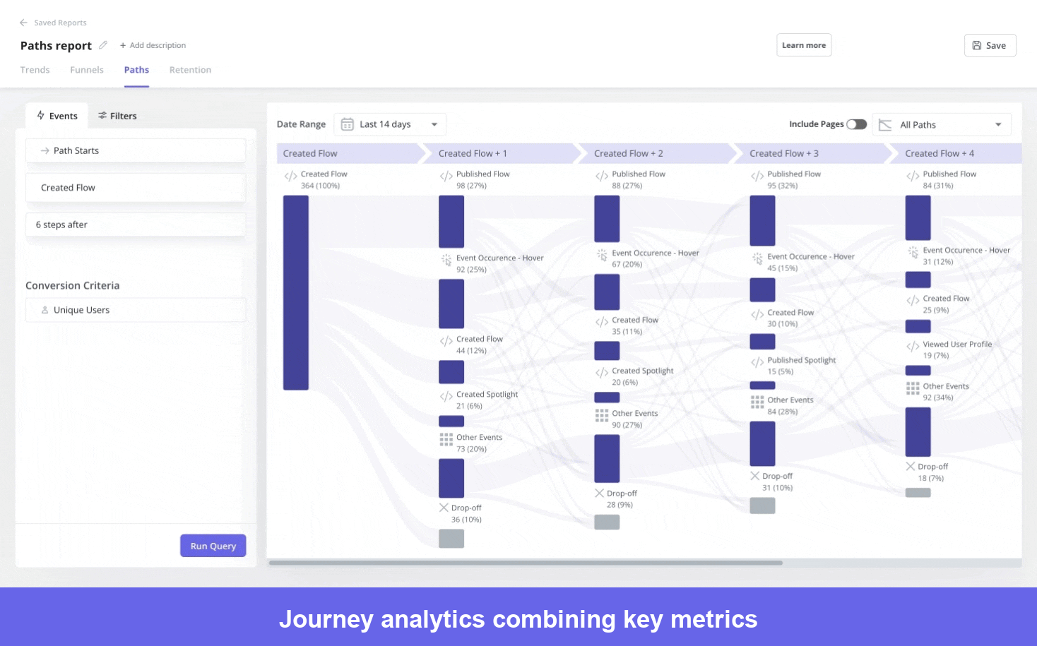
User experience and journey analytics data
Journey analytics tracks the full path users take through your product, from entry point to final outcome, such as conversion or churn. It combines behavioral metrics like retention rates, task completion times, and abandonment rates with qualitative measures like perceived usability and satisfaction, giving you a complete picture of the user experience rather than isolated snapshots.
What should you look for in a user tracking software?
There is a large catalog of user tracking tools on the market that offer numerous features and functions. The best ones have these properties that you should look out for:
- Ease of use: If your team needs a data engineer to get value from the tool, it will create more problems than it solves. Prioritize interfaces that non-technical team members can navigate independently.
- Analytics depth: Look beyond page views and event counts. The tool should support cohort analysis, funnel reporting, path analysis, and retention curves.
- Visualization options: Data is only useful if it’s readable. Funnels, heatmaps, and path diagrams help teams share findings across functions without needing someone to translate the numbers.
- APIs and integrations: Your tracking tool will never sit alone in your stack. Check for clean bidirectional sync with your CRM, marketing automation platform, and data warehouse.
- Data security and compliance: PII masking, GDPR, CCPA, and SOC 2 certification matter more as privacy scrutiny grows. For healthcare-adjacent use cases, refer to our list of HIPAA-compliant analytics tools.
Key features of a user tracking software
Effective tracking platforms go beyond basic analytics by offering a core set of capabilities that deliver real diagnostic value.
- Session replay and recording: Watch real user sessions with privacy masking, filters, and annotations to identify friction points quickly.
- Heatmaps and visual analytics: Click, scroll, and attention maps that surface behavioral patterns and segment differences at a glance.
- Funnel and path analysis: Measure step-by-step conversions and uncover how users actually navigate, beyond the flows you predefined.
- Real-time analytics and dashboards: Live activity monitoring, alerts, and customizable views tailored by role and goal.
- Advanced segmentation and filtering: Slice data by attributes, behaviors, and custom properties to surface targeted insights rather than averages.
Wrapping up our user tracking tools roundup
No matter what tool you pick, you need to comply with the regulations when tracking users.
As regulations like GDPR (Europe), CCPA (California), LGPD (Brazil), and PIPEDA (Canada) continue to expand in scope, you need to build compliance into your tracking strategy right from the beginning.
I’ve put together a simple checklist to assess your tracking implementation:
| Category | Item |
|---|---|
| Consent and disclosure | Users are informed about what data is collected and why before tracking begins |
| Consent mechanisms are present and functional in all applicable jurisdictions (EU, UK, California) | |
| Privacy policy accurately describes tracking practices and data retention periods | |
| Consent can be revoked at any time and tracking stops when it is | |
| Data minimization | You collect only the data you actually use for specific, defined purposes |
| PII (names, emails, addresses, payment data) is masked or excluded in session recordings and heatmaps | |
| User identifiers are anonymized or pseudonymized where full identification is not required | |
| Data storage and access | You know where user data is stored and in which countries or regions |
| Access to tracking data is restricted to team members with a legitimate need | |
| Data retention policies are documented and old data is deleted on schedule | |
| Third-party compliance | Every third-party tracking tool is listed in your DPA and privacy policy |
| You have signed DPAs with each vendor that processes EU user data | |
| Vendors have been verified against your required compliance standards (SOC 2, GDPR, HIPAA if applicable) | |
| User rights | Users can request access to their personal data |
| Users can request deletion of their data and you have a process to honor that | |
| Your team knows how to handle DSARs within the legally required timeframe | |
| Technical safeguards | Data in transit is encrypted |
| Your tracking implementation has been reviewed for security vulnerabilities | |
| You have a breach notification process in place |
Building compliant tracking doesn’t mean tracking less. It means being deliberate about what you collect, transparent with users about how it’s used, and rigorous about protecting the data once you have it.
About the author