Summary of in-app onboarding
- In-app onboarding is the process of teaching users how to use an app to achieve their goals.
- Mobile users tend to have less patience, so their onboarding needs to be shorter and less complex.
- In-app onboarding is necessary to let users experience value. Once they activate, they’re more likely to stay with your product and convert to paying customers.
- Progressive onboarding introduces more complex features gradually as users get more confident using the app.
- Function-oriented onboarding focuses on teaching users how to complete tasks, while benefits-oriented onboarding shows how the product can improve users’ lives.
- The key elements of in-app onboarding include a sign-up page, welcome screen, interactive walkthrough, feature guidance, and self-serve support.
- Keeping the sign-up process simple helps users start engaging with the product in less time. This reduces the risk of them dropping off.
- Contextual onboarding offers guidance at the time when users need it. This increases their chances of activating features and reduces the risk of overwhelming them with unnecessary information.
- Checklists are an effective way to take users through the initial stage of onboarding.
- Using in-app UX patterns like tooltips or modals is a powerful way to help users discover new features.
- Mobile app onboarding shouldn’t take more than 60 seconds, so personalize it for users and include the absolute minimum of steps. Use a progress bar to tell users how many steps are left.
- Use the empty state screens for product guidance or to set them off on the way to activation.
- Test your in-app onboarding flows with A/B tests to choose the most effective ones.
- Want to see how to design native mobile app SDK and web app onboarding flows with Userpilot? Book the demo!
What is in-app onboarding?
It is the process of educating users about a product so that they know how to use it to solve their problems and satisfy their needs and wants.
The objective of in-app onboarding is to help users experience product value. Later on, in the customer journey, in-app onboarding helps users discover more advanced features, informs them about product changes, and keeps them engaged.
Web vs mobile app onboarding
Both web and mobile app onboarding have the same purpose: introducing new users to the application and helping them become competent users. They rely on the same principles like personalization, friction elimination, and monitoring progress.
However, the two have their unique limitations and characteristics, which affect the onboarding process.
For example, mobile onboarding needs to be shorter and more engaging to compete with other distractions that mobile phones offer.
In this article, we explore best practices for both kinds of onboarding.
What’s your main goal with in-app onboarding?
What’s your biggest in-app onboarding challenge right now?
Which type of in-app onboarding best describes your approach?
Ready to build in-app onboarding that converts?
Based on your answers, a tailored, contextual in-app onboarding experience could significantly boost your activation and adoption rates. See how Userpilot can help you achieve your goals.
Why is web and mobile app onboarding important?
There are a number of reasons why web and mobile onboarding is essential for app success.
As mentioned, one of its key purposes is user activation. This is essential because it has a knock-on effect on free trial conversion rates and customer retention.
In simple terms, if users don’t know how to use the product or don’t experience its value firsthand, they won’t hang around. And that means they won’t be converting to paying customers. Not yours, anyway.
What are the three types of user onboarding in-app?
There are different ways to organize in-app onboarding:
- Progressive onboarding
- Function-oriented onboarding
- Benefits-oriented onboarding
In progressive onboarding, users discover new features gradually as they are using the product. This starts with the basic features that are essential for users to get going and becomes more complex as they get more confident.
Function-oriented onboarding, also known as instructional-based onboarding, shows users how to accomplish their goals using the key functions. This approach is most common in mobile app onboarding.
The benefits-oriented onboarding process focuses on highlighting the benefits of using the product rather than its features. The goal is to show users how the product can change their lives for the better.
What are the core features of an onboarding process?
Onboarding processes, both web and mobile ones, rely on a number of key features.
- Signup page – the first step in which users create their accounts and provide essential information.
- Welcome/ onboarding screen – that’s what users see when they log into the product for the very first time. It can contain a survey, an onboarding checklist, or a CTA prompting users to start.
- Interactive walkthrough – a step-by-step guide that prompts users to engage with the most relevant features.
- Feature promotion – can be achieved with in-app messages, like tooltips or modals.
- Self-serve support – resources that users can access on-demand, teaching them how to use the product and solve the issues they come across.
What makes a good app onboarding?
A good app onboarding process should be simple and easy to follow so that non-tech-savvy users can learn how to use the product.
What’s more, solid app onboarding should be customized to the needs of users to help them experience value ASAP.
Web app onboarding best practices to create a positive user experience
How can you optimize the web app onboarding to deliver a delightful user experience and drive product adoption? Here are a few best practices that you can try out.
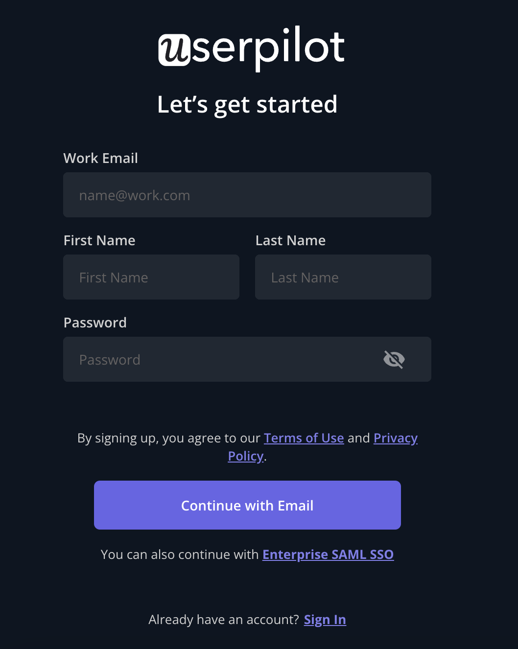
Keep the sign-up process simple and short
The signup flow needs to be as simple and short as possible.
Why?
Because you want your users to start using the product as quickly as possible, and every bit of friction delays this moment.
That’s why make sure to ask only for information that’s absolutely essential to create the account. Consider enabling Single Sign-On (SSO) so that users can sign up using their existing accounts and delay email confirmation until later.
Create contextual onboarding for new users
Contextual onboarding offers users guidance at the exact time when they need it.
By providing such relevant information, you increase their chances of success and avoid overwhelming them with details that they couldn’t care less about.
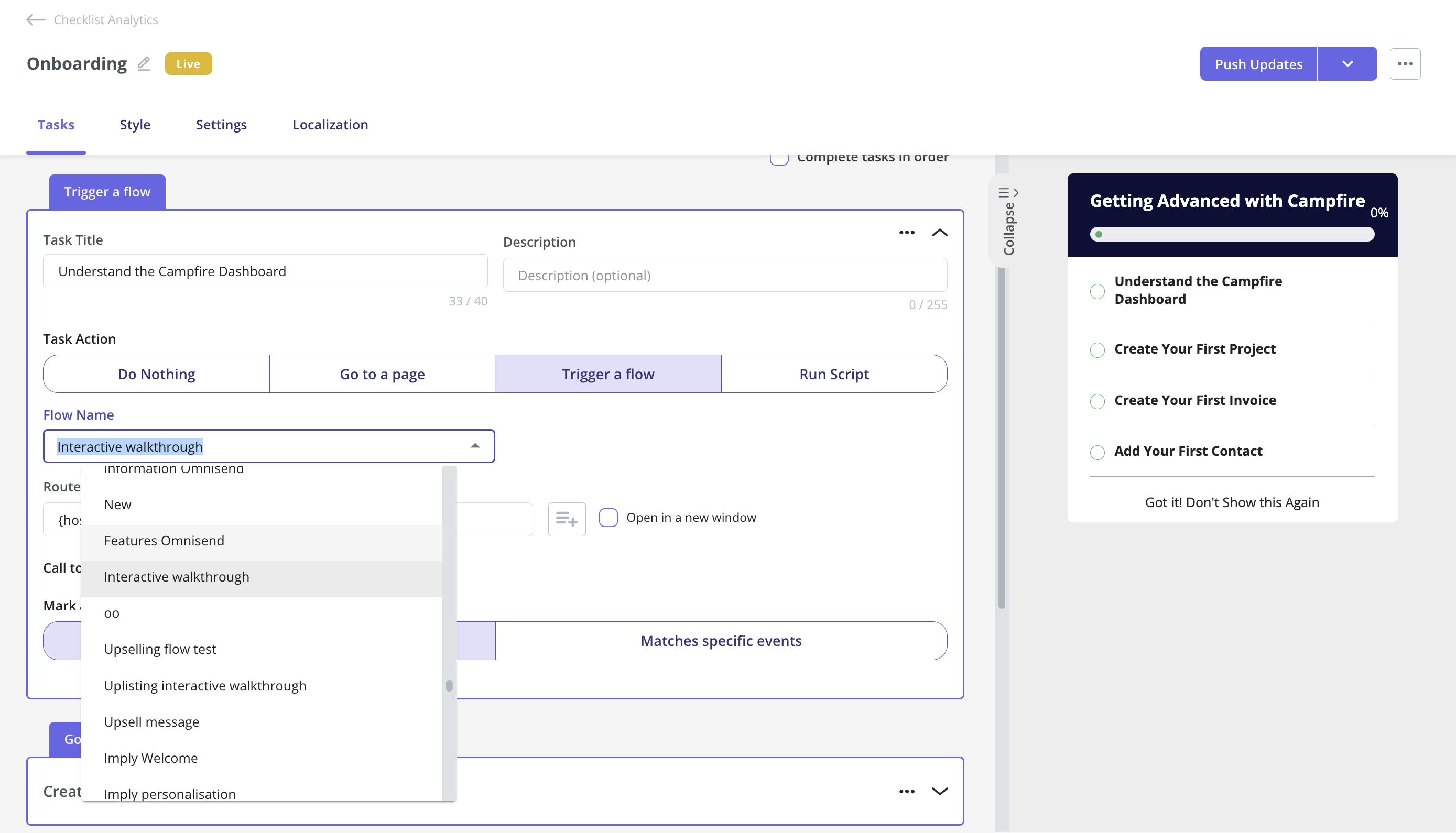
Use onboarding checklists to drive app users toward activation
Onboarding checklists are super effective at driving user activation.
For starters, they are clear, organized, and easy to navigate. What’s more, human beings find it really difficult to resist ticking items off their lists. And the closer we are to the end, the stronger the urge to see it through.
To make your checklist compelling, keep them short – 4 to 5 actions will do. Provide a progress bar so that your users can see how far they’ve gone, and give them a head start by including actions they’ve already completed, like creating the account.
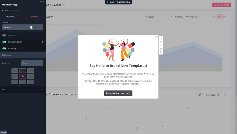
Highlight important features to existing users to boost user retention
Once your users activate the product and get comfortable using it, keep them engaged by introducing new features that are relevant to their use cases.
This is easy to do with in-app messages like modals, banners, or tooltips.
So first, segment your users based on their JTBDs and track their product usage to know which features they haven’t used yet. Then use in-app messaging to introduce those features to them.
Mobile app onboarding best practices to implement
The web app onboarding best practices apply to mobile app onboarding as well. However, there are a few more things to pay attention to here because of the unique characteristics of mobile devices and how we use them.
Generally speaking, mobile users are less patient and expect access to all necessary information within 60 seconds.
Collect data early on to personalize the onboarding process
To make sure that the user onboarding process is as short as possible, it needs to be personalized.
To achieve this, start onboarding with a survey to collect the information you need to segment your users. Next, use the information to trigger bespoke onboarding flows for each of them.
Beware, however, of asking unnecessary questions as these can put off users. This has to do with extra friction but also concerns users as to how their data is going to be used.
Ensure mobile onboarding flows have minimum steps
As you personalize the onboarding flow, include only the absolute minimum of steps. Focus only on those that are essential for users to start using the app.
It doesn’t mean you should skip the more advanced features altogether. You can always introduce them later when users activate.
The same applies to permissions. Don’t ask for access to the camera or users’ location unless it is essential for the adequate functioning of the app.
Show users’ progress along mobile app onboarding screens
A progress bar removes the uncertainty as to what else users have to do and how long it’s going to take.
By setting clear expectations with a progress bar, you make the process more bearable and reduce the chances that users drop off.
Common mistakes to avoid when creating an app onboarding experience
What are the factors that can ruin the user onboarding experience and cause users to drop off? There are a few common culprits.
Don’t overwhelm users with excessive information
Providing users with too much information can bite you back in three ways.
First, it causes sensory overload. Users are simply not able to process all of it, which causes fatigue and affects the quality of the experience.
What’s even worse, receiving information that doesn’t apply to the situation or customer use case may make them wonder whether they’ve chosen the right tool. And they may look somewhere else if that’s the case.
Finally, it makes the flows longer, which tests users’ patience – and attention spans.
Avoid leaving the empty states ‘blank’
Blank empty states can also be overwhelming for users but in a very different way.
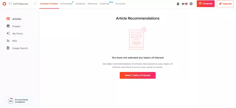
In a way, they are the opposite of information overload. They simply don’t provide users with the information that they need to start using the product.
A simple CTA or a checklist is enough to get them going, so there’s no reason not to include them.
Not testing and improving the user onboarding flow
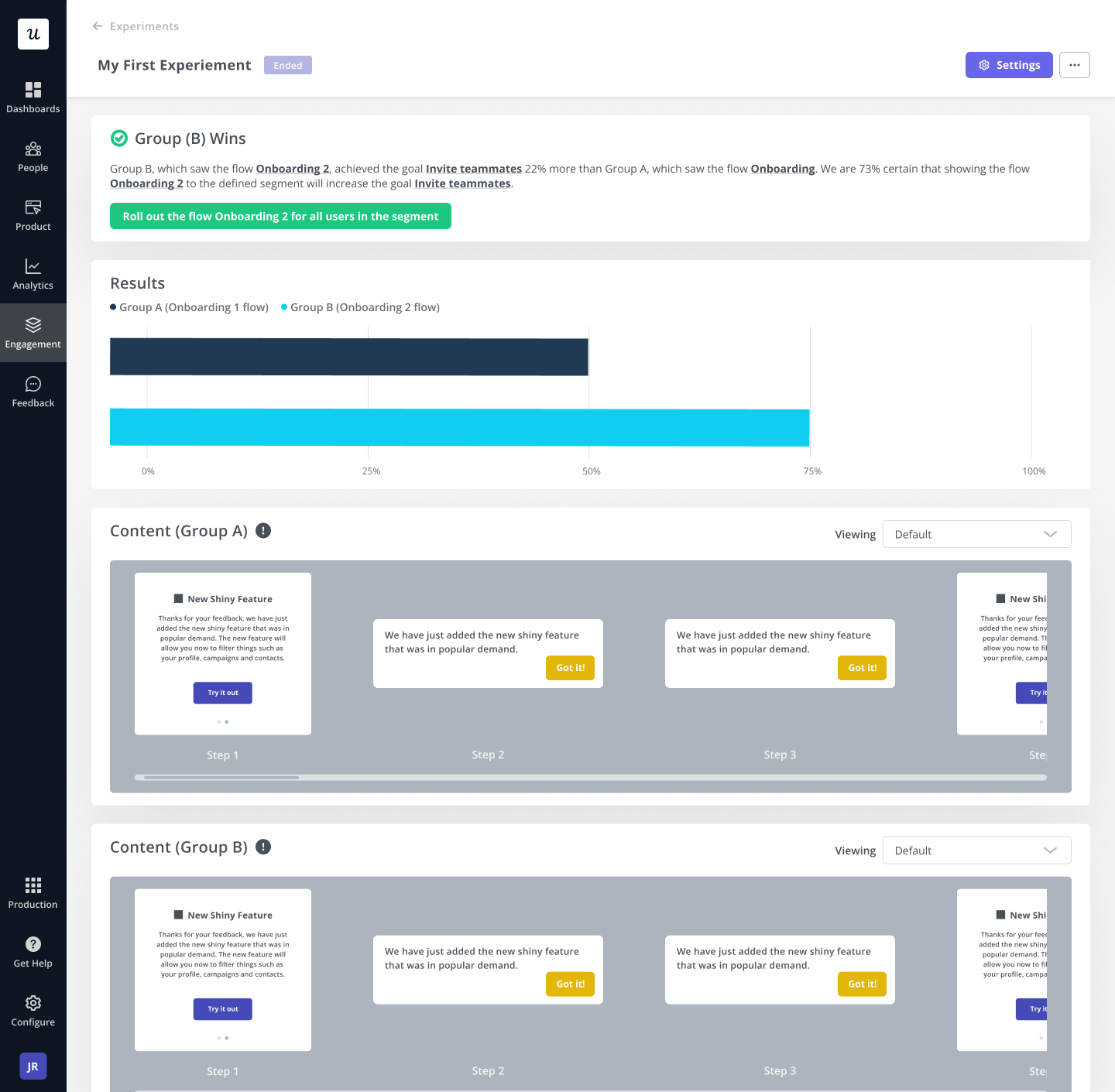
No matter how much thought you put into designing the onboarding process, you won’t know how well it works until you test it with real users.
You can assess its effectiveness by tracking user progress. When you see your users drop off or slow down at a particular stage, tweak that part of the flow and run an A/B test to see if it brings better results than the original.
The best app onboarding flow examples from SaaS companies
Now that we know the dos and don’ts of designing in-app onboarding flows for web and mobile apps, let’s check out a few examples of how companies have successfully implemented them.
Sked Social provides a step-by-step guide to first-time users
Sked Social is a social media management platform. When the company started using Userpilot for user onboarding, it managed to triple its trial-to-paid conversion rate.
What’s its secret?
Checklists!
Let’s see how it all works.
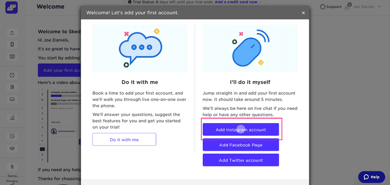
First, users need to add a social media account. They either have the option to do it themselves or with one-to-one support from the customer success team.
Once you set up your first account, you’re taken to the main dashboard where the onboarding checklist pops out.
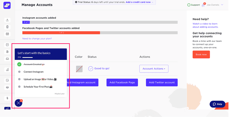
When you click on each item from the list, you’re taken to the relevant section.
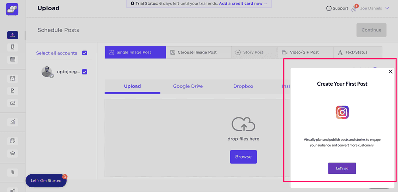
And when you finish all tasks from the checklist, a modal with a congratulatory message appears.
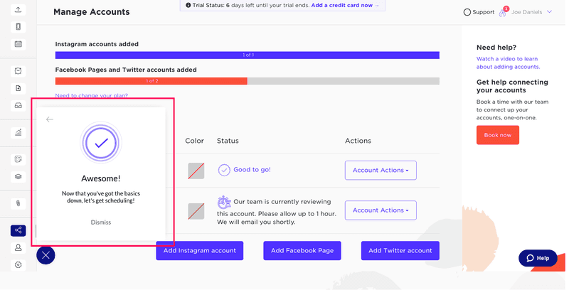
What’s great about the onboarding flow?
✅ Use of a checklist
✅ A short and simple sequence of tasks
✅ Progress bar
Canva offers a personalized web app experience
Canva is a popular graphic design tool. It offers its users thousands of templates for creating bespoke visuals like logos, featured images, and posters.
Canva’s success could be attributed to the personalized user experiences it offers its users.
When you first log in, the app asks what you will use Canva for. The 6 options to choose from include personal, educational, and business use.
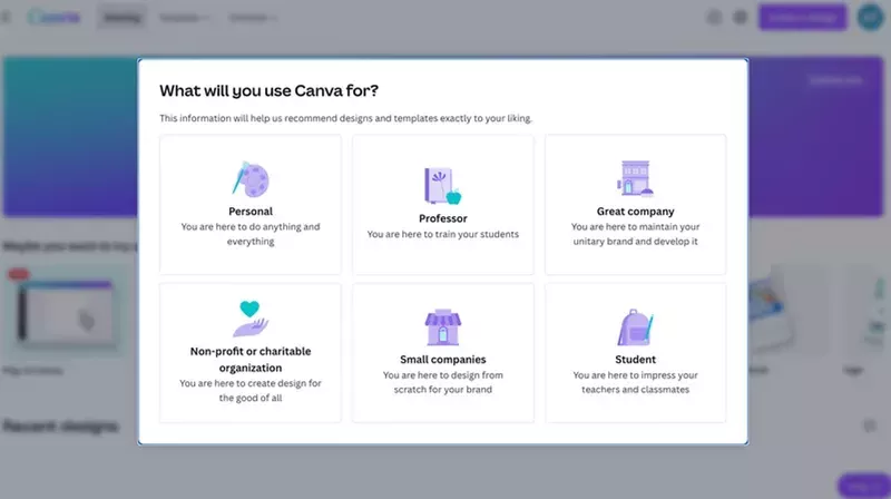
When you choose one, Canva customizes the dashboard for you to include the most popular kinds of visuals associated with your use case. For example, for personal use, it gives you shortcuts to Instagram posts, logos, posters, invitations, or social media posts.
If the list doesn’t include what you’re looking for, you can use the search engine instead.
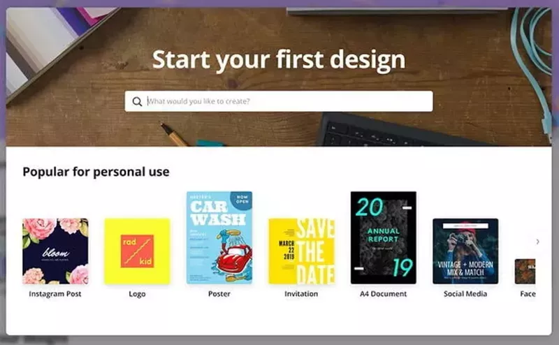
Once you choose a design, you’re taken to the design page, where you can pick and customize a template with your bespoke content. To help you with that, Canva uses contextual tooltips.
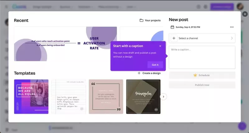
What do we like about the onboarding flow?
✅ Shortness and simplicity
✅ Use of anticipatory design and user data to personalize their experience
✅ Use of contextual in-app messages to aid feature discovery
Grammarly creates a minimal mobile onboarding flow
Grammarly is a super-popular writing assistant tool used by individuals and organizations across the globe. Its freemium plan provides powerful error correction functionality, and that’s the focus of its onboarding flow.
To start with, you have to set it up by adding and enabling Grammarly Keyboard.
When this is done, a demo document appears on the onboarding screen. It describes the different kinds of errors Grammarly detects and how it marks them. To illustrate this even better, the text contains examples of all the different kinds of errors.
At the bottom, there’s a modal with suggested corrections for users to apply. In this way, users learn the color coding that Grammarly uses and practice fixing errors.
Once users correct them all, another modal with a congratulatory note appears.
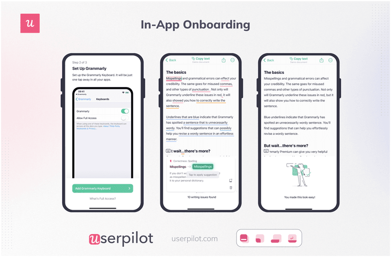
What’s great about Grammarly onboarding?
✅ It’s short
✅ It uses both explicit explanations and real-life examples
✅ Provides demo content and a chance to practice using the tool
Slack onboards mobile users seamlessly
Slack is a messaging app that has taken the B2B startup scene by storm.
Once you install the app on your device, it prompts you to provide just two pieces of information. The name of your team and the project you’re working on.
Based on that, it creates the workspace and channel for you.
At this stage, the app is ready to use. However, if left alone at this stage, some users wouldn’t necessarily know how to start using the app.
That’s why Slack provides suggestions for actions you could do next, like sending a message or adding a teammate.
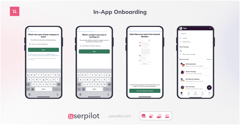
Slack mobile app onboarding is effective because it:
✅ Asks for the absolute minimum of information to set up the workspace
✅ Consists of minimum steps
✅ Prevents users from getting stuck by populating the empty state with suggestions on what to do next
✅ Includes a progress bar
The top tools for creating the best app onboarding experiences
What tools do you need to create personalized in-app onboarding experiences for your users? Let’s check out a couple of options that you have.
Userpilot: All-in-one multiplatform solution for web and mobile
Userpilot is a product adoption platform that enables you to create fully customized user onboarding flows without writing a single line of code.
Its key features include:
- UI patterns for in-app messaging: Choose between tooltips, modals, banners, slideouts, hotspots, and other UI patterns to create tailored user flows, product tours, and walkthroughs. You can use these to either create in-app experiences for existing users or onboard new users.
- A/B testing: Userpilot’s A/B testing feature lets you run experiments to improve adoption rates. You can split-test flows, surveys, or experiences, iterate on the best-performing variants, and optimize based on user behavior analytics.
- Analytics dashboard: Track all your adoption-related metrics in one simple dashboard. Identify your active users, see which features they engage with the most, and more. You can also sort through the data by period if needed.
- Adoption funnel analysis: See how users progress through each step of the adoption funnel. Funnel analysis also helps you discover drop-off points and optimize stages that hamper conversions.
- Path analysis. Choose a starting point in your product and see where users proceed next. Userpilot’s path analysis feature helps you analyze the efficiency of different user paths and discover the best path for users.
- Feedback surveys: Choose from different survey templates (including NPS, CSAT, and CES surveys) and customize them to match your brand image. You can also trigger these surveys contextually or create different surveys for different user segments.
- Autocapture and session replay: Userpilot’s Autocapture automatically tracks user interactions without manual tagging, while Session Replay lets you watch real user sessions to uncover friction and optimize the product experience.
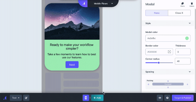
- Mobile onboarding: Create customized carousels and slideouts to onboard users and announce new features without any coding required.
- Deploy mobile-first features: Deploy mobile features without technical support and mobile-optimized UI, reducing developer dependencies.
- Mobile surveys: Reach a wider audience by collecting feedback directly from mobile app users through surveys like NPS, CSAT, and CES.
- Push notifications: Send targeted push notifications to drive users back to your app, increasing retention and engagement.
- Mobile analytics: Build custom analytics dashboards to keep track of app engagement metrics, such as top screens, drop-offs, and active users.
Appcues – recommended for mobile applications
Appcues is a digital adoption platform like Userpilot. It works on web apps but it really shines when used for mobile app onboarding.
Here’s the breakdown of its key features:
- Segmentation
- In-app onboarding flows based on tooltips, modals, slideouts, hotspots, and checklists
- Flow analytics
- Flow A/B testing
- Launchpad for self-access in-app guidance
- In-app surveys
- Event and goal tracking
Conclusion
The quality of in-app onboarding processes can make or break your product.
If you design simple and relevant flows tailored to the needs of your users, your adoption and retention will grow, and your product will thrive. Make it too long, too complex, or too irrelevant, and your new signups will drop off like flies.
If you want to see how to use Userpilot to create personalized onboarding experiences for your users, book the demo!

