What is app onboarding design?
App onboarding design is the process of creating an engaging experience for new users that introduces them to your product and helps them experience its value. It allows users to understand how your product works and familiarizes them with its core features, guiding them in achieving their goals.
Effective onboarding design incorporates various UI patterns, such as checklists, modals, and tooltips, to guide users to the “Aha moment.”
Benefits of app onboarding
Beautiful app design and powerful marketing and sales strategies can help your product grab eyeballs. However, when it comes to building a loyal user base, a frictionless onboarding experience is non-negotiable.
In-app user onboarding offers the following benefits:
Faster time to value
A seamless onboarding process familiarizes users with your product’s key features. They get a clear idea of what each feature can do and how they’re supposed to use it.
You can even take things up a notch with a personalized onboarding experience that introduces users to features that are relevant to their goals and pain points.
This enables users to reach the activation point faster and speeds up the time to value, helping users understand how well your product fits into their lives.
With a reduced time to value, you can encourage users to pay for add-ons and upgrades. Plus, it improves user satisfaction and gives you a competitive edge in the market.
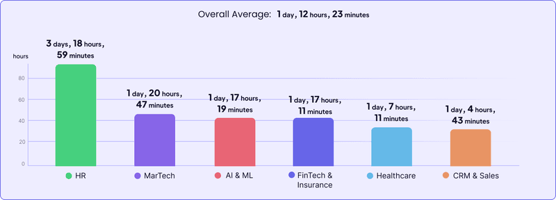
Wondering how your product’s time to value stacks up against other players in your industry? Take a look at the time-to-value benchmarks for different industries:
Higher conversion rates
Getting people to sign up for a free trial is only the first step. If you want to build a successful product, you must convert free trialers into paid users.
But here’s the thing—new users will only opt for a paid plan when they see value in your product. That’s precisely what app onboarding design helps you demonstrate.
Effective and frictionless onboarding design helps free trialers experience your product’s value first-hand, which, in turn, boosts free trial-to-paid conversions.
Improved 1-month user retention rate
Month-1 retention rate measures the percentage of users who continue to use your product a month after signing up. It’s an indicator of whether new users find value in your product and will keep coming back to it in the long run.
A well-designed user onboarding process helps educate and engage users from the get-go. It ensures that they know exactly what steps to take to realize their goals. This early engagement boosts the month-1 retention rate and sets the stage for long-term customer retention.
Take a look at month-1 retention rates for different industries and find out how you stack up against competitors:

Increased user engagement and satisfaction
With a well-defined user onboarding process, users aren’t left clueless when they log into your app for the first time. Instead, they have a clear idea of how to get started.
They also know exactly what features they can use to accomplish their tasks. This keeps users engaged throughout their journey and prevents churn.
Also, when users receive contextual guidance at every step, it eliminates friction from the user experience. It helps improve their satisfaction levels and ultimately wins user loyalty.
Key app onboarding design elements
Successful in-app onboarding involves guiding users as they interact with your product. The idea is to minimize friction in the initial stages of the user journey and allow them to navigate your app with confidence. The following UI design elements come in handy here:
Welcome screens
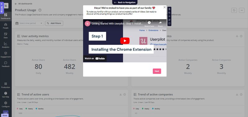
The welcome screen is what users see when they log into your product for the first time. You can use it to set the tone for their entire experience.
While greeting them with a “Hello” or “Welcome” is a given, consider personalizing the message. Start by including their first name in the message and highlighting how your product can help them.
Next, include a catchy call-to-action (CTA) that encourages them to start a product tour or take a welcome survey. You can even nudge them to check out relevant tutorials and other resources from the help center. Lastly, you could keep things simple and just highlight the first task they should complete to set up their account.
Welcome surveys
Welcome surveys help you understand new users better and deliver a personalized onboarding experience. You can use them to learn more about a user’s goals, jobs to be done, and pain points. It’s also a good idea to ask them about their organization and role.
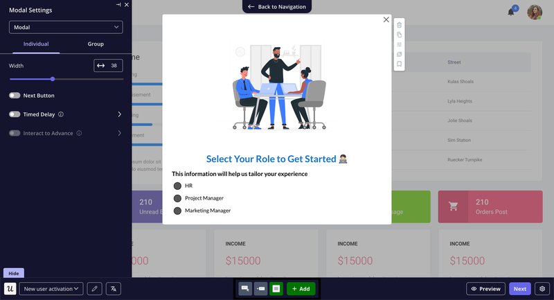
All these details come in handy for tailoring subsequent steps in onboarding flows. For instance, if you’re building a project management tool, you can recommend analytics and reporting-related functionalities to C-suite executives. On the other hand, entry-level employees will benefit from features that help them complete basic tasks.
Empty states
Most software applications leave an empty state blank, but this is actually your opportunity to tell users what they need to do to set up their account and experience meaningful value.
Take a cue from Mixpanel:
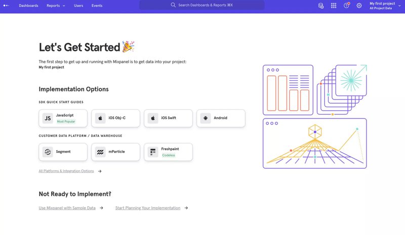
Likewise, when a user encounters an error, you can use the empty screen to recommend relevant help center resources.
Onboarding checklists
Learning to use a new app is overwhelming. How do you know which features to try first? Do you need to install a browser extension or configure your account? Wouldn’t it be great if someone recommended just the steps required to complete your jobs-to-be-done?
An onboarding checklist takes care of all this and more, making it one of the most valuable onboarding UI design elements.
With checklists, you can break down onboarding into short and easy steps. Users can complete each step to move forward to the activation event without feeling overwhelmed.
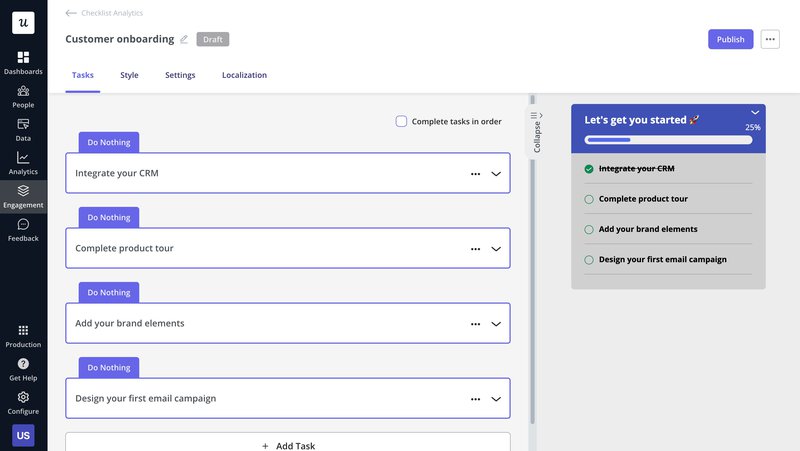
When Sked Social, a social media management platform, implemented an onboarding checklist using Userpilot, they observed that users who completed the checklist converted 3x more than those who didn’t complete it!
Interactive walkthroughs
Both product tours and walkthroughs help educate users about your product’s features and functionalities. But, unlike product tours, interactive walkthroughs require users to complete specific actions before moving to the next step. It makes them more immersive, and when used right, they can help improve user engagement and activation.
You can use modals, tooltips, hotspots, and other UI patterns to create engaging walkthroughs that help customers understand how to use your product.
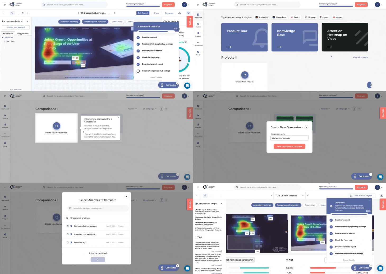
Modals
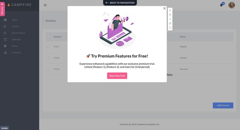
Modals are one of the most widely used onboarding UI design elements. These rectangular overlays help grab eyeballs and share important information with users (like announcements).
Most modal designs also include CTAs that guide users in a specific direction. From product tours and walkthroughs to in-app messages, modals come in handy at every step of the user onboarding process.
Tooltips
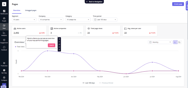
If you want to share information about a specific feature or tool without disrupting the user experience, tooltips are the way to go. They usually appear when a user hovers over or clicks a particular in-app element.
That makes tooltips ideal for providing users with always-available, contextual guidance. They help users understand what a specific feature does and how to use it, resulting in reduced friction and improved feature adoption. Here’s an example of a tooltip:
Hotspots
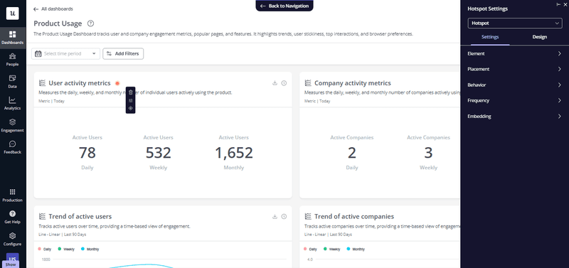
Hotspots are tiny pulsating dots that draw a user’s attention to specific in-app elements. They’re less intrusive than modals and tooltips, making them an extremely valuable onboarding UX pattern, particularly useful for highlighting non-essential features.
Progress bars
A progress bar creates a visual representation of how far a user has moved in the onboarding process. It relies on the human brain’s innate need to seek completion. When users know how far they’ve come, it motivates them to finish what they’ve started. Also, it adds an element of gamification to the experience and boosts user engagement.

What’s your biggest app onboarding design challenge right now?
Which stage of the user journey are you most focused on improving?
How do you currently build your in-app onboarding experiences?
You’re ready to perfect your app onboarding design.
Based on your answers, it’s clear you’re focused on creating a seamless user journey. Userpilot can help you build, test, and optimize code-free onboarding experiences that drive activation and long-term retention.
Best practices for a successful app onboarding process
Effective onboarding requires a strategic approach to delight and engage users. It isn’t just about adding a few modals, tooltips, hotspots, and checklists to your product’s UI.
Here are a few tips to help you create a successful app onboarding process:
Segment customers based on their welcome survey responses
Nothing drives new users away faster than generic onboarding flows. A one-size-fits-all approach educates users about your product without addressing their unique needs, which can take a toll on user engagement and activation.
So how do you avoid alienating app users with generic onboarding? The first step is to segment users according to their welcome survey responses.
Welcome surveys help you collect information about user needs, preferences, and pain points. You can use these details to create customer segments with shared attributes, such as:
- Company size.
- Job role.
- Business goals.
- Use cases.
- Job designation.
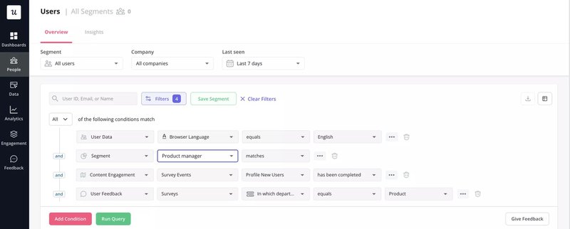
You can even divide users into segments based on their learning preferences and pain points. The attributes you should use for segmentation depend on your product’s niche and target audience.
Create a personalized user onboarding flow for each segment
How do you retain user attention during onboarding and accelerate time to value? One of the most effective solutions is to deliver a personalized onboarding flow.
Each user should feel like the onboarding process is tailored to their unique needs and preferences. The user segments you created based on welcome survey responses come in handy here.
Dig deeper into each segment to understand user interests and pain points. Next, create personalized onboarding paths that provide hyper-targeted guidance and feature highlights.
Let’s say you segment new and existing users based on their job designations. Employees in product managerial roles will have different goals and priorities than C-suite executives. Consider creating targeted onboarding flows that educate them about the features that’ll help them achieve their goals.
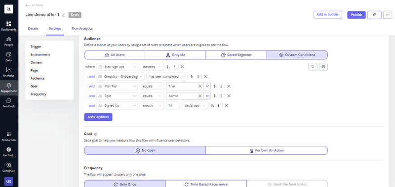
With Userpilot, you can analyze qualitative and quantitative survey responses and use them to trigger personalized in-app experiences.
Minimize friction from the user onboarding experience
The more customer friction in the onboarding process, the less likely users are to finish it. While you can’t create a truly frictionless experience, there are various ways to make things smoother.
These include:
- Use a simple sign-up process – Let users log in with their Gmail or social media accounts. Alternatively, you could allow them to experience your product without signing up. Take a cue from Userpilot’s short sign-up form.
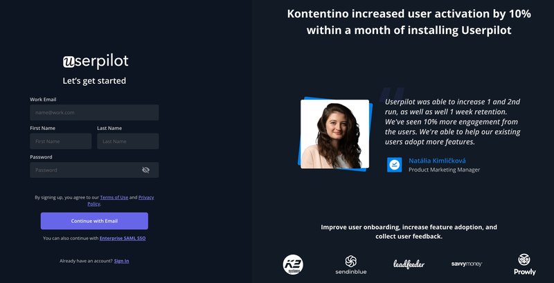
- Eliminate unnecessary steps – Include only those steps that are relevant to a user’s unique goals, pain points, and use case. Adding too many irrelevant steps can affect user engagement.
- Auto-fill information – When users need to fill out forms or surveys, consider auto-filling known details to reduce their effort.
- Introduce features gradually – Educate users about core features that are relevant to their use case first before introducing them to advanced functionalities.
- Provide contextual guidance – Use tooltips to help users understand how key in-app elements and features work.
- Build an in-app resource center – Include articles, product tours, and video tutorials to help users learn about your product at their own pace. Organize the content into logical categories to help users easily locate relevant resources.
Make sure that the UX copy is helpful and convincing
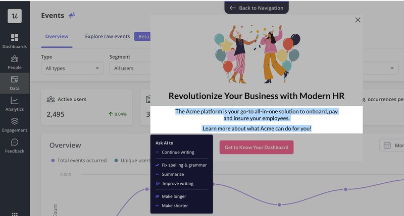
Compelling UX copywriting helps encourage users to complete key onboarding tasks. From walkthroughs and tooltips to empty states, you need to draft clear, concise, and user-friendly copy to guide new users effectively.
Keep UX copy simple enough for users to understand what they have to do to get to the next step. But make sure it’s convincing enough to showcase your product’s value and motivate them to take desired actions.
Also, pay close attention to UX microcopy, such as CTAs, error messages, and placeholders. Userpilot offers an AI writing assistant to help you find new ideas for persuasive microcopy. You can even use the platform to localize your copy based on a user’s region.
Gamify your onboarding experience to encourage users to complete actions
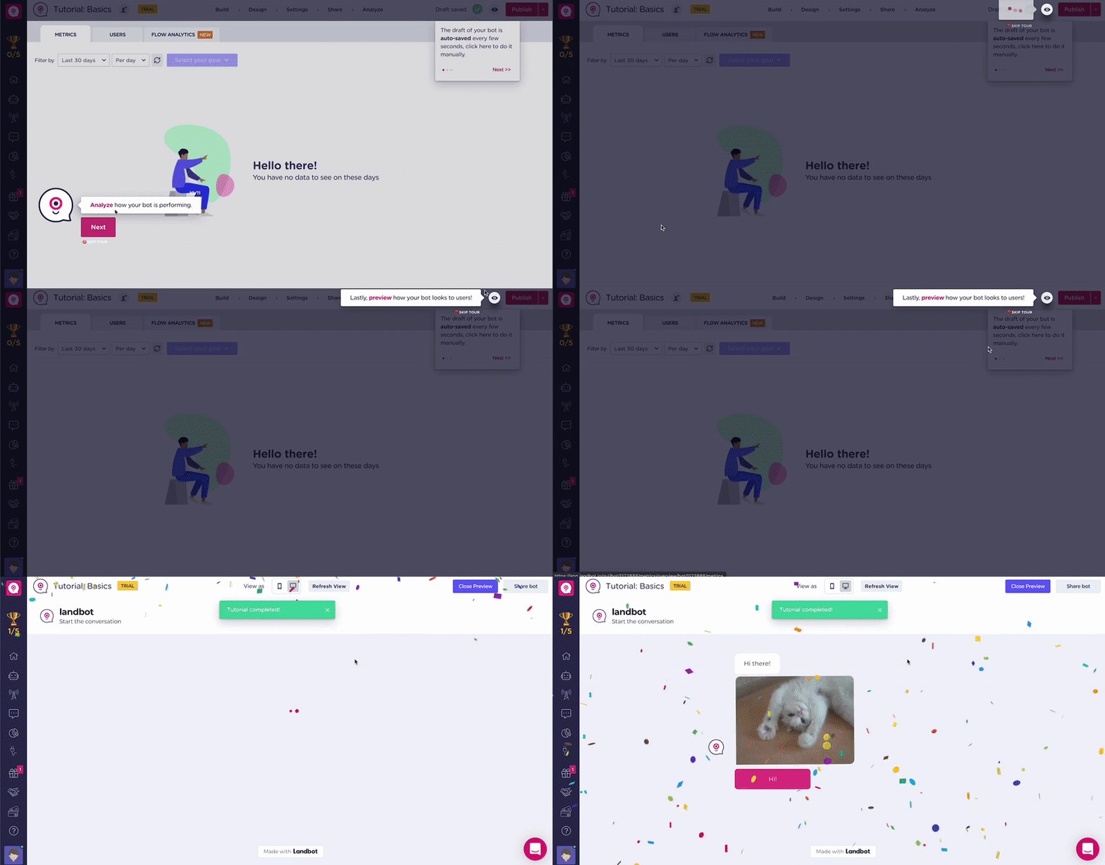
Adding game elements, such as badges, leaderboards, and points, creates a more engaging and fun user experience. It can even encourage healthy competition between users and create a sense of urgency.
And how does this help you? It improves onboarding completion rates and drives product adoption.
When it comes to user onboarding gamification, you can use the following elements:
- Progress bars that show users how far along they’ve moved in the onboarding process.
- Points that users can earn by completing specific actions; they can redeem these points for add-ons.
- Badges and emoji reactions that show appreciation when users reach key onboarding milestones.
- Leaderboards that create a sense of competition among users and amplify product usage.
Run A/B tests to see which onboarding flow performs better
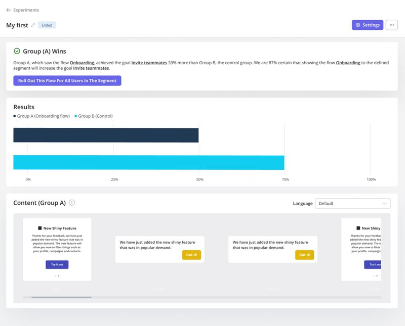
There isn’t a secret formula for building the best user onboarding experience. Instead, you have to continuously experiment with different onboarding flows and identify the ones that deliver the best results. That’s where A/B testing steps into the picture.
You can create slight variations of your app’s onboarding flow and implement each version for a specific set of users. A product analytics tool like Userpilot lets you run these experiments and monitor the time to completion and completion rate of each version. It helps you identify the version that resonates the most with your user base.
Launch surveys to gather user feedback on how you can improve
Successful new user onboarding doesn’t happen with a set-and-forget approach. You have to continuously identify areas of improvement and optimize the process.
That emphasizes the importance of collecting user feedback through in-app onboarding surveys. Launch these surveys at key steps in onboarding flows to get insights into user satisfaction and sentiment.
You can ask questions about the challenges they faced during onboarding and things they’d like to change about the process. Some questions you could include:
- Did you feel adequately supported during the onboarding process?
- Are there any additional features or resources that you would have found helpful during the onboarding?
- Did you feel that the onboarding process prepared you to use [your product] well?
Here’s an example from Userpilot’s onboarding survey:
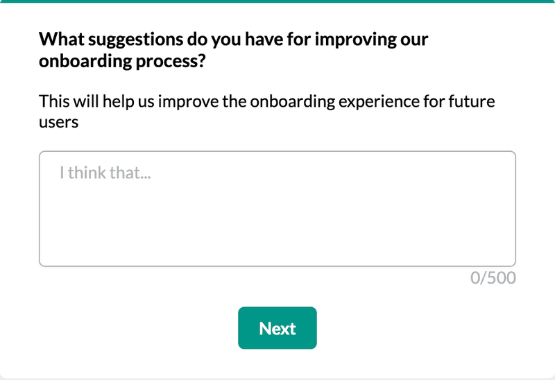
Analyzing responses from onboarding surveys will help you identify and address user pain points better, enabling you to optimize the onboarding process further.
Create email marketing campaigns to drive users back into the app
Despite the best onboarding efforts, some users are likely to disengage. The good news is that you can re-engage these users with targeted email marketing campaigns.
If you’re already using Userpilot, you can integrate it with HubSpot and send hyper-personalized emails based on in-app user behavior. For instance, if a user doesn’t return after completing their free trial, you can send an email with discounted plans.
Successful user onboarding examples to inspire you
Before you start designing your app onboarding process, look at the following user onboarding examples for inspiration:
The Room increased new user activation by 75%
The Room is a global platform that helps companies connect with tech talent. Their key activation point is when a new user uploads their CV.
But they faced a roadblock here—not many new users were completing this action.
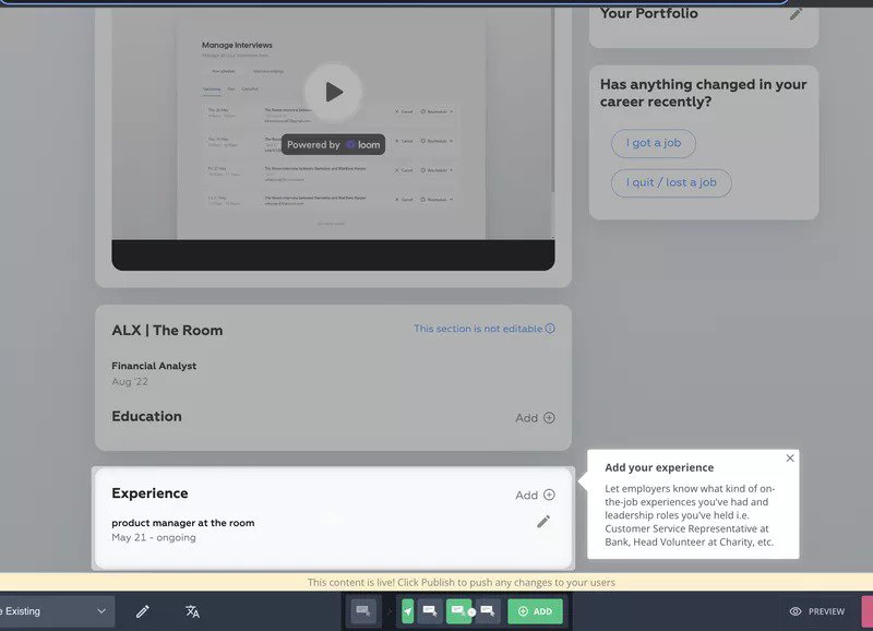
The team behind The Room decided to implement an in-app user onboarding flow with Userpilot. The simple flow used a driven action to direct new users’ attention to the “Drop your CV here” CTA. Also, it included a tooltip that guided users to update the “Experience” section of their profiles.
The result was a 75% increase in CV uploads (and user activation) within 10 days of implementing Userpilot!
Groupize gamified their in-app onboarding
A meetings management platform, Groupize, implemented Userpilot to bring Groupize Guide (G.G.)—the award-winning gamified onboarding assistant—to life.
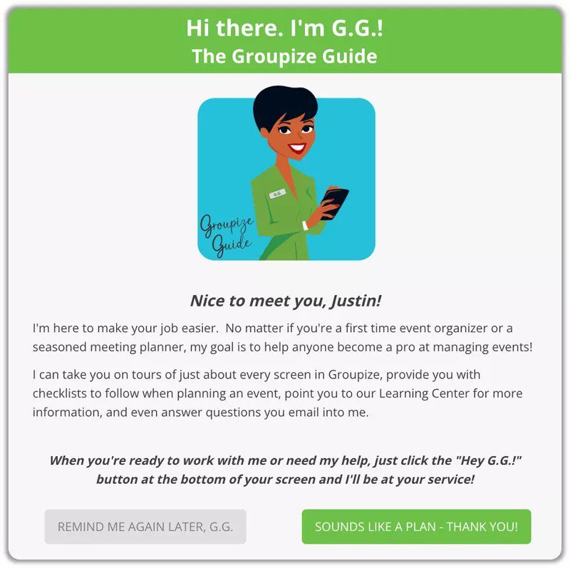
G.G. would usually pop up on every page a user visited. However, most users reported feeling overwhelmed by it.
That’s when the Groupize team decided to create an in-app resource center with Userpilot and include an option to connect with G.G. Users could even request guided tours of individual pages from the resource center.
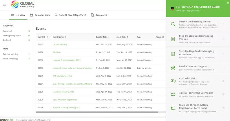
After implementing onboarding tours and checklists through Userpilot, Groupize saw a significant shift in the quality and volume of support tickets.
Sked Social tripled conversions with an onboarding checklist
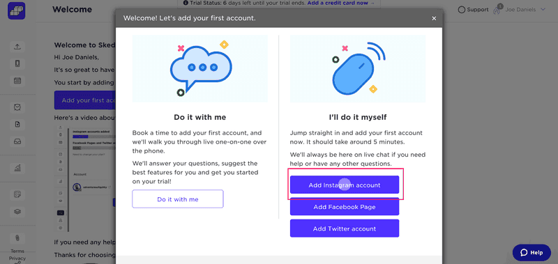
When you log into Sked Social for the first time, a modal pops up to welcome you and asks you to add your first account.
After you connect a social account, you reach the main dashboard, where you’re presented with a simple 4-step onboarding checklist built with Userpilot. It’s worth noting that the first task (Account Created) has already been checked off, creating a sense of accomplishment.
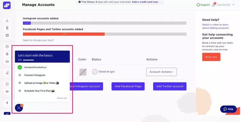
That, along with the progress bar, encourages users to complete the other steps. The steps in the checklist are designed to direct users to the activation event (scheduling their first post) and convert them into paid users.
After implementing the checklist, Sked Social saw a 3x higher conversions!
Kontentino increased new user activation by 10% with an onboarding flow
A social media scheduling tool, Kontentino has two key user activation events—when a user adds their social media account and when they schedule their first post.
Kontentino greets new users with a welcome message that includes “Let’s Start!” CTA.
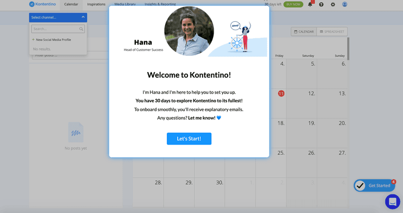
Clicking the button triggers a breezy interactive walkthrough that uses tooltips and driven actions to nudge users to the “Aha moment.”
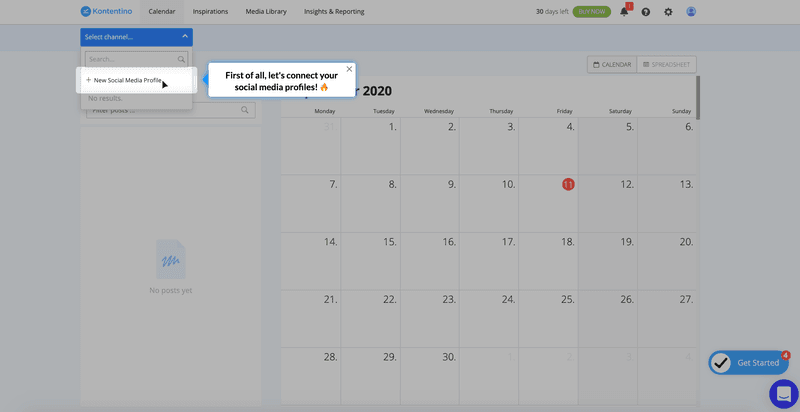
When you connect your social account, a Kontentino team member celebrates the milestone with a funny GIF.
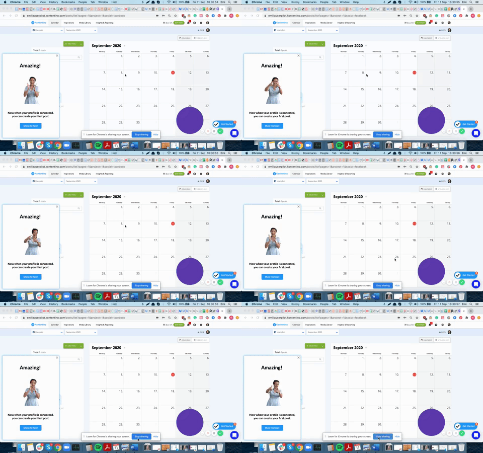
Similarly, another series of tooltips helps users schedule their first posts. This simple yet fun user onboarding flow created with Userpilot has led to a 10% increase in new user activation.
Kommunicate increased feature adoption through strategic onboarding techniques
Customer service automation software Kommunicate found that their users often asked for features that were already available on the platform. Since most users didn’t realize that the feature they needed was already there, they didn’t see the product’s value.
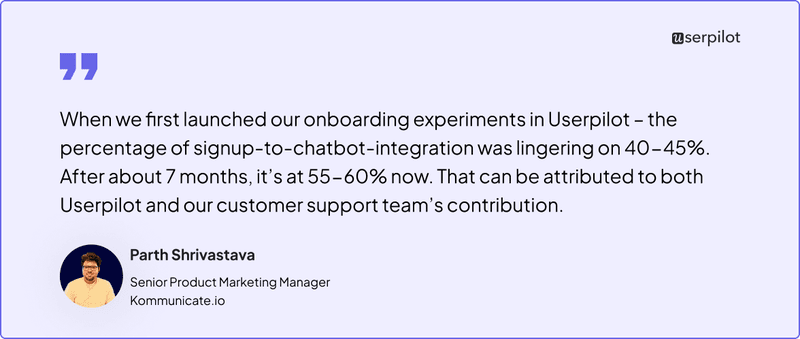
That’s when the Kommunicate team decided to improve user onboarding with Userpilot. The first thing they implemented was a simple notification bar to prompt users to install a chatbot integration, which led to a 15% increase in this feature usage.
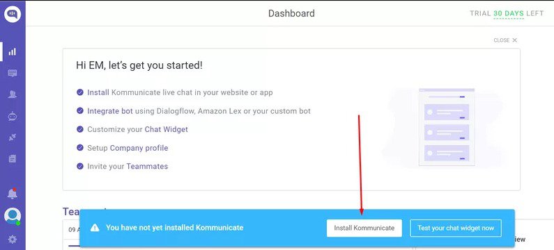
Then, they implemented a checklist that guided users through multiple “Aha moments” and educated them about relevant features associated with each step. That, in turn, helped increase feature adoption by a further 4%.
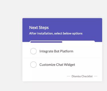
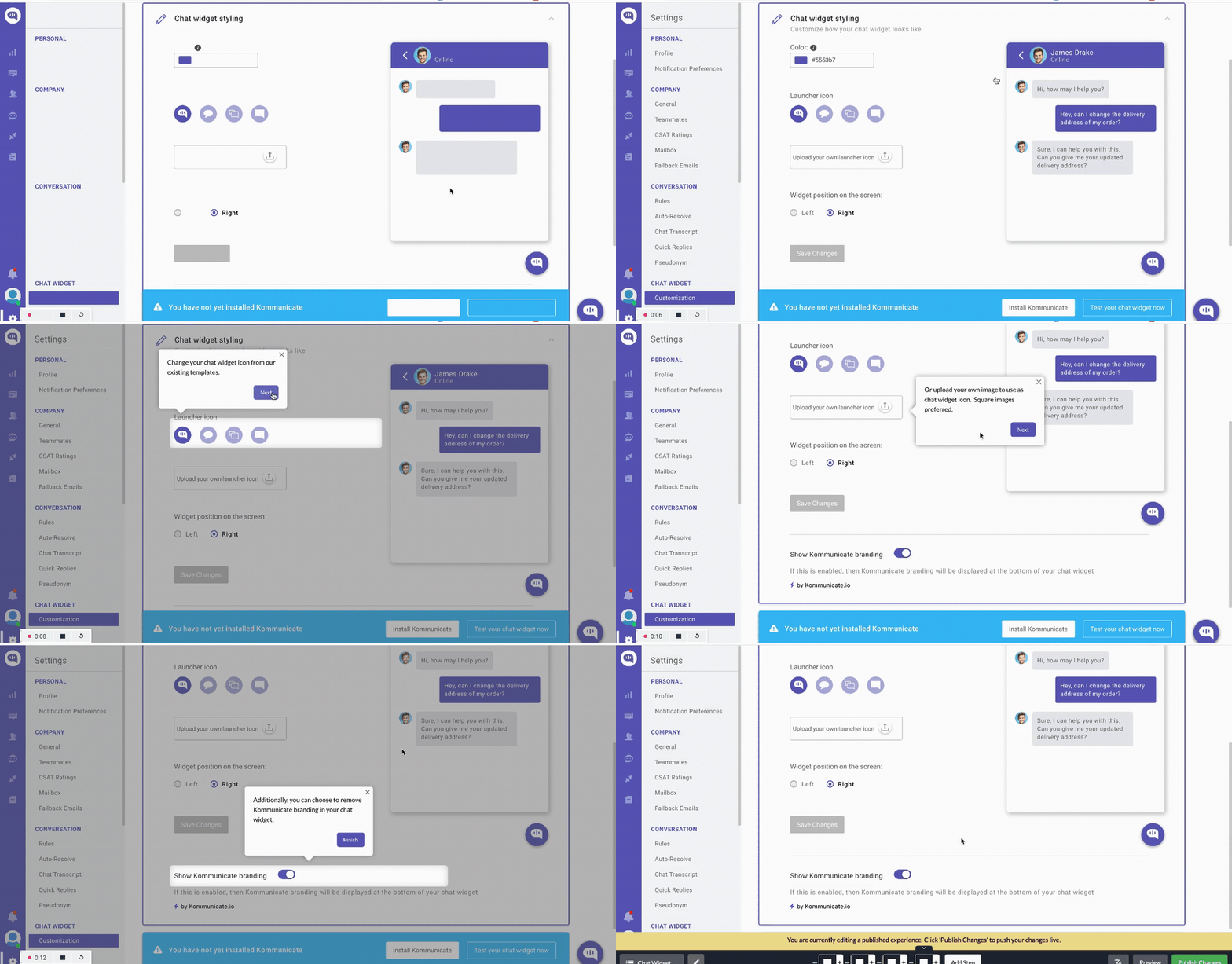
Finally, they have created an interactive walkthrough that guides users through customizing the chat widget, which is yet another important “Aha moment.” This UI element helped them increase this feature usage by 3%.
App onboarding design tools to increase conversions
In this section, we’ll look at a few user onboarding tools that come in handy for creating and implementing successful onboarding flows.
Userpilot
As a full-fledged product growth platform, Userpilot offers various features to help you design the onboarding process. These include:
- Segmentation – You can segment users based on demographics, firmographics, survey responses, and in-app behavior.
- Highly customized flows – You can create personalized in-app flows for pre-defined user segments. It’s also possible to trigger custom in-app experiences based on real-time user actions.
- Surveys – It offers a variety of customizable user survey templates to collect feedback. You can also analyze survey responses and use them to trigger tailored in-app flows.
- A/B and multivariate testing – You can set up A/B and multivariate tests and analyze their results to identify the best-performing onboarding elements.
- Analytics reports – Userpilot offers several analytics reports, including funnel, retention, and cohort analysis, to understand product usage and user behavior better.
- Metrics dashboard – You can create custom dashboards to monitor the most crucial metrics relevant to your product, like customer acquisition cost, churn, etc.
- Auto-capture – Userpilot automatically captures and tracks in-app user interactions like clicks, text inputs, and form submissions to eliminate the cumbersome manual process.
Pendo
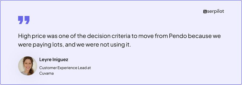
Pendo is a no-code product adoption platform that lets you create and publish in-app user guides to onboard new customers. You can also use it to monitor product usage and user behavior, create in-app surveys, and segment your user base. Paid plans come with more features, such as product engagement scores and resource centers.
However, unlike Userpilot, Pendo offers limited customization capabilities. Also, Pendo lacks advanced surveys (you can only run NPS surveys) and doesn’t offer features like auto-localization. It also comes at a higher price point.
Appcues
Appcues is among the most commonly used user onboarding platforms. You get all the features you’d expect from a standard solution, including no-code product tours, in-app surveys, interactive user guides, and segmentation.
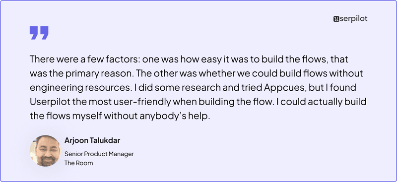
However, many Appcues users struggle with customizing the look and feel of content and the lack of product analytics. Also, it offers less value for money compared to other user onboarding solutions like Userpilot—basic features like checklists aren’t available in all plans.
Conclusion
Whatever your app’s niche and target audience, UI design elements like welcome screens, interactive walkthroughs, and checklists can help users see your product’s value.
The key, however, is to continuously test your app onboarding design and optimize it for the best results. The software solution you use to create your onboarding experience can be of big help here.
Userpilot offers various features, including personalized in-app flows, checklists, auto-capture, surveys, and real-time analytics. Schedule a demo to find out how it can help improve your user onboarding experience.
FAQ
Is app onboarding necessary?
Whether you want to improve user activation or customer advocacy, a smooth in-app onboarding experience is non-negotiable because it helps guide new users through initial steps and educates them about your product’s core features.
With interactive walkthroughs, tooltips, and checklists, you can help users experience your product’s value and realize their goals. That, in turn, improves trial-to-paid conversion and retention rates.
How do you structure an onboarding process?
If you want to design an onboarding process, start by identifying the key activation event, i.e., the moment when users experience value and are likely to become long-term customers. Next, work backward from the activation event to determine key steps in the onboarding flow.
Then, use a product growth platform like Userpilot to design and implement a frictionless onboarding experience comprising of walkthroughs, checklists, product tours, and more.
How do you measure app onboarding success?
You can track various onboarding metrics to measure the effectiveness of in-app onboarding flows. These include time to value, user activation rate, trial-to-paid conversion rate, product adoption rate, and user retention rate. Monitoring the customer effort score and customer satisfaction levels can help, too.
Similarly, you can track the engagement and completion rates of individual onboarding components, such as checklists and walkthroughs. You could even set up conversion funnels to track conversion rates at various steps of the onboarding process and identify drop-off points.

