Are you doing enough to lead your company toward product-led growth?
Given the right product growth tools, you can transform your product into a self-growth machine.
Curious about the tools that make this happen? Don’t fret! In this article, we’ll go over 16 tools that each product team may want to have in their tech stack!
Overview of product growth tools
When evaluating product growth tools for this listicle, I reviewed tools across the following categories that make up a complete SaaS product growth engine: user activation and product adoptions, product management, user feedback collection, user behavior analytics, sales and marketing enablement, and customer service. I considered different channels and only picked tools with mature infrastructure that enable integrations.
Here is the summary:
| Tool | Best for | Starting price |
|---|---|---|
| Userpilot | Product-led growth tool for web apps | $299/month (billed annually) |
| Pendo | Product adoption software for mobile apps | Quote-based (free plan for up to 500 MAUs) |
| UserGuiding | User onboarding software for small companies | $89/month (billed annually) |
| ProductPlan | Road mapping and product-led growth strategy | $49/editor/month (billed annually) |
| ClickUp | Project management for SaaS companies | $7/user/month (billed annually; free plan available) |
| Refiner | Customer feedback software for user surveys | $79/month (billed annually) |
| Userzoom | User research and user interviews | Quote-based |
| Google Analytics | Analyzing customer journey across web channels | Free (premium Google 360 on request) |
| Mixpanel | Product analytics and data visualization | $28/month (free plan available) |
| Hotjar | Collecting quantitative and qualitative data | $32/month (billed annually; free plan available) |
| HubSpot | Customer relationship management (CRM) | $15/month/seat (billed annually; free plan available) |
| Salesforce | Sales teams and revenue intelligence | $25/user/month |
| Semrush | Product-led content marketing and SEO | $108.33/month (billed annually) |
| ActiveCampaign | Retention email marketing | $9/month (billed annually) |
| Intercom | AI-powered chatbot customer service | $39/seat/month |
| Zendesk | Omnichannel help center and ticketing | $55/agent/month (billed annually) |
Below, you can find a complete summary of each tool’s key features and pricing.
Best product growth tools for user adoption
User adoption platforms are software solutions designed to help users learn and master new software applications.
These platforms provide tools and features to guide, train, and support users through the onboarding process and ongoing usage, leading to higher engagement and productivity.
1. Userpilot – best product-led growth tool for web apps
Userpilot is a product-led growth platform for web apps with key features highlighting product adoption and user onboarding.
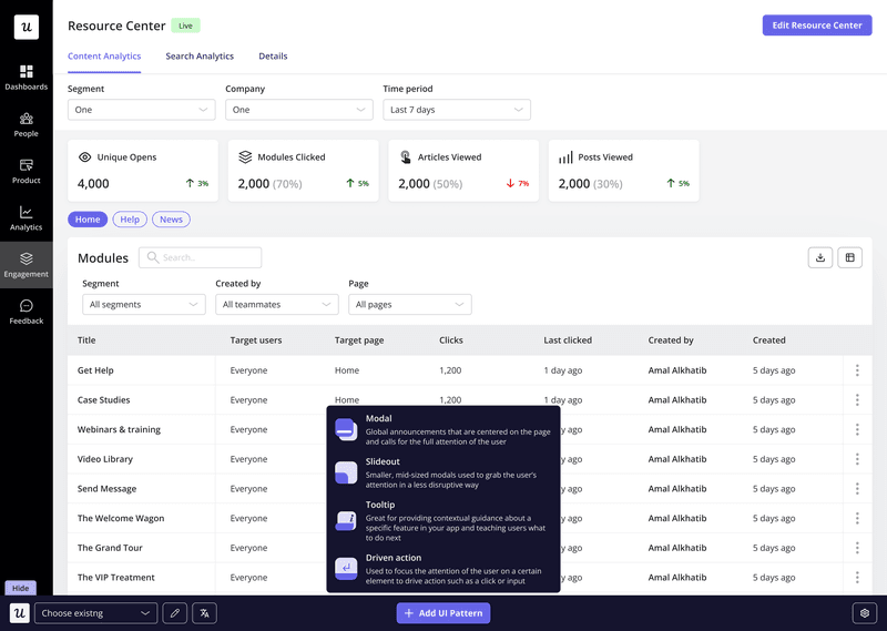
- Chrome extension builder: With Userpilot, you can craft an engaging customer experience utilizing different UI patterns and in-app messages (e.g. modals, banners, checklists, tooltips, etc.) completely code-free.
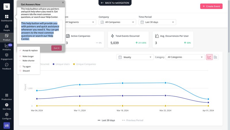
- AI writing assistant: Userpilot’s AI writing assistant helps enhance the copy of your in-app messages so they are more readable and engaging. After writing a few lines of product copy, you can rephrase, shorten, or expand it to better resonate with your audience.
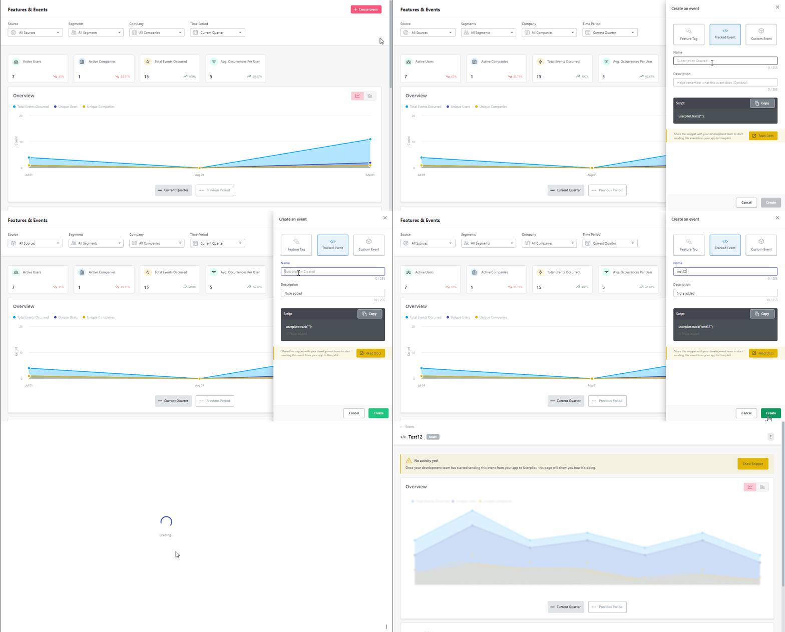
- Event tracking: Userpilot tracks different in-app interactions such as clicks, hovers, and form infills. You can also customize events by combining them to make a distinct trackable event. With event tracking, you can see how customers are engaging with your adoption flows or trigger specific customer engagement flows based on user behavior.
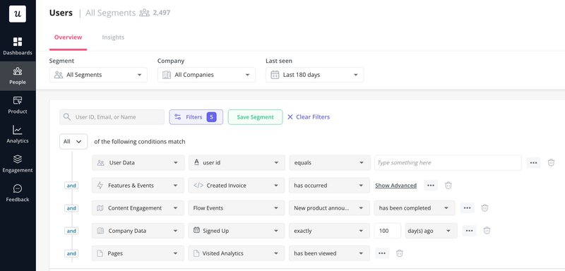
- Segmentation: Userpilot’s sophisticated user segmentation allows you to group users based on different attributes like user persona, previous survey responses, NPS scores, and product usage. Teams can then take these segments to deliver highly personalized experiences.
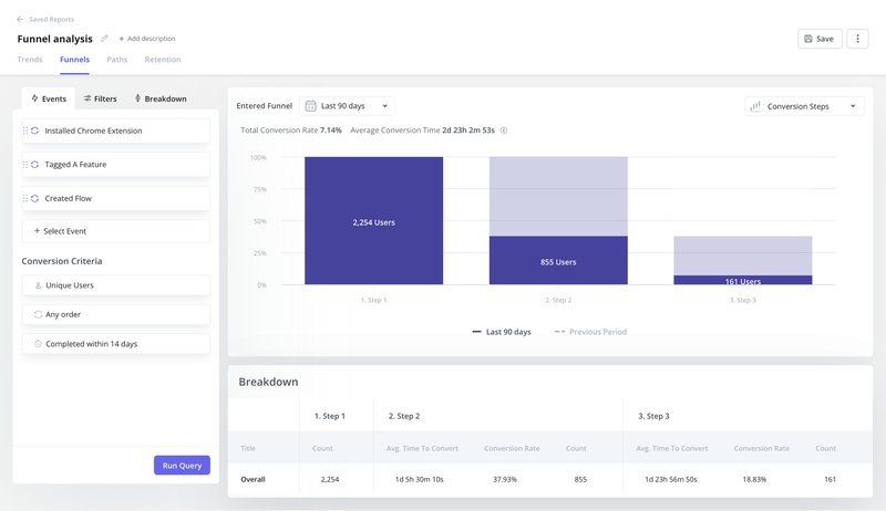
- Funnel analysis: The funnel analysis tool tracks how users progress through the steps of the adoption funnel. Using it, you can uncover friction points that disrupt the user experience and fix them to improve conversions.
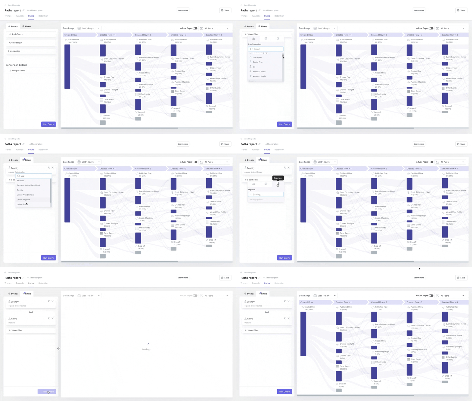
- Path analysis: With path analysis, you can choose a starting point and see what steps users take from there. It can be used to analyze the effectiveness of different paths users can take and identify the “happy path” that leads users toward the most desirable outcomes.
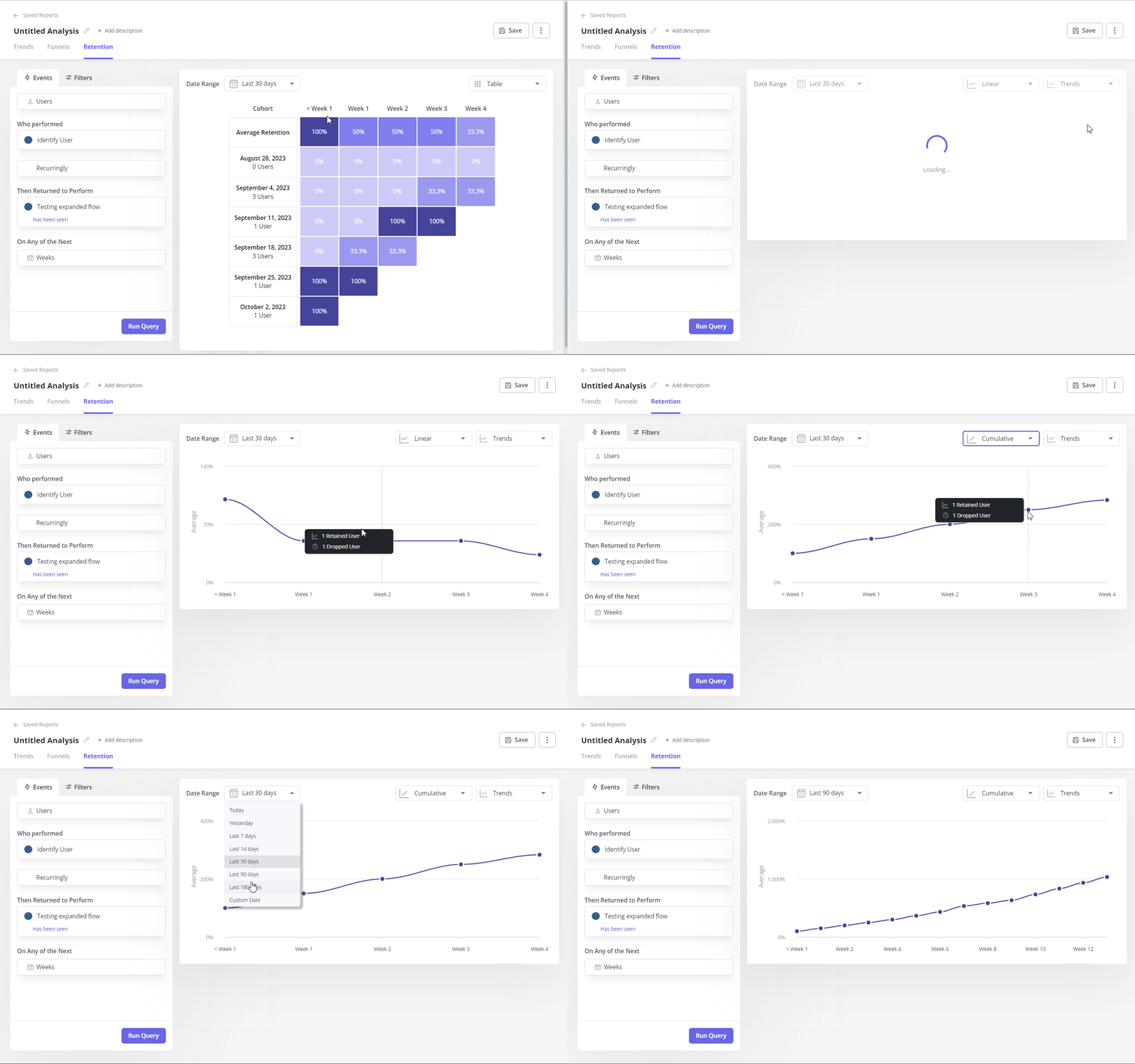
- Cohort tables: Userpilot lets you visualize retention rates based on user cohorts so you can easily spot retention trends and make data-driven decisions.
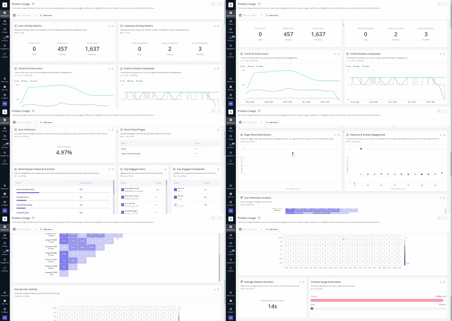
- Analytics dashboards: Userpilot’s analytics dashboards will give you a glance view of all the relevant adoption metrics such as the number of active users, sessions, average session duration, or product usage. Additionally, Userpilot customers can customize their dashboards how they want, highlighting metrics of their choice.
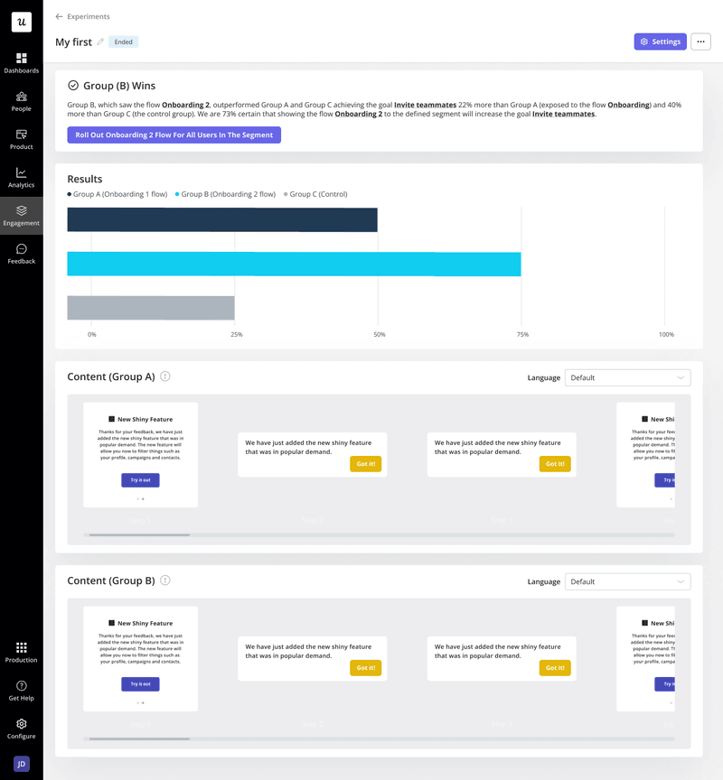
- Product experimentation: You can run A/B and multivariate tests to identify the best-performing variants of an in-app experience and implement them for the rest of your user base to optimize conversion rates.
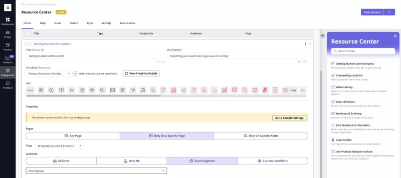
- Resource center: Userpilot allows you to create an in-app help center and embed different types of resources into it. This way, whenever users come across an issue, they’ll know where to turn to and get quick answers.
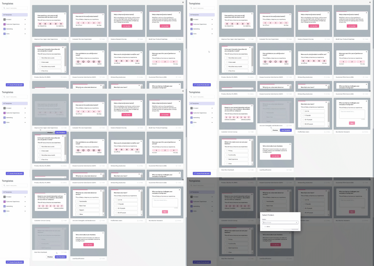
- In-app surveys: With Userpilot, teams can collect user insights with the in-app surveys to inform their product-led growth strategy. You can customize different microsurvey templates such as Product-Market Fit, Customer Effort Score, and Customer Satisfaction Score, or build one from scratch.
Userpilot pricing
Here’s an overview of Userpilot’s pricing plans:
- The Starter plan begins at $299/month (billed annually) for up to 2,000 monthly active users. It includes in-app user engagement, usage trend analysis, NPS surveys, and essential product analytics—ideal for mid-market SaaS teams getting started.
- The Growth plan offers custom pricing and adds advanced analytics, retroactive event auto-capture, in-app surveys, session replay, and more. It’s the most popular choice for growing teams that need deeper insights and scale.
- The Enterprise plan offers custom pricing and includes everything in Growth, plus bulk data handling, custom roles and permissions, SOC 2 Type 2 compliance, and enterprise-level support.
2. Pendo – best product adoption software for mobile apps
Pendo is a digital adoption software perfect for mobile applications. It helps businesses understand and improve how users interact with their digital products.
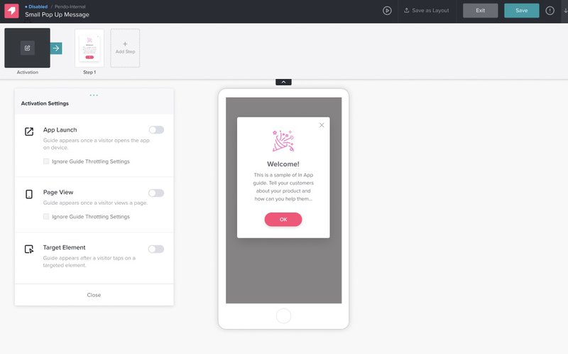
- Auto-generated guides. Powered by Pendo’s artificial intelligence, generate in-app product tours according to your preferred parameters, from the number of steps in a guide to the tone of voice employed.
- Flow triggers. The activation options let you set different conditions under which an onboarding flow should be triggered. These include users interacting with a tagged element, using a particular type of device, landing on a specific URL, or matching a specified segment.
- Product analytics. Pendo collects product usage data and allows you to create various visualizations with it. These include funnel charts, path reports, and a customizable analytics dashboard with 26 widgets to choose from.
Pendo pricing
Pendo operates a quote-based pricing model for all four of its pricing tiers. Pendo also offers a free plan with basic tools for up to 500 MAUs.
3. UserGuiding – best user onboarding software for small companies
UserGuiding is a product walkthrough and user onboarding software great for small companies looking for good, basic, moderately-priced alternatives to advanced platforms.
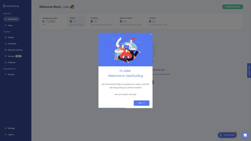
- UI patterns for different use cases. UserGuiding gives access to various user interface patterns like checklists, hotspots, tooltips, and modals, For example, you can use modals to announce new features, or hotspots to provide more information when hovered over.
- User segmentation: UserGuiding lets you segment users based on their shared browser attributes, such as their operating system. You can also create user segments based on the UserGuiding materials they’ve interacted with.
- Resource Center: With UserGuiding, you can create a resource center and add different educational resources to guide users and remove adoption friction from the customer journey.
UserGuiding pricing
UserGuiding offers three paid plans (starts at Basic Plan’s $89/month billed annually for up to 2,500 MAUs, up to Corporate Plan’s $689+/month billed annually for a custom number of MAUs). UserGuiding also offers a 14-day free trial and a 30-day money-back guarantee.
Best product management software for SaaS companies
Product management tools are software solutions that assist PMs with various tasks throughout the product development process.
These tools usually have functionalities for capturing and iterating ideas, prioritizing features, and communicating short and long-term product strategies.
4. ProductPlan – best tool for road mapping and informing your product-led growth strategy
ProductPlan is a product roadmap software assisting business growth through crafting product-led growth strategies.
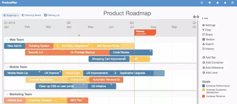
- Roadmapping: Productplan provides flexible layouts for roadmaps, including Timeline and List views, enhancing the visualization of your product strategy.
- Prioritization: The platform provides weighted scoring systems and allows easy drag-and-drop organization.
- Sharing: You can generate links and share them with stakeholders, make your product roadmap public, export your ideas to third-party platforms like Slack, and so on.
- Planning tools: ProductPlan offers a variety of planning tools to help teams prioritize features, track progress, and set goals.
ProductPlan pricing
ProductPlan offers two paid plans (Starting at Basic’s $49 per editor/month billed annually, up to Profesional’s $89 per editor/month billed annually) and an enterprise plan available upon request.
5. ClickUp – best project management tool for SaaS companies
ClickUp is an all-in-one productivity platform that allows teams to come together, brainstorm, plan, and collaborate on various projects.
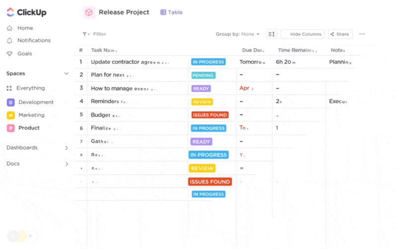
- Tasks management. ClickUp offers various project management functionalities to keep your team organized and operating optimally. You can assign tasks and subtasks to multiple people, create custom fields for updating tasks, show dependencies that affect task completion, and leave comments under the tasks.
- Goal tracking. Set an objective and then organize your goals and targets into a manageable system. For example, one can use it to build good habits, like remembering to hold weekly professional development sessions. Or you can use it for planning product sprints.
- Collaborative dashboard views. From internal reports to client-facing views, there are different use cases for dashboards. For example, you can use dashboards to present a managerial review of tasks completed, time spent, and deals closed. Or, you can create a client portal where your customers can monitor project progress, chat with you, and add tasks to your to-do list.
ClickUp pricing
ClickUp has a free plan with limited functionalities.
ClickUp also offers two paid plans (starting at Unlimited’s $7/user/month billed annually, up to Business’s $12/user/month billed annually) and a separate enterprise plan available on request.
Best product-led growth tools for user feedback
User feedback tools allow companies to gauge customer sentiment. collect user insights and analyze them to uncover patterns and trends.
Feedback tools provide a structured approach to understanding how your product is perceived by users and what users like/dislike about it.
6. Refiner – best customer feedback software for creating user surveys
Refiner is a customer feedback platform built explicitly for SaaS and digital products.
Refiner is known for its high customizability and integration capabilities, making it a versatile tool for businesses looking to deeply understand and improve customer experience.
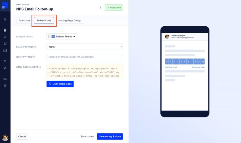
- In-app microsurveys. Refiner enables you to collect real-time feedback via non-disruptive in-app surveys. Precision targeting allows you to send the surveys to the right users. You can decide on the time when users receive a survey using automatic launch triggers.
- Shareable surveys. With Refiner, you can generate URL links to your survey and share them with customers via email, social media, chatbot, or other channels.
- Survey analytics. There are custom dashboards within the admin panel to display survey results such as the number of respondents, response rates, common answers, etc.
Refiner pricing
Refiner offers two paid plans (Starting at Essential’s $79/month billed annually for up to 5,000 MAUs, up to Growth’s $199/month billed annually for up to 5,000 MAUs) and a separate enterprise plan available on request.
7. Userzoom – best user research tool for conducting user interviews
Userzoom is a user experience research tool under the UserTesting platform featuring feedback collection functionalities like surveys, live video interviews, and usability testing.
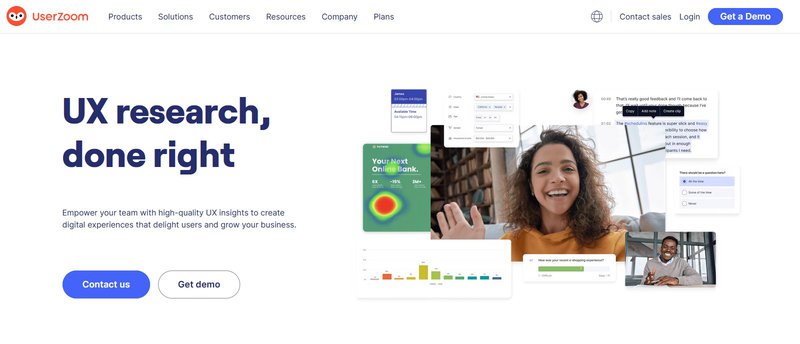
- Design usability tests. Userzoom offers a variety of usability tests you can conduct such as click tests, tree tests, and card sorts. You can also combine multiple tests to garner more powerful and trustworthy results.
- Surveys. The platform lets you create traditional surveys in addition to usability tests. You can use these surveys for pre/post-test screener questions, stand-alone feedback collection, or to gather quantifiable ratings.
- Live interview transcript. During the live user interview, Userzoom automatically transcribes the session according to the chosen language. When an interview has concluded, teams can quickly search the transcript for relevant keywords, with the notes synced to the actual video playback.
Userzoom pricing
Userzoom operates a quote-based pricing model for all their pricing tiers. Contact the sales team for more information regarding pricing plans and offers.
Best product growth tools for user behavior analytics
Behavior analytics tools are software that collects, analyzes, and interprets customer behavior data to actionable insights about customer engagement, conversion, and retention.
Teams can utilize these insights to inform or optimize their product-led growth strategy.
8. Google Analytics – best for analyzing the customer journey across web channels
If you are looking for the best user behavior analytics tool that is free, Google Analytics is the right choice.
It is a web analytics service offered by Google that tracks and reports website or app traffic and events. It currently exists as a platform inside the Google Marketing Platform brand.
- Acquisition and engagement reports. Google’s acquisition reports show how website visitors reached the site, and engagement reports display how users interacted with the product.
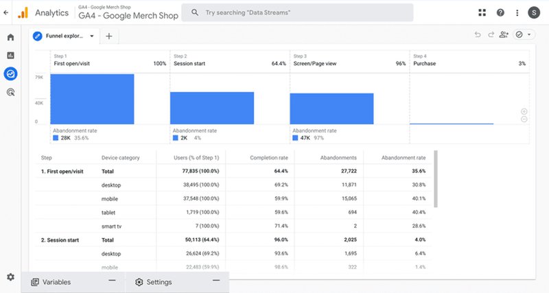
- Funnel analysis. Create custom funnels for your web app and track how users progress through the funnel. GA4’s funnel analysis shows the number of users progressing from one stage to another. You can also analyze and break down user journeys, and see where users drop off.
- Predictive analytics. With Google’s machine learning models, you gain access to predictive analytics that forecast customer behavior. You can take these insights to boost conversions, increase retention, and mitigate customer churn.
Google Analytics pricing
Google Analytics employs a freemium pricing model, offering basic tools for free. Google Analytics’ premium version, dubbed Google 360, is available for enterprises on request.
9. Mixpanel – best product analytics tool for visualizing customer data
Mixpanel is a digital analytics platform notorious for its impressive data visualization capabilities.
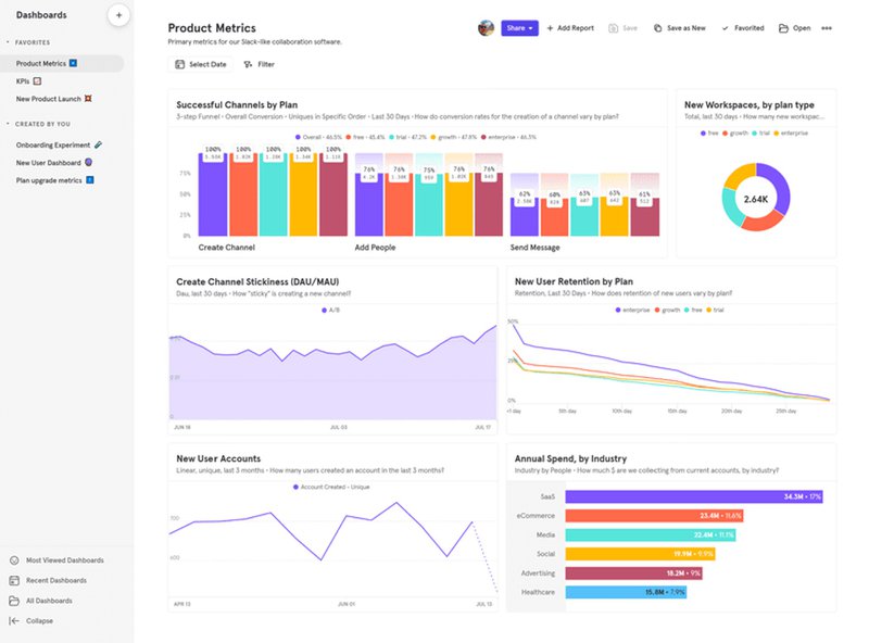
- Dashboards. Mixpanel provides teams with dashboards that visualize behavioral data into easy-to-read reports. You can also take advantage of dashboard templates that are organized by industry, lowering the barrier for non-technical teams.
- Stacked column charts. Mixpanel’s newest feature, stacked column charts adds another layer of depth to your user analytics. Stacked column charts show columns depicting the total for a metric, with divisions stacked on top of each other to indicate different groups that make up the metric, like location, age group, etc.
- Benchmark reports. Mixpanel allows you to conduct a benchmark analysis and compare your metrics with industry averages within minutes.
Mixpanel pricing
Mixpanel offers two paid plans, Growth and Enterprise. Growth starts at $28/month for 10k events and scales with events. Enterprise uses a custom pricing model. Mixpanel also offers a free plan.
Startups that are 5 years old or less and have raised a cumulative total of $8M or less in funding are eligible for a program that grants the first year of their Growth plan for free.
10. Hotjar – best tool for collecting quantitative and qualitative data
Hotjar is a customer behavior analytics platform known for its heatmaps and session recording functionality.
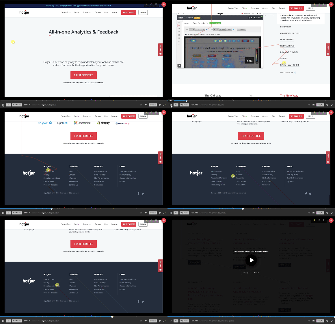
- Heatmaps and scroll maps: The heatmaps and scroll maps tools create a color-coded visual report that reflects user behavior. Heatmaps show website visitors’ areas of interest, and scroll maps show how far users scroll.
- Session recordings: You can record and replay individual user sessions to see exactly how users interact with your site. This helps you identify usability issues and understand user behavior in detail.
- Trends: Visualize your user metrics to identify patterns and uncover the ‘why’ behind the numbers. You can track trends over time, zoom into individual recordings from trends (and vice-versa), and compare your data across segments.
Hotjar pricing
Hotjar offers three paid plans (starting at Plus’ $32/month billed annually, up to Scale’s $171/month billed annually) as well as a free plan and a 30-day free trial of its Business plan.
Best product growth tools for sales and marketing
Sales and marketing tools help companies acquire new users, retain existing customers, and automate various workflows.
11. HubSpot – best customer relationship management software
HubSpot is a comprehensive CRM SaaS company designed for B2B and B2C industries. It offers a wide range of marketing, sales, and service software solutions to help businesses grow efficiently.
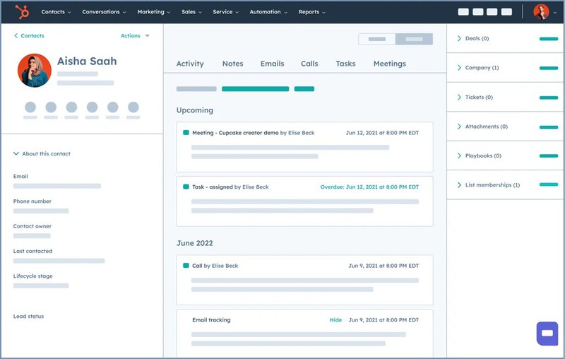
- Lead management. HubSpot’s lead management tool empowers teams to accompany leads throughout the entire sales funnel. Engagement with leads automatically updates the funnel, giving managers up-to-date information on all leads. Prioritization is done automatically to keep the most pressing leads in front of others.
- Marketing and sales integration. The CRM enables seamless data flow between HubSpot’s Marketing Hub and Sales Hub and ensures there’s alignment between marketing and sales efforts.
- Automation. Create automated campaigns using workflows and bot builders. Also, you can automate campaigns across different channels, from email and SMS to in-product marketing.
HubSpot pricing
HubSpot’s Sales Hub offers three paid plans (Starting at Starter’s $15/month/seat billed annually, up to Enterprise’s $150/month/seat billed annually) and a free plan with basic tools from all of HubSpot’s products.
12. Salesforce – best tool for sales teams
Salesforce is a global leader in customer relationship management solutions, providing tools for sales, customer service, marketing, and more to both B2B and B2C markets.
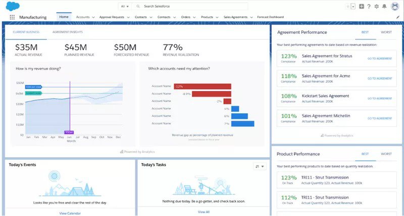
- Revenue intelligence. The revenue intelligence feature built into Sales Cloud empowers sales teams to increase revenue by using insights pointed out by AI or creating a forecast to predict what happens next.
- Integrations. Numerous integrations, including native SaaS apps and third-party solutions like Userpilot, extend Salesforce’s capabilities.
- Analytics and reporting. Utilize powerful analytics and detailed reporting tools to gain insights into sales trends, customer behavior, and marketing effectiveness.
Salesforce pricing
Salesforce offers five pricing plans (Starting at Starter Suite’s $25/user/month billed monthly or annually, up to Einstein 1 Sales’ $500/user/month billed annually) and a 30-day free trial.
13. Semrush – best tool for product-led content marketing and SEO
SemRush is a search engine optimization, social media analytics, and competitor analysis platform focusing on online marketing analysis.
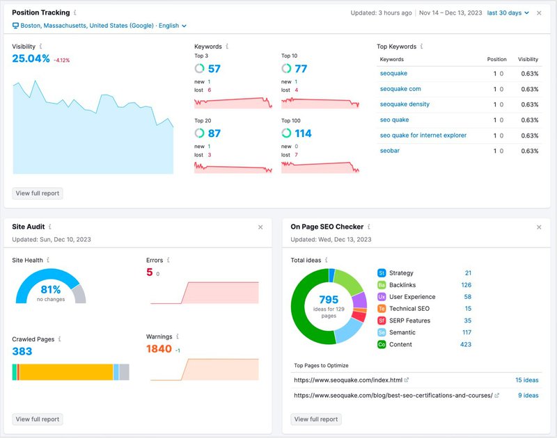
- Keyword and topic research. SemRush’s enormous keyword database lets you study the most effective keywords in your industry that can attract customers. Semrush can also generate a template with optimized content centered around your target keywords.
- Content generation. The content idea generator feature in SemRush assists teams in reaching gaps that competitors left open. Find topics that resonate with your market, discover fresh ideas that no one is taking, and create a content plan for your perfect niche.
- Competitor research. Keep up with competitors or find how you stack up against global trends with Semrush’s robust competitor research feature. Know what your competitors are doing when it comes to marketing activities and imitate — or improve — their iterations.
Semrush pricing
Semrush offers three paid plans (starting at Pro’s $108.33/month billed annually, up to Business’s $416.66/month billed annually) and a 7-day free trial for its Pro and Guru plans.
14. ActiveCampaign – best suite of retention email marketing tools
ActiveCampaign is a marketing automation software with tools designed for retention email marketing.
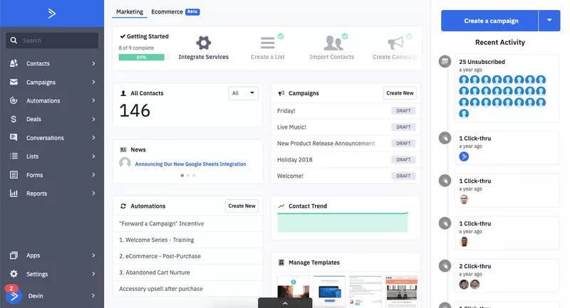
- Email designer. The email designer tool creates professional-looking emails without needing design prowess. Use images, media, and customizable buttons and create emails that will grab your customer’s attention.
- Contextual email marketing. With an automation-first mindset coupled with robust personalization capabilities, ActiveCampaign ensures your emails go to the right person at the right time.
ActiveCampaign pricing
ActiveCampaign offers four paid plans (Starting at Lite’s $9/month billed annually, up to Enterprise’s $259/month billed annually) and a 14-day free trial.
Best product-growth tools for customer service
Customer service tools assist users in finding trouble using a product, connecting them to customer service reps, or other solutions that can address user concerns.
15. Intercom – best AI-powered chatbot software
Intercom is a customer service solution with an AI-first approach to customer success.
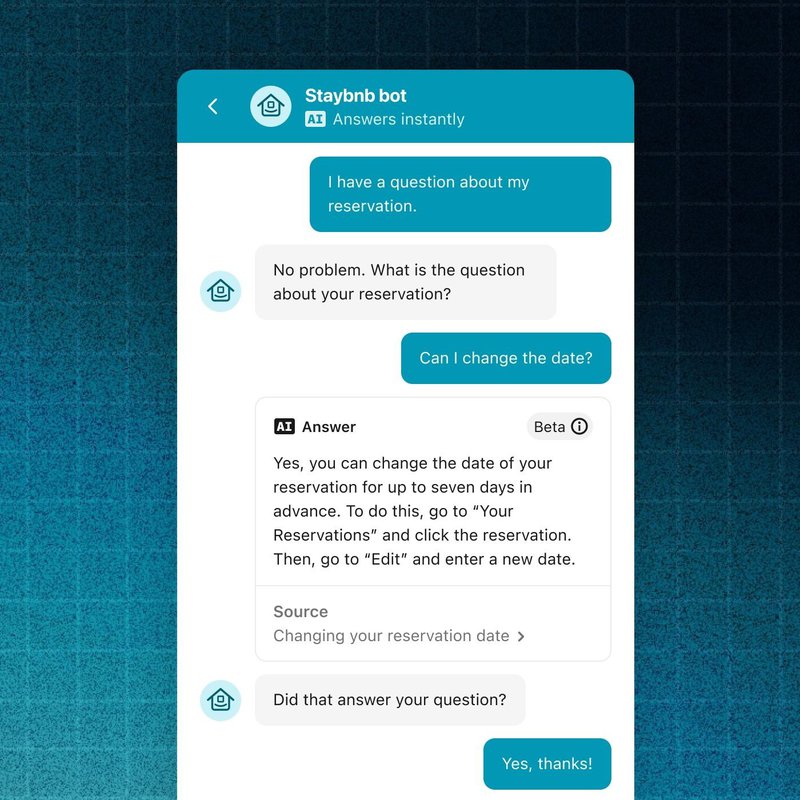
- Chat widget. Intercom provides users with an in-app chat widget that lets them connect with support agents, send queries to a chatbot, and run searches on the help center. You can also schedule automated messages to users with the widget.
- Seamless handoff. The seamless handoff feature lets human agents close deals quicker after Fin AI handles most of the tedious work. When the sophisticated AI has exhausted all facets or is unable to answer queries, it can automatically hand over tickets to human agents.
- Multilingual support. Intercom offers multilingual support for 45 languages right out of the box. Intercom’s Fin AI will communicate in any of the available languages, increasing your customer reach. You can also find all live chat exchanges from different channels within a single unified inbox.
Intercom pricing
Intercom offers three paid plans (starting at Essential’s $39/seat/month up to Expert’s $139/seat/month) and a 14-day free trial.
16. Zendesk – best omnichannel help center and ticketing tool
Zendesk is a customer service solution software with omnichannel support and ticketing tools for customer success.
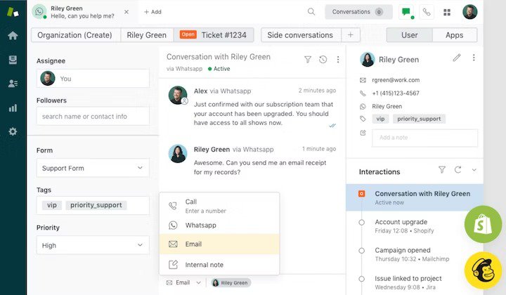
- Omnichannel help center. Zendesk’s access to omnichannel messaging allows for customer support no matter what channel. Provide support from anywhere, or send support articles from your knowledge bases to support customers who want to figure it out themselves.
- Ticketing system. Zendesk’s ticketing system keeps customer service agents on top of their jobs while providing context for every ticket generated. With an integrated hub for all customer support, agents will have an easier time resolving issues, while customers feel satisfied with the swift response.
- Voiced customer support. Beyond messaging, Zendesk also provides voice customer support. The integrated hub means agents access calls in the same place they receive messages.
Zendesk pricing
Zendesk offers three paid plans (starting at Suite Team’s $55/agent/month billed annually, up to Suite Professional’s $115/agent/month billed annually) and a separate enterprise plan available on request. Zendesk also offers users a 14-day free trial.
Conclusion
Unlike sales-led growth, product-led growth focuses on improving the product to attract customers. This makes customers more loyal to what the product can offer, increasing the likelihood of long-term consumption.
From product adoption to customer relationship management, these business tools provide the path for product-led growth.
Are you convinced of the power of product growth tools? Sign up for a free Userpilot demo today and get started on product-led growth!
FAQ
What are product growth tools, and why do you need them?
Plain and simple, product growth tools are software solutions that help you execute your PLG strategy.
These technologies position your product at the center of your growth strategy, focusing on delivering an exceptional user experience that drives customer acquisition, retention, and expansion.


